
Today I would like to take a look at the PM complex as there are some interesting charts building out. Please don’t confuse this report with what Sir Spock, Sir Norvast and others are doing at the Chartology Forum as they’re looking for undervalued PM stocks that will be ready to buy when the time is right. In some cases the time might be now as a few of the PM stocks are holding support. In the vast majority of the cases though, excluding some of the Australian and a few South African PM stocks, most are still under pressure. So for some folks who like to get in a little early and have the patience to wait for the bear market to exhaust itself, one can start picking up a few shares of their favorite PM stocks and see what happens. There won’t be a bell go off at the bottom I can assure you of that.
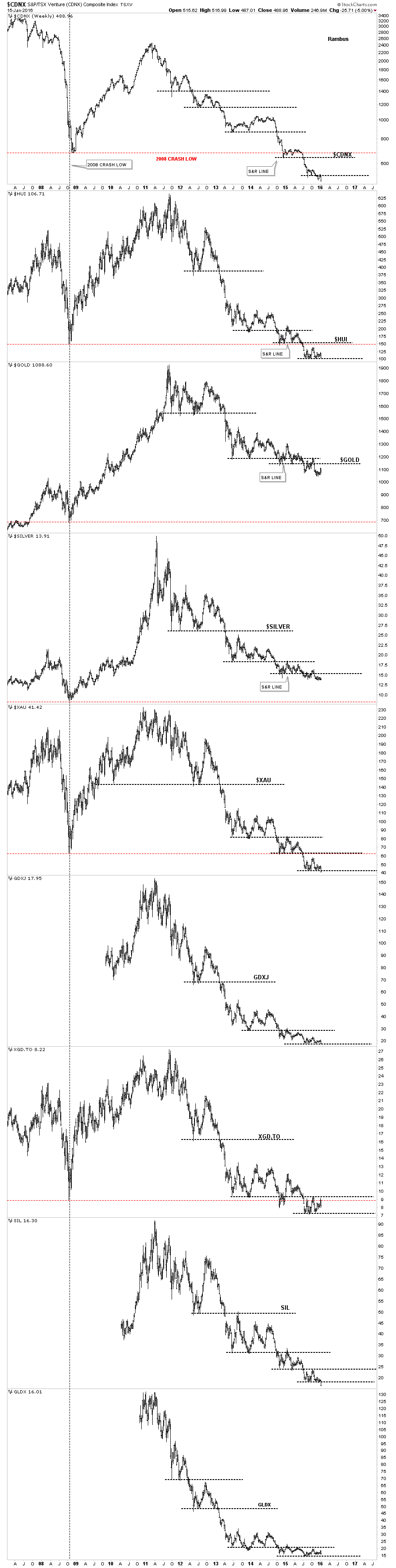
This first chart is a combo chart which has Gold, Silver and five different PM stock indexes, big and small caps on it, to help give you a feel for where we stand right now in regards to the bear market that began in 2011. These charts don’t have any patterns on them just a few simple black dashed horizontal support and resistance lines. The vertical dashed line shows the 2008 crash low and how the PM stock indexes are all trading below that important low while gold and silver are trading well above it. The red dashed horizontal line shows the 2008 crash low. Looking at all these chart objectively it’s hard to see any type of bottoming action taking place yet. The very first thing we would need to see is the price action take out the first overhead resistance lines to even consider that a bottom is building out. There is no law that says it can’t start tomorrow but with a few of the PM stock indexes breaking down to new bear market lows there is alot of work to do for this sector to start looking bullish. Keep in mind I’m not talking about the Australian PM stocks or even a few of the South Africa gold mining stocks which are showing a little strength in here, but the general big picture which is still very negative.
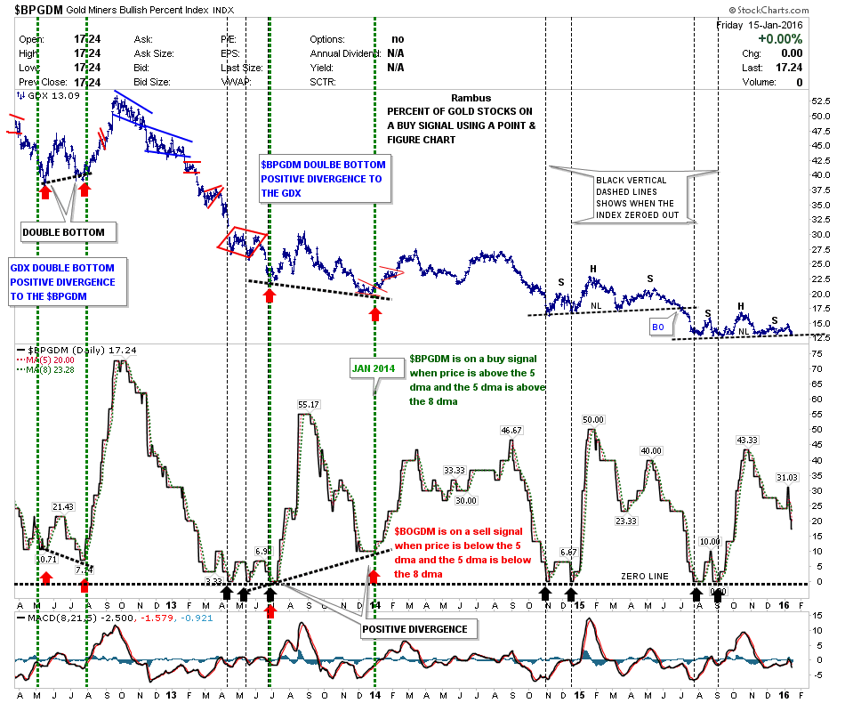
A quick look at the $BPGDM shows it’s on a sell signal as the price action is trading below the 5 day ma and the 5 day ma is trading below the 8 day ma.
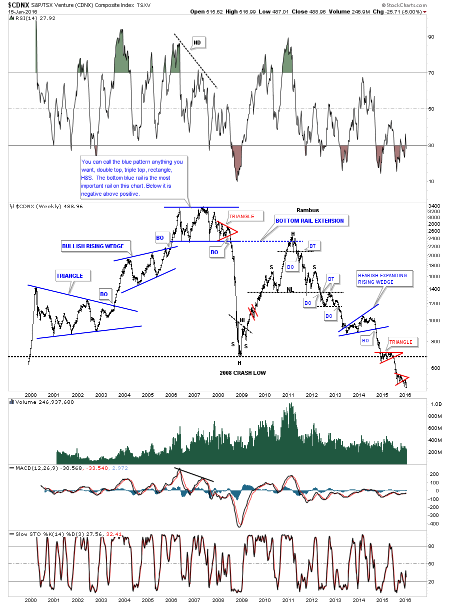
It has been quite a long time since we last looked at this long term chart for the $CDNX, which is basically a small cap Canadian stock index which is made up of precious metals and other small resource companies. This small cap index had one of the biggest bull runs during the earlier part of the bull market in the PM complex. It was the first to top out in 2007 with a huge, I labeled it whatever you want to call the formation inside the blue box, anything you’d like. I remember at the time the bull market was still going strong and what ended up forming inside the blue rectangle, had several different patterns. The big give away that the pattern would break to the downside was the small red triangle that formed on the right side of the blue top. That red triangle broke down first and then shortly afterwards the big blue trendline gave way. There was no way to know back then the magnitude of the 2008 crash or even that the blue trading range would be the actual bull market high which formed several years before the rest of the PM stock indexes. I think we’re seeing something similar in the stock markets right now with the Russel 2000 and micro caps leading the way down. Small caps, in any sector is where the extra cash will go in a bull market and exit first during a bear market.
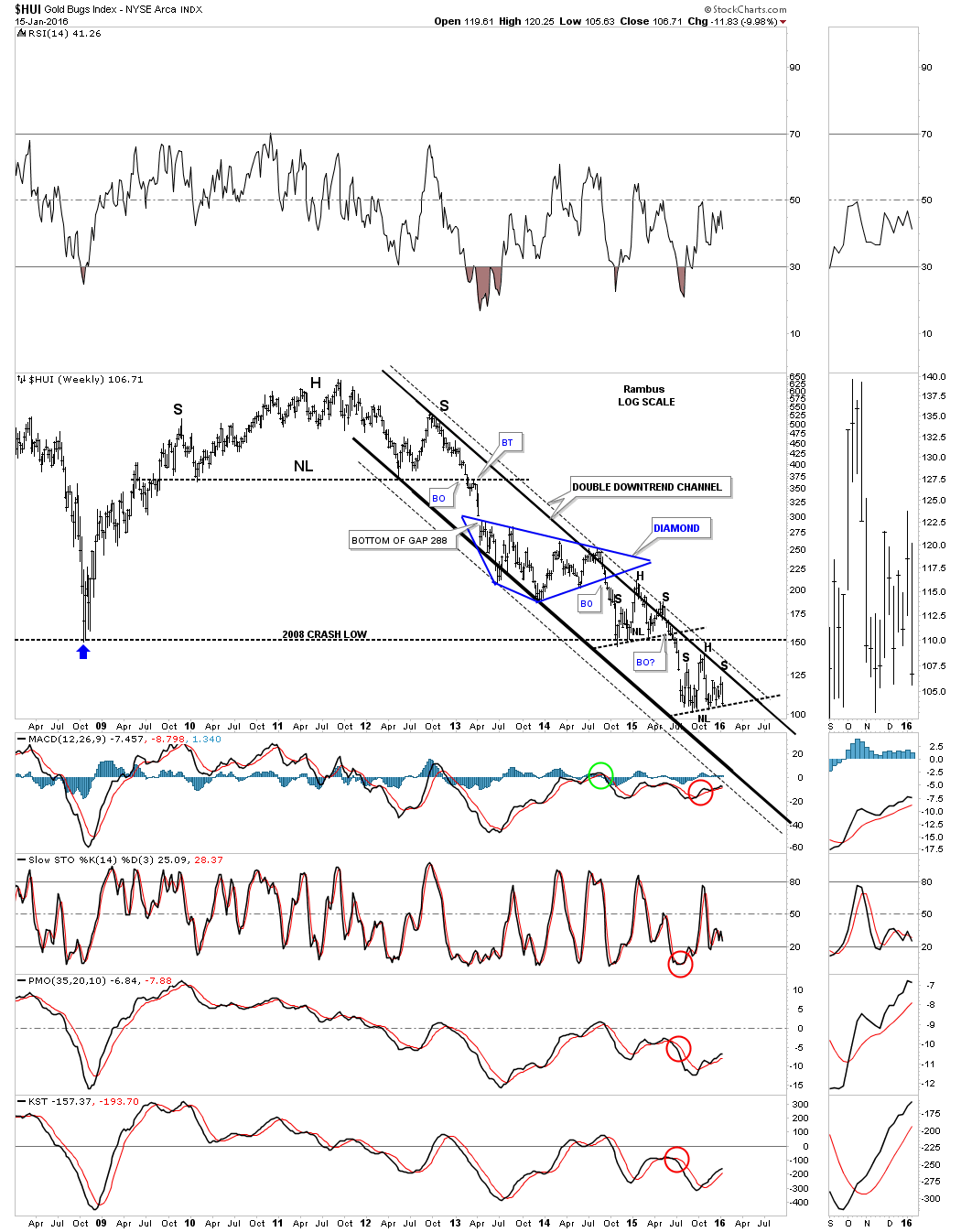
There are several H&S consolidation patterns that are forming on some of the PM stock indexes. The $XAU is the leader breaking below its neckline last week. Below is a three year weekly chart which shows the blue eight point Diamond with the H&S consolidation patterns just below it and our most recent H&S consolidation pattern which has a price objective down to the 32.05 area.
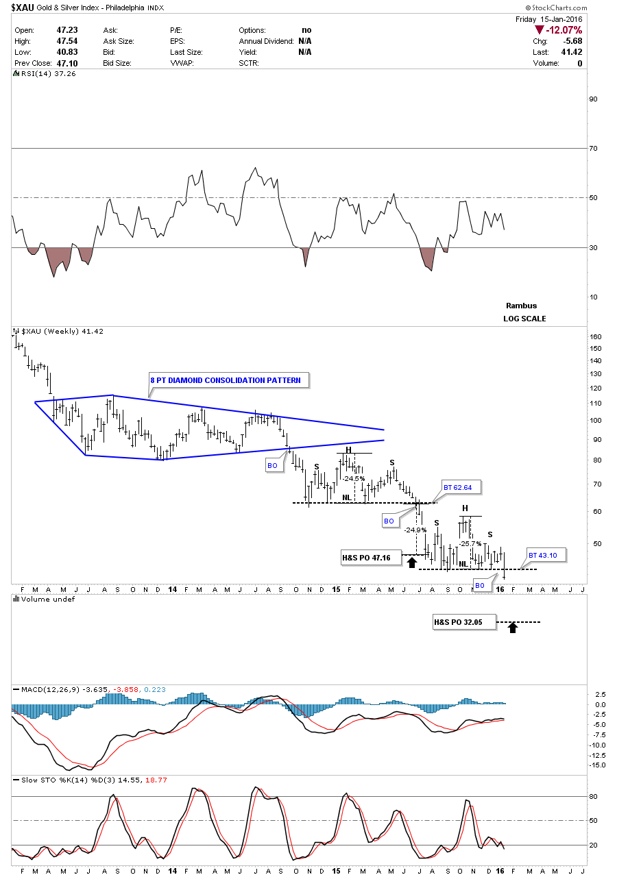
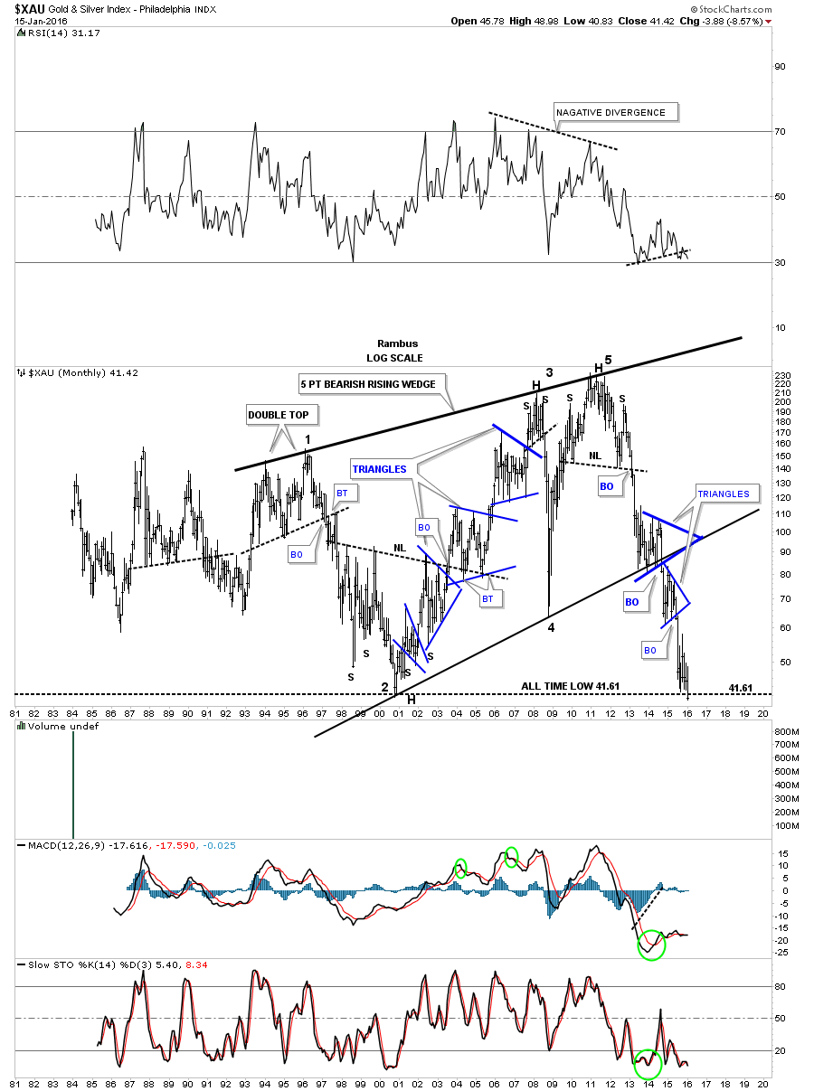
The 30 year monthly chart for the $XAU shows it built out a massive 5 point bearish rising wedge and is currently sitting right on the all time low. Note how the two blue consolidation patterns formed one above the bottom rail of the five point rising wedge and one consolidation pattern just below. This usually sets up a bearish scenario which so far is playing out.
It’s been awhile since we last looked at this long term weekly chart for the HUI which shows it’s double rail bear market downtrend channel.
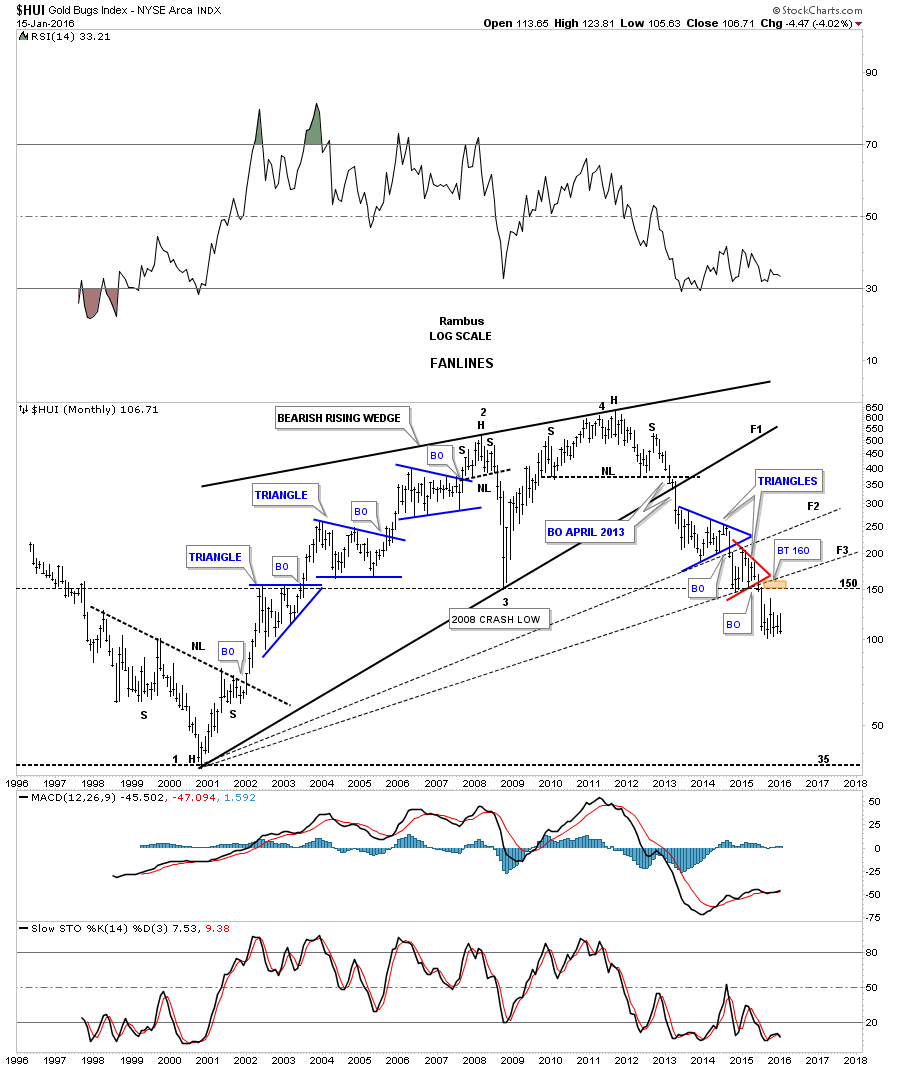
The long term monthly chart for the HUI shows the fanlines it has made since the bear market low in 2000. Normally when the third fanline breaks the pattern is complete.
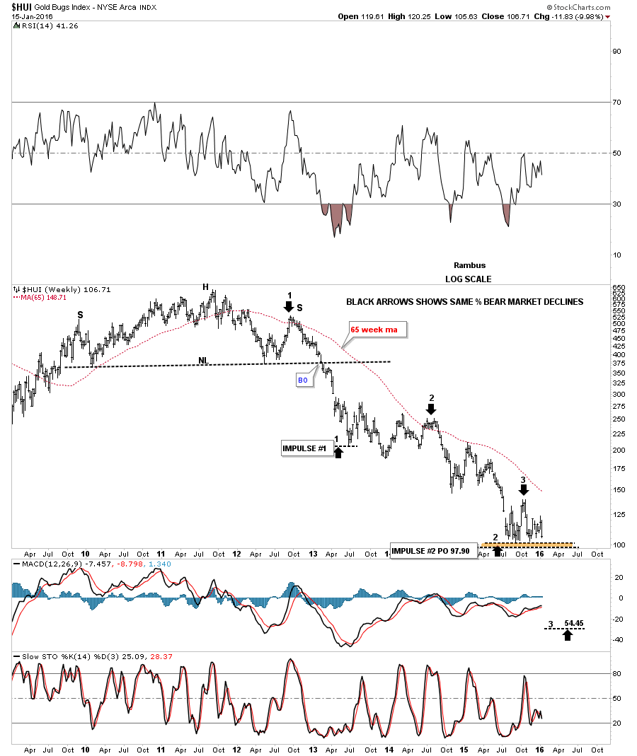
Sometimes the markets will do something that makes you go WOW. This next chart is a weekly bar chart which shows all the bear market rallies were the same exact height on a percentage basis as shown by the blue arrows on log scale.
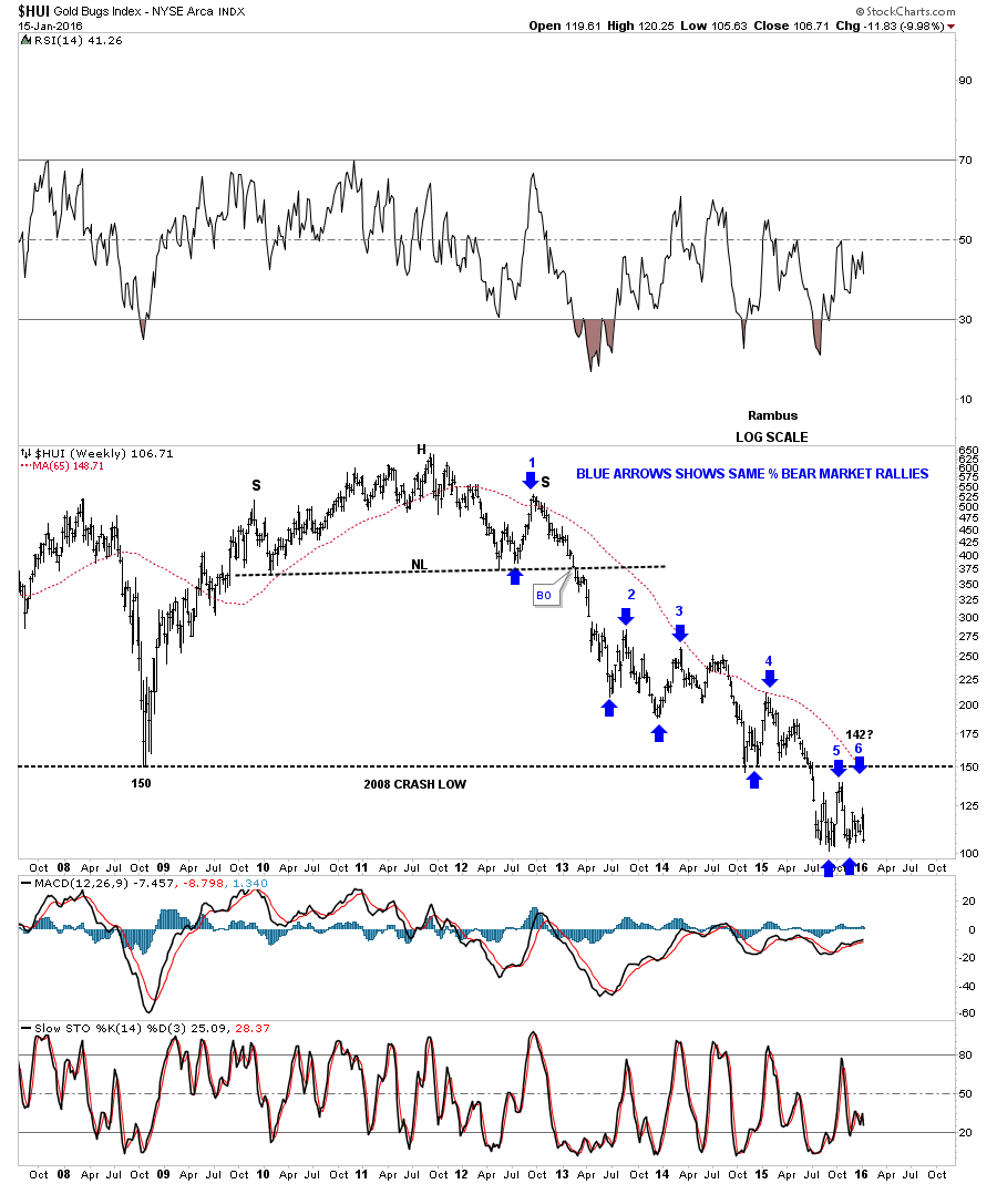
Not to be out done by the bulls the HUI bears have created two major legs down that were the same length as shown by the black arrows. If this next impulse move down matches the previous two then the price objective would be down to the 54.45 area. It will be interesting.
The short term weekly chart for the GDX shows it’s trading right at the neckline of the lower H&S consolidation pattern. A break below the neckline will complete the H&S consolidation which would give us a price objective down to the 9.78 area.

So there you have it . Not exactly the best time to be a bull in this disintegrating forsaken sector . But as always we watch the charts for clues .
Since the markets are closed in the US tomorrow I’ll do a part two for the Weekend Report as there is so much to look at right now. For US members enjoy the day off monday. All the best…Rambus