
In this weekend report I would like to show you some different currencies that are completing major reversal patterns that should be positive for the US dollar. By the looks of some of the base metals miners BHP, RIO and FCX they seem to be saying that deflation is on the horizon. These big miners look like the HUI before it broke down from its major H&S top pattern.
PART 1 :
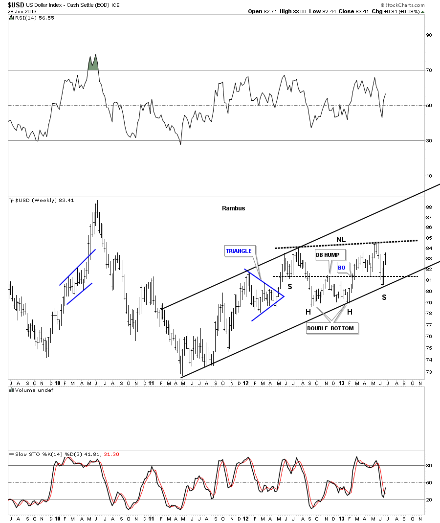
Lets start with the US dollar that has been rallying back after hitting its long term resistance rail last month in a sharp sell off. I think that was the shake out before the breakout. This first chart of the US dollar shows a nice H&S consolidation that is getting close to breaking the neckline to the upside. A break above the neckline will put the US dollar at a 3 year or so high.
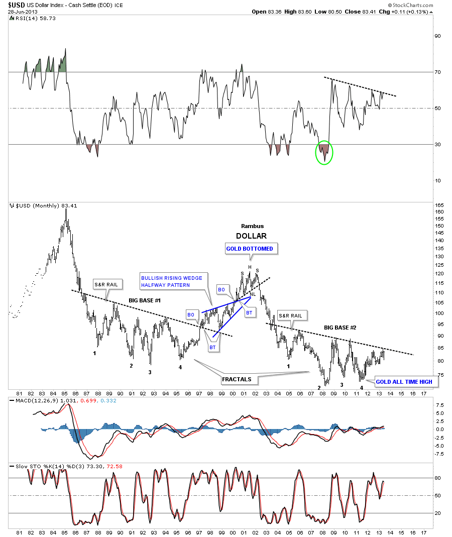
This next chart is a long term look at the dollar that shows the two fractal bottoms. After selling off in June the dollar is now approaching that all important top rail. Remember this is a monthly chart so things change very slowly compared to the minute charts.
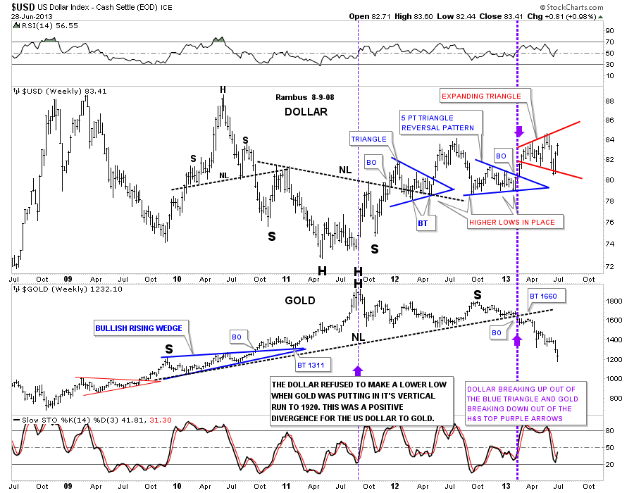
This next chart is a comparison chart with the US dollar on top and gold on the bottom. Note the heavy purple dashed vertical line where gold broke below its long term neckline and the dollar broke above its 5 point triangle reversal pattern. As the dollar has been trading sideways, in what is beginning to look like an expanding triangle, gold had been selling off.
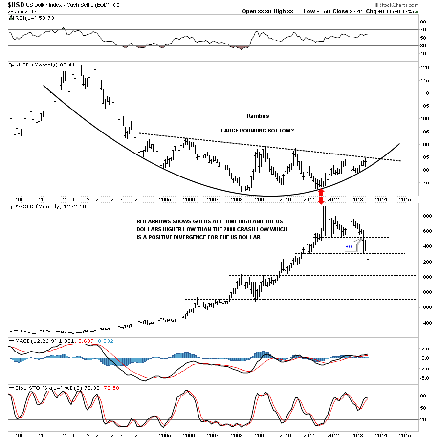
This last chart for the US dollar shows the nice rounding bottom with the price action now trading between the top rail and the bottom of the parabolic arc. The sell off we had in June found support just where we needed to see it come in, right at the parabolic arc. So far so good. Nothing is broken.
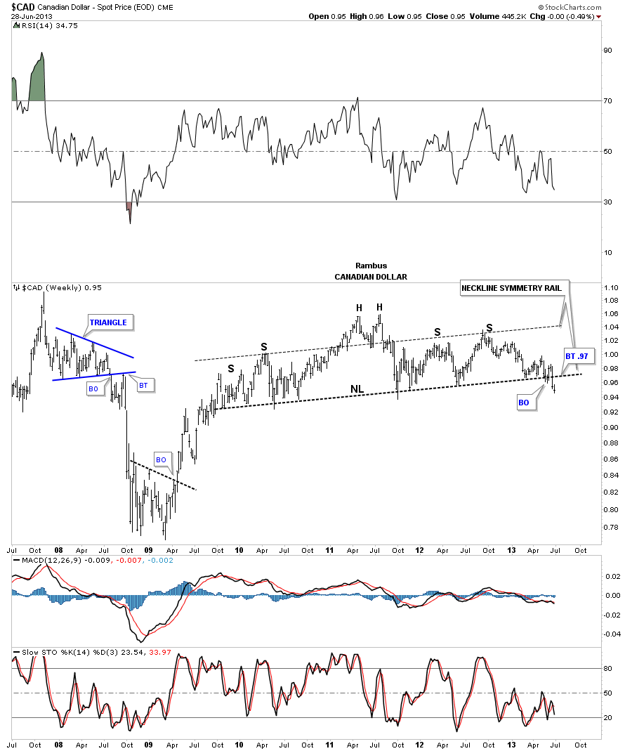
Lets now look at a few currencies that look like they are putting in some big topping patterns that are just now starting to breakdown. This weekly chart for the Canadian dollar looks an awful lot like the HUI before it broke down. Note the neckline symmetry rail that shows the top for the right shoulder.
The Australian dollar shows a beautiful blue 5 point triangle reversal pattern with a 7 point rectangle reversal pattern that formed out toward the apex. After breaking out through the bottom rail of the blue triangle you can see one quick little backtest before prices started to fall in earnest.

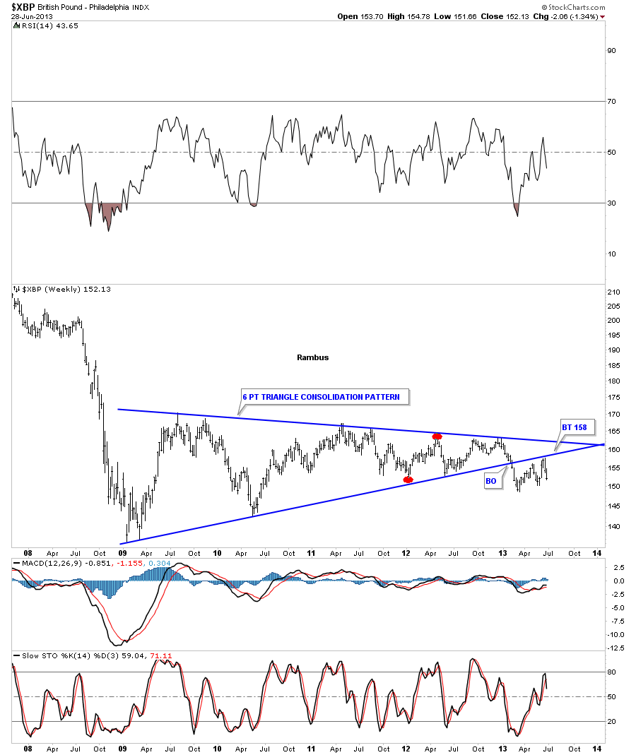
The British Pound has broken down from a triangle consolidation pattern and has had two backtest with the second one completing two weeks ago by the looks of it.
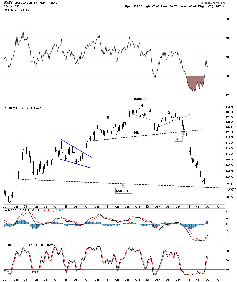
The Yen had a nice big H&S top before it broke down.
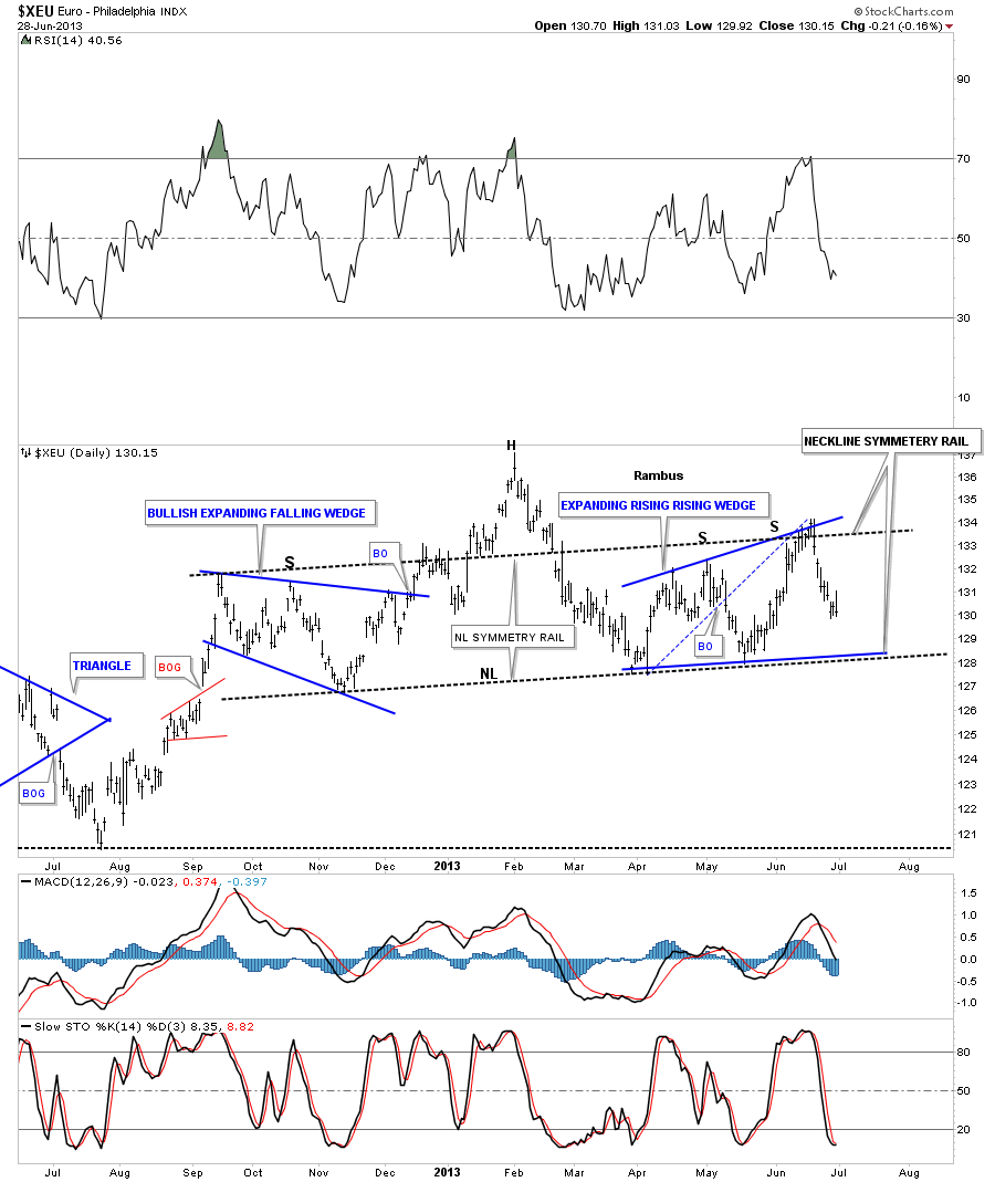
The XEU has been holding up pretty well compared to some of the other currencies. You can see the nice H&S top that has been forming for sometime now with the neckline symmetry rail holding resistance at the top of the right shoulder.
The Euro is the Last Component (and the largest) of the US Dollar Index to hold out . When / If this chart breaks, the deflation scenario will be baked into the Charts
…………………….
PART 2 :
In the second part of the Weekend Report I AM going to show you some charts for the risk off trade where commodities show weakness in a deflationary type setting. This generally happens with a strong dollar as I showed you in part 1 , with the strong dollar and weak currencies charts.
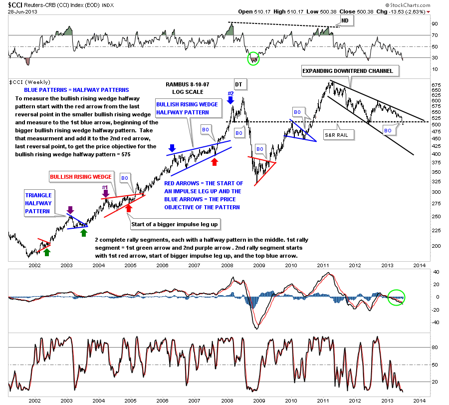
The first chart I would like to show you is the CCI commodities index that topped out in 2011 and has been in a slow downtrend that has taken on the shape of an expanding downtrend channel. Note the black dashed horizontal trendline labeled the S&R rail, support and resistance rail. Above is support and below it becomes resistance. As you can see by last weeks price action the CCI traded below that important S&R rail for the first time in a long time.
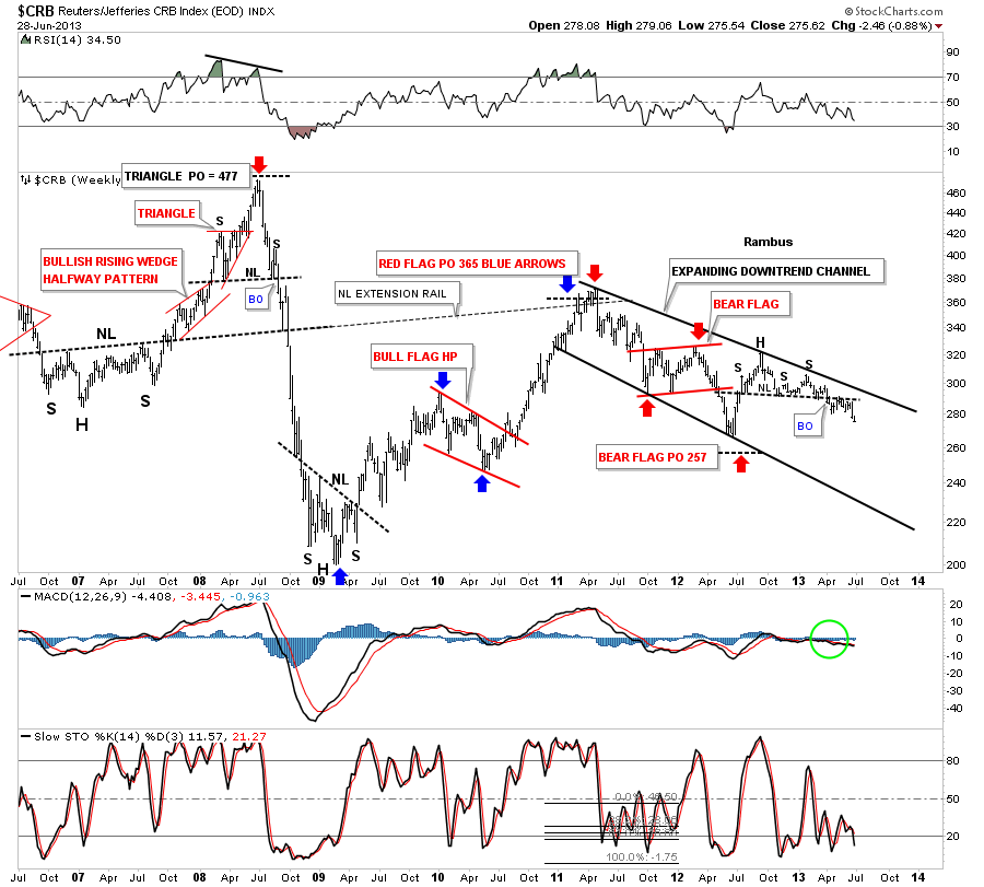
The old CRB index has been much weaker than the newer version of the CCI as it failed to make a new all time high back in 2011 and actually made a much lower high. You can see the H&S consolidation pattern that has formed on the right side of the chart that is now starting to breakdown after doing the breakout and backtesting move. It to is in an expanding downtrend channel.
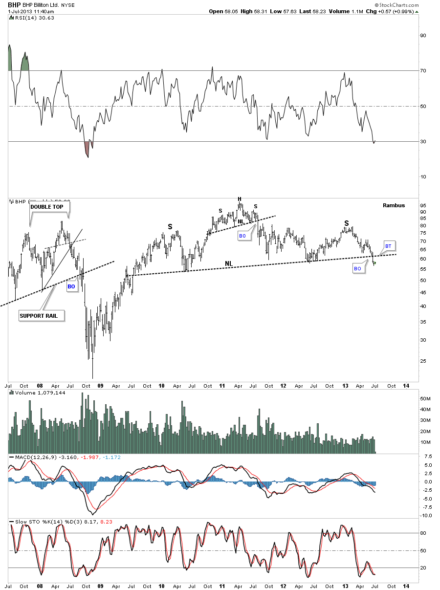
I mentioned last night that some of the big base metals miners are showing some big H&S topping patterns. BHP has a very similar looking H&S top that the HUI has, only the HUI has led the way lower by breaking its neckline back in February of this year a good 4 1/2 months ago. There could now be a backtest to the underside of the the neckline before the real move begins lower.
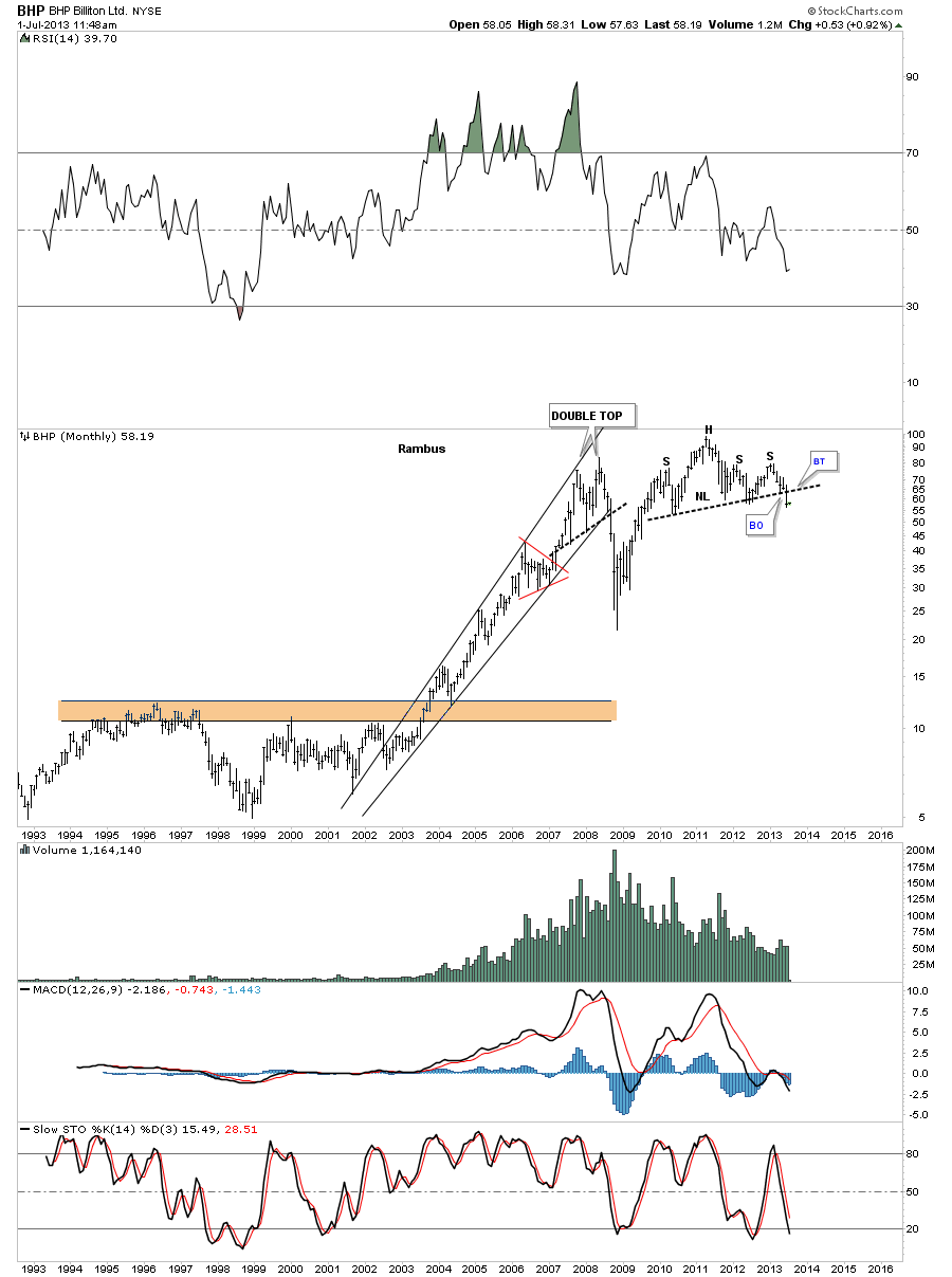
The monthly chart for BHP looks extremely bearish as that H&S top is sitting right at the end of the 2008 crash low rally. Remember this is a monthly chart that takes a lot of time to build out a big topping pattern, but when it is finally complete there will be a big impulse move down. Right now it’s all about patience to see if it does a backtest to the underside of the neckline.
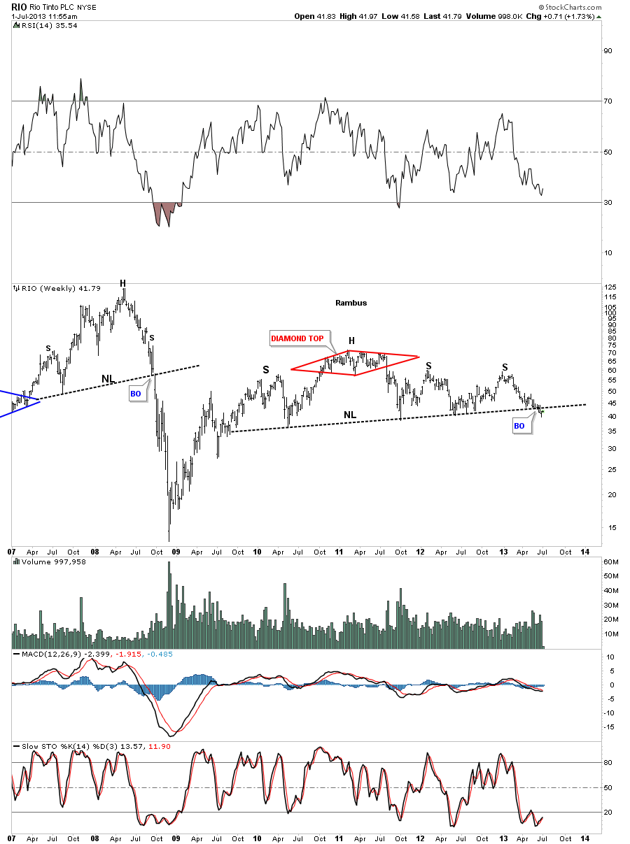
RIO is another big miner that shows a similar big H&S topping pattern with the breakout and now the possible backtest underway. Again, look at a 6 year weekly chart of at any of the precious metals stock indexes to see what awaits the completion of this big H&S topping pattern.
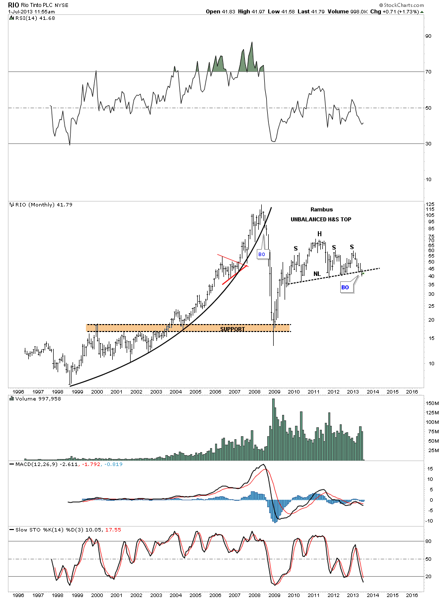
RIO monthly.
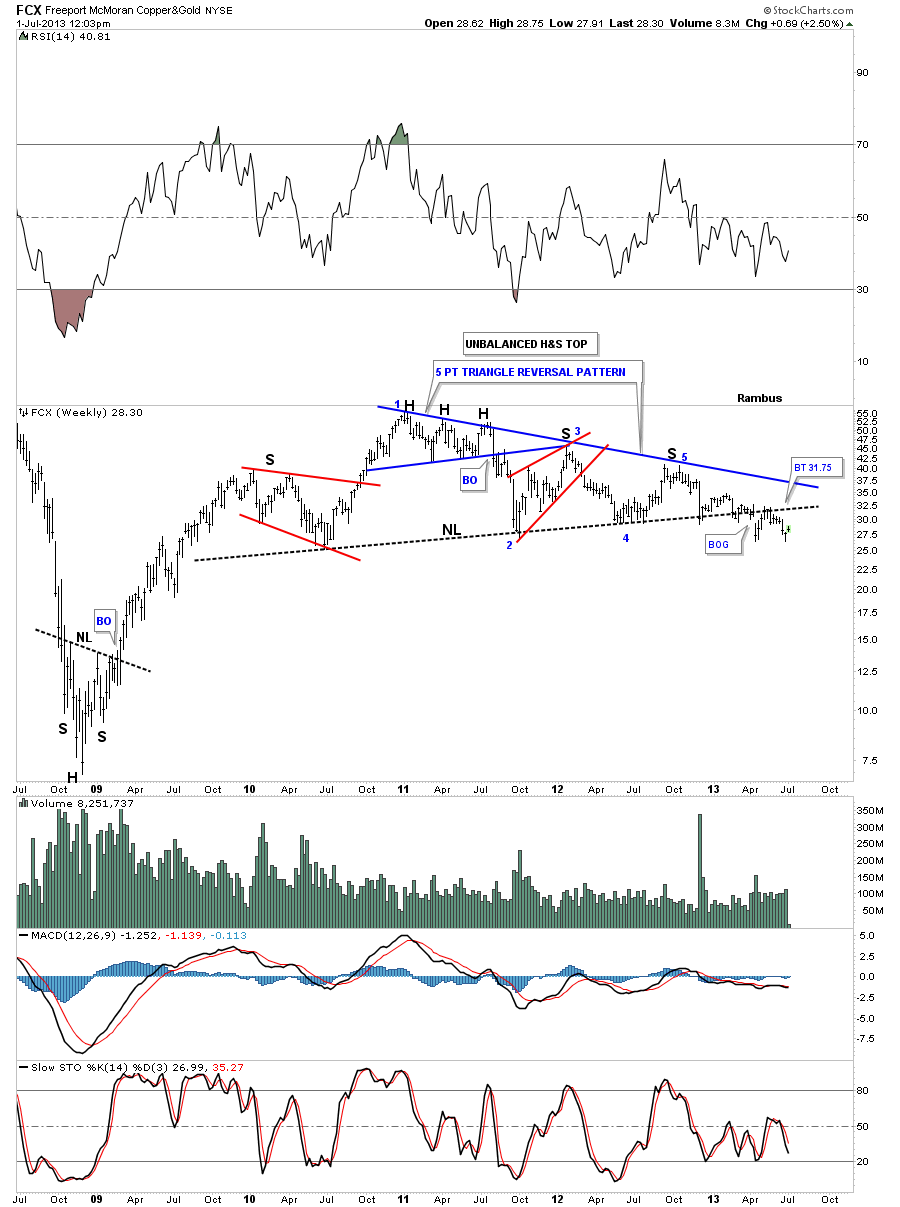
FCX has created a complex topping pattern that consists of an unbalanced H&S top with a 5 point triangle reversal pattern. It has been taking its sweet ole time breaking out and backtesting. There is a good chance it has finished the backtesting process. We won’t know for sure until the impulse move down starts in earnest.
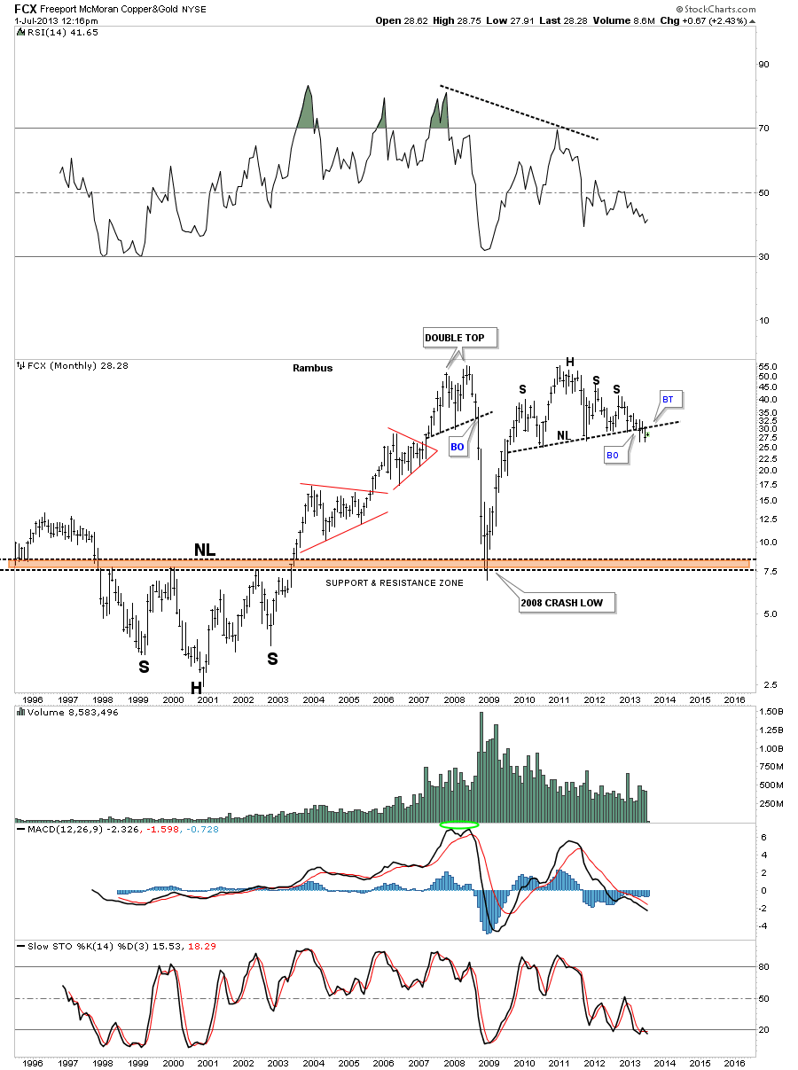
FCX monthly.
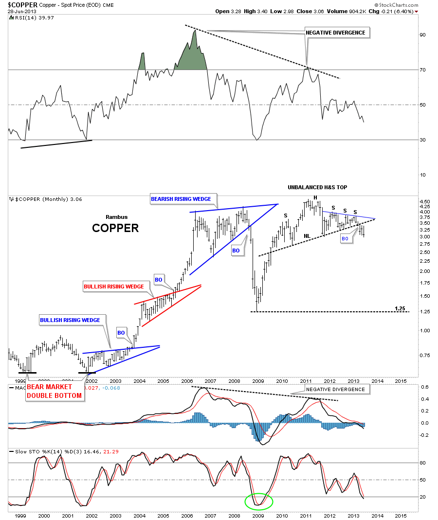
Lets take a look at copper as that commodity really crashed during the 2008 deflationary episode. As the weekly chart shows copper made a H&S top back in 2011 which broke to the downside followed by the 6 point blue triangle consolidation pattern which also has broken down.
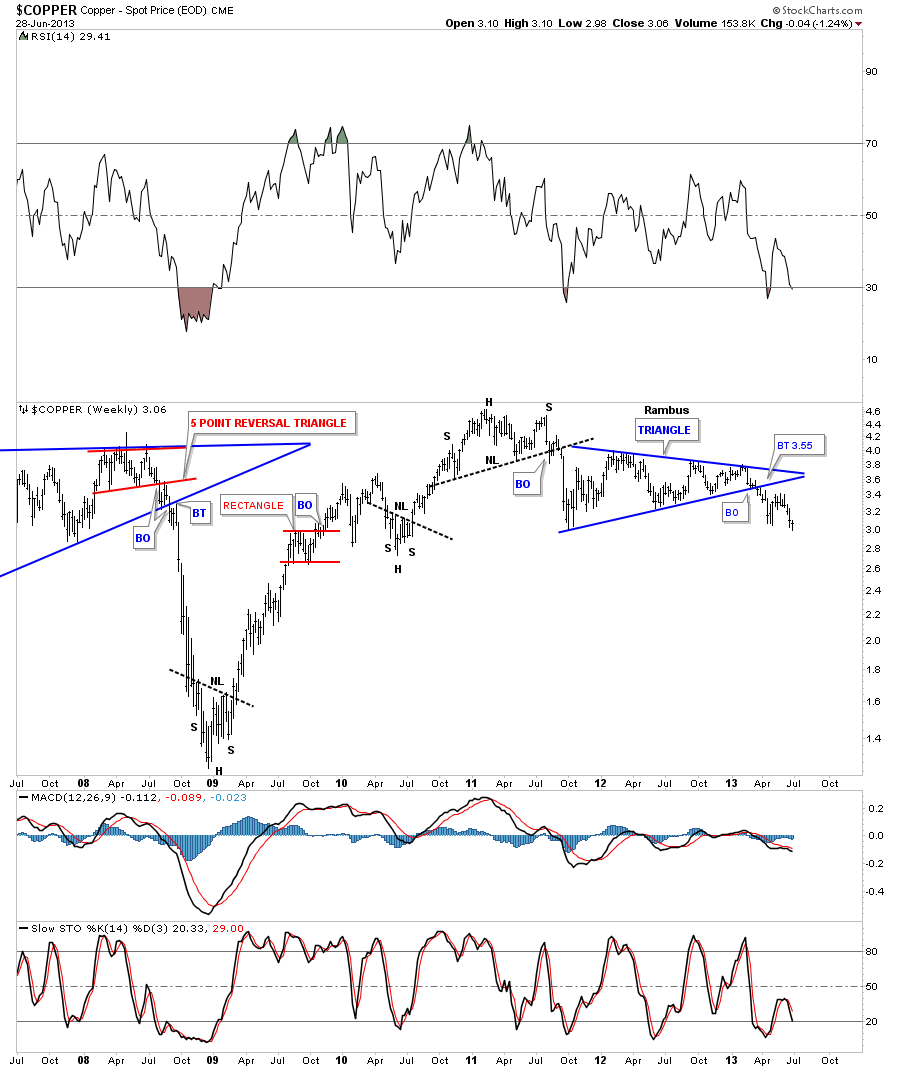
Notice the last bar on this monthly copper chart that shows it’s really close to making a multi year low with just a little more weakness. As you can see on the left side of the chart, impulse moves start when these big patterns finish building out. Chop chop chop and then bang.
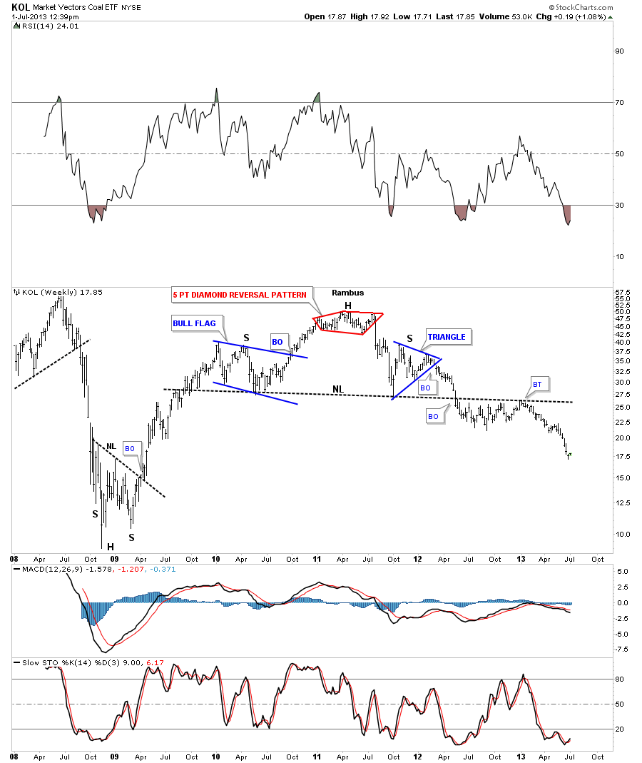
KOL is a coal etf that is now starting to move lower after a long drawn out breakout and backtest.
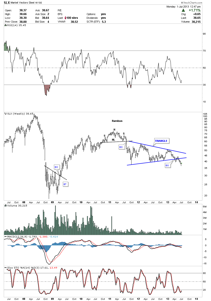
SLX is a steel etf that just recently has broken down from a triangle consolidation pattern.
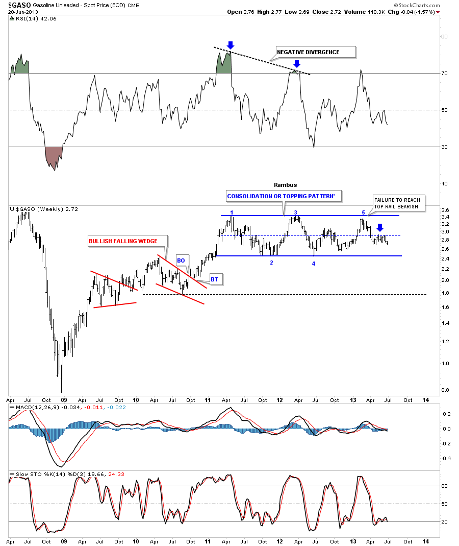
The GASO, gasoline chart, is still trading at the center dashed rail of a very large rectangle pattern. Many times a failure at the center of a rectangle will led to the breakout move.
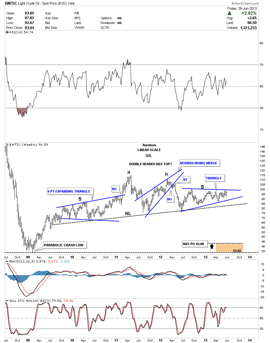
The oil chart shows a potential large H&S top pattern. The blue triangle on the right side of the chart that is trying to form the right shoulder and has done a little morphing lately breaking slightly above and below the top and bottom blue rails. So we wait for further developments.
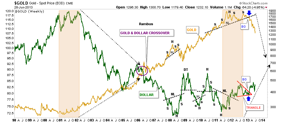
This last chart I’ve overlaid gold on top of the US dollar so you can see the inverse relationship between the two. It’s not always perfect but they tend to run opposite of each other. Notice the price action back in 2001 when the US dollar topped out and gold bottomed out. Now fast forward to our most recent price action where just the opposite is happening right now where gold is topping and the US dollar is bottoming. I’ve circled the area in 2006 where gold and the dollar crossed paths on their way to gold’s top and the dollar bottom. Is gold and the US dollar going to cross paths again in the not to distance future? Time will tell. It always does. All the best…Rambus
PS
These long term charts that I’ve been posting on the US dollar, currencies, and commodities are painting a picture of deflation IMHO. These are huge topping patterns that aren’t going to play out in weeks or months but possibly several years. I think the precious metals complex has been leading the way down with the currencies and commodities playing catch up at some point. We have to get the main trend right so we’ll know how to play this deflationary episode. That is 75% of the game. Trade with the big trend whenever possible. I think once the deflation period ends that is when we’ll see the real inflation picture take hold. We will know when the time comes by the bases that will have to be built just as these topping patterns are showing us the way lower now. Big trends don’t change on a dime, it’s like turning the Titanic around. At some point the US dollar and gold may cross each others path again. Maybe they will kiss each other and reverse back the way they came. We just have to watch the price action for clues. All the best…Rambus
