In this weekend report I’d like to catch everyone up on the many H&S patterns I’ve been showing for several weeks now. So far none have been completed yet as most of the work, right now, has been on the developing right shoulders. I’ve been showing these H&S patterns in their early development so you can follow along, in real time, to see how the net results turn out. Just remember the actual buy or sell signal won’t come until the neckline is broken. Once that happens we will then be able to measure a possible price objective base on the height of the H&S pattern. That price objective would be a minimum. As H&S patterns, are for the most part reversal patterns, the price may go much further than just the minimum price objective.
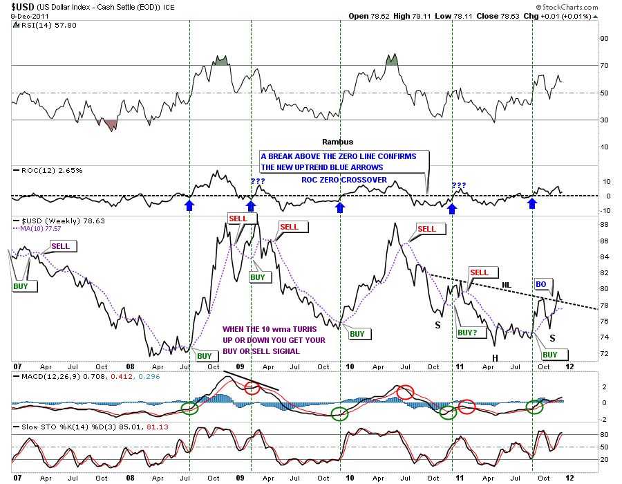
The first chart I want to show is the all important US dollar. Everything from my perspective has to do with which way the dollar is going to move as that should affect the precious metals complex, commodities and the stock markets in an inverse manner. The weekly line chart shows several buy signals. The first buy signal is just a simple 10 week move average. It works good as a trending tool. When it turns up or down you get your buy or sell signal that you follow until it reverses at some point. Our latest buy signal came at the very end of August. You can see it is starting to flatten out a bit so the dollar needs to start showing some strength in here to keep the 10 wma rising. The indicators at the bottom of the chart, MACD and the slow stochastics are still on a buy signal. The ROC indicator just above the dollar chart is also on a buy signal. I’ve added some green dashed vertical rails so you can see how the 10 wma and the ROC, rate of change indicator, working together to show the buy signals. When the 10 wma turns up and the ROC passes up through the zero line together, that is your buy signal. One last note. Notice how the line chart is showing the dollar already breaking the neckline and if you look real close you can see we did some backtesting last week from above. Getting interesting.
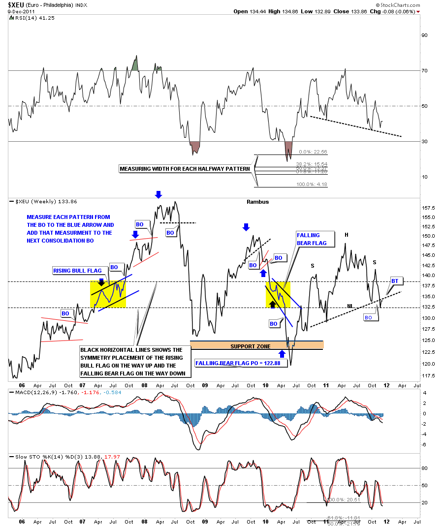
Now we must look at the Euro as it should have an inverse look to the US dollar. I did this chart originally as a bar chart but switched it over to a line chart to see if we had the same breakout and backtest as the US dollar, only inversely. Its diffidently there. Now we need to start seeing some follow through to the downside to confirm the H&S top is in place. Notice the RSI at the top of the chart. It appears to also be building a H&S pattern.
XEU…Euro H&S top line chart.
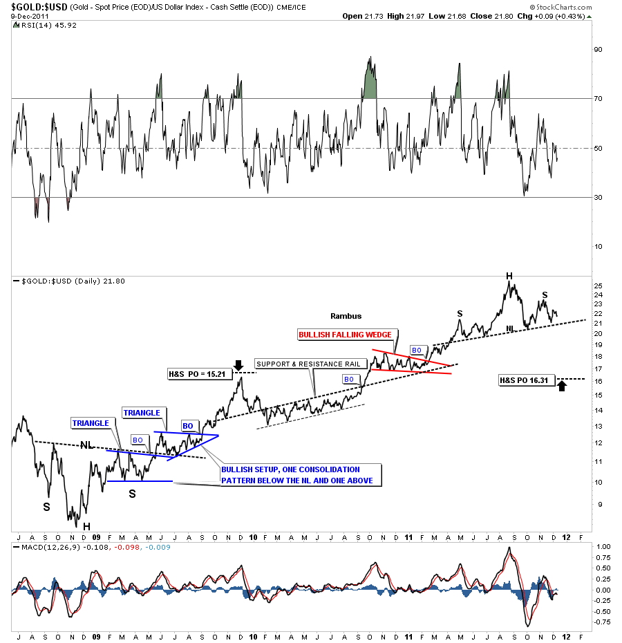
Here is a ratio chart showing gold to the US dollar. This H&S pattern has a very ominous look to it. If gold is outperforming the dollar the chart will show a rising trend and if the dollar is outperforming gold then the trend is down. As you can see the rally off the 2008 low has been in a very nice uptrend. What is so ominous about this H&S pattern is that it is coming after a nearly 3 year rally phase. Note the big H&S base at the bottom left side of the chart. That H&S base was built to reverse the 2008 crash. You can see how important these patterns are and what the implications are if we break the current neckline. Food for thought.
Gold to the US dollar ratio chart, H&S top.
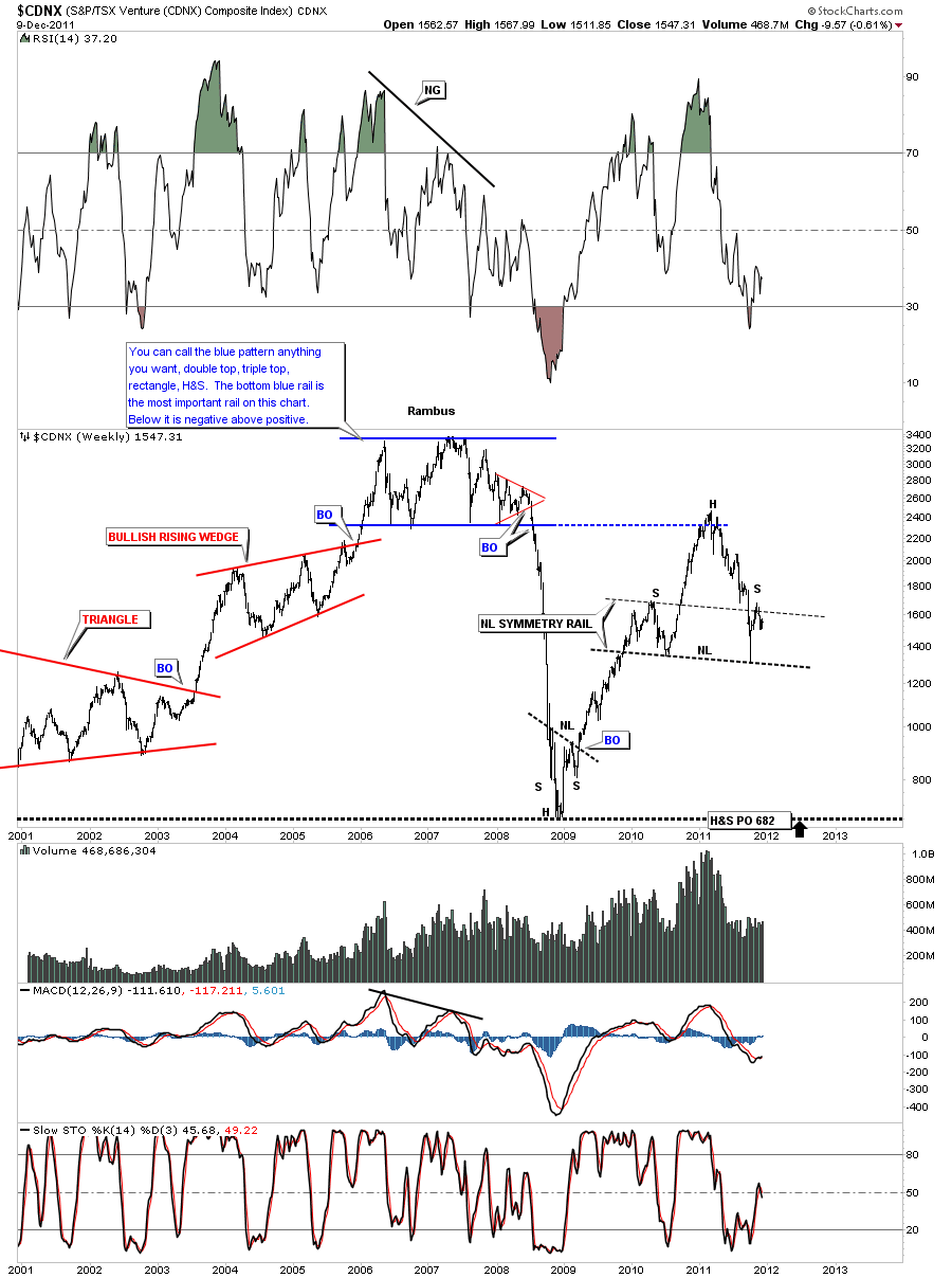
Next is a weekly chart of the CDNX which is a Canadian small cap index that was our only proxy for the small cap precious metals stocks until they came out with the GDXJ. There are other small cap stocks such as oil stocks in this index. So its a good index to look at to get a feel for the speculative feel for the precious metals complex as a whole. We know if the little juniors are rising, money is coming into the sector as the appetite for the speculative investor is good for the overall precious metals sector. When the juniors are falling that is not a good sign. The CDNX actually led the 2008 crash by starting their decline much sooner than the big caps. Note the H&S base that was made at the end on the big crash in 2008 and the straight line decline from the breakout of the big top pattern.
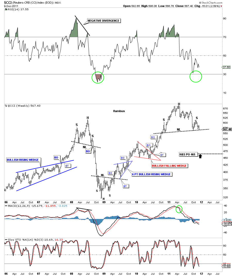
Next up is the CCI commodities index. This chart shows how precarious the situation is for commodities. We are sitting right on the neckline. Notice the other 2 H&S patterns. One was made at the top in 2008 that foresaw the panic crash that ensued. The other H&S pattern was made after the crash was over and reversed that vertical drop of the 2008 high. As you can see the 2008 H&S top and the 2008 H&S bottom went much further than the H&S measured price objective. For the most part think of a H&S pattern as a reversal pattern, reversing a trend that has been in play for a period of time. There can also be a H&S consolidation pattern but they are much more rare.
CCI commodity index weekly H&S top.
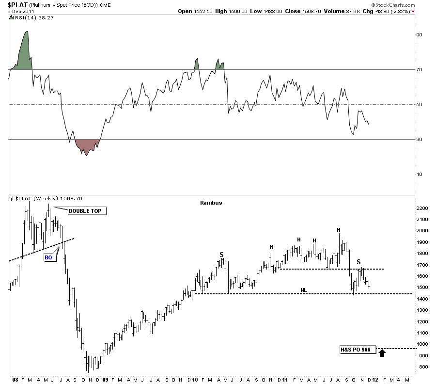
Next lets look at a precious metal that most don’t follow real close but is important nonetheless. Platinum is trading for less than gold which is kind of anomaly. It happens from time to time as is the case right now. Again lets take a weekly look at it’s H&S top that has been in place for almost 2 years now. If this H&S top plays out can the other precious metals be far behind? Time will tell.
Platinum weekly H&S top.
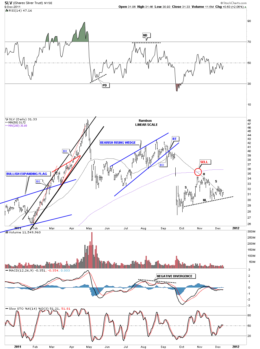
Lets look at one more chart that has a H&S consolidation pattern instead of the reversal pattern. I’ve been showing the Silver H&S consolidation pattern for sometime now, on the daily chart. You can see how this H&S pattern is forming in the middle of the downtrend and not at a top or bottom, thus a consolidation pattern. The 50 dma is governing SLV right now.
SLV H&S consolidation pattern on the daily look.
All these H&S patterns are painting a very bearish picture. I think once the dollar finally shows it’s hand and breakouts out, all these H&S patterns will follow suit which will lead to a cascading effect that will be in progress for some time as most of the charts above are on the weekly look. Make sure you keep this in mind, we haven’t broken any of the necklines yet. The dollar is very close but no cigar. So watch the necklines very closely and act accordingly. We are very close but not quite there yet.
All the best ….Rambus

