
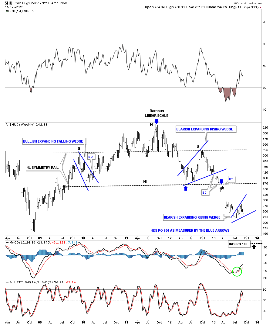
Tonight I would like to show you some charts of what this nearly 10 week counter trend rally looks like compared to this downtrend that has been in place since the highs made one year ago. I want to start with a one year two month chart for the HUI that starts with the right shoulder top, for the massive H&S topping pattern, Big S. This chart may look a little busy but if you start at the top left side corner, Big S, you will see the downtrend channel that has been in place for one year now and shows all the consolidation patterns that have formed during this time. Looking at the top left side of the chart the first chart pattern you see is the black bearish falling wedge which at the time I thought would be a bullish falling wedge. Note the two day hard break below the bottom black rail of the bearish falling wedge. That was my cue that the black 5 point falling wedge was a reversal pattern to the downside. The red arrow and the purple vertical dashed line shows you where we took our first position in DUST, which is a 3 X short the precious metals stocks index, on December 3rd, 2012. As you can see we bought the backtest to the underside of the black falling wedge reversal pattern. We slowly kept building our short position as the downtrend unfolded. Take a moment and look at the downtrend channel starting at the top, following the price action bar by bar all the way down to the June low. You will see, for the almost one year decline, there wasn’t one time where the HUI made a higher high and higher low until the June low this year. So by following the price action we never had to sell our short position and just kept riding the downtrend. Notice all the small red lesser consolidation patterns that formed during the one year decline. They don’t look like much looking back but when you’re riding these little patterns out in real time it can make one insecure about the big picture and question if you are still on the right side of the market. I can always tell when subscribers start to get grouchy that the consolidation area is starting to get to them.

I now want to show the lower part of the daily chart that shows our current possible bearish expanding rising wedge. This pattern shows a different character than all the price action above. As you can see this blue pattern has made a series of higher lows and higher highs. The $64,000 question is, is this a bottom reversal pattern or a consolidation pattern that will show the way lower when it’s complete ? Right now the price action, over the last year, is trapped in a parallel downtrend channel. Notice the placement of the small double top at the top of the blue bearish rising expanding wedge and the top rail of the downtrend channel. Is it a coincidence that the small double top formed where it did? Lets zero in on the latest price action that shows the black dashed down slopping trendline that runs through the center of the blue pattern that is labeled a S&R rail, (Support and Resistance rail). Below it is resistance and above is support. You can see yesterday’s price action gapped below that S&R rail with today’s price action testing the S&R rail from below. You can also see the 50 dma comes in right here and now. We are going to have an interesting couple of days ahead of us as we watch how the price action interacts with the black dashed trendline and the 50 dma.
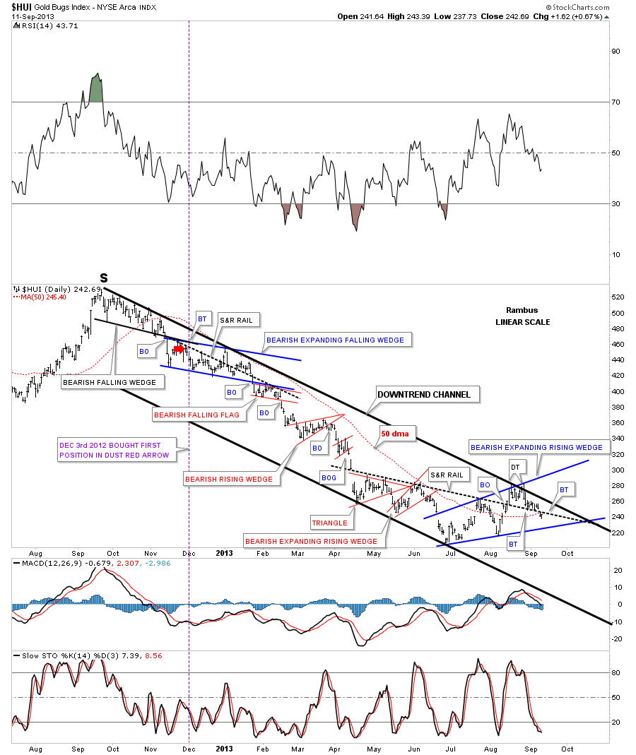
Lets look at the same area without the downtrend channel trendlines in place. As you can see it is obvious that we are in the biggest congestion area in more than a year. We won’t have confirmation of a continued down trend until the price action breaks below the bottom blue rail. The HUI is now trying to backtest the underside of the little red triangle that formed just below the double top.
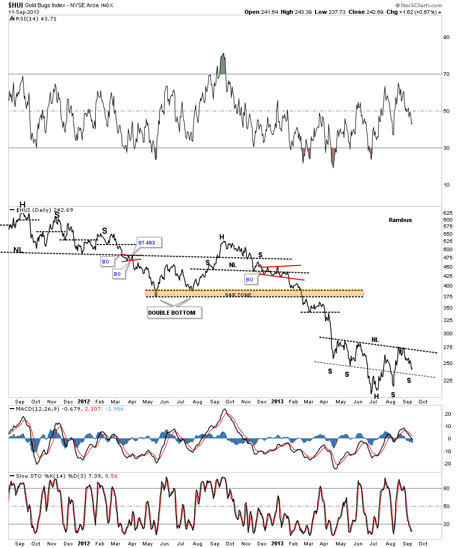
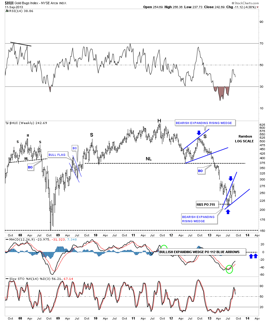
Lets take a look at the other possible scenario that many are looking at which is the inverse H&S bottom. There is a certain symmetry taking place that has two shoulders on the left side of the head and with today’s price action we are now in an area where a second right shoulder could form creating the inverse H&S bottom. I’ve also put on two necklines that connect each left and right shoulders. Yesterday the price action gapped below the lower neckline with a backtest in progress today. In order for the inverse H&S bottom to have a chance the first order of business is for the HUI to break above the lower neckline.
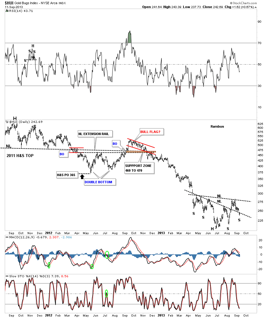
Lets take a look at the daily line chart that show the potential symmetry taking place on each side of the head. Even though this inverse H&S bottom is not my favorite scenario right now I still have to keep an open mind for any possibility.
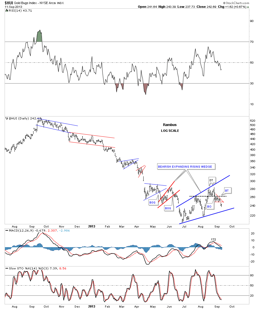
Lets put our one year downtrend into perspective by showing the massive H&S top and the price action that I showed you on the charts above that is the downtrend off of the right shoulder top. The first thing to note is this chart is in linear scale and shows the massive H&S top that has a price objective down to the 106 area. If our current blue bearish expanding rising wedge plays out to the downside we can expect a similar move that led into the pattern to take place as the price action leaves the pattern. I know it seems impossible at this time for such a move to take place but that is what will most likely happen if the bearish expanding rising wedge breaks down.
Looking at the same chart in log scale we get quite a bit higher price target for the HUI H&S top that comes in at 215 or close to the bottom of the blue bearish expanding rising wedge. Until something proves me wrong I’m looking at our current blue bearish expanding rising wedge as a possible halfway pattern to the downside with a price objective that would come in around the 112 area.
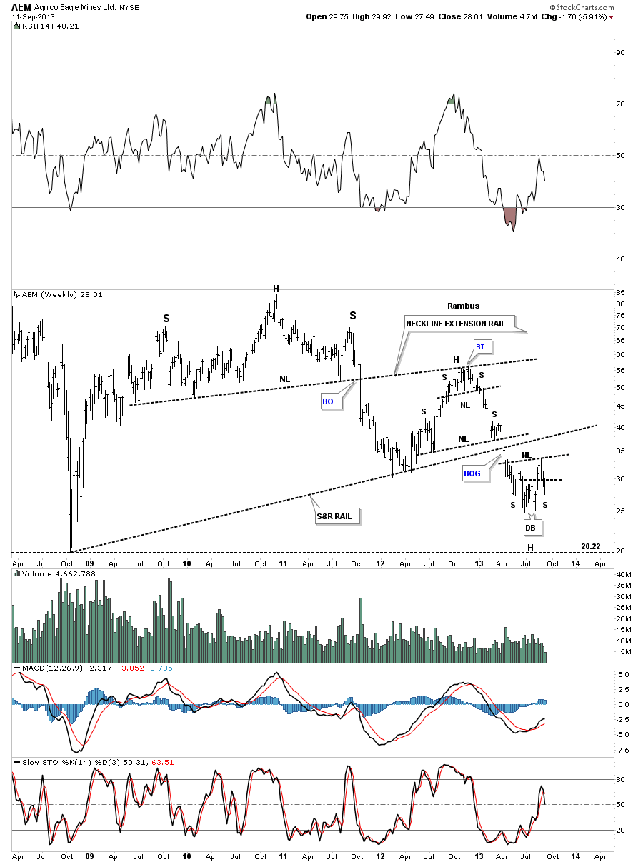
Now I want to look at some big cap precious metals stocks to see how much damage as been done during the last 10 week rally. Lets look at the longer term charts as they are much more important than the daily’s. Lets start with a look at AEM that shows the price action gapped below the bottom S&R rail in April of this year. AEM has made several attempts to rally back to the underside of the S&R rail as a backtest but so far without any luck. Note the most recent price action that shows the small double bottom that led to the 10 week rally that should now be offering support. As you can see the double bottom hump has given way this week. If AEM is going to form an inverse H&S Bottom it needs to find some support in this general area. Also note the nice big H&S top that broke down almost two years ago and the backtest to the neckline extension rail that halted its advance.
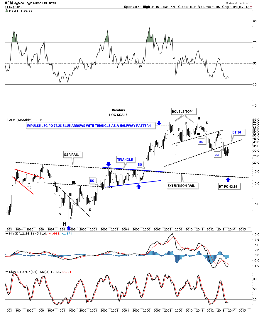
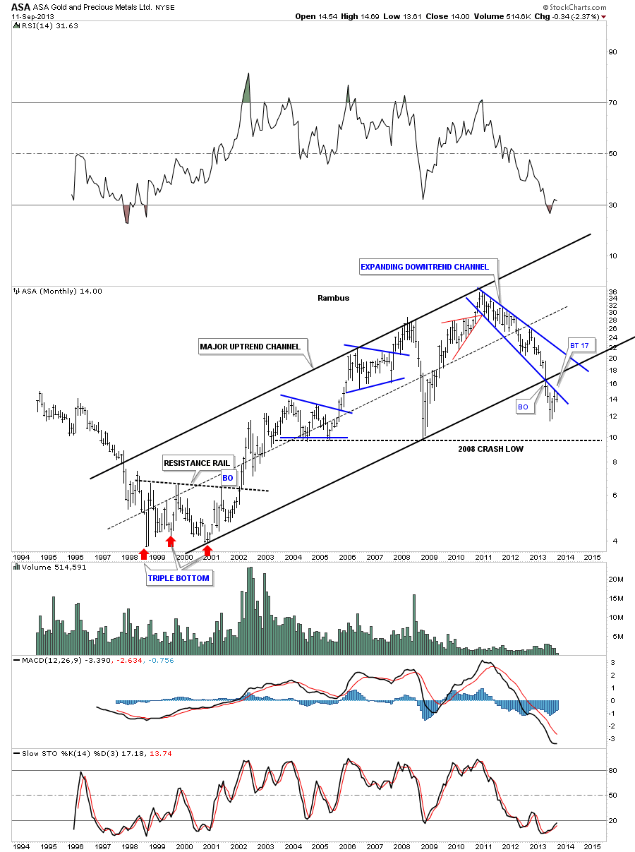
The monthly chart shows 20 years of price action. Note the last two bars on the right side of the chart that looks more like a backtest to me than a reversal pattern to the upside.
Looking at the long term monthly chart for ASA we can see it broke below two important trendlines, the bottom blue rail of the expanding downtrend channel and the bottom rail of the black uptrend channel. As you can see the last 10 weeks or so have been a backtest move to the bottom rail of the blue expanding downtrend channel. This is a critical test taking place right now. So far it’s failing the test.
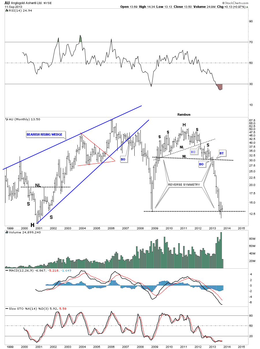
The AU monthly chart shows the beautiful reverse symmetry that took place during its one year decline that slammed into the 2008 crash low and has bounced. We’ll see if this is a dead cat bounce or something more important by the way the price action interacts with the 2008 crash low.
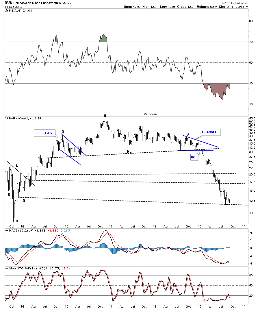
The last 10 week rally in BVN shows just some chopping action around the lower Support and resistance rail. It actually looks like it is trading at a 52 week low if it doesn’t rally pretty hard for the rest of this week. Note the reverse symmetry coming down compared to the rally phase that started in 2008.
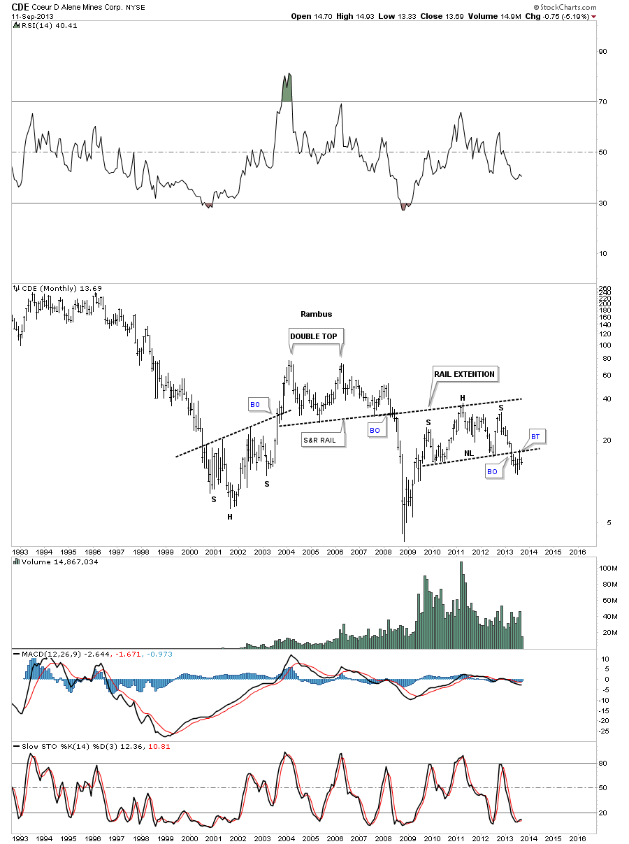
The weekly chart for CDE shows an inverse H&S bottom that looks like it is failing. You can see the rally took the price up to the S&R rail which is actually the neckline on the monthly chart.
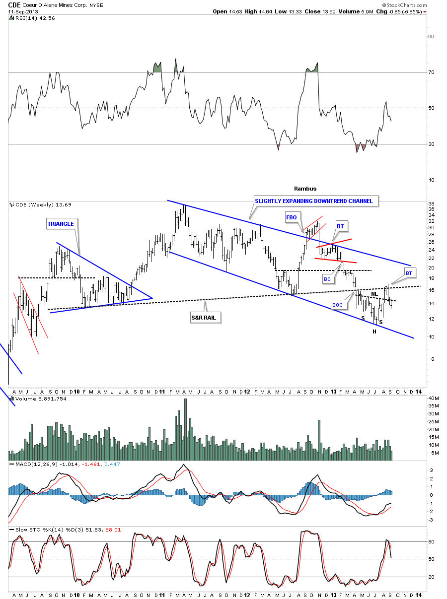
The monthly chart for CDE shows the breakout and backtest to the big H&S top neckline.
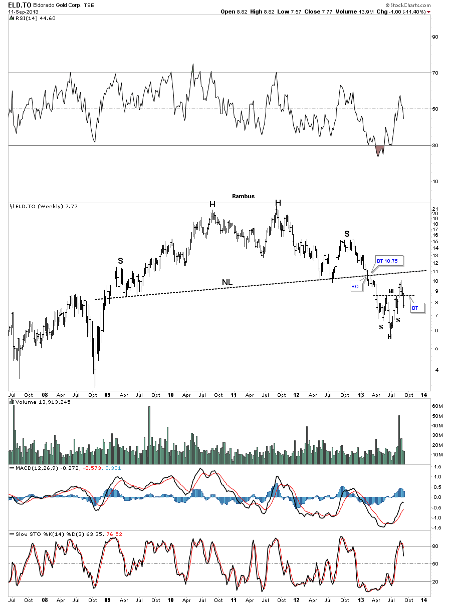
The weekly look at ELD.to is showing another failed inverse H&S bottom. The ten week rally made a good move toward backtesting the big H&S neckline but has fallen just shy or reaching it.
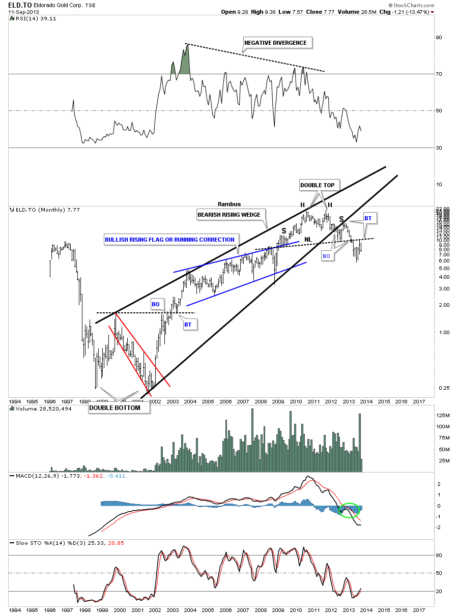
The long term monthly look at ELD.to shows some very nice chart patterns. Note the big black bearish rising wedge that has the neckline running through to top of it. Many times a rising wedge will encompass the left shoulder and the head as you can see. The backtest to the bottom rail of the rising wedge formed the right shoulder. Note the last two bars on the right side of the chart that show the backtest to the neckline over the last two months.
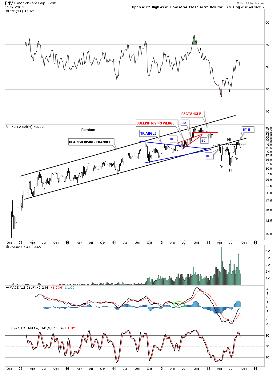
FNV used the 10 week rally to backtest the bottom rail of its bearish rising channel. It also looks like a possible H&S bottom that has formed just below the bottom rail is failing. FNV just experienced the the second backtest to the bottom rail of the bear channel.
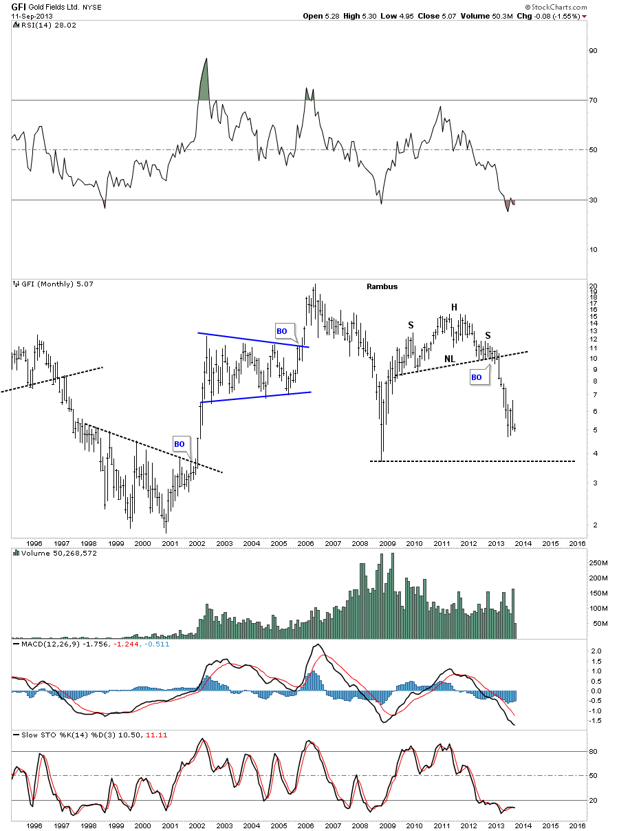
The GFI monthly chart is begging for the price action to at the very least test the 2008 crash low.
The weekly chart for GG shows it used this 10 week rally to backtest the neckline at 32.35. The possible H&S bottom looks like it’s in trouble if it doesn’t find support pretty soon.
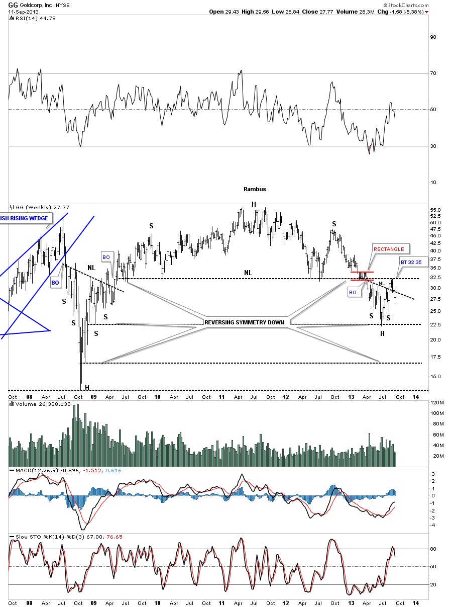
The monthly chart for GG shows it breaking below the neckline and the long term bottom rail of the uptrend channel.

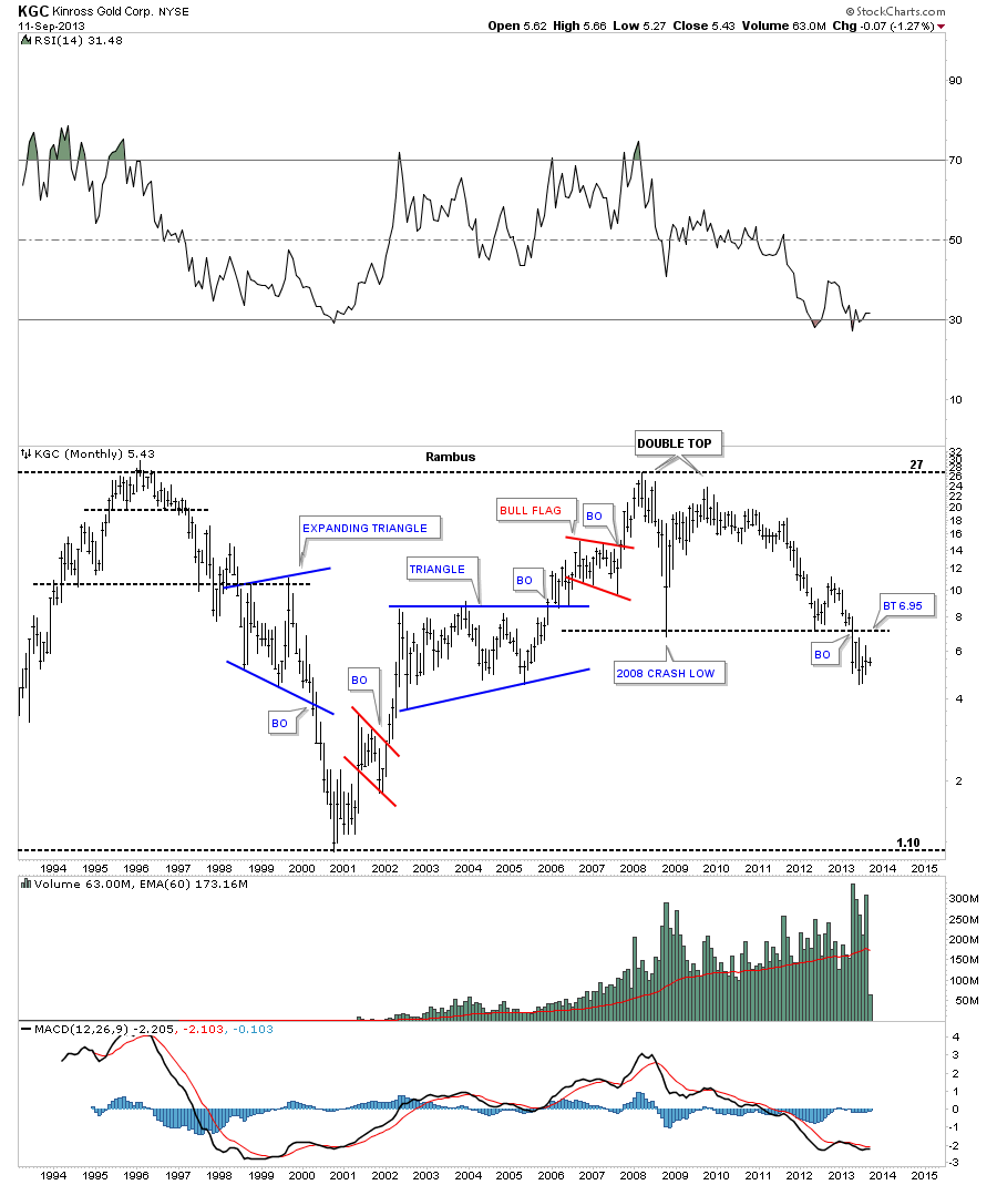
The monthly chart for KGC shows how it used the 10 week rally to backtest the 2008 crash low from below. It has been one of the weaker PM stocks as it has already broken below the 2008 lows.
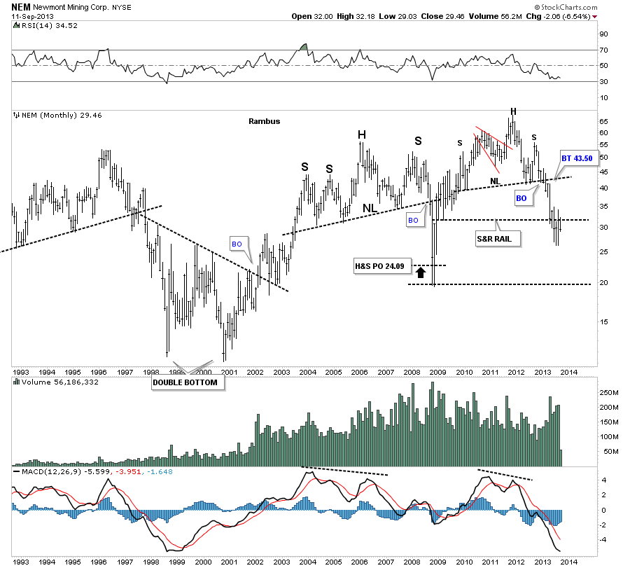
The last several months shows very little price action for NEM. It’s very close to testing the monthly low closing price that would go back to the same period as the 2008 rally. Again the 2008 crash low is begging for a retest IMHO.
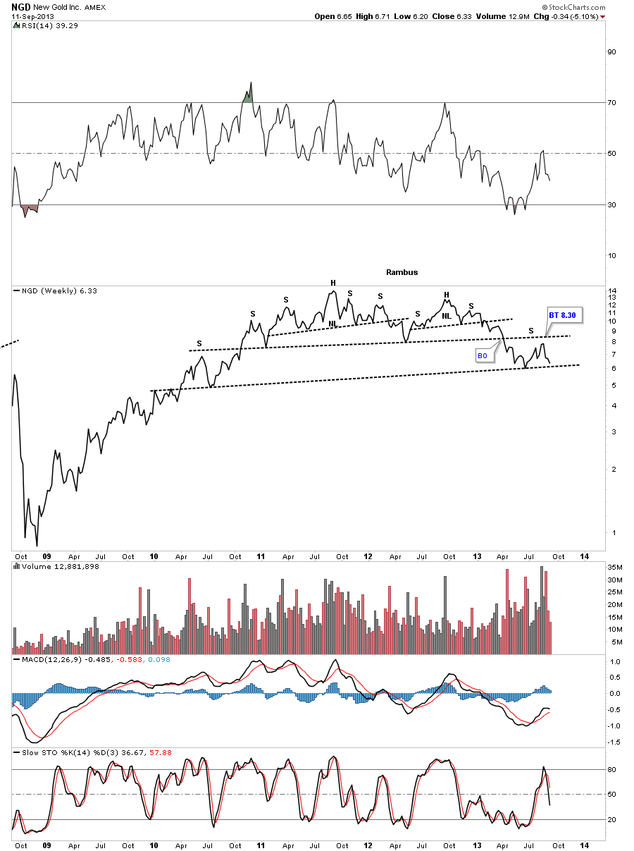
Below is a weekly line chart for NGD that shows it used the 10 week rally to put in a right shoulder that will create a double H&S top if it breaks below the lower neckline.
It’s getting late and I need to get this posted. I have more examples of precious metals stocks that have used this last 10 week rally as a consolidation phase or a backtest to a much bigger topping pattern. Nothing is broken in the strong bear market the precious metals stocks have been in for the last year or so as far as I can see. This looks just like your normal backing and filling before prices start moving lower again. I hope these charts paint a clear picture for you of where I think we are in the bear market for the Precious metal sector. All the best…Rambus