
In this Weekend Report I want to continue looking at the precious metals stock indexes and the consolidation patterns that have been building out since the June low. The reason I’m spending so much time looking at this possible consolidation area is so you can get a feel, in real time, how breakouts and backtest work. There is no better way to learn how the markets work than to watch how things unfold moment by moment. Its easy to say after the fact, yes I should have done this or that, but real time doesn’t give you the luxury of 20/20 hindsight.
I’m going to start with the 2 hour, 6 month line charts that I showed you a couple of weeks ago before the flash rally. They looked like they were on the verge of breaking down at the time. I think the flash rally just delayed the inevitable. It may not feel like it but a lot of work has been going behind the scene with the breakout and backtesting that takes time to complete. As you will see everything up to this point is still working out as planned except for the flash rally. Keep in mind when I posted these chart we were still trading inside the bearish expanding rising wedges.
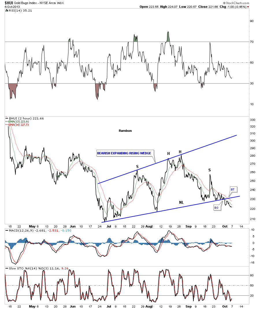
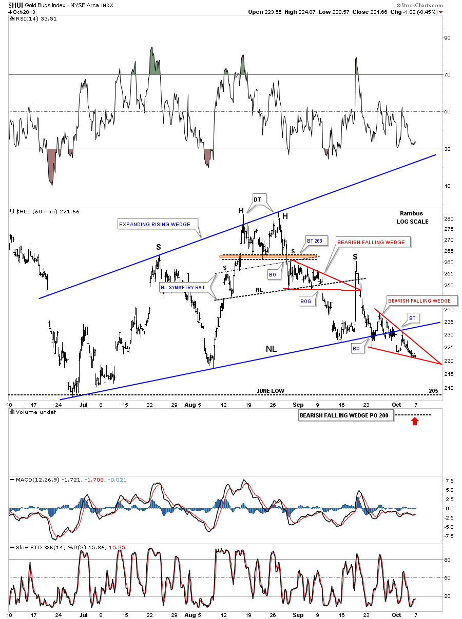
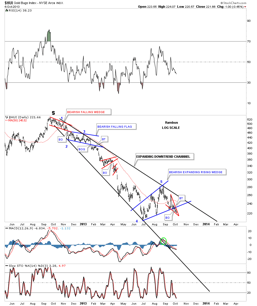
Lets start with the strongest of the precious metals stock indexes the HUI that now shows the breakout and a half hearted backtest so far. You can also see the H&S consolidation pattern that is part of the bearish expanding rising wedge consolidation pattern that shows up on the other PM stock indexes as well.
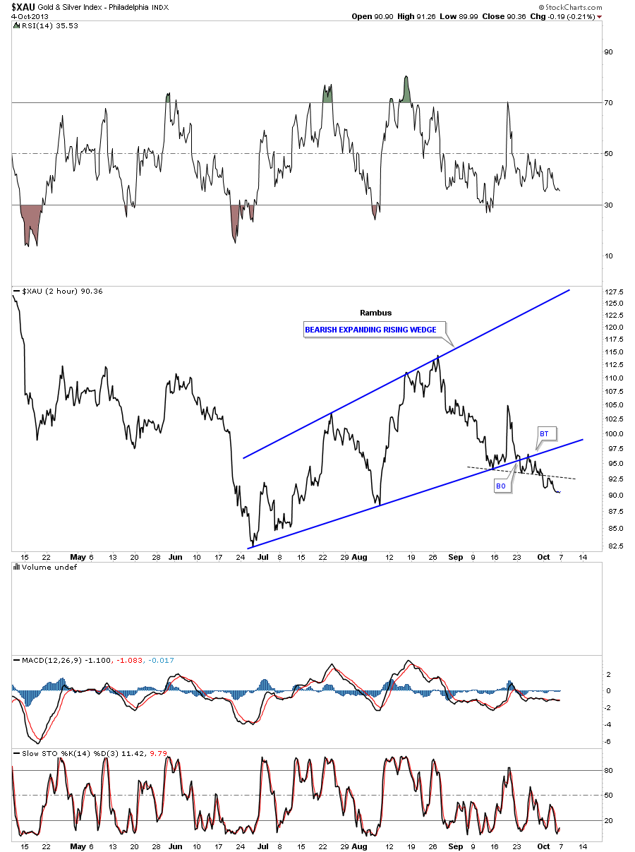
The XAU shows it a little further along in it’s move lower.
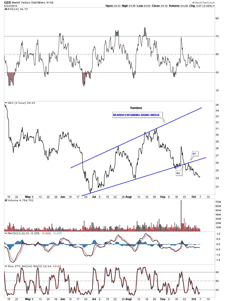
The GDX shows a nice breakout and backtest.
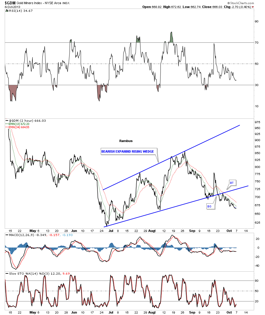
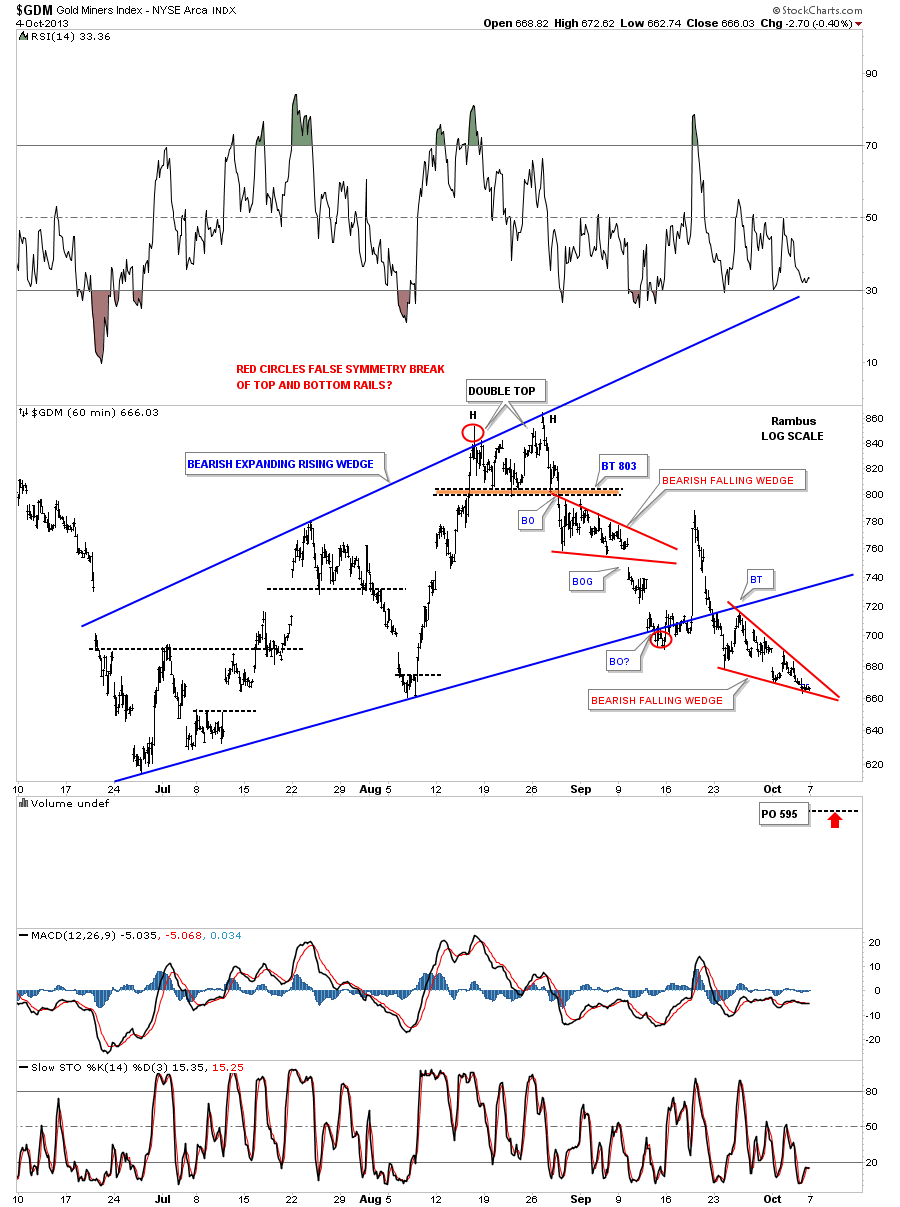
GDM is a proxy of our DUST trade which is trading lower which is good for DUST.
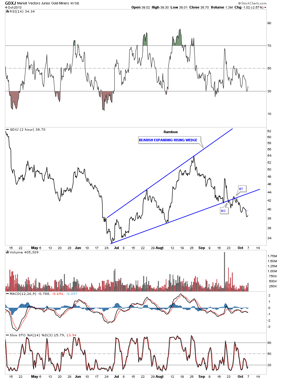
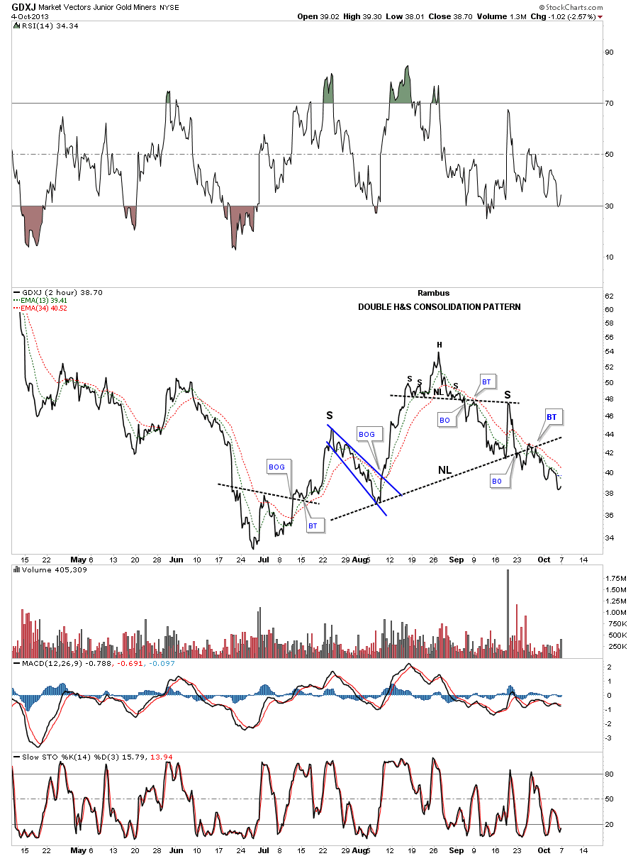
The GDXJ, small caps, shows the same setup as the other PM indexes.
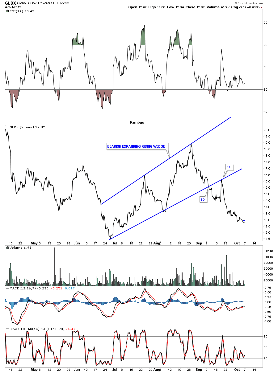
The GLDX small cap gold mining stock index is the furthest along in its impulse leg lower. Note, that one backtest after the breakout. That is something we have to keep an eye on with the big cap PM stock indexes. You never know for sure from what level a backtest could spring up from so this chart is a heads up just in case the big cap PM stock indexes have something up their sleeve. This chart also paints a bigger bear case as the little guys are leading the way down. You want to see just the opposite happen in a bull move.
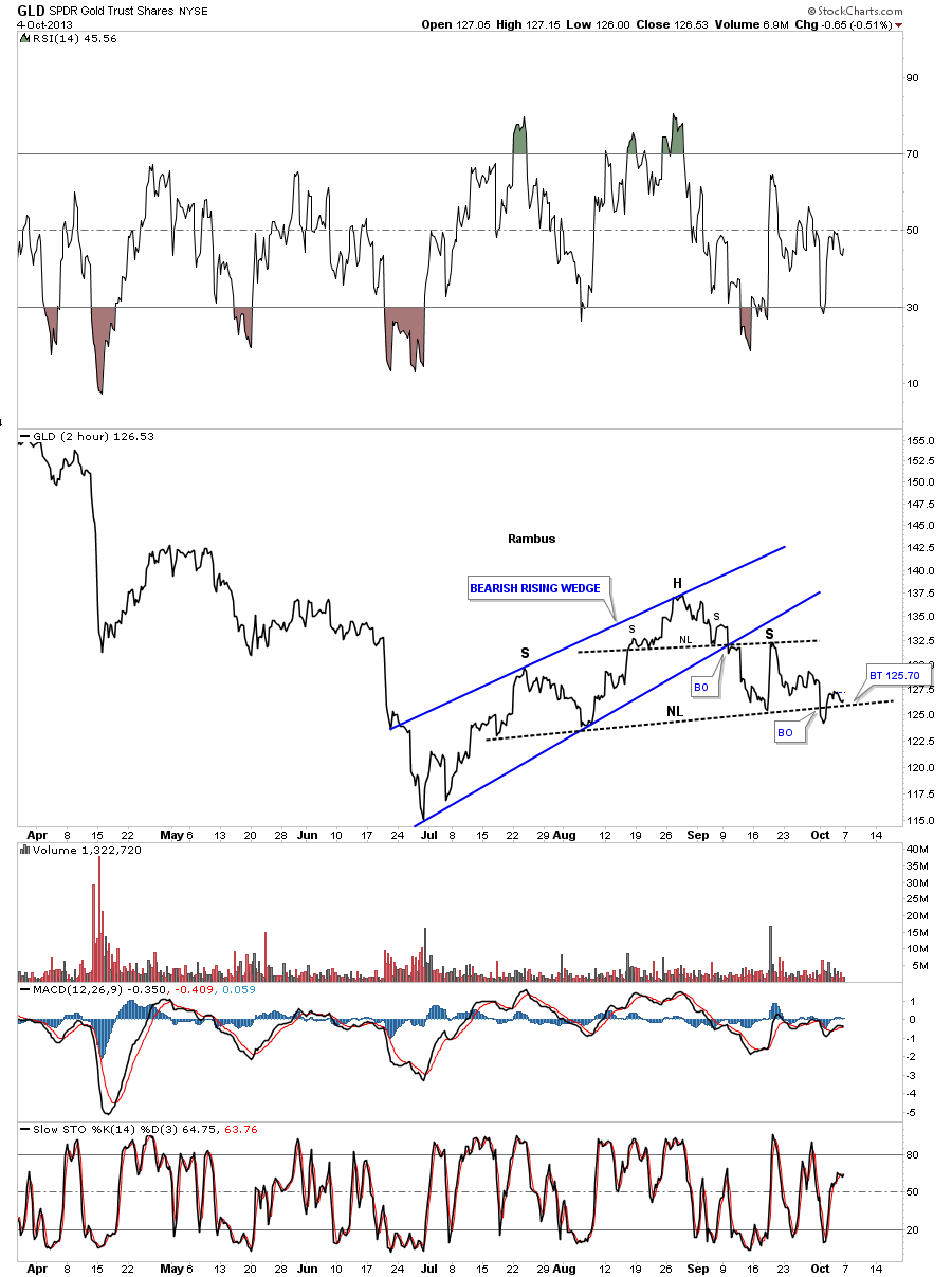
The 2 hour line chart for gold shows a H&S pattern that broke down and is now in a strong backtest. We need to see the price action break back below the neckline again to confirm the H&S pattern.
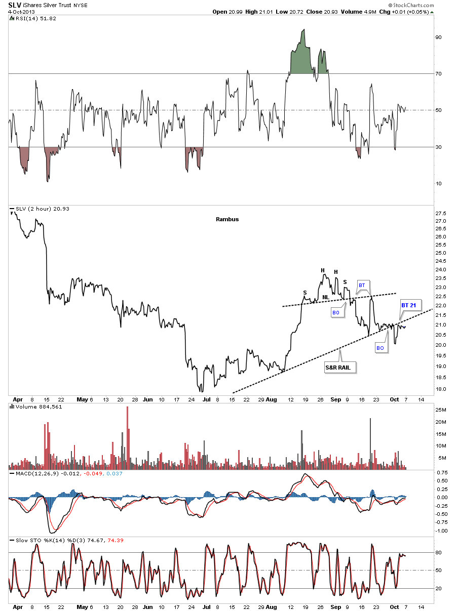
SLV is showing a small unbalanced H&S consolidation pattern that has broken down below the neckline with 2 backtests. It has also broken down from the much bigger support and resistance rail and is backtesting it from below. Above the S&R rail is positive and below is negative.
Next lets look at the internal structure of the blue bearish expanding rising wedge as seen on the 60 minute chart for the HUI. It wasn’t until the small double top was in place that the expanding rising wedge could even be seen as a possibility. Once I recognized the double top I was then able to draw in the top blue rail which so far has turned out to be the major resistance point for the HUI. As you can see there is a smaller H&S pattern with the double top as the head and the red bearish falling wedge as the right shoulder. Note the big breakout gap that took out the neckline and the bottom rail of the red falling wedge. That’s what you like to see happen in a situation like that. There is also a much bigger H&S pattern in play at this time with the left shoulder forming back in July. The last point of interest is the red bearish falling wedge that is forming basically right on the bottom blue rail of the expanding rising wedge and the H&S neckline. Note the beakout gap and the backtest last week to the underside of the neckline and the bottom blue rail that ended up being the 4th reversal point in the red falling wedge.
As you can see the GDM chart has a similar look to the rest of the PM stock indexes as they all look pretty much the same.
The GDXJ shows a double H&S top that is showing the way lower for the bigger caps.
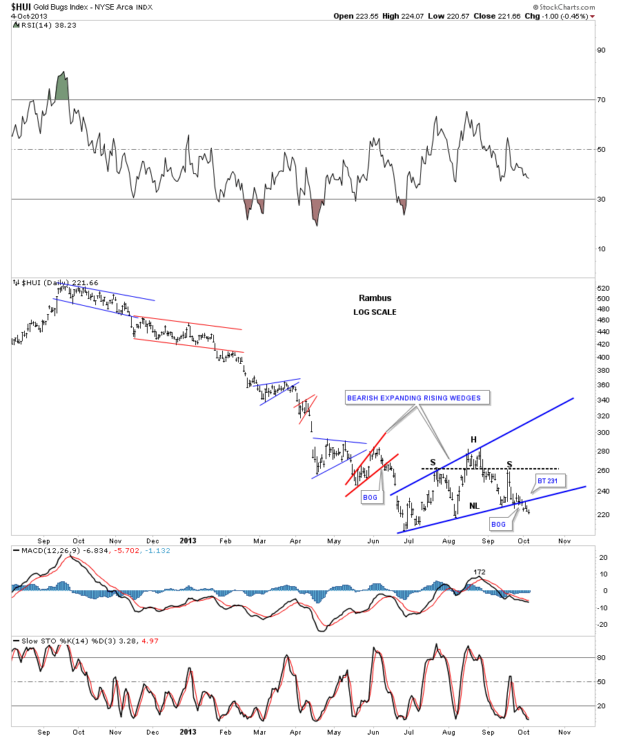
Lets put our blue bearish expanding rising wedge into perspective which shows it as the last consolidation pattern in a string of consolidation patterns that have made up this downtrend that started at the right shoulder high made last year around this time. You can see a breakout gap accompanied by the backtest last week which shows the work that was being done to get ready for the next impulse leg lower. Everything is in place. Now we just need to see some follow through to the downside to really get the ball rolling. Also note that our bearish expanding rising wedge is by far the biggest chart pattern of this downtrend. This tells me it could very well be a halfway pattern. We’ll just have to follow the price action and see where it leads us.
This next chart starts putting all the pieces of the puzzle together up to this point in time. The top and bottom rails of the expanding downtrend channel each have three touches which makes this viable pattern. Normally in a downtrend you will have a hard move down followed by a sideways consolidation pattern that can chop sideways until it hits the upper trendline. It can do this several times before the downtrend is finished. The blue numbers shows this happening on the chart below. Point #1 started the downtrend with points #2 and #3 being the sideways consolidation pattern trading between the bottom and top rails. Now fast forward down to reversal point #4 which is the beginning of our blue bearish expanding falling wedge that has now trade between the bottom and top rails. I don’t know if the price action will trade back down to the bottom trendline but it’s setup to do so. If it did the decline would probably look similar to the decline between reversal points #3 and #4. Again we will just have to watch the price action for clues along the way.
Using the linear scale chart we get a more parallel down trend channel.
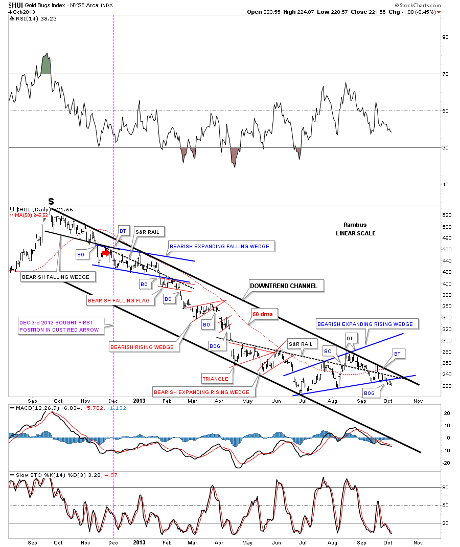
I would like to go back in time and show many of our newer subscribers what we were looking at back in the beginning of 2012. The first thing you will notice is the black dashed down sloping trendline that I labeled as a support and resistance rail. The red arrows shows how it acted as resistance and the green arrows shows how it acted as support. That was a very important trendline at the time which let us know where we stood as far a being in the bull or bear camp. You can see the H&S top that has all the green arrows underneath it as it was acting as support. That was a very nice looking H&S top that I thought was going to be our major top at the time. As you can see the price action broke below the neckline that said all systems go for a move lower. The backtest started off of the solid black uptrend rail that took the HUI back up to the neckline, red arrow. So far everything was working out beautifully. I drew in the solid black uptrend rail connecting the 2008 low and the low we just made. When the HUI started to move lower after backtesting the neckline from below I really thought the price action would break through the solid black uptrend rail with no problem as the H&S top was in place. As you can see when the HUI declined back down to the black rail it didn’t give way and the HUI started to rally creating the double bottom. This was a very trickery situation as we had the H&S top in place and a double bottom that had just held. We were short at the time and I had to decide very quickly if that was the correct position to be in as the double bottom held and the HUI was rallying strongly up. Long story short we exited our short position and went long. Once above the neckline, red arrow, it felt like the bull market was taking off again and the place to be was to the long side. This is why following the price action is so important. The rally stalled out at the blue arrow, which we now see as the right shoulder of a bigger H&S topping pattern. I held my ground on the backtest from the top side just as you would have expected to happen as the support and resistance rail suggested should now hold as support, green arrows. The moment of truth came when the HUI broke below the black dashed support and resistance rail with a strong move. I said at the time this wasn’t supposed to happen if the bullish case was in place. We exited our short position with a small loss to break even. At that point we backtested the black support and resistance rail from below and is when we took our initial position in DUST on December 2nd I believe. I used the red circle to show how we were interacting with the neckline, which is part of the support and resistance rail and the solid black uptrend rail. The Chartology worked its magic within the red circle as you can see. The price action backtested the neckline and then when the uptrend rail was broken to the downside it backtested it as well. This was as clear a signal as you could get that the false breakout above the neckline or the support and resistance rail was nothing more than a bull trap that caught many bulls by surprise including me. I was lucky enough to have Chartology on my side so by following the price action we were able to get out of our precious metals stocks and ride the whole bear market impulse leg down using DUST, DSLV and DGLD.
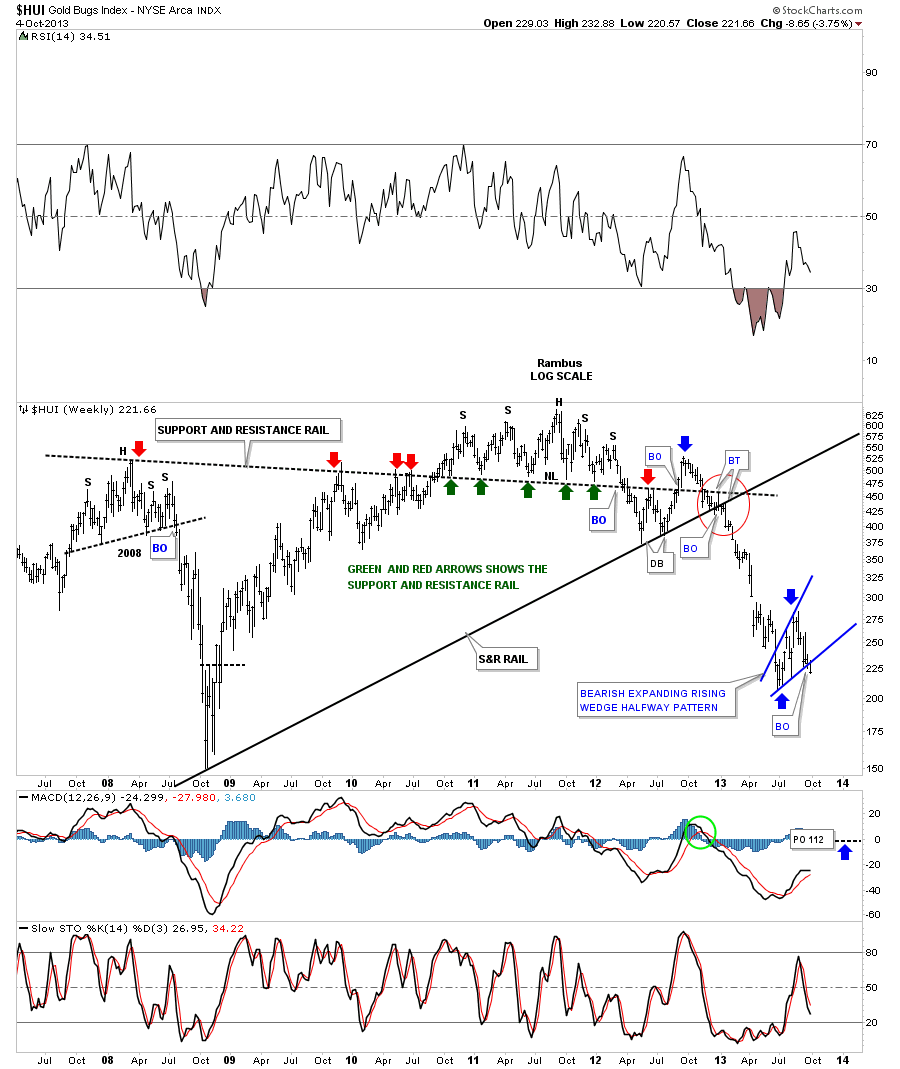
Now you can see our blue bearish expanding rising wedge that nobody is seeing except members of Rambus Chartology. There is a very good possibility that this pattern is showing us the halfway point of the major decline that started at the top of the right shoulder on the bigger H&S top that I’ll show you in a minute.
The chart below shows the small H&S top on the chart above but also shows the much bigger H&S top that formed when the rally stalled out above the smaller H&S neckline that I’ve labeled as a bull trap.
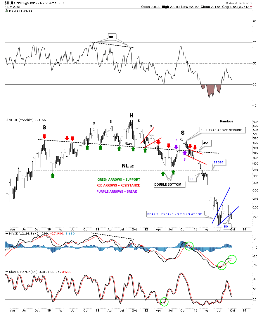
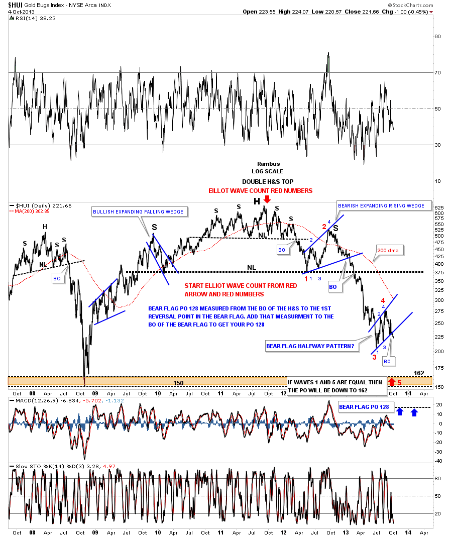
Below is a daily log scale line chart that shows the double H&S top in place with our blue bearish expanding rising wedge as a possible halfway pattern. Keep in mind the linear scale chart gives a lower price target for the big H&S top.
I need to warp this up as it’s getting late. So far nothing is broken and the price action is moving along as expected. There are times when the markets whipsaw you before you know what hit you. By following the price action we can generally stay on the right side of the bigger move. The markets are always trying to shake you off before your price objectives are hit, it’s just the nature of the beast. We’ll see if we get any follow through to the downside this week that will leave our bearish expanding rising wedge in the DUST. All the best…Rambus