
Tonight I want to look at what I think has been an ongoing consolidation phase since April of this year. I mentioned numerous times, when we broke down form that massive H&S top on the HUI, that what we were experiencing was a rare move that doesn’t happen all that often in a trader’s career. To be able to catch the beginning of that huge impulse leg down and hold on through several smaller consolidation patterns took a lot of guts, but I knew the reward would be worth it in the end. The end came in August of this year when the HUI crossed above the 50 dma that had kept us in the trade the whole way down.
What you are experiencing now is the total opposite of an impulse move. The HUI has been correcting that huge move down, chopping in a 70 point trading range from 210 to 280 with no visible trend. This is the job of a consolidation pattern, to work off the oversold readings to get ready for the next move lower. Sometimes this chopping action will carve out a reversal pattern and a new trend will emerge. Normally, 3/4th of the time, the trend will continue in the same direction leading into the congestion area when it leaves. The odds favor a continued move down once our consolidation pattern has finally finished its dirty work. So tonight lets look at some charts, for the precious metals complex, to see what is developing.
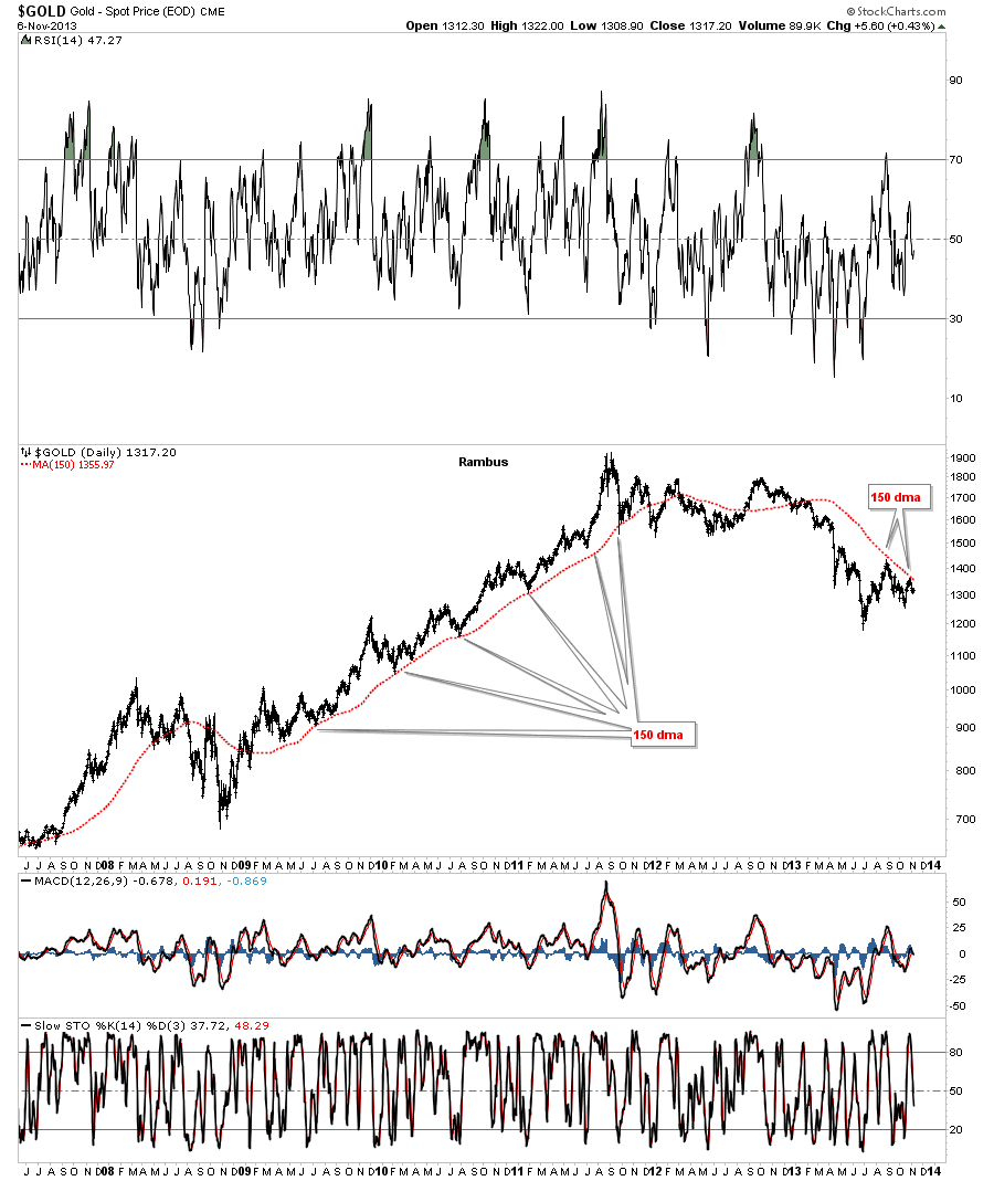
The first area I would like to look at is gold. During the bull market years the 150 dma gave the very best signal that a bottom was in, bar none. You could have thrown out every technical indicator, time cycles, Elliot Waves and yes even Chartology and you would have nailed every important bottom. The only time the 150 dma didn’t work was during the 2008 crash. Below is a daily chart starting from the 2008 crash low to the present. I have been watch this moving average with great interest wondering if it would do the same thing when gold turned down. We are now starting to get the answer. As you can see on the chart below gold is testing the 150 dma from below for the second time. Until it fails I will have to consider the 150 dma as our most important indicator for a top. I know it sounds too simple but sometimes simple is best.
This next chart for gold shows the 150 dma with one completed blue triangle that formed back in April and June of this year with a possible much bigger triangle that is still under construction. So far the 150 dma is holding resistance, top rail of the bigger blue triangle. There is another important feature on this daily chart that is talking to me. Normally, when you get a breakout from a consolidation pattern, think small blue triangle, the next consolidation pattern will form below the bottom of the consolidation pattern. Here you can see the possible bigger blue triangle is not doing this. It’s correcting in the same general area as the smaller blue triangle. This strongly suggests to me that both triangles are part of a bigger consolidation pattern that is still developing.
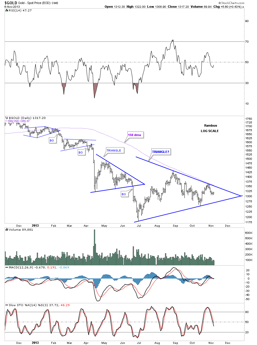
Before you look at the next chart see if you can figure out what type of consolidation pattern might be forming on gold?
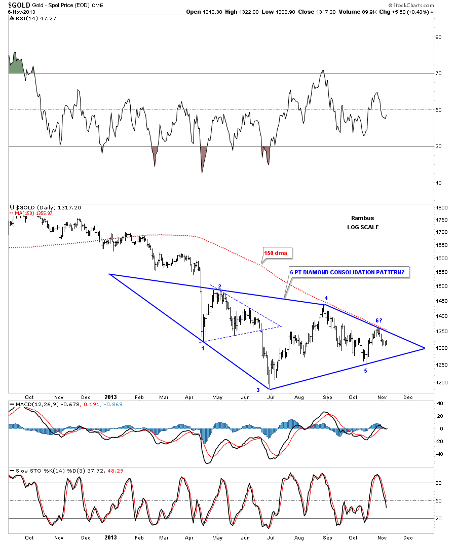
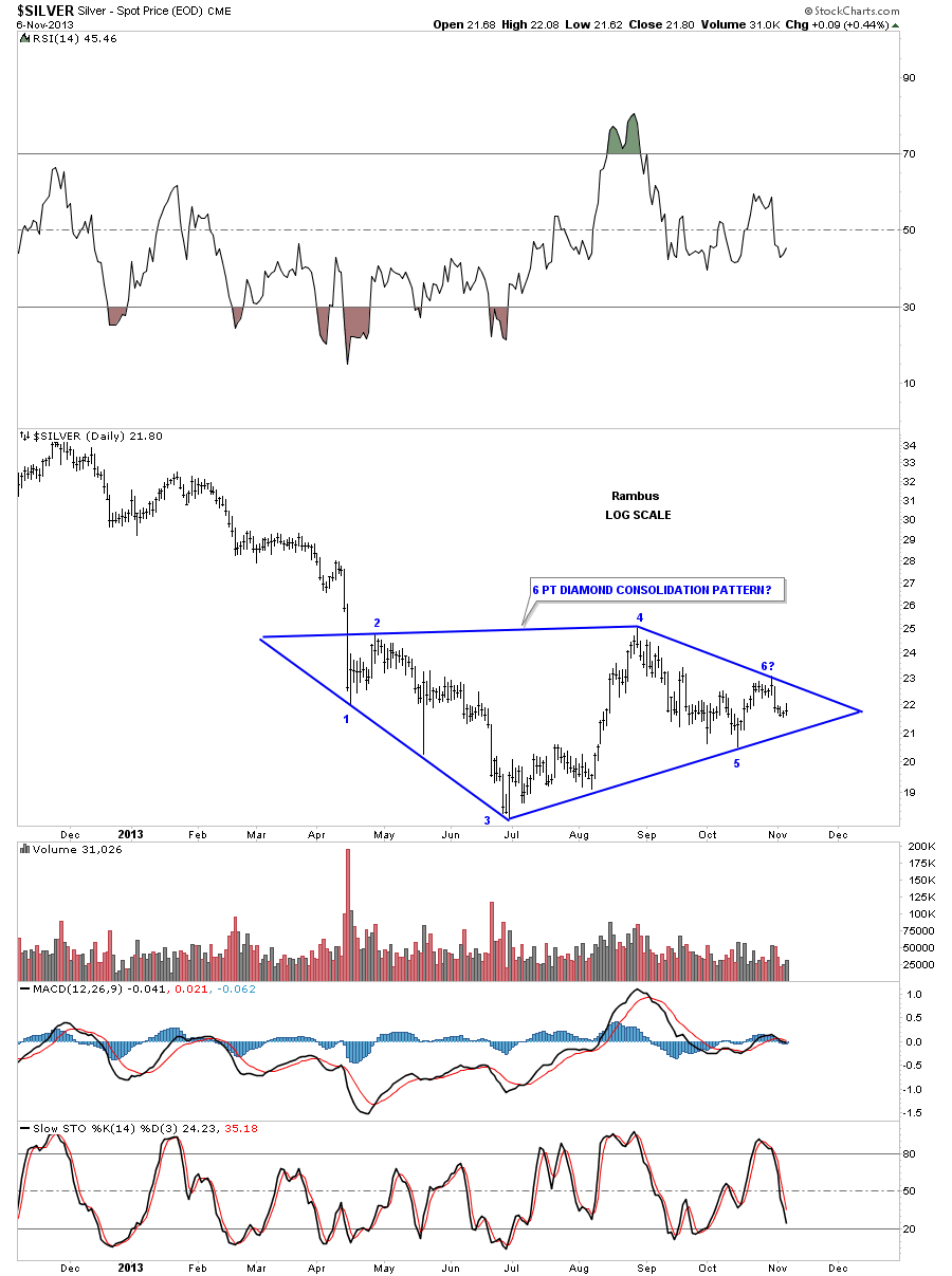
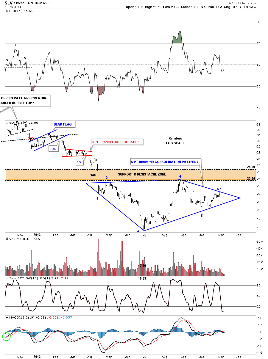
Next lets look at a chart for silver. If gold is building out a 6 pt diamond consolidation pattern the odds favor that silver will have a similar looking pattern. I often wonder about that big long bar that was made back in May of this year and if it would have any relevance down the road. As you can see it fits the diamond consolidation pattern perfectly.
The next chart I would like to show you is a daily chart for SLV that shows the Diamond pattern forming just below an important support and resistance zone. Many times you will see something like this that forms just above, right on or just below and important S&R zone. In this case SLV is forming its diamond just below this important area.
If you were a subscriber back in 2012 I brought this 8 point blue diamond consolidation pattern to your attention:
(Editors Note:
This is a certified unchanged chart from January 3 2013…please Note the Price Objective on the Chart !!)

(Editor’s Note 2 : Here is the Story behind this chart Posted at the forum tonite
http://forum.rambus1.com/?p=32884
If you recall the breakout was one of those slow motion breakouts that took almost 8 weeks to do the backtest. This chart gave me the courage to stand my ground when the going got tough. As you can see once the backtest was finished the impulse leg down began that took SLV below 18 before it bottomed.
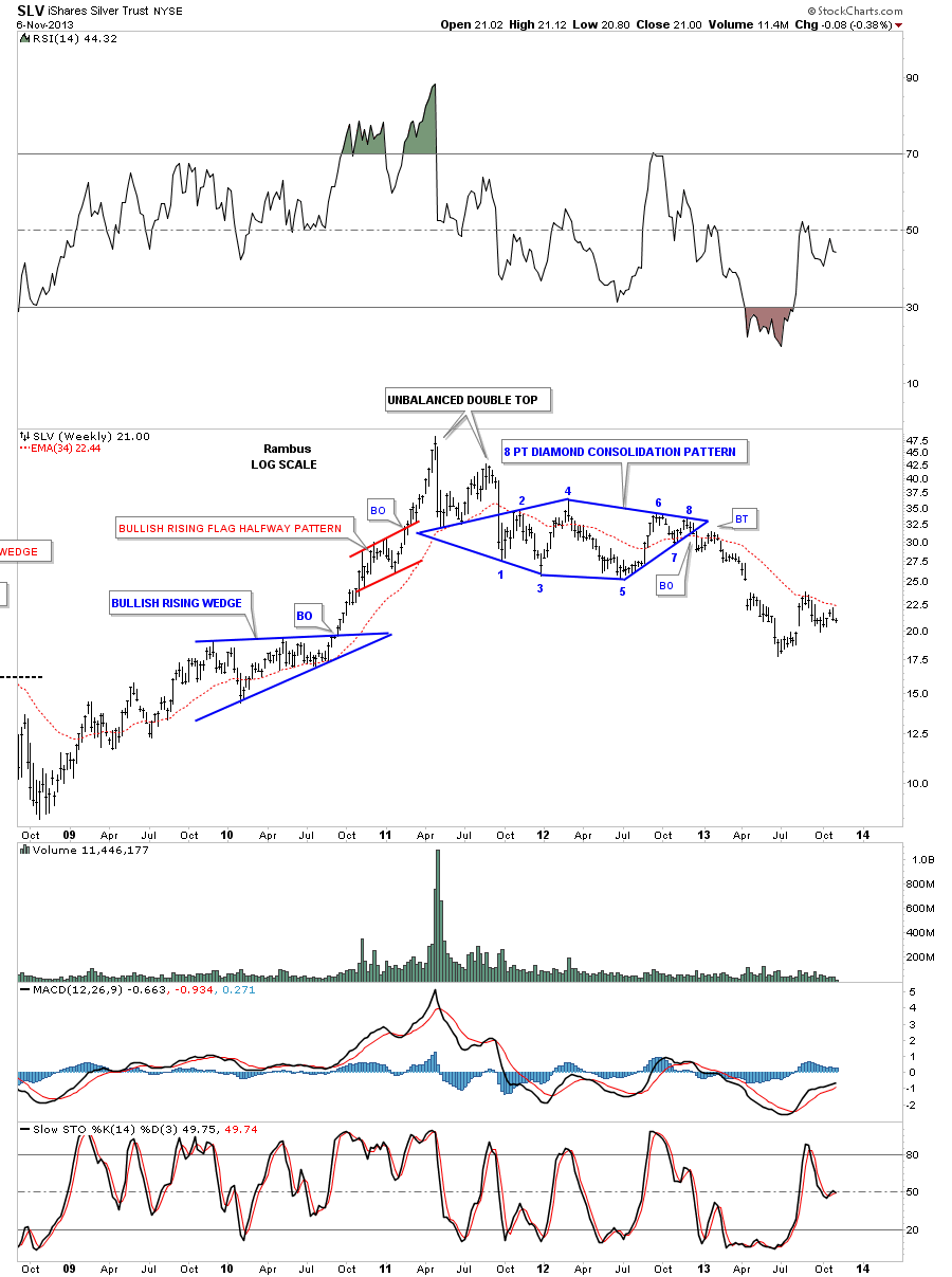
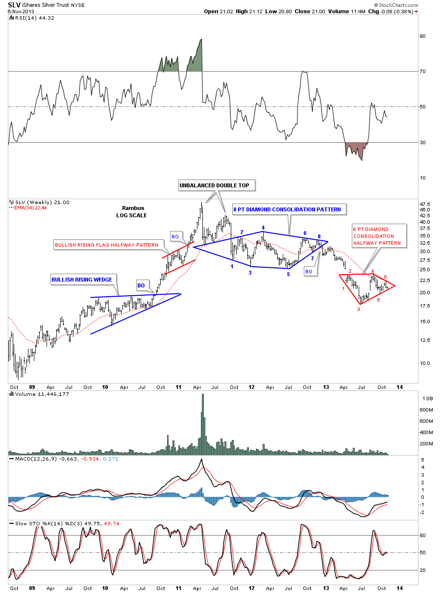
Now lets put both of our Diamonds together on the weekly chart and see what the big picture looks like. If this diamond consolidation pattern plays out like I expect it will then it will be a halfway pattern to the downside. Note the red bullish rising flag that formed as a halfway pattern back in the parabolic blow off phase. I wish I would have had our website up and going back then as that red bullish rising flag measured out beautifully. That was then. Now we have a very similar setup with our current red 6 point diamond consolidation pattern that may play out as a halfway pattern to the downside. The move leading out our smaller red 6 point diamond should look similar to the move leading into our smaller 6 point diamond from the breakout of the bigger 8 point blue diamond. The setup is there. We just have to wait for confirmation and a break of the bottom red rail to get the ball rolling to the downside after a possible backtest.
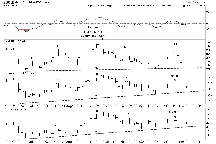
This next chart is a comparison chart that shows you how the HUI, gold and silver tend to run together. One can be stronger than the others at times but as a rule you can see they generally move together which is important to know. So if gold and silver are showing a certain consolidation or topping pattern then the HUI is most likely forming a similar pattern. The annotations on the chart below shows them to be forming a H&S top pattern. I’m really just using the annotations to show you the similarities between the three patterns so don’t pay attention to the S’s, H’s and the NL’s. Think of the NL’s as support and resistance rails, above is support and below in resistance.
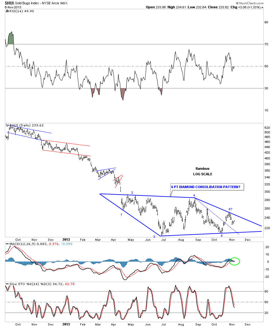
Several weeks ago I showed you what I thought were diamond consolidation patterns that were forming on the precious metals stock indexes. At the time I was showing what looked like a 5 point diamond reversal pattern to the upside. On the chart below is an updated look at the HUI that shows the original 5 point diamond on the left side of the down slopping blue dashed line. As you can see that line was broken to the upside which in turn may now be showing us a 6 point diamond consolidation pattern instead of a reversal pattern. Remember the golden rule, an odd number of reversal points equals a reversal pattern and an even number of reversal points equals a consolidation pattern. Keep in mind this possible diamond pattern is still developing which could go on for several more weeks yet.
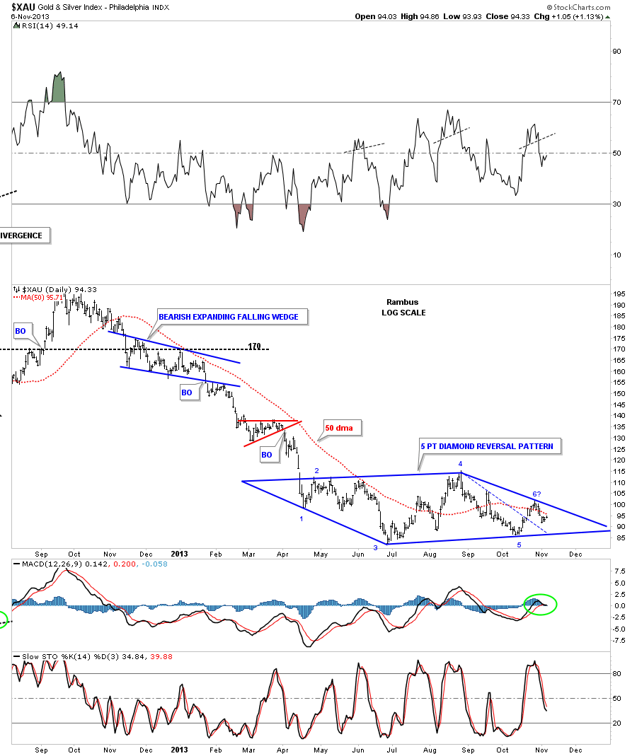
This next chart shows the XAU’s diamond pattern that is still labeled as a 5 point reversal pattern. The 6th reversal point is still in progress.
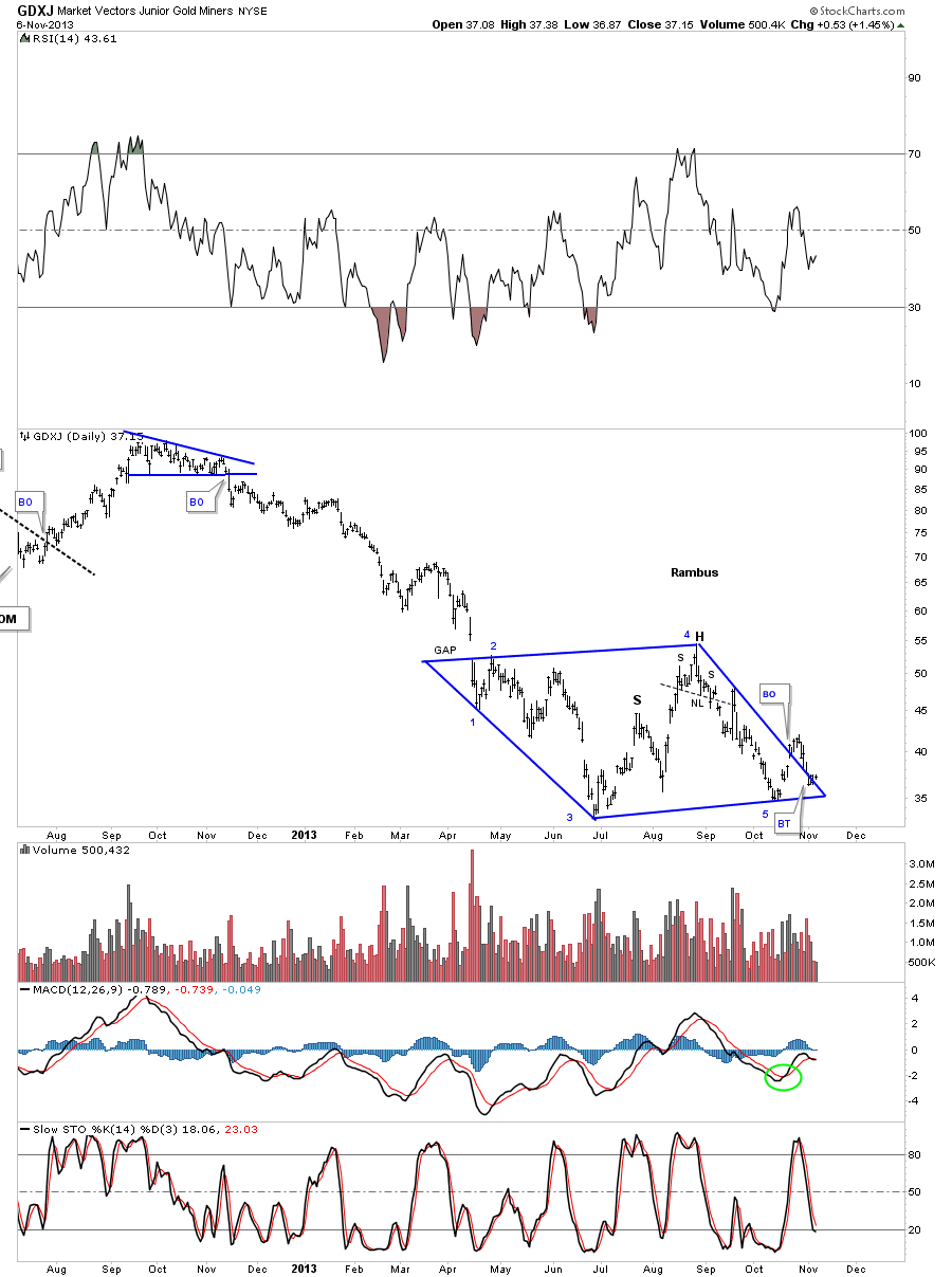
Below is the original chart for GDXJ that I’ve not tweaked yet. Note the breakout gap above the top right, down slopping rail that looked like a real breakout at the time. As you can see the price action has now drifted almost all the way back down to the bottom of the diamond.
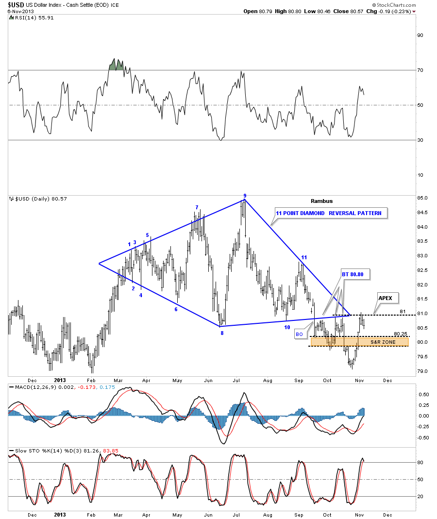
Another important piece of the puzzle is the US dollar. Lets look at what the dollar has done this week since the Weekend Report. If you recall I was expecting some resistance at the apex of the Diamond around the 81 area. So far this is what we are getting. Even if the price action is going to break above the apex I would still expect an initial hit, a small move down and then another hit. So far the US dollar is behaving the way it should. The real question will be if it can actually break above the apex, because if it does that will be a monster clue that the dollar is getting stronger.
This is the way I see things right now in regards to the precious metals complex. We’re kinda of in no mans land right now waiting for confirmation from the many diamonds I’ve shown you. Keep in mind there are many individual precious metals stocks showing this same diamond pattern that started to form back in April of this year. There was no way to know back in April what kind of consolidation pattern might form. As you can see these consolidation patterns can go through many changes before the final pattern reveals itself. That’s what makes these areas so hard to trade. If you don’t catch the exact bottom and then sell at the top they can whipsaw you around before you know what hit you as we have seen. It’s getting late and I need to get this posted. Keep an open mind. If these possible Diamond patterns play out we will then have another important impulse leg to trade that will make up for all the chopping action we’ve been in since April. All the best…Rambus