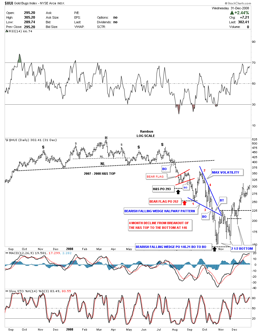
Below is a chart of the HUI H&S top that I was showing on another website , during its formation in 2008 and the crash that followed. Keep in mind the HUI had been rallying for 8 years without a topping formation so when I started to show the possibility of this H&S top nobody wanted to hear it. Some of you know the feeling, that when you post something negative about the precious metals complex, you have to take a lot of flack to make your point.
The point I want to make with this chart is the volatility that occurred when the neckline was broken to the downside. The volatility we are experiencing right now on the HUI is so very mild compared to the 2008 crash. There were two halfway patterns. The first one was the red bear flag that had a price objective down to 252 red arrow. That low was the first reversal point in the much bigger blue bearish falling wedge that was also a halfway pattern. I used the breakout to breakout method to measure the price objective down toward the 145 area. Just measure the distance from the breakout from the H&S top to the first reversal point in the blue bearish falling wedge, red arrow. Take that measurement and add it to where the price action broke out from the blue bearish falling wedge to get your price objective.
Note the price swings inside the blue bearish falling wedge. These are daily bars that show the first rally inside the blue falling wedge was right at 100 points in just 2 weeks. The decline down to reversal point #3 was 130 points in about 2 weeks before the HUI rallied 70 points to 300 that created the 4th reversal point. Note the clean breakout and the backtest 3 days later that sealed the fate for the blue bearish falling wedge. I didn’t have room to label the bottom but I call this type of bottom a 2 1/2 point double bottom. You can see the double bottom that formed between Oct and December and the rally that took the price action up to the apex of the blue bearish falling wedge. You can see how volatile the price action was when the HUI put in the second low in December that was a tad higher than the October low that was a small double bottom in its own right. Normally the double bottom hump should hold support but sometimes, in volatile markets, the stock will make one last attempt to decline but the bears are finally exhausted and there are just buyers left so the price only declines about halfway down before it’s exhausted.
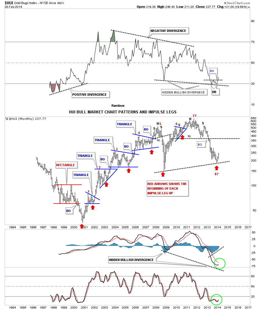
This monthly chart shows the total history for the HUI. It’s actually one of the most symmetrical and beautiful charts, from a Chartology perspective, that you will ever see unless you look at the gold’s bull market that has many beautiful chart patterns. When I see the beauty of this chart I can’t help but to think this chart was made by a natural process. If the precious metals were manipulated, as some many gold bugs presume, you could not have such beautiful looking chart patterns. They would be all ragged and no symmetry if some one had tried to manipulate all the stocks that make up the HUI. This long term monthly chart is a textbook look at Chartology and how it works in creating chart patterns and impulse moves. Maybe sir muslhead will confirm for me if there is actually a hidden bullish divergence taking place between the 2008 and 2013 low. Bottom line : Is this the start of the 8th impulse move higher since the HUI was first conceived? We’ll know in hindsight. All the best…Rambus