Tonight I would just like to look at some random PM charts, in no special order, to get a feel of where we are in the near to long term look. As you know the PM complex finally broke down from their two month consolidation patterns which is part of a bigger 10 month consolidation pattern. In most cases the consolidation patterns have a down slopping look to them that tells me the price action wants to head lower. In a normal downtrend a consolidation pattern will form sideways like a triangle or rectangle or will slope up against the downtrend such as a bear flag that has a higher high and higher low before it gives way to the downside.
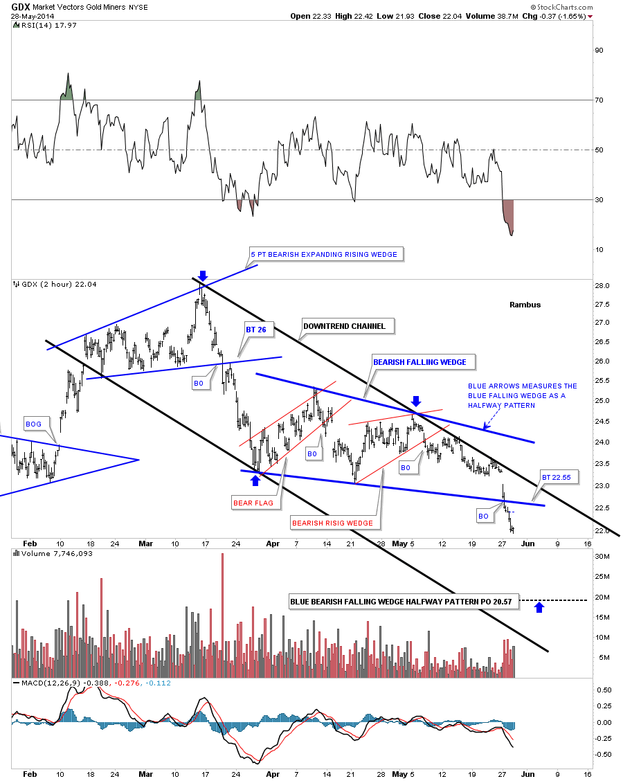
Lets start with a four month 2 hour chart for the GDX that shows the downtrend that has been in place since the March high. After breaking out from the five point bearish expanding rising wedge GDX went on to form two small red consolidation patterns that make up the bigger blue bearish falling wedge. The blue arrows measures each half of the big impulse move down with the blue bearish falling wedge in the middle. There is a good chance we may see a backtest back to the underside of the blue falling wedge before the price action moves lower.
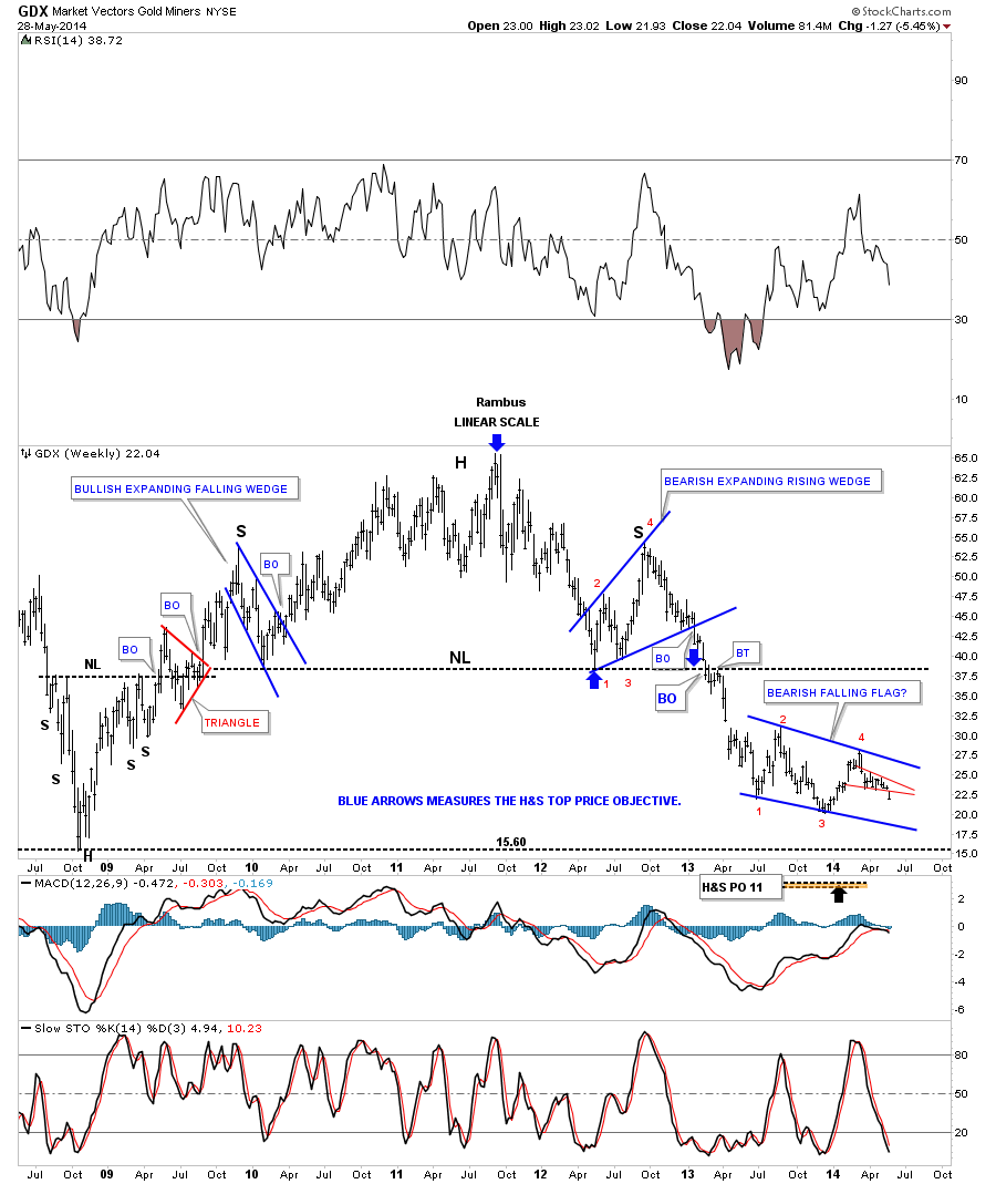
The one year chart for the GDX begins to show you the bigger picture which is so important to grasp. Our current downtrend channel has almost the exact same angle as the downtrend channel on the left side of the chart.
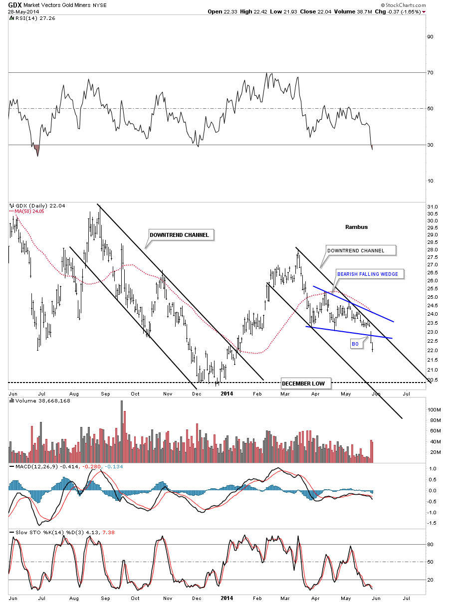
This next 2 1/2 year daily chart for the GDX starts to paint the big picture that we’ve been focusing in on since the possible 4th reversal point on the big blue bearish falling flag. The little red falling wedge is the same pattern as shown on the charts above. The big blue falling flag shows you the fight between the bulls and the bears and how the bears have been able to take the price action lower regardless of all the fundamental reasons why the PM stocks should be going up.
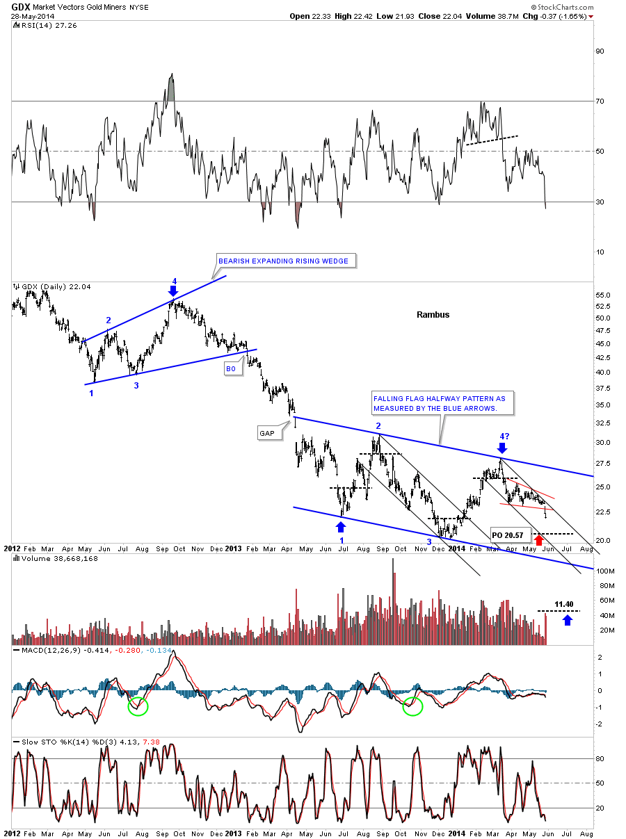
This last chart for the GDX shows you the very long term weekly look that has the massive H&s top reversal pattern in place that has led to our current price. You can see the blue falling flag that is now 10 months in the making with our little red falling wedge that I showed you on the first chart above. You can see this week was the breakout week for the little red falling wedge. This helps us in confirming the all important downtrend is still in place. I’m sure you’ve heard the expression, it’s always easier try to trade in the same direction as the major trend. This chart shows you why. We were only able to capture just small profits during each of the little counter trend rallies you see on this chart. You had to be very nimble to get in and get out without taking a big loss. If you hesitated the GDX showed no mercy on you. Our best trade was when we were able to short into the downtrend in the first few days of December of 2012 and exiting our shorts in August of 2013. The main trend was our friend.
Next I would like to show you some long term charts for gold we’ve been following for some time now as nothing has broken the downtrend that has been in place since the September 2011 high. This first chart shows what would happen if our current blue triangle works out as a halfway pattern to the downside. Keep in mind gold has a lot of work to do yet but as long as it keeps making lower lows and lower highs this chart gives us something to follow.
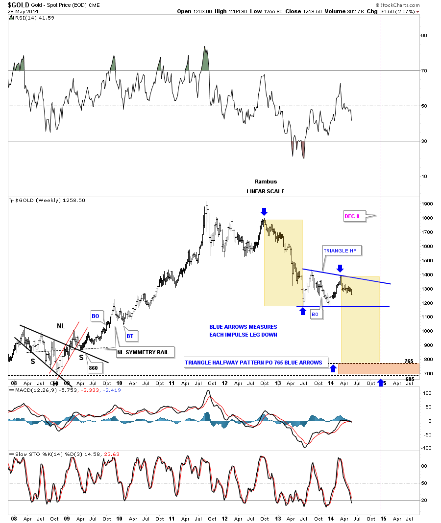
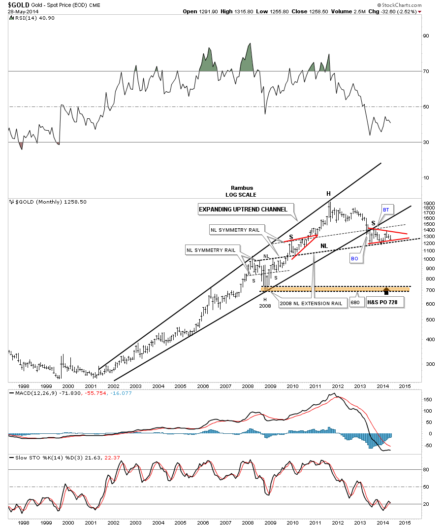
Below is a long term monthly chart for gold that shows a massive H&S top forming. If the red triangle breaks to the downside that move will complete the massive H&S top. The symmetry is absolutely beautiful as shown by the neckline symmetry rails. I know few believe gold could produce such a move down but few thought that gold would ever get this low back in 2011. Whatever everyone wants nobody gets.
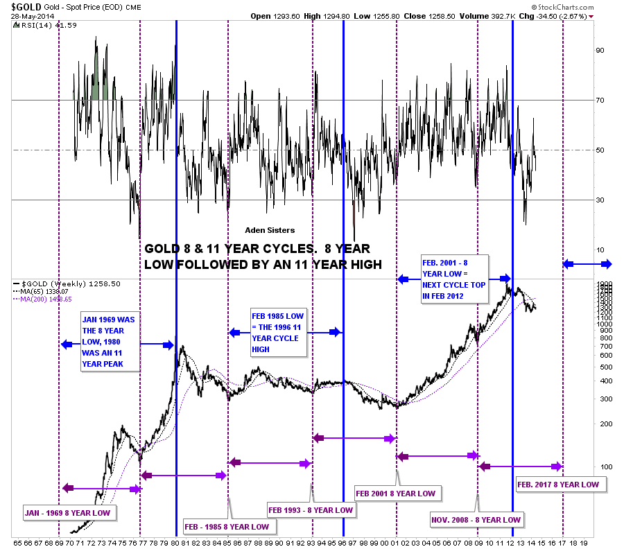
About four years ago the Aden Sisters posted a chart similar to this one I built after reading their article on gold. Keep in mind this was before the 2011 high in gold. This is a time cycle chart that goes all the way back to the early 1960’s which shows an eight year low followed by an eleven year high. This is my version of their chart they showed in their public article. As you can see the top in 2011 came in a few months earlier than what the vertical blue ling shows but for an eleven year cycle high I thought it was dead on the money. What this time cycle chart is now showing us is that the next important 8 year cycle low should come in around February of 2017. Keep in mind it doesn’t give a price just the time component. So the expected important low in 2017 can be anywhere on the chart. Maybe lower than the current price action or higher depending on what gold does over the next three years or so. At any rate I found this chart to be very fascinating as it takes in such a long period of time and it did call the latest top in gold to within about four months or so. This chart also ties into my big picture analysis that is showing there is still plenty of room for gold to move lower over the coming months. All the best…Rambus