
In this Weekend Report I’d like to show you some charts on the different US stock markets and some of the stronger sectors within the US markets. It seems like no one believes this rally taking place in the US stock markets and many stock markets abroad. The mantra is we have to have a correction because markets can’t keep going up like this , which is true , but the stock markets will let us know when it’s time for a correction. Right now most of the charts are looking positive with no sign of a top in place yet. This could all change next week but right now things are looking much more bullish than bearish.
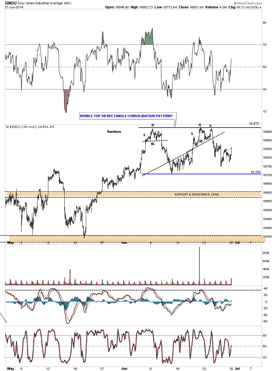
Lets start with the Dow Jones daily chart that shows us the price action has been chopping around in a 270 point trading range for the better part of June. We still don’t know if this pattern is going to be a rectangle consolidation pattern that will let the price action breakout to the upside or if it will be a double top reversing the uptrend. More time is need to see what the Dow wants to do.
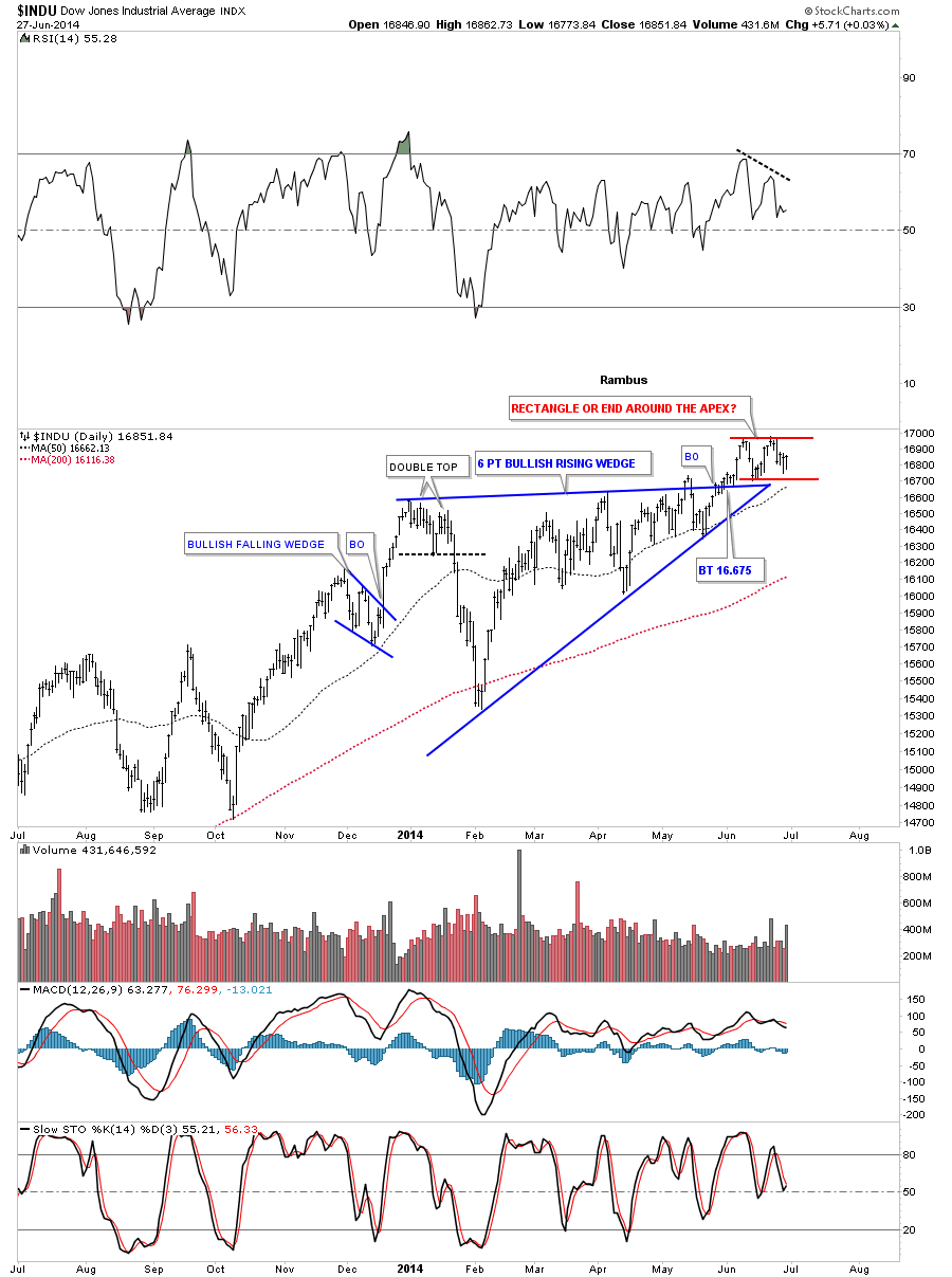
Now lets put our little June trading range in perspective by looking at a daily chart to see how it fits into the bigger picture. What this daily chart shows us is that the Dow has been actually consolidating since the fist of the year. The possible little rectangle has formed as the backtest to the top blue rail of the rising wedge. What we don’t want to see is an end around the apex move as that would change everything in the short to probably intermediate term. So from my perspective a six month correction is enough time for the Dow to have another impulse move higher before it’s time for the next consolidation phase to begin as long as the apex isn’t violated. The trend is your friend.
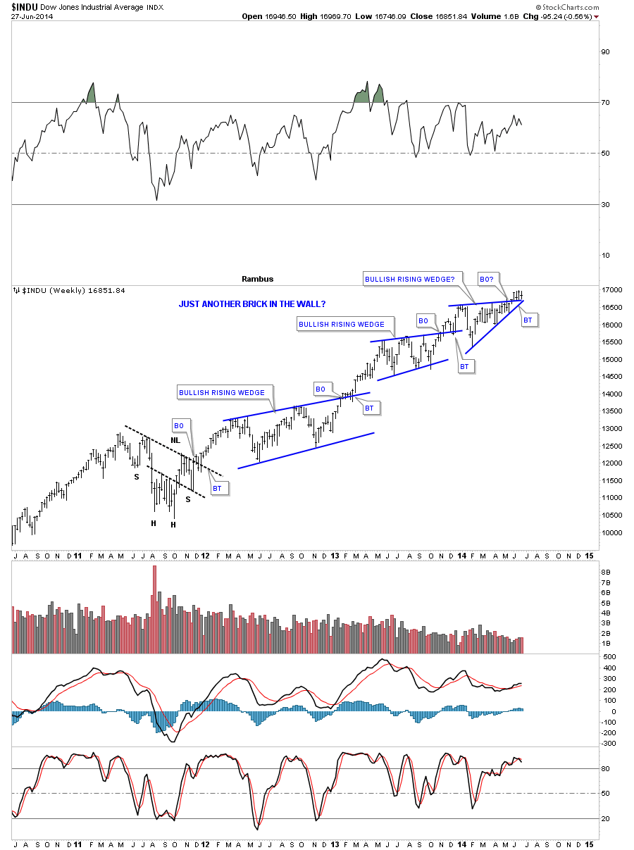
Now lets look a long term weekly chart that shows our latest consolidation pattern, at the top of the chart, as just another in a string of consolidation patterns that have formed since the low in 2011. As you can see the Dow is in backtest mode right now that needs to hold so the next leg up can begin. As you can see the Dow has been flirting with new highs for the last four weeks now.
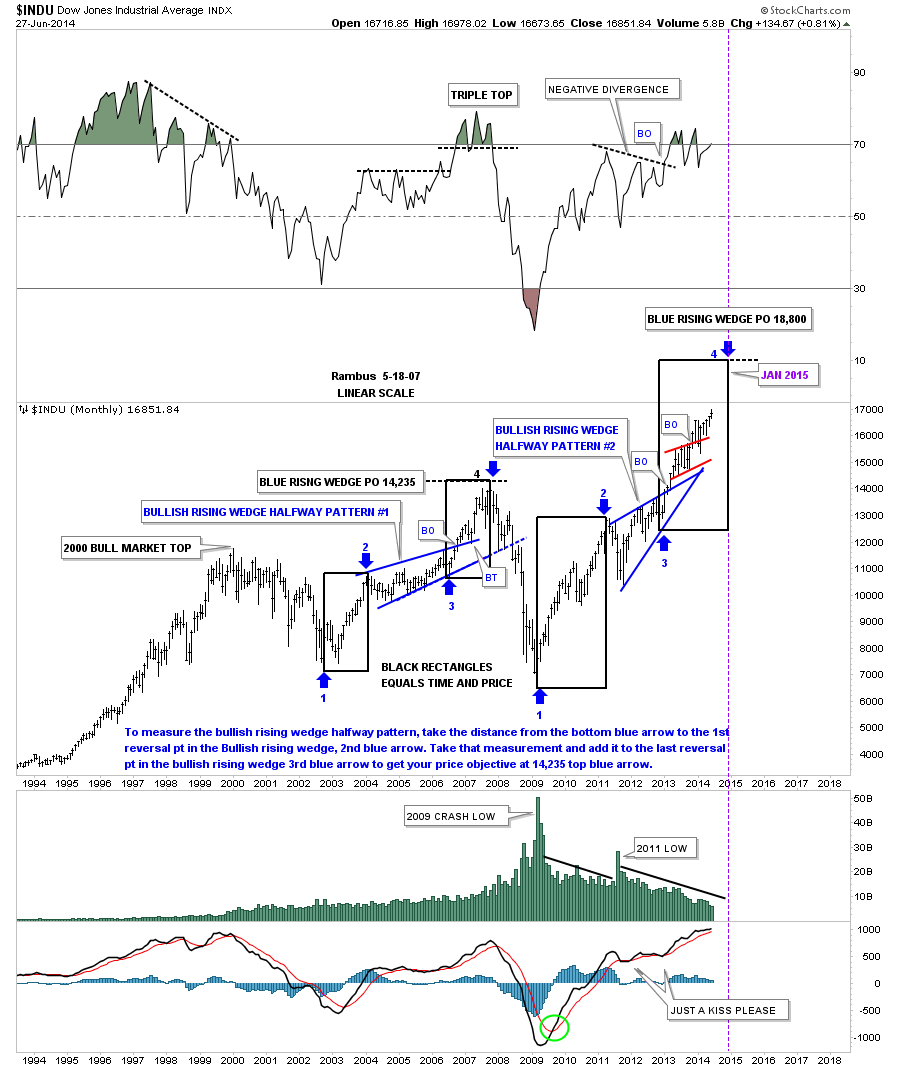
This last very long term monthly chart for the Dow shows how I’ve been following the price action for many years how. What is interesting about this chart is the blue bullish rising wedge that formed back in the rally phase from the 2002 low to the 2007 top. It formed exactly in the middle of that nearly five year cyclical bull market in both time and price as shown by the blue arrows and black rectangles. Now fast forward to the 2009 crash low and the rally phase that has ensued since. Some of our long term members may remember this chart when I posted it when the price action broke out of the blue bullish rising wedge. We got about three months of rally before the Dow started to form another rising pattern the little red rising bull flag. If you look at the price action from the 2009 crash low this monthly chart shows a rally that doesn’t want to quit. When I see chart patterns slopping up into an uptrend that tells me we are in a very strong market. Just the opposite in a down market when the consolidation patterns slope to the downside in the same direction of the downtrend. Until something changes this behavior we have to go with the trend, which is up until proven other wise.
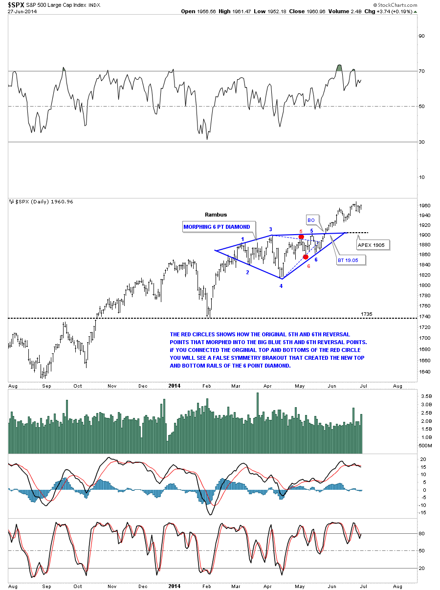
Back in May I showed you this morphing six point Diamond consolidation pattern on the SPX which so far has been working beautifully. Note how much stronger the SPX chart is compared to the Dow chart above. While the Dow has been building out a sideways trading range the SPX has been making a series of higher highs and higher lows since it broke out of its consolidation pattern. It’s showing relative strength to the Dow.
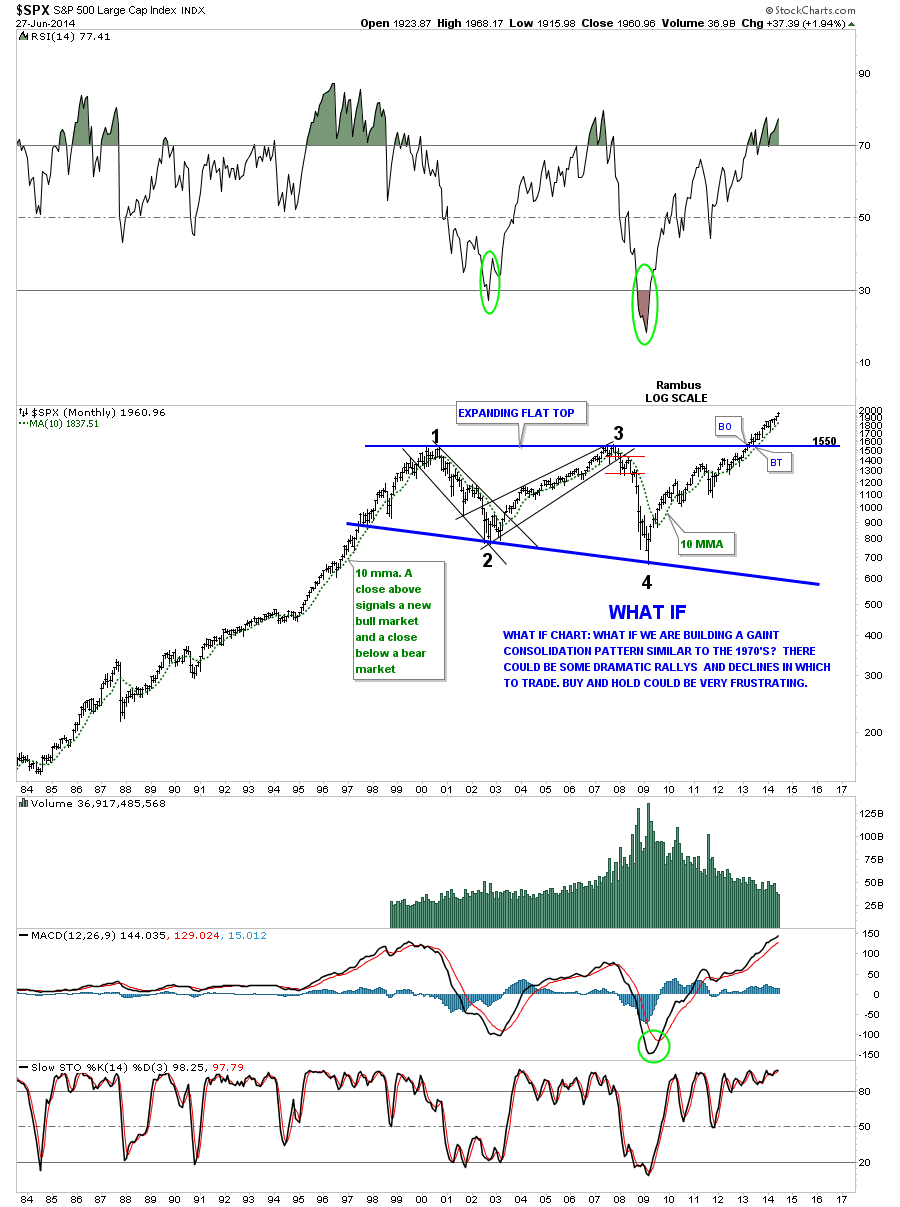
This next very long term monthly chart for the SPX I built many years ago. You can read what I wrote when we were still trading inside the massive flat top triangle consolidation pattern. At the time I didn’t know when the SPX would breakout or if it would ever breakout but as you can see it did in fact breakout and hasn’t looked back since. June produced another new all time high regardless of all the reasons why it shouldn’t.
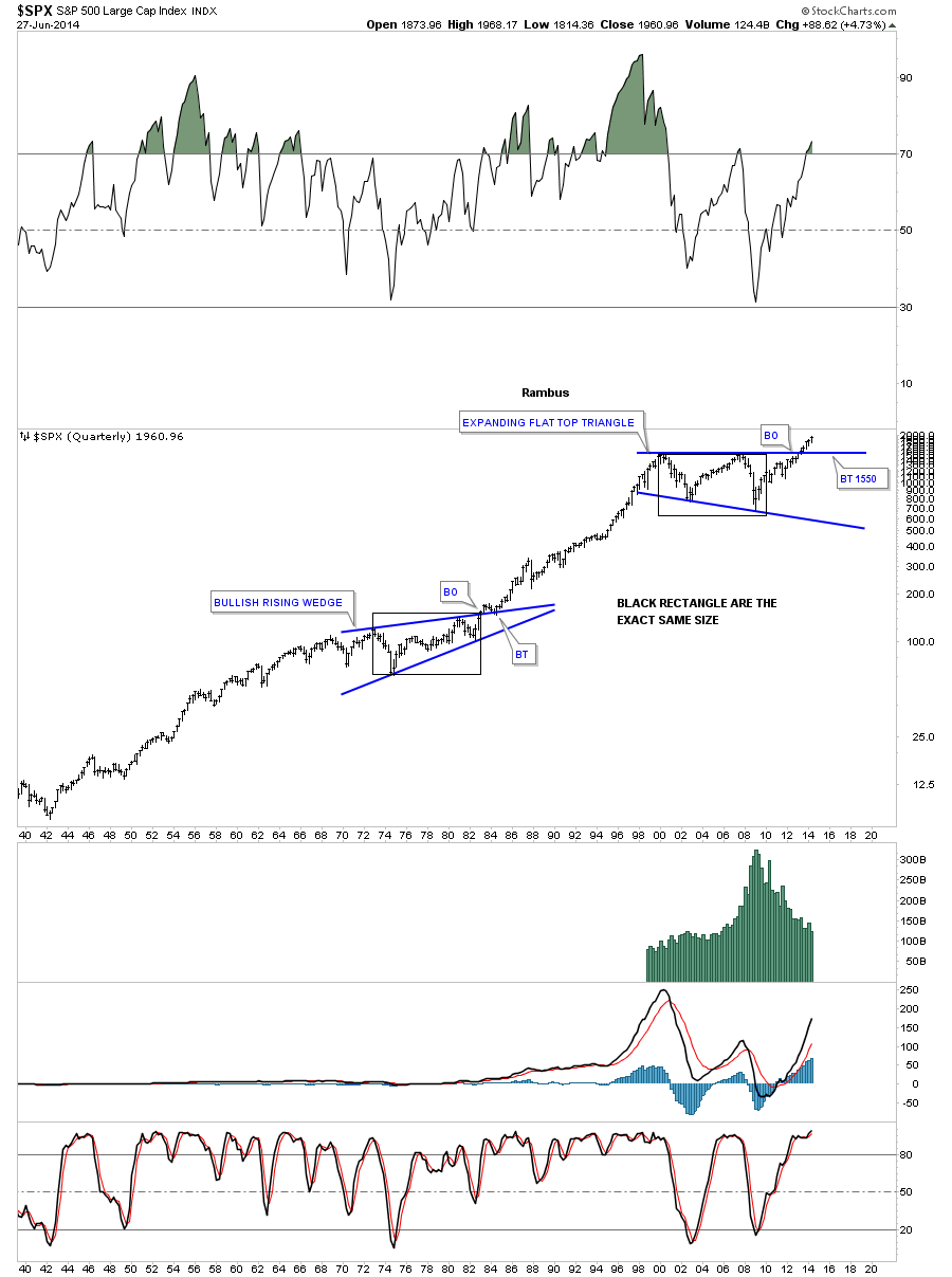
This last chart for the SPX shows you 74 years worth of trading. The reason I’m showing you this chart is so you can see how big the 13 year blue flat top triangle is relative to anything built in the last 74 years. Big consolidation patterns creates big moves.
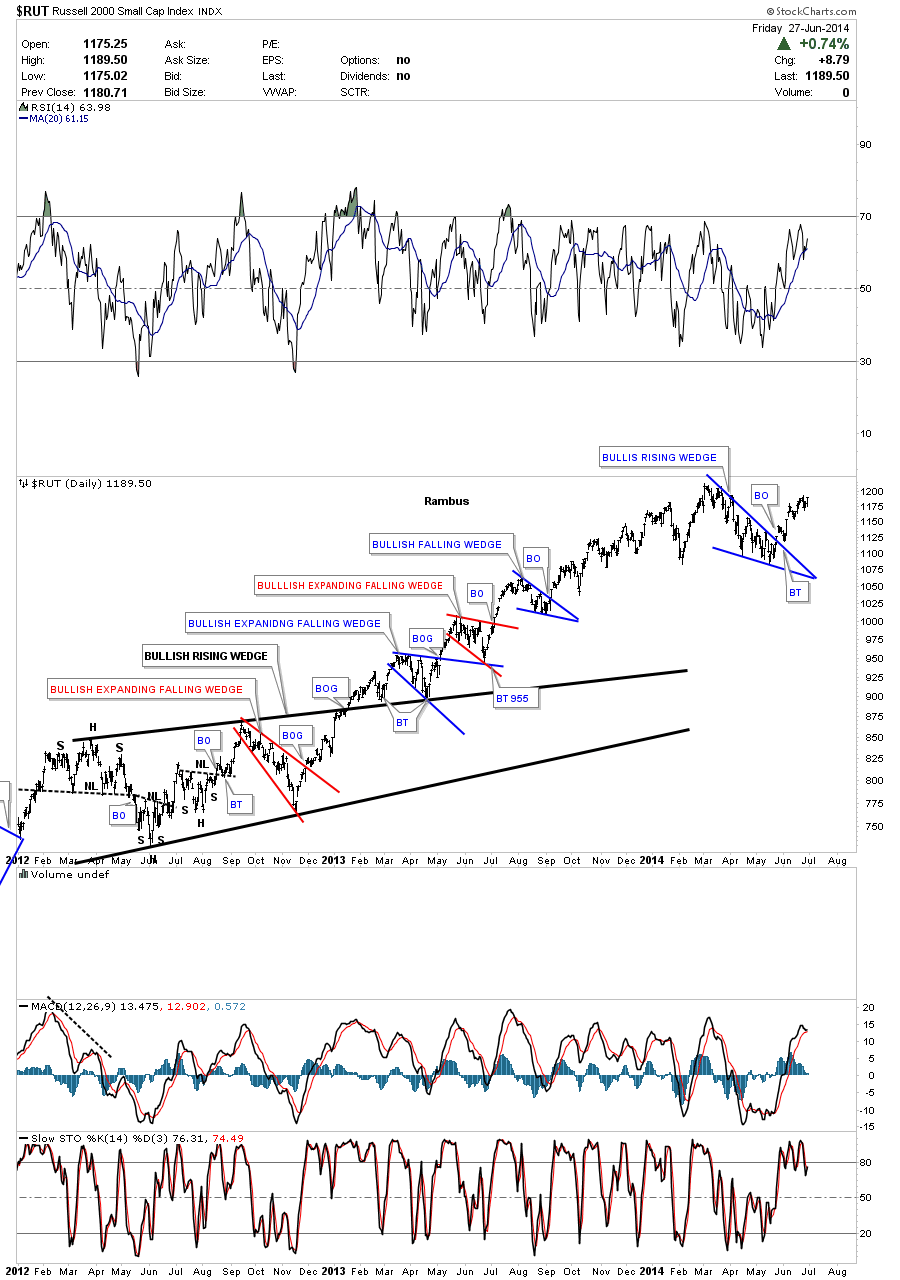
Lets take a quick look at the RUT that shows its correction since the first of the year was the blue bullish falling wedge. As you can see it just looks like another consolidation pattern in a long string of consolidation that have developed since the 2009 crash low. I would like to see the RUT take out the previous high to confirm the new move higher.
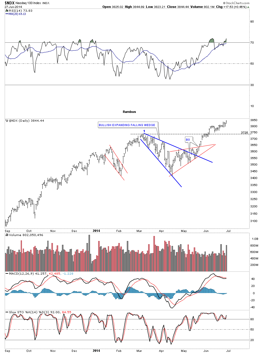
The NDX has been gaining back its strength since it had its correction this year that took on the form of the blue bullish expanding falling wedge. The NDX made a new multi year high last Friday that shows you strength not weakness. It still has some more work to do to breakout into new all time highs but it is getting there.
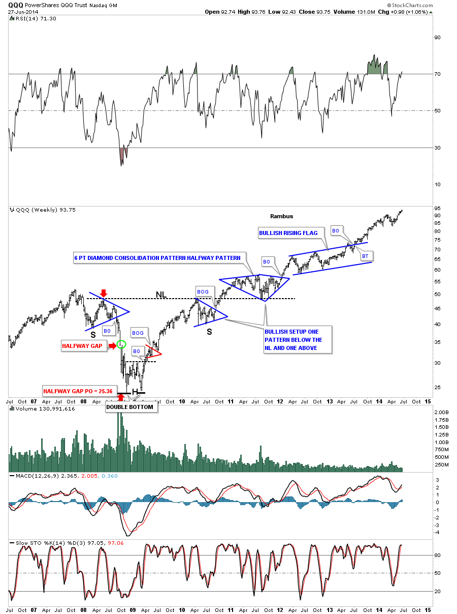
Lets look at the long term monthly chart for the QQQ which is the etf for the NDX 100 biggest tech stocks. This chart shows some beautiful Chartology starting with its massive three year inverse H&S bottom with the head portion being the 2009 crash low. Note the bullish setup that occurred at the neckline where there was one consolidation pattern that formed below the neckline and then one that formed on top of the neckline. After breaking out from the blue bullish rising flag the price action as been rising steadily creating a new multi year high last week. From a Chartology perspective it’s hard to find anything bearish with this chart.
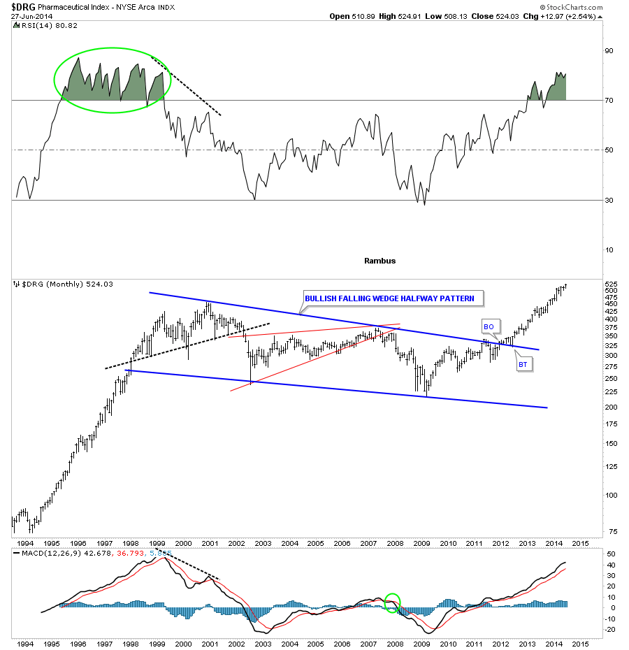
Lets now look at several areas of the stock markets that have been doing exceptionally well. The fist sector I would like to show you is the DRG sector which is making new time highs. After breaking out from its massive blue bullish falling wedge it has been a straight shot to the upside. Whenever you see a nice neat consolidation pattern like this many times how a rally looked coming into the consolidation will look very similar when the price action leaves the consolidation pattern. Note how similar the move was leading into the bullish falling wedge and how similar the rally is since DRG broke out.
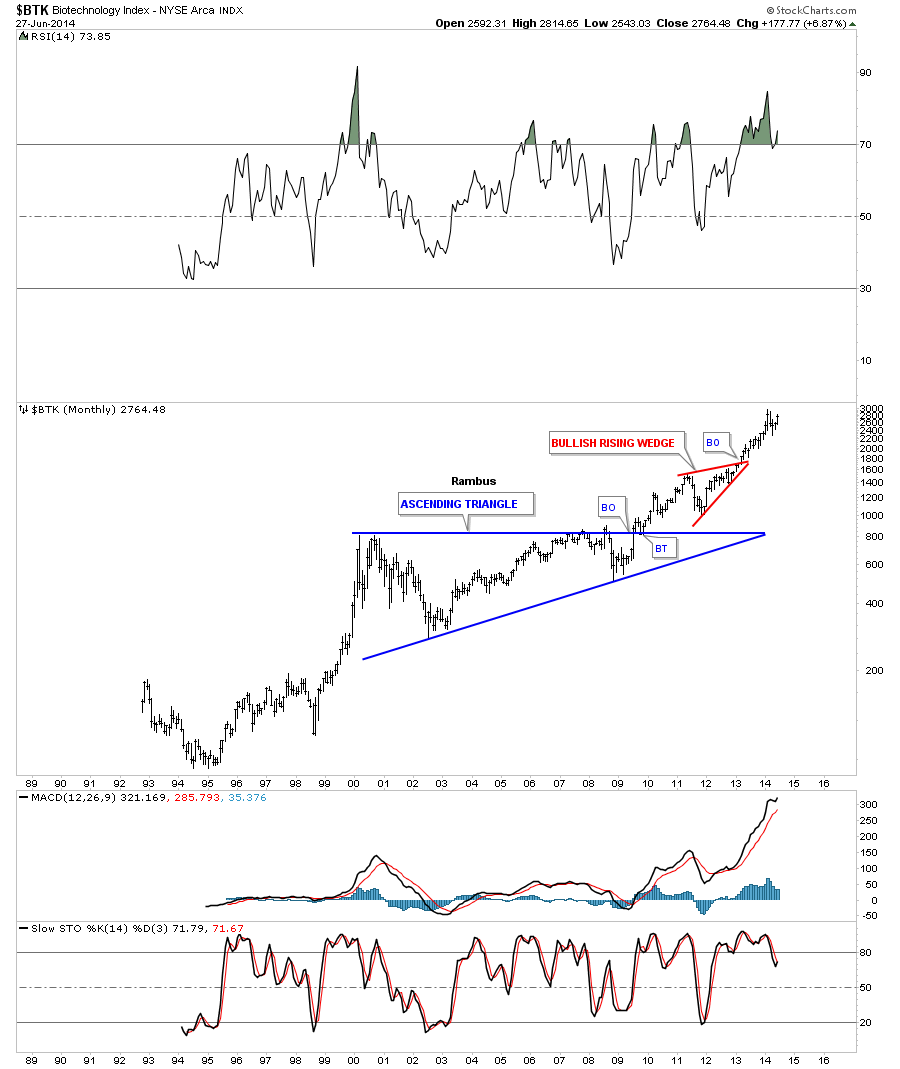
The BTK has been the strongest and the first sector to breakout and begin its new bull market back in early 2010. While most stock markets and different sectors really crashed in 2009 you can see it is hardly visible on the long term monthly chart. This is why it has been the leader during our current bull market.
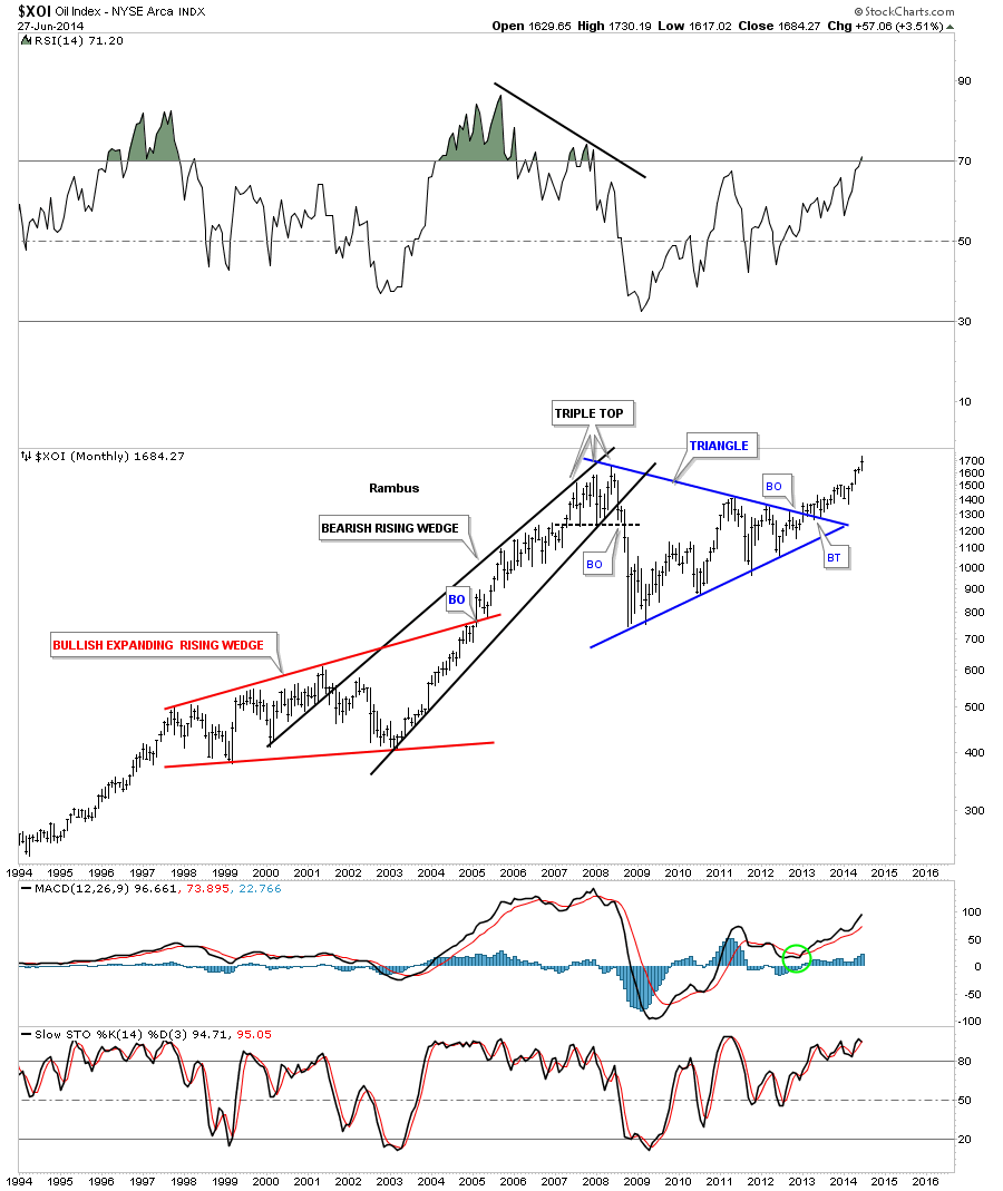
I had been watching the XOI build out that beautiful blue symmetrical triangle for literally years. As you can see it kept bouncing within the confines of the blue triangle with each reversal getting smaller and smaller. It was one of those big patterns that was hard to believe when it first broke out because of all the time and reversal points it took to finally complete the consolidation pattern. Now with the beauty of hindsight we can see the price action is starting to accelerate to the upside just as we should expect. As you can see it made a new all time high this month.
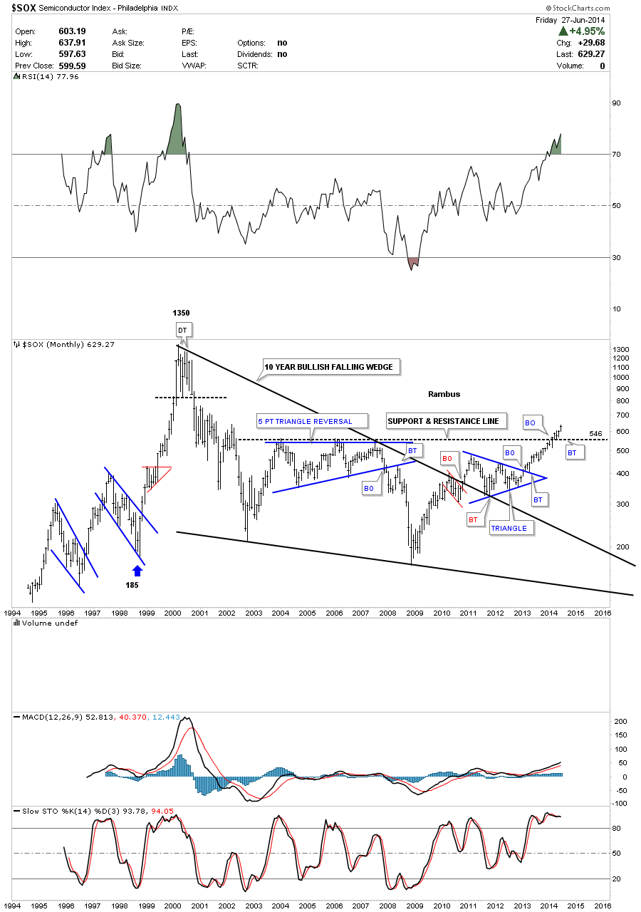
This last sector I would like to show you is the SOX which is not close to making new all time highs but it has just recently broken above horizontal resistance at 546. As with all the other sectors I showed, which all had massive consolidation patterns, the SOX also has its own 10 year bullish falling wedge. When you look at this chart it shows a good example of how markets work from a Chartology perspective on any time scale. There is an impulse move followed by a consolidation period followed by another impulse move. Rinse and Repeat until eventually the major move is finished and then what may look like another consolidation will actually be a reversal pattern. Then the same thing happens when the markets goes down.
When I look at these massive consolidation patterns that have broken out, some years ago already, it’s hard for me to see a new secular bear market forming. Many have been claiming this rally off the 2009 crash low was nothing more than just a counter trend rally in the secular bear market. When you have stock markets and different sectors in the stock markets making new all time highs its hard to call it a top or bear market. Tops take time to form and with many stock markets making new all times highs it would still take a long time to build out a major top. I’m just going to follow the price action and see where it takes me regardless of why the markets are not supposed to go higher.
There are many individual stocks in these strong sectors that one can find using a little Chartology. If you put in a little time and effort you will be surprised what you will come up with. It’s called doing your homework. You know what sectors are strong right now so those are the areas to focus your attention on.
All the best…Rambus