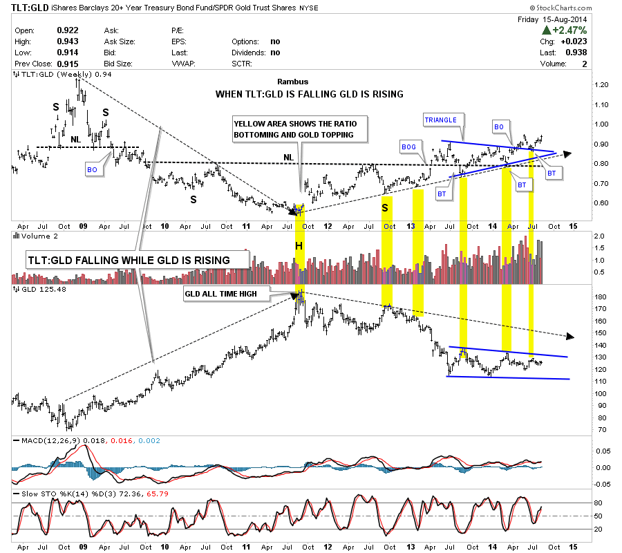
Below is a combo chart that shows the TLT:GLD ratio chart on top and the GLD on the bottom. This chart shows you when the ratio is falling GLD is rising and when the ratio is rising GLD is falling. Notice back in 2008 the ratio was at its high and GLD was at its low. As you can see the ratio fell during the next three years while gold put in its all time high at 1920 in September of 2011. From that all time high in GLD to the low in the ratio chart, GLD has been falling while the ratio has been rising. Note the massive inverse H&S bottom on the ratio chart that broke out in April of 2013. There was a laborious backtest to the neckline that seemed to go on forever which ended up forming the blue triangle that sits right on top of the neckline. We got the backtest to the top rail of the blue triangle back in early July that held beautifully. Now the ratio chart is getting ready to make a new high for this move off of the September 2011 low. The yellow shaded areas shows minor lows in the ratio chart that corresponds to minor tops in the GLD. As long as the ratio chart keeps rising, which it should after breaking out of the blue triangle and the huge inverse H&S bottom, GLD should fall and most likely break throug of the bottom of its one year plus blue trading range. The Chartology of this chart says GLD is going lower in no uncertain terms. All the best…Rambus