In this Weekend Report there are so many charts I want to show you it’s hard to know where to start. It seems like we have entered a critical inflection point in both the stock markets and the precious metals complex. These inflection points can last for awhile before they show their hand but it’s important to know one exists so we can take advantage of the situation. I’m fully aware that the stock markets are entering the most dangerous time of the year as they move into September. As I mentioned to you before, The Only Rule in the Stock Markets are There are no Rules, so anything can happen at anytime. It just goes with the game we choose to play. With that said lets start by looking at several long term charts for the SPX.
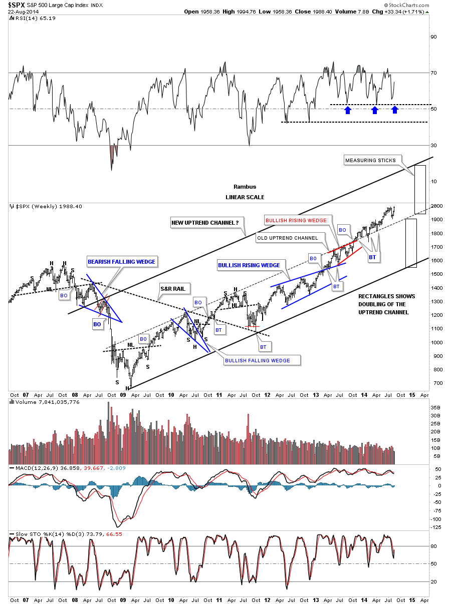
Below is a weekly chart for the SPX that goes all the way back to the 2009 bottom and the uptrend that has developed. It seems like most chartists are looking at the price action from the 2009 bottom as a bearish rising wedge formation which I can see also. I have a different take on the 2009 uptrend tho which I believe is going to double at a minimum. I’ve used this technique in the past in real strong markets either going up or coming down. The original uptrend channel consists of the bottom solid black trendline and the center black dashed trendline. Just follow the price action from the 2009 low to where the SPX broke out above the center dashed trendline in October of last year. That center dashed trendline has done a beautiful job of reversing its role from what had been resistance until it was broken to the upside in October of last year. Outside of the one weekly spike below the center dashed rail, that immediately reversed back up, the center rail has held support just as you would expect from a Chartology perspective.
As you can see the SPX is trading at its all time highs right now. It’s possible that we could see a small consolidations pattern form right here with the current high last week being the 3rd reversal point if the SPX decides it needs a little more time to build up the energy to really keep this new impulse leg up going. On the other hand there is nothing to say it can’t just keep going up from here. Notice the two black rectangles that are exactly the same height. In situations like this many times the original lower uptrend channel, in a strong bull market, can double in size, as the upper black rectangle shows. As you can see there are no touches on the upper solid black trendline yet but if the SPX is in a true impulse move up we’ll see that top rail hit at some point. Right now the center dashed trendline is our line in the sand, above is bullish and below is bearish. Depending on when the price action reaches the top rail of the uptrend channel, a rough estimate would be around the 2300 area.
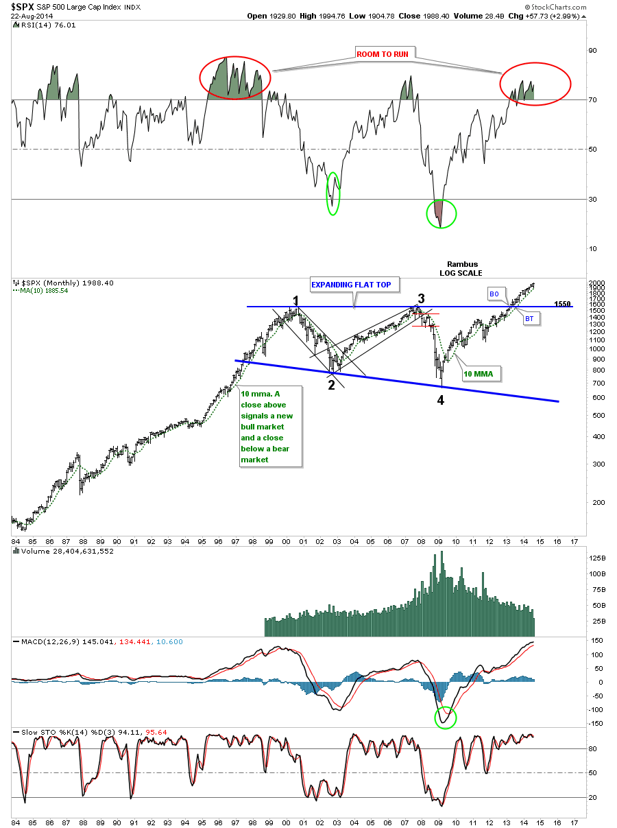
The long term monthly chart shows the big multi year flat top triangle that broke out back in March of 2013 with one tiny backtest right after the breakout. Note the impulse moves up during the bull market years in the 1990’s. In strong bull markets these moves can become imbedded just like some of the indicators. Notice how the RSI formed back in the 1990’s bull market that stayed overbought for most of the bull market. It wasn’t until the very end that a negative divergence showed up which was a strong warning to take profits. As you can see the current RSI is overbought but not even close to the 1990’s.
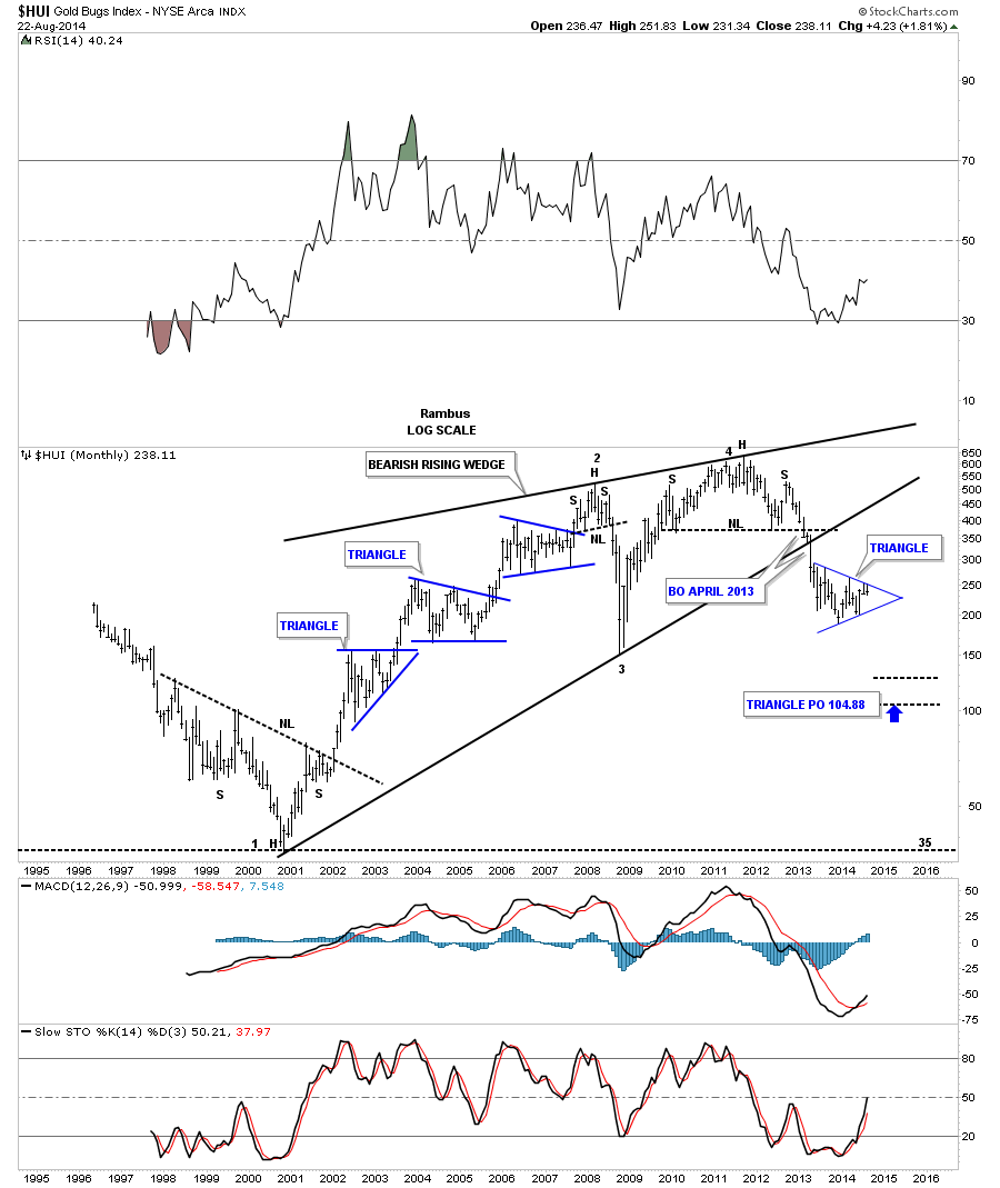
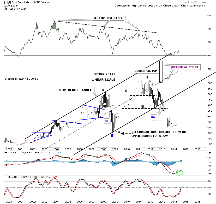
Let me show you a couple of examples of how the doubling of a channel has worked in the past. First lets look at the HUI that crashed in 2008 after being in a strong bull market for 8 years. I used the top rail of the uptrend channel as my guide as it had four touches on it. Keep in mind we are only looking at the uptrend channel that started in 2001 to the 2008 H&S top. The center dashed trendline was the bottom of the channel at that time. The H&S top in 2008 suggested we were in for the first real good correction since the bull market started. I had no idea of the magnitude of the correction at that time only that we were seeing the first reversal pattern forming in eight years. Once the price action broke below the center dashed trendline I knew the correction was going to be bigger than what I had originally thought. At that point I used the measuring stick, taken off the original upper channel and added it the center dashed trendline to see where a possible bottom may come in using this technique. As you can see it was calling for a low around the 160 area which ended up being just a few points higher than the actual low. Like the SPX chart above, when I put that lower trendline on the chart, it had no touches, it just hung out there on its own until it was finally touched at 160. Notice how the new bottom rail held support during the formation of the right shoulder of the big H&S top formation for 8 months before it finally gave way when the massive H&S top completed.
Lets look at one more example of a doubling of an uptrend channel. After finally putting in a bottom in 2008 gold started its move to its all time high at 1920. Notice how most of the uptrend formed in the lower half off the 2008 crash low. When gold broke above the now center dashed trendline, of the original uptrend channel, it was time to add the measuring stick that would show a doubling of the upturned channel. Note how the final blow off phase to golds bull market accelerated after the original top rail, now the dashed trendline, gave way. That was it for gold.
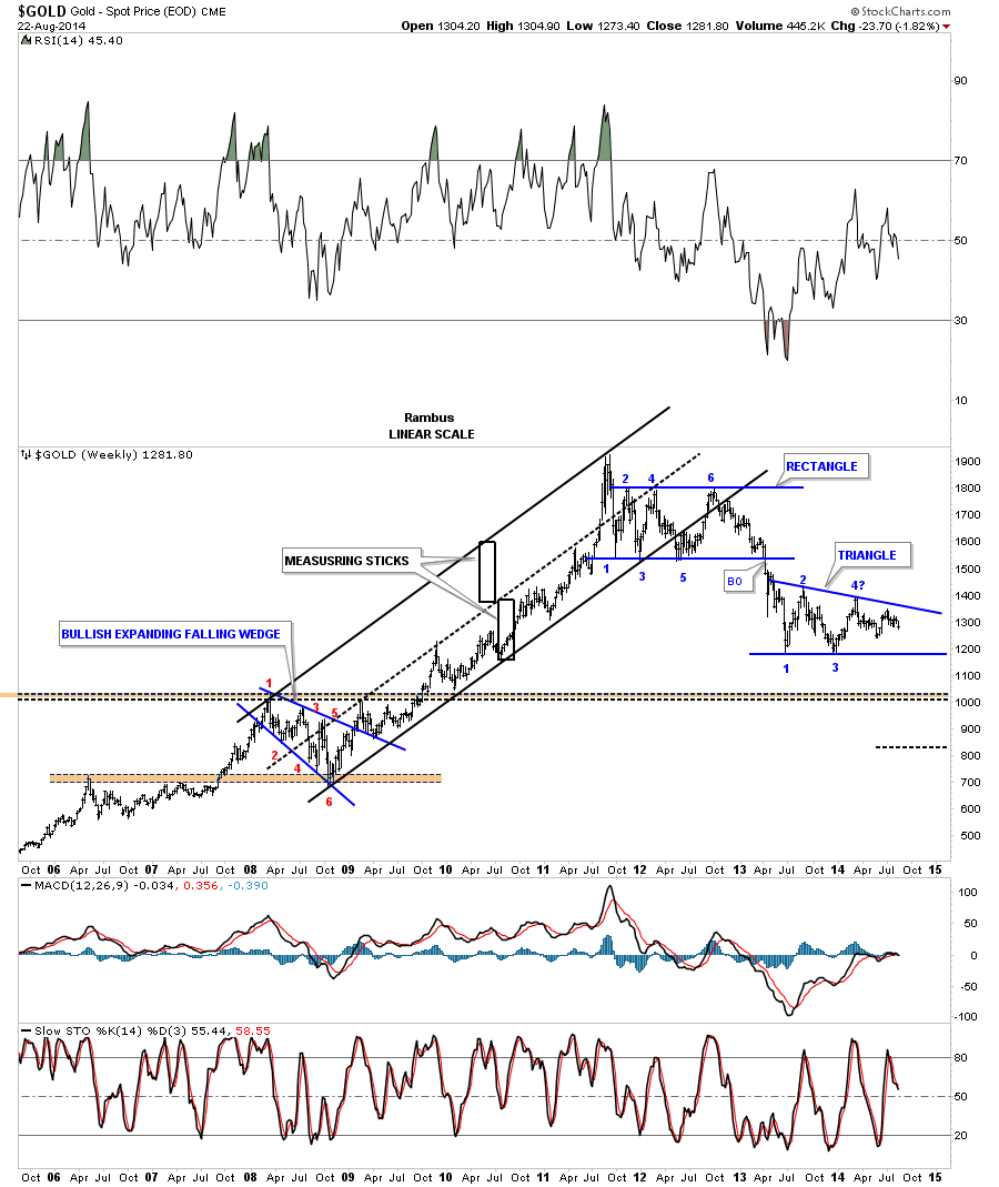
Before we leave this weekly chart for gold notice our current triangle that is working on its fourth reversal point. A touch of the bottom rail will confirm the pattern is a triangle. Note since the all time high made at 1920 in September of 2011 gold has produce lower lows and lower highs all the way down. The last little high gold made last month has so far failed to reach to top rail of the blue triangle. This could be a warning sign that gold is running out of gas.
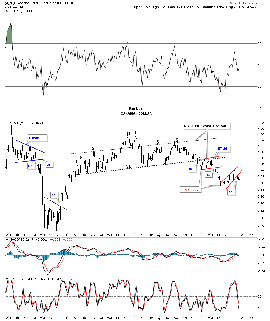
Next lets look at some different currencies to see if this rally in the US dollar is going to be just a flash in the pan or is there something bigger brewing. Its has been awhile since I showed you some of these different currencies but the general trend down is still in play. The CAD built out a massive H&S top that is very similar to the one the HUI built out. As you can see it built its first bear flag as the backtest to the neckline. It has now just finished up breaking out of another bear flag to the downside.
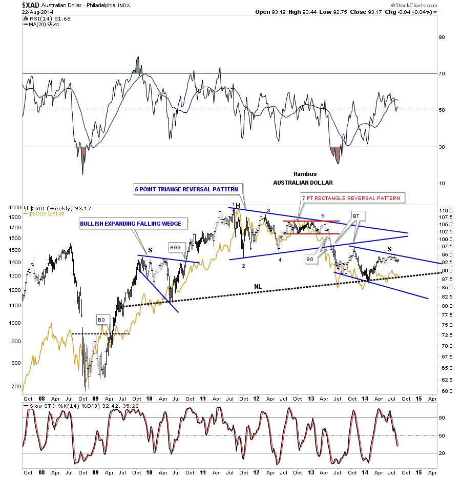
The XAD topped out with the blue 5 point triangle reversal pattern. Since the five point blue triangle reversal pattern, that reversed the uptrend, XAD maybe finishing up a right shoulder of a massive H&s top. I’ve overlaid gold on top of the XAD so you can see how they tend to move together.
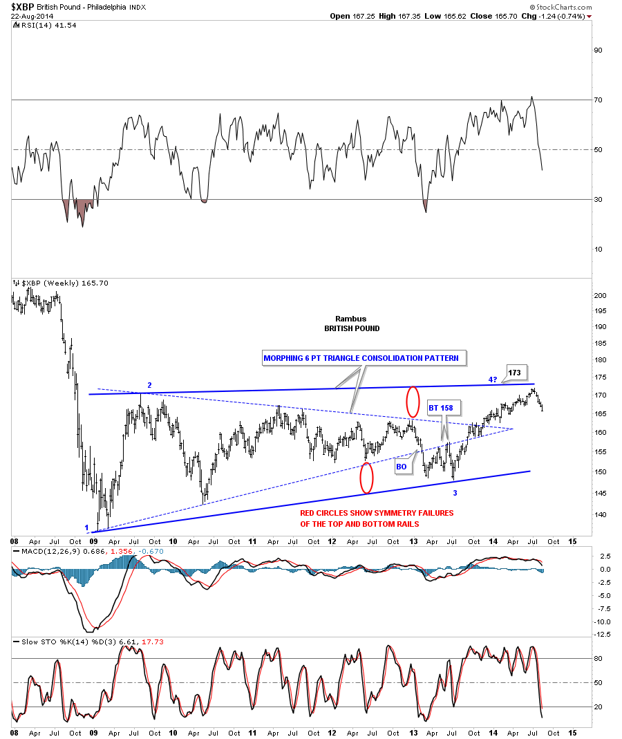
The last time I showed you this chart for the XBP was probably 6 months or longer ago in which I was showing you how the original 6 point dashed triangle was morphing into a bigger triangle. I have not touched this chart since the last time I posted it. The 6 point blue dashed triangle looked like the real deal at the time as the price action broke below the bottom rail, with several backtest to the underside. It threw us a curve ball which I was able to pick up on by the way these types of triangles morph into bigger triangles. Whenever I see a nice tight triangle like the blue dashed triangle, it’s rare that they don’t play out in the expected move, in this case down. This is where I have shown you in the past how a morphing triangle develops by showing you the morphing process using the red circles. The red circles are exactly the same size that measures the false breakout of the bottom rail which we will see a similar false breakout of the top rail. It’s just a symmetry thing. The markets love symmetry. As you can see I was looking for the top to come in at reversal point #4 at 173. The actual high came in at 171.92 or just about a point lower than what I was looking for. I will now go ahead and tweak the top rail to the most recent high that still shows a triangle consolidation pattern, just as we thought before the morphing process, but now it just a bit bigger. Note the ping pong action in the apex of the blue dashed triangle. This happens a lot during the morphing process.
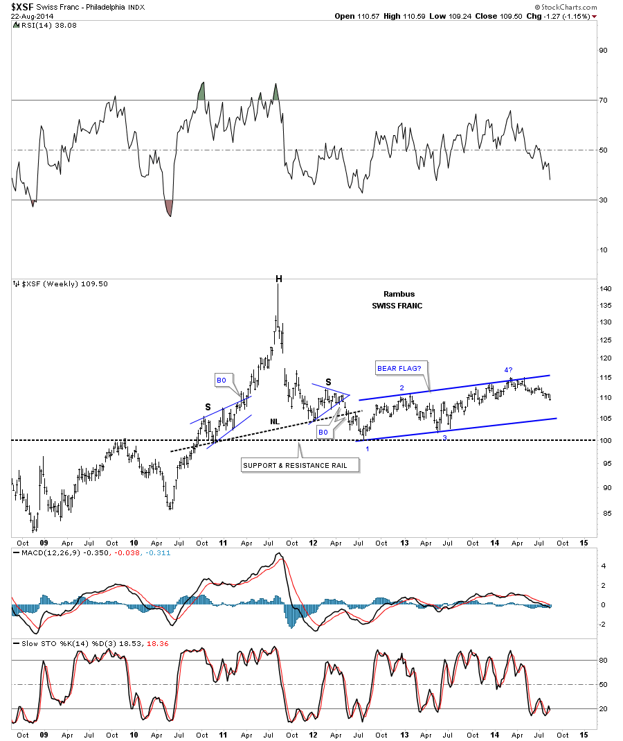
Lets take a look at the XSF that has been building out a rising channel for 2 years now that has the potential 4th reversal point in place. The pattern won’t be complete until the bottom blue rail is broken to the downside. Note the failed H&S top that looked so promising when it was developing.
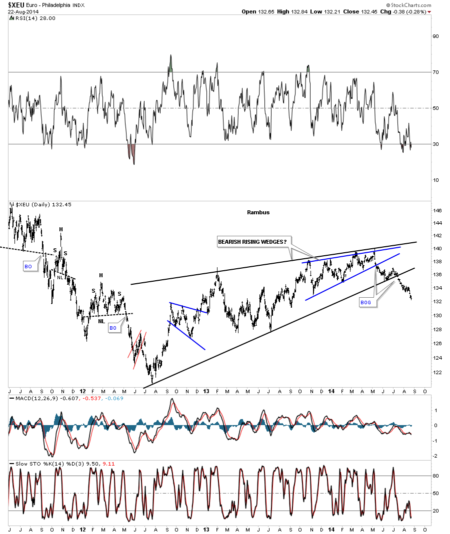
Lets now look at the two currencies that will affect the US dollar the most, the EURO and the Japaneses Yen. Lets start with the euro that broke out of two bearish rising wedges, one inside the bigger rising wedge and the big rising wedge, each accompanied by a breakout gap. Keep in mind when these big patterns are complete is when you get your impulse moves which it looks like the euro is now in. Note the little pause just before the euro broke below that bottom black rail. This is what I like to see.
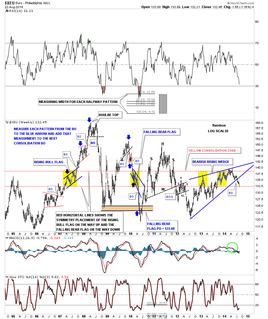
The weekly chart shows the two year bearish rising wedges that broke out six weeks or so ago. For those that like to play with Chartology you will not find a better chart that shows measured moves and symmetry. The directions are on the chart if you want to play with the uptrend that formed in 2006 to 2008 and the downtrend that formed during the decline that occurred in 2010. The distance between each consolidation going up and coming down were all exactly the same height. The red horizontal dashed lines shows the center of the price action. In 2007 the euro built out a bullish rising flag on the way up. During its decline in 2010 the euro built out a bearish falling flag in the exact same location. Anyway it’s a good study in measured moves and symmetry.
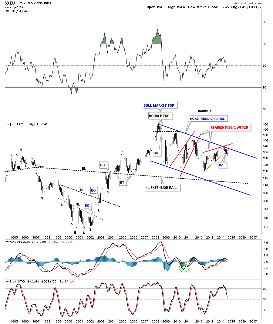
The very long term chart for the euro shows the blue downtrend channel that began forming in 2008. The euro is now in month number 2 since it broke out of the red bearish rising wedge as shown on the weekly chart above. There are two possible areas of support that could come into play down the road. The bottom rail of the blue downtrend channel and the neckline extension rail taken off the massive inverse H&S bottom made at the turn of the century.
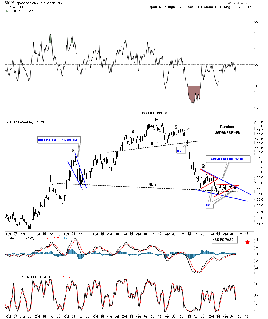
Now I would like to expand on the Japaneses Yen chart I showed you Friday night. Below is the same chart I posted Friday night that shows it just broke out of a bearish falling wedge which was the second pattern that has formed inside the much bigger falling wedge that started to build out in May of 2013. The first pattern to form inside the big black falling wedge was the blue triangle that did a little morphing as shown by the red circles. On this chart you can see I have the big black falling wedge labeled as a bearish falling wedge. You are probably wondering why, which I will show you in a bit.

The long term weekly chart shows a large H&S top that formed back in 2011 and 2012. Note the impulse move once the H&S neckline was broken to the downside. The decline stopped right where our black bearish falling wedge started to form back in May of 2013 right after the precious metals stocks collapsed in April. What I think is happening, and have said so before when I posted this chart, is that the Yen is forming a massive H&S top. The blue bearish falling wedge is the right shoulder that matches the blue bullish falling wedge that formed the left shoulder. Note the very last bar on the chart that shows the yen closed right on the potential neckline last week.
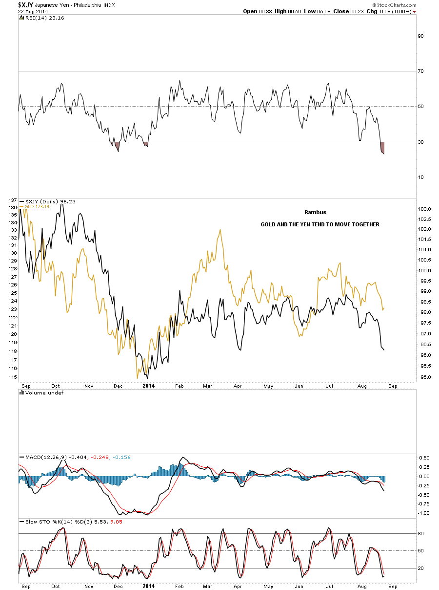
You maybe asking yourself, whats the big deal if the Yen is putting in a large H&S top? On the chart below I’ve overlaid gold on top of the yen so you can see what it looks like and why the potential H&S top is very important to the big picture. It’s not a perfect correlation but it’s pretty close.
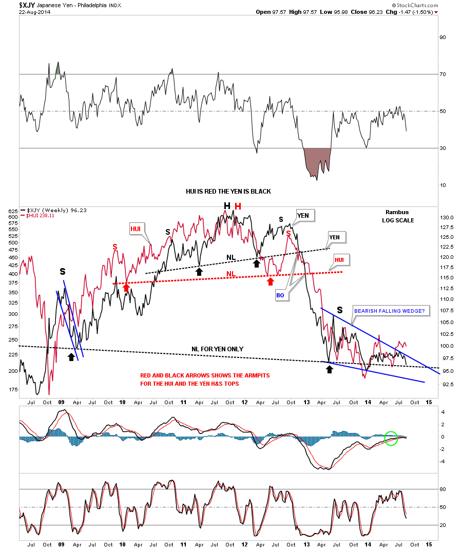
Lets take it one step further and see how the yen correlates with the HUI, the precious metals stocks. The HUI is in red and the Yen is in black on the chart below. Again not a perfect correlation but pretty close. I wouldn’t want to bet against it unless it was for a very short term scalp. Note the price action for both stocks once the right shoulders were completed back in late 2012 and the first half of 2013.
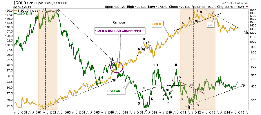
Below is a chart that I’ve shown you many times in the past where I overlaid gold on top of the US dollar. Since gold topped out in 2011 it has been trending down while the US dollar has been trending up.
This next chart is a multi combo chart that shows how gold is trading vs many of the important currencies out there. If we ever see gold trading above all those black dashed support and resistance lines I will have to reconsider the bearish case for the PM complex but until that happens the trend seems to be down. Notice how the black support and resistance lines have been backtested from below telling us that those lines are hot.

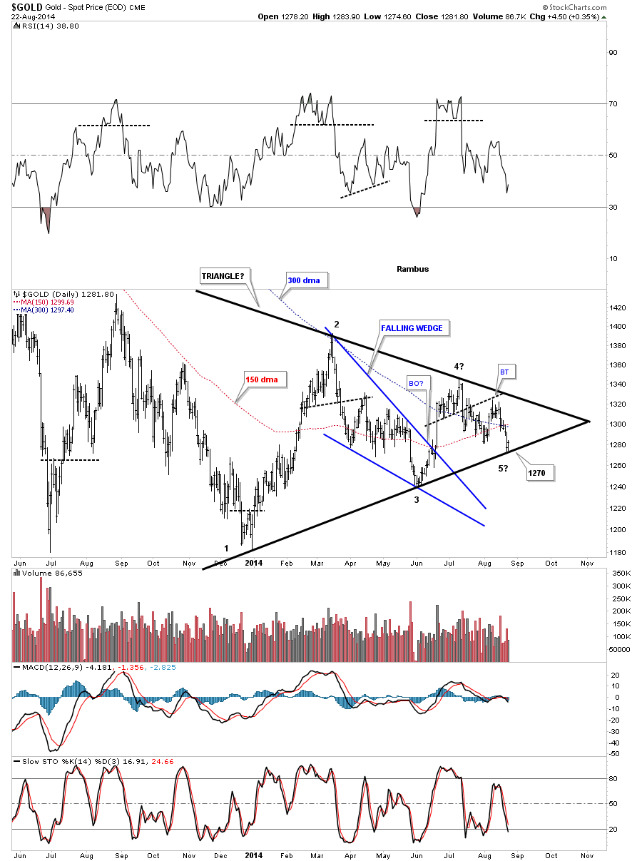
Below is gold’s triangle we’ve been following. I showed you the bottom rail support would come in around the 1270 area. Last weeks low was 1274. So far this is a text book test of the bottom rail. Initially I like to see an important trendline hit and have a small bounce telling us the trendline is still hot. After just a small bounce we need to see the next decline take out the bottom rail with preferably a nice long bar on increasing volume. If you’re a bull you want to see the bottom trendline hold and a 5th reversal point form that will take the price action up to the top rail. A break of the top rail would then strongly suggest the triangle is a 5 point triangle reversal pattern to the upside.
This last chart for tonight shows the entire history for the HUI. I have shown you the big black bearish rising wedge but not the blue triangle because I didn’t know what type of pattern would form below the massive H&S top and the bearish rising wedge. This blue triangle has the same reversal points as gold. Notice on the gold chart above the price action is bouncing off of the bottom trendline on its triangle while the HUI is bouncing off its top rail of its potential triangle. Previously the precious metals stocks led the way down. If the triangle ends up being a consolidation pattern to the downside it looks like gold is going to lead the way lower with the PM stocks following behind. I believe we are as close as we’ve been, since this one year plus correction started, to actually follow through on the next impulse move down, which will take the PM complex to new lows for this bear market. Silver is sitting on a potential massive H&S top neckline also. It’s impossible to pin point the exact moment this next impulse leg down will begin but we have enough Chartology to strongly suggest the next major move for the precious metals complex will be down and not up. Keep a close eye on the bottom rail of gold’s triangle for the first big clue that the PM complex is headed lower. All the best…Rambus