
Over the last several weeks I’ve been posting many charts showing massive H&S tops in many sectors of the markets in which I’m trying to paint the big picture for you on what to expect in the longer term time frame. I don’t know how many of you are grasping the big picture and what it means going forward but the big picture should be your main focus unless you’re a day trader. It’s no coincidences that the US dollar is breaking out of a massive multi year base while the precious metals complex and commodities have been taking a beating. It’s happening right here and now as last weeks price action is confirming for me the next impulse move down has begun.
Lets start this Weekend Report by looking at two more massive H&S tops, one on silver and the other on gold. I’ve been showing these potential H&S tops for the better part of a year now if not longer. At some point, if you’re right on your call, the day will come when you finally see the breakout. It may seem like an eternity sometimes but having patience and not giving up when nothing is broken can give you an early heads up to the next big move.
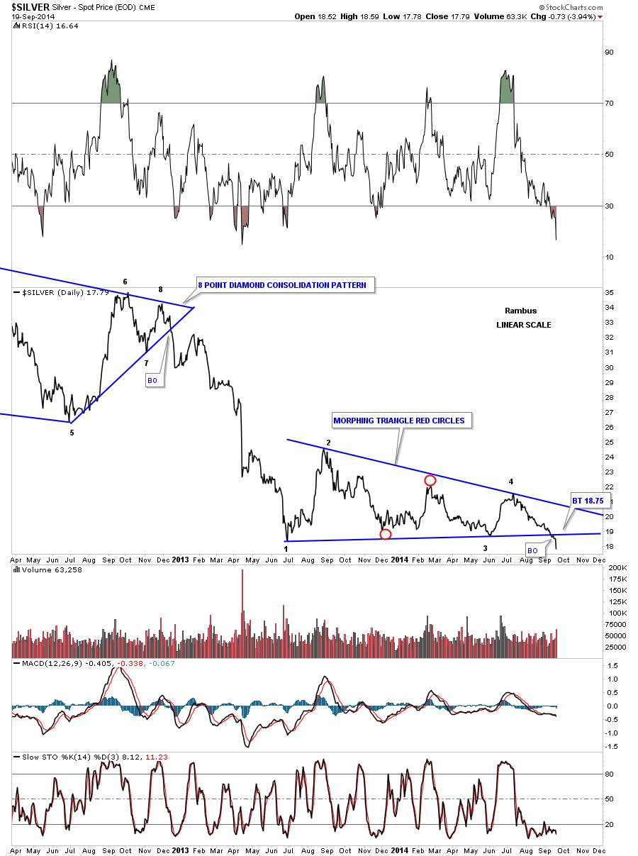
Silver’s day came this past week on Friday when it was down 73 cents on a nice increase in volume. Big moves like Friday”s don’t come around very often but when they do you have to take notice. Usually when I see a big move like that it generally means there is a breakout and that is exactly what silver is doing. After nearly 15 months or so of building out a morphing triangle the real breakout move came on Friday even tho there was a small breakout and backtest earlier in the week. Below is the daily line chart that shows the morphing triangle, red circles, and the real breakout on Friday. The only question is will we see a backtest before silver moves lower?
Now lets take a look at silver’s massive H&S top on the monthly chart. As you can plainly see the breakout is taking place right now. We still have another seven days of trading left for the month of September before the monthly bar is completed. There is not a lot of support below the neckline until major support shows up at the brown shaded support and resistance zone around the 8.50 area. I wonder how many precious metals investors will hold on for a round trip, back to the beginning of the bull market, that will be asking themselves in the future, why didn’t I sell out a long time ago. I know the same thing happened in 1980 when most thought the bull market wasn’t over until it was too late. You can also throw in the 2000 top in the stock market bubble as well.
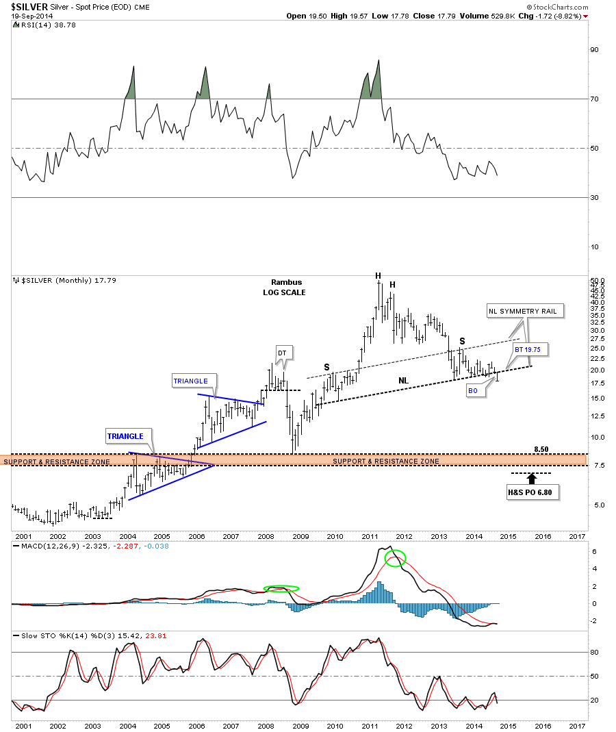
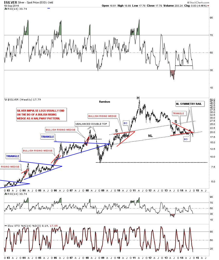
Below is a weekly chart for silver that shows some of the Chartology that was made during the bull market years to the present.
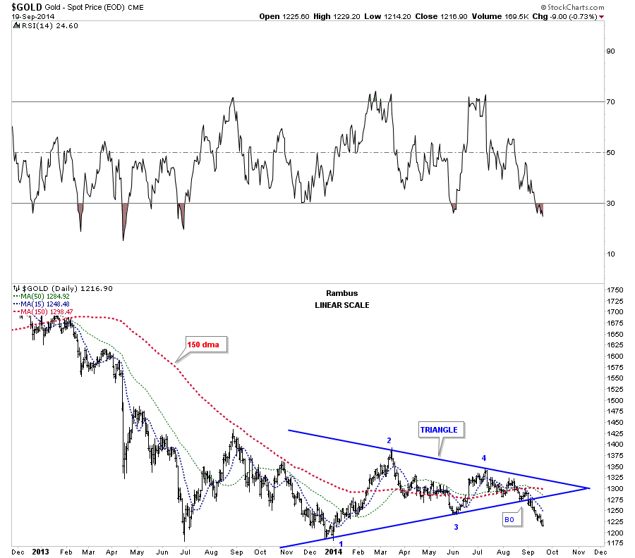
Lets now take a look at some gold charts that have actually been showing us the way lower. Gold was the first to breakout from its triangle consolidation pattern several weeks ago while silver and the PM stock indexes were still building out their respective triangles. You can see the all important 150 dma is now starting to roll over after rising slightly since June of this year.
Below is a weekly chart for gold that shows a downtrend channel where the top rail was being tested over the last several months. With the breakout of the red triangle the impulse move is underway that should take gold down to a minimum of the 985 area using the red triangle as a halfway pattern. The all important 65 wma has been doing a good job of holding resistance over the last several years.
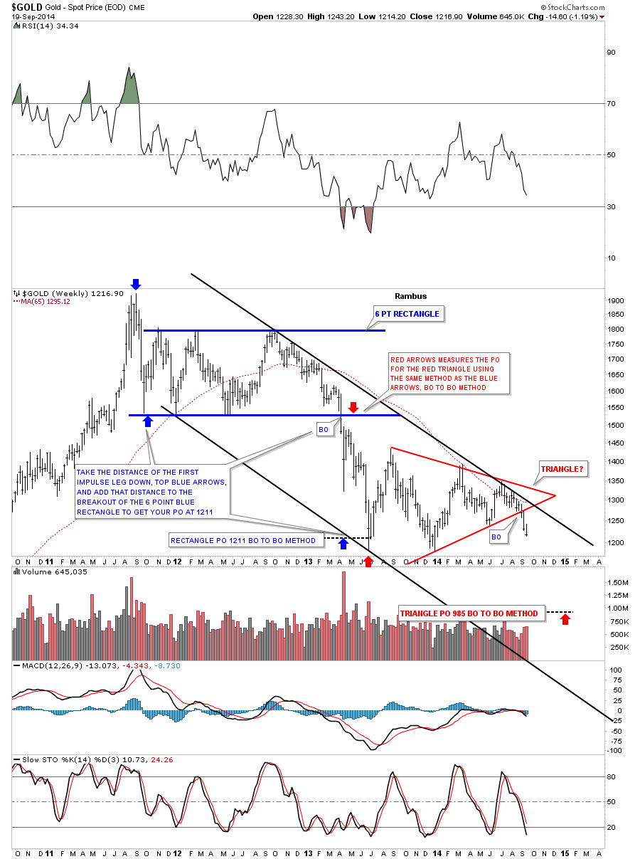
Below is gold’s massive H&S top which is strongly testing the neckline right now. The price objective for the H&S top would be down to the 700 area which was the low for the 2008 crash. Note the MACD that is starting to curl back down along with the slow stoch.

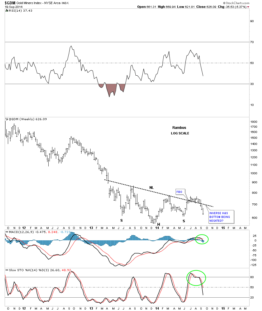
As I mentioned at the beginning of this post, I believe last week marked the beginning of the next impulse move down. I want to focus in on the GDM as a proxy for the precious metals stocks indexes. The first chart is a daily candle stick chart that shows the reverse symmetry down and all the back candles I said we would see if we were in a true impulse move lower. So far so good.

Below is a daily line chart that really shows the reverse symmetry taking place right now.
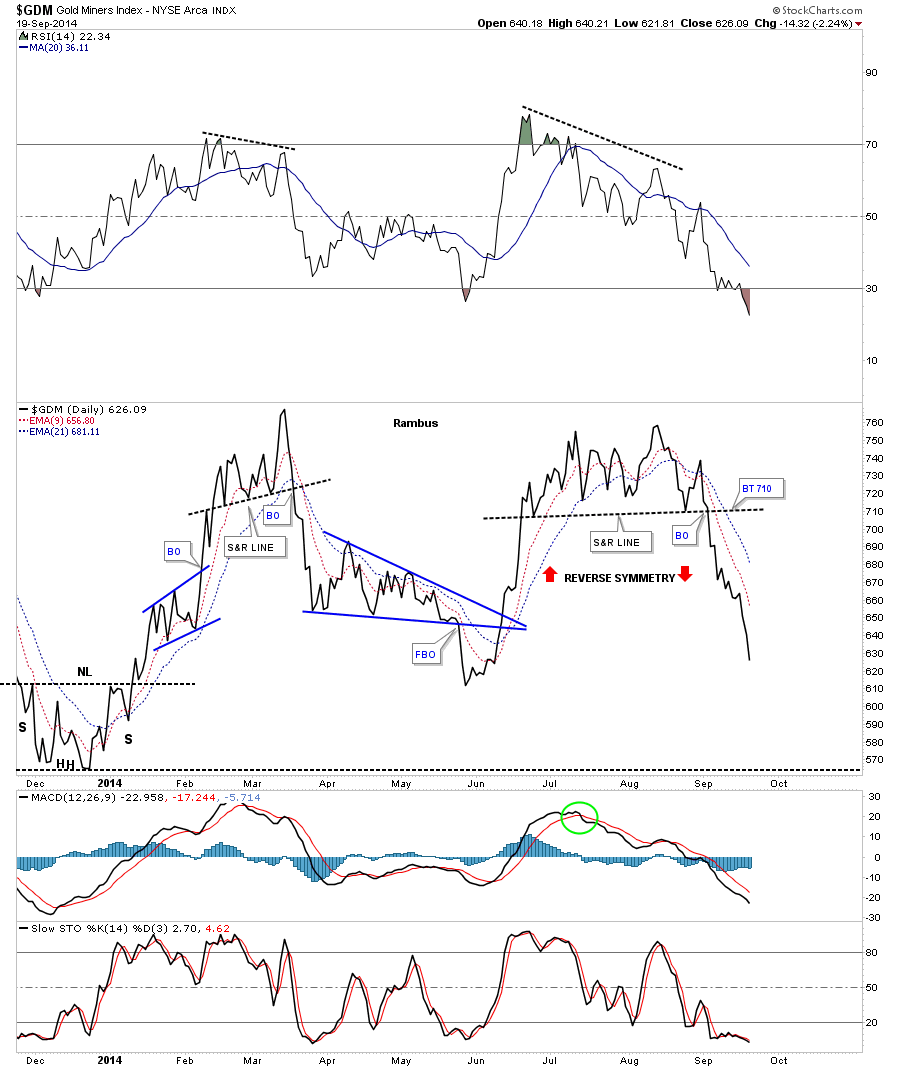
This next daily chart for GDM shows it breaking out from its triangle consolidation pattern late last week. A backtest would come in around the 645 area.
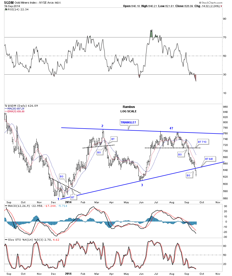
These next few chart will show you just how important this triangle consolidation patten is. The first weekly chart shows the massive H&S top and our current blue triangle consolidation pattern that is finally breaking out to the downside. Note how the oversold condition has been worked off on the RSI at the top of the chart. Also notice how the MACD and the slow stoch have rolled over and are headed down.
I would like to update you on that potential inverse H&S bottom that kept us in limbo for close to 8 weeks. I had to respect the fact that the price action broke above that potential neckline which held support for 8 weeks or so. Once that neckline failed to hold support anymore it was a green light for me that the failed breakout would lead to a big move in the opposite direction which is now occurring. I also said that a lot of gold bugs were looking at the potential neckline as their savior in which a new bull market would be launched and if that neckline failed we would start to see them exiting their longs positions. What everyone wants no one gets.
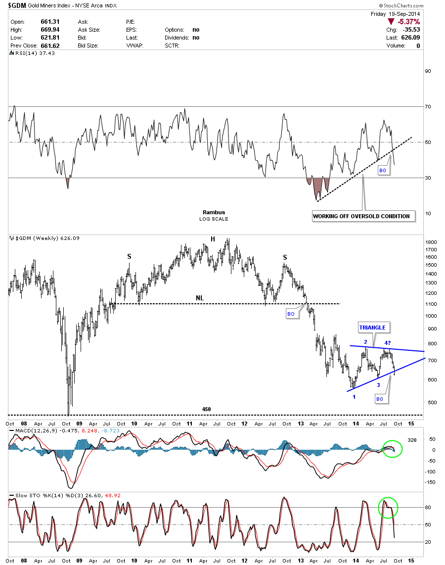
This last chart for GDM shows you how I think things may play out over the next year or so. First there is some interesting symmetry with the inverse H&S bottom that formed at the beginning of the bull market in 2000. What is interesting is that the H&S top that formed in 2011 is the exact same height as the 2000 inverse H&S bottom. They are both reversal patterns that reversed many years of a trend that had been in place.
I would like to paint a picture of how this bear market may unfold over time. Again reverse symmetry will play a key role. I drew in two thin black dashed horizontal lines, one at 540 which was the bottom of the blue triangle that was made in 2005 which shows where our current blue triangle found a bottom just slightly higher than 540. The lower thin black dashed horizontal line comes in at 350 which is the bottom of the blue triangle that was made in 2002. What is interesting about the 350 area is that’s close to where our current blue triangle has a price objective if it plays out as a halfway pattern to the downside. The brown shade support and resistance shows where we could see this impulse move down find support between 320 and 350.
I drew in another blue triangle that could be the area for one last consolidation pattern to form before the bear market is finished. The blue triangle is only for the sake of showing you where a potential consolidation pattern may form. I have no idea if it will be a triangle, rectangle or a wedge of some type. One last note. During the bull market years the rallies lasted between four to six months once they broke out from their triangle consolidation patterns. If we see a similar time frame for the breakout of our current blue triangle I could see GDM hitting the 320 to 350 area sometime after the first of the year. At that point we could see one more consolidation pattern form before it’s all said and done.

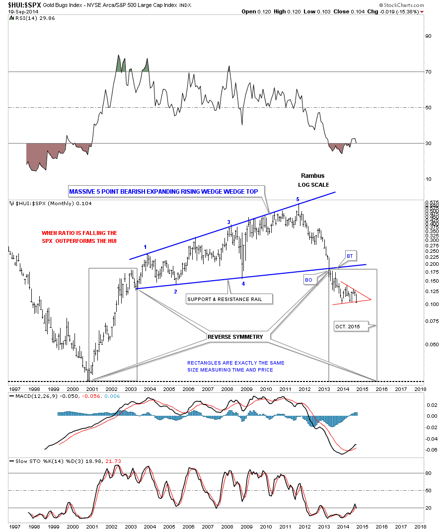
I would like to show you one last chart that I haven’t posted in awhile that is a ratio chart comparing the HUI to the SPX. The first time I posted this chart the ratio was just breaking down from that massive five point bearish expanding rising wedge. The 2011 high matches precisely the top in the precious metals complex and most. The two rectangles are the exact same size that measures time and price. If this ratio continues to play out as expected we could see a low in this ratio by October of 2015. The red triangle looks like it’s getting ready to break to the downside at any time now which would suggest a weak PM complex and a strong stock market on a relative basis.
I really think the evidence is piling up that is strongly suggesting that we are now in the next impulse leg down, not only in the precious metals complex, but commodities as well. It’s no coincidence that the US dollar is strong and is breaking out to the upside while we’re seeing weakness across the board in most commodities. One plus one is equaling two from a Chartology perspective. This is the time to get positioned and hang on for dear life. Trying to trade in and out of an impulse move will be unforgiving for most investors. As I have said many times before, you will be given every reason in the book to cover your short position, but for those that can stay on for the ride will be richly rewarded for their effort IMHO. All the best…Rambus