I just want to update some of the precious metals stock indexes since the breakdown from last Friday. Whenever there is a gap at an important trendline I always pay close attention as it might mean there is something bigger brewing. That big gap last Friday came at a most critical spot on the HUI chart.
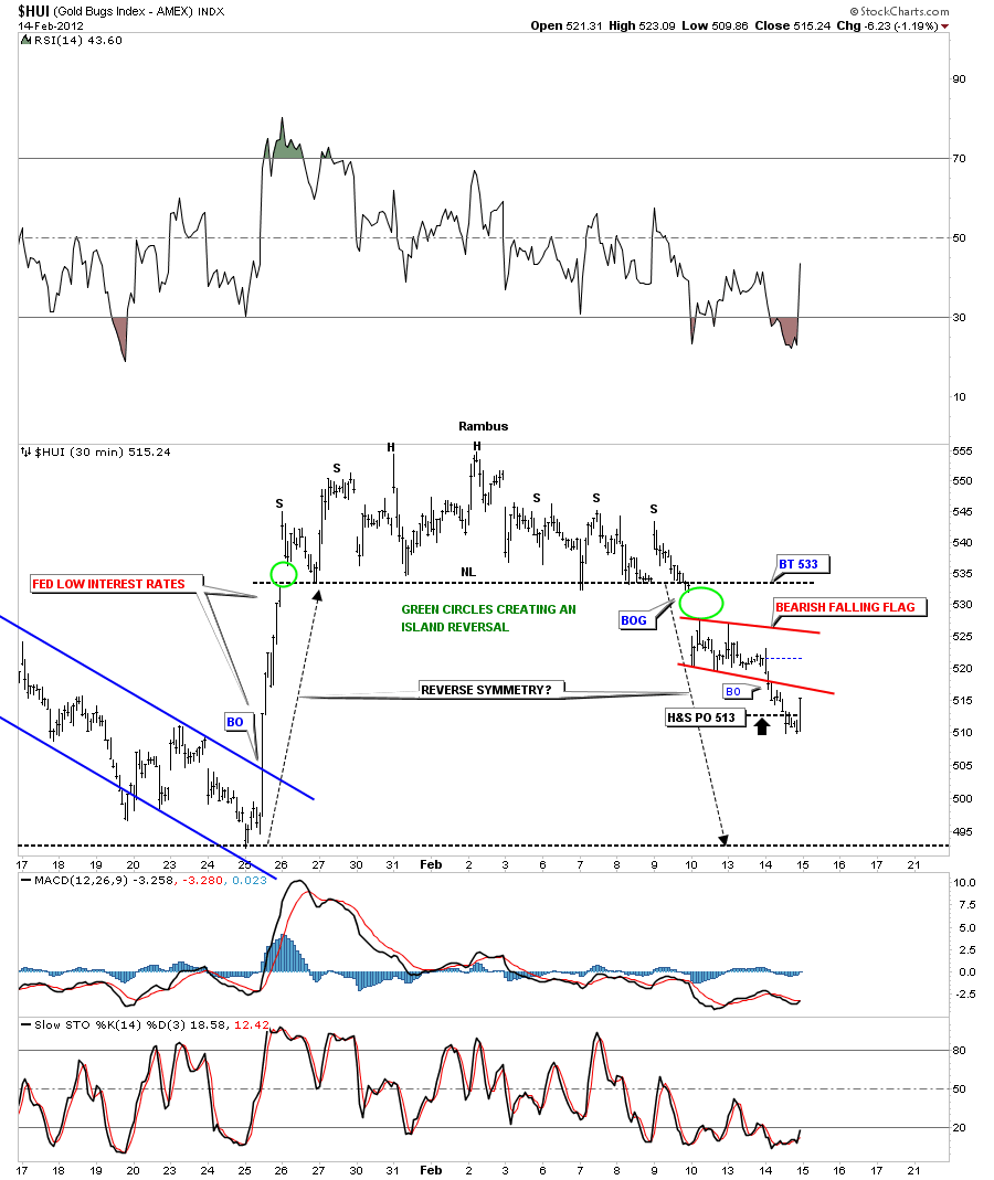
Below is a 30 minute chart I’ve been showing that has two gaps. One was made on the way up and the other one was made last Friday on the way down. Those two gaps, green circles on the chart below, show an island reversal pattern. You can call the top an unbalanced looking H&S or expanding triangle if you draw the trendlines alittle different. We hit the price objective this afternoon and got a good bounce.
HUI 30 minute island reversal with a H&S top.
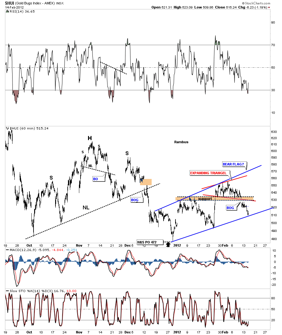
We are going to work our way out in time to put everything into perspective and see how these minute charts look in the big picture. Next is a 60 minute look that shows a possible bear flag. Also the top could be classified as an expanding triangle or an unbalanced H&S. The expanding triangle is pretty much what the other gold stock indexes formed. The brown area is where we were looking for support until the big gap down. That big gap took out the brown horizontal support zone and the bottom red rail of the expanding triangle. Today’s decline stopped at the bottom blue rail of the possible bear flag that has been forming since the December 29th low. So now we have broken support from the horizontal brown area and now we have support at the bottom rail of the possible bear flag. Keep that picture of the possible bear flag in the back of your mind until we start to look at the longer term charts.
HUI 60 minute look showing a big gap over the brown horizontal support zone and support at the bottom blue rail if possible bear flag.
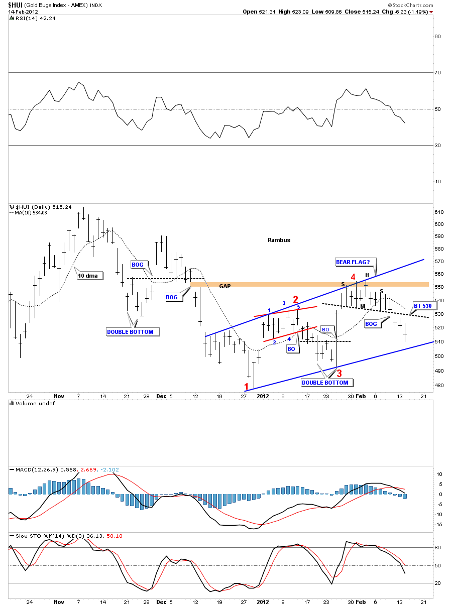
Next lets look at 5 month daily chart so you can see the possible bear flag. You can see the rally stalled out after the gap was closed around the 550 area, gap closed. We are also trading below the 10 dma which has offered decent support and resistance for the short term in the past. Its possible we may get a backtest to the neckline at the 530 area if the PM stocks show alittle strength over the next few days. The bottom blue rail is now our most important support zone.
HUI 5 month daily look showing the possible bear flag and a possible backtest to the neckline at 530.
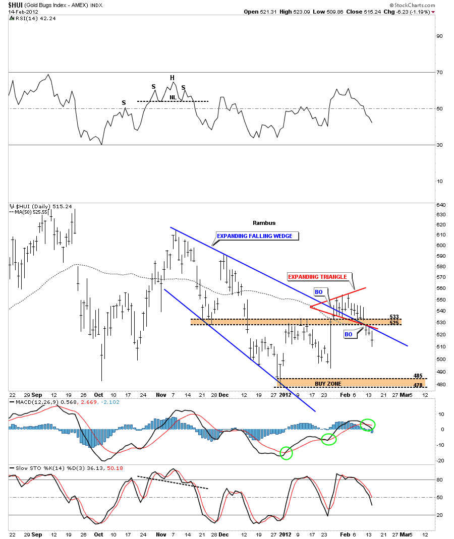
Lets look at another daily chart that show why the big gap last Friday was so negative to the overall bullish picture at that time. You can see we had a nice breakout move above the top blue rail of the expanding falling wedge. That big gap took out two critically important support zones in one move. You can see the price action on Friday and yesterday found resistance just below the blue top rail of the expanding falling wedge. It has reversed it’s role from support to now resistance. If we were in a strong bull move we shouldn’t have violated the top blue rail like we did. Also note the crossover of the MACD at the bottom of the chart.
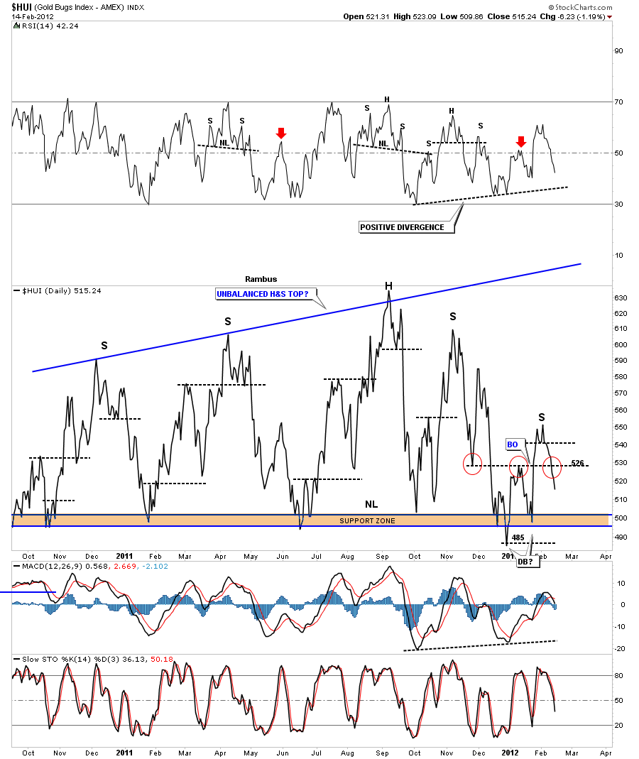
Next lets look at the line chart that shows another failed support zone from a horizontal perspective. The red circles shows how support turns into resistance and resistance into support. The HUI should have caught support at the horizontal rail at 526 but it didn’t happen. Another clue that shows the bears are in control for the time being. Note the little double top at our last little high. Also with the last move higher we could start to make a case that the whole big trading range over the last year or so could be an unbalanced H&S top as the line chart is showing. Nothing will be confirmed until we take out the lows if that happens. One step at a time.
HUI daily line chart showing failed horizontal support and possible unbalanced H&S top.
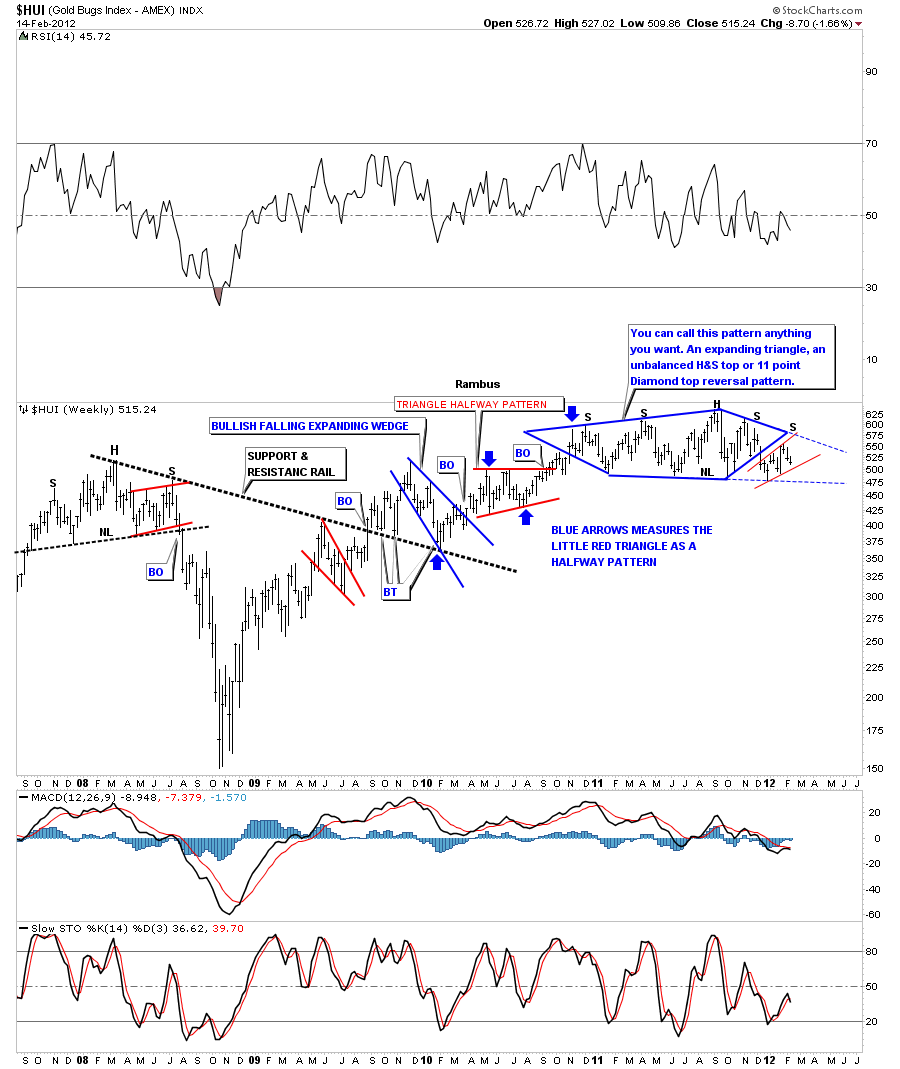
Lets step out to the weekly look and see what the big picture is looking like. You may recall this pattern of the diamond formation that I put on the back burner for awhile. Technically we broke out of the diamond, to the downside in December, and then we had the fed announcement that they were going to keep interest rates low for sometime. We got that one day wonder of a rally that looked like the real thing at the time but as you can see we have given up most of those gains. Note the 4th bar from the right side of the chart. That long bar was the fed announcement. I’ve extended the top and bottom rails of the diamond to show the real support and resistance, blue dashed rails. Note the little red uptrend channel at the end of the diamond. That is the same pattern I showed on the minute charts above. You can see how that little red pattern could be significant going forward. One last word here is that until we takeout the bottom blue dashed rail at the bottom of the diamond there is still hope that the situation can be saved. A break of the bottom dashed blue rail will confirm a top is in.
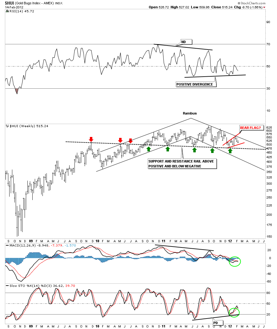
I want to show you one more chart that I posted last weekend of the HUI. This is a weekly chart that shows the importance of the support and resistance rail. Above it is positive and below it will be negative. We are still comfortably above it right now but going back to the the possible bear flag that I showed you on the minute charts that pattern could be a game changer if it breaks to the downside. Again we have to take it one step at a time and let the market tell us of her intent. The one thing is, I don’t want to be caught looking the other way if she has something else in mind. I know almost all precious metals analysis out there are super bullish right now. So many are basing there decisions on the 1970 bull market which may or man not work out. I can tell you that very few investors got out at the top back then as many were calling for much higher prices just like the tech bull market. Maybe we have several thousand points to go to the upside for gold and that would be fine because we will be able to look at the charts and jump back in if that is the case. But if the diamond turns out to be a top of some kind most won’t get out and will ride the whole wave down. I’m not saying the major top is in, I’m just trying to make you aware of the possibility that’s all. We still have alot of work to do before we jump to any conclusions. I’m not looking for a crash similar to 2008 but more of a grinding down type move similar to the left side of the chart as shown by the chart below.
HUI weekly diamond with possible bear flag forming.
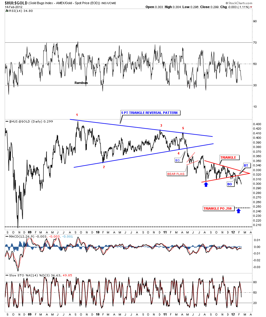
This last chart I want to show you is the HUI to GOLD ratio chart that shows you why you have felt so much pain in the precious metals stocks. Until this ratio starts to show some improvement the pain will not let up. As you can see we are very close to making a 3 year low where the gold stocks have underperformed gold.
So this is the situation right now. I think we have to be on the defensive right now since the breakout gap last Friday. This not to say the situation can’t be saved because it can. But we have to respect what the charts are saying. Until the the HUI to gold ratio starts to improve it will be tough sledding for the PM stocks. I will probably wait another day or two and see what develops before I make a decision on the model portfolio stocks. There’s an old expression that stated, better safe than sorry, and that couldn’t be more true in the stock markets. All the best Rambus

