
There seems to be a lot of confusion out there as to whether the stock markets are bullish or bearish. Is the Dow Jones in a topping pattern as so many analysis are suggesting? I’ve seen some charts that are calling the big trading range , on the Dow Jones going all the way back to the 2000 bull market top, THE JAWS OF DEATH. Man it doesn’t get anymore dire than that. As usual I have a different take on the JAWS OF DEATH, which I would like to share with you tonight .
Before we look at the first chart for the Dow Jones I need you to clear your mind of everything related to the stock markets in any shape or form. That means no Elliot Wave counts, Time Cycles, Gann Lines , volume studies, no indicators of any kind. Clear your mind of every article you’ve ever read on the stock markets, bullish or bearish. And last of all, NO CHARTOLOGY. I want you to look at just the pure price action without any bias whatsoever. From that point we can then start to see what is really happening to the Dow Jones and related markets .
This first chart is a long term monthly look at the Dow going back to 1997 with no annotations or indicators of any kind, just pure price action. When you look at this chart for the Dow I want you to look at the very last bar on the top right hand side of the chart. As you can see the Dow is making new, ALL TIME HIGHS, for the month of November. Folks this is not what a top or bear market looks like. This is as bullish a chart you will find anywhere. Regardless of all the reasons why the Dow should be topping or is going into a bear market simply don’t add up . Again look at the last bar on the top right hand side of the chart.
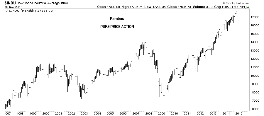
Now that you can see what I’m seeing lets put some Chartology on this chart and see what it looks like. If you prefer you can put on your own trading discipline and see what you come up with. One of the basic principals of charting is what the the definition of an uptrend or down trend is. An uptrend consists of higher lows and higher highs while a downtrend makes lower lows and lower highs. This is a simple concept to understand. On this monthly chart below I’ve added all the chart patterns, as I’ve seen them form through the years.
Lets start at the 2009 crash low that ended on a massive capitulation spike in volume. Who could have ever guessed that five years later the Dow would be making record highs in 2014. I remember the 2009 low very well, the world as we knew it was coming to an end. That has stuck with investors all these years and makes them fearful every time the Dow has a decent rally. In reality, the real world, nothing could be further from the truth over the last five years. The old saying, the stock markets like to climb a wall of worry, pertains perfectly in this case.
Getting back to what a basic uptrend is, you can see the Dow has fulfilled this requirement to a Tee. Higher highs and higher lows all the way up. Start at the 2009 crash low and follow the price action all the way up to our most recent high. I have said many times that gold’s bull market produced some of the best chart patterns I’ve ever seen in a bull market but the Dow is quickly catching up in that department. Once again notice the last bar on the top right hand side of the chart.
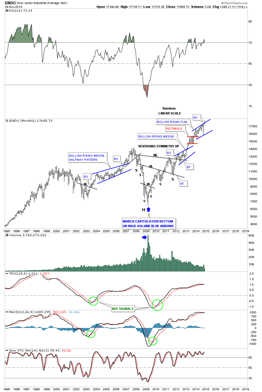
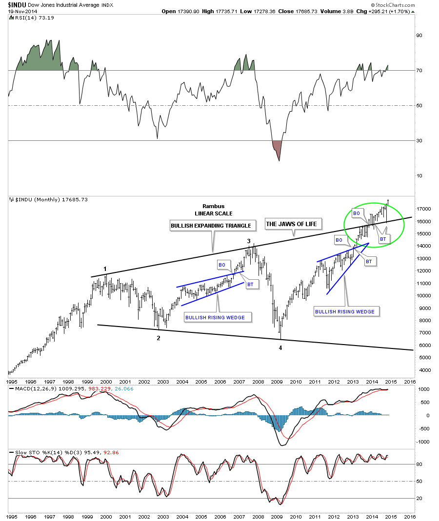
The next chart shows you what most chartists are calling the JAWS OF DEATH. From a Chartology perspective this is classic price action. Any trendline you put on a chart is either a support or resistance line. When the price is trading above a trendline it will act as support when touched from the top side and when the price action is trading below a trendline it will act as resistance. Eventually one of the trendlines will fail and that’s when you get your breakout.
If you look at a triangle consolidation pattern the top rail is resistance and the bottom rail is support. The price action trades between the two rails until either the bulls or the bears win out. In a bull market the bulls usually win the battle and in bear markets the bears usually win out. Looking at the chart below you can see it took six months of chopping action below the top rail of the Jaws of Life consolidation pattern before the Dow was able to overcome that strong resistance rail, as shown by the BO (Break Out) annotation. The Dow then spent about a year trading above that, what had been a resistance rail, to now a support rail. This is a perfect example of what happens when, in this case, the bulls win the battle, resistance turns into support. Note the two backtests, BT, that touched the top rail of the Jaws of Life from the topside.
You may recall last month when the markets were having a tough time of it and everyone was talking bear market. Note where the October low hit. Dead on the top rail of the Jaws of Life. …Let that sink in for a moment….
Dead On !
A rapid waterfall 10% move to precisely the breakout point . Mr. Market was just checking back from above .At Rambus Chartology we were hoping and waiting for a chance to get on board . But we had to be nimble. Mr. Market did not hang around for a millisecond, in the grand scheme of things . A small head and shoulders pattern on the minute charts was the only signal he gave and fortunately we pounced on it in our General Market Leveraged ETF Trading Portfolio .
This tells us that is one hot rail to be respected. It’s very simple. Above that top rail is bullish and below is bearish. Until that top rail of the Jaws of Life pattern is broken to the downside, one has to be bullish on the longer term time frame, as this massive 14 year consolidation pattern is just breaking out. Well its been breaking out for a year now but it looks like all the work is done and the next big impulse move up is ahead of us. Again notice the last bar on the top right hand side of the chart.
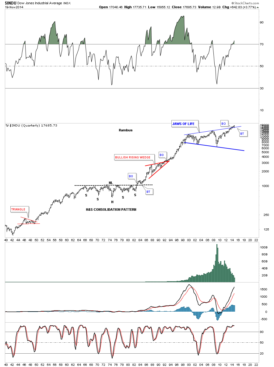
A 75 YEAR BULL MARKET ? ARE YOU SERIOUS ?
Yes Virginia I am .
Next lets put our Jaws of Life in perspective by looking at a 75 year chart for the Dow Jones. I know some of our older members will remember the 1970’s period when it looked like the world was coming to an end with inflation and rising interest rates going through the roof. That period on the chart carved out a massive H&S consolation pattern complete with a breakout and backtest before the bull market of a lifetime began. You can see our Jaws of Life consolidation pattern that is just breaking out at the top of the chart. Are we at the equivalent in time to the 1982 period for the Dow Jones? Few believed back in 1982 that a bull market was just getting started. It really wasn’t until the mid 90’s that everyone finally figured it out which led to the parabolic blow off. Followed by our just completed 14 year Jaws of Life consolidation .
Lets look at the Dow’s Little brother , the SPX. As you can see the SPX has already broken out of its massive flat top triangle , almost two years ago already! If you focus in on the breakout area you will see there was one quick backtest shortly after the breakout and the SPX hasn’t looked back since.
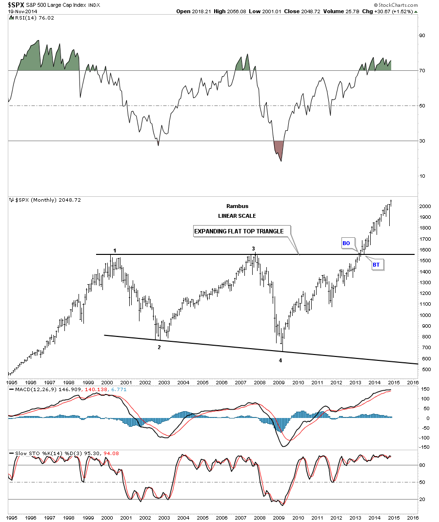
Lets look at the 30 year chart for the SPX that shows the beautiful flat top triangle consolidation pattern with four complete reversal points. If you compare our current price action, since the 2009 crash low to the bull market rally back in the 80’s and 90’s, separated buy the red bullish rising wedge, you can see the price action just seems to keep rising relentlessly with only small corrections along the way, leaving many retail investors staring from the sidelines in awe !
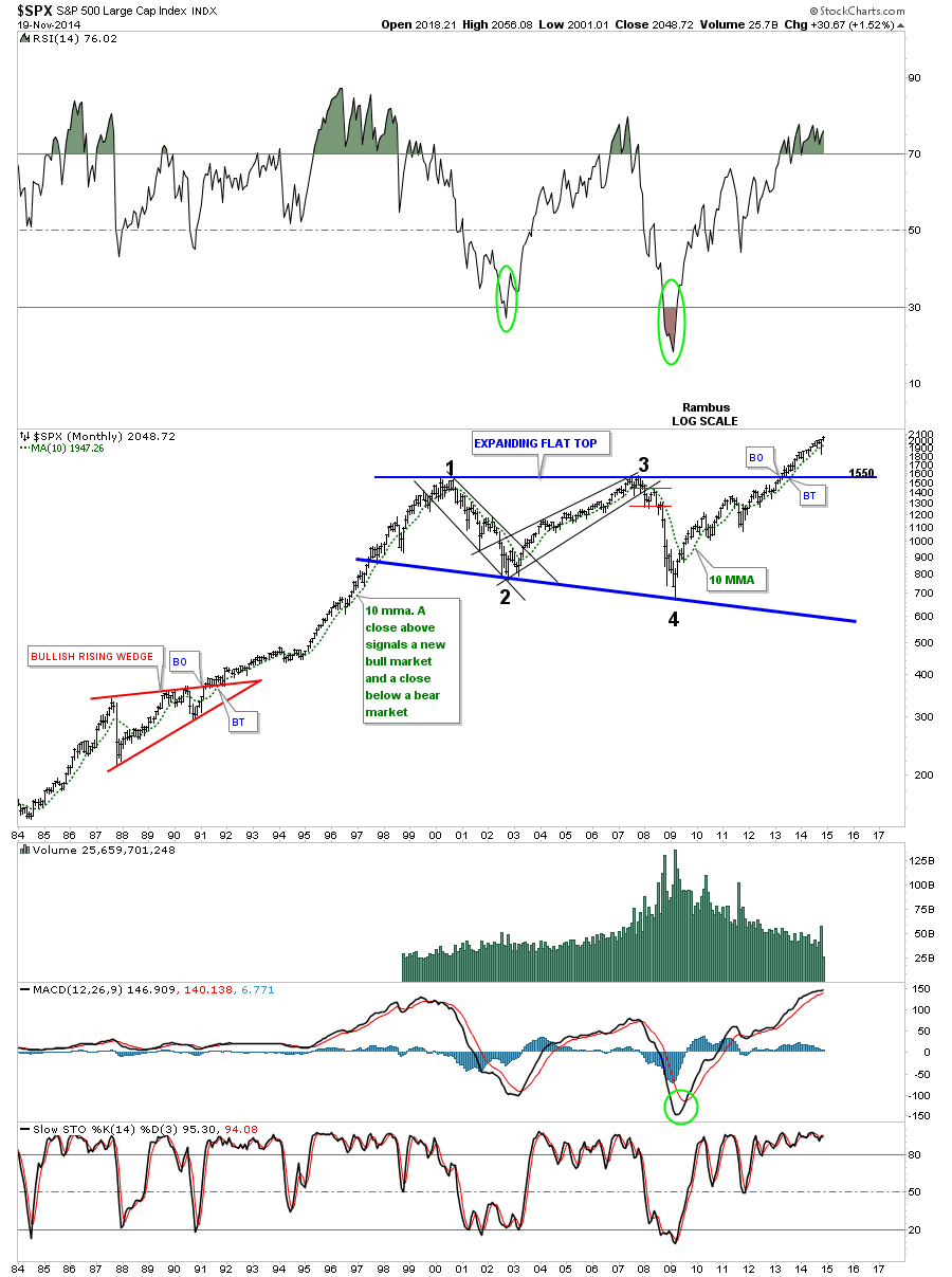
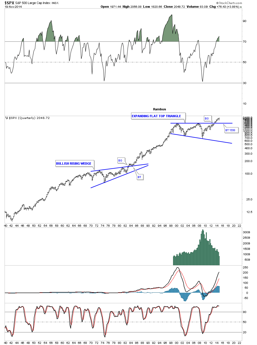
Looking at the 75 year chart for the SPX you can see how our current flat top triangle fits into the big picture. As in any time frame an uptrend is a series of higher highs and higher lows. For the most part we can call this a massive 75 year uptrend.
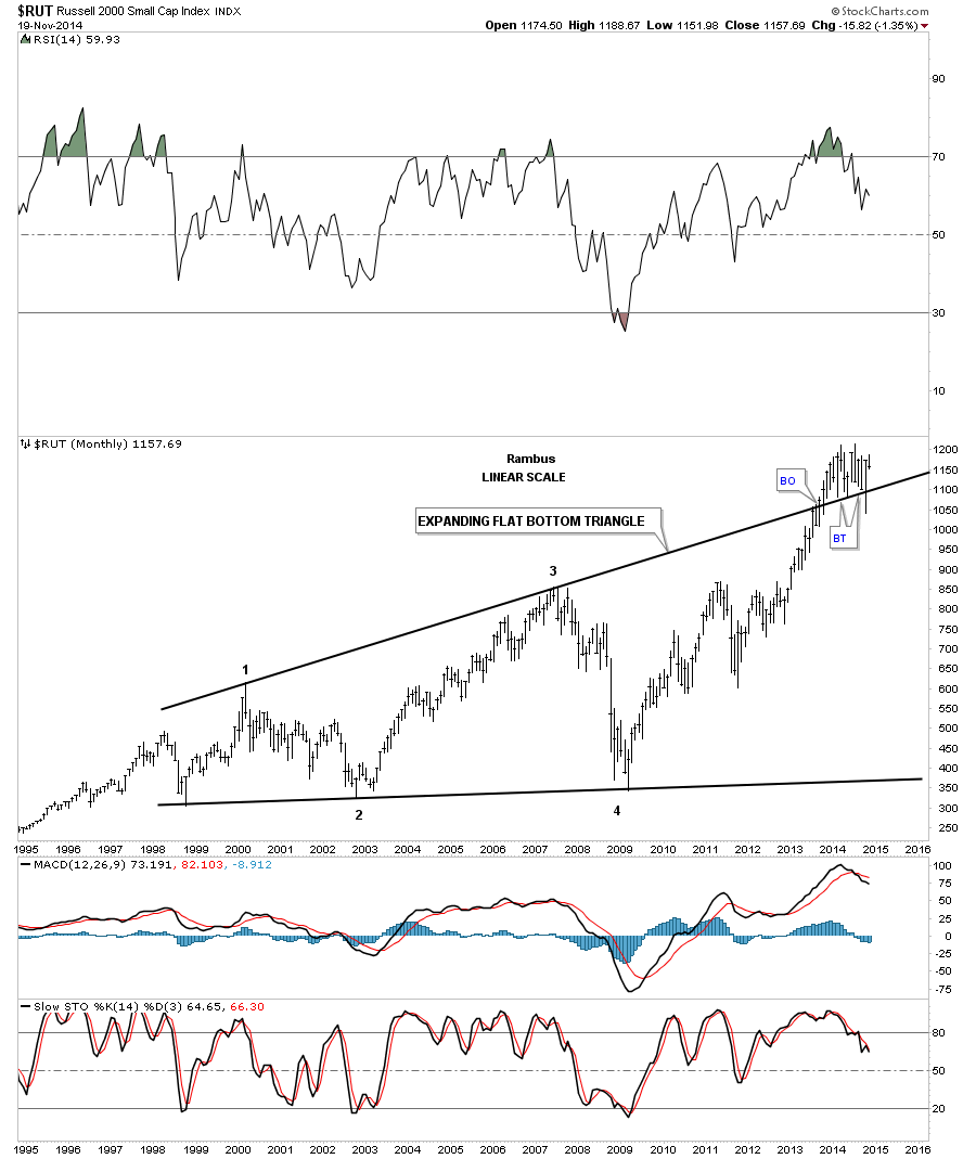
Lets look at one last chart which will be for the RUSSEL 2000 small cap stock index. It to has broken out above its top rail of a 14 year expanding flat bottom triangle and is still in the process of the backtesting the top rail from above.
As these charts above show we’re at an interesting juncture right now in regards to the stock markets. If one has the discipline and courage to buy the strongest stocks or etfs and hold them for several years or longer they will be well rewarded for their efforts in the future in my opinion. I can tell you it’s never easy to hold on during a bull market as every little correction will seem like the next bear market is beginning. There were some outrages profits made during that last secular bull market in the 80’s and 90’s for those that bought the right stocks, especially in the tech sector, and held on for the ride of a life time. No one knows how long our current five year bull market will go on but by the looks of those really big consolidation pattens, that I showed you above, it’s not going to be a flash in the pan type of move. The bigger the consolidation pattern the bigger the move that follows.
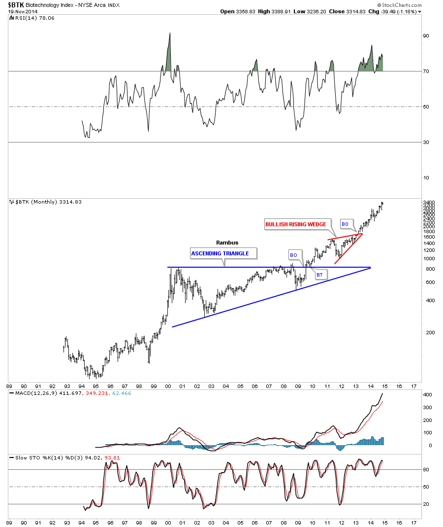
I want to leave you with one last long term chart for the BTK (Biotec Index) that has been the leader in this bull market and has a similar big blue consolidation pattern to the ones I just showed you above. I expect the Dow Jones and the other US stock markets will have a similar look when they really get going. Will you be watching or Participating ?
All the best…Rambus
PS: Tomorrow I will show you some charts on some of the Kamikaze Stocks that you haven’t seen yet. These are fresh out of the oven…