So far this week the PM complex has come under some selling pressure and is testing some very important support and resistance lines. Is this the start of the long awaited impulse move down to new lows for this sector? Lets look at some charts and see where we are in the short to longer term perspective.
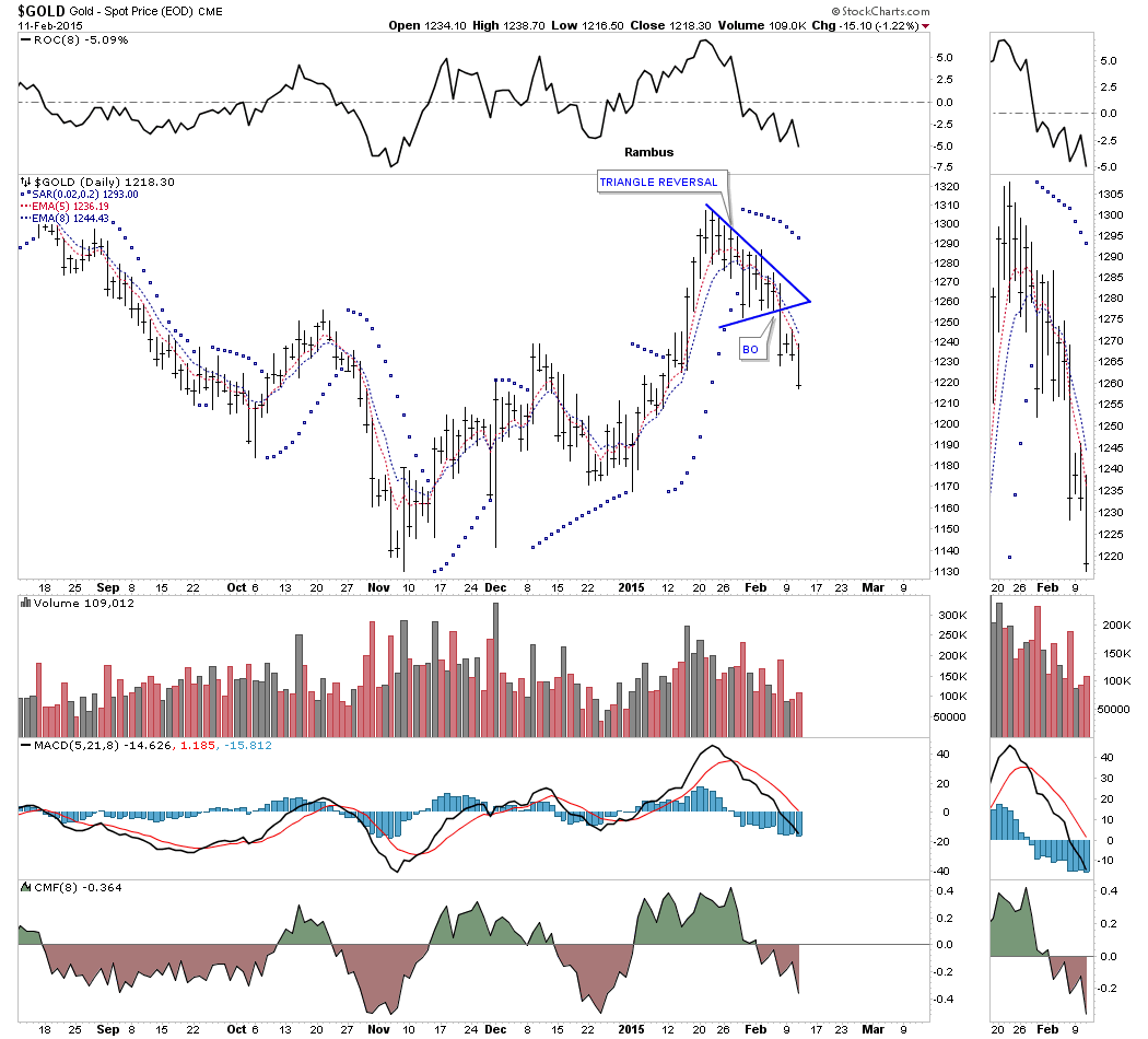
The first chart tonight is a daily look at gold that shows a triangle reversal pattern that formed at the last high. This is not a textbook example of a triangle reversal pattern but when you look at the price action it makes sense. Note the big long bar that was made four days ago when gold broke below the bottom rail and the increase in volume. When I see a big long bar or a gap of an important trendline I always take notice as one or both of these events can take place during a breakout. On the very short term the 5 ema crossed below the 8 ema just before the breakout. This chart also shows the PSAR has been on a sell signal for several weeks now.
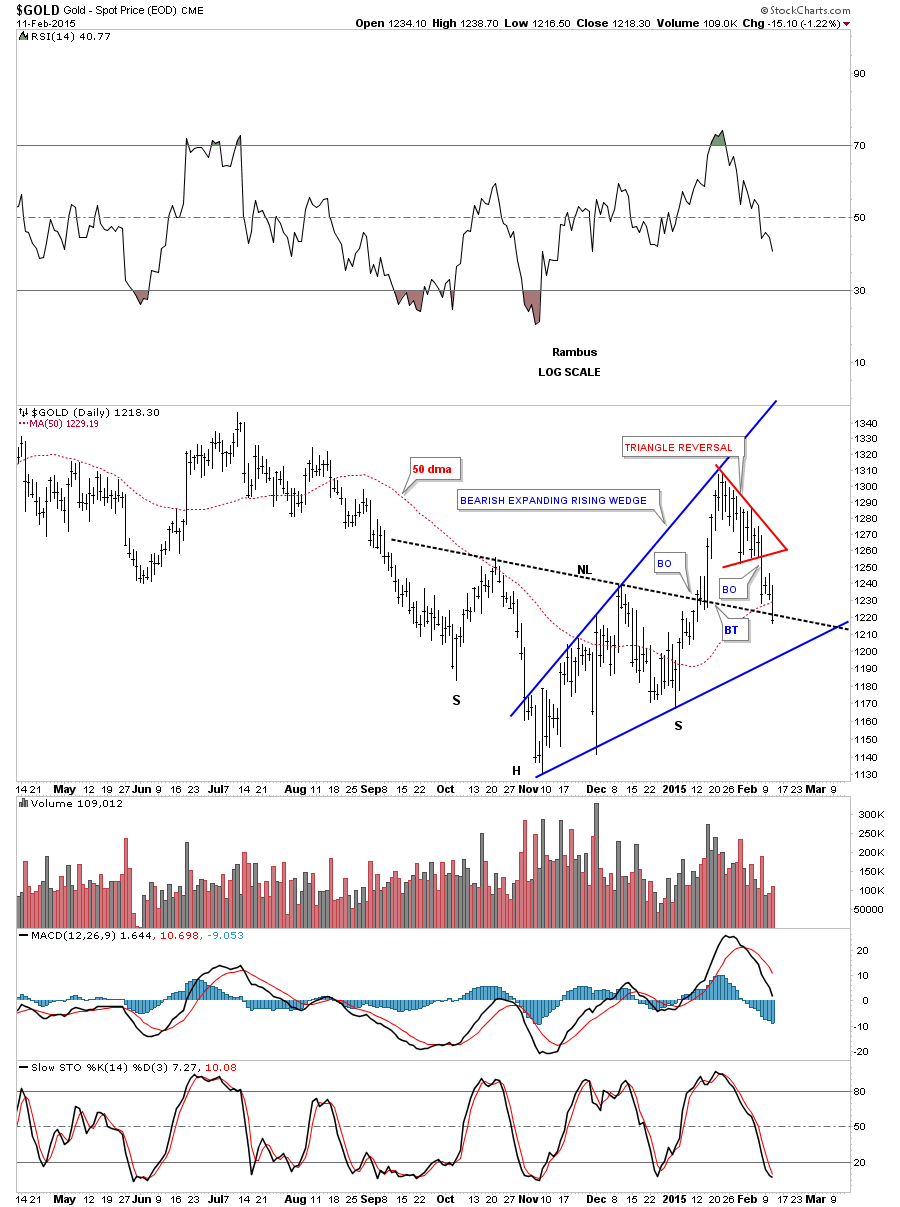
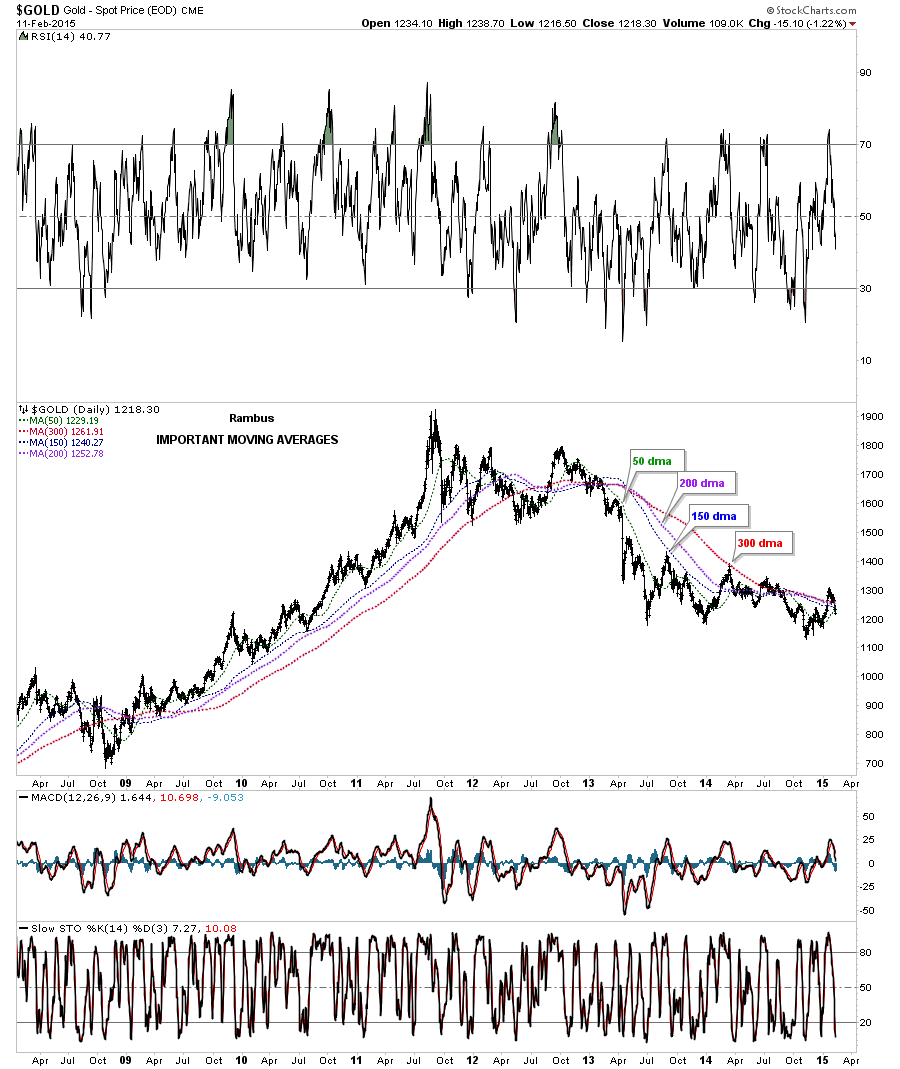
This longer term daily chart for gold shows several chart patterns we’ve been following for clues to help guide us through this correction within the bear market. The first pattern is the blue bearish expanding rising wedge which so far is THE consolidation pattern for this counter trend rally off of the November low. Gold still has to break below the bottom rail to confirm this pattern. The second formation we’ve been following is the possible inverse H&S bottom which maybe negated today. We still need a few more days to see if the neckline can hold support or not. Also today gold closed below the 50 dma for the first time in awhile.
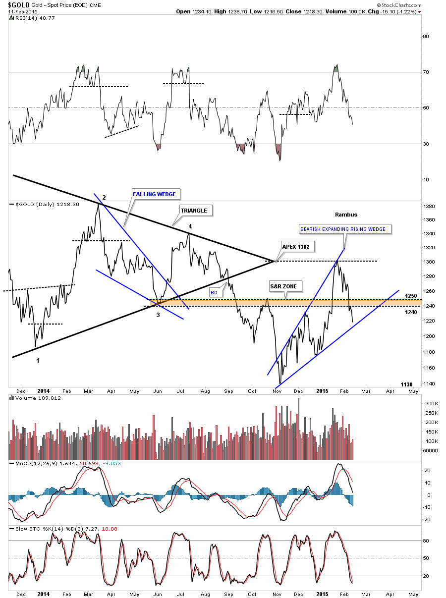
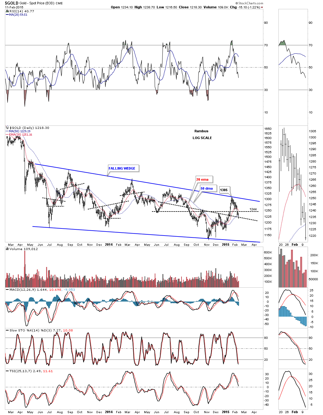
Lets look at gold from a slightly different perspective by looking a a daily line chart. There are several important clues to watch for. The line chart shows the price action is much closer to the bottom rail of the blue expanding rising wedge which will most likely show the breakout before the bar chart. Next notice how the apex worked as resistance on this last rally up to the 1300 area. I’ve shown you many instances where the apex of a triangle can be strong support or resistance depending on which way the price action is moving. All the energy from the top and bottom trendlines is focused out into the apex so it becomes very important to watch the price action for either an end around the apex move or to see if it work as support or resistance. The last bit of information on this chart shows how the brown shaded support and resistance zone, between 1240 and 1250, has reversed its role several times. Gold is now trading between support, bottom blue rail of the expanding rising wedge and overhead resistance at the brown shaded S&R zone.
This next chart for gold we’ve been following shows the four most important daily moving averages of which today’s price action finally closed below the 50 dma. It’s not earth shattering but it’s nice to see gold trading below all the moving averages again.
This next chart for gold shows the big 19 month trading range that has taken on the shape of a falling wedge. Last week I showed you how I tweaked the top rail to touch the last reversal point at 1305 which is now my line in the sand. You can see how the 1240 area has been reversing its role from support to resistance several times in the last eight months or so. Gold still has a lot of work to do yet to complete this consolidation pattern but it’s working in the right direction. With 19 months under its belt, time wise, this pattern could very well be mature. A break of the bottom blue rail will confirm the completion of this big consolidation pattern.
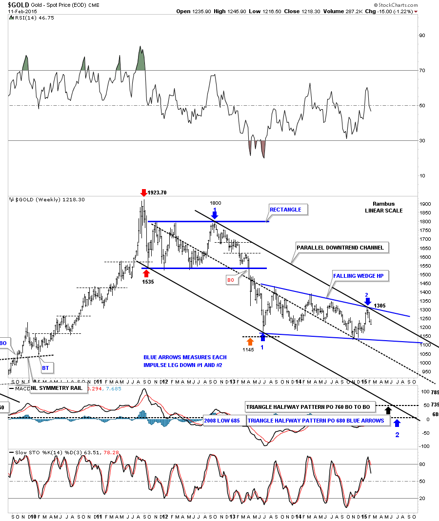
Last week I showed you this updated weekly gold chart that shows the parallel downtrend channel with our 19 month falling wedge consolidation pattern. Note the first impulse move down out of the blue rectangle labeled with the blue arrows with a number one. That first impulse move down started at 1800 and declined all the way down to 1150 or so. Until something changes I’m viewing our most recent high at 1305 as the start of the second impulse move down that has the price objectives down at the bottom of the chart. If you study that first impulse move down you will see it had a sharp decline followed buy about six weeks of sideways price action. You need to mentally prepare yourself for this type of price action once we have confirmation that we are in the second impulse move down that very well may mark the end this bear market.
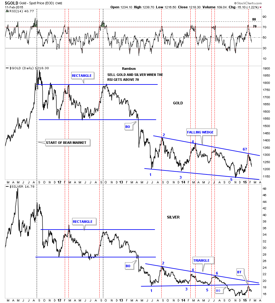
This next chart is a combo chart with gold on top and silver on the bottom. The thin red dashed vertical lines shows how a top comes in when the RSI gets up between 70 and 80 since the bear market began in 2011. It’s easy to see how much weaker silver has been compared to gold as silver broke down below its bottom rail last September and has just completed a backtest.
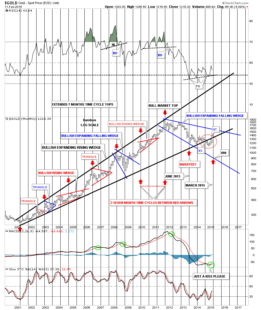
Lets look at one last chart for gold that shows a possible more bullish outcome than the weekly chart above. This monthly chart shows the three seven month time cycles that have governed gold since the bull market began in 2001. The red circle shows how gold backtested the bottom blue rail of the expanding rising wedge in January of this year. So far the month of February shows gold declining from that backtest last month which tells us that bottom rail is still hot. The more bullish outcome would be if gold only corrects back down to the bottom rail of the blue expanding falling wedge. Time wise gold is going to have to start a near vertical move down if the March time frame is still in play which would bring gold down to the 890 area or the bottom rail of the blue expanding falling wedge.
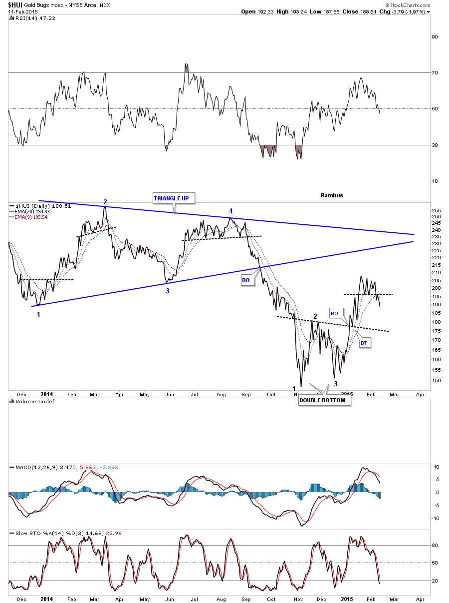
Now lets look at the HUI as a proxy for the rest of the PM stock indexes. Below is a 2 hour chart that shows we finally got a little conformation that the possible 5 point triangle we’ve been following has finally broken below the bottom rail this week accompanied by a small gap.
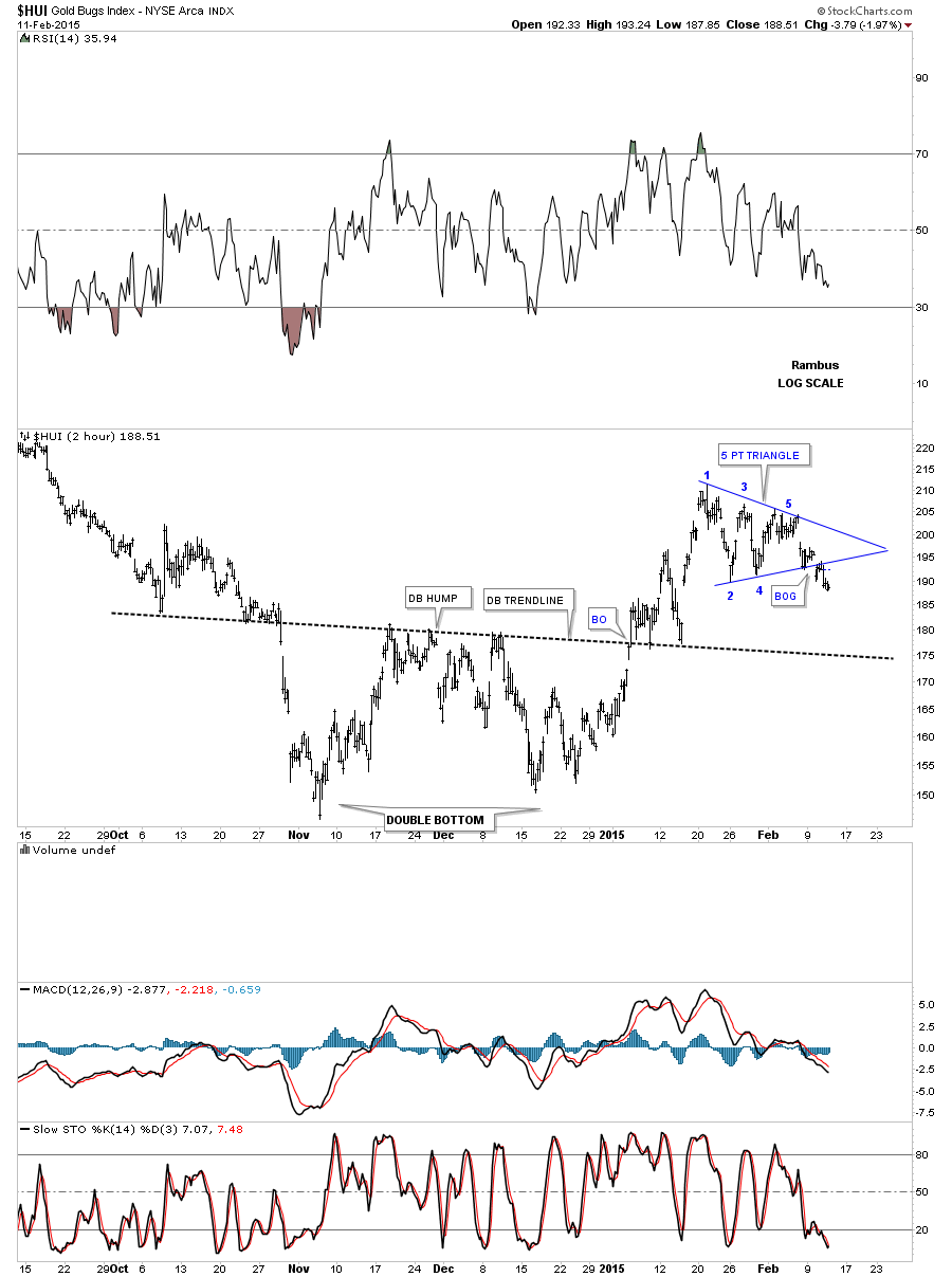
The daily chart shows the 5 point blue triangle reversal pattern that broke below the bottom rail on Tuesday of this week with a little follow through today. It’s still possible we get a backtest to the underside of the bottom rail at 195 or so.
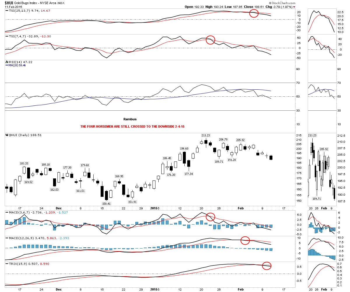
All four horsemen have crossed strongly to the downside now.
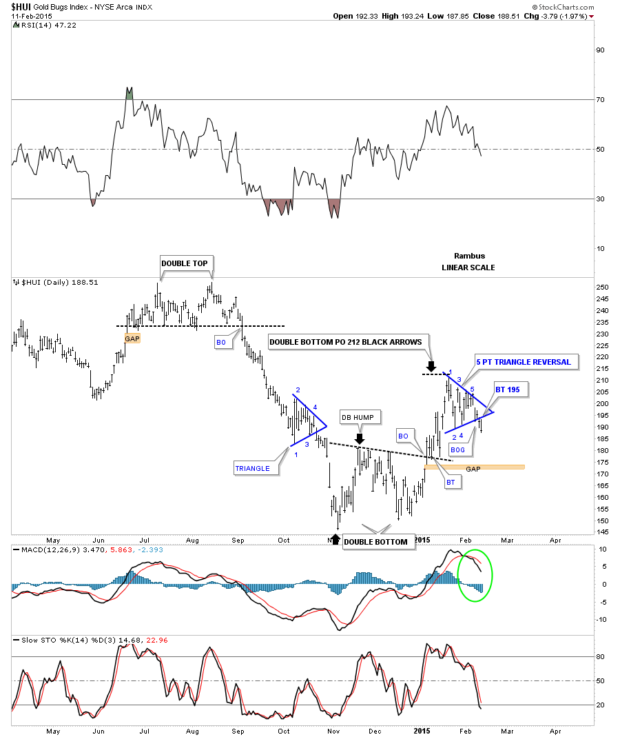
Below is a daily line chart that shows the 3 point double bottom that led to the most recent rally phase off of the November low. Note the little multi top that formed over the last several weeks that is actually the triangle on the bar chart. This is just a different perspective.
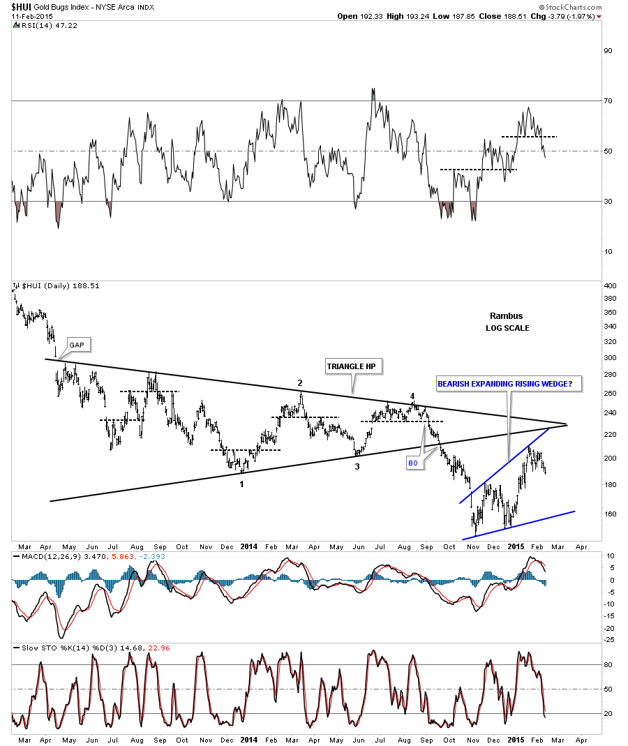
In the past I’ve shown you how gold, silver and the PM stock indexes can top out and bottom out fairly close together. They also tend to make similar chart patterns. On the second chart of this post I showed you how gold has been building out a potential bearish expanding rising wedge. We maybe seeing the same pattern forming on the HUI as shown by the chart below. The pieces of the puzzle are stating to come together. These types of patterns are extremely difficult to spot in real time but if you can spot one early enough they can be very rewarding. I think gold is giving us a big clue.
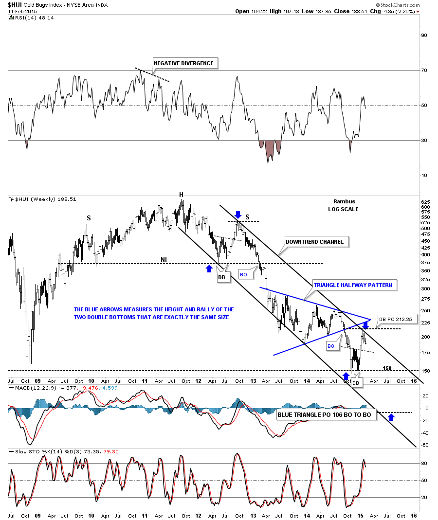
I still view this next chart as the most important chart for the PM stock indexes. Below is a weekly look at the HUI’s downtrend channel we’ve been following since the price objective of the double bottom was hit at 212 which also coincides with the top rail of the downtrend channel. Note how similar our current setup is to the one that occurred back in late 2012 and 2013. Back in 2012 the HUI built out a small double bottom which is almost exactly the same size as our current double bottom. The important area of support back in 2013 was the neckline of the massive H&S top. Our current major support line would be the 2008 low where the HUI built its double bottom off of. We could very well be at the same point as the blue arrow at the top of the chart, as in, you are here.
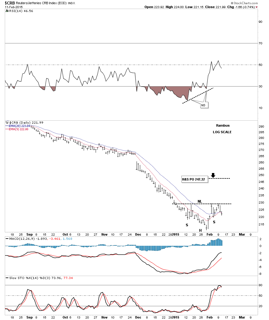
I would like to quickly update a few charts from this weekends report. The first chart is the daily look at the CRB index that is still building out a possible inverse H&S bottom. Until the price action can break above the neckline it’s just a potential inverse H&s bottom.
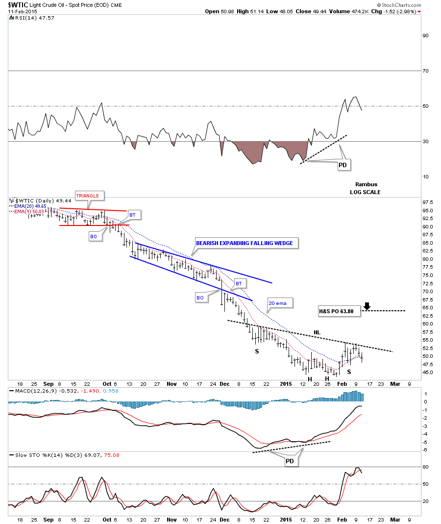
The daily oil chart shows it’s still working on a potential right shoulder.
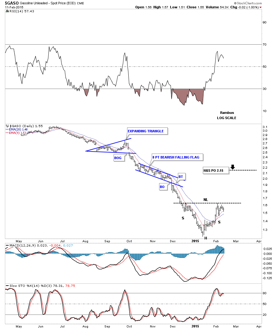
The GASO chart shows it to is still working on a potential right shoulder.
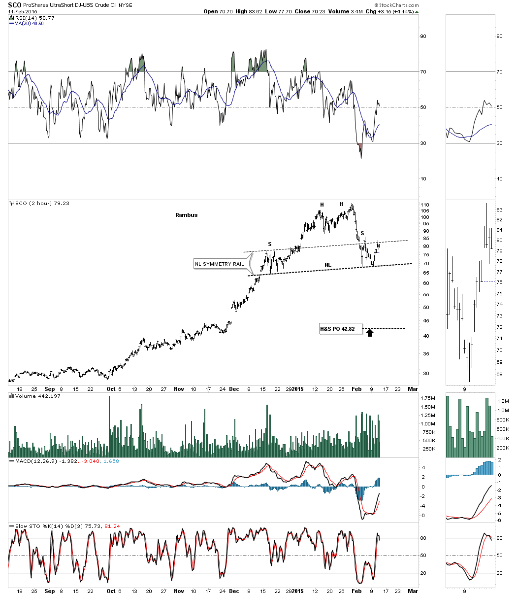
SCO is a 3 X short oil etf that is testing the neckline symmetry rail. Again the neckline has to be broken to the downside to complete this possible H&S top. All the best…Rambus