Every now and then I’ll do a post on “What If ” something is changing or not following along with what the original Chartology was suggesting. I have to keep an unbiased opinion and follow what the charts are saying. Sometimes it’s easier said than done. I know many of you were surprise when I exited the Kamikaze Stock last Friday. Believe me it’s not what I wanted to do but the short term charts are suggesting there maybe be a little more upside price movement left in the PM stock indexes.
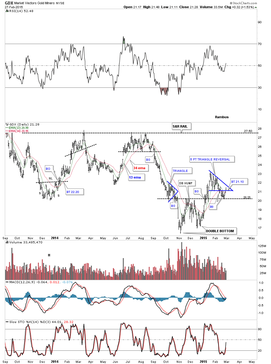
Lets start with the daily chart for GDX which I showed you last week that has the 5 point triangle reversal pattern. I pointed out the the GDX was bouncing between the double bottom hump at 20.20 and the bottom rail of the 5 point triangle. This went on for eight days or so with no conviction either way. I said this is where we’ll see how strong the bulls are. As long as the price action stayed below the bottom rail of the 5 point triangle the bears were in control. It doesn’t look like a big deal on this daily chart below but you can see the GDX closed above the bottom rail of the blue triangle telling me the bulls may have more strength than I gave them credit for.
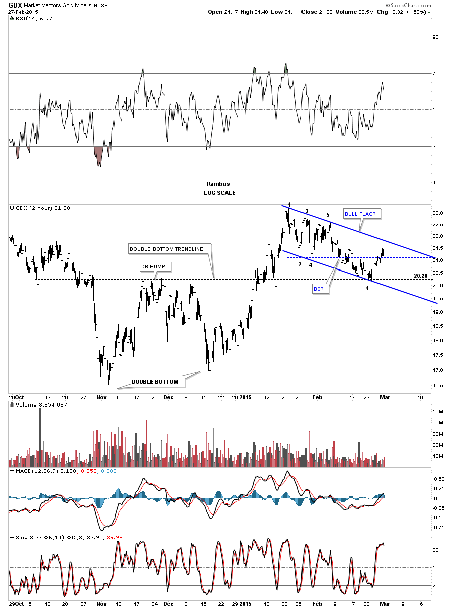
Now lets look at the 2 hour chart for GDX which shows the dominant pattern in place an unbalanced double bottom with the right bottom being a little higher that the left. The double bottom hump comes in at 20.20 which should be strong support at least on the initial hit. When the 5 point triangle broke down the double bottom hump, at 20.20, was the next area of support to keep a close eye on. There are several ways an important S&R line can be taken out. First, in a strong move the S&R line can be gapped. The second way can be the drop and pop, where the price action comes down and tests the S&R line and gets a bounce. The bounce quickly fails and then you get your drop down and through the S&R line. The third way is to see a big long daily bar that slices right through the S&R line and closes well below it. This 2 hour chart shows the double bottom trendline held support at the 20.20 area and the HUI bounced up inside the blue triangle as shown by the horizontal dashed rail. Finding support at the double bottom trendline at 20.20 now gives us possible new pattern to watch which would be a bull flag with the recent touch at 20.20 being the possible 4th reversal point. The initial bounce at 20.20 was to be expected but the rally above the bottom rail of the 5 point triangle showed the bulls were stronger than the bears on Friday. For me this meant going to a neutral position until we get some more information to work with.
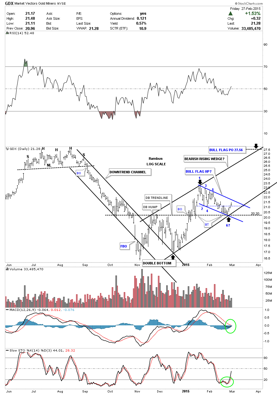
This next daily chart for the GDX shows you my concern from last Friday’s price action. Always keep in mind no matter how bullish or bearish I may be on a stock I’m always looking at the bull and bear scenarios. This daily chart in now starting to have a bullish bias to it based on last Friday’s price action. Here you can see how the double bottom hump held support at 20.20 last week which was bullish. GDX closing above the bottom dashed rail of the 5 point triangle was bullish. Now we have to see how the GDX interacts with the old top rail of the triangle which may now be the top rail of a 6 point bull flag which I will label as a halfway pattern to the upside if it can breakout through the top rail. If the potential bull flag works out then we should see a price objective up to the 27.56 area. If you look over to the left hand side of the chart you’ll see the last topping pattern which was H&S top that reversed that uptrend. In big trading ranges like this it’s normal to see a reversal pattern form at the top and bottom. This is another reason why I think this double bottom is so important to the trading range as it’s reversing the downtrend from the H&S top. So from a Chartology perspective things are starting to make sense.
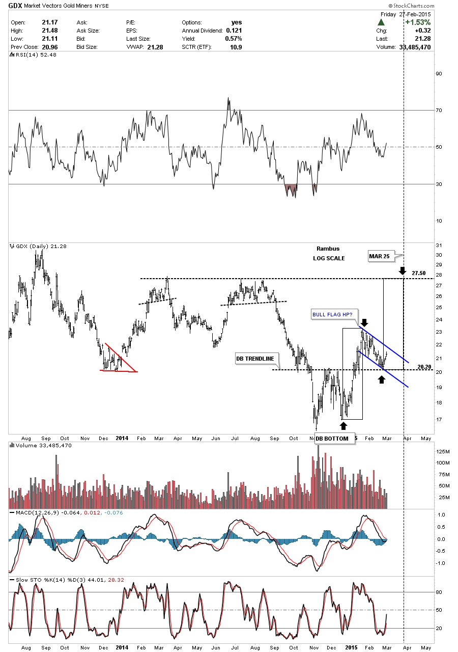
The next daily chart for GDX shows how I’m going to measure the price objective if the blue bull flag plays out as a halfway pattern. The two black rectangles measures time and price so if the bull flag plays out we should see a top begin to form at the 27.50 area towards the third week of March.
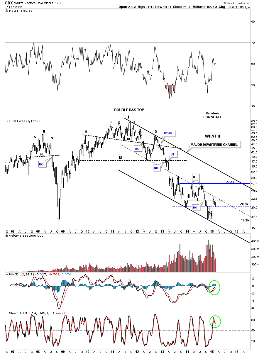
If this potential short term bullish scenario plays out up to the 27.50 area that is going to change things from the longer term perspective. Below is a weekly chart for GDX which shows two important developments if this new short term scenario plays out. First you can see the previous two highs were made at 27.50 which held resistance. Next I’ve added a brand new downtrend channel based off of the top of the head on that massive H&S top and the top of the right shoulder. I then pulled that top trendline down to the bottom of the channel and it matches up pretty close to the three previous lows. The center dashed line also has some pretty clean touches.
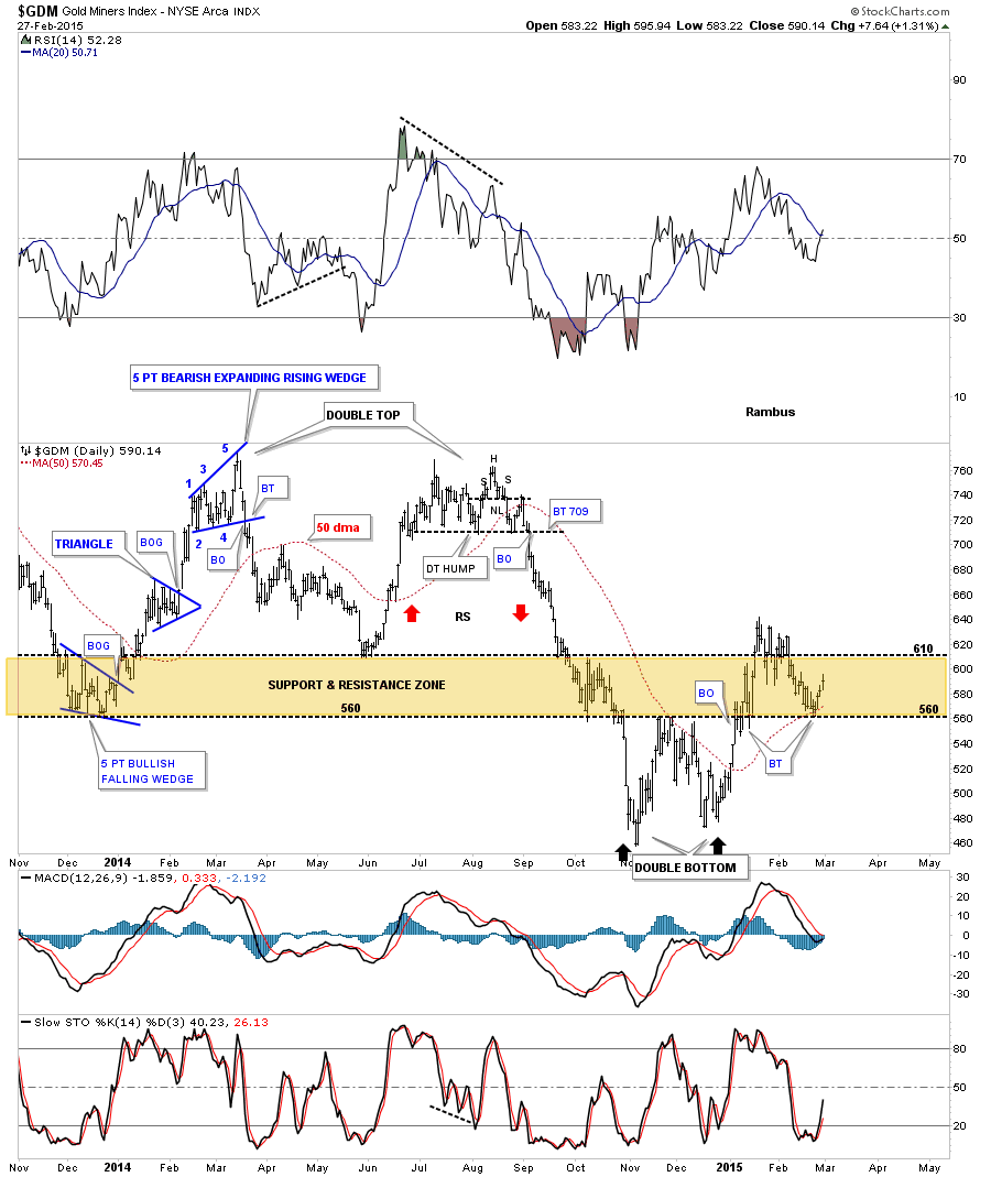
Lets now look at the daily chart for GDM that we’ve been following for a very long time now that shows the wide brown shaded support and resistance zone. Note how the wide brown shaded S&R zone held support and resistance as the price action bounced between the top and bottom rails before finally breaking out. The rally out of the right side bottom of the double bottom reversal pattern broke above the S&R zone only to fall back into it but then found support at the most recent low at 560 with the 50 dma helping with support.
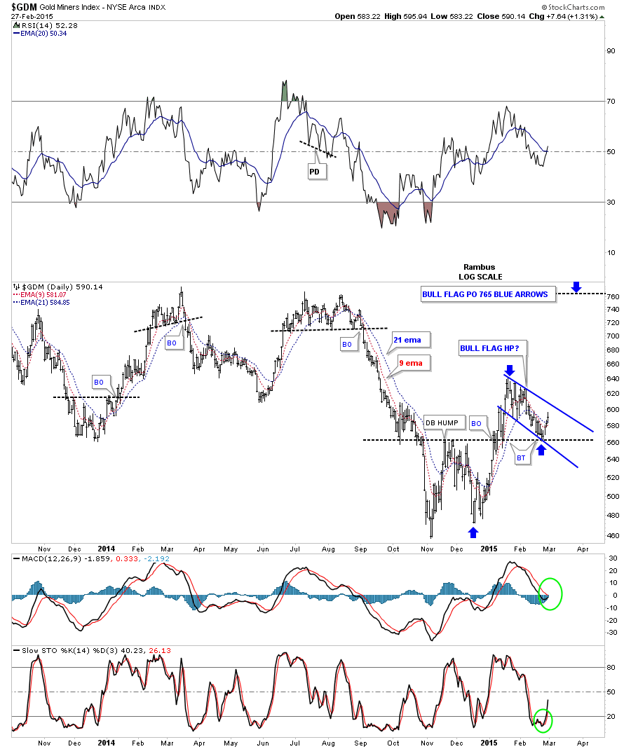
The next daily chart shows the 765 area as the price objective of the potential bull flag.
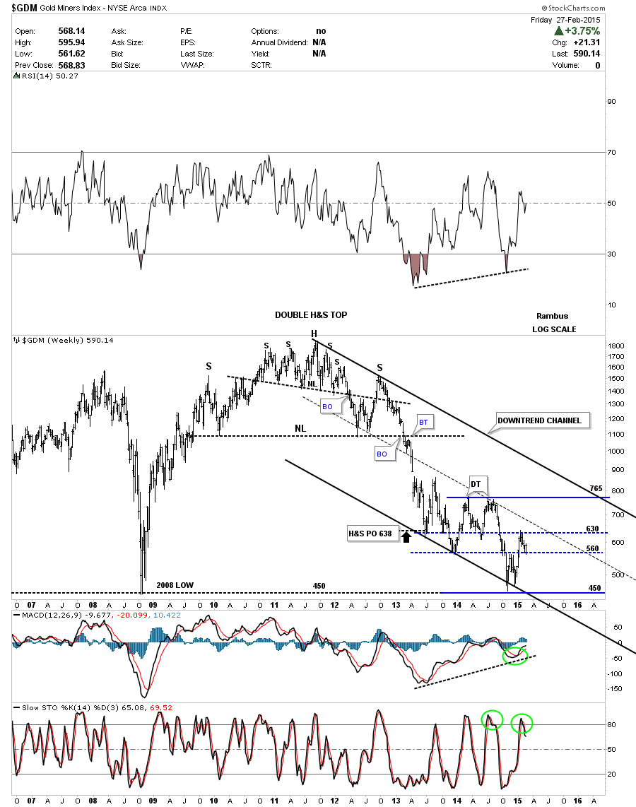
The weekly chart for GDM shows where the 765 price objective comes in at the 2 other previous highs. Again, I took the top rail based on the head and right shoulder of the H&S top to get the bottom and center trendlines.
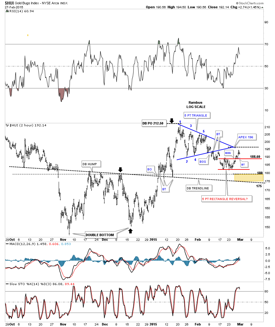
Next I would like to give you a play by play for the 2 hour chart for the HUI we’ve been following since the formation of the double bottom. You may recall the brown shade area where I was looking for initial support between 175 and 180. That brown support zone was taken from the double bottom trendline that slopes down and the double bottom hump which is horizontal. You can see when the HUI broke above the double bottom trendline there were three backtests before the price action rallied up to the first reversal point on the blue 5 point triangle at 212.50. The 212.50 area was also the price objective of the right bottom on the double bottom as shown by the black arrows. From the 212.50 high the HUI started building out the blue triangle pattern. I had no idea which way it was going to breakout. Three fourths of the time a consolidation pattern will breakout in the direction of the move leading into the pattern. But that wasn’t the case. As you can see the HUI gapped below the bottom rail of the blue triangle it signaled the triangle was a 5 point reversal pattern to the downside. There were two backtest to the underside of the bottom rail before the HUI gapped down that looked like the impulse was beginning. It was very short lived as the price action started to trade sideways creating the little red rectangle. Again one would have expected the little red rectangle to breakdown as that was the direction of the move leading into the pattern. Note Friday’s price action that closed above the top rail of the red rectangle. That is the point I decided to go to cash in the Kamikaze Portfolio until I see what happens next. There are two areas I”m keeping a close eye on. The first is the Apex of the blue triangle that comes in around the 196 area. The second short term area I’m watching is the top of the little red rectagnle at 188.60 or so. In order for me to get bearish again the HUI would have to close below the double bottom trendline at 175.
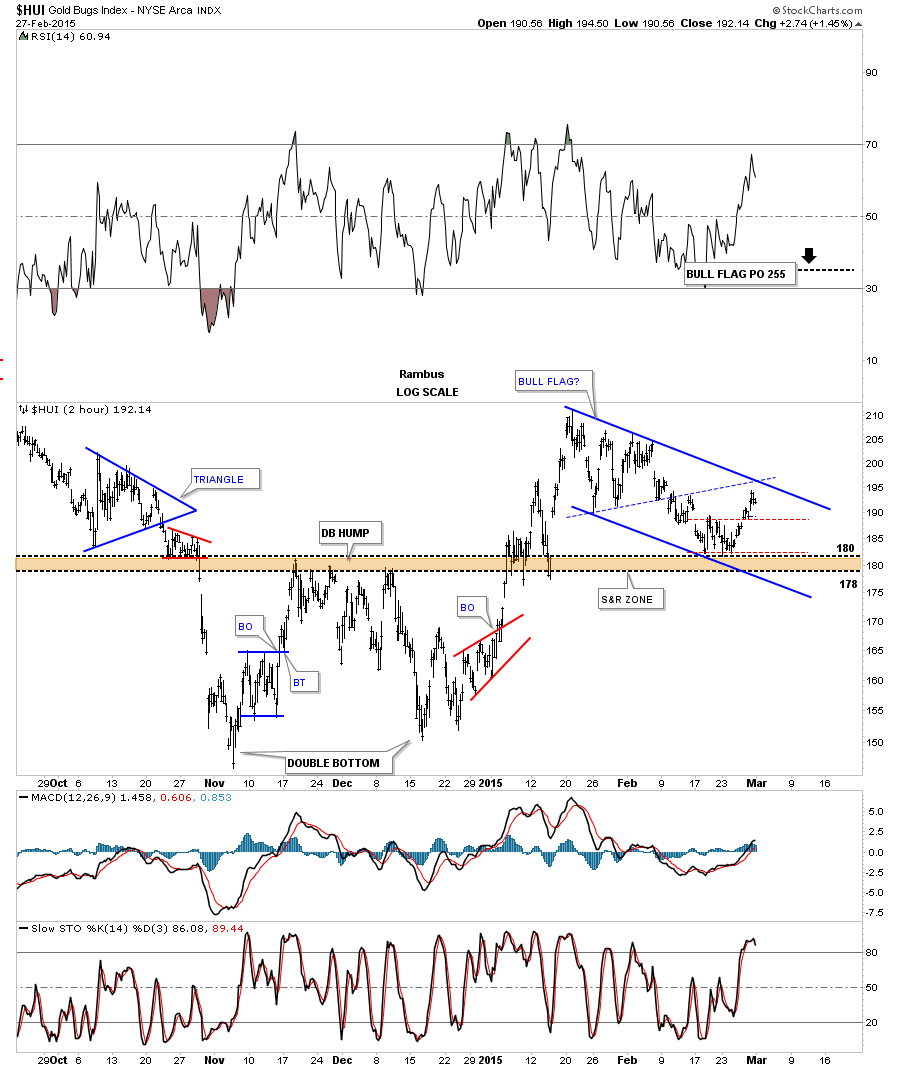
Below is another 2 hour chart that shows the potential bull flag that is forming on top of the double bottom hump with the 4th reversal point at 180. If the potential bull flag plays out the HUI may reach the 255 area.
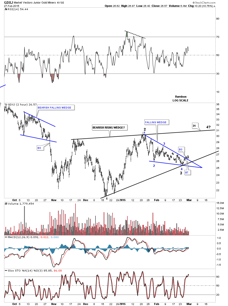
Lets take a quick look at GDXJ which is showing a possible blue falling wedge that is forming inside a bigger rising wedge.
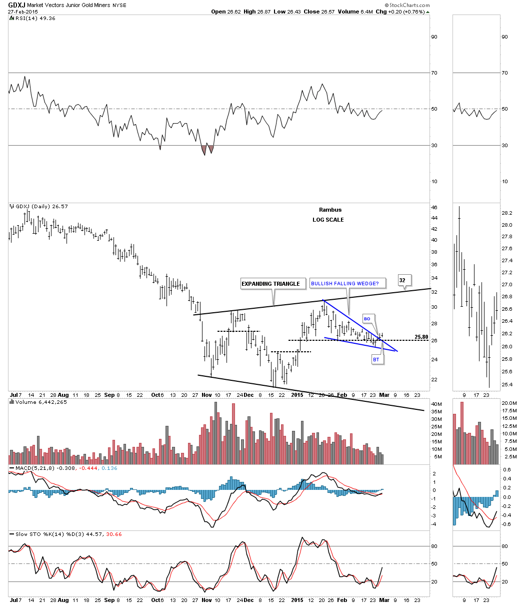
The daily chart for GDXJ shows the potential blue falling wedge forming inside the much bigger expanding triangle that began to form at the November low. Will the backtest hold?
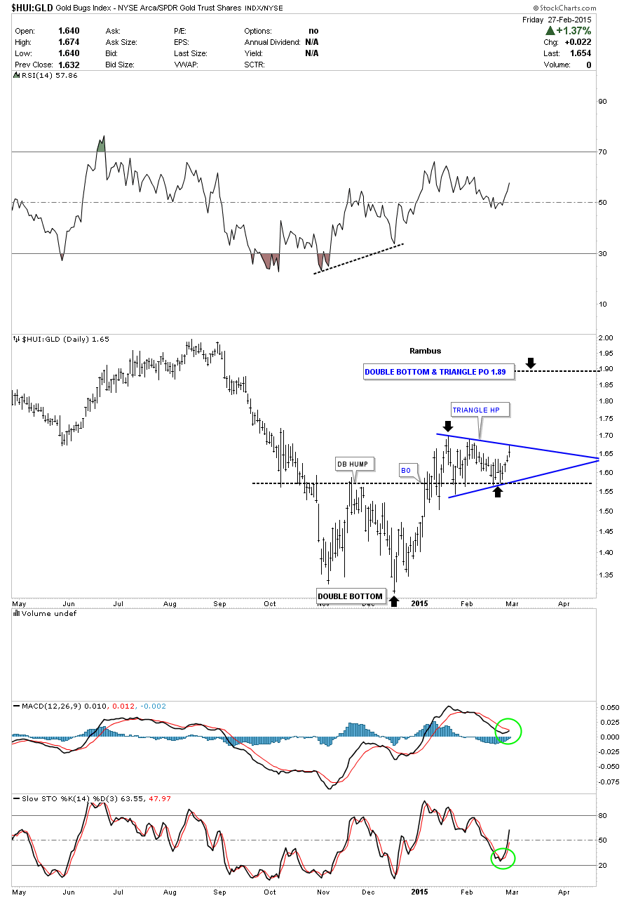
There is one more chart I would like to show you before we wrap up this Weekend Report which is the HUI:GLD ratio chart. This chart has a similar setup to the PM stock indexes as it’s showing a double bottom with a blue triangle forming on top of the double bottom hump. This ratio chart may give us the first real clue as it touched the top rail of its blue triangle last Friday and sold off a bit. That was the initial hit. Now we’ll see if there is any follow through to the upside this week.
I think this week we’ll have some important answers to the short term trading direction for the PM stock indexes. A rally right here would embolden the bulls and scare the bears. That’s what the markets are good at. Just give me a trend for several weeks and I’ll be a happy camper. If this is the start of the next small impulse move up the next three weeks should be pretty interesting. All the best…Rambus

