
Tonight I would like to update you on some precious metals charts we’ve been following very closely to shed some light on where we’re at and where we maybe heading. When investing in the markets we need to have a game plan to follow so that we know when the game changes we have to change. As long as the game plan is working you stick with it until you’ve reached your price objectives or the trend changes.
Believe me it’s not at all easy to follow a game plan. There are things that happen to a stock or market on a daily basis, that we have no control over, that can affect our thinking. Without a game plan to follow we are at the mercy of every little wiggle a stock makes. One has to have a certain amount of confidence in whatever trading system they use to be able to ride out the wiggles that can whipsaw you to death if you act on every move a stock makes.
Getting the initial position to stick is one of the hardest things to do because it’s impossible to buy the absolute bottom. A stock or market will move two steps forward and one step back in an uptrend. It’s that one step back that tends to get you if you didn’t buy the actual low. So usually, at the beginning of a trade, many times you’ll find yourself with a small loss to deal with. If you got the trend right it will generally fix itself and your small loss will finally turn into the gain you’re originally looking for.
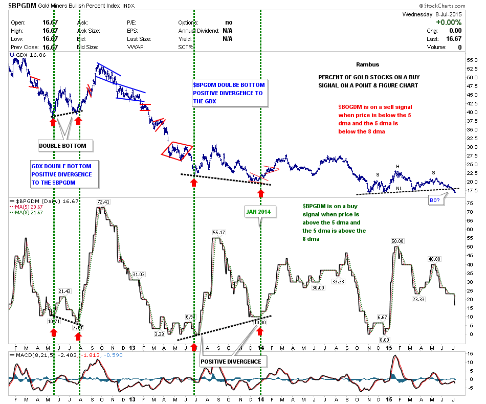
Lets now look at some precious metals stocks to see if our original game plan is still working. Below is a chart for the $BPGDM that shows the GDX on top and the BPGDM on the bottom. The last time I showed you this combo chart the GDX still hadn’t broken the neckline yet and the BPGDM chart on the bottom was stuck at 23.33 I believe. As you can see the GDX has broken below its neckline and the BPGDM has moved lower and is now trading at 16.67 which means that only 16.67% of gold mining stocks, on a point and figure chart, are on a buy signal. Note the alinement that now shows the BPGDM is leading the way lower with the faster 5 dma next and the 8 dma last. This is the setup you want to see in a downtrend.
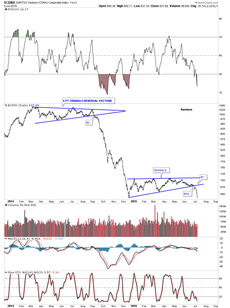
The next chart is a long term daily look at the CDNX index which was just starting to break below the bottom rail of the blue triangle consolidation pattern the last time we looked at it. As you can see it’s now starting to pick up some steam to the downside confirming the small caps are in trouble.
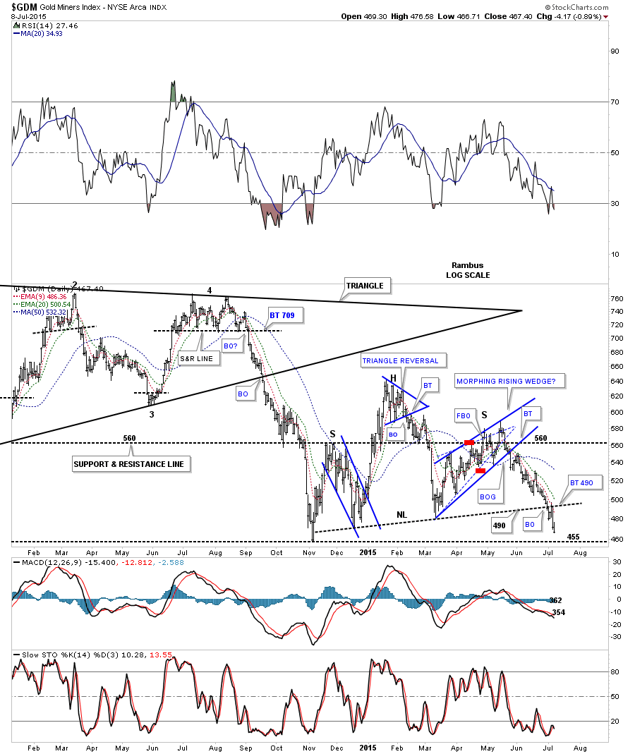
This next chart is a daily look at the GDM which shows the combo triangle / H&S consolidation pattern that started to form at the November low from last year. It’s easy to see in hindsight now how all the pieces of the puzzle fit together. Note the breakout from the triangle, black solid trendline, eight days ago was quickly followed by the breakout below the neckline three days later. This past Monday was the backtest day that tested the neckline. This chart shows you the game play we’ve been following since May which is still working according to the Chartology. If for some unexpected reason the price action starts trading above the neckline and the bottom rail of the black rectangle then the game plan will have changed and I will have to adapt to what the chart is saying at that time. So far so good.
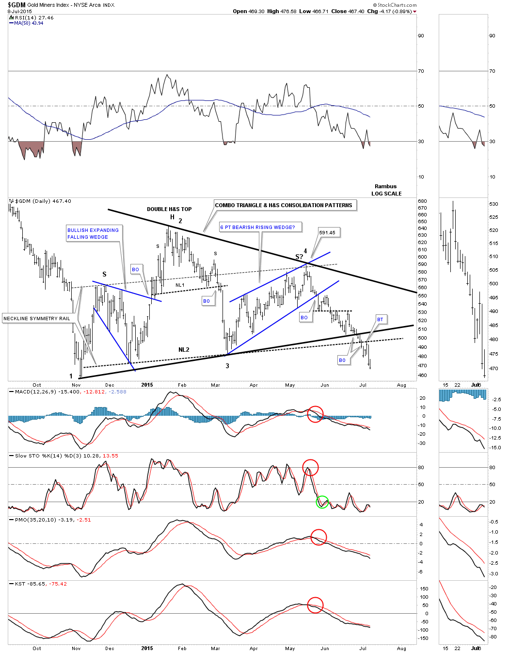
The indicator chart shows all the inductors are bearish at this time.
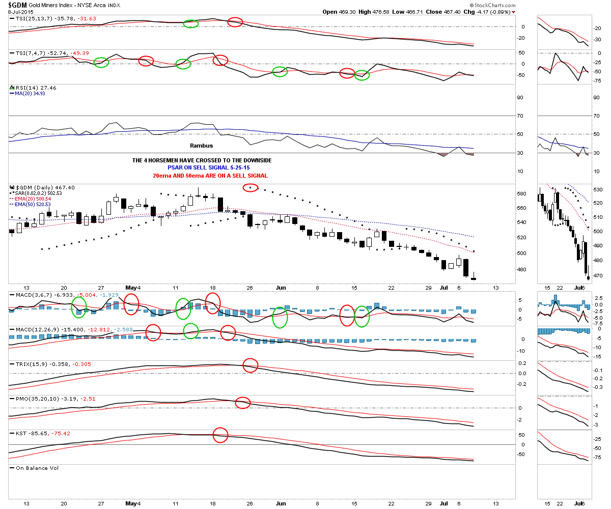
Some of you may remember this daily chart for GDM which is showing the blue morphing rising wedge that caused a little trouble back when it was forming. The red marks shows how it morphed into a slightly larger bearish rising wedge with a false breakout of the top dashed trendline and then an equal false breakout of the bottom dashed trendline that represents the original bearish rising wedge. The solid blue trendlines ended being the pattern I was looking for. Note the breakout through the bottom rail of the blue bearish rising wedge and the backtest that lasted about a week before the price action began to decline in earnest. That little move helped confirm the game plan for me at the time. It looks just like another little wiggle to most folks but for me it was a serious piece of the puzzle.
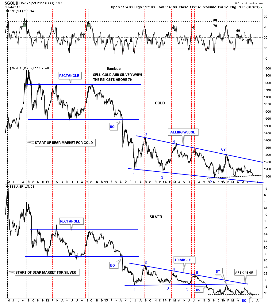
Below is a long term daily line chart that shows gold on top and silver on the bottom. The black dashed trendline down at the bottom right hand side of the chart finally shows silver cracking that important trendline / NL while gold is still testing its own black dashed trendline. It has taken awhile but this chart is still confirming the game plan. There is still a lot of room for the RSI indicator at the top of the chart to move lower.
Below is a daily chart for gold that shows its most important moving averages which are all above the most recent price action confirming the game plan. If we were to see gold start trading above some of these important moving averages then I would have to start to reconsider the game plan but for now there is nothing broken.

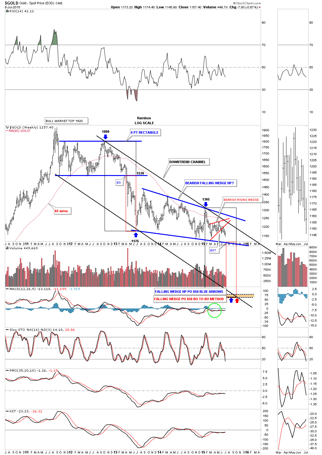
This next chart for gold shows the downtrend channel I’ve been trying to show you once a week so that you can follow the Chartology as it’s developing in real time. The black and red rectangles measures time and price for each impulse move. I’ve been saying that I would like to see the price action testing the bottom rail of the blue bearish falling wedge by the middle of July. The reason for that is because that is when gold broke below the bottom rail of it big six point blue rectangle back in 2013 and the red rectangle measured that impulse move down. The red rectangle at the bottom right hand side of the chart is the exact same size that shows where we may look for a low in time and price. It’s not mandatory that gold hits the bottom rail of the blue falling wedge in the middle of July but time wise it would be some nice symmetry if it did.
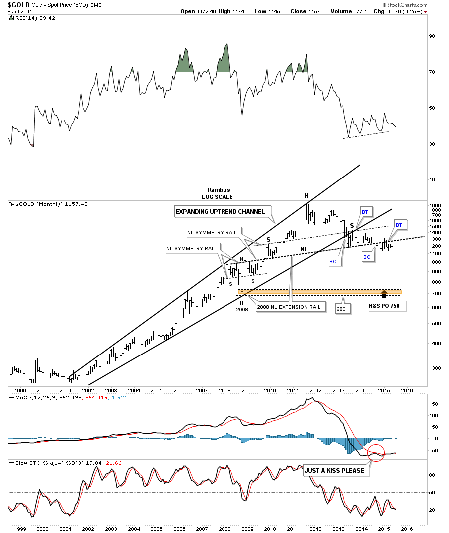
I’ve been showing you this long term monthly chart for gold shortly after it broke down from the bearish expanding rising wedge almost two years ago. Longer term members may remember when I added the neckline extension rail that is taken from the 2008 H&S consolidation pattern and extended it out in time to the right hand side of the chart. The symmetry was just too pretty to ignore as shown by the neckline symmetry rails. They’re all the exact same angle which shows the bottoms of the left and right shoulders of the 2008 H&S consolidation pattern, which is also the same angle for the neckline, which also shows the highs for the left and right shoulders of the massive H&S top and its neckline. The breaking and backtesting process has been going on for close to a year now but this is a massive H&S top that is in play as big patterns take a lot time to develop. Now it’s getting time for gold to break to new lows since its bear market began in September of 2011. That will confirm the game plan.
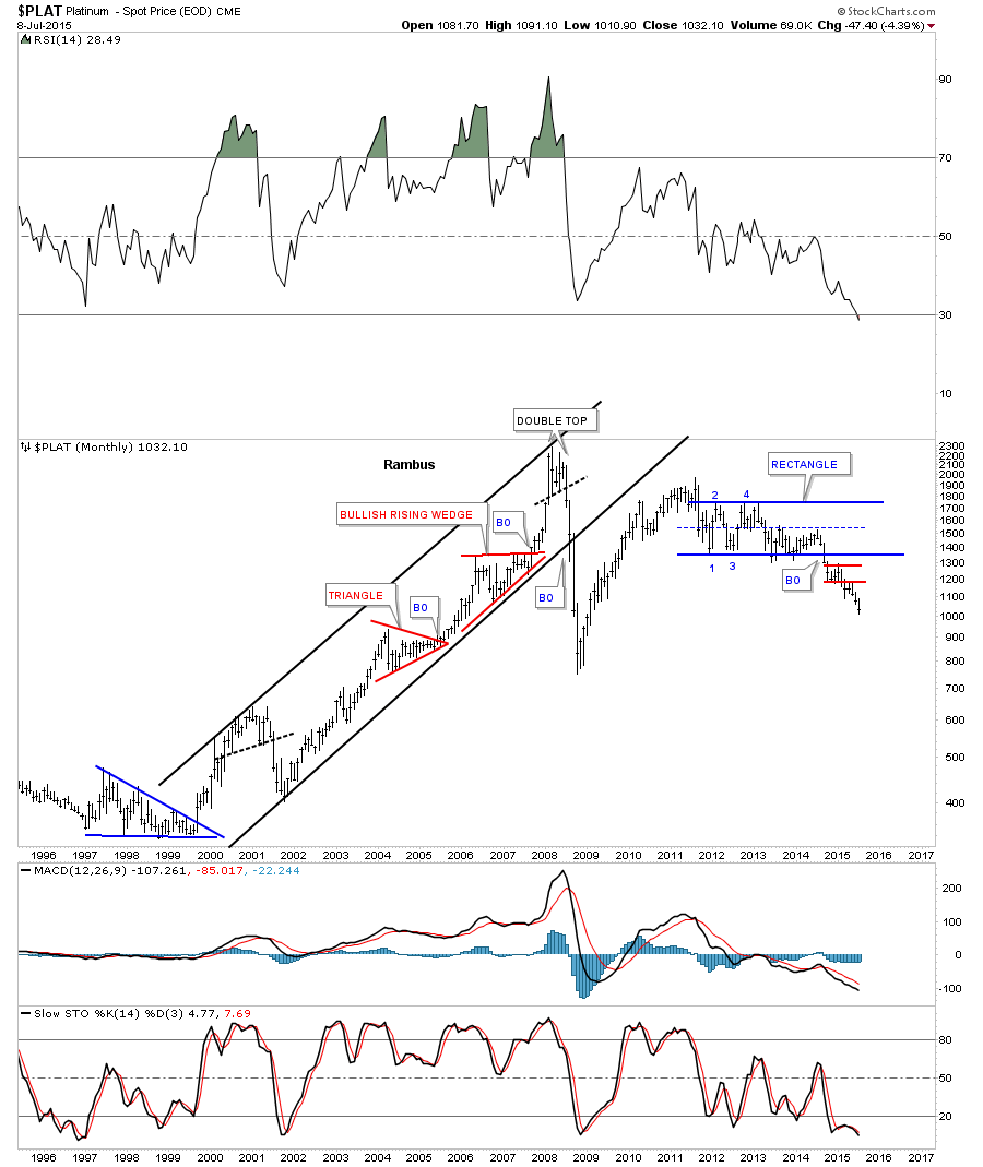
I don’t show Platinum very often but it’s part of the game plan. Below is a long term monthly chart that shows its multi year blue rectangle. It then formed the smaller red rectangle and is now making new yearly lows.
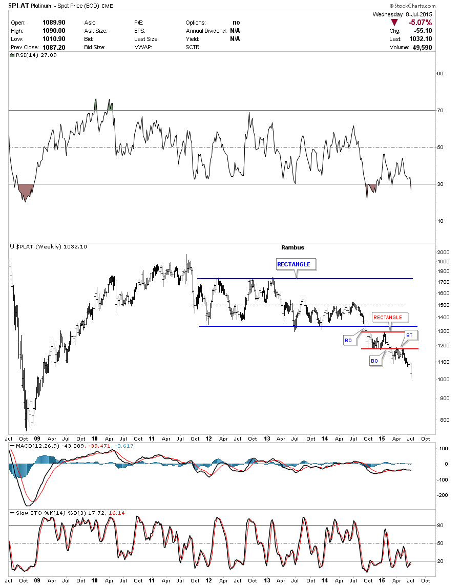
Platinum weekly chart.
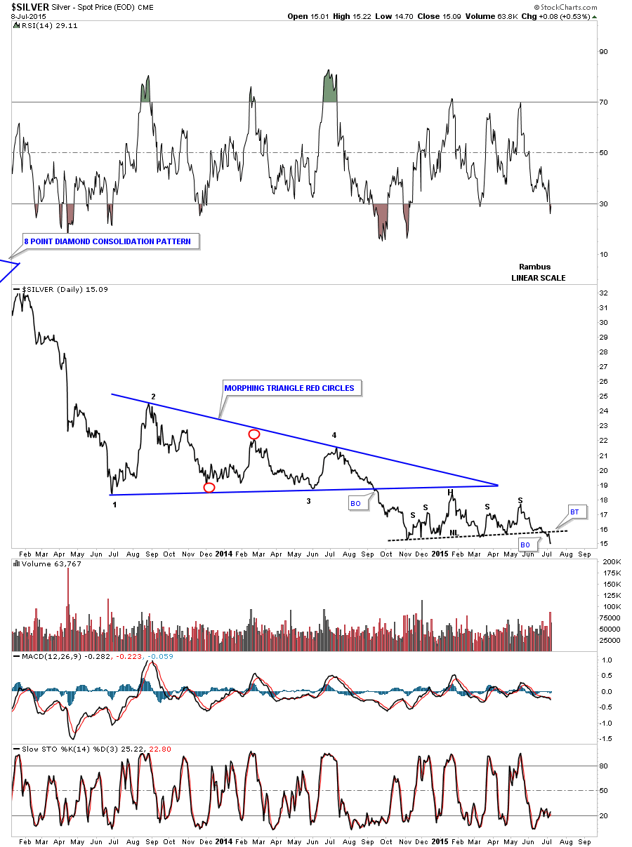
This next chart is a daily line chart for silver that shows it breaking below its neckline. If you look really close you can see a tiny little backtest to the neckline. It’s possible we see another backtest to the neckline but the fact that it has broken below the neckline tells us we’re on the right track.
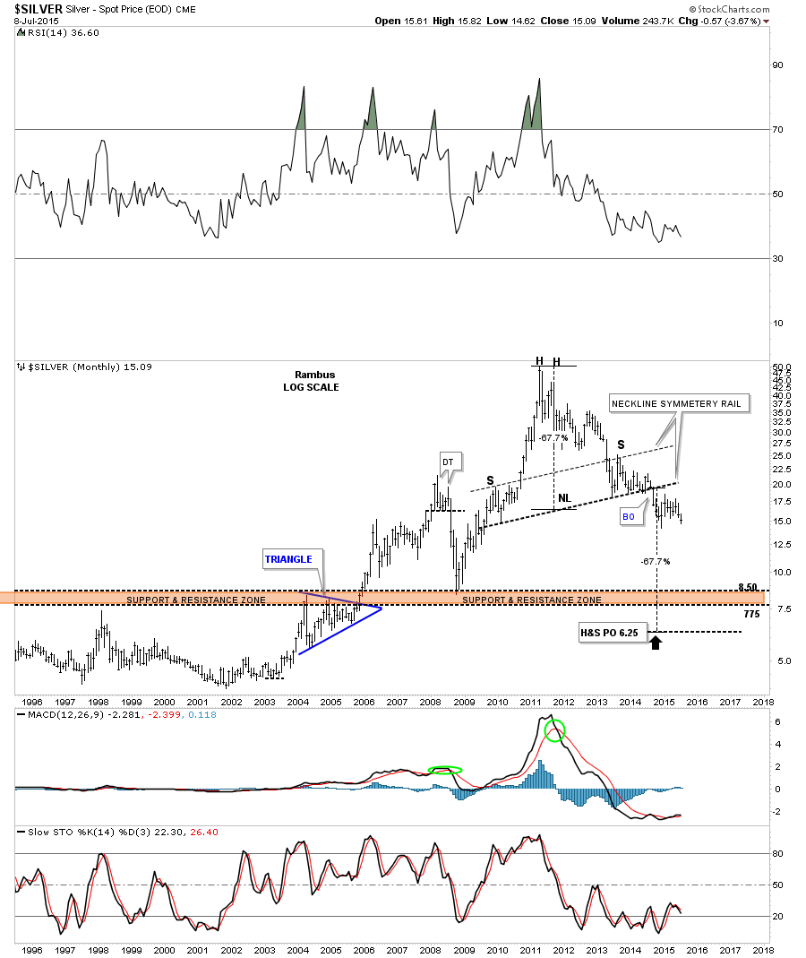
As with gold silver to has a massive H&S top in place. It too has some very nice symmetry as show by the neckline symmetry rail which shows the height for the left and right shoulders. My game plan is to shoot for the brown shaded support and resistance zone. If silver makes it that low I’ll be satisfied.
I have many more charts I could show you but I would like to end this Wednesday report by looking at the GDXJ. Below is the two hour chart we’ve been following that shows the blue bearish rising wedge with a H&S top.
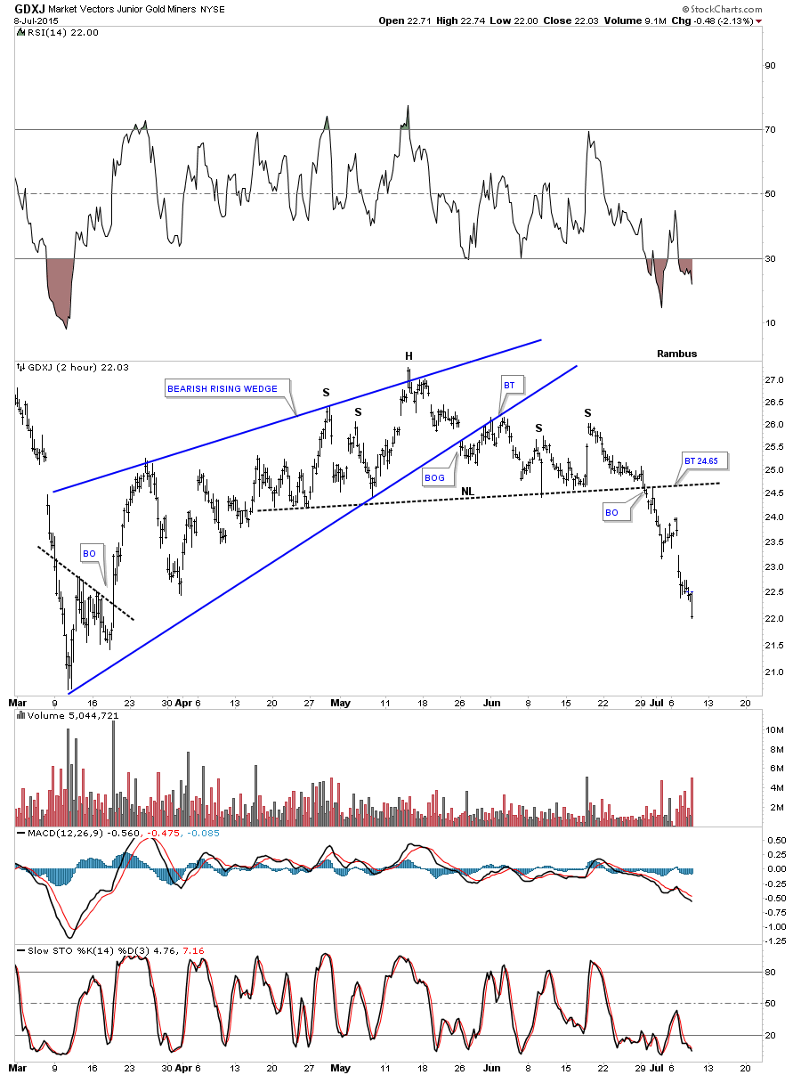
Below is a long term daily chart which shows the previous consolidation pattern, the bearish rising wedge at the top of the chart. The H&S top I showed you on the two hour chart above is the fourth reversal point in the new bearish falling wedge at reversal point #4. Note the impulse move down from the blue bearish rising wedge at the top of the chart that also had a H&S top at its fourth reversal point. Our current blue bearish falling wedge would give us a price objective down toward the 12 area as shown by the blue arrows.
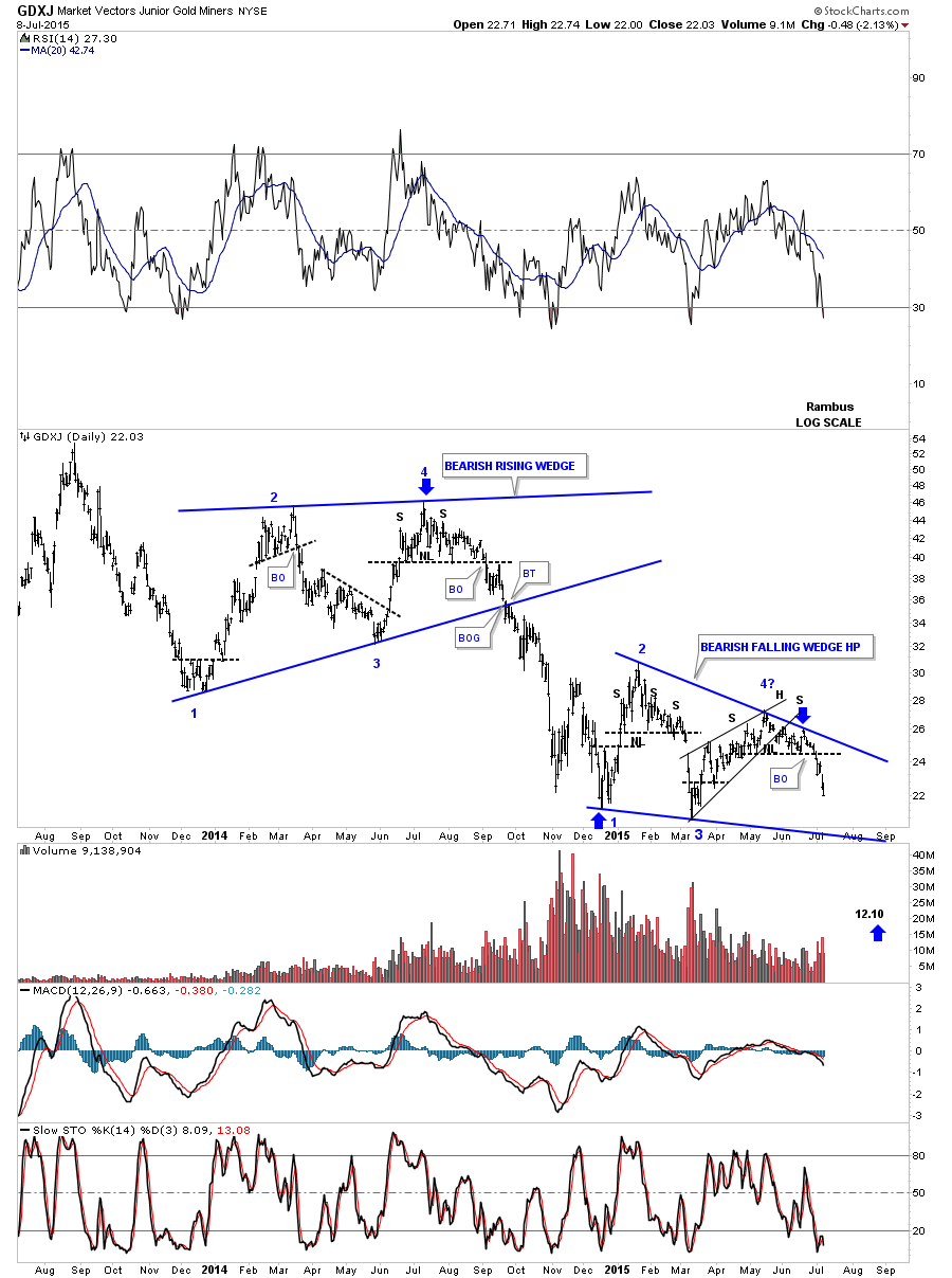
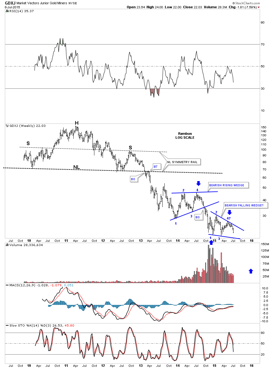
This long term monthly chart shows how our current blue bearish falling wedge fits into the bigger picture.
When you look at all the individual precious metals stocks I’ve been posting that are breaking out from their seven month consolidation patterns along with these charts above the game plan is still clearly in affect. It’s possible it could change at anytime but until that time comes I have to go with the game plan that has been working. All the best…Rambus