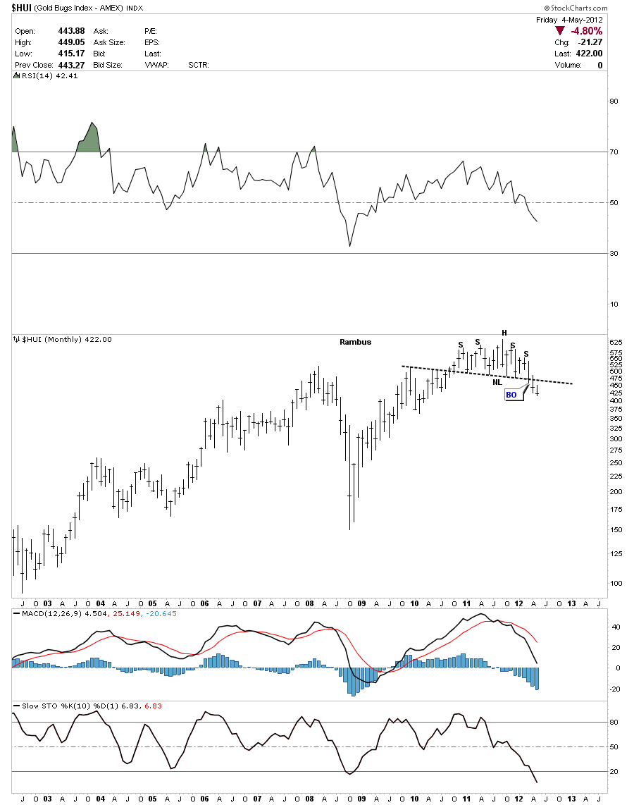
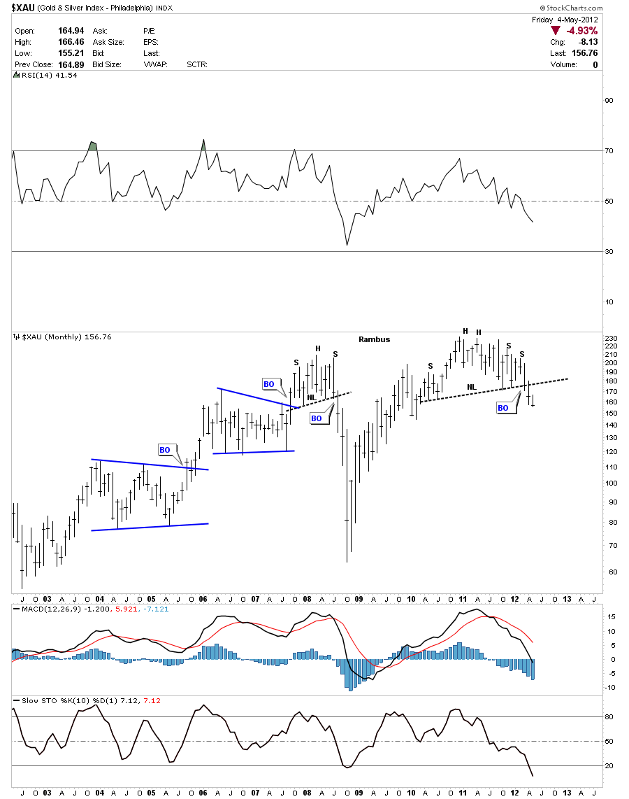
In this weekend report I would like to add some more H&S top patterns to the ones I’ve already shown previously that are still in the making. A strong picture is emerging that many of the European stock markets are starting to top out along with some in this country. Spain and Italy are approaching the their lows made back in 2009 during the crash. I’ve shown many H&S top patterns on the precious metals indexes and PM stocks that seem to be on the leading edge of the next world wide decline in stocks. I don’t say this lightly as there are H&S topping patterns all over the place including commodities, big cap miners and now the stock markets. I believe the dollar bottomed last week which would put pressure on just about everything else related to a strong dollar. It doesn’t seem like the United States will be immune to the crisis in Europe as the global economies start to slow down affecting everybody.
The first chart I want to show is the DAX German stock market as it has been one of the strongest economies in Europe. If the DAX starts to fall it will not be a good sign for the rest of Europe. As you can see on the chart below the DAX is fast approaching it’s neckline. The H&S top pattern will not be complete until the neckline is broken to the downside. 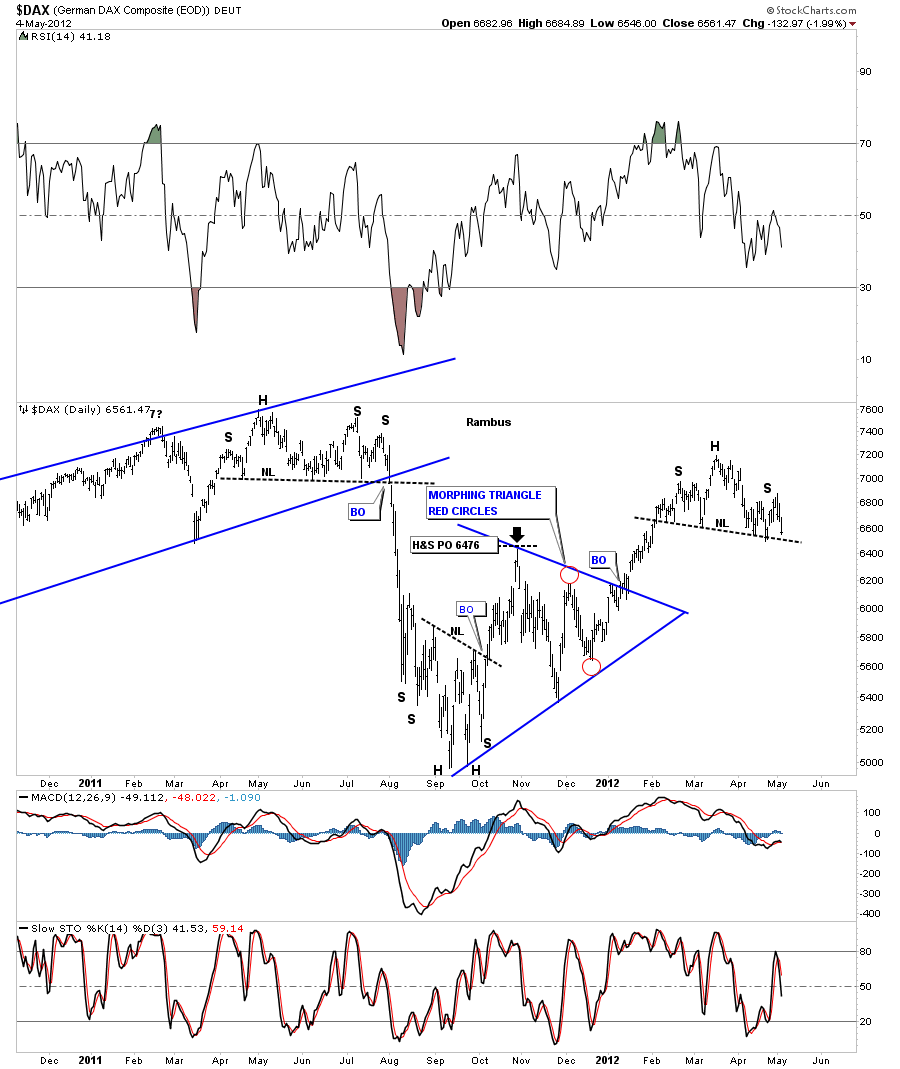
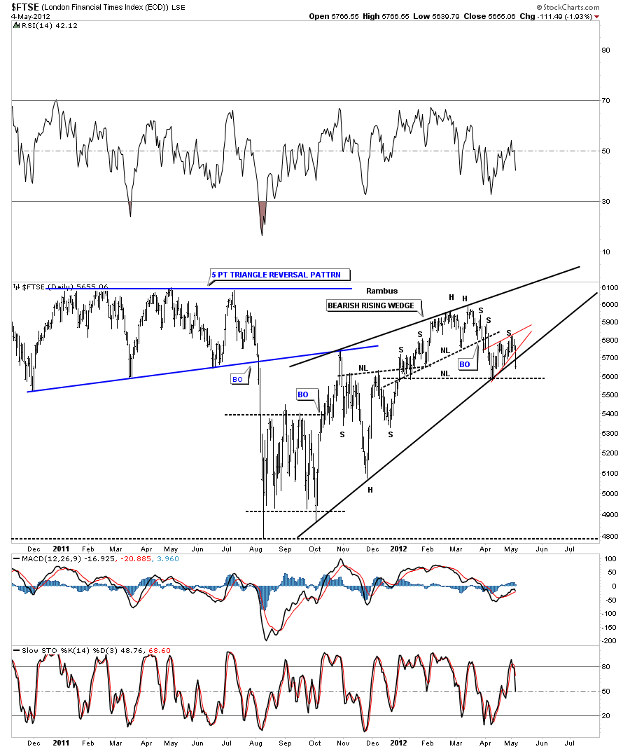
The next chart is the daily look at the FTSE which is the London Financial Times stock index that broke two important support rails on Friday. The bottom rail of the little red bearish rising wedge and the bottom rail of the bearish rising wedge. Once the neckline is taken out the H&S top pattern will be complete. Two down one more support rail to go.
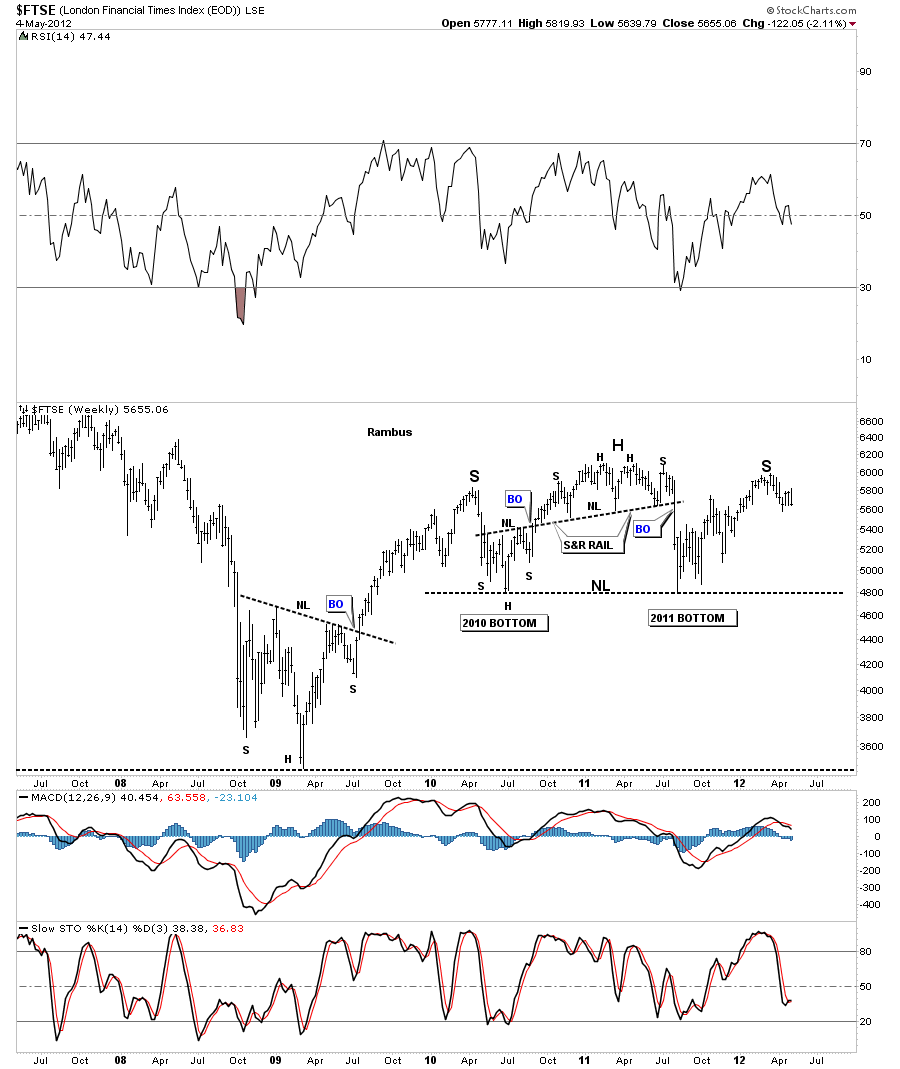
Lets stay on the FTSE and look at the weekly chart to put our current H&S top in place. There is a potential for a much bigger H&S top that is in play right now if our current H&S top does in fact play out. Our current H&S top will be the right shoulder of an almost 2 1/2 year very large H&S topping pattern. As you can see we are still trading toward the top of the right shoulder so we still have alot of time left before this possible large H&S top pattern can play out. A break below the neckline at 4800 will confirm the big H&S top pattern is in and the real pain will begin.
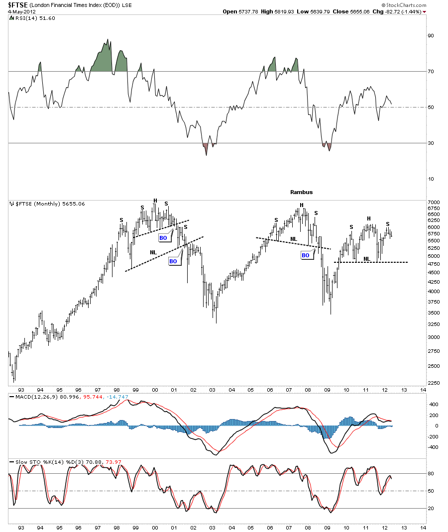
:The monthly look shows how this secular bear market has played out over the last 12 years or so. If there was ever a perfect place for a big H&S top pattern to form we are in that place right now. You can see how the other two H&S top patterns played out after the H&S patterns were completed.
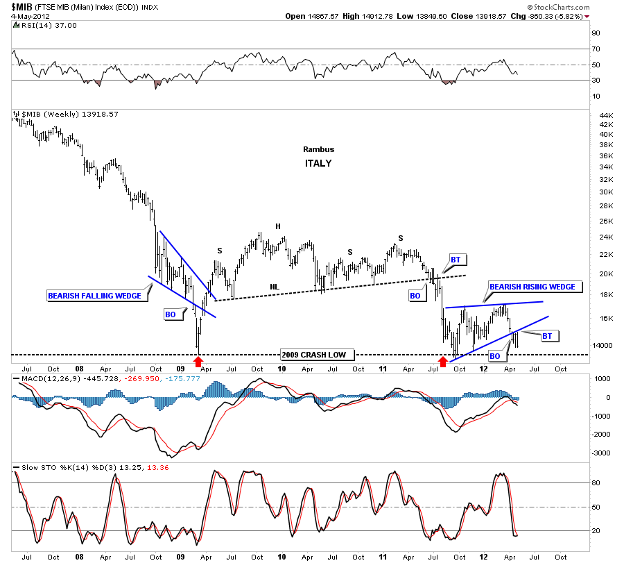
Next I want to show you a couple of weaker European stock markets that are attempting to take out the 2009 crash lows. This is a big deal IMHO as they maybe showing the way for many other stock markets. The MIB Italian stock market is in serious trouble right here as the chart below shows. As you can see the rally that started last October, like so many other stock markets around the world, really was not much of a rally but more of a consolidation pattern that has formed right on the 2009 crash lows. This is a very negative setup as this bearish rising wedge will have enough energy to take price well below the previous lows. You can see the clean breakout and the backtest that took place over the last couple of weeks.
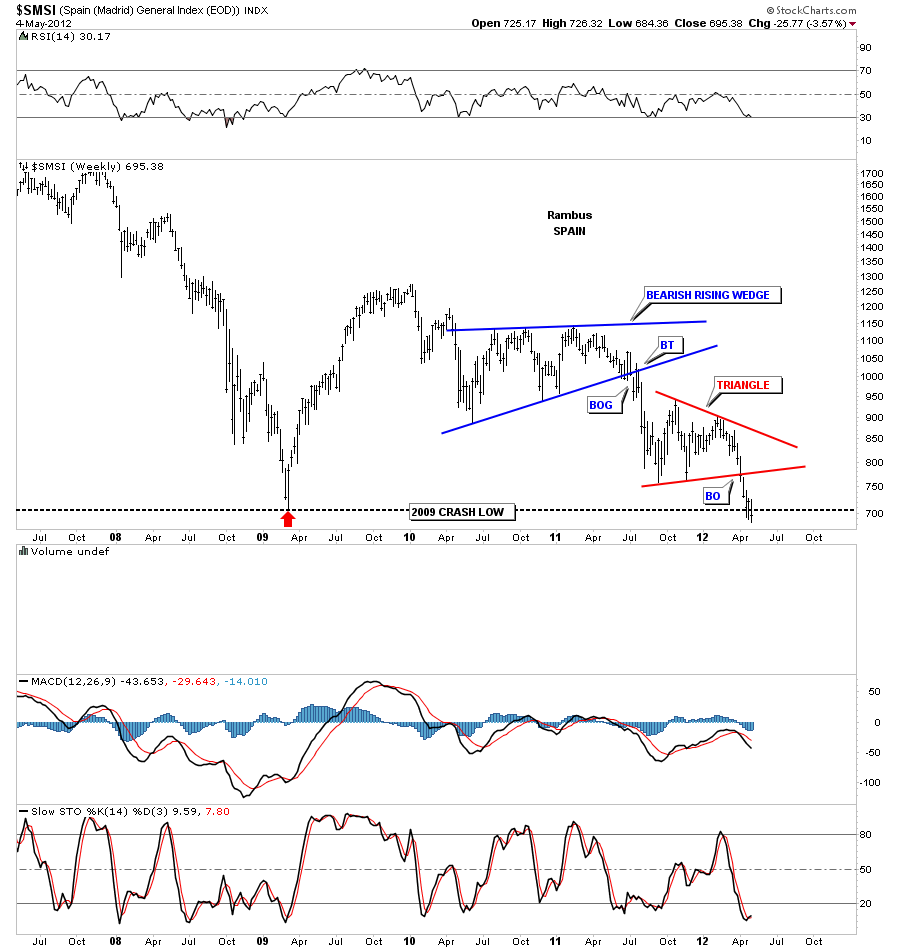
The other weak European stock market I would like to show you is the SMSI, Spain stock market. As you can see this stock market is weaker than the Italian stock market as its already breaking the 2009 crash low. The move off last years low is very similar to the Italian stock market in that it was only able to form a triangle consolidation pattern. So this is a very negative setup for Spain.
Now lets turn our attention to some of the US stock markets and see how they are shaping up. What is very obvious is that the United States has enjoyed a very nice counter trend rally in the context of it’s secular bear market. But there are some warning signs that all might not be good for the US stock markets going forward. As some of the stronger European stocks markets have enjoyed a very strong rally since the lows made last October they were still alittle weaker than the US markets. This last week in the US markets was very telling in that the H&S top patterns that had been forming really showed their hand.
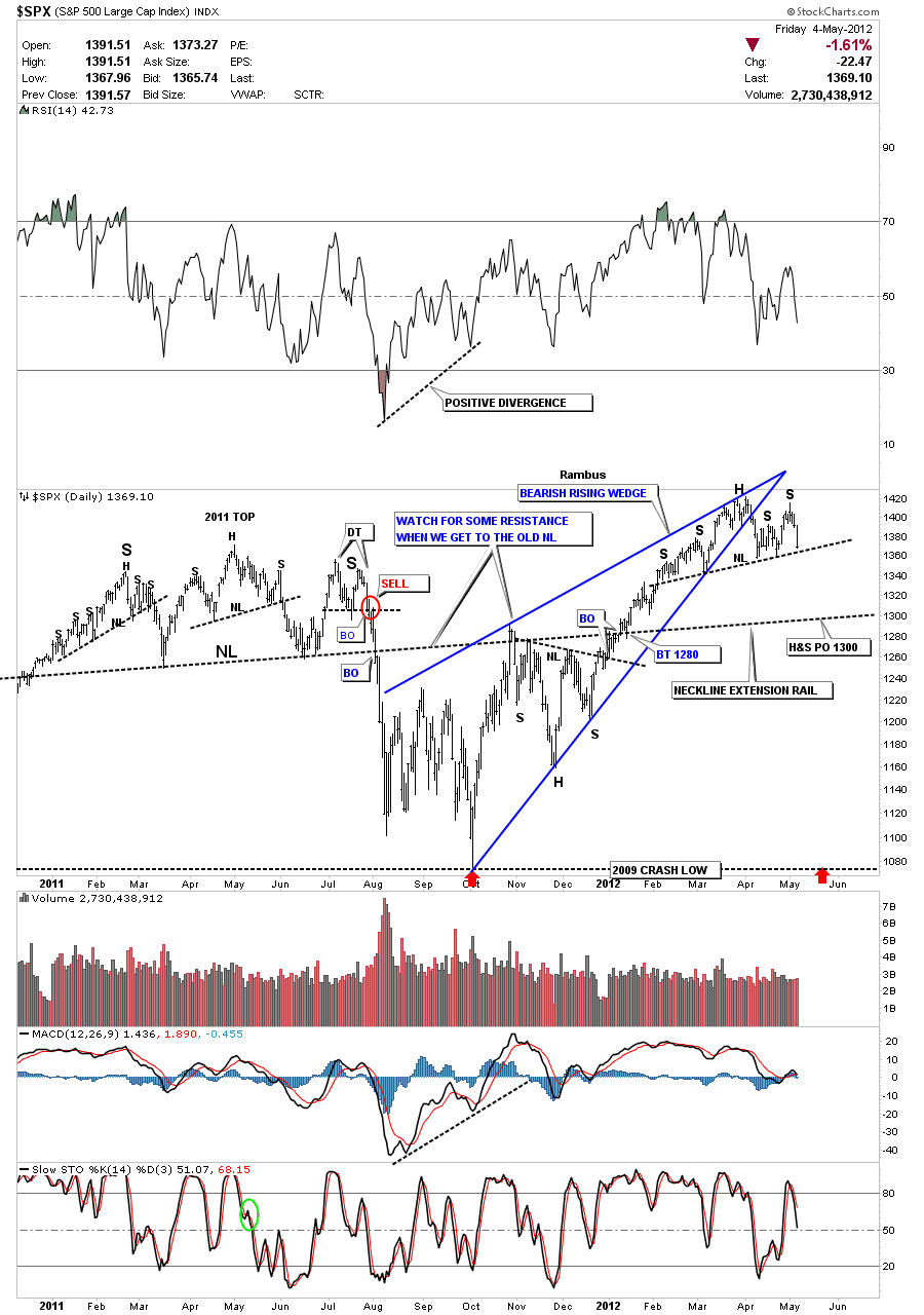
Lets start with the SPX which is the biggest 500 big cap stocks in America. You can see how last weeks decline really shows the right shoulder now that will be complete when the neckline is broken to the downside. There is another bearish pattern that is a bearish rising wedge that created the left shoulder and the head portion of the H&S top pattern. I’ve extended the neckline from the 2011 H&S top pattern that sometimes comes into play further down the road. It looks like the first initial support may come in at 1300 based on the current H&S top measurement and the neckline extension rail. Note how strong the rally was off last years October low compared to the European stocks markets.
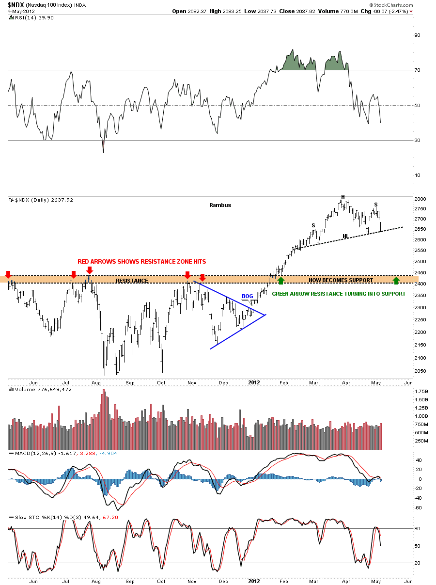
Next lets look at the NDX 100 which was one of the strongest markets here in the US. This 100 big cap stock technology index was the star performer since the October low last year with Apple and a few other technology stocks leading the way. As Apple went parabolic there is a very good chance that the fall will be just as swift as the rise. Last Friday’s decline really shows that the right shoulder is now almost complete. A break of the neckline will probably usher in a move down to the brown horizontal zone that once was resistance on the way up and once we broke it to the upside should now act as support initially.
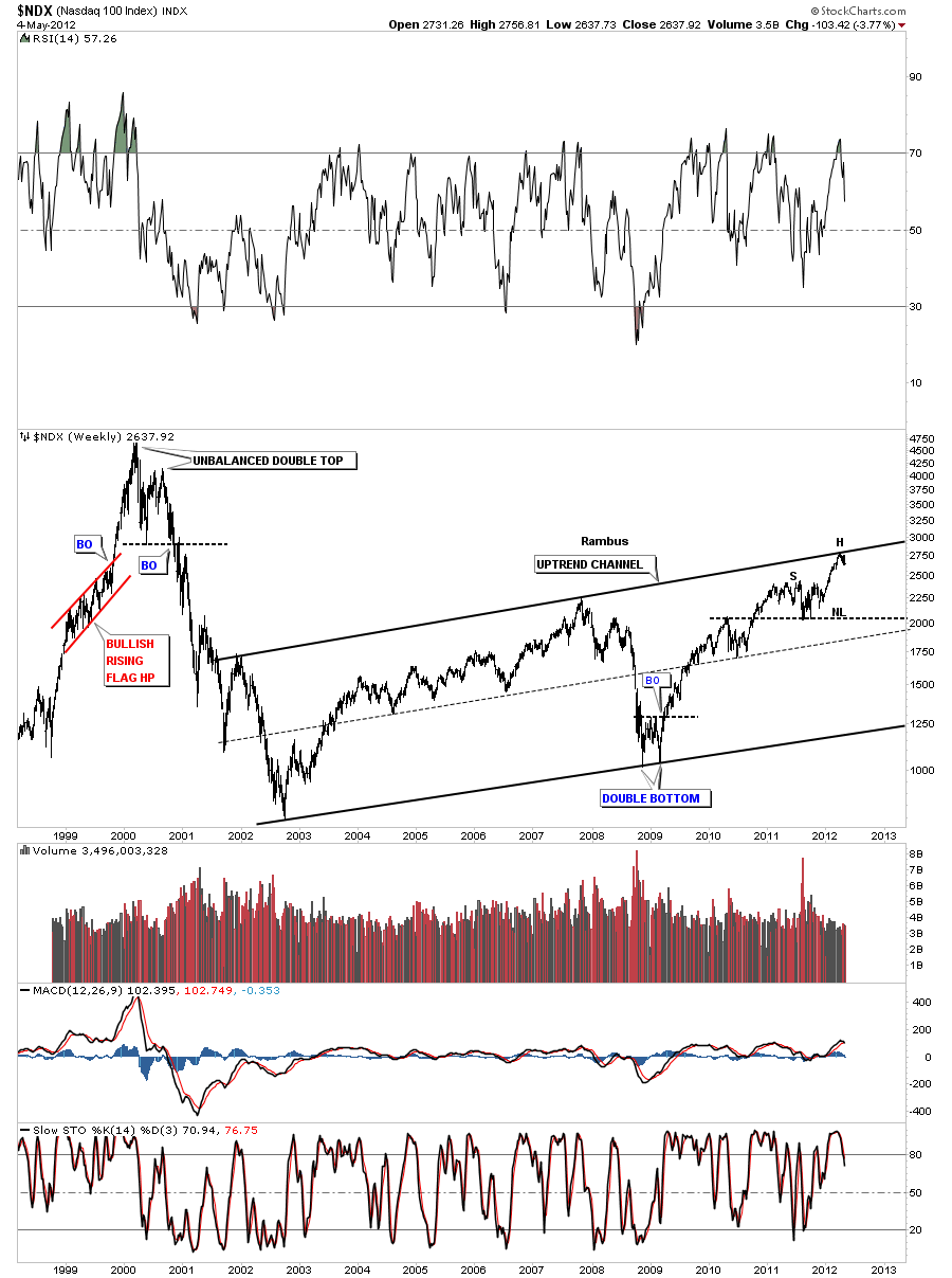
The weekly look of the NDX shows why our current H&S top pattern is forming right where it is. As you can see on the chart below our current H&S top is forming just below the top rail of an uptrend channel. You can also see the potential for a much bigger H&S top pattern if the NDX has a fairly steep drop that comes in close to a possible neckline I’ve put on the chart below. Again there is still alot of work to do but its something to keep an eye on.
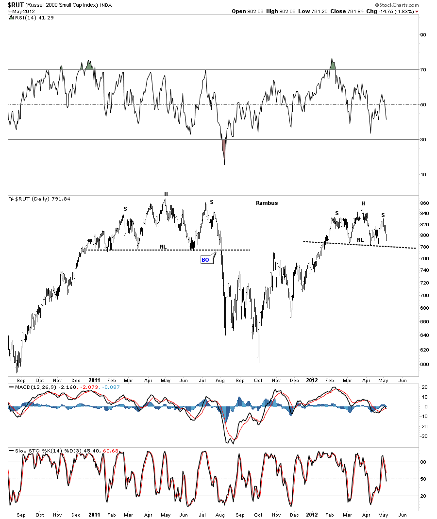
Lets look at the RUT 2000 small cap index that can lead the way higher or lower sometimes. Again another H&S top in the making.
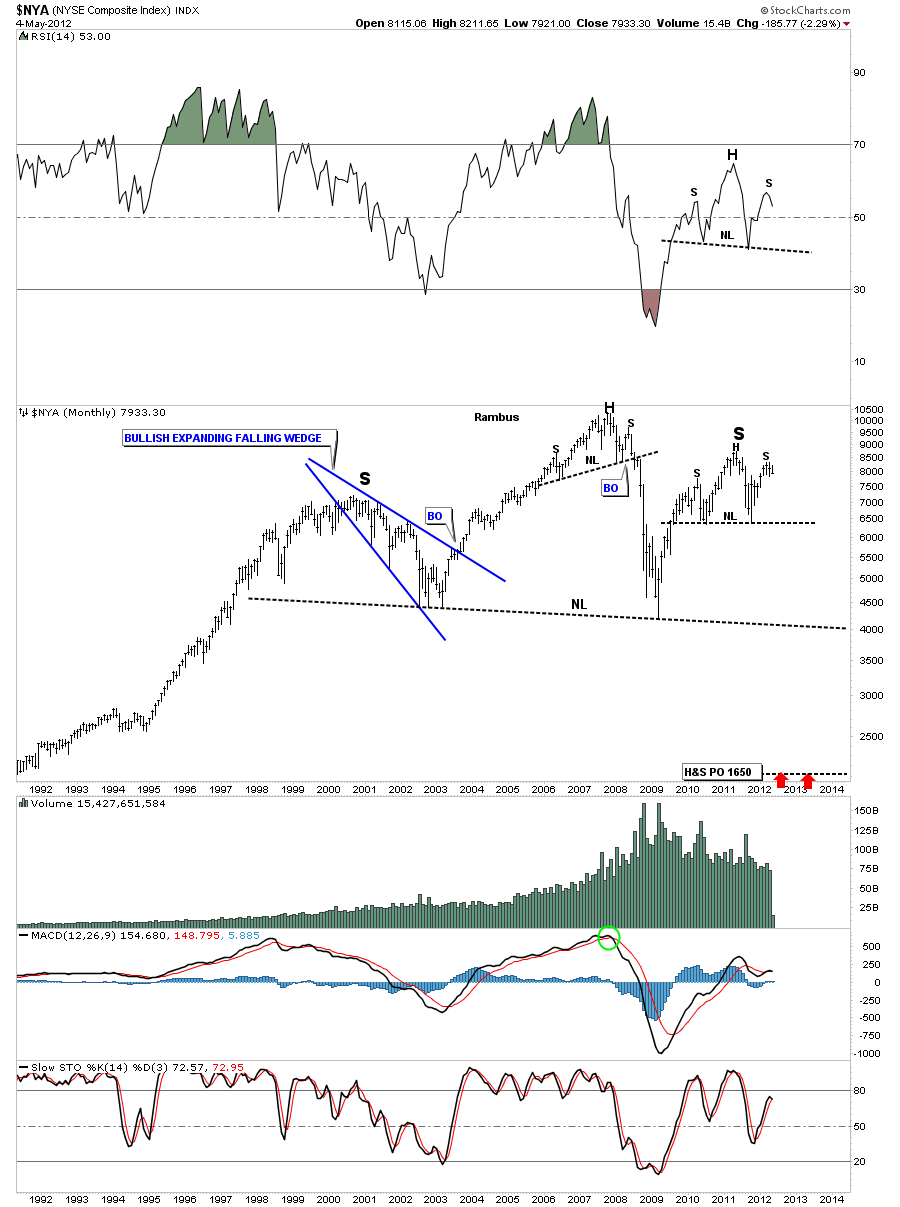
The NYA is a broader measure of US companies. As this chart shows it has been one of the weaker US stock market indexes as it fell short of the 2011 high. Note the head portion of the H&S top was also a smaller H&S top pattern. Many times a H&S pattern will consists of three individual chart patterns that make up the whole pattern.
Next I want to show you the very long term chart of the NYA that may have huge implication further down the road. Keep in mind we are still working on the possible right shoulder of a 12 year H&S topping pattern. This pattern still has a very long ways to go yet before we can even consider it a strong possibility. I’m just showing it now so you can see the possible huge move down to the 1650 area as measured by the big H&S top. Just something to keep on the back burner.
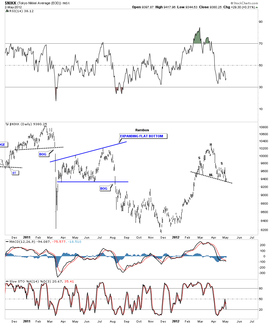
Now that we have looked at the European and US stocks markets lets see what the other side of the world looks like, the NIKK Japaneses stock market. Here to another H&S top pattern that is almost complete except for the breaking of the neckline.
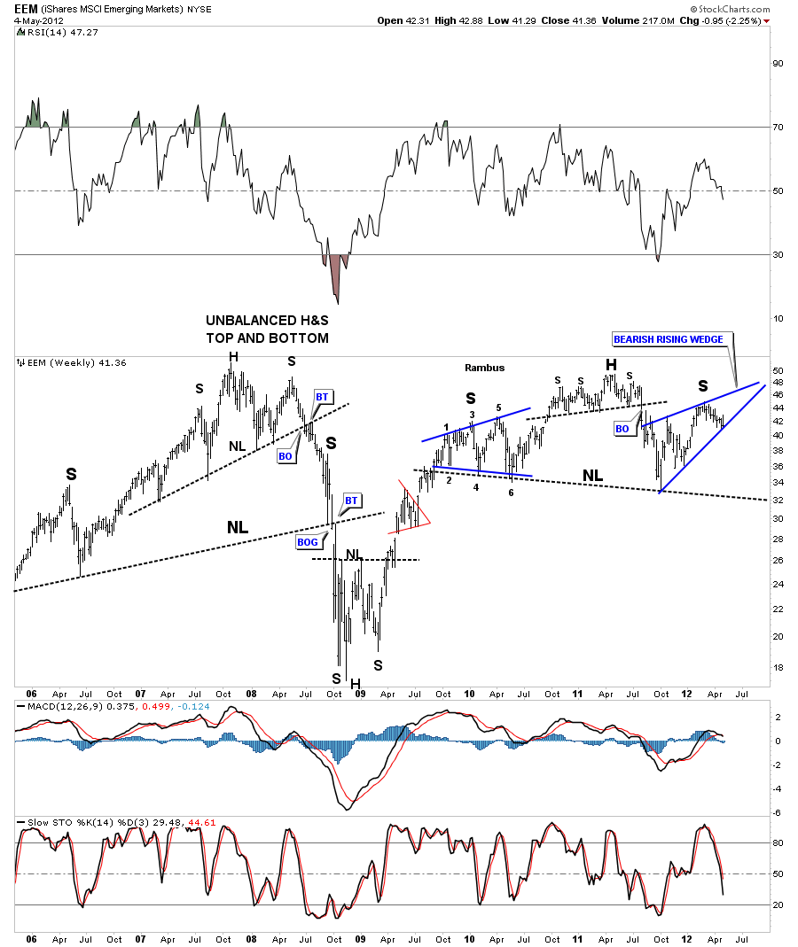
I would like to show you one more chart that takes in the emerging markets. This chart is very telling as there are several bearish looking chart patterns that could spell serious trouble for the emerging markets which would be another big blow to the global economy. Unlike the US stock markets that enjoyed a very strong rally off the October 2011 low the EEM had a decent rally but nothing compared to the US rally. Note the move off the October 2011 low that was only able to create bearish rising wedge. Note the three individual patterns that are making up this large H&S top. The left shoulder consisted of an expanding triangle. The head portion is a smaller H&S top and the right shoulder is a bearish rising wedge. Three patterns creating one big pattern.
At the beginning of the article I mentioned that I thought the Precious Metals indexes were leading the stock markets lower. As you can see on the charts above most of the H&S top patterns still have a little ways to go yet before they can be declared complete. Not so with the Precious Metals indexes as they have completed their big H&S top patterns last month. Lets start with the HUI H&S top that I’ve been showing for sometime now that few realize its importance to the precious metals stocks.
The XAU monthly H&S top pattern.
The GDX monthly look.
This next chart of the GDXJ small cap precious metals stocks probably worries me the most because I know alot of perma bulls will hold on to the bitter end. What this big H&S top pattern is suggesting is that this index could be cut nearly in half before reaching a measured move down to the 12.90 area. I know many think that is impossible but I can assure you stranger things have happened in the stock markets.
I could go on by showing some of the commodities charts that are not looking very good at this point. I think its very possible that we are entering another deflationary episode that will take the inflationists by surprise. It looks like we are still in the early stages of this scenario playing out and if it does then cash will be king down the road. I know there are several long term cycles coming due between now and 2014 which may play a key role in a deflationary cleansing of the system. As always time will tell but if you start to see some of these H&S top patterns playing out to the downside take note. This isn’t about being right or wrong its about protecting ones hard earned capital. All the best….Rambus

