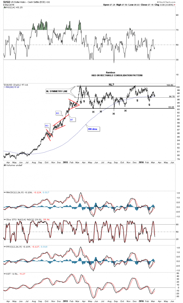
It’s been awhile since we last looked at the US dollar which has been consolidating its big impulse move up. The reason I haven’t posted it much is because it’s stuck in a sideways trading range going back over a year now.
99.9% of Market participants are either Bullish the Dollar , with all the implications including Lower Gold Prices or Bearish the Dollar, with the opposite implications .
However there are not two but THREE possible outcomes to this present trading range.
For the Bulls , the breakout is in progress with a present backtest of the bullish flag .
For the bears , if the 200 day ma fails to hold support in this general area for the bottom of a right shoulder, a move back down to the bottom of the trading range would then setup the possible rectangle consolidation pattern around the 93.25 area. The least likely, but is possible, is a huge double top if the price action breaks below the bottom rail.
The third possibility , the one most don’t consider , is a prolonged trading range. At this point I favor the sideways trading range that forms a rectangle consolidation pattern as I explain below.
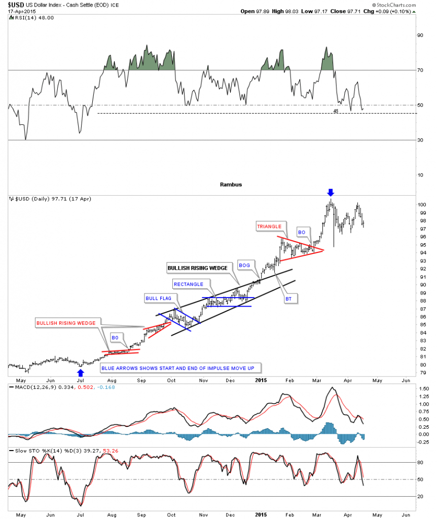
Note the three smaller red consolidation patterns that formed during its big impulse move up from mid 2014 to the early part of 2015. That’s what a strong impulse move looks like. Normally in strong impulse moves you’ll see at least three smaller consolidation patterns and on rare occasions four which strongly suggests you’re getting close to the end before a much bigger consolidation pattern starts to form. As you can see that is what has taken place so far.
Below is a static chart for the US dollar which shows more details of that massive impulse move up. The blue arrows shows the beginning and the end of that rally phase. You can see how several smaller consolidation patterns formed a bigger bullish rising wedge which is centered about in the middle of that uptrend. The blue arrow at the top of the chart shows the beginning of our current one year trading range as shown on the daily chart above.
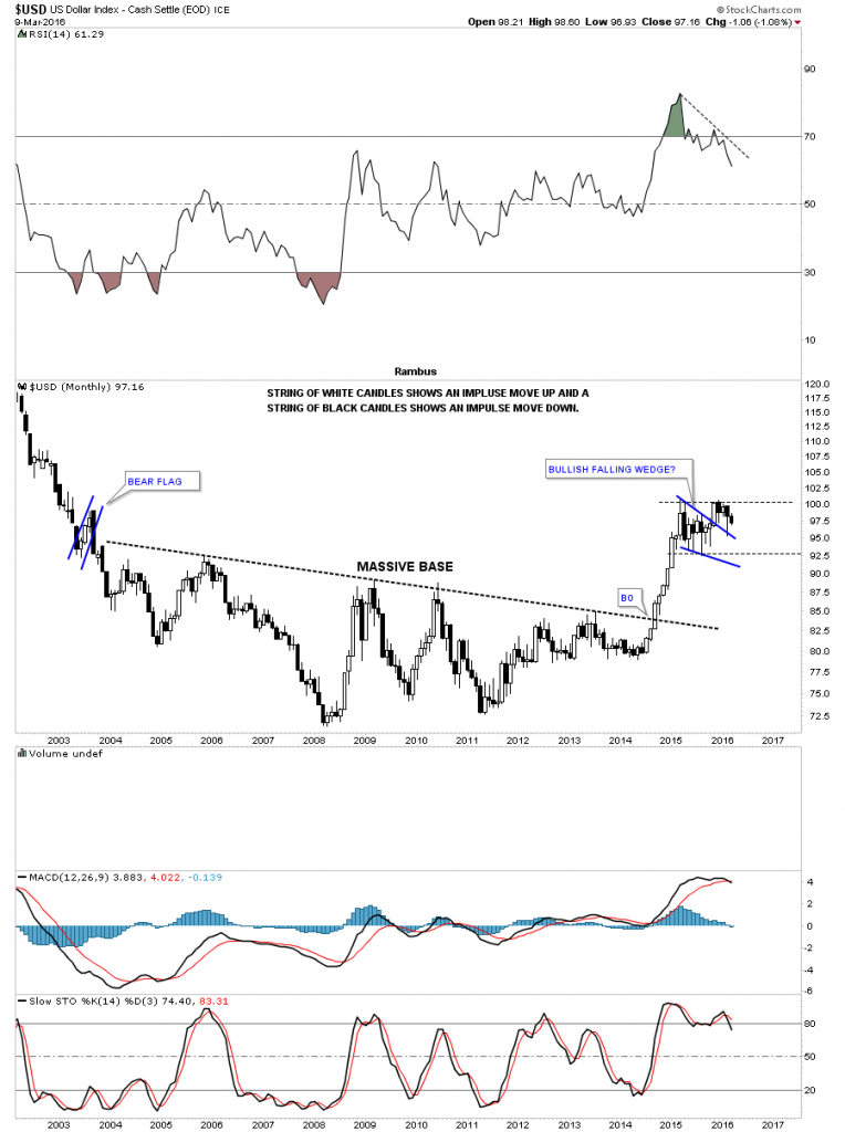
For newer members, who may not have witnessed that big impulse move up, below is a monthly candlestick chart which shows a string of nine white candlesticks all in a row when the US dollar broke out of that massive base. Note the blue falling wedge that looked like it could have been the perfect consolidation pattern for the next leg up but the failure to take out the high suggested that the consolidation pattern was going to be more complex and take longer to build out. The top blue rail of the falling wedge was backtested in February, but again the price action couldn’t take out the high of the pattern.
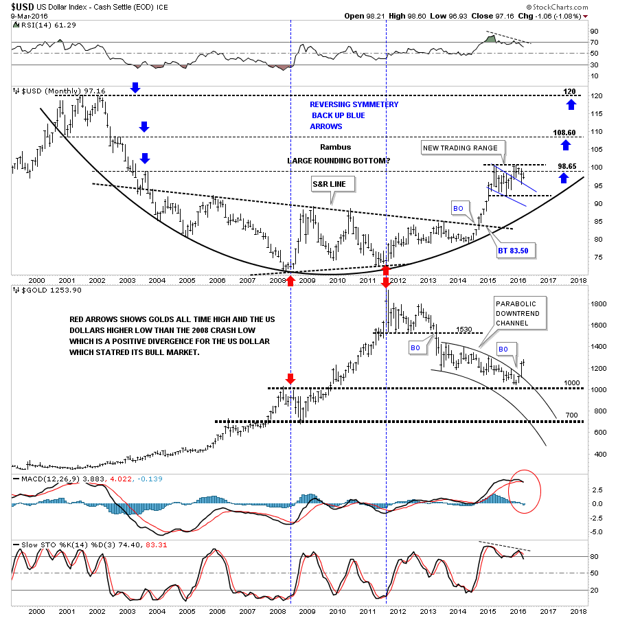
Below is a monthly combo chart that has the US dollar on top and gold on the bottom. The last time we looked at this chart gold was still trading inside of the parabolic downtrend channel. Gold had a nice clean breakout of the top rail of the parabolic downtrend channel in February, and has continued to move higher this month. When I look at the blue falling wedge on the US dollar chart I see a failed pattern for two reasons. The first reason is that it couldn’t take out the first reversal point high, the second reason is with this type of pattern the US dollar should have risen strongly after the initial backtest four months ago. The failure to make a new high after the initial backtest says to me that the trading range is going to take more time before it matures out.
There is one more important aspect to see on this combo chart. The red arrows on the left side of the chart shows where the US dollar bottomed and gold topped just before the 2008 crash in gold. Now look at the two red arrows in 2011, which shows where gold’s bull market topped out after a nearly parabolic rise while the US dollar actually made a higher low vs the 2008 low. That was a big positive divergence for the US dollar which also shows that gold can rally on a relative basis to a strong US dollar. There is no way to know how long the US dollar will work on its consolidation pattern. Its already taken one year and with the impulse move being so big it’s seems likely that the US dollar will be working on this trading range for much longer than we can imagine.
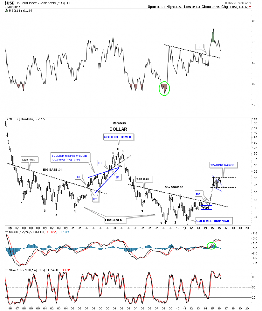
This next chart may give us a glimpse on how long our possible trading range may take to mature out. Below is the 30 year fractal chart we were watching before the US dollar broke out from big base #2 which launched its massive impulse move. Note the big blue bullish rising wedge which formed as a halfway pattern when big base #1 broke out. That big blue rising wedge began to form in 1997 and the breakout came just less than three years later in March of 2000. Again there is no way to know for certain how long our current trading range may last but if the fractals keep playing out like they have the US dollar could be in a lengthy trading range giving the precious metals complex time to flex their muscles. Note the H&S top on the US dollar in 2000 which marked the beginning of gold’s bull market.
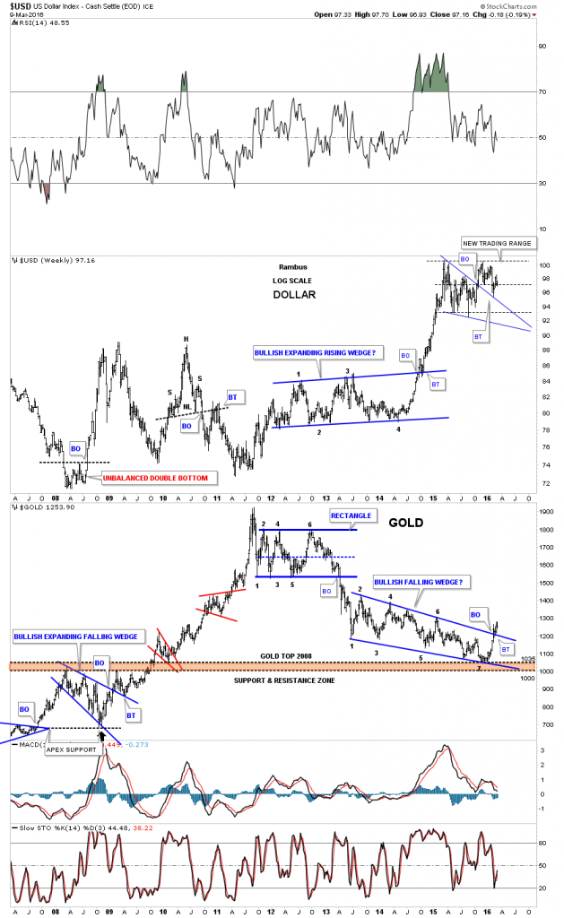
Below is another combo chart which has the US dollar on top and gold on the bottom. Lets start by looking at the gold chart on the bottom. The brown shaded support and resistance zone is built from the top gold made in 2008 before it crashed to just below 700 or so. Note where the 7th reversal point on the falling wedge formed on gold, right on the very top of the brown shaded S&R zone at 1035. The bottom of the S&R zone is at 1000. After almost three years of building out that blue falling wedge on gold, it finally looks like the wedge has broken to the upside and has had one backtest so far. As long term members know I was looking for one last capitulation move down to finish off the bear market but when I look at this chart it’s very clear to me that gold found support right on top of the 2008 high, resistance turning into support.
Note that massive rally the US dollar had that started in the middle of 2014 and ended in the first part of 2015. While the US dollar was rallying in a near vertical move , gold just kept on chopping out the blue falling wedge, which in hindsight now, we can see was a positive divergence for gold to the US dollar. IMHO the setup for gold couldn’t be anymore bullish with a nearly three year seven point bullish falling wedge which formed on the brown shaded support and resistance zone at 1035 and has had a breakout and backtest to the top rail. We have a very clean line in the sand with the top rail of the seven point blue falling wedge reversal pattern similar to the breakout and backtest gold had when it broke out of the blue bullish expanding falling wedge in early 2009. That top rail was tested multiple times and held support which eventually led to the biggest rally in gold history. So the next time you’re feeling bearish on gold bring up this chart and see if gold is trading above the top rail of the falling wedge. As long as it is, all systems are go. All the best…Rambus.

