In this weekend report I would like to show you some charts that can tells us if we are in a risk off trade, DEFLATION, or risk on trade which would signal INFLATION. As most of you know I have been in the Deflation camp since the first of the year and up to a week or two ago that has been the best the safest place to invest. There is always an ebb and flow to markets which never go up or down in a straight line. In a bull market you have more ups than downs and in bear markets just the opposite happens. I think we are at one of those turning points in the markets where deflation, which has been in control for close to a year is now giving way to another inflationary move which would be good for the RISK ON type of trades. We are still very early in this turn toward inflation which should give us some good buys.
Before you read any further I would like you to clear your minds of all the stuff you read in the papers, the internet or see on TV that that keeps enforcing how bad things are here and around the world right now. Remember the markets are always looking six months to a year out in the future. What you are seeing in the markets right now is what the stock markets were seeing many months ago. Just like right now the markets are looking ahead many months into the future and what some of the charts are saying is that now is not the time to be a hardcore bear. I know it flies in the face of reality of what we are seeing right now but I think things will be looking better for the stock markets, commodities and the precious metals six months from now. I know most of you have heard the expression, The Markets Climbs a Wall of Worry. How many times have you seen the markets go up on bad news? You think to yourself, that doesn’t make any sense which of course it doesn’t if you are looking to the present to find your answers. So with that in mind and having your mind free and clear to look past the present and into the future, lets see what the charts are telling us as to the risk off or risk on trade.
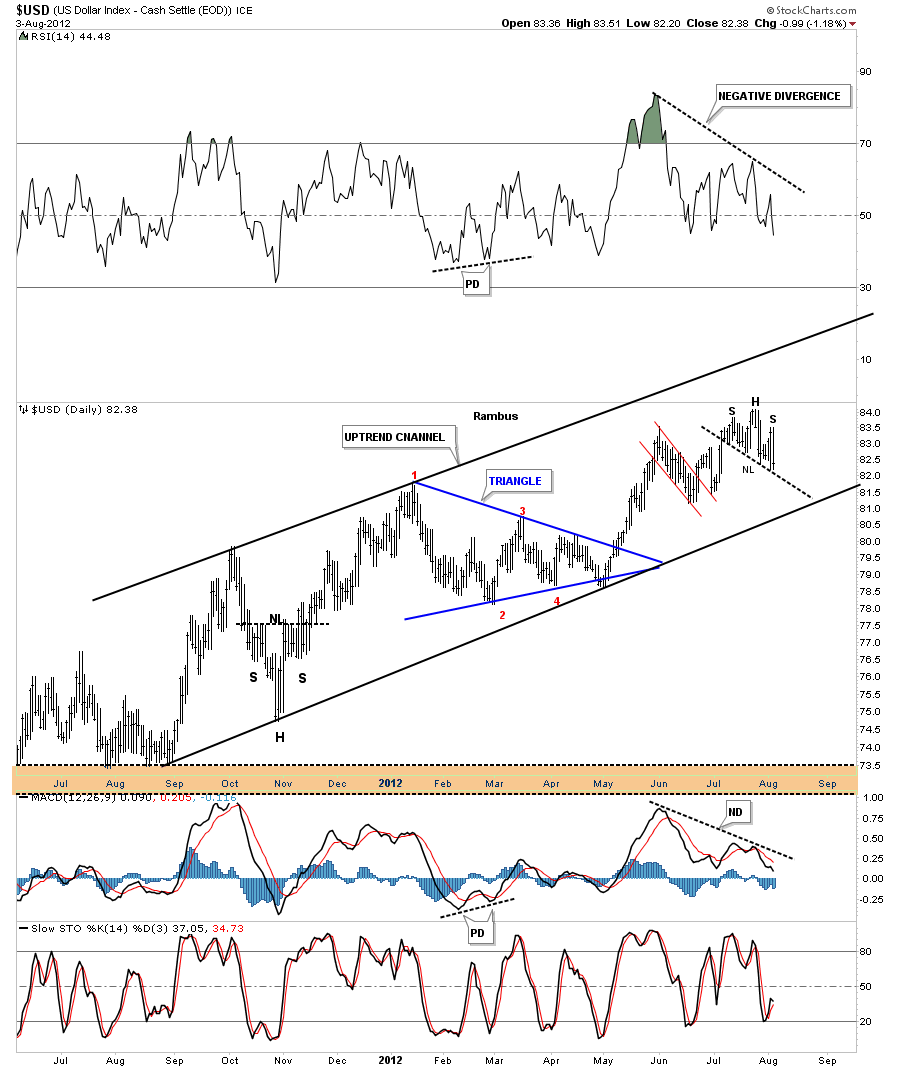
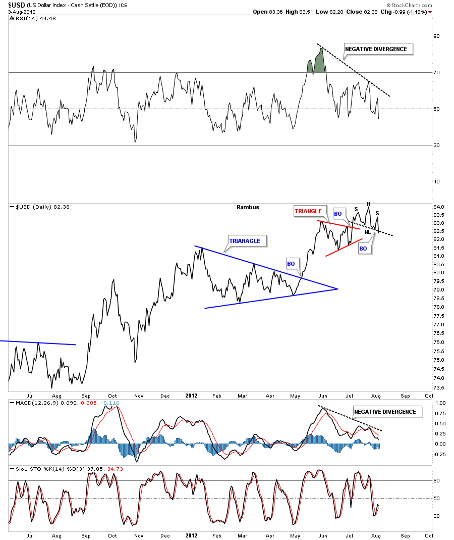
The US dollar is the key to understanding the move in the risk off or risk on trades. When the dollar rallies the risk off or deflation trade is where you want to be and when the dollar is falling commodities or risk on trade is the place to be invested. I have been pretty bullish on the US dollar for some time now but there was a pattern that formed last week that says a top might be at hand in the dollar. The pattern didn’t really show itself until last Friday, August 3rd. On the chart below you can see a small H&S top with a steep falling neckline. The neckline hasn’t been broken yet on the bar chart but the line chart shows the neckline has already broken down. Also notice the big negative divergence on the RSI indicator at the top of the chart and the negative divergence on the MACD at the lower part of the chart.
That H&S top is not that big but it is a reversal pattern that is signaling at least a temporary end to the uptrend that has been in place for almost one year now. The line chart below shows the little H&S top breaking the neckline. Another little clue that this could be a top is the failure of the little red triangle to reach it’s price objective. It has fallen way short and now with the the H&S top in place I have to lean heavy for a top in the US dollar at this time.
Next lets look at the weekly chart for the US dollar that doesn’t look quite as bad as the short term daily charts. It looks like another backtest to neckline #2, at 81, will be a big deal. I’ve drawn in a potential bigger H&S top using neckline #2 as the neckline. If we are just now starting to enter into the risk on trade then the US dollar will have to top out in this area. How it does it no one knows for sure but a topping pattern, like the H&S top, is the most likely candidate to reverse the one year uptrend.
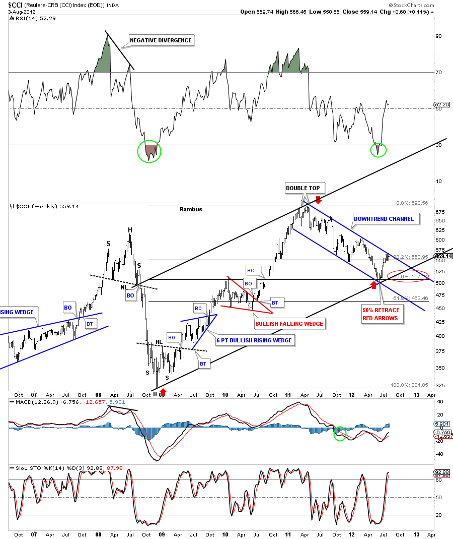
If the US dollar has been in a one year uptrend that means the commodities indexes have been in a downtrend for at least a year. Lets start with the $CCI commodities index that indeed shows its been in a nice orderly downtrend channel for close to a year. It is currently testing the top rail of the downtrend channel. Also the red arrows shows a Fibonacci 50% retrace of the bull leg that started at the 2008 crash lows and ran all the way up to the top that was made in May of 2011. One last note. If you follow the 50% Fibonacci line to the left side of the chart you can see a red bullish falling wedge that was made on the way up. The top of the red bullish rising wedge is a perfect place to look for support.
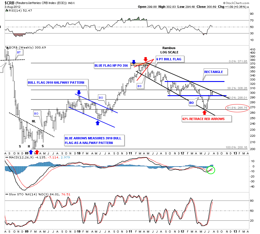
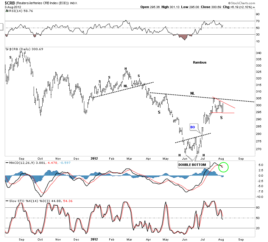
Next lets look at the CRB commodities index that has corrected 62% of its bull market rise off the 2008 bottom. You can see on the chart below the last three bars have been bouncing between the top downtrend rail and the bottom rail of the rectangle consolidation pattern. A break of the top rail of the downtrend rail would be a good step in the right direction for the risk on trade.
The daily chart of the CRB index is showing a potential inverse H&S bottom. That is the kind of pattern we want to see down here that will give the index enough energy to take out the top rail of the downtrend channel that will spark the new uptrend.
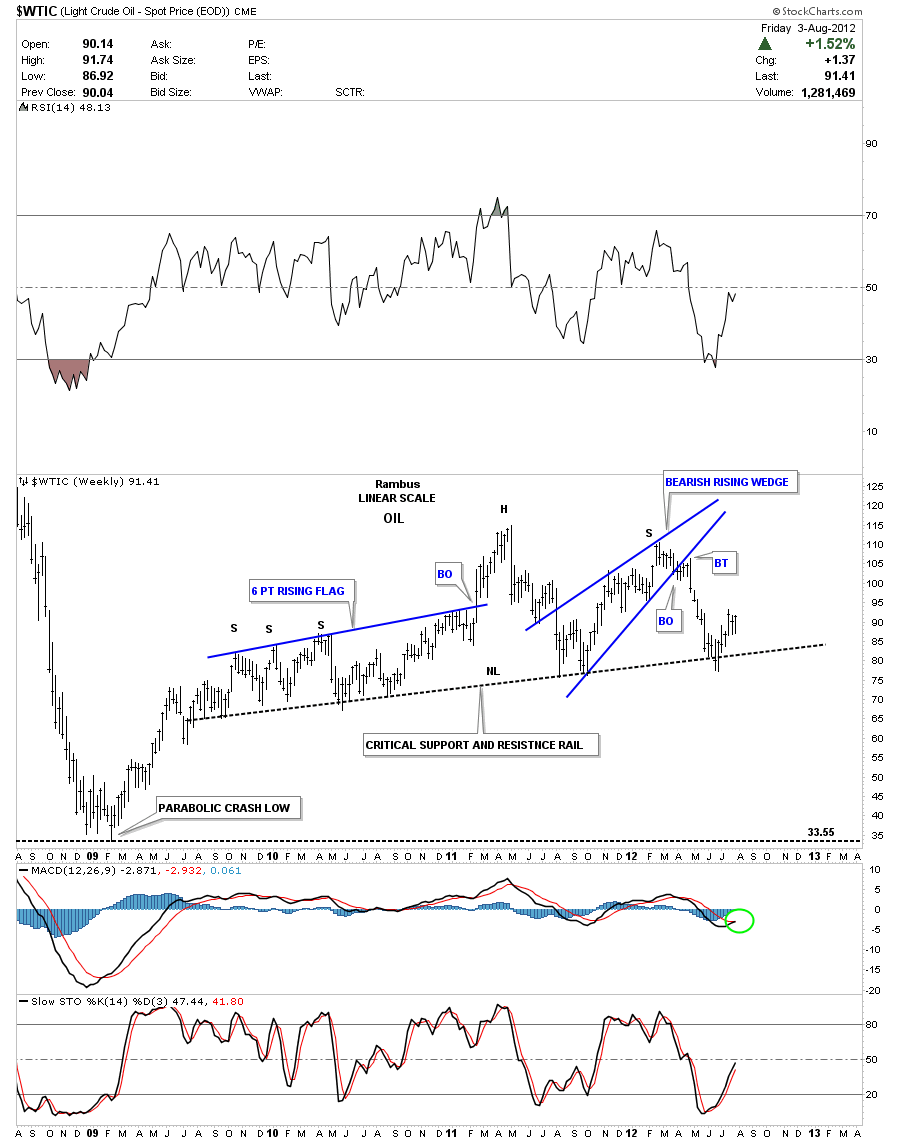
Next lets look at the oil chart for more clues to the risk on, risk off trade. Oil is always an important commodity in the deflation – inflation debate as oil affects so much of our everyday lives. The first chart I would like to show is the weekly look that shows the big H&S top pattern. You can see where I labeled the neckline as a critical support and resistance rail for the simple fact that it has many touches on it. About six weeks ago it penetrated the all important S&R rail but quickly turned back up and closed back above it. That was a very important development IMHO as it told us oil wasn’t ready to go down yet.
The failure of oil to crack the potential neckline has now given rise to a more bullish scenario for oil. The next chart below shows a potential big blue triangle forming. This is a huge consolidation pattern has a price objective north of 200.
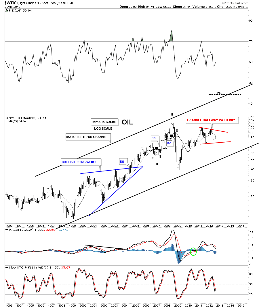
Below is a monthly chart of oil that is showing how the triangle maybe forming as a halfway pattern. Its hard to believe that oil could trade over 200 but if this triangle consolidation pattern plays out that is exactly where the price of oil would be headed.
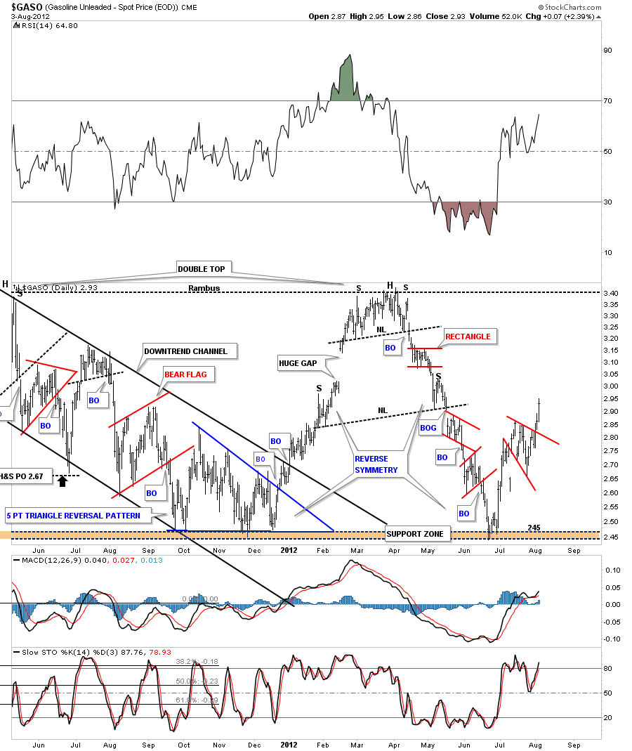
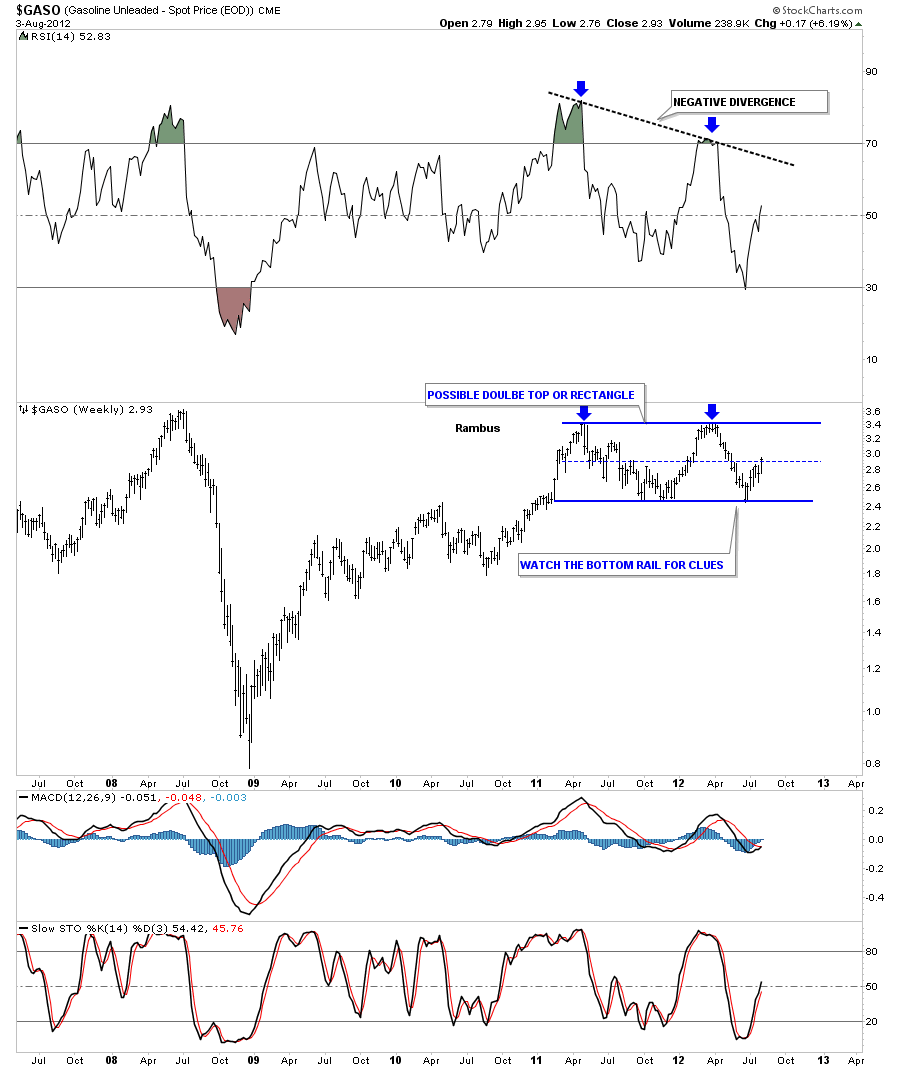
While were on the subject of oil lets look at the gasoline chart as it should reflect a rising gas price as oil rallies. The chart below is the same chart that I’ve shown you in the past on gasoline. When I first posted it gas was trading up at its old high around 3.45 or so. You can see how the reverse symmetry played out to the downside. Once gasoline hit the old low it has been rallying back up at a fast rate. It now appears to be reversing symmetry back up.
The weekly chart of the gasoline really puts the trading range, from the chart above, in perspective. The last time I posted this chart we were testing the bottom rail of the big rectangle. Keep in mind the triangle consolidation pattern that I showed you on the oil charts above. This rectangle in the gas chart is the equivalent to the big triangle on the oil chart.
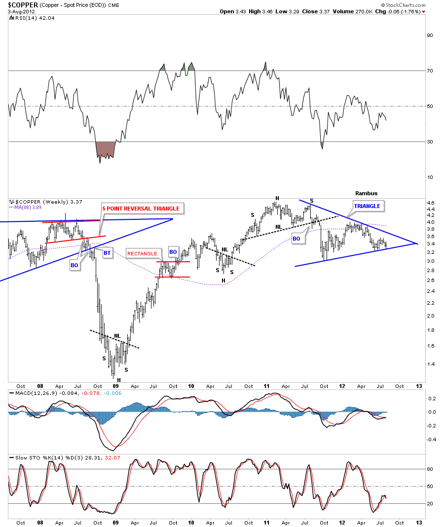
Copper is always a good commodity to look at when one is looking for a strong or weak economy or risk on or risk off trade. Just like the oil and gasoline charts above that are showing big consolidation patterns copper is also showing a big blue triangle.
As these charts above are showing we could be at the beginning stages of another round of inflation. There are alot of stock markets around the world that look like they are trying to bottom out which would put more pressure on commodities. I will post the second half of this inflation scenario in the Wednesday Stock Report which will include many of the world stock markets and a few more key commodities that could be setting up for higher prices. All the best…Rambus
EDITOR’S NOTE :
Rambus Chartology is Primarily a Goldbug TA Site where you can watch Rambus follow the markets on a daily basis and learn a great deal of Hands on Chartology from Rambus Tutorials and Question and Answeres .
Most Members are Staunch Goldbugs who have seen Rambus in action from the 2007 to 2008 period at www.goldtent.org and now Here at Rambus Chartology since early 2012 .
To review his Work and incredible calls from the 2007-2008 period click on the top right sidebar in the “Wizard of Rambus” ….”What If !!” Post
To Follow Rambus Unique Unbiased Chart Work and participate in a Chartology Form with questions and answeres and learn the Art and Science and Mindset of a Pro Trader please Join us by subscribing monthly for $29.99 at
www.rambus1.com
We have many subscribers from all over the world who are glad they did as they enjoy the many daily updates and commentaries provided at this exciting new site
As you will see Rambus (Dave) has prepared us for this difficult period by being one of the only ones to see and warn about this incredibly debilitating PM smackdown as early as Jan 2 2012 …click on the” HUI Diamond in the Rough” Post in the “Wizard of Rambus” top right
You will find Rambus to be a calm humble down home country tutor with an incredible repitoir of all the TA based protocols tempered with his own one of a kind style…simply put…He wants to keep his subscribers on the right side of these crazy volitile and downright dangerous markets
See you at the Rambus Chartology

