In this weekend report I think its time to look at the precious metals complex as last weeks move finally showed some underlying strength that took prices up to some important resistance zones. At the close of trading last Friday, August 24th, gold, silver and the precious metals stock indexes were all trading at key trendlines. We know there hot as they all stalled out on their initial hit which should be expected. The next couple of weeks are going to be critical for the precious metals complex as those important resistance rails will need to be taken out before a serious new leg up can begin. Last weeks price action was very positive as there was enough energy to rally the precious metals sector back up to critical resistance which is the first step in a new impulse leg higher. Keep in mind the markets generally move two steps forward and one step back during a good move up. Only when we reach the parabolic portion of the bull market is when we will see maybe five steps forward and one step back. So lets look at some of those important resistance rails, that we can keep an eye on for future reference.
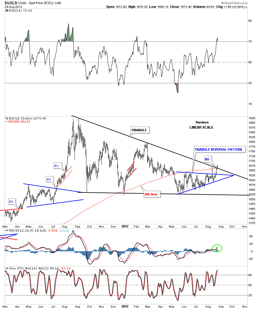
Lets start with gold as it has actually penetrated the most important downtrend rail of what is looking more like a triangle consolidation pattern to the upside in black. The smaller blue triangle that has formed over the last 3 months or so is located in the best possible place to to offer it’s strength for a complete breakout of the much bigger year old black triangle. Also note the 300 dma, in red, that was also broken to the upside right at the top rail of the big black triangle. This is what you call killing two birds with one stone. If this is a true breakout the top black rail of the big triangle should not be violated on any backtest in the future.
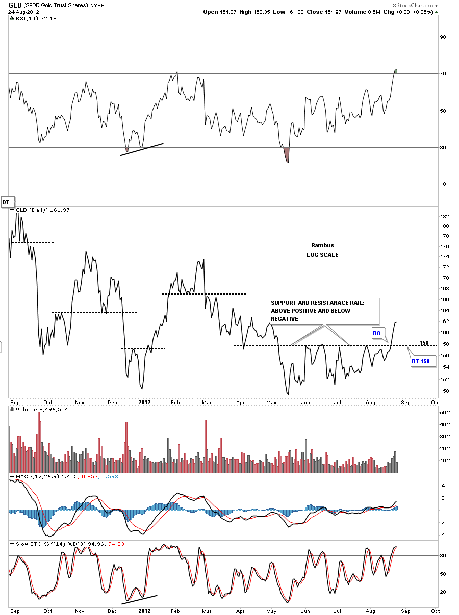
The next chart I would like to show you is a daily line chart for the GLD. Line charts have their place in charting as they can identifying support and resistance zones. They can takeout a lot of noise that a bar chart some times exhibits. Line charts also do a good job of identifying double tops and bottoms that might be harder to see on a bar chart. With that said lets look at a one year line chart of the GLD that is showing the 158 area has held resistance from May of this year until it was decisively broken to the upside this week. If we have any weakness over the next week or two the 158 area on the GLD should now act as strong support. Basic Technical Analysis.
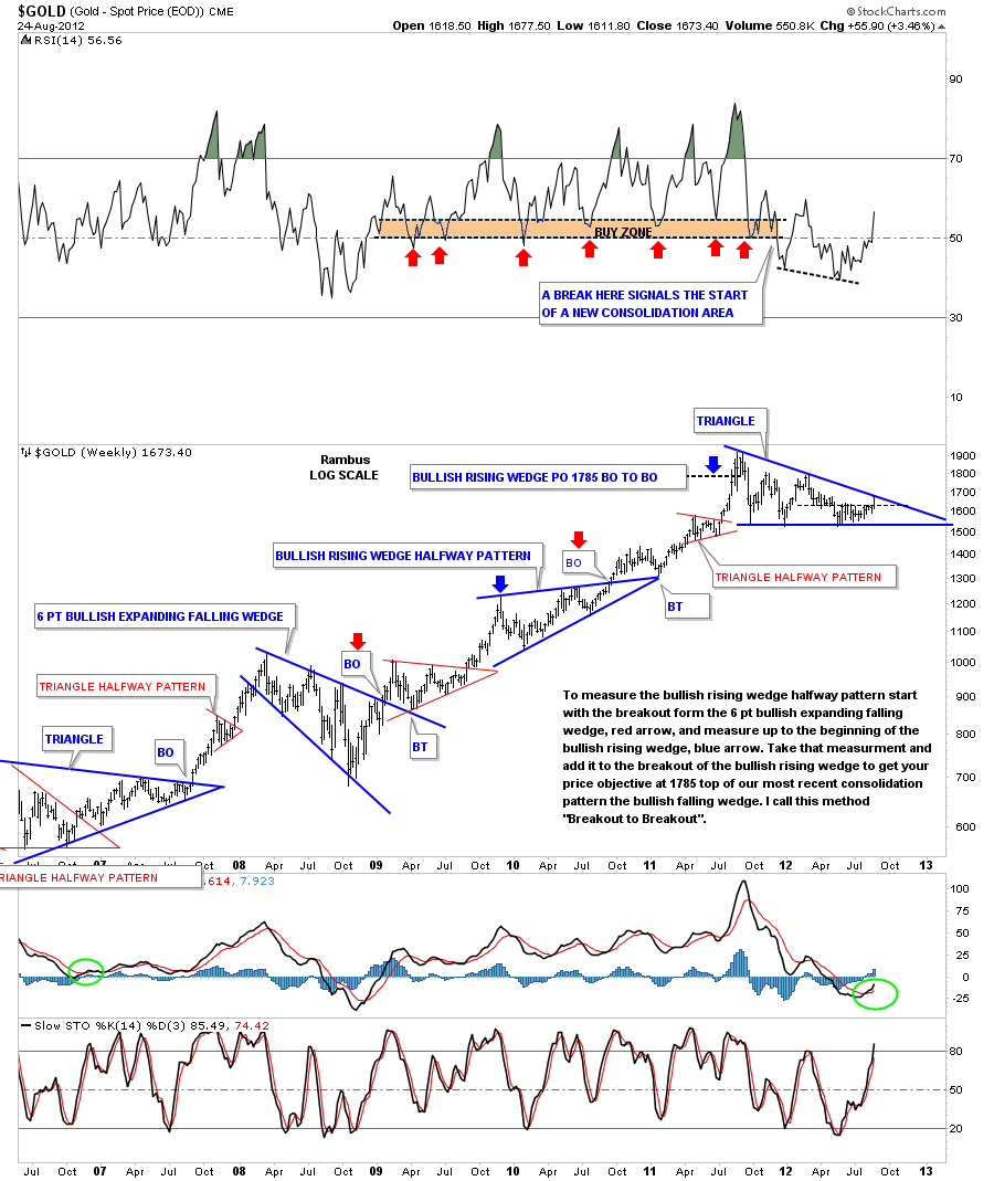
The weekly look at gold is showing the possible triangle that has been forming for close to a year now. Breakouts can take their time on occasions with alot of backing and filling around the breakout area. Then there are other times when a stock has a breakout gap and never look back. You never know for sure what type of breakout you’ll get until after some time has passed. As of today gold is testing the top blue rail of the blue triangle so what type of breakout we will get is still up in the air. Any type of breakout will be positive though. Note the RSI indicator at the top of the chart. When gold was in it’s last strong impulse leg higher, anytime the RSI fell down to the 50 area that launched the next leg higher. When the RSI finally broke below 50 is when we started our latest consolidation pattern. Also you can see where the RSI made a lower low, black dashed rail, and gold failed to follow through, that was a bullish sign for gold.
This last chart for gold is a long term 30 year look that puts our latest triangle consolidation pattern in perspective. You can see when gold finally left it’s big base it has produced one consolidation pattern ofter another. Our most recent triangle consolidation looks like it fits right in to the major uptrend that began in 2000. One last note on the chart below and that is the big neckline that runs through the center of the chart. We know that big neckline was hot by the way the price action traded at the breakout area in 2007. As you can see there was a nice red triangle that formed just below the big neckline. That told us gold was building up the energy to finally take out that 27 year neckline, which it did. What is more important is how the big neckline reversed it’s role and held support during the big stock market crash in 2008. Gold built a beautiful H&S consolidation pattern with the head portion testing the big 27 year neckline. So the breakout and backtest were complete which led to the biggest impulse run higher for the entire bull market to date.
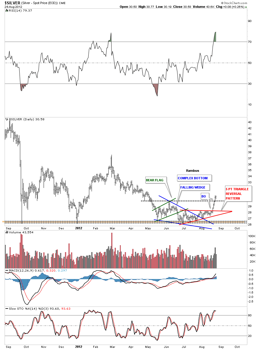
Lets now turn our attention to silver and see how it has performed last week. On the chart below I’m labeling the bottom formation as a complex pattern because it is made up of three different chart patterns. The green pattern is the bear flag, the blue pattern is a bullish falling wedge and the most recent and most important pattern is the 5 point red triangle reversal pattern. By the close of trading on Friday silver closed above the June high. That is significant as Silver has now put in a higher high.
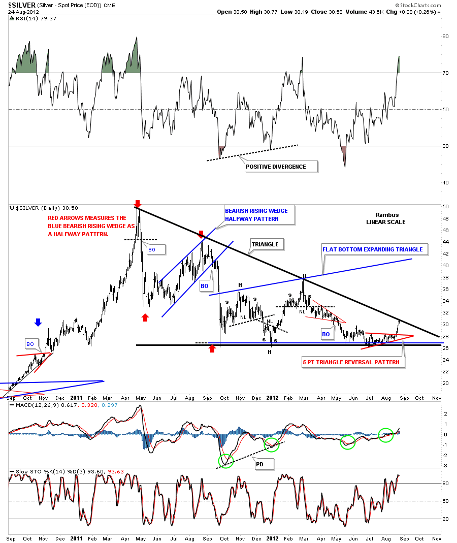
Lets now look at a two year chart for silver that starts to paint a bigger picture since the all time high at 50 in April of last year. As you can see on the chart below the price action took silver right up to the downtrend rail of a possible big triangle formation. The bottom rail of the big triangle has held support many times since the correction began in April of last year. You can see another big chart pattern that has formed since the initial crash down to the 26 1/12 area that started the flat bottom expanding triangle in blue. That pattern is similar to the gold big rectangle that I showed earlier. So silver is now testing the all important top rail of the triangle.
The 30 year chart of silver is a very beautiful chart technically speaking. Silver had two massive H&S bases stretching back to 1982. Note the red triangle that formed just below neckline #1. That red triangle was going to fuel the breakout once everything was in place. The rally that followed took silver form 8 to 20 before it was time for the next pull back. As with the big 30 year chart for gold that I showed you above, silver also had a crash that took prices all the back down to the breakout of neckline #1 around eight. From that backtest to neckline #1 silver went on to have it’s biggest rally of the bull market topping out close to 50 the1980 high. From there silver has been in a very strong correction that has take the price all the way back down to 26 or so where strong support has come in on every test. You can see the brown area is where I was looking for support at neckline #2 backtest around the 24 area. If our latest consolidation pattern does indeed takeout the top rail of the big triangle then the 24 support zone will most likely not be hit. Just for what its worth the big H&S #2 price objective comes in around the 132 area. Big bases big rallies.
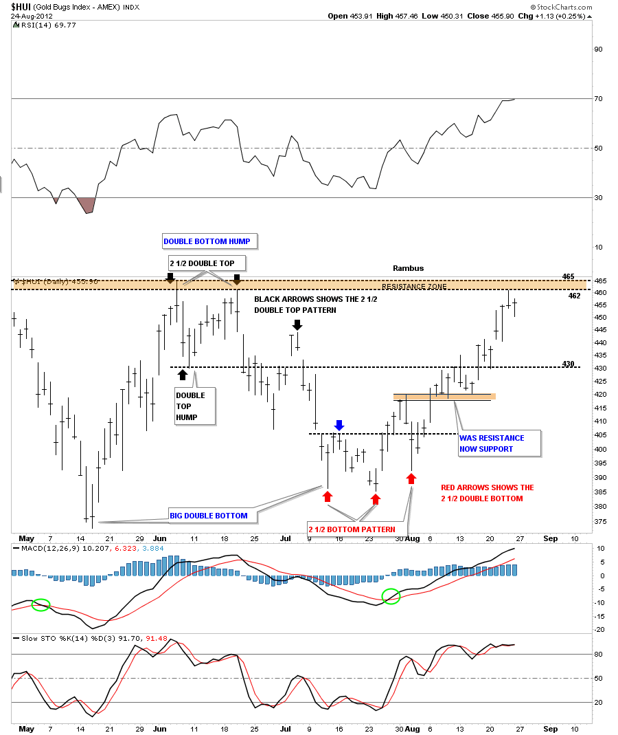
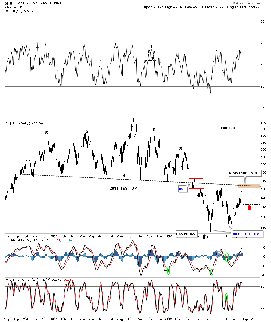
Lets now look at the HUI as a proxy for the other precious metals stock indexes. The HUI is building out what could be a double bottom reversal pattern. At the top of the chart I’ve labeled the critical double bottom hump that the HUI needs to trade above to signal that the double bottom is in place. That comes in around the 465 area. As you can see by last weeks price action the HUI hit the top resistance zone on Thursday and sold off telling us that top rail is hot and is still holding resistance. After a small sell off on Friday the HUI is in the process of rallying back up to test the top rail again. At some point if we are truly embarking on the next impulse leg higher that 465 will be taken out and then it will reverse it’s role from resistance to support. The black and red arrows shows the smaller double top and bottom that have formed within the much bigger double bottom. I’ve labeled these two smaller reversal patterns as a 2 1/2 double top and double bottom. I know many of you out there are thinking “where did Rambus come up with the name for those pasterns?” I’ve seem these patterns form many times over the years but you won’t find them in any text book. The half bottom refers to the move after a breakout from the double bottom that quickly runs out of gas and declines back below the double bottom trendline about half the distance to the bottom. Note the 3 colored arrows that shows the top and bottom 2 1/2 patterns. The double tops and bottoms are still valid patterns its just that the backtest was stronger than normal creating the half part of the double top or bottom. You can also view the half part as a false breakout that doesn’t really materialize as it moves back below or above the horizon black dashed rails. There were probably alot of sell/stops that the market maker could see that he could catch before the rally began in earnest. That’s how alot of the long tails come about at tops and bottoms.
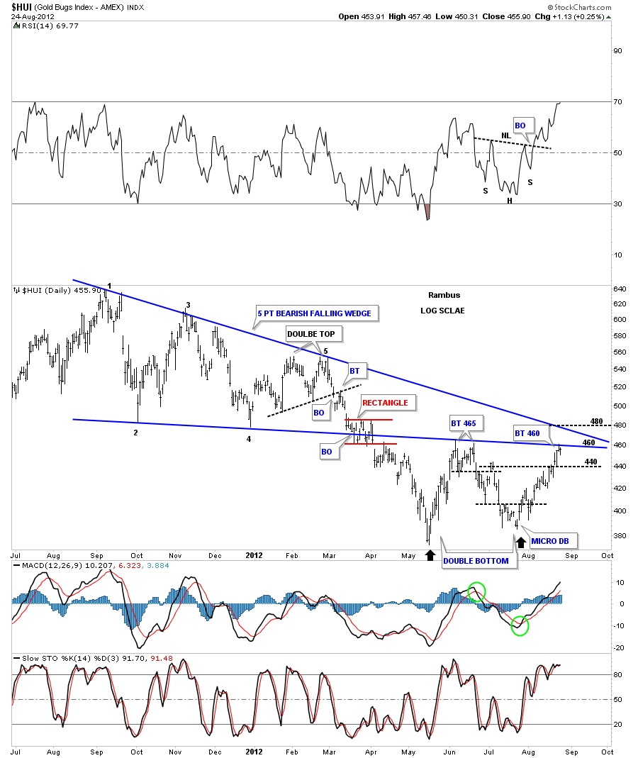
The next chart shows why we are now just starting to enter into some overhead resistance. There was a five point bearish falling wedge that gave way back in March of this year, red rectangle. That point represented the breakout. After bottoming out in May of this year the HUI rallied all the way back up to the underside of the bearish falling wedge where it ran out of gas and sold off again taking the price action back down toward the previous low. As you can see on the chart below the HUI as rallied all the way back up to the bottom blue rail again this week. Thursday it hit the bottom rail and sold off and Fridays action is starting what looks like another move higher to challenge the double bottom hump at 465. The most positive thing the HUI could do in here is takeout both the bottom and top rail of the bearish falling wedge that would have them reversing their roles from resistance to support.
Below is another chart that shows why the 465 area is critical resistance right now. There is a confluence of trendlines that intersect, right now at 465, red arrow. 
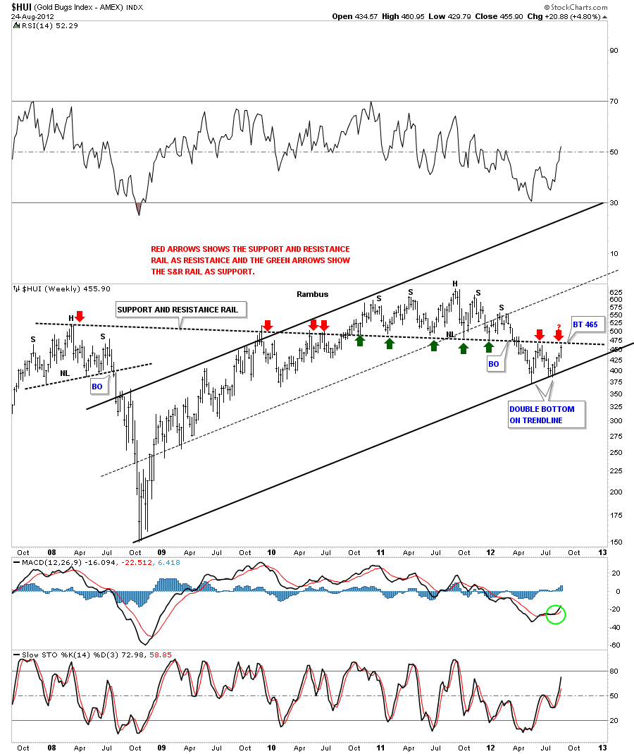
The next chart is a weekly look that again shows why the 465 area is such critical resistance right now. I’ve added a long black dashed support and resistance rail that goes all the way back to the H&S top that was made back in 2008. As you can see it has worked its magic reversing it’s role from resistance at the 2008 high, red arrows, to support at the neckline, green arrows. As you can see we are approaching the S&R rail again from the underside.
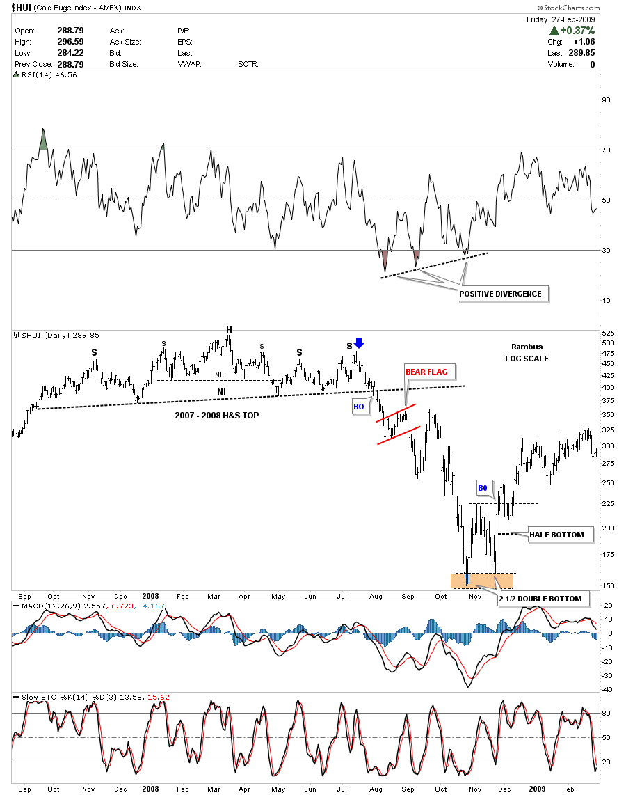
The next chart I would like to show you is a chart from the 2008 period and how similar that setup was compared to our most recent price action. First, the 2008 time frame shows the big H&S top that most couldn’t believe was taking place at the time. Only after the fact did it become apparent. What I want you to focus in on is the 2 1/2 double bottom that was created when prices were finally exhausted. You can see the half bottom formed abut halfway below the double bottom hump horizontal trendline. It didn’t hurt the double bottom pattern that actually reversed the downtrend but it gave a scare to the few technicians that were following the double bottom development. The rest is history as they say as the HUI went on to trade above 600 before it topped again.
The last chart I would like to show you is our most recent H&S top and the price action that followed the breakout. This is a comparison chart to the one above. I want to focus your attention to our current double bottom that is in the processing of building out. You may have to do a double take to make sure you aren’t looking at the 2008 double bottom. They are very similar looking.
So far last weeks rally in the precious metals complex moved the price action back up into critical resistance for the most part. It will be a very big tell if and when the precious metals complex starts trading above all the overhead resistance rails that I have shown you in this article. With the dollar trying to top out in here a strong move lower will propel the precious metals and indexes through their critically important resistance rails and take away some of the over head resistance that has been in play for over two years now. This should get everyone caught up on where we are in regards to the precious metals 12 year bull market. All the best….Rambus
EDITOR’S NOTE :
Rambus Chartology is Primarily a Goldbug TA Site where you can watch Rambus follow the markets on a daily basis and learn a great deal of Hands on Chartology from Rambus Tutorials and Question and Answeres .
Most Members are Staunch Goldbugs who have seen Rambus in action from the 2007 to 2008 period at www.goldtent.org and now Here at Rambus Chartology since early 2012 .
To review his Work and incredible calls from the 2007-2008 period click on the top right sidebar in the “Wizard of Rambus” ….”What If !!” Post
To Follow Rambus Unique Unbiased Chart Work and participate in a Chartology Form with questions and answeres and learn the Art and Science and Mindset of a Pro Trader please Join us by subscribing monthly for $29.99 at
www.rambus1.com
We have many subscribers from all over the world who are glad they did as they enjoy the many daily updates and commentaries provided at this exciting new site
As you will see Rambus (Dave) has prepared us for this difficult period by being one of the only ones to see and warn about this incredibly debilitating PM smackdown as early as Jan 2 2012 …click on the” HUI Diamond in the Rough” Post in the “Wizard of Rambus” top right
And Now Rambus is Preparing us for a Potential Big PM Rally
Dont miss Rambus PM Portfolio of 20 of the Best Stocks which is in the process of being developed now
You will find Rambus to be a calm humble down home country tutor with an incredible repitoir of all the TA based protocols tempered with his own one of a kind style…simply put…He wants to keep his subscribers on the right side of these crazy volitile and downright dangerous markets
See you at the Rambus Chartology
…………………….

