Charting is one of many disciplines used to follow the markets. You have Elliot wave guys that base the market movements on wave counts and cycle analyst that look at the different cycles from short to long term. A good Elliot Wave analysts can look at a chart and start counting waves based on years of experience. An experienced cycle guy will understand when a cycle is left or right translated whereas the inexperienced cycle person will say, because the price action didn’t turn on a dime when he expected it to, cycles are worthless to follow. With any discipline that one uses, it takes alot of hard work and time to finally become some what proficient in understanding what the markets are throwing at them. There is no holy grail when it comes to the markets but if one takes the time and makes an honest effort to understand one of the disciplines they can get the odds in their favor to make a trading decision base on something other than pure emotions.
For me personally, charting the markets is the way I interrupt market movements based on chart patterns and understanding how support and resistance works. In the late 70’s an old timer gave me a book by Edwards and Magee, Technical Analysis of Stock Trends, that showed all these neat chart patterns but it bored him to tears. I couldn’t put the book down. I read it over and over again until I understood exactly what was being taught. That was the book learning part of charting. Then you have the “real time” work to put in, following the markets on a day to day basis and learning through trial and error and mistakes, that finally, if one sticks with it, things start to make sense. There is no better teacher than real time experience.
In this weekend report I would like to show you the chartology of the HUI based on my own personal experiences with charting over the years. We’ll look at some chart patterns based on bar charts and some line charts in different time frames. I want to focus in on the big one plus year top that the HUI craved out mostly in 2011. As you can see on the chart below the big top was made up of two different chart patterns. The first pattern to observe is the 11 point diamond reversal pattern. The red numbers shows you the 11 complete reversal points, which an odd number of reversal points, makes a reversal pattern. Just a quick note. A double bottom or top is a three point reversal pattern. A H&S top or bottom is a 5 point reversal pattern. The diamond on the chart below is an eleven point reversal pattern. You can have five, seven or more odd numbered reversal points in a triangle or rectangle that will reverse the trend. An even number of reversal point such as four, six, eight or more will end up being a consolidation pattern or continuation pattern.
As you can see on the chart above there is also a beautiful nine point H&S reversal pattern, not numbered. The diamond pattern actually gave one an earlier warning that the trend was about to reverse back down with the breakout gap just below point number 11. Note the quick backtest to the blue rail and then the fall away move down to the big neckline where a small rectangle formed, right on the neckline. As the little red rectangle was only a four point pattern it had to be classified as a continuation pattern to the downside. I know alot of gold bugs were not happy with my call to go to cash but the evidence was so overwhelming. I had no choice in the matter.
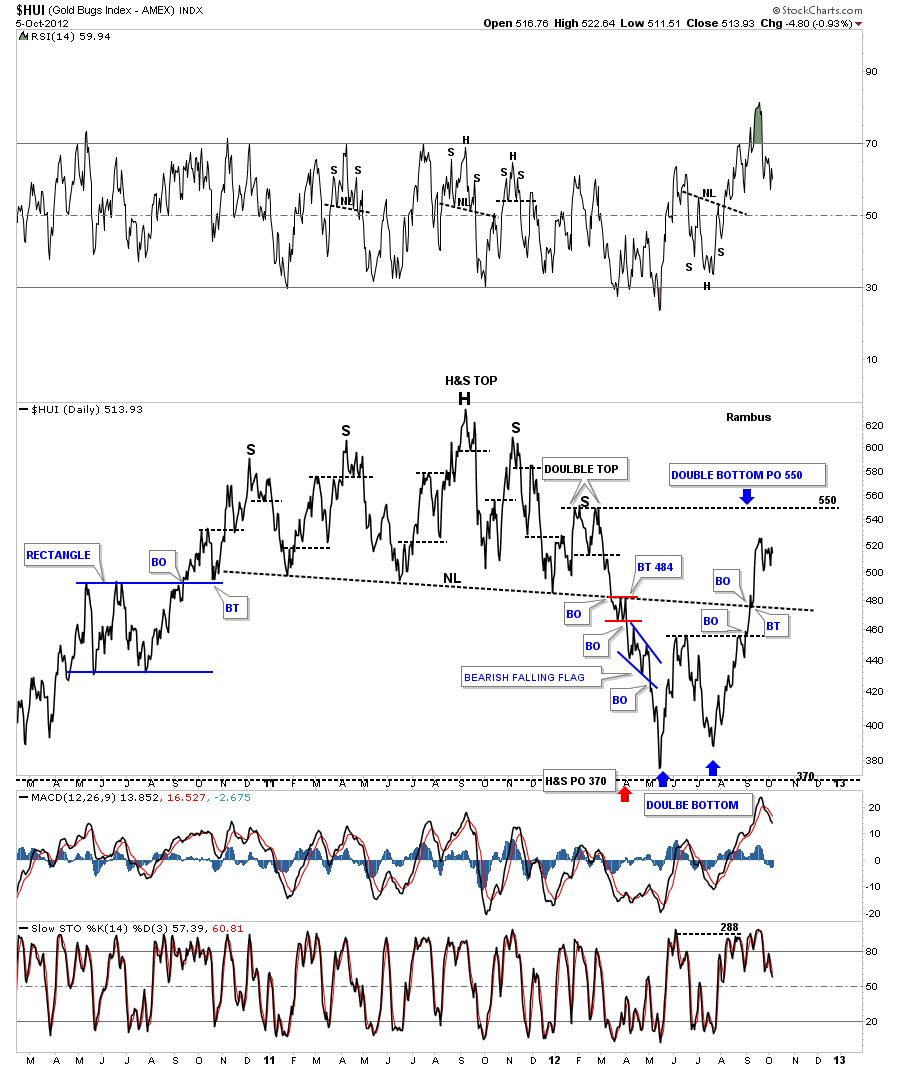
Next I want to show you the same one year top using a daily line chart. A line chart just takes the closing daily price and adds it to the next days closing price connected by a line. On the chart below you can see how beautiful and symmetrical the H&S top looks. On the line chart the little red rectangle formed just below the neckline, which was now acting as resistance, followed by one more small consolidation pattern, the four point bearish falling flag. The big H&S top hit its measured move price objective down at 370. That satisfied the minimum price objective.
Lets look at one more chart of the big H&S top, on a weekly line chart, before we move on to our most recent pattern, the double bottom. Sometimes a line chart can takeout some of the noise a bar chart might show by taking out some of the big interday price swings that can get wild sometimes. Double bottoms and double tops, on a line chart, often stick out like a sore thumb whereas on a bar chart they might be harder to spot. Anyway you can view the neckline as a support and resistance rail. Above is support and below is resistance. Note the other two H&S patterns on the chart below.
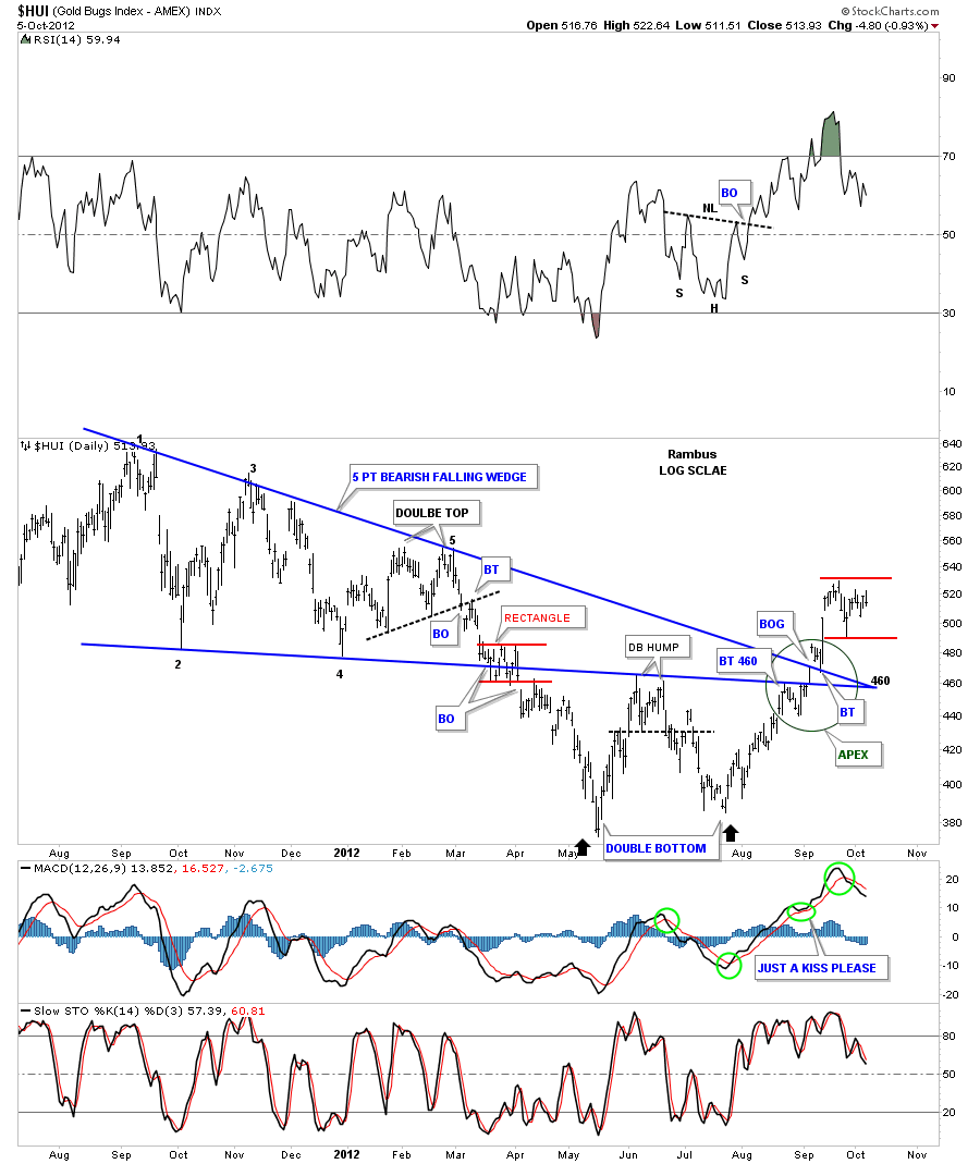
We now know that the big H&S pattern was a reversal pattern to the downside which met its downside price objective at 370. Now, in order to get a reversal of trend we need to see some type of reversal pattern form at the lows. The two patterns I always look for is an inverse H&S bottom or a double bottom. In our current situation the HUI has put in a beautiful double bottom reversal pattern. A double bottom isn’t complete until the double bottom hump is taken out to the upside. You can see on the chart below the double bottom hump was actually a small double top that separated the left and right bottoms. This chart is also a good study in how support and resistance works. If you follow the price action up from the right bottom, note how cleanly the HUI moved up and through the apex of the five point bearish falling wedge, green circle. Keep in mind trendlines on a chart pattern are nothing more than a support or resistance rail. Chart patterns shows you the battle that is going on between the bulls and the bears until one side wins out. The way the price action moved through the apex of the falling wedge tells me the HUI wants to go higher as it’s not wasting much energy getting above the two blue trendlines, at the apex, which should have been some pretty serious overhead resistance. The two small red horizontal rails shows where we should see some kind of consolidation pattern form if indeed the bottom is in place.
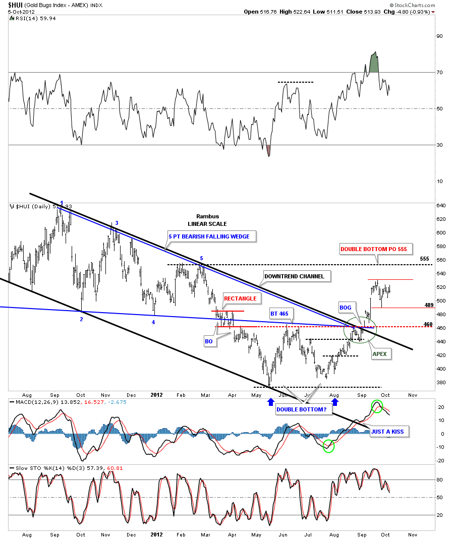
The next chart shows the downtrend channel that is made up of the five point bearish falling wedge and our current double bottom. Again note how cleanly the price action was when the HUI took out the overhead resistance, green circle.
Alot of times when a stock makes a double bottom there will be a strong decline going into the first bottom. After the second bottom is completed a move of equal magnitude, in the opposite direction can take place, I call this reverse symmetry. The chart below shows our double bottom with the reverse symmetry taking place shown by the black arrows.The double bottom has a price objective up to the 550 area
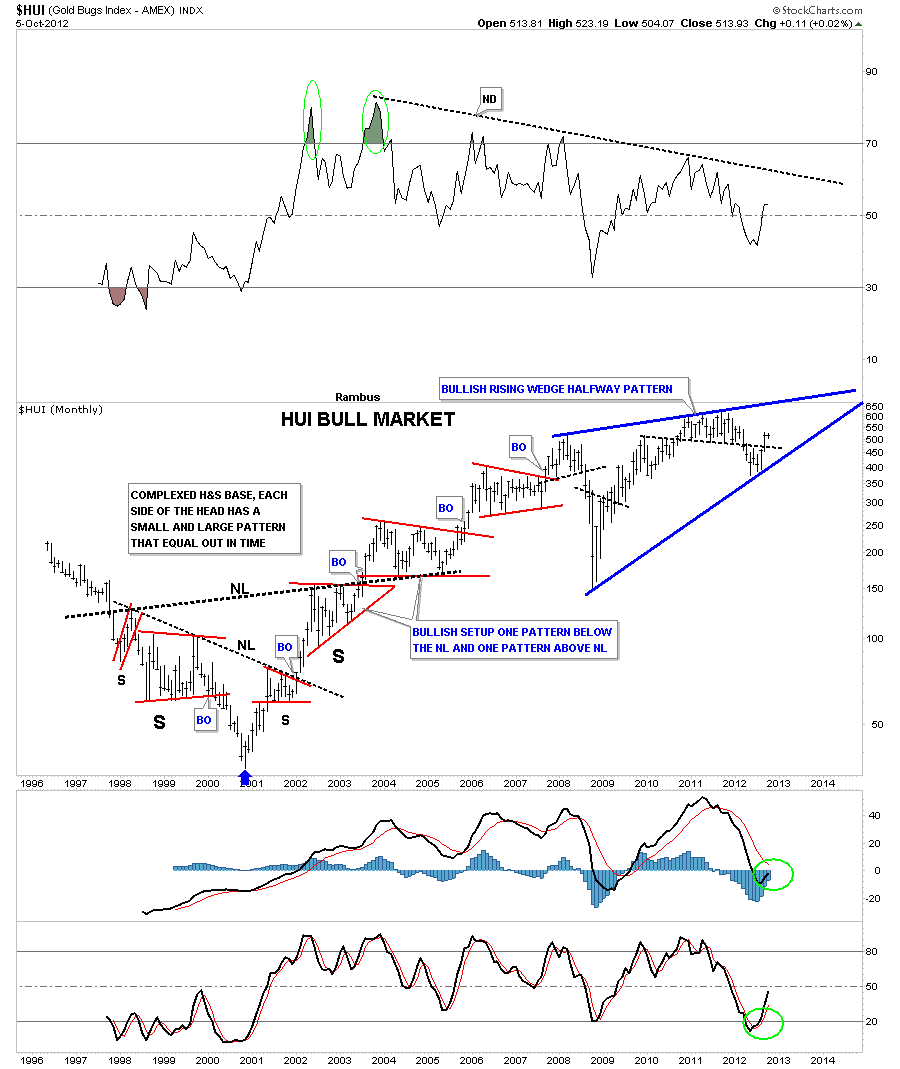
I want to show you one last chart that I have never posted. Until our recent double bottom became apparent I wasn’t able to draw in the bottom trendline. Most chartists will view this chart as bearish but I can assure you if it breaks out through the top blue rail it will be very bullish for the HUI. The chart below shows the whole bull market with the big complex inverse H&S base and the smaller red consolidation patterns that formed up until the 2008 top which is the start of this pattern. With the completion of our recent double bottom we now have four reversal points in play. The first reversal point is the 2008 H&S top. The crash low inverse H&S bottom that I showed you on the weekly line chart is reversal point number two. The big H&S top that we discussed at length at the beginning of this article is reversal point number three and our recent double bottom is reversal point number four. The HUI still has alot of work to do yet to get up to the top blue rail of the bullish rising wedge. How we interact with the top rail will give us some major clues if this potential blue bullish rising wedge will be a halfway pattern to the upside. The potential bullish rising wedge is telling us that the HUI has been basically consolidating since the 2008 H&S top was made.
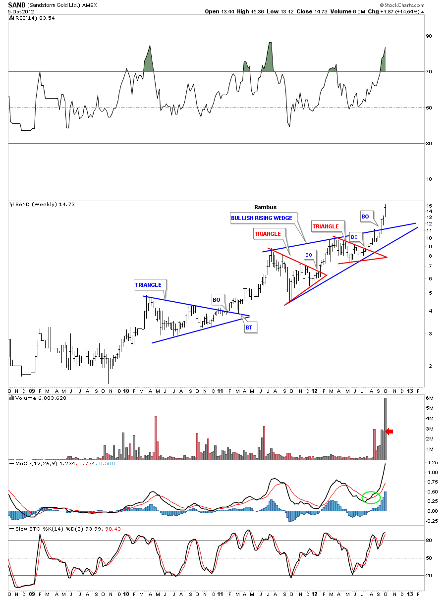
If you think a rising wedge is always a bear pattern I would like to show you one we’ve been following at Rambus Chartology that is made up of two small red individual chart patterns.
So there you have it from this chartists perspective, The Chartology of the HUI bull market to date. All the best…Rambus
………………………..
Rambus Chartology
www.rambus1.com


