In this weekend report I would like to look at some ratio charts that compare gold to many different areas of the markets. If gold is going to lead the the charge I would like to see it rally against just about everything.
This is where ratio charts come into play. The first set of charts I would like to show you is comparing gold to some of the different stock markets. These monthly charts go back to the beginning of the bull maket for gold, that shows without a shadow of a doubt, gold has significantly outperformed the stock market as the charts below show. There are periods when gold has consolidated its run up against the stock markets but it has not lost much ground through it’s 12 year bull market run relative to the stock markets.
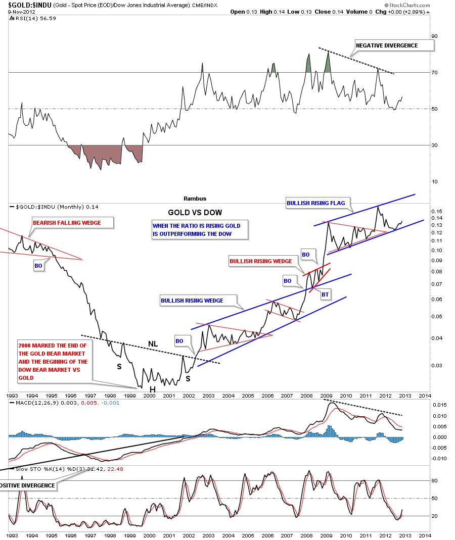
The first monthly chart I would like to show you compares gold to the INDU. When this ratio is rising gold is outperforming the Dow Jones. You can see the nice inverse H&S bottom that formed back in the 2000 timeframe. That was the base that launched gold against the Dow that had been in one of the strongest bull markets of all time. As you can see the ratio chart has been rising in a very bullish fashion that shows the first big pattern to form out of the inverse H&S base was big blue bullish rising wedge. That big blue bullish rising wedge was made up of several smaller red consolidation patterns. The top blue consolitation pattern is showing another bullish rising pattern that is forming it’s 4th reversal point. Keep in mind this is a monthly chart and changes are gradual.
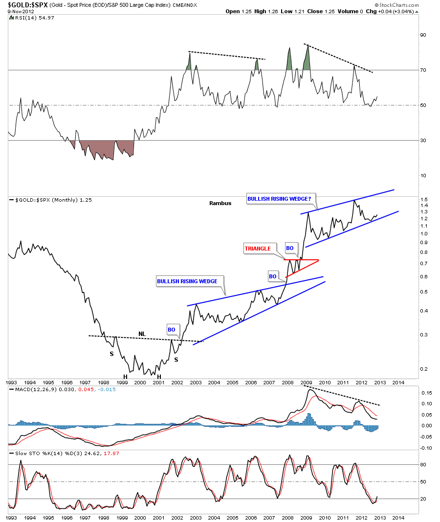
Gold to the SPX shows a very similar setup to the ratio chart above. As you can see this ratio chart is trying to put in its 4th reversal point where the current price action is now trading. This is where gold and the stock markets might start to part ways. We just need to see this ratio start to rise and the steeper the rise the faster gold is outperfoming the SPX.
Lets compare gold to one more stock market that has been a little weaker than the Dow and SPX. Again you can see another bullish rising wedge that is bouncing off the bottom rail. What these ratio charts are showing you is that we could be very well at an inflection point where gold really starts to outperform the stock markets in a big way. That can happen in one of two ways. The first way is that gold and the stock markets go up together but gold goes up much faster causing the ratio to rise moderately. The other way is for gold to rally and the stock markets fall which would cause a near vertical move in the ratio.
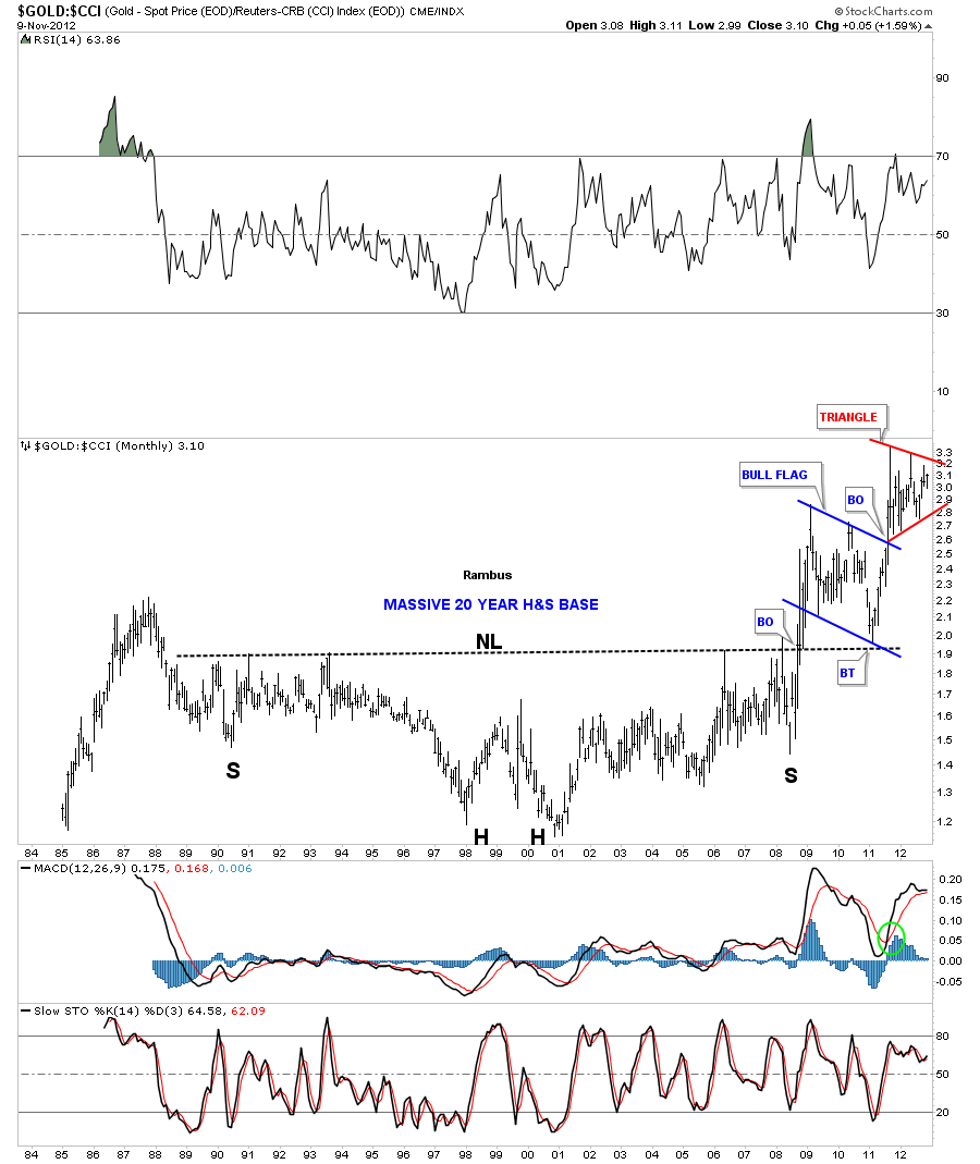
The ratio charts above shows gold outperforming the stock market in a big way and is possibly getting ready to accelerate it’s move. These next set of charts shows how gold is performing against a basket of commodities by looking at the gold to the CCI index. The first thing that will jump out at you is the massive 20 year inverse H&S bottom that finally broke out in 2008. You can see the pretty blue bull flag that formed on top of the neckline as the backtest. Since the breakout of the blue bull flag this ratio chart is putting in another bullish consolidation pattern, a red triangle that is nearing completion. A breakout of the red triangle will probably lead to a vertical move where gold is really outperforming a basket of commodities.
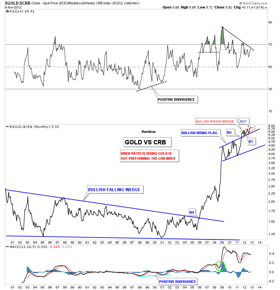
Lets look at a very long term ratio chart that compares gold to the old CRB index. The chart below shows a massively long term 25 year bullish falling wedge. Please note the vertical move once the top rail was broken to the upside. That built up energy, once released, signaled gold was entering a brand new bull market against a basket of commodities. Notice the smaller blue bullish rising flag that broke out to the upside back in July in 2011. The price action has been consolidating on top of the blue bullish rising flag as another bullish rising pattern, the red bullish rising wedge, that is just now starting to breakout.
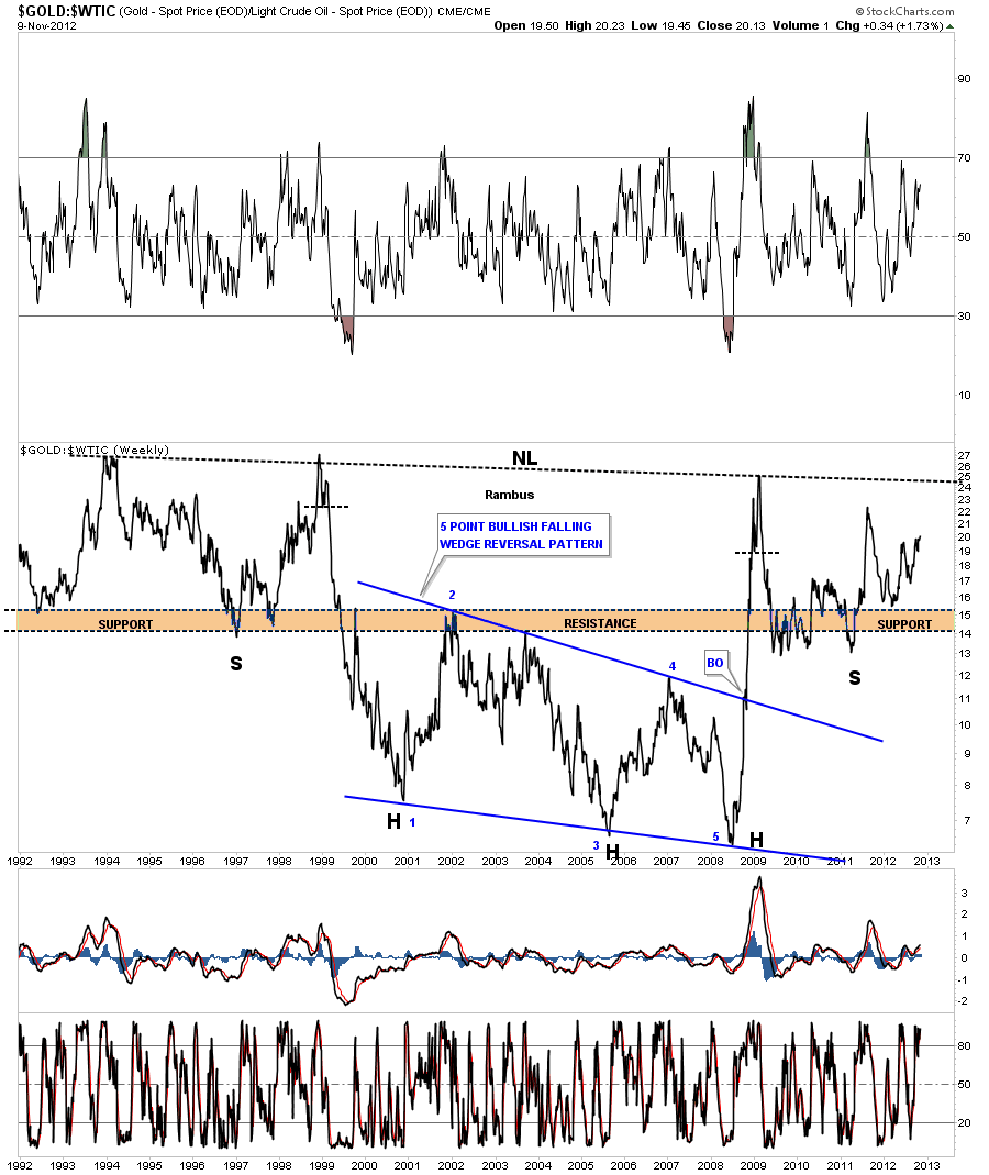
Lets now compare gold to the WTIC, oil index. This long term chart shows another massively large inverse H&S bottom. The head portion is comprised of a 5 point bullish falling wedge reversal pattern. You can see there is some pretty nice symmetry taking place on the left and right side of the chart that is showing a left and right shoulder. Notice how vertical the move was on the breakout of the 5 point bullish falling wedge. That is what a breakout looks like after being confined in a narrowing trading range for so long. All the energy is released and a vertical move follows. This chart shows that this ratio should be bullish for the precious metals producers as their cost of fuel is falling as the price of the precious metals is rising.
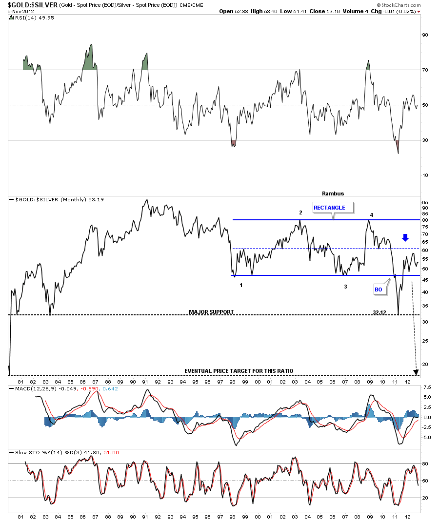
Lets now compare gold to silver to see how this ratio has been playing out over the very long term. You can see this ratio formed a very large rectangle that took about 11 years to complete. It finally broke down through the bottom rail when in 2011 silver had its massive bull maket run up to the 50 area. Once the move was over, the countertrend rally took the ratio back up to the center dashed rail of the recangle, that often times signals the counter trend move is over. Then a resumption of the primary trend is back in force, in this case backdown. I think before this bull market is over the gold to silver ratio will fall below the 20 area.
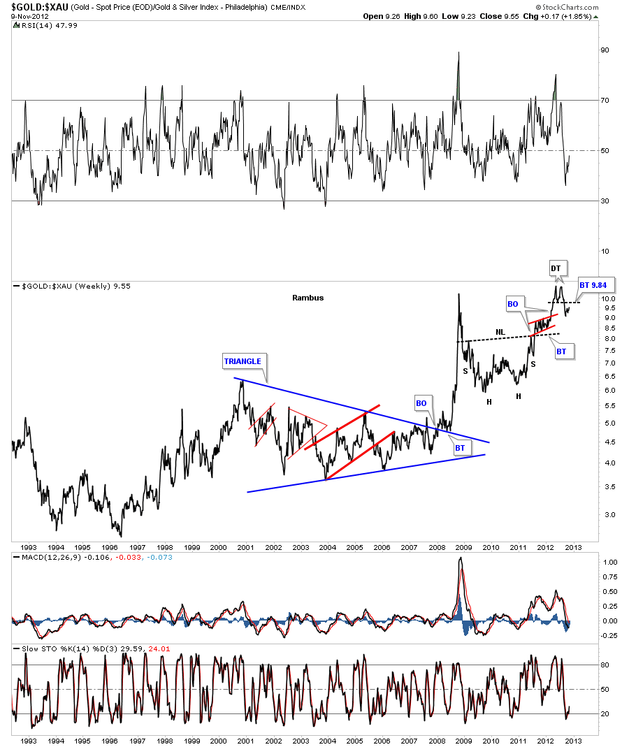
This next chart compares gold to the XAU that shows you how undervauled the precious metals stocks are compared to gold. After finally peaking out at an all time high back in August of this year the ratio formed a small double top. It now looks like the ratio is in the process of backtesting the breakout from the double top hump at 9.84. This is a critical backtest taking place right now. If the backtest is successful then all the work should be done and the XAU should start outperforming gold with the ratio falling.
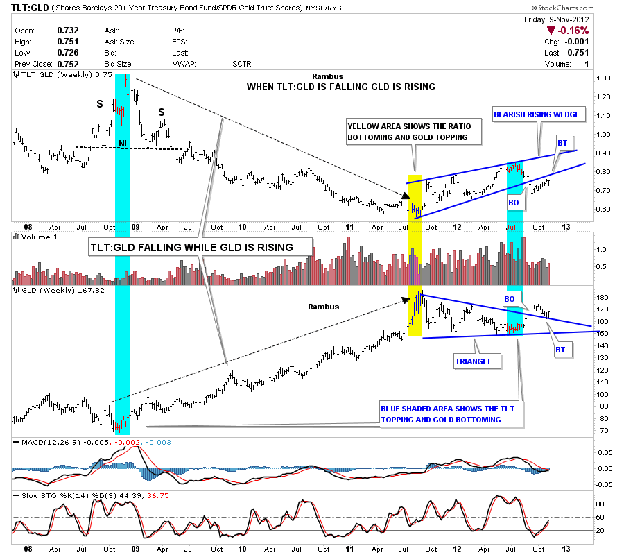
The last ratio chart I would like to show you is the TLT to GLD ratio chart. The TLT is the 20 year bond and when you make a ratio chart that compares the TLT to gold it can show you which direction gold may travel. Below is a combo chart with the TLT to Gold ratio on top and GLD on the bottom. It clearly shows when the ratio is falling gold is rising and when the ratio is rising gold is falling. There is an interesting setup taking place right now with the ratio chart on the top forming a bearish rising wedge and gold itself is forming a triangle consolidation pattern. They have both broken out of their respective patterns and are in the proccess of doing the backtest move. Once the backtest is complete gold should be ready to rise to new highs.
What these long term ratio charts are telling us is that gold is at an inflection point with just about everything related to the markets. This is a good setup for gold right now if it can break free from all those consolidation patterns that I have shown you above. I think it can win the Academy Award for best performance of an asset class at the next awards ceremony. All the best…Rambus
……………………
For More Rambus
www.rambus1.com
………………….
Site Features

