
In this report I would like to show you some important stock markets from around the world that have broken out of triangle consolidation patterns and are in rally mode. You must clear your mind of all previously conceived notions that the world is coming to an end. At least for the foreseeable future, maybe six months to a year, most of the stock markets around the world are going to rally.
We here at Rambus Chartology have been throwing this idea around for sometime now about investing in the European Stock markets, but seeing that we are primarily a precious metals site we hesitated to present this view. As you well know the precious metals stocks have been one of the weakest performing sectors to put ones hard earned money into and try to make a decent profit. We finally decided that we should put the Model Portfolio to work in what are some of the stronger stock markets around the world. As I said earlier you have to look at the following charts with an open mind to grasp the significance of what is taking place outside our borders. With that said lets look at some etf’s from around the world.
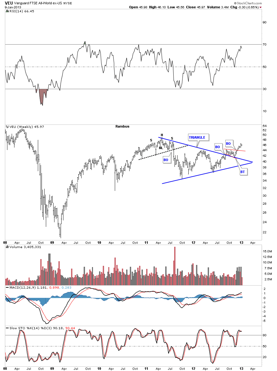
Lets start with the VEU that is a world etf minus the US stock markets. This etf gives you a good look at what the world stock markets are doing without the US stock markets coloring the rally as the US markets have been one of the strongest stocks markets since the 2009 crash. As you can see the VEU broke out of a beautiful symmetrical triangle, had a nice backtest to the top blue rail and has started it’s next leg up.
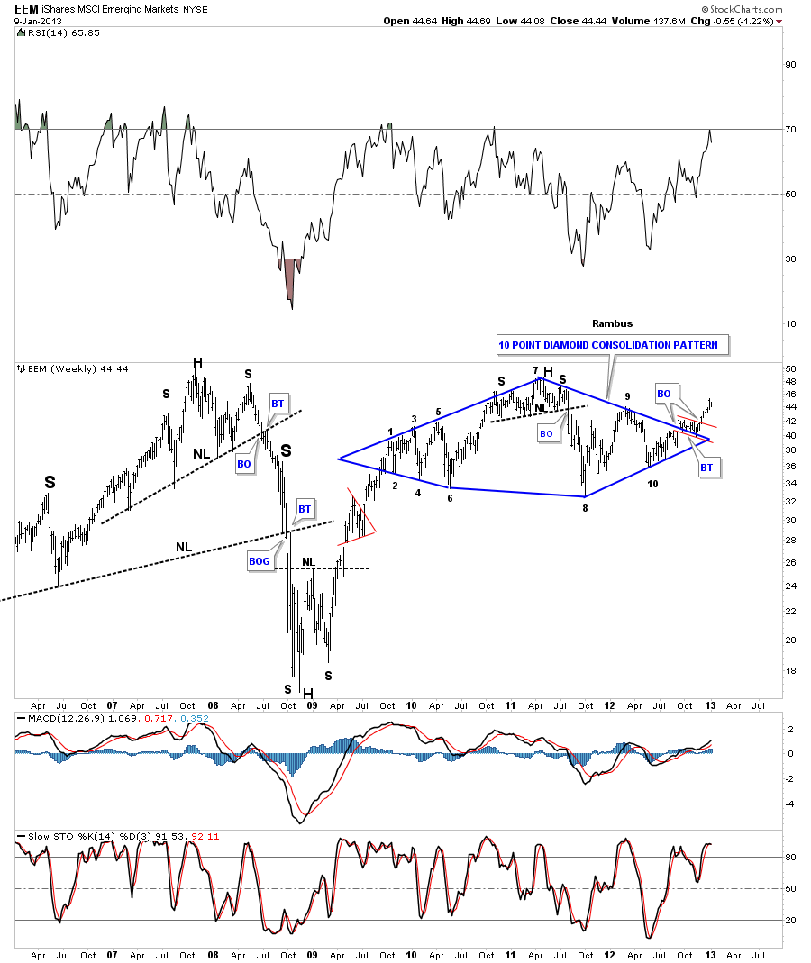
Lets take a look at the emerging markets and see how they have been performing. I have been watching this ten point diamond consolidation pattern for a very long time. Until it finally broke up and through the top blue rail I couldn’t be sure which way it would finally move. My question was answered about 8 weeks ago when it finally finished the backtesting process and started to rally. I took this weekly chart back 7 years so you could see the big H&S topping patterns and the crash that ensued once they were completed. As you can see we are not that far off now from it’s all time highs around the 50 area. Whats important to understand, when you look at these charts, is that most of them you will see have been in at least a one year consolidation pattern and some even longer. My goal is to catch the impulse moves out of these consolidation pattern because that is where the real money will be made. Big consolidation patterns are for traders and breakouts are for the intermediate to longer term in investors.
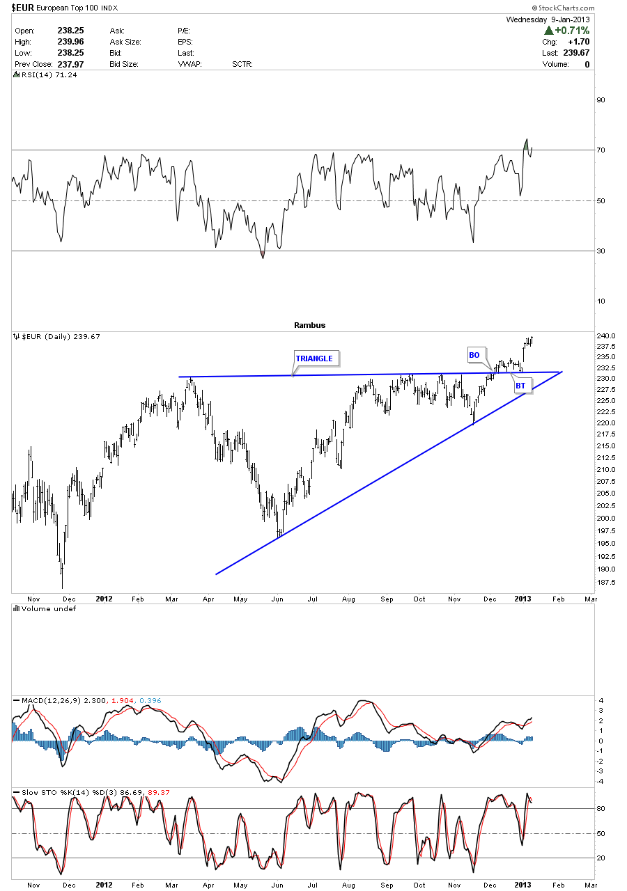
This next chart, $EUR Top 100 index that focuses in on the European stocks markets that shows it broke out of a very nice ascending triangle and finished it’s backtest last week. This index is just now breaking out and looks like it has a decent move ahead regardless of what the news headlines are telling us.
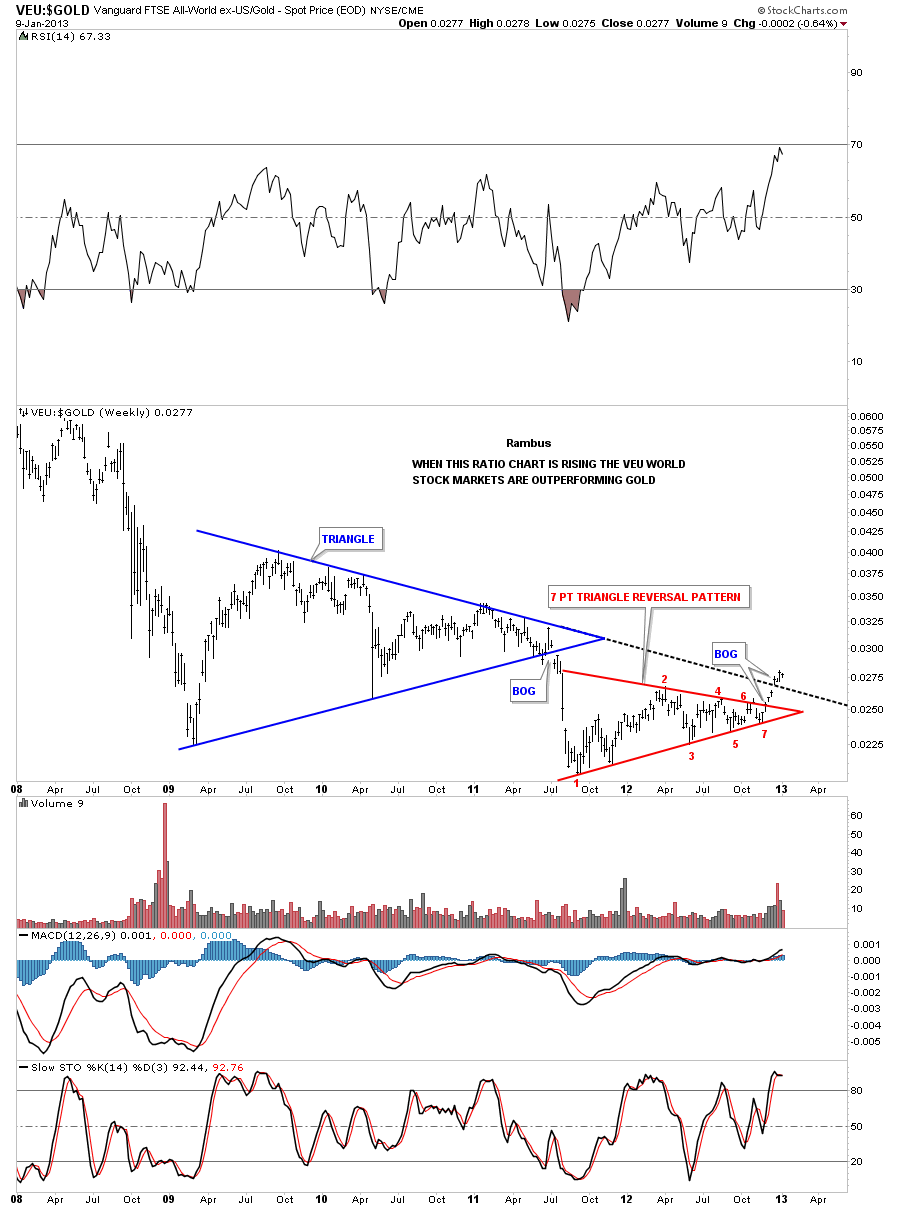
Before we move on to some of the etf’s I will recommend I want to show you a few ratio charts that compare gold and the HUI to some of the etf’s shown above. These chart will show you which is the stronger place to put ones capital to work which is what investing is all about. Regardless of all the news headlines, charts don’t lie. They encompass everything about the stock from the fundamentals, to the bullish case, to the bearish case and whatever else one wants to through into the mix. All the information is in the chart patterns. Its the interpretation of the charts is where the problems lies for most chartists as everyone has there own methodology in which to unlock the secrets of a chart.
First lets compare the VEU world stock market etf to gold to see which one is more bullish at this time. After breaking out of a beautiful 7 point triangle reversal pattern the VEU encounter the next overhead resistance rail that was the extended top blue rail of the huge blue triangle formed back in 2009 to 2011. Note the nice gap of that top resistance rail. That lets us know that rail is hot and will most likely hold support if it’s tested from the topside now. This chart tells us the world stock markets are now outperforming gold.
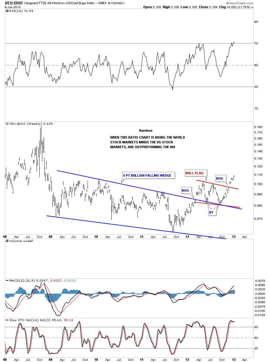
Now lets compare the VEU to the HUI and see what it looks like. Folks this chart should make you stand up and take notice. After completing the blue 5 point bullish falling wedge in late summer of 2011 this ratio chart has been outperforming the HUI. Now I want to focus your attention to the right side of the chart where you can see this ratio has just broken out of a red bullish rising flag formation. As long as this ratio is rising the world stock markets are outperforming the HUI. One must ask themselves a serious question right here. Should I remain in the big cap precious metals stocks because of principal or should I take advantage of the big divergence taking place right now with this ratio chart in favor of the world stock markets. Only you can answer that question.
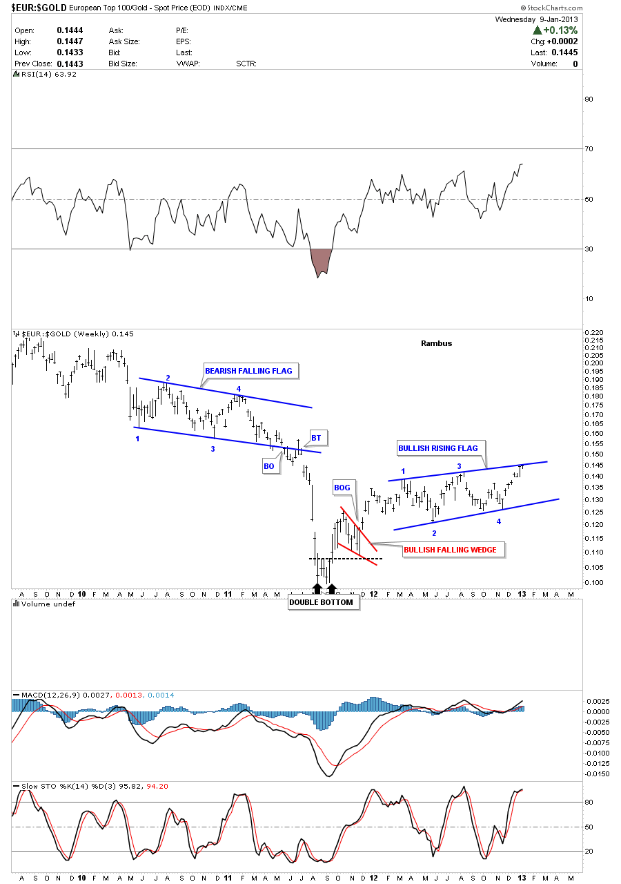
Lets now compare the European top 100 index, $EUR, to the price of gold and see how it looks. When the price action is rising the EUR is outperforming gold. As you can see on the chart below this ratio has been consolidating for quite sometime now in a rising flag formation. Its testing the top blue rail as we speak so a breakout can occur at anytime.
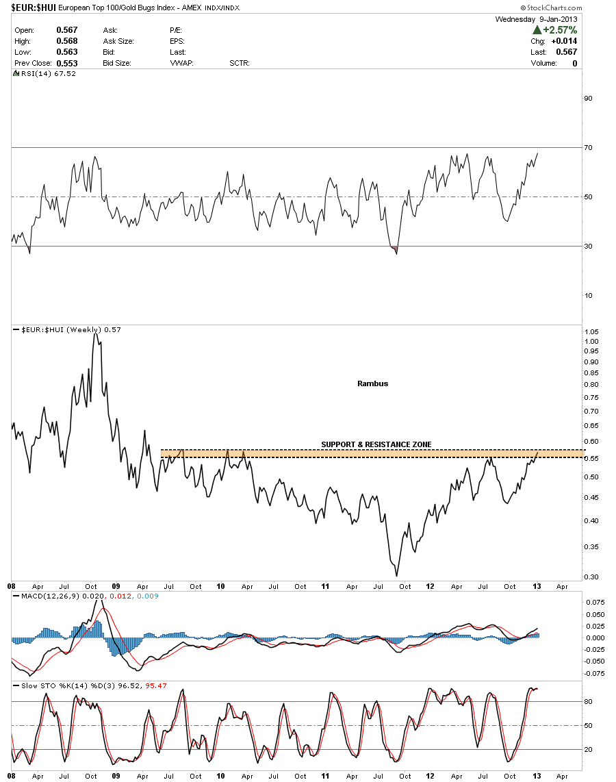
This next chart compares the $EUR to the HUI. Its now testing the brown shaded support and resistance zone that goes all the way back to highs made back in 2009 and 2010. With just a little more strength this ratio is going to hit a five year high. As you can see on the chart below the EUR 100 index has been outperforming the HUI since the fall of 2011. What is that saying about the HUI, that can’t even outperform the European stock markets, that have been in the headlines for a long time now on how bad things are over there?
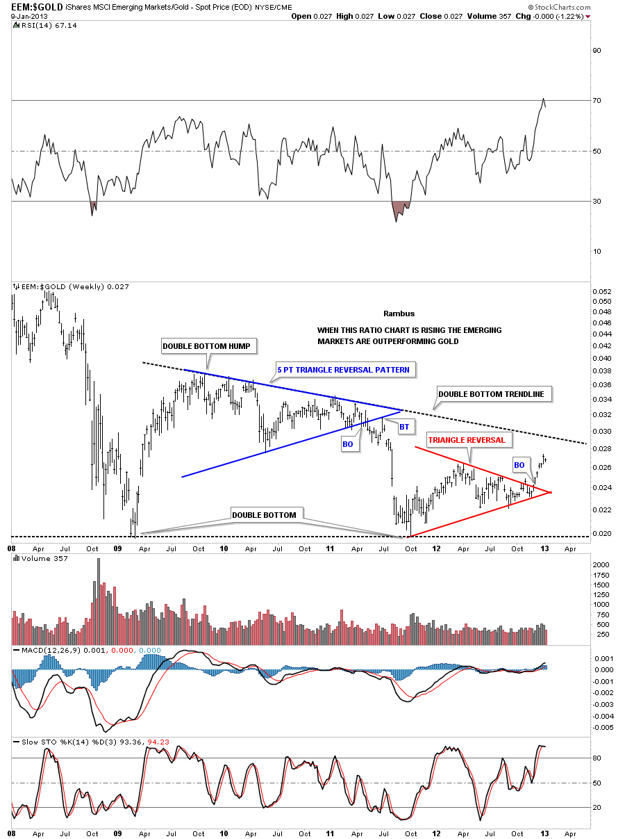
Lets now compare gold to the EEM, emerging markets and see which one is showing some strength in here. This ratio made a huge double bottom with the first bottom being made in 2009 and the second bottom forming in October of 2011. This ratio chart is also showing a very nice red triangle reversal pattern that has broken out to the topside about 6 weeks ago. I will be watching with great interest on how this ratio interacts with the double bottom trendline which is still above the current price. Right now the EEM is outperforming gold over the last six weeks.
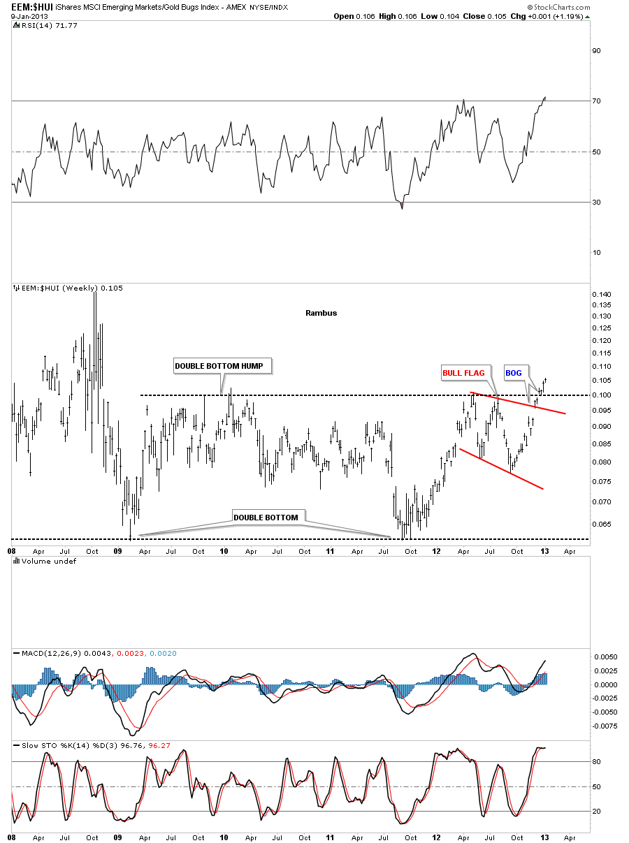
Now for the last chart for this part 1 report lets look at the EEM to the HUI ratio that is showing the emerging markets are now breaking out compared to the HUI. Four weeks ago this ratio broke above the double bottom hump with a nice breakout gap. Six weeks ago it broke out of the red bull flag pattern. You now have to go all the way back to 2008 to find a higher price for this ratio. Its very possible we could see a backtest to the double bottom trendline at 1.00 before this ratio moves higher buy no guarantee.
What these ratio chart are showing us is that there is some very significant outperformance by basically the rest of the world stock markets. This is a big deal IMHO as its telling us that investors are seeing better value in most of the world stock markets. They are taking money that normally would be going into the precious metals complex and putting it to work else where for a better return on their money as the ratio charts above are showing. We can listen to all the news stories on how bad the world economies are and how the precious metals complex is going to save us all. In the end that might very well be the case but for right now, at this moment, I believe there are better investments to be made to grow ones capital. I will have part 2 tomorrow and show you some of the individual stock market etf’s that I think will do very well over the next 6 months to a year. Until tomorrow…All the best….Rambus.