
Last week we looked at some of the stock markets from around the world. Today I would like to show you what is going on with our own stock markets on a weekly and monthly look. We really need to look at the longer term picture to get a feeling for what has been taking place over the last 13 years or so when most of the stock markets topped out in the spring of 2000.
What has been going on since the 2000 top has been a very large trading range for most US stock markets. Some US stock markets have made slightly new highs within their respective consolidation pattern while others have only reached as high as their 2000 top. I know a lot of analysis are looking for a much longer trading range with new lows for the US markets based primarily on the large consolidation pattern that formed in the US markets back from 1966 to 1982 which was an inflationary environment. Also there are some big long term cycles that are supposed to hit in 2013 and 2014 that would signal a deflationary event. For right now lets take a look at some of the US stock markets and see what they maybe telling us going forward.
The first US stock market I would like to show you is the SPX that has the 500 largest companies in the United States. This is a good index to show us how these big companies are doing as a whole. The first chart is a weekly look going back 7 years that shows the last top made in 2007 and the crash that occurred into the spring of 2009. What I want to focus in on is the uptrend channel that started off the crash lows that has been moving up for almost four years now. As cyclical bulls go this one is definitely getting long in the tooth if this is a cyclical bull market made off the 2009 crash lows. As you can see on the chart below there is a possible rising wedge forming that many will see as a bearish pattern. The way I’m looking at is, whichever way it breaks out will be the next big move for the SPX.
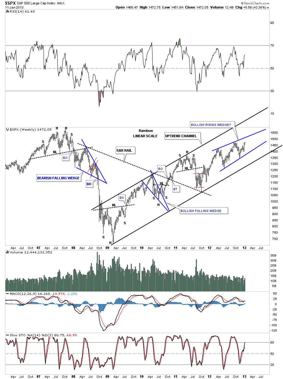
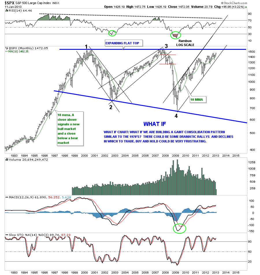
The next chart is a month look at the big trading range since the 2000 top. On the left side of the chart you can see the bull market that led up to the 2000 all time high back then. You can also see the the very nice reversal points within the big Expanding Flat Top Triangle. A touch of the top blue rail that is just slight above our current price will complete the pattern. We still won’t know which direction the market will go only that we have a completed flat top. Not always but most of the time when you have a flat top or flat bottom triangle the price action usually breaks through the horizontal trendline has been my experience. At the very least I would expect some resistance if the top horizontal rail is hit. From that point, if this cyclical bull markets is over, the price will start to fall. On the other hand if this is a continuation of the move off the 2009 bottom, as show by the chart above, and the top horizontal rail is decisively broken to the upside then we could very well be in a secular bull market that started at the 2009 lows. Only time will answer our question.
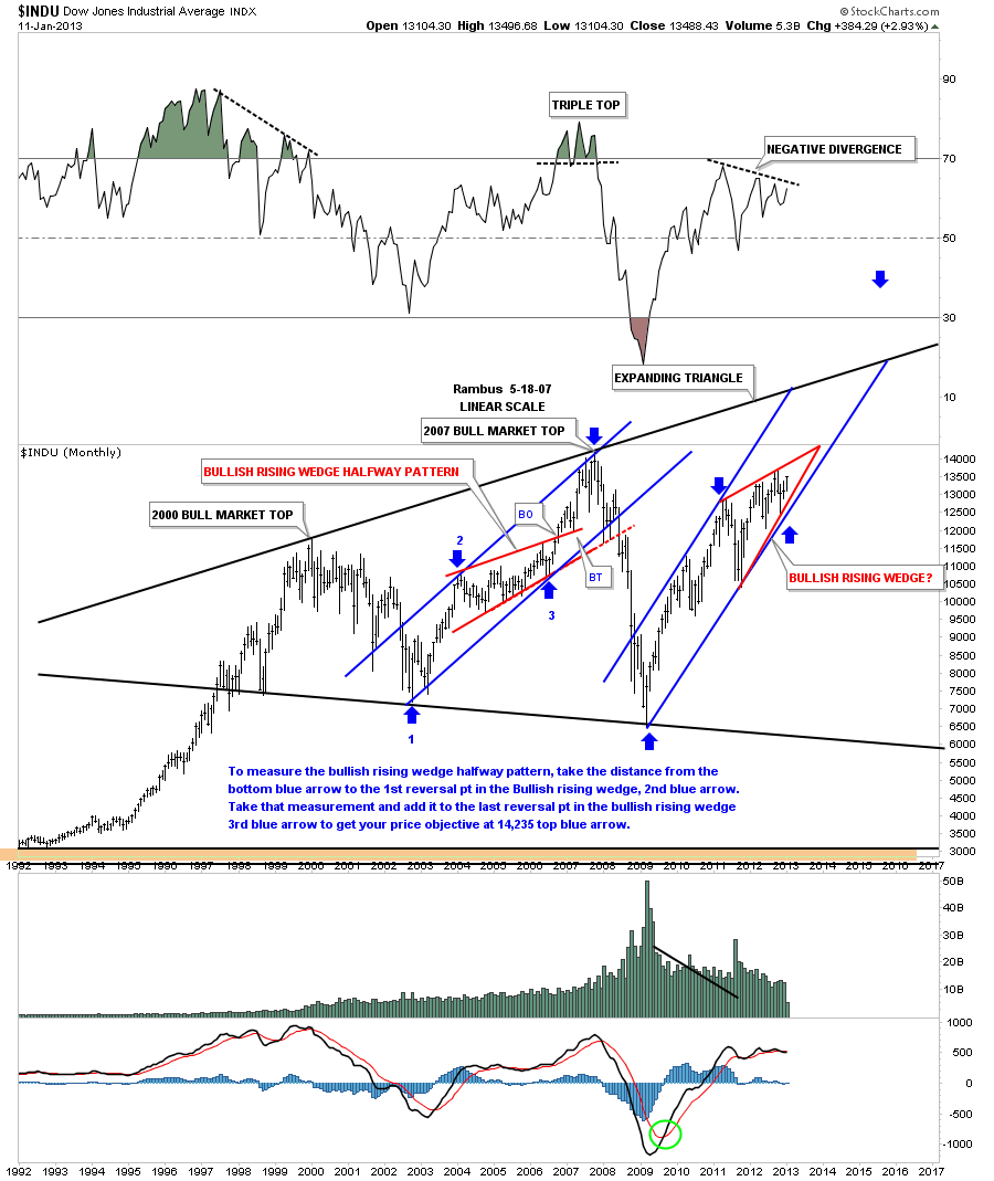
Lets look at the long term chart of the INDU that shows it was stronger than the SPX as this index made a higher high back at the 2007 cyclical bull market top at 14,235 before it crashed. You can see in the cyclical bull move to the 2007 all time high had a red bullish rising wedge as a halfway pattern. Its still too early to say yet but our current cyclical bull market maybe forming another bullish rising wedge as a halfway pattern. If it is forming a bullish rising wedge then we can expect a move, in time and price that was made off of the 2009 bottom to the blue arrow at the first high in the red rising wedge, to repeat in the next leg up. If that turns out to be the case then the Dow Jones will breakout through the top rail of the expanding triangle completing the big consolidation pattern.
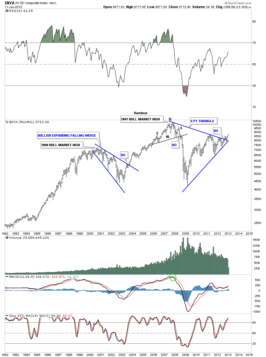
Lets look at the NYA that is a more broadly based index that has made a large 6 point triangle pattern. As you can see on the chart below it waited until the last moment to finally breakout. The rule of thumb for a triangle, when the price action breaks out close to the apex or the terminal end of the triangle, is that it’s suspect and loses its energy. I’ve seem them breakout and run and I’ve seen them fail. We will just watch the price action very close and see what happens.
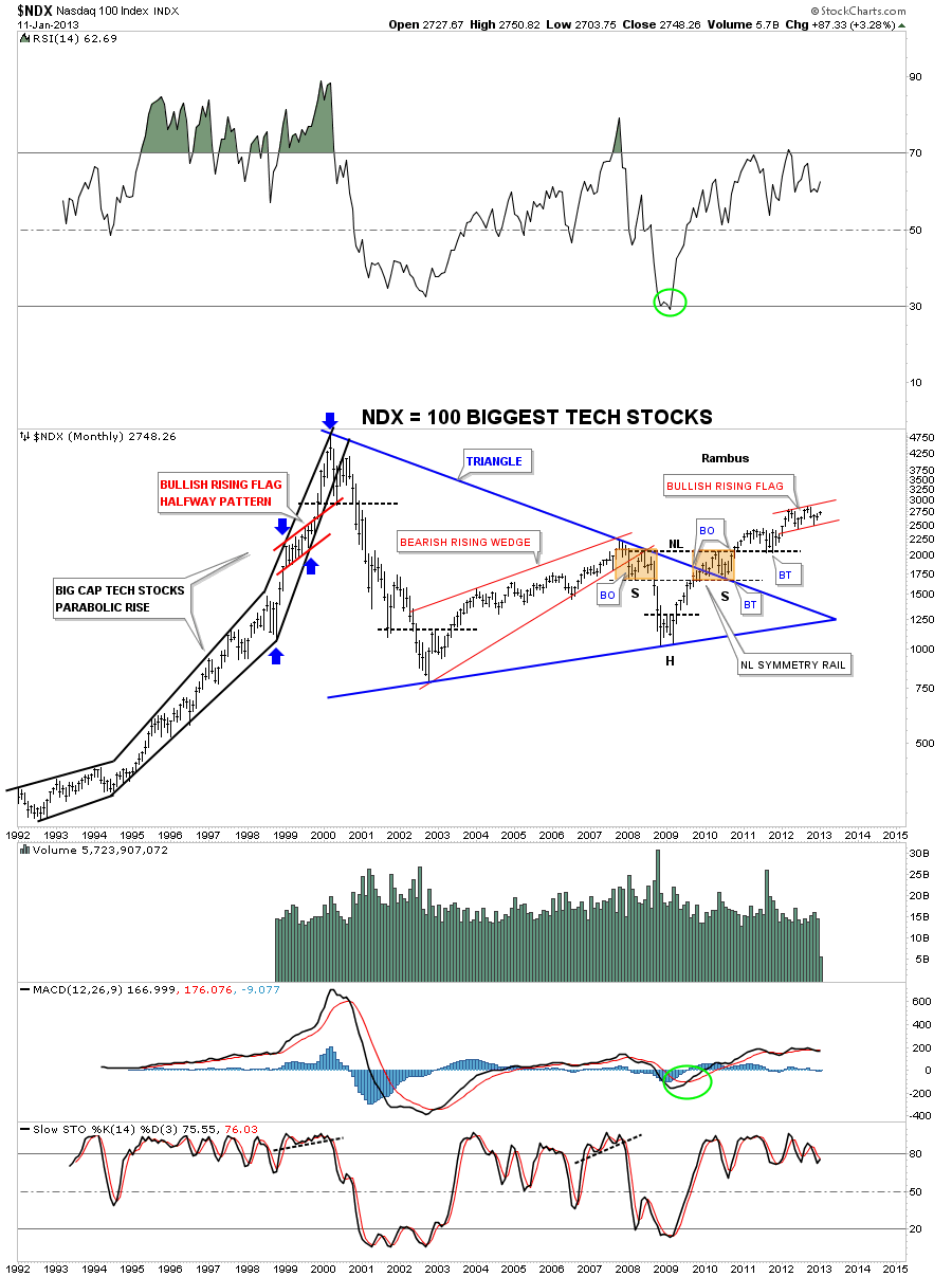
Next lets look at the NDX 100 index which is made up of the 100 biggest cap technology companies in the US. There are some interesting things to note on the chart below. First, on the left side of the chart you can see the parabolic rise into the 2000 top. That parabolic rise was much larger than what occurred with the Dow Jones or the SPX so it has taken longer to recover. There is some very positive price action taking place on this chart that is showing a very nice entrenched uptrend move starting off of the 2009 bottom. Before we move on note that the 2009 low was much higher than the 2002 low whereas the Dow and SPX made lower lows in 2009 compared to the 2002 bottom. This tells us the NDX was washed out in the 2000 crash with many tech stocks losing 90% or more of their value. Now we see it making higher lows and higher high which is an uptrend. Note the H&S consolidation pattern made at the 2009 low and how symmetrical it is. Its been acting in text book fashion by breaking out of the blue triangle with the backtest creating the right shoulder of the H&S pattern. Note the breakout of the neckline and again the nice backtest. As with the Dow and SPX charts from above the NDX may also be forming a bullish rising flag.
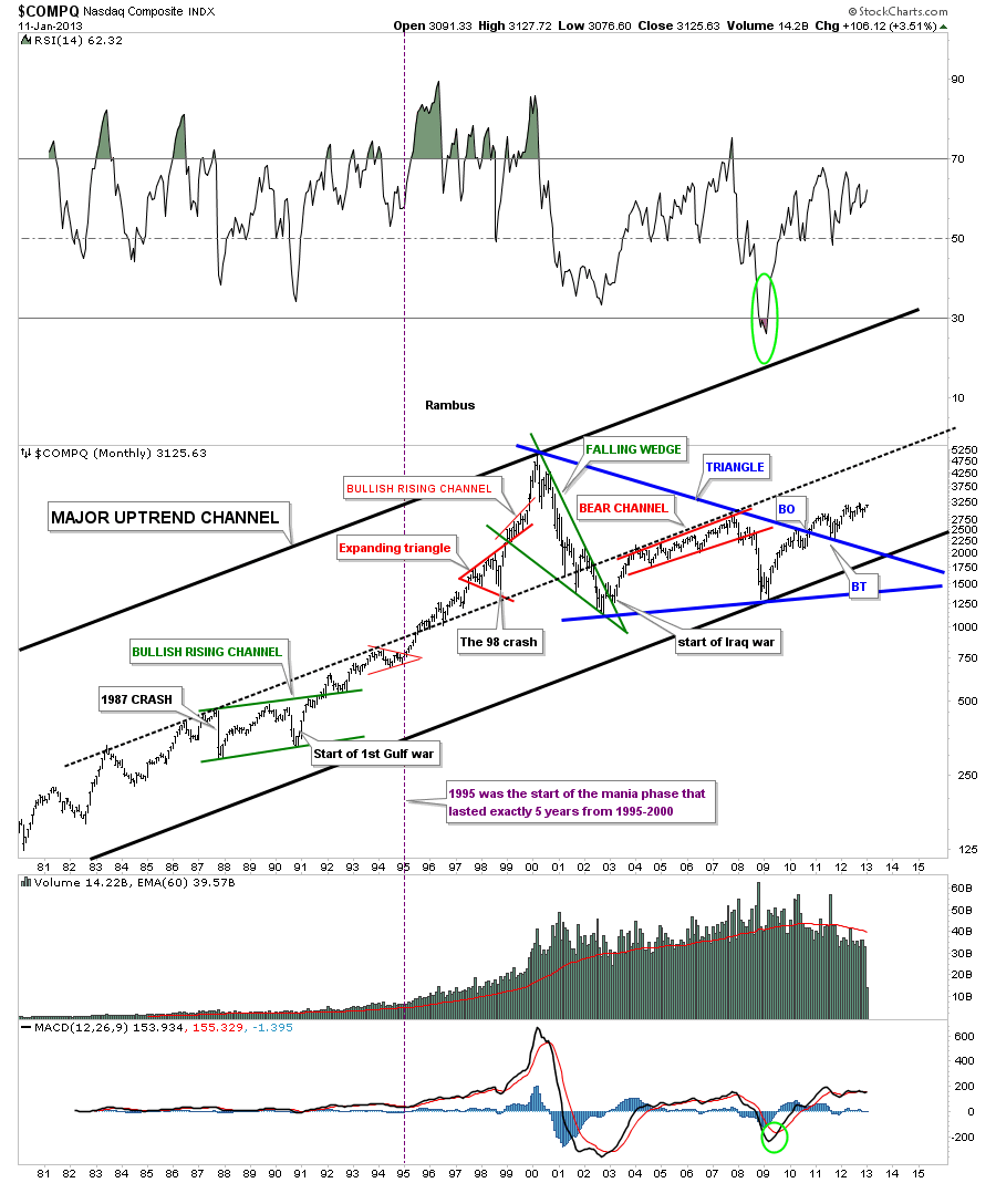
Below is a chart of the COMPQ that I built a long time ago that shows some of the historical events and how they played out. This chart shows the price action breaking out of a beautiful blue triangle consolidation pattern with a breakout and backtest being completed.
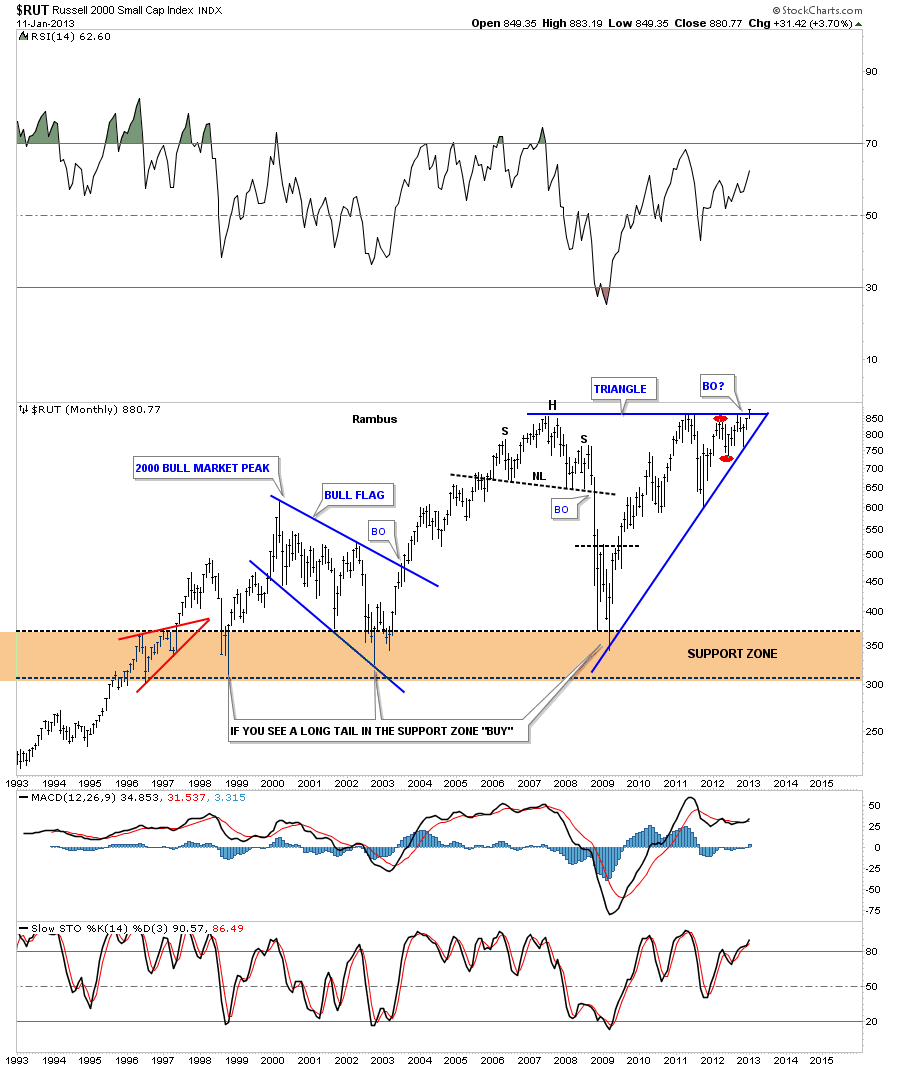
The next chart I would like to show you is the RUT 2000 that is made up of small cap stocks. This is an important index to follow because if it’s showing strength, relative to the big caps, that means investors are feeling more comfortable and start to bid up the more riskier small cap stocks. This is similar to the Juniors mining companies in the precious metals arena. When the juniors are outperforming the big cap PM stocks that is a healthy sign overall. As you can see on the chart below the RUT 2000 is the first US stock market to move into new all time highs. All be it by a tiny fraction but the breakout has to start somewhere.
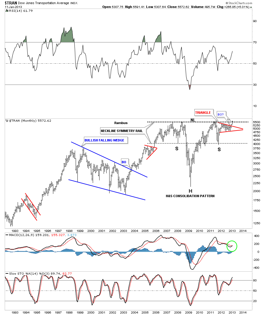
The Transportation Index maybe giving us one of the best signals that is suggesting the US stock markets maybe ready to rally to new all time highs. First lets look at the weekly chart that is showing a very nice blue symmetrical triangle with a smaller red triangle that has formed out at the apex. You can see it had a nice little breakout with a quick backtest and is now starting to rally higher.
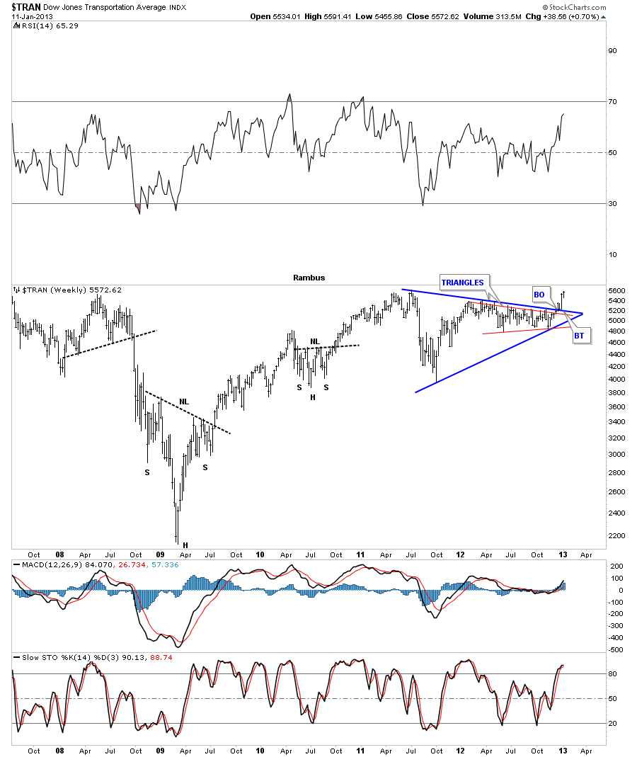
I want to wrap up the report by showing you the most important chart that may give us the best clue that things are looking up for the US markets. As you well know the Transportation Average plays a key role in the health of the US markets. If the economy is picking up steam so should the transportation stocks that will be needed to move the goods being produced. As you can see on this long term monthly chart for the Transportantion Average there is a massively large H&S consolidation pattern forming. Its very beautiful and symmetrical in its formation. As you can see the triangle I showed you on the weekly chart above is actually the right shoulder. This is a powerful setup for the Transportation Average as the red triangle strongly suggests that there is now more than enough energy to take out the neckline.
If the Transportation Average is telling us the truth about our US economy then it looks like things are going to start improving. I know how hard it is for alot of folks to believe that the stock markets can rally and rally big with all the negative news out there but if these charts, that I showed you tonight, begin to breakout to the topside all the money the Fed has created will be looking for a place to go. It looks like alot of it will find its way into the US stock markets.
In the Wednesday Report we will look at some of the important indexes like the BKX, bank index and HGX housing index to see what they are up to. As they say we live in interesting times and I couldn’t agree more…All the best…Rambus
EDITOR’S NOTE :
Rambus Chartology is Primarily a Goldbug TA Site where you can watch Rambus follow the markets on a daily basis and learn a great deal of Hands on Chartology from Rambus Tutorials and Question and Answers .
Most Members are Staunch Goldbugs who have seen Rambus in action from the 2007 to 2008 period at www.goldtent.org and now Here at Rambus Chartology since early 2012 .
www.rambus1.com
To review his Work and incredible calls from the 2007-2008 period click on the top right sidebar in the “Wizard of Rambus” ….”What If ?! ”
To Follow Rambus Unique Unbiased Chart Work and participate in a Chartology Form with questions and answers, and learn the Art and Science and Mindset of a Pro Trader you may Join us by subscribing at
www.rambus1.com
We have many subscribers from all over the world who are glad they did as they enjoy the many daily updates and commentaries provided at this exciting new site.
As you will see Rambus (Dave from The Ozark Mtns in Arkansas) has prepared us for this difficult period by being one of the only ones to see and warn about the incredibly debilitating PM smackdown as early as Jan 2 2012 …click on the” HUI Diamond in the Rough” Post in the “Wizard of Rambus” top right
More Recently Rambus called a Bottom in HUI in this post…and has had subscribers on board for a Powerful Run to the Upside
rambus1.com/?p=5651
Followed again by his timely bearish call in this SLV Update which has had us on the sidelines and or short
rambus1.com/?p=8876
BUT
What is he seeing Now ?
You will find Rambus to be a calm humble down home country tutor with an incredible repitoir of all the TA based protocols tempered with his own one of a kind style…simply put…He wants to keep his subscribers on the right side of these crazy volitile and downright dangerous markets
See you at the Rambus Chartology