
In the weekend report we looked at some of the precious metals stock indexes that are showing some massive H&S topping patterns. These type of patterns are distribution patterns and the bigger they are the bigger the move down in time and price. Could these massive topping patterns be the end of the bull market for the precious metals stocks? I think on a one or two year basis these H&S topping patterns could put a big dent in the bull market for the precious metals stocks if the necklines are broken to the downside which remains to be seen yet.
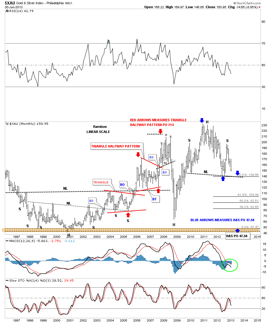
Before we move on to the individual precious metals stocks I want to show you a long term monthly chart of the XAU to give you an idea of what I mean by the end of the precious metals stocks bull market. First, notice the massive 8 year H&S base that was made back in the late 90’s and early 2000’s. It consisted of two smaller H&S bottoms. It was also very symmetrical in nature. If you can visualize turning that big 8 year H&S bottom upside down you would have a massive H&S top. Same principal just in reverse. Now look to the right side of the chart where you can see our big 4 year H&S top. That’s a big top by any standard of measurement. Note how I measured the red triangle that showed me a price objective up to the 214 area that was just a tad higher than the actual H&S top that formed back in 2008. Now using that same measuring technique I’ve measured our current H&S top, using the blue arrows, to show you where the price objective would be. As you can see the price objective would come in at the lows made back in 2001 around the 47.50 area. What will be the fundamental reasons for such a big move lower? Only time will tell but from a chartists perspective whatever the reasons are they are baked into the H&S top.
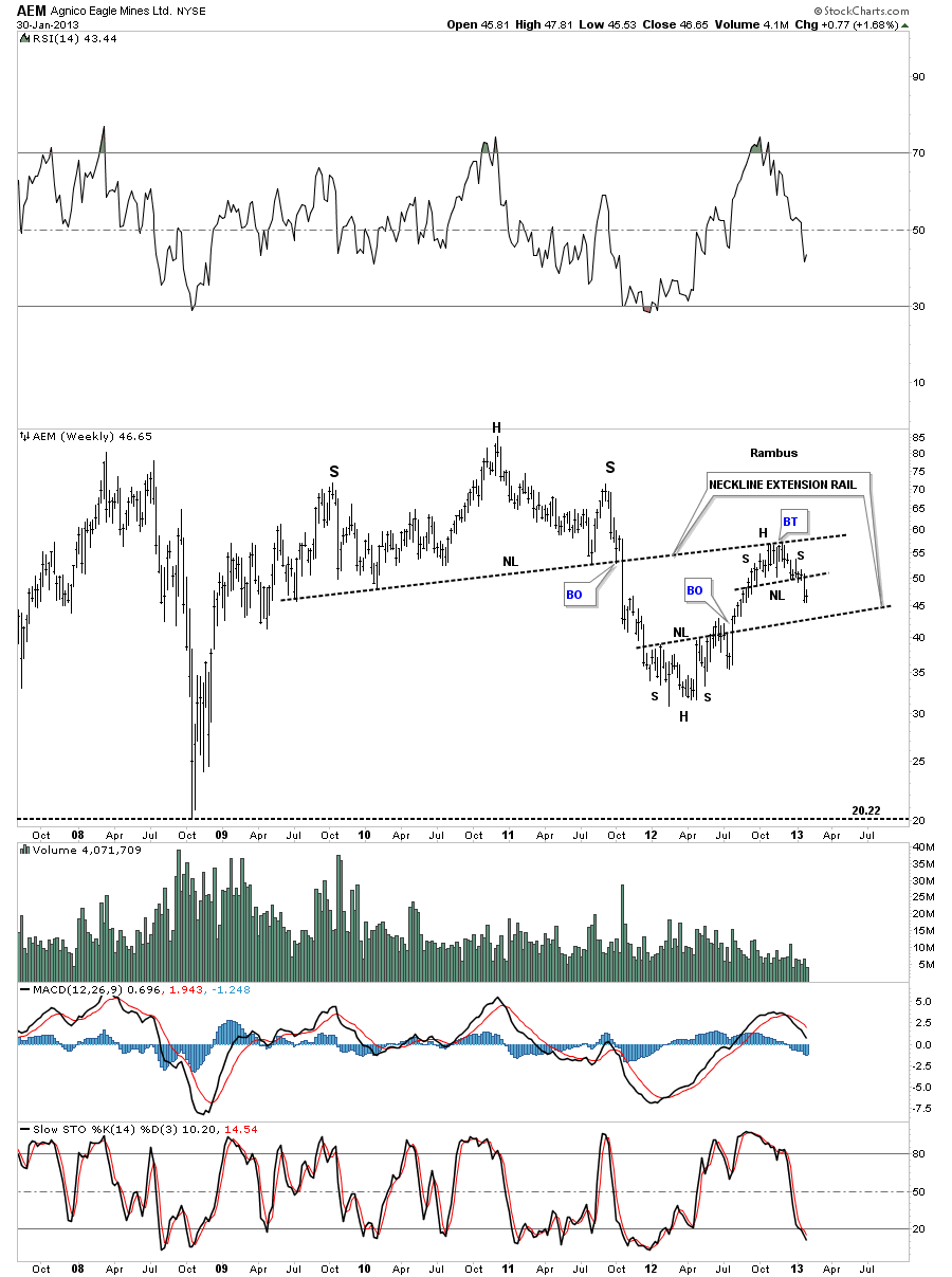
In order to have a big move down in the XAU the precious metals stocks need to have some big topping patterns as well. Lets start with AEM that was one of first precious metals stocks to breakdown from it’s H&S top back in the summer of 2011. I’m showing you this one first so you can see how this particular H&S top played out. You can see the large one week bar that accompanied the breakout that often times happens. I can’t recall what the fundamental reason was for the breakout but it was enough to send this stock into a bear market. As you can see it lost nearly 2/3’s of its value before it formed a small inverse H&S bottom that took the price action all the way back up to original neckline that I’ve labeled as the Neckline Extension Rail. As you can see it has now formed another smaller H&S top just below the neckline extension rail signaling the counter trend rally is now over. Keep the big three year H&S top in mind when you look at the charts to follow.
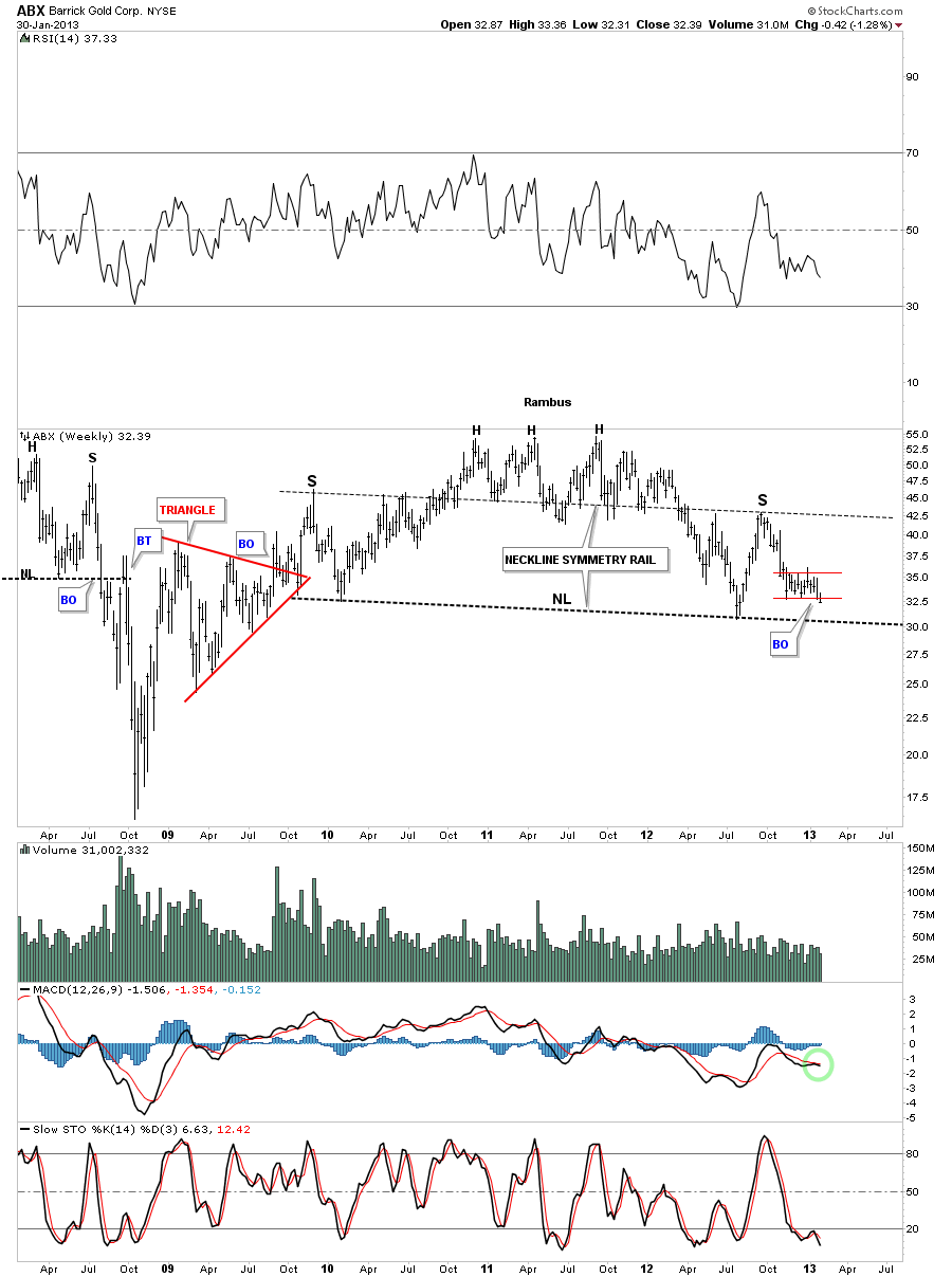
Lets now look at some of the biggest of the big cap precious metals stocks and see what they look like. The first big cap stock I would like to show you is the ABX weekly chart. As I’ve shown you on the PM stock indexes there is some beautiful symmetry going on. You can see the neckline symmetry rail that showed us where to look for a possible high for the right shoulder. Note the little red rectangle that is now just breaking below it’s bottom rail. That should insure a move to the big neckline.
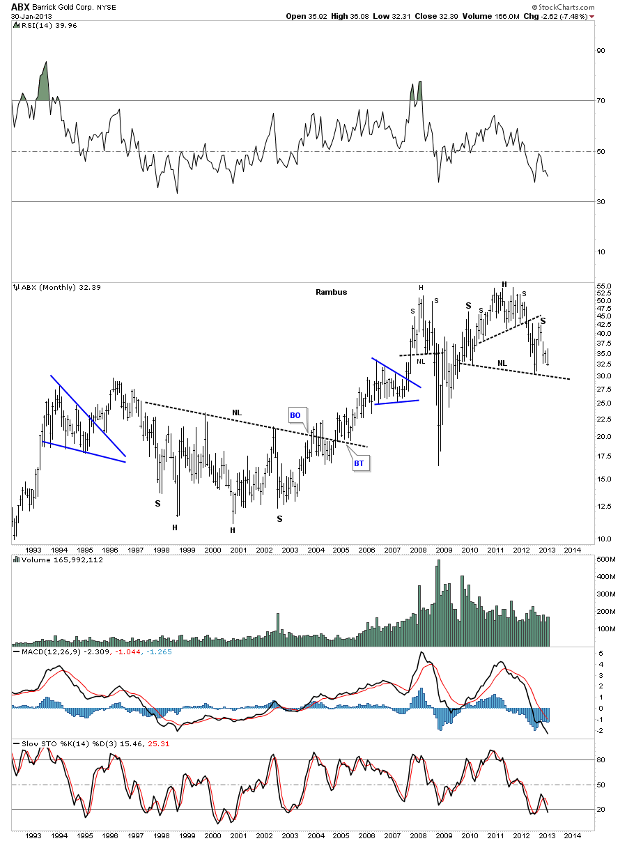
The ABX monthly chart shows our double H&S top along with the 2008 H&S top. Also notice the massive H&S base that launched the bull market.
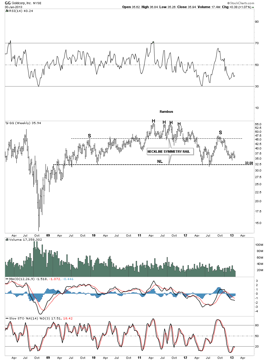
Another big cap precious metals stock is GG that looks just like any of the precious metals stock indexes. Again very symmetrical in appearance. As you can see it still has several points before it reaches the neckline.
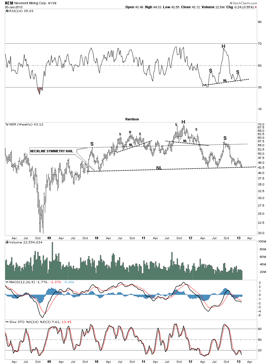
NEM is another big cap precious metals stock that shows the same beautiful symmetry and is now touching the big neckline. It may lead the way lower ahead of ABX and GG.
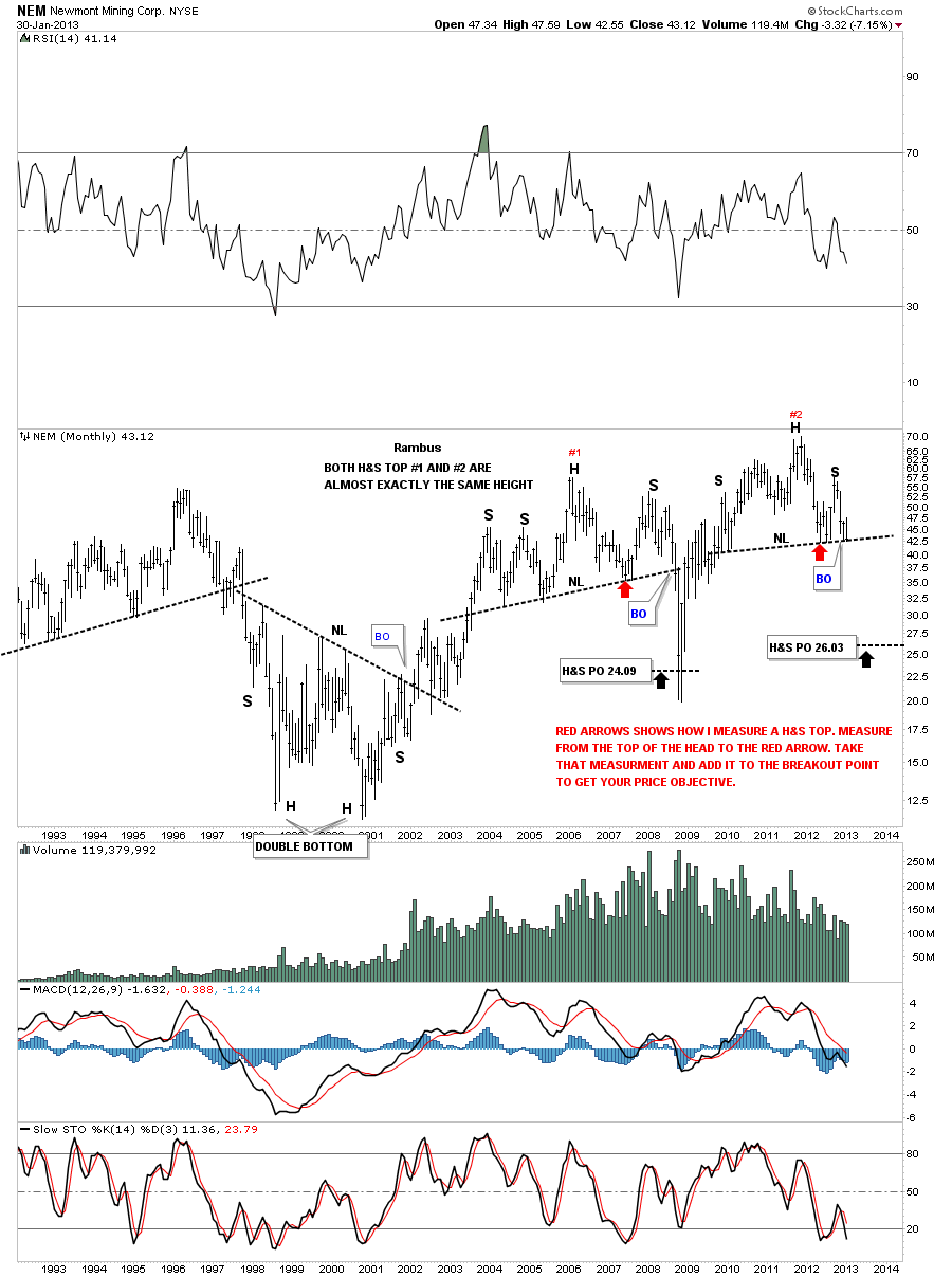
The monthly chart for NEM is interesting in that the previous H&S top which took about four years to build out and broke down in 2008 is almost identical to our most recent H&S topping pattern. The red arrows shows how I measure for a H&S price objective.
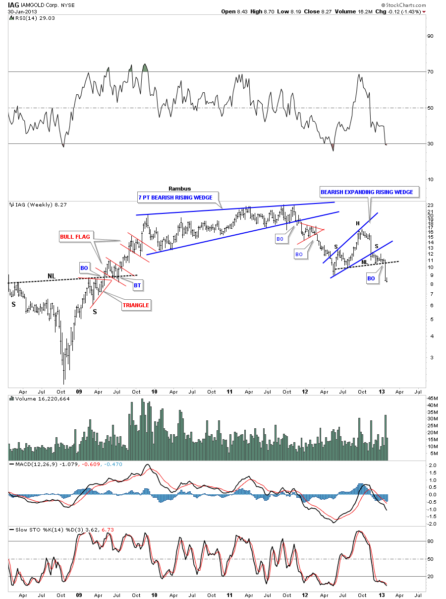
Lets now look at some other precious metals stocks that are breaking down from their own H&S patterns on different time frames. IAG broke down from a smaller H&S top that formed on the daily chart last week. Note the nice symmetry with a blue pattern on the left side of the chart and one on the right side of the chart. Also note the Head portion of the H&S top pattern was an unbalanced H&S top. Unbalanced meaning there was one shoulder on the left side and two shoulders on the right side. Also note the massive breakout gap from the smaller H&S top and a nice breakout gap that accompanied the breakout of the bigger H&S top pattern.
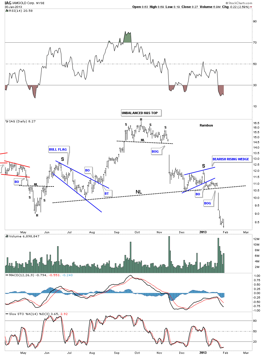
The weekly chart for IAG shows when the distribution began back at the end of 2009 which took on the form of a 7 point bearish rising wedge. I believe if the precious metals stocks were still in a bull market that point #7 on the blue bearish rising wedge would have broken out through the top. As it turned out it broke through the bottom rail confirming lower lows and lower highs which is the definition of a downtrend.
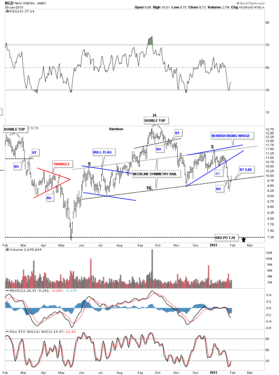
Below is a daily chart of NGD that is loved by most precious metals stock investors. Here to you can see the beautiful symmetry taking place within the H&S top. The neckline symmetry rail shows us where to look for a high for the right shoulder which also corresponds to the last reversal point in the blue bearish rising wedge. Once it broke below the bottom blue rail of the bearish rising wedge it wasted little time trading down to the neckline which it penetrated last Friday. You can see today’s price action had a fairly strong backtest to the neckline but closed right on the neckline.
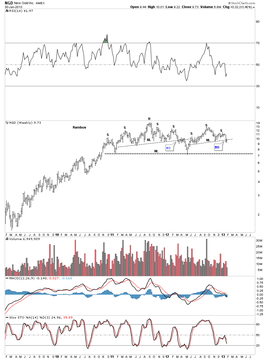
The weekly look shows the much bigger topping pattern or distribution pattern that began all the way back at the end of 2010. By the time its all said and done I will probably label the big topping pattern as a rounding top.
The monthly chart for NSU.To shows a nice symmetrical H&S top that is not as far along as some of the other topping patterns but you can see all the pieces of the puzzle are in place.

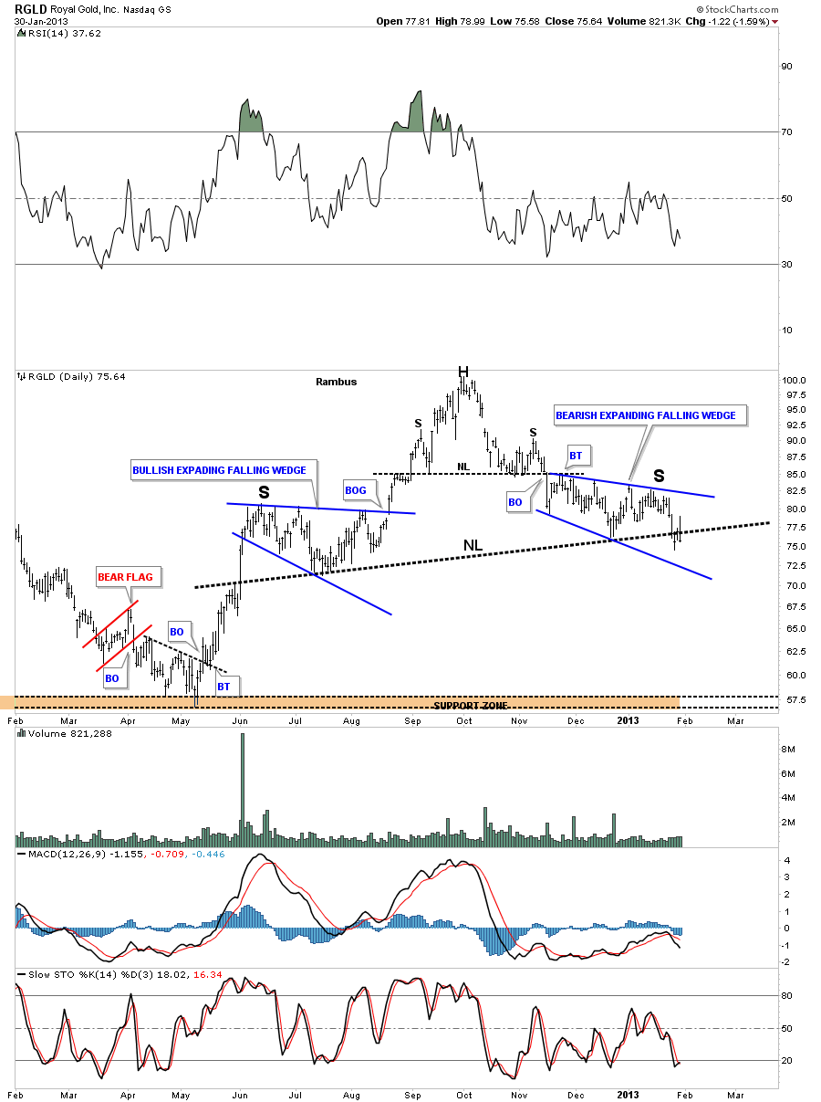
RGLD is in the process of breaking the neckline on the daily chart. Note the smaller H&S top that formed the head portion of the this H&S top.
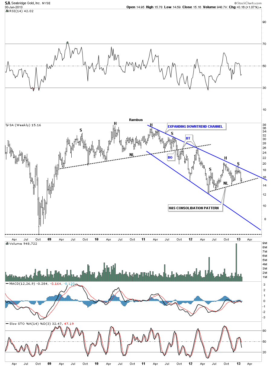
Lets look at one more precious metals stock before before I call it quits for the night. SA broke down from it’s huge H&S top in October of 2011. You can see since the breakout it has been trading in an expanding downtrend channel that is presently showing a H&S consolidation pattern. A break below the neckline will usher in the next impulse leg down.
I want to leave you with this last chart for the HUI that is a daily look that goes back to the beginning of the bull market. As I have shown you on the charts above symmetry plays a big role in how I view the formation of chart patterns. Alot of times the way a stock moves up will have a direct impact on how a stock will move down when a top is put in. For instance when there is a parabolic move up there isn’t much time to form any consolidation patterns to form so the move down is just as fast or faster than the move up. This happens to a lesser degree in normal uptrend or downtrends in that how a stock goes up is how it will come down. The HUI chart below shows the possible H&S top, possible because the neckline hasn’t been broken yet, and how the move lower may unfold based on the way the rally off the 2008 bottom looks. I call this Reverse Symmetry. The black rectangles equals time and price.

I could go on and show you many more of these topping patterns but I think you get the point here. Everyone is trying to be the first one to call a bottom when in fact they should be calling a top. There are many good chartists out there that are being blinded by the herd and can’t see the forest for the trees. As you can see on many of the charts above one good trendline in the right spot can make the difference between success or failure. There is nothing fancy about the H&S tops in the precious metals stocks. Its all just basic charting that anyone can learn to do. You just have to keep an open mind and be willing to accept change when it presents itself. So the bottom line is: Is this just a cyclical bear in the secular bull market? Or: Is the Fat Lady Singing ? And: What About Gold and Silver ? Stay tuned for further developments. All the best…Rambus
FREE TRIAL
http://rambus1.com/?page_id=10