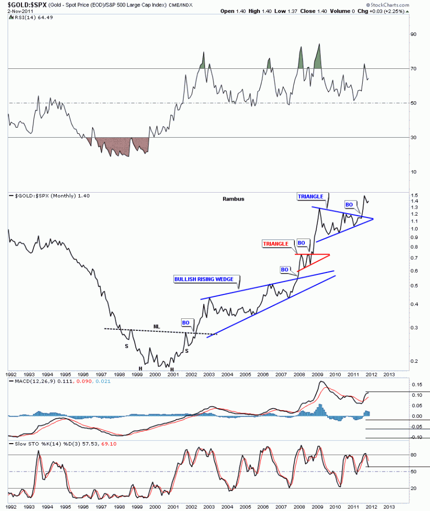
Today I want to look at a couple of ratio charts concerning gold. Ratio charts are a good tool to see how one item is preforming against the other and where is the best place to invest one’s capital. We are going to look at the very long term monthly charts of the Gold to SPX and Gold to CCI to see if gold has really been a good investment compared to the stock markets and commodities. First we’ll look at the Gold to SPX and see how gold has fared compared to the 500 biggest cap stocks in America. If gold is out preforming the SPX the chart below will have an upward bias showing gold’s relative strength. When looking at the left side of the chart below, gold was probably one of the worse investments during the stock markets raging bull market that ended in 2000 about the same time the bear market for gold was ending. Notice the almost 4 year H&S bottom for gold at the bottom of the chart. It took four years to reverse the downtrend that had basically been in place since gold’s bull market top at 850 in January of 1980. There can be no denying, by looking at the Gold to SPX chart, that gold has vastly outperformed the biggest 500 companies in America.
Gold to SPX monthly ratio chart showing gold’s relative performance to the SPX.
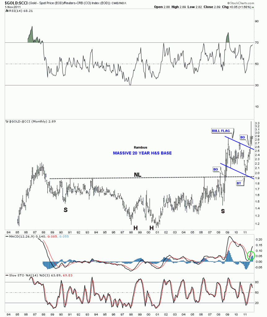
Next, lets look at how gold has fared against a basket of commodities using the CCI commodities index. By looking at the chart below you can see how gold gradually outperformed the CCI since its bear market low from 1998 to 2001 bottom which also created a double bottom which intern is the head of a massive 20 H&S bottom. Gold showed modest relative strength to commodities, in general, until the 2008 stock market and precious metals crash. That crash helped forge the right shoulder and was the percourser to gold’s rally that would go vertical compared to most commodities. It was a massive rally that took out the 20 year neckline and showed gold was finally in charge. After such a big rally gold needed a rest. The resting period for gold to the CCI took the form of a bullish flag pattern that found support right where one would expect to find it, right on the 20 year neckline. Perfect TA. Three months ago this ratio broke out of the flag formation and is now ready to begin outperforming commodities. So the chart below shows how gold is getting ready to outperforming commodities, in general, and is still the place to be invested compared to the stock markets and most commodities.
Gold to the CCI index monthly look.


