This week I want to focus on the US dollar and the Euro charts as they are both sitting on their respective necklines of a very large H&S bottom for the dollar and a very large H&S top for the euro. Understanding the consequences of these two large H&S patterns should keep us on the right side of the markets. The H&S patterns still haven’t completed the breakout yet but are precariously on the verge of confirming the H&S patterns. Keep in mind these are very large patterns and it will probably take sometime to complete the breakout and the backtest before the real move gets underway. If these two patterns play out the way they should the Euro is in big trouble at the moment. Regardless of all the news coming out of Euro land their currency looks like its in for a pretty good correction at the very least.
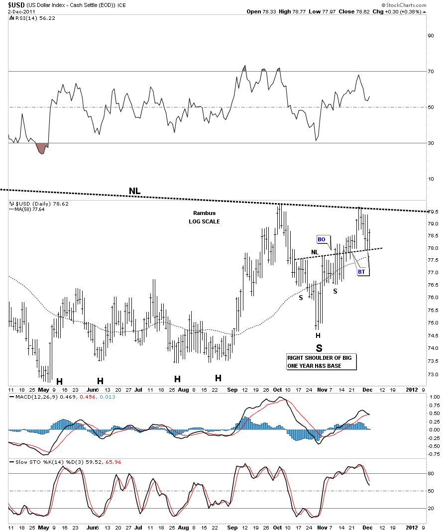
Lets start with an eight month chart of the dollar that shows about 2/3’s of the big H&S base. Notice the small H&S bottom that is forming the right shoulder of the much bigger H&S bottom. You will see a big neckline that runs across the top of the chart that is the neckline of the much bigger H&S top. The H’s are the head of the big H&S bottom. I just wanted to zero in on this latest price action to show how bigger patterns can be made up of smaller patterns. You can see we have backtested the neckline several times. Also the 50 dma comes in just under the recent price action.
US dollar 8 month daily look showing right shoulder of big H&S bottom.
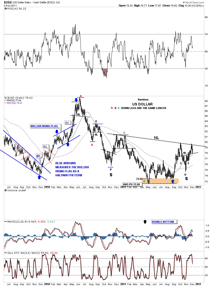
Next, lets step out two years so you can see the big H&S bottom and how it fits into the bigger picture. Note the right shoulder. That is the H&S bottom on the chart above that is creating the right shoulder of the big H&S base. Special note. For those that have the capability of measuring price, either with a Fib tool or can draw a box, you can measure each impulse leg down starting with point A, in red, at the top of the chart. Measure down to the lower A and that is the distance for the red A impulse leg down. Without changing your measurement take your fib tool or box and put it on the B top. You should see that the A measurement is equal to the B impulse leg down. Again without changing your fib tool or box you can move it down to the top of the C impulse leg down. You will see that each of the impulse legs down are almost exactly the same distance which played an important role in finding the low for the dollar. The C wave impulse leg down has created a bottom for the big H&S base which has multiple heads.
US dollar 2 year look showing big H&S base with equal impulse legs down
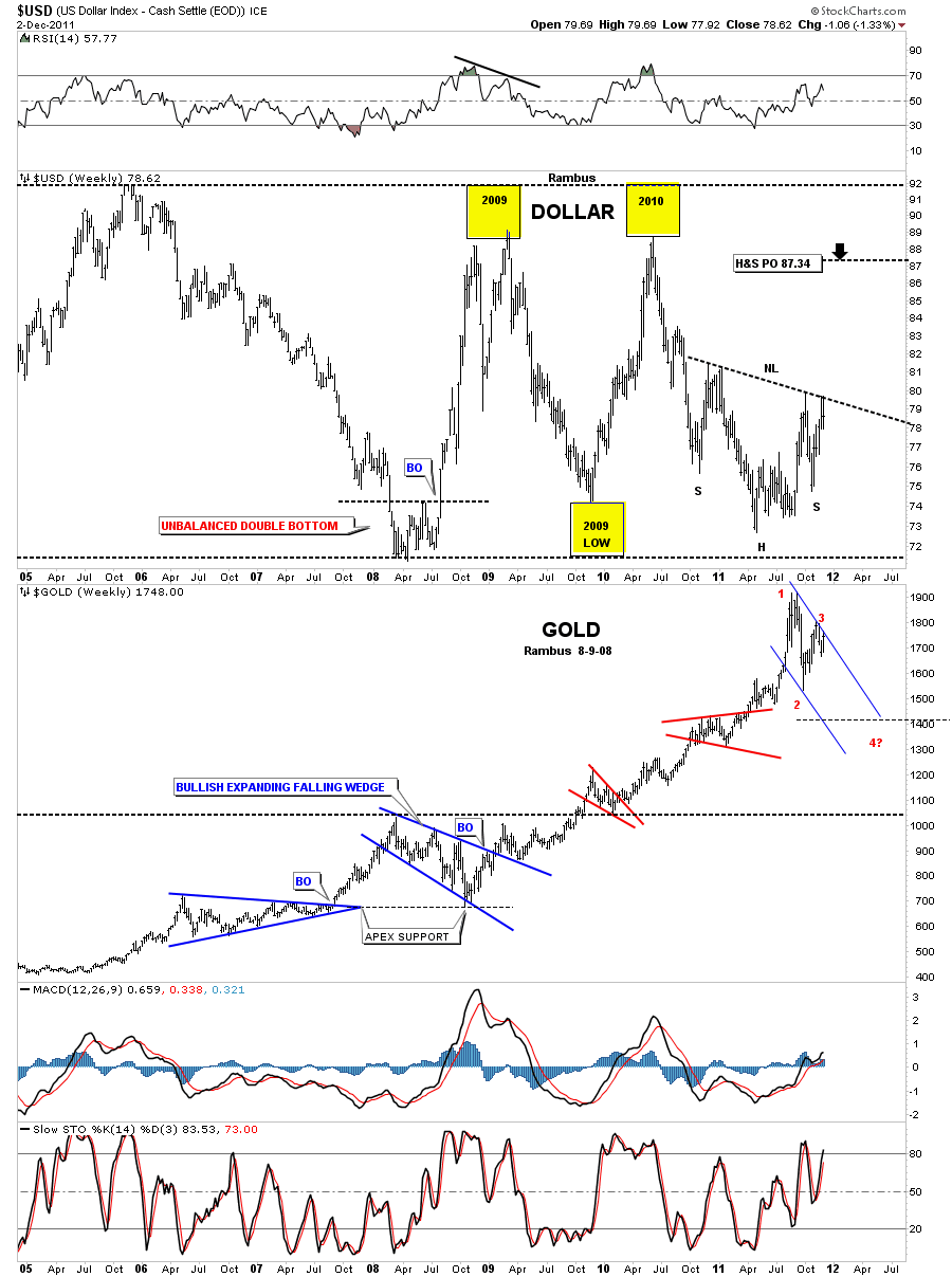
Next lets look at a weekly 7 year chart that shows a possible trading range and our big H&S base. The yellow areas on the chart below shows how the dollar failed to reach the top in 2006 using the yellow squares for 2009 and 2010. Now look at the 2009 low that failed to reach the bottom black dashed rail from the 2008 low. It also failed by the exact same distance that the two top yellow boxes failed. This is a symmetry thing. You can see the big H&S price objective to 87.34. I wouldn’t be surprised once the impulse leg up gets started that we don’t make it all the way up to the top black dashed rail, the 2005 high. At any rate the big H&S base should push the dollar up to 87.34 at a minimum. I also put a chart of Gold under the dollar chart so you can see they are both up against a resistance rail. The dollar neckline and gold the blue downtrend rail.
US dollar weekly look symmetry yellow squares.
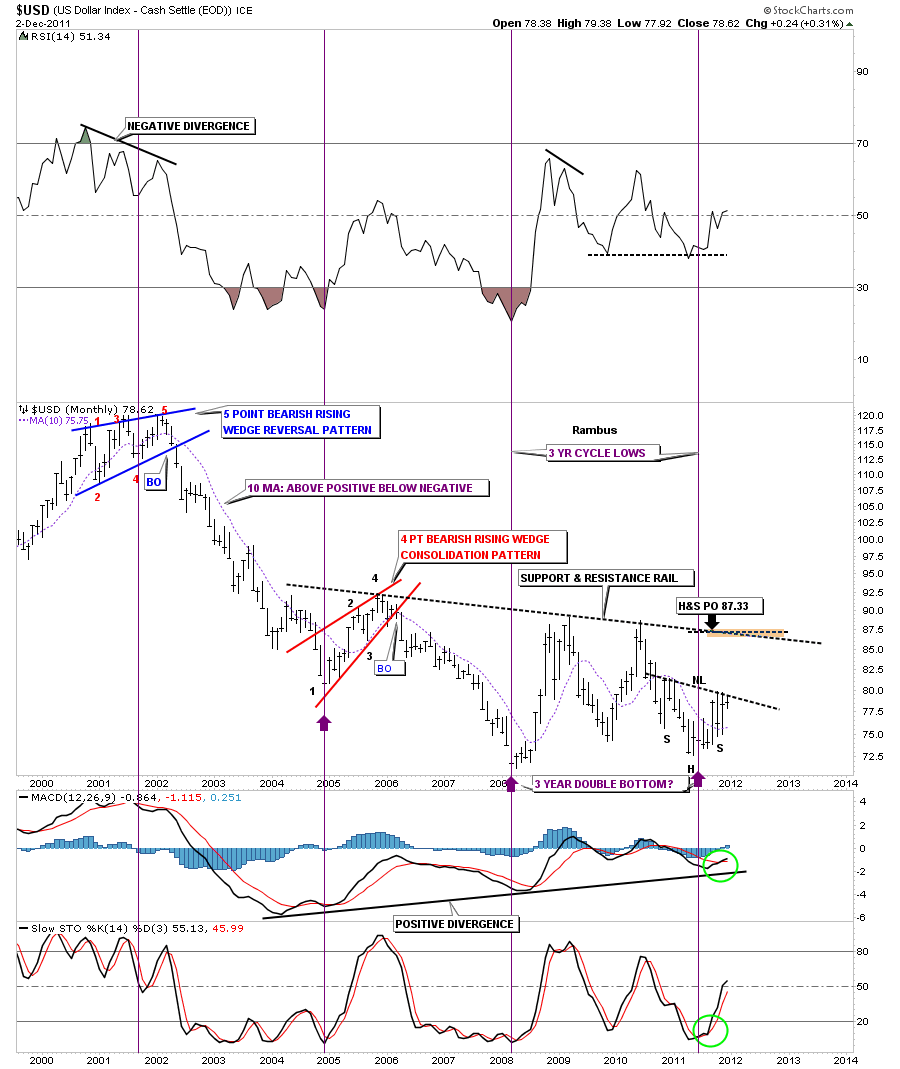
The next chart is a monthly look going back to the US dollar top in 2000. This chart shows the roughly 3 year cycle bottoms, purple vertical lines. Note where our current 3 year cycle low comes in, right at the head of our H&S base. Knowing when to look for some kind of reversal pattern is always helpful. There is also a 10 month moving average that shows, when you are below it things are bearish and when you are above it its bullish. You can see we are well above the 10 mma right now which is a strong positive. One more thing about this monthly chart of the US dollar is the S&R rail, support and resistance rail, that shows the possibility that the dollar could be carving out a huge base. Thats only speculation at this time as we will have to see how we interact with S&R rail if the dollar can ever make it up that high.
US dollar monthly look using the 10 month moving average.
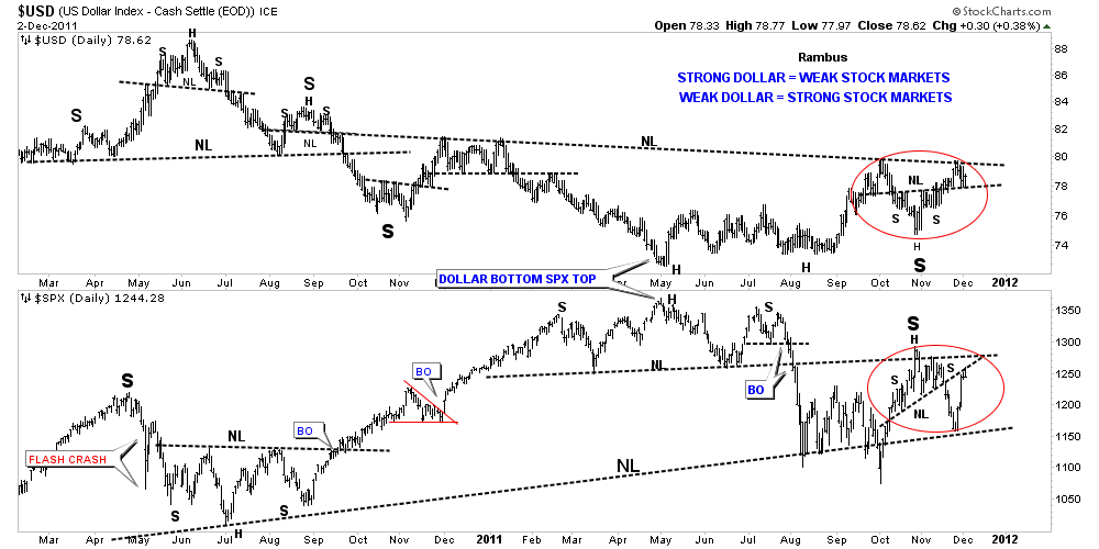
I want to do a comparison chart of the US dollar and the S&P 500. This chart could be very telling for the stock markets if the dollar breaks out it’s small H&S, right shoulder of the big H&S base, red circles. You can see the S&P 500 is also close to completing a H&S top. Last weeks huge rally in the S&P 500 took the index up to backtest the neckline. As you can see from looking at the chart below everything is hinging on the dollar breakout to get the ball rolling in the next important move in many markets.
US dollar H&S comparison chart ,red circles, with the S&P 500.
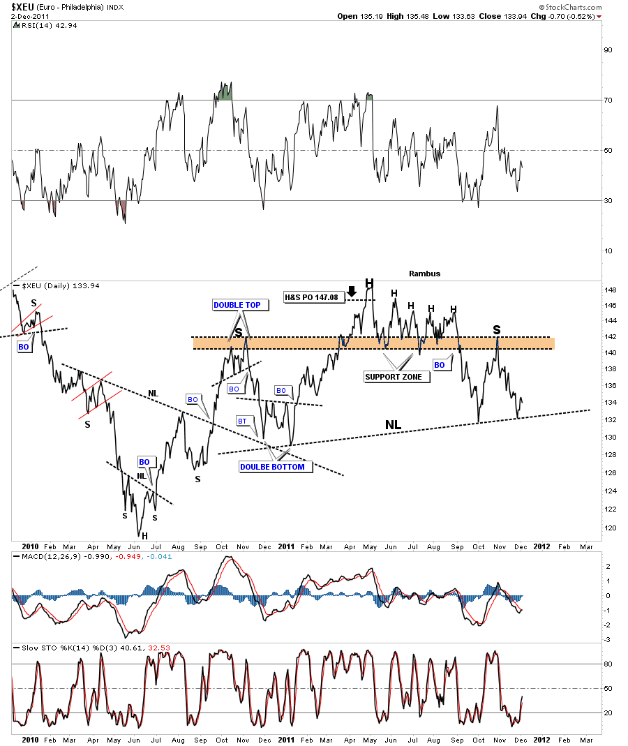
Next lets look at the XEU, euro chart that is showing a H&S top formation that is equal in size to the dollars H&S bottom. This line chart shows a nice H&S base that was made in 2010 that had a big backtest that created a double bottom on the neckline. The price objective for the H&S base was finally achieved at 147 in May of this year. You can see the multiple heads that equate to the multiple heads on the dollars big H&S base. Also note the height of both left and right shoulders on the H&S top. Pretty nice symmetry going on there.
XEU daily H&S top.
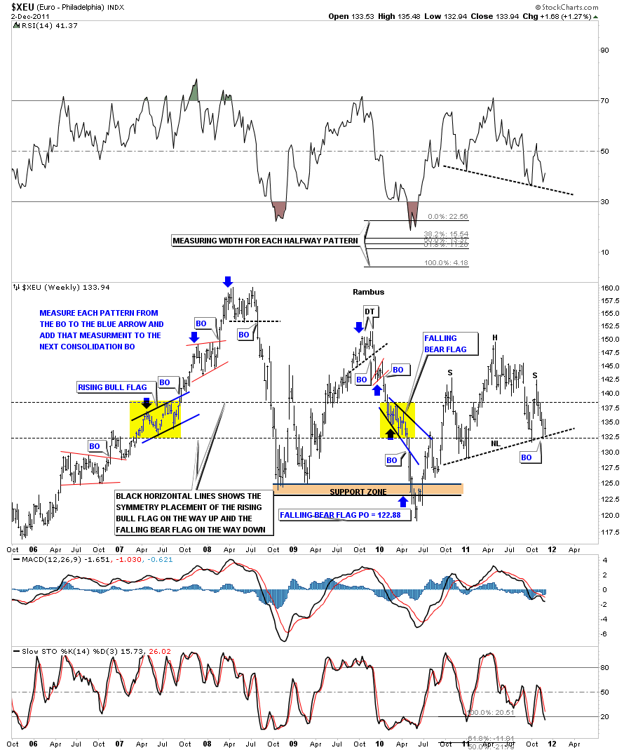
The weekly look at the XEU shows how close we are to completing the big H&S top.
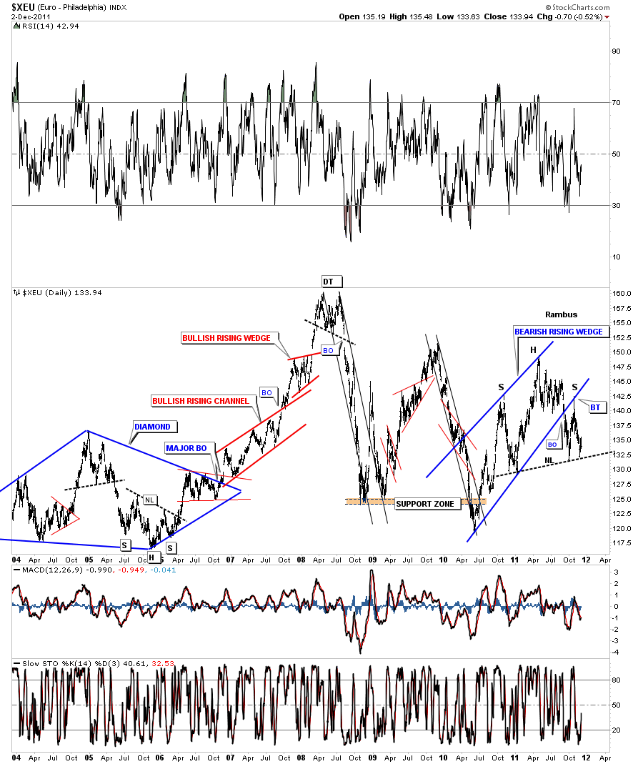
The next chart shows all the trading patterns the euro has made over the last 8 years or so. Note the blue bearish rising wedge on the right side of the chart. You can see how the bottom blue rail of the rising wedge has played a key role in the development of the H&S top. The big backtest to the underside of the bottom blue rail created the right shoulder of the big H&S top. Again you can see how precariously we are sitting on the neckline. At a bare minimum, between the H&S top and the bearish rising wedge, the price objective should be down to the bottom of the chart. The euro looks to be in trouble if this chart plays out.
XEU bearish rising wedge with H&S top. Not looking good for the Euro.
Lets look at one more long term monthly chart that is showing a downtrend channel forming off the bull market top at 160 in 2008. You can see there is a clear picture of lower lows and lower highs. Also you can see the red bearish rising wedge and our H&S top from the chart above. I extended the neckline, that may come into play further down the road, that may act as support.
XEU monthly downtrend channel with H&S top and bearish rising wedge.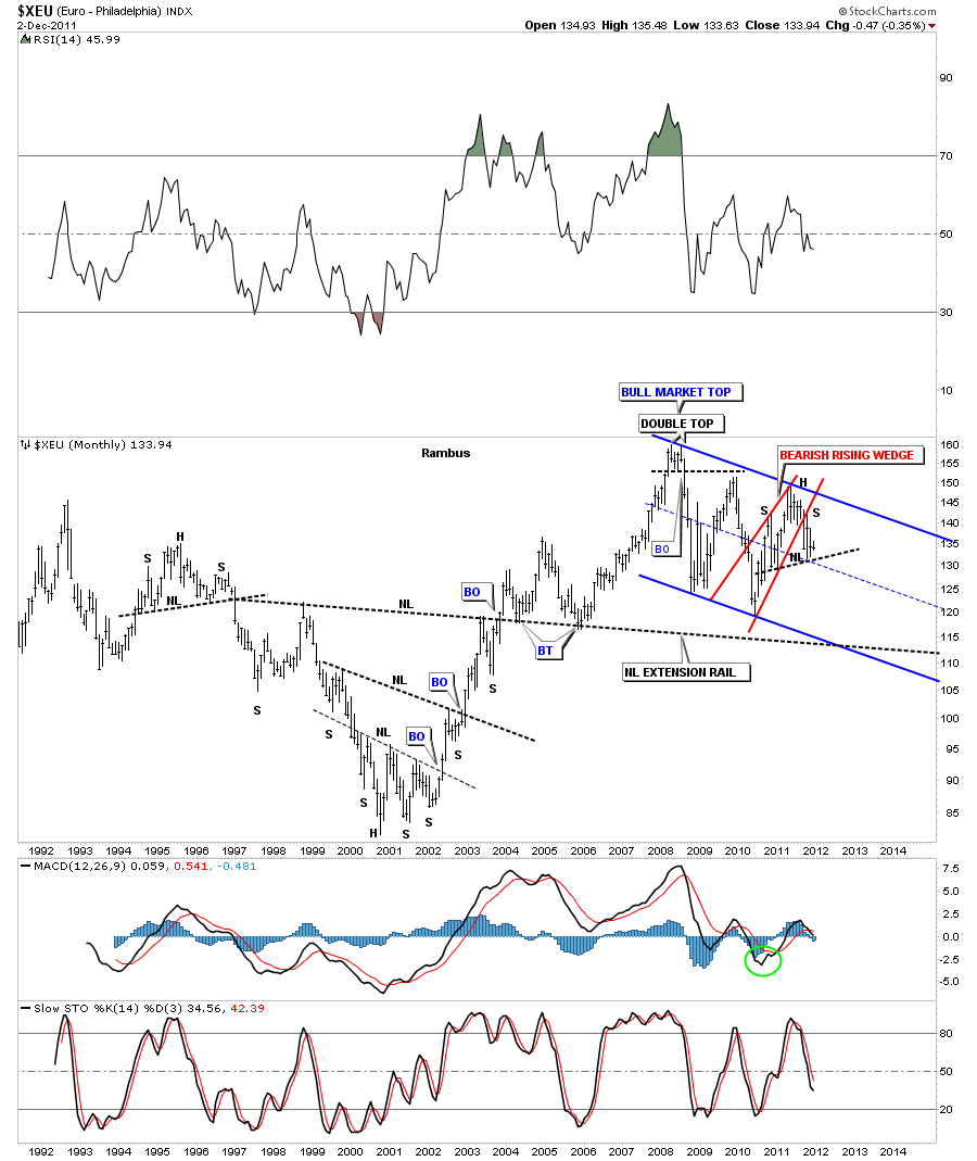
So the bottom line is if the US dollar and the Euro H&S patterns play out as expected there should be some pressure on the stock markets and the precious metals complex unless this time is different. We will be able to monitor the change if things are going to be different but for right now it is what it is until proven otherwise. All the best …Rambus

