Friday I did a post on the HUI showing a two year bullish rising channel, bullish rising flag or running correction, whatever you want to call it. I showed how the symmetry should play out with the move off the 2008 bottom equaling this new move I see coming for the HUI and the precious metals stocks in general. I know many of you out there think its impossible for the HUI to have such a big rally in just over a year so I’m going to show two charts, one from the Dow rally off the 2002 -2003 bottom that was the first crash low off the secular bull market top in 2000. The second chart I’m going to show you is the COMPQ and the final move into it’s parabolic top at 5132 in 2000.
First, these patterns I’m about to show you happen all the time on different time scales. What amazes me is how few chartists actually see these patterns for what they are worth. They work just like any other consolidation pattern and generally show up as a halfway pattern. The patterns I’m talking about are the bullish rising wedge and the bullish rising flag or channel. They can also form in a down trending market as a bearish falling wedge and a bearish falling flag or channel.
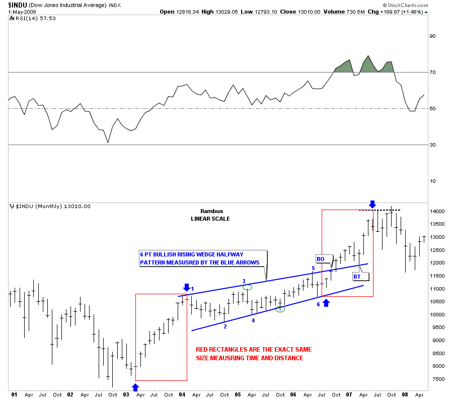
The Dow formed a beautiful 6 point bullish rising wedge in the middle of it’s bull move off the 2002 – 2003 low to the 2007 high. That high in 2007 led to the infamous stock market crash of 2008. It took alittle over 3 1/2 years of sideways to upward chopping action to carve out the eventual bullish rising wedge. Not once during the formation of that pattern did the Dow ever make a lower low or lower high. Six months after the breakout through the top blue rail of the bullish rising wedge there was one last backtest, that for me, confirmed the pattern and that we would see a similar move higher equal to the first leg up off the 2002 – 2003 bottom. The way I measure these type of patterns, or any other consolidation patterns for that matter, is to measure the impulse leg up leading to the first reversal point in the consolidation pattern. Then I add that distance to the last reversal point in the consolidation pattern to get your price objective. On the Dow chart below the blue arrows shows how the bullish rising wedge worked out almost perfect, as a halfway pattern. The red rectangles shows you how the lower impulse leg up matched the upper impulse leg up in time and distance.
Dow monthly showing the bullish rising wedge as a halfway pattern.
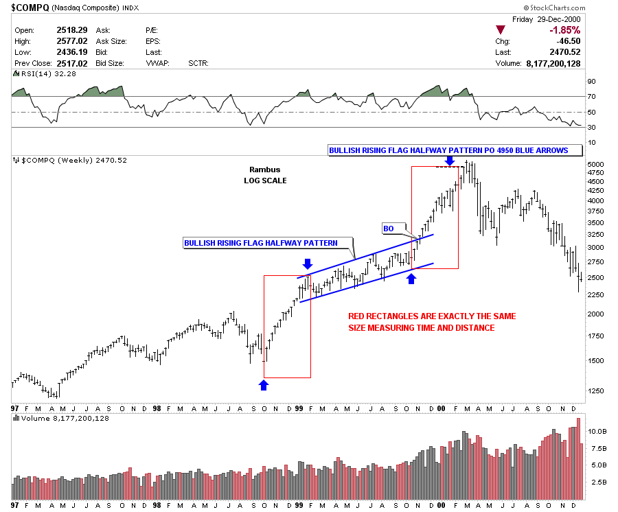
The next chart I would like to show is weekly look at the COMPQ that shows a beautiful bullish rising flag that showed up smack dab in the middle of it’s last major leg up that ended in 2000. How many of you traders out there would have recognized that pattern for what it was worth and sold at top of the bull market. When you see these patterns show up in big moves like that you know that either the bull move is over, or that in the very least, a big consolidation will start. If one would have acted on what the bullish rising flag was showing he could have gotten out right near the top preserving the big gains from the massive bull market. I know from fist hand experience that very few recognized the big top in the COMPQ back in 2000. As is usually the case many of the experts were saying we are in a new paradyme and the markets where going to just keep on rallying. It was really hard to think outside the box back then as everything was being hyped up to no end. But just a simple chart pattern gave you everything you needed to see, that was happening in real time, a clear cut signal as to when to exit the markets. No second guessing. No emotional turmoil as what to do. Just a black and white signal to exit the markets. Below is the chart of the COMPQ that shows the bullish rising flag, as a halfway pattern, in the middle of the last big impulse leg up to the 2000 secular bull market high at 5132.
COMPQ weekly look showing the bullish rising flag as a halfway pattern.
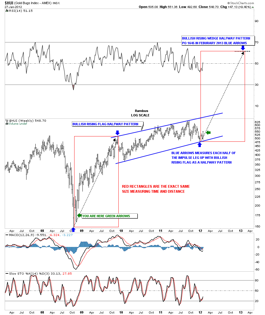
Now that I have shown you how important it is to recognize these types of patterns its now time to look at the HUI and the implication of a very similar setup to the two charts above. After the precious metals stocks crashed in 2008 the HUI had a very good rally that lasted just about a year and recovered all the ground lost during the crash. From that point, at the end of 2009 is where our current bullish rising flag started to form. Its been a two year upward chopping move that has frustrated gold bugs to no end. Everytime it looked like a breakout was eminent the precious metals stocks would sell off hard. So now we find ourselves at the bottom of the bullish rising flag. The rally over the last week or so has left a bottom in place that just may be “THE BOTTOM”. Note the green arrows and their implications .As with the two charts shown above, we have the first impulse leg up off the 2008 low, the two year rising chopping action, with the now strong possibility of the second halfway impulse leg just getting started that will take the HUI up to 1645 in just over a year from now. I can assure you no one is looking at the HUI from this perspective as these bullish rising patterns are off the radar screen for most chartists.
HUI weekly bullish rising flag halfway pattern.
Bottom line is we now have a road map in which to follow this next impulse leg up in the HUI and the precious metals stocks in general. I can tell you right now that when we hit that price objective of 1645 a year from now the hype will be so strong that it will be hard to let go of your precious metals stocks. I’m not saying its going to be the end of the bull market but that a big correction, at the very least, will be in play going forward. So there you have it a road map to 1645 on the HUI in just over a year from now. Stay tuned for further developments. All the best … Rambus


