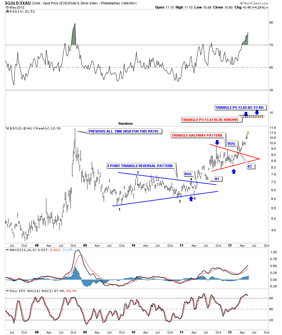
The gold to XAU ratio chart is showing we are approaching the all time high made back in 2008. That was a spike high that reversed almost immediately and signaled the bottom was in for the precious metals stocks. On the chart below you can see we have a different setup as we approach that all time high this time.
As you can see on the chart above the ratio bottomed out with a 5 point triangle reversal pattern to the upside. The ratio then went on to form a red triangle consolidation pattern that broke out to the upside about three months ago. If we view that red triangle as a halfway pattern the price objective comes in around the 12.80 area based on two different measuring techniques I use. So even though this ratio is at an extreme it looks like it wants to go higher IMHO.
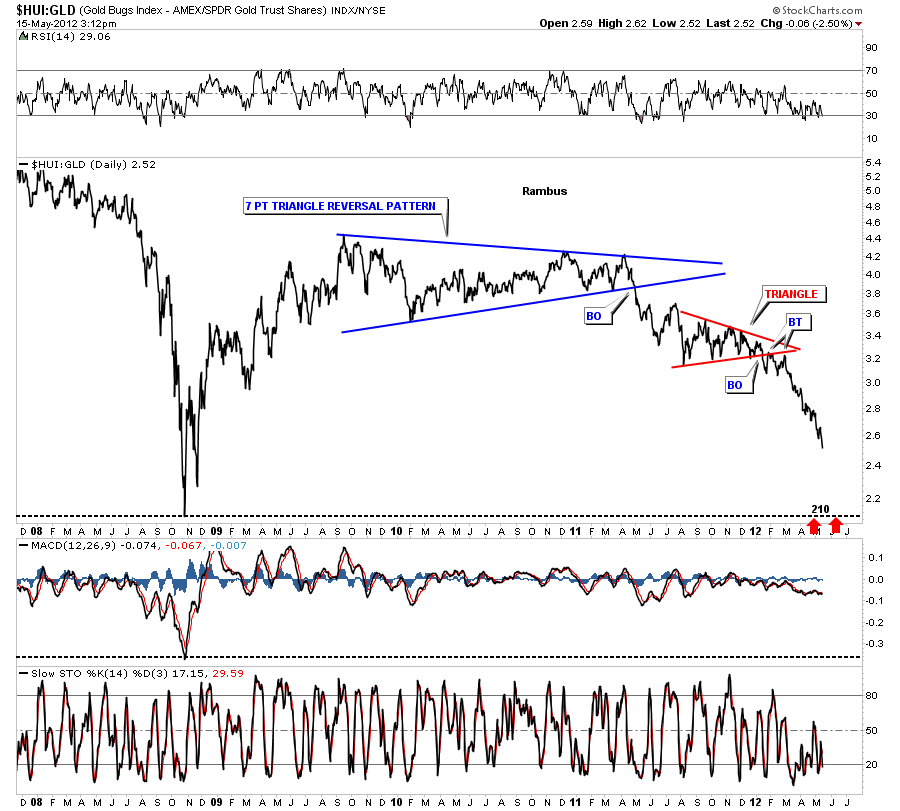
Below is a daily look that shows the HUI:GLD ratio chart still has a ways to go yet before we test the 2008 crash lows down at 210. I mentioned several months ago that I thought that the PM stocks were accelerating to the downside relative to gold. This has been the case as the chart below shows.
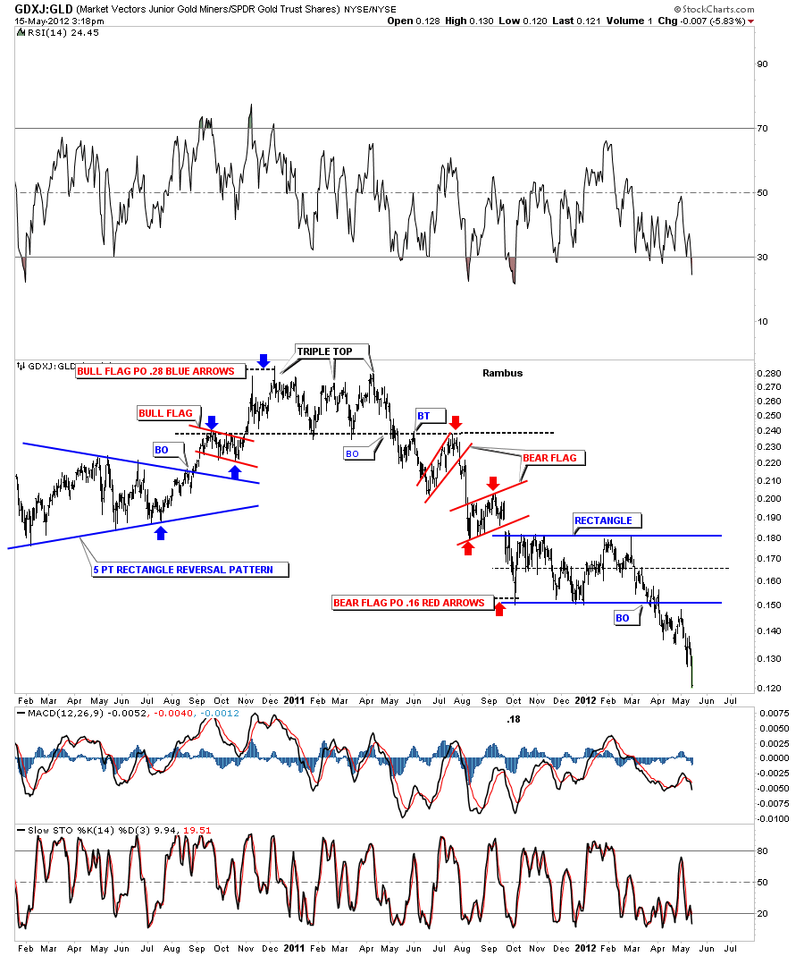
The GDXJ:GLD really shows the little juniors plunging against GLD after completing a rectangle consolidation pattern.
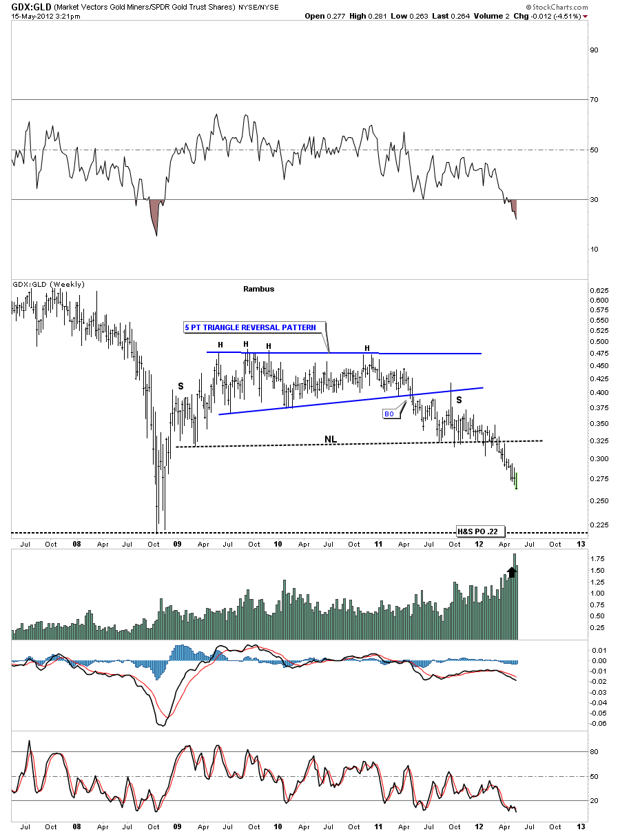
I can make a case for a big H&S top pattern with the weekly GDX:GLD ratio chart that shows there is still some more room to move lower before we reach the crash low of 2008. Although the PM stocks seem to be oversold compared to gold there is still room to move down before we reach the 2008 panic lows. Note the price objective that measures down to the 2008 bottom.


