Tonight I would like to show you a stock from the model portfolio and how I plan to keep it updated for easy reference. For the last month, since we reopened the model portfolio, my focus has been on finding some good quality stocks with bullish chart patterns in which we can invest. There are literally 100’s to look at which takes alot of time to analyze. Right now we have a pretty full portfolio that will keep us busy for awhile. This is by no means the end of looking for better precious metals stocks when they show up or tweaking the model portfolio when need be. For right now its important for me to bring the model portfolio up to date so we can have easy access, at a minutes notice, if one chooses to look at a certain stock.
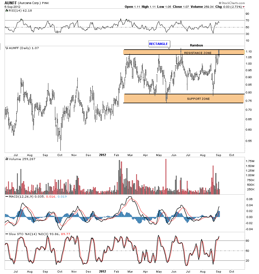
The first chart I would like to show you is a daily chart for AUNFF that I know several members follow very close. When you look at the model portfolio this analysis is what I want you to see with all the other stocks. I plan to keep an indepth look from daily, weekly to monthly if need be. There will be a green arrow on either a daily or weekly charts that will point to where we bought in on price and date.
Lets look at a daily charts for AUNFF that shows a loose rectangle formation that has been in place since February of this year. As you will see with the weekly look this loose rectangle is just a small part of a larger formation.
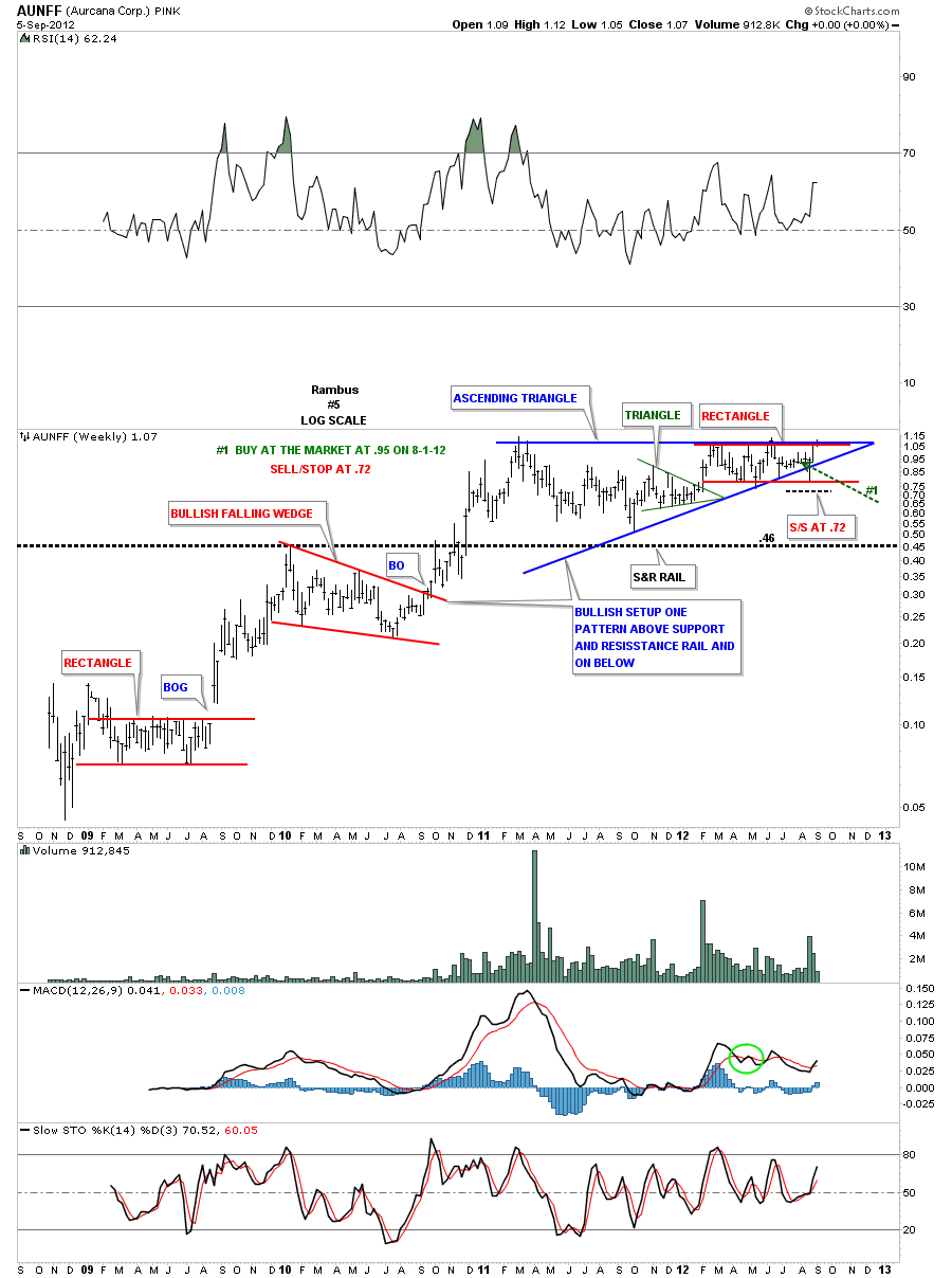
This next chart is a weekly look that shows how the rectangle, from the chart above, fits so well within the bigger blue ascending triangle. The green arrow points to the date and price we bought in at. Note the false breakdown from the blue triangle that ended up being the last reversal point in the red rectangle. AUNFF is also trading right at the top of the blue triangle where anything can happen at anytime now.
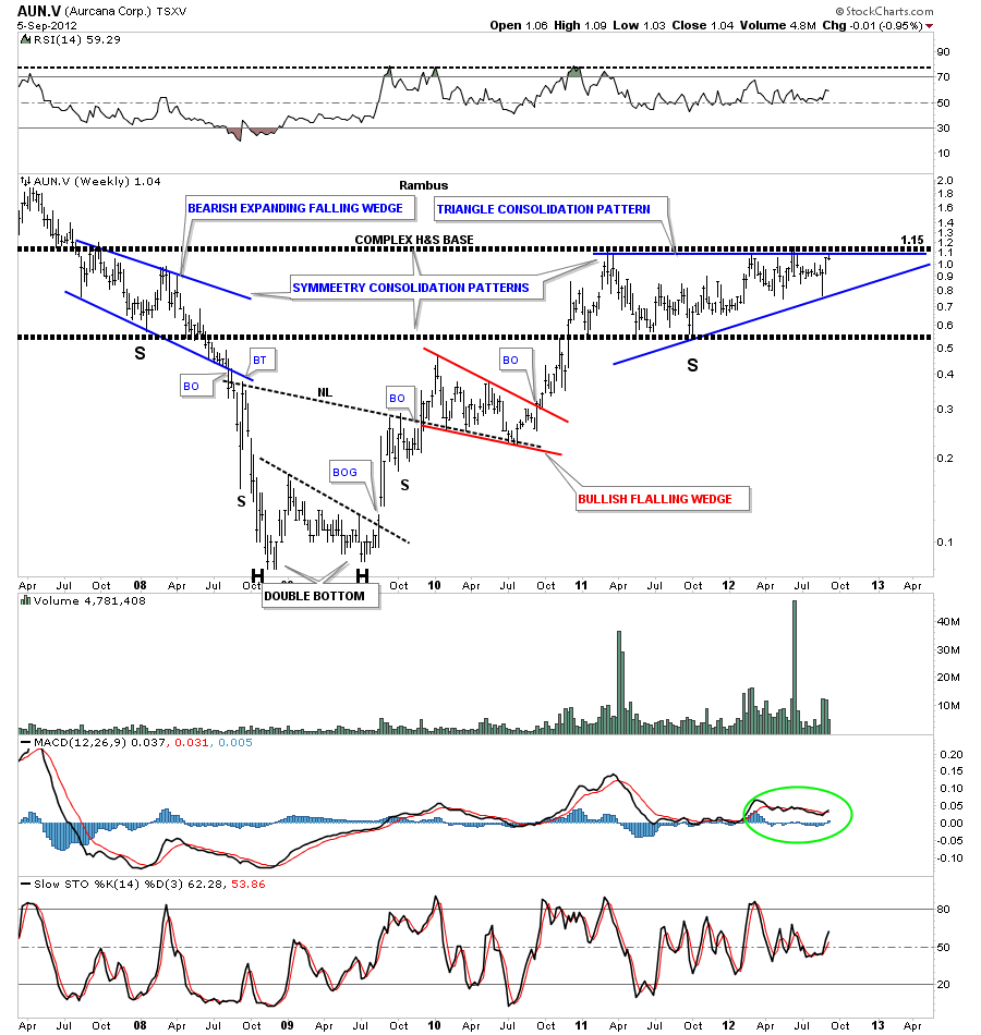
Lets look at another weekly chart for the Canadian symbol for Aurcana, AUN.V. This chart shows good symmetry on both the left and right side of the chart. You can see two very heavy black dashed horizontal trendlines that defines the top and bottom of the two blue consolidation patterns, the bearish expanding falling wedge on the left side of the ascending triangle on the right side. Putting all the pieces of the puzzle together you can also see the potential for a huge inverse H&S base.
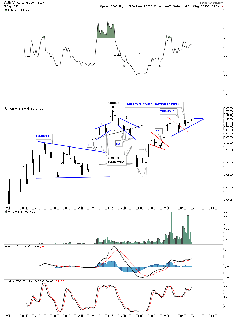
The monthly chart shows our very well defined blue triangle that is made up of two smaller consolidations patterns, the first is the red triangle and the other is our current red rectangle. Those two red patterns are creating the bigger blue ascending triangle which I’m labeling as a high level consolidation pattern.
This is how I’m going to do every stock in the model portfolio plus the kamikaze trades. I will keep them updated on a weekly basis with the daily charts needing the most updating. The weekly and monthly charts change much more slowly. I will still be posting each day when something interesting is happening with our precious metals stocks but my main focus over the next week will be to get the model portfolio 100% updated. Thanks for your patience as I think it will well be worth the effort for everyone concerned. All the best…Rambus


