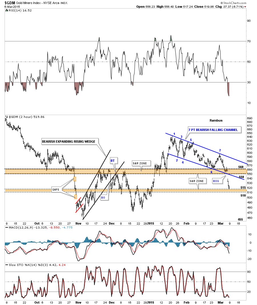
In this Weekend Report I would like to show you some charts for the PM complex in which we finally got some answers to some pressing questions that needed to be answered. The break below the brown shaded support and resistance zone – double bottom hump on the PM stock indexes, now gives us confirmation that the support zone is now negated and the bears are back in charge. The bulls failed miserably last Friday to defend that most important area and are now in retreat. They may put up a small temporary skirmish over the next several days but that’s all they’ll be able to do. Our job now will be to short into any strength.
Lets start by looking at a 2 hour chart for GDM that shows the big brown shaded S&R zone between 550 and 560 which was gapped over last Friday telling us the bulls were very weak. If you start at the left side of the chart you can follow the price action and see how the S&R zone has reversed its role several times going back to October of last year. There is another brown shaded S&R zone that I built after the second low was put in, back in December of last year, that runs between 510 and 515 or so. Again you can see how it has reversed its role several times. Notice how the price action will rally up to the underside of the S&R zone, have a small sell off and the next rally takes out that overhead resistance which then reverses its role and becomes support on the next decline. Friday’s price action tested the top of the lower S&R zone at 515. The lower S&R zone between 510 and 515 maybe a place to look for a small counter trend rally in which to add to our short positions. If the bulls are strongly in retreat there is a possibility that we may see another gap of the lower brown shaded S&R zone. Chances are we may see some weakness on the open tomorrow and then get a corrective bounce but that’s all it will be. This is the start of a possible impulse move down not the end.
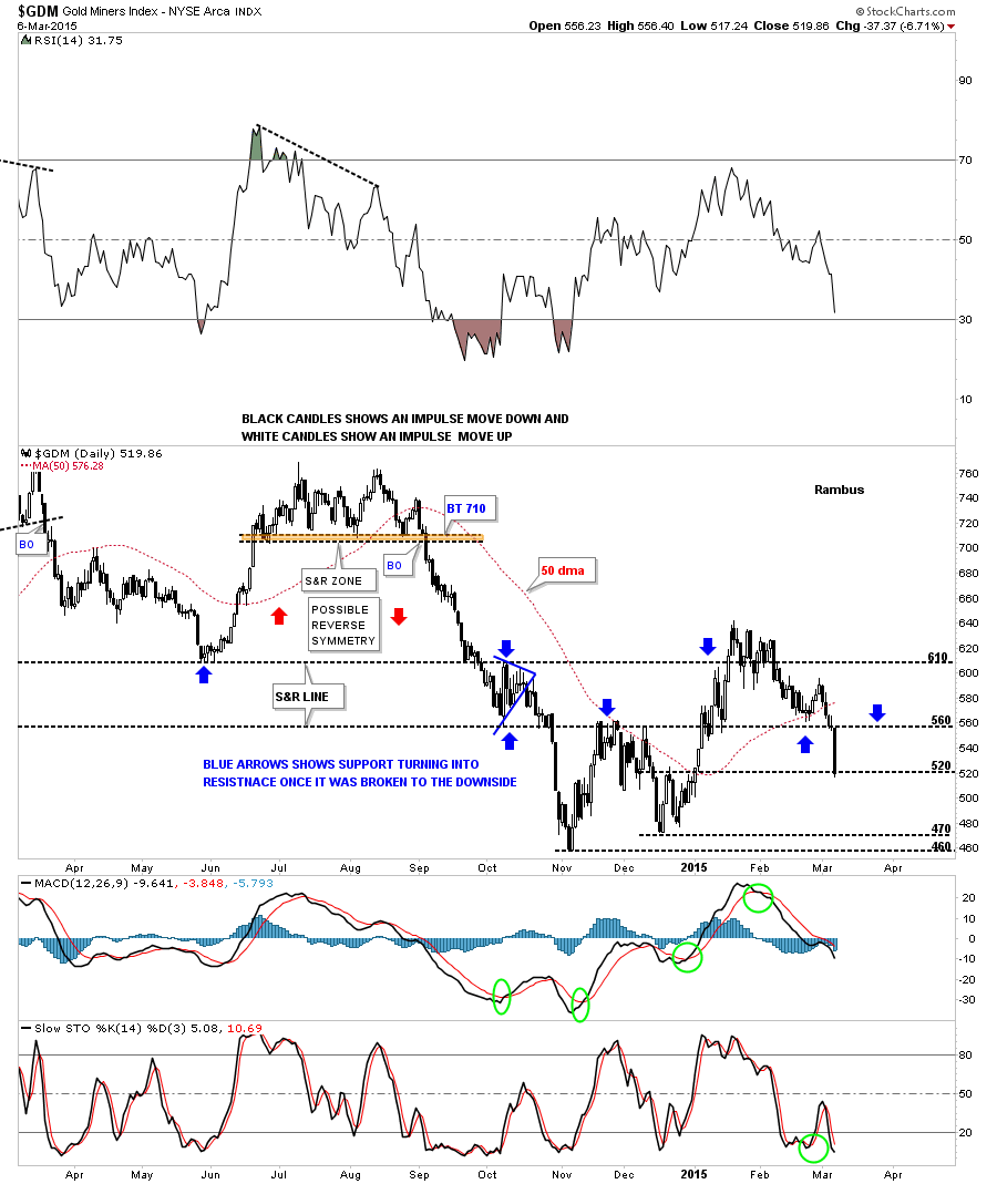
Next is a daily candlestick chart that shows us why we could see a small bounce at the 520 area. There was a small double bottom that formed in December and that double bottom hump comes in at 520 so initially we could see a small bounce. It remains to be seen, if we do get a bounce, how high it may go. The 560 area would be the maximum I would expect the bulls to rally GDM.
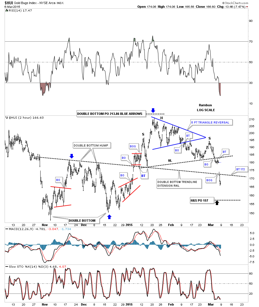
Below is a 2 hour chart for the HUI that shows all the chart patterns since the double bottom was formed starting at the November low. Now with the benefit of hindsight we can see how the double bottom trendline slices right through the trading range with the double bottom forming below the double bottom trendline and the H&S top forming above the double bottom trendline. It will be interesting to see if the double bottom trendline holds resistance now at the 172 area.
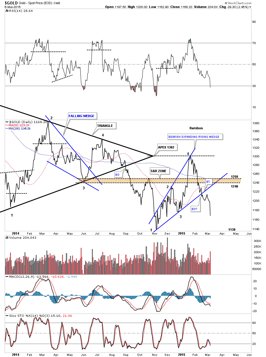
Now I would like to show you a chart pattern for the HUI which I have shown before but didn’t go into any great detail. With Friday’s big move down the pattern now jumps out at you like a sore thumb. Originally I first recognized this pattern on the daily line chart for gold which was the bearish expanding rising wedge that started to form at the all important November low. The rally was a little stronger than I thought at the time as gold traded above the brown shaded S&R zone which was showing strength. Theoretically the brown shaded S&R zone should have stopped the counter trend rally dead in its tracks. Gold managed to rally all the way up to 1305 which ended being the apex of the blue triangle. From that important high it has been all downhill for gold. You can see the small breakout and backtest of the bottom blue rail of the expanding rising wedge which was very hard to see on a bar chart at the time. First let me show you the daily line chart so you can clearly see the defined bearish expanding rising wedge then I’ll show you the exact same chart, leaving the trendlines and annotations in place, so you can see the subtly difference. As I have mentioned many times in the past a line chart can sometimes give you an earlier heads up on a breakout vs a bar chart. The daily line chart for gold.
Now the very same chart with nothing changed except for being a line chart it’s now a bar chart. You can see by looking at the bar chart the breakout and backtest are clearly defined even though there were some spikes through the top and bottom trendlines of the expanding rising wedge. Friday’s big move down is now starting the next impulse move lower as the breakout and backtesting processes of the bearish expanding rising wedge is now complete. Most folks don’t like to look at line charts but I find them very useful in certain circumstances.
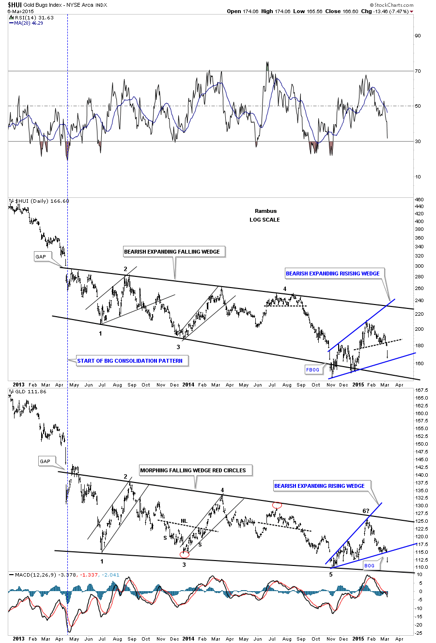
Now I would like to show you a combo chart that has the HUI on top and GLD on the bottom. I’ve shown you this chart many times in the past as it shows the beginning of the almost two year trading range for both the HUI and GLD. I have also shown you many charts in the past that shows how the PM complex tends to move together forming similar chart patterns and breaking out and backtesting their respective trendlines at roughly the same time. It doesn’t always workout perfectly but if gold is breaking out then there is a good chance that the HUI and silver are close to breaking out also. The big two year chart patterns for the HUI on top and GLD on the bottom are very similar but slightly different. Both chart patterns have down slopping trendlines with the HUI forming a bearish expanding falling wedge while GLD has formed a bearish falling wedge. Now to the meat and potatoes of this post. As I showed you on the daily chart above gold formed a blue bearish expanding rising wedge. As you can see on the chart below the HUI also has formed a blue bearish expanding rising wedge of its own. The only difference is GLD has broken out of its bearish expanding rising wedge pattern with a breakout gap while the HUI is still trading inside of its pattern. At this point it looks like GLD is leading the way lower but the HUI isn’t very far behind. So the next big test for the HUI and the other PM stock indexes will be when they break the bottom rails of their respective bearish expanding rising wedges.
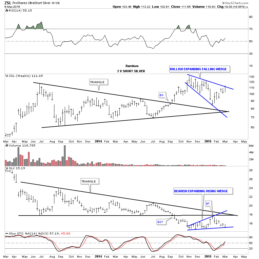
Now that you can see that the HUI and GLD have bearish expanding rising wedges in place lets take a look at SLV and see if there are any similarities. Below is a weekly combo chart that has ZSL on top, which is a 2 X short silver etf, and SLV on the bottom. SLV has been leading the HUI and gold lower as it broke out of its big trading range last September. As you can see the ZSL and SLV both closed on their important trendline last Friday. Those expanding rising wedges are not small patterns which should lead to a pretty big move once they break their respective trendlines.
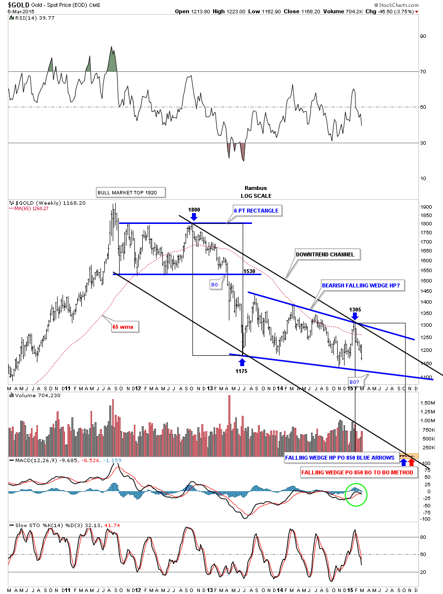
Below is the weekly chart for gold that I’ve been trying to post once a week or so that shows its downtrend channel with the last high coming in at 1305. I know for some of you it may feel like we’ve missed the boat on this move down but in all actuality this move down is just beginning as it’s only been about 5 weeks since the top at 1305 was last touched. So far this move down is stronger than the last impulse move down that started at the1800 area back in the fall of 2012. If this impulse move is anything like the last one, that started at 1800, we still have a good eight months to go yet. This impulse move will not be straight down by any stretch of the imagination as that would be too easy. Just look at the first one that started at 1800 and see how volatile it was at times. At any rate we did get some big clues last Friday that will help us understand where we’re at and where we might be headed. Now the game plan will be to add to our shorts in the Kamikaze Portfolio on any strength we see. All the best…Rambus

