Tonight I would like to update some of the charts we’ve been following for some of the SPX that had a wild October to say the least. For whatever reasons October has a lot of volatility which can lead to some important lows and in a few cases a crash which is rare. This past October shaped up similar to many of the previous Octobers we’ve seen since the bull market began in 2009.
This weekly chart for the SPX shows all the Octobers since the bull market began in 2009. For the most part if you took a position in October you were generally ahead of the game the following October with a few exceptions. This past October again marked a good spot to take a position in the SPX for a possible intermediate term move.
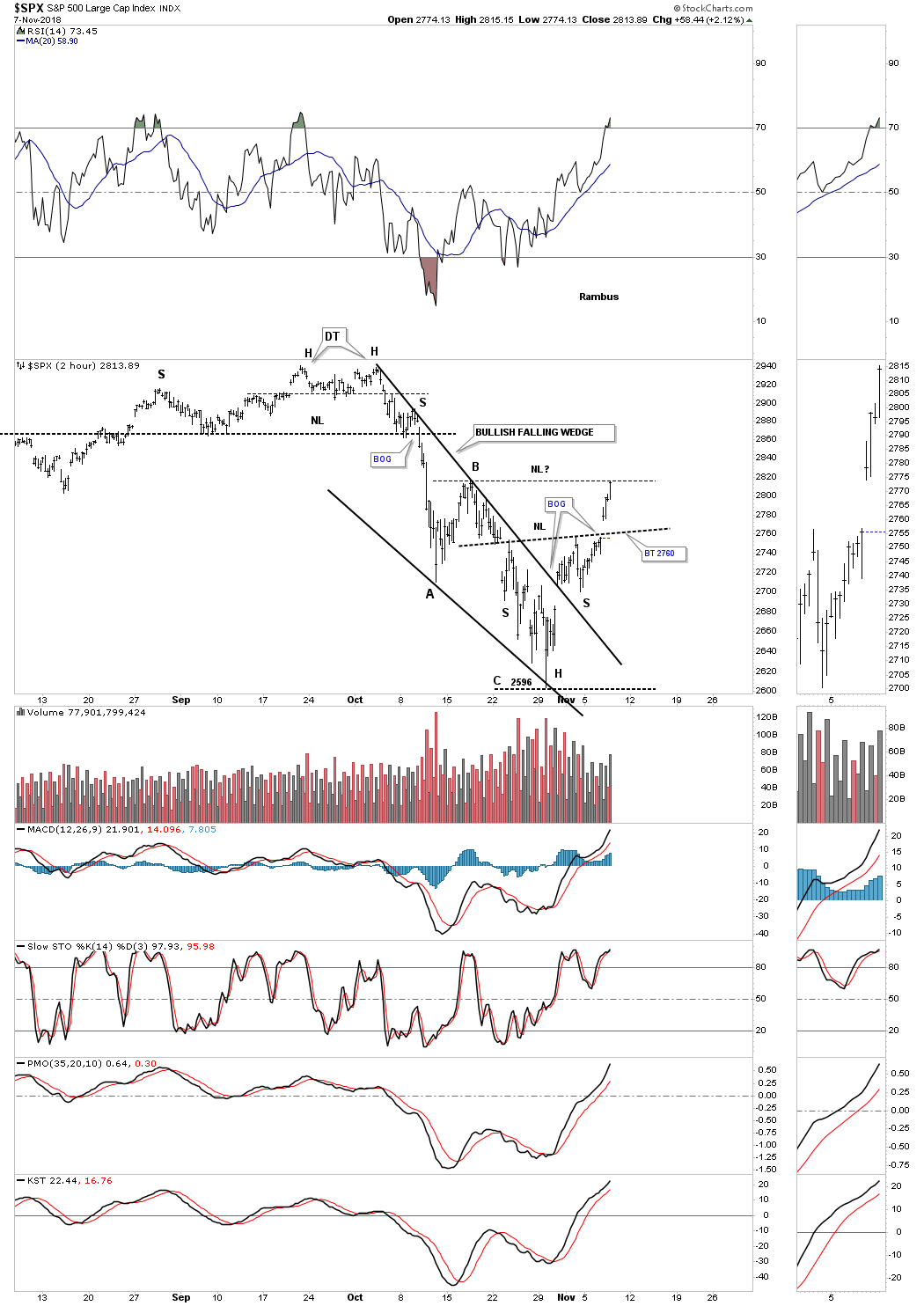
This next chart is a two hour chart of the SPX that we looked at back in the middle of October when we were looking for an ABC price decline with the A leg down matching the C leg down in price which hit pretty close. During the October decline the SPX built out a bullish falling wedge which was concluded with a big breakout gap. Whenever I see a well formed wedge, in this case the falling wedge, I like to look for reverse symmetry on the way up. We have looked at many cases where the left shoulder low and head form inside the falling wedge, with the right shoulder low forming during the backtesting process.
As you can see so far this two hour chart is showing the bullish falling wedge with a H&S bottom as part of the falling wedge. The H&S bottom was confirmed with the big breakout gap this morning. Today’s price action reached the top of the B leg where we could see a pause that refreshes with a possible move down to the original H&S neckline around the 2760 area. If that were to occur and the neckline held support we could end up with a double H&S bottom which is only a possibility right now.
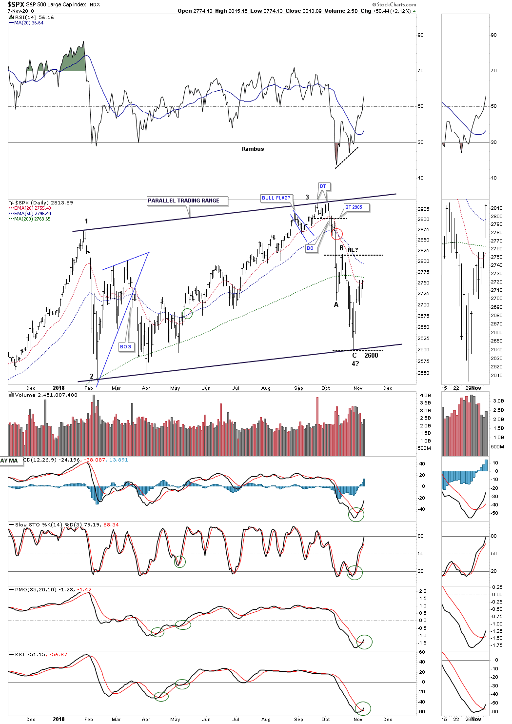
Below is a daily look at the SPX which shows the 2018 trading range which is shaping up to be a parallel rising flag formation if the price action can takeout the top rail. Note how today’s move took out the three moving averages by gapping above the 200 day sma and the 20 day ema and closed above the 50 day ema. Again it’s possible we could start to see a potential right shoulder build out which would close today’s breakout gap.
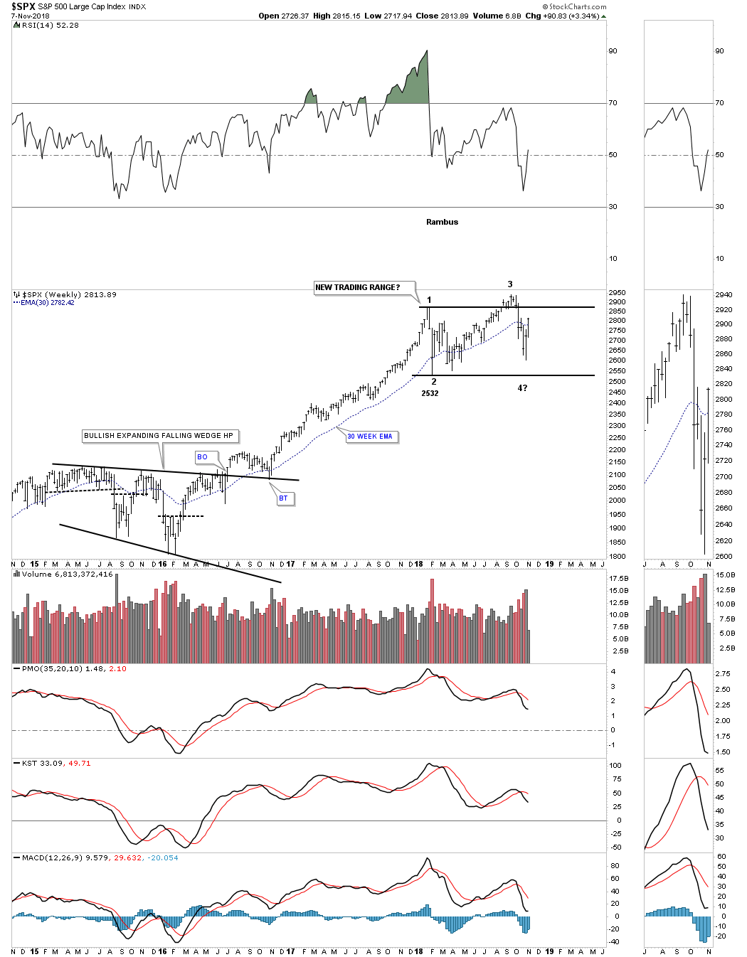
Earlier this spring when it became apparent that the first reversal point was in place and the price action began to rally off the bottom, to start the second reversal point to the upside, I strongly suggested back then that I would be looking for a possible four point consolidation pattern to build out because that’s what stocks do during a bull market. Since we only had reversal point #1 in place with the possible 2nd reversal point starting I drew in the top and bottom trendlines as horizontal. There was no way to know what type of trading range would build out so I always start out with a horizontal top and bottom trendline. As more information becomes available you then start to tweak your top and bottom trendlines. It wan’t until the October high, which made a slightly higher high vs the January high could we begin looking for the 3rd reversal point to the downside, which you can see on the chart below.
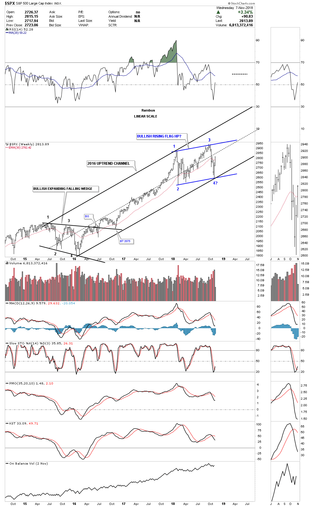
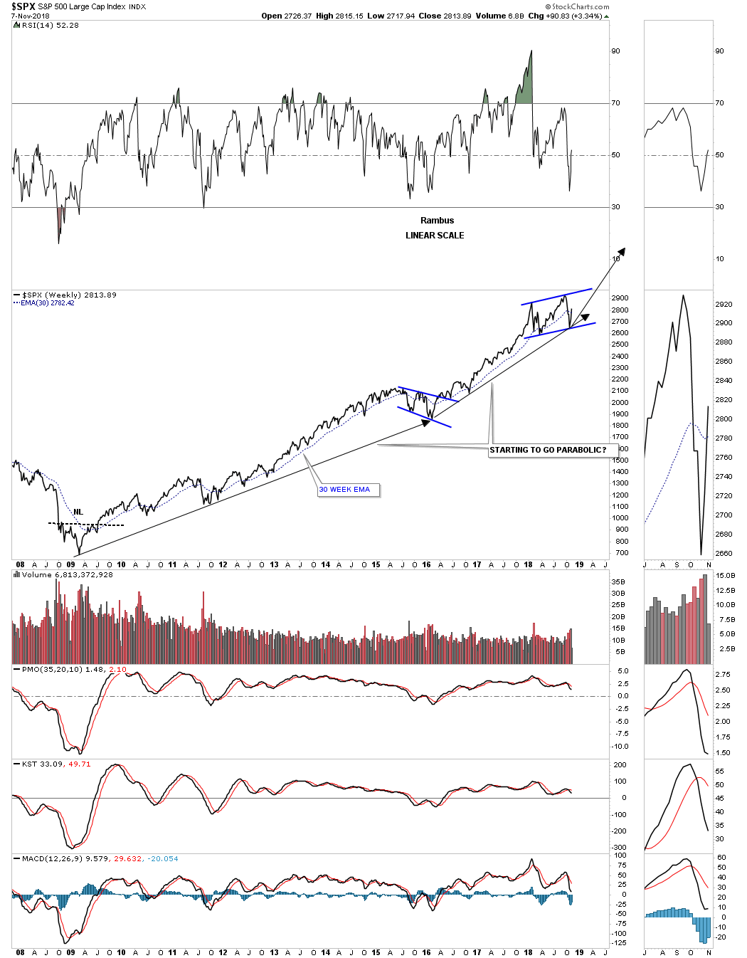
This next weekly chart shows the now rising flag formation is 3/4’s the way finished if we end up with four reversal points. What is also encouraging about this pattern is that it’s slopping up in the uptrend trend channel which shows a strong bull market is still in play. One last positive on this chart is the SPX is now trading back above its 30 week ema.
If our potential bullish rising flag plays out this simple weekly chart shows how the bull market that began in 2009 is starting to go parabolic. From the 2009 low to the 2016 low the uptrend was steady as she goes. Then from the 2016 low to our most recent low in the rising flag formation, the trend is getting steeper. It’s subtle, but it is possible that our next rally phase could be steeper than the two year 2016 rally phase.
This monthly chart shows the 2009 bull market which is classic in its development. A breakout above the top rail of our current rising flag formation will lead to a similar rally out of the previous consolidation pattern, the bullish expanding falling wedge, to the first reversal points in our current trading range. The chances are that it could also be steeper than the 2016 rally phase if we get a blowoff phase similar to the end of the 2000 bull market.
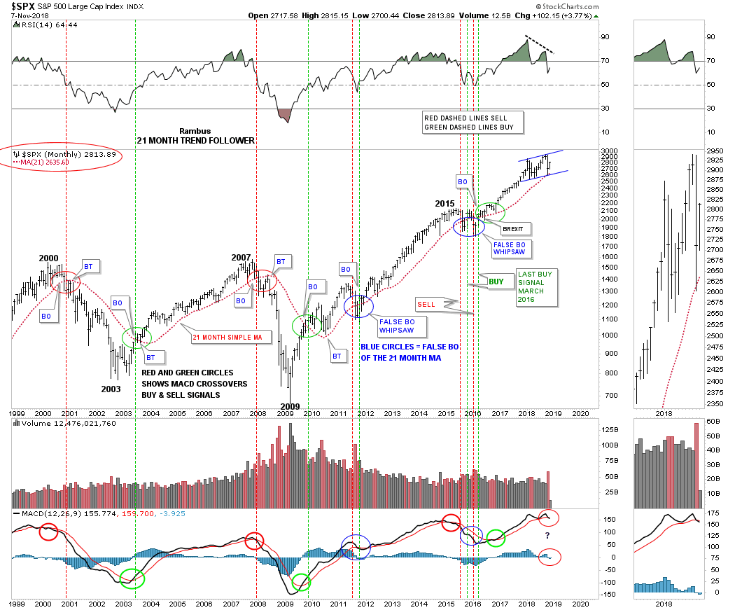
This next chart is the 21 month trend follower chart which we looked at last month when the price action was testing the all important 21 month sma on the SPX. During the deepest part of the correction last month the 21 month sma held support just as I had hoped it would. It was nip and tuck at the bottom, but so far so good.
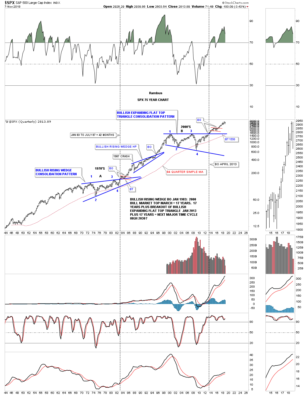
To put everything into perspective below is a 75 year quarterly chart for the SPX which shows the 1970’s trading range and the 2000’s trading range which has led to a secular bull market after the big consolidation patterns were finished building out. I know how radical this chart seems to most people but we’ve been following this secular bull market since the SPX broke out from the flat top expanding triangle in 2013.
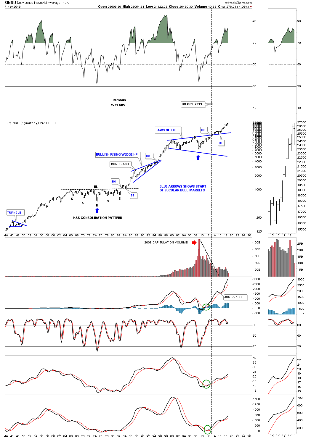
Below is a 75 year quarterly chart for the INDU which I call the Jaws of Life, because so many analyst were calling it the, Jaws of Death, where I saw a consolidation pattern they saw a top. The backtest to the top rail of the Jaws of Life was one to test your patience as it went on forever before the impulse move finally began. If you look at the thumbnail on the right side of the chart you can see that the INDU is within striking distance of new all time highs. You can also see on the thumbnail that the last four quarterly bars are forming a rising wedge formation.
Since our current bull market that started in 2009 there have been countless opportunities for the bears to be correct, but in the end, at least so far, this bull market has proven them all wrong. One of the most important rules of all time is, “The Trend is Your Friend.” All the best…Rambus


