Tonight we’ll take a general look at the markets to try and understand the intermediate to long-term direction, which can give us an edge in determining which direction to trade, either long or short. With so many different ETFs nowadays, long or short, the opportunities are endless if you can get the intermediate and longer trend right.
Let’s start with the daily chart for the CDNX, where many of the small and micro-cap PM stocks reside, which is the last of the PM stock indexes to participate much in the rally that began in March 2024. After reaching the top of the May 2024 ascending triangle for the fourth time, we were looking for a small decline, which is typical at previous highs, which we have gotten. Now the CDNX has started to move higher once again, after forming an island reversal pattern below the 50-day SMA, toward the top trendline, which is critically important to the overall big picture.
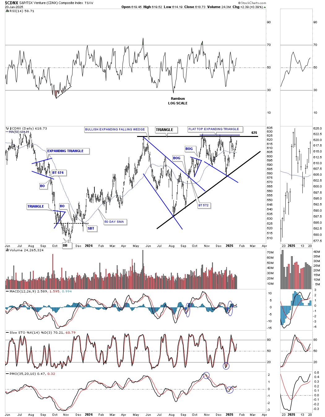
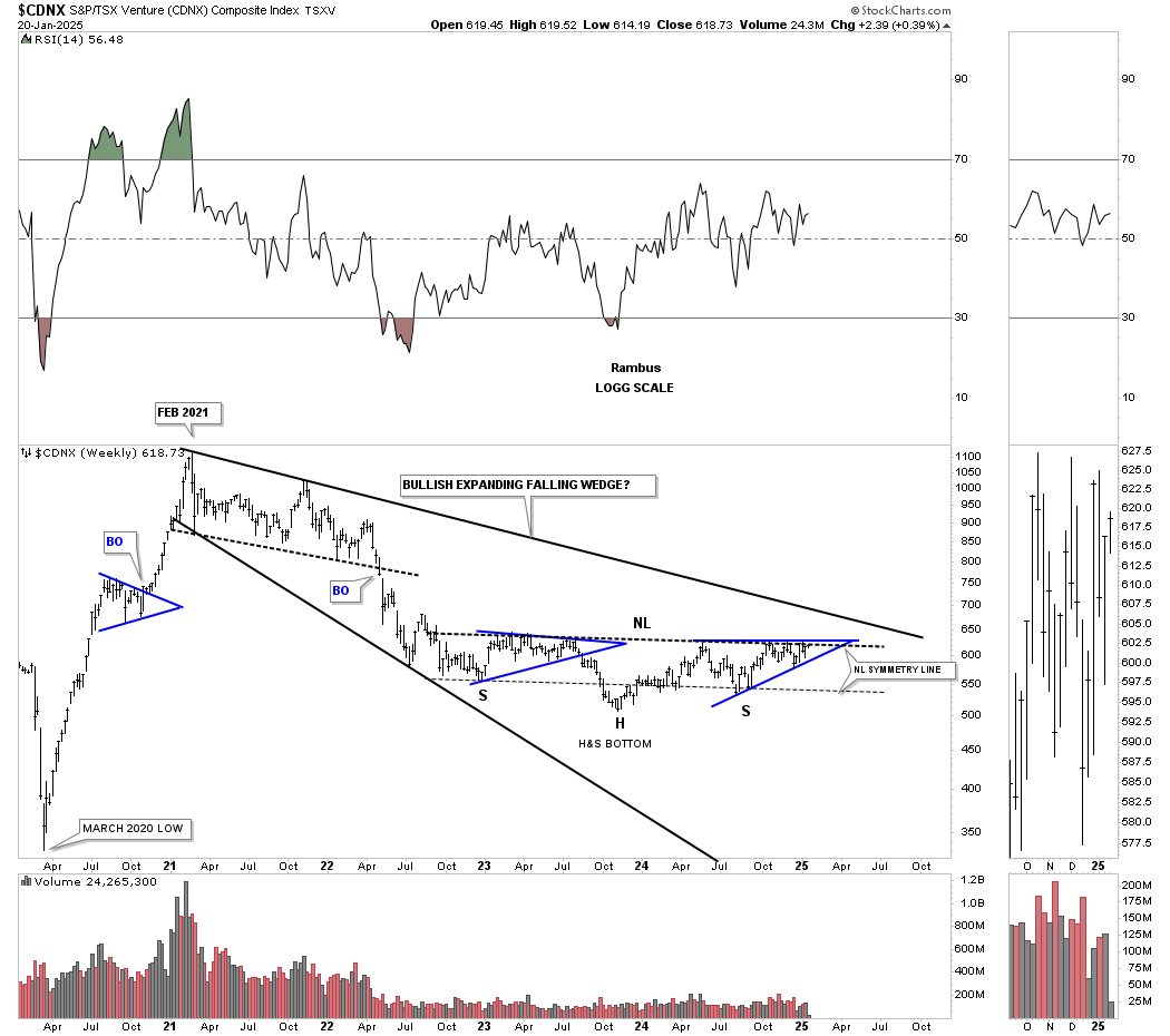
As you can see, the CDNX is now approaching the top rail of the black ascending triangle, which is also part of the much bigger three-year H&S base. Most of the micro-cap PM stocks have been pretty devastated during the long bear market in the CDNX, but this H&S base will get them moving higher in a more prolonged manner. It’s the micro-cap PM stocks where you can get 5 to 10 baggers, which are high-risk, high-reward trades, but just a few successes can make up for any losers. Generally, when this sector catches on fire, the tide will lift most boats.
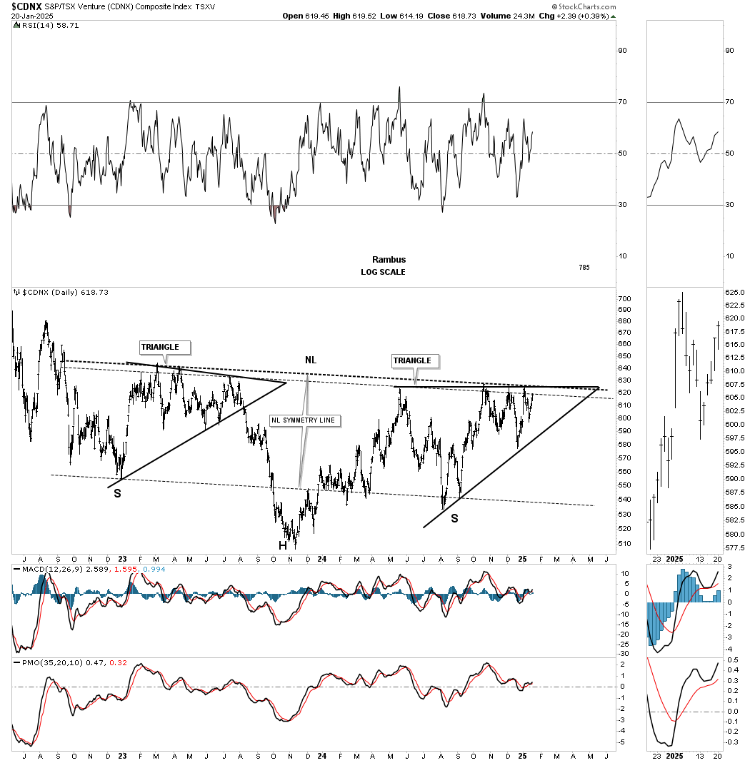
Another bullish factor that is in play for the CDNX is the 2021 bullish expanding falling wedge, which most of the other PM stock indexes have already broken out of.
After putting in a double bottom reversal pattern back in early March 2024, the PM stock indexes put in a second double bottom reversal pattern at the very end of December, which is forming a new uptrend channel. The blue circles show the similar double bottom setup. Last week, GLD broke out of its November triangle with a breakout gap. Critical support is at the double bottom trendlines, shown by the horizontal black dashed lines.
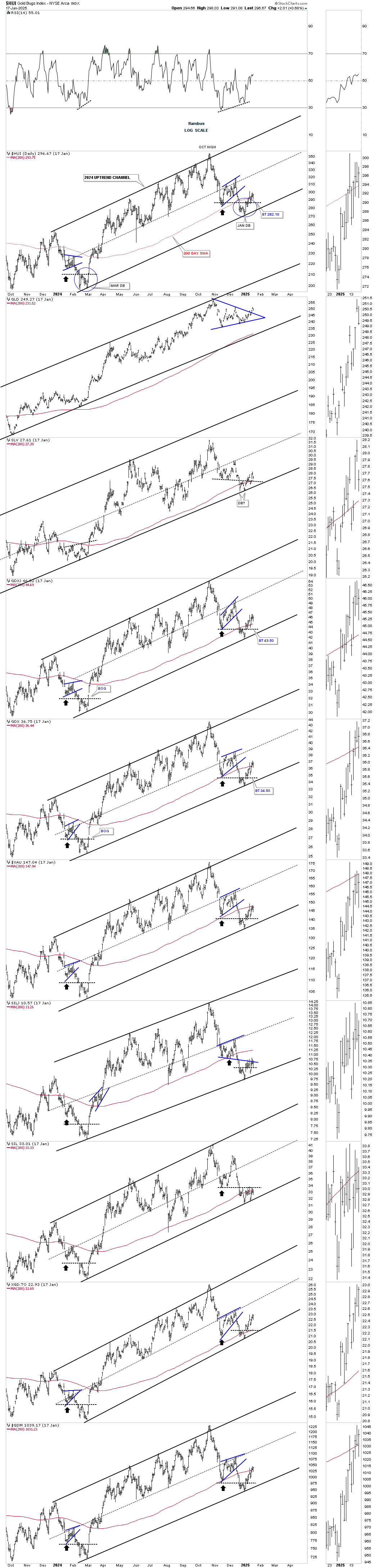
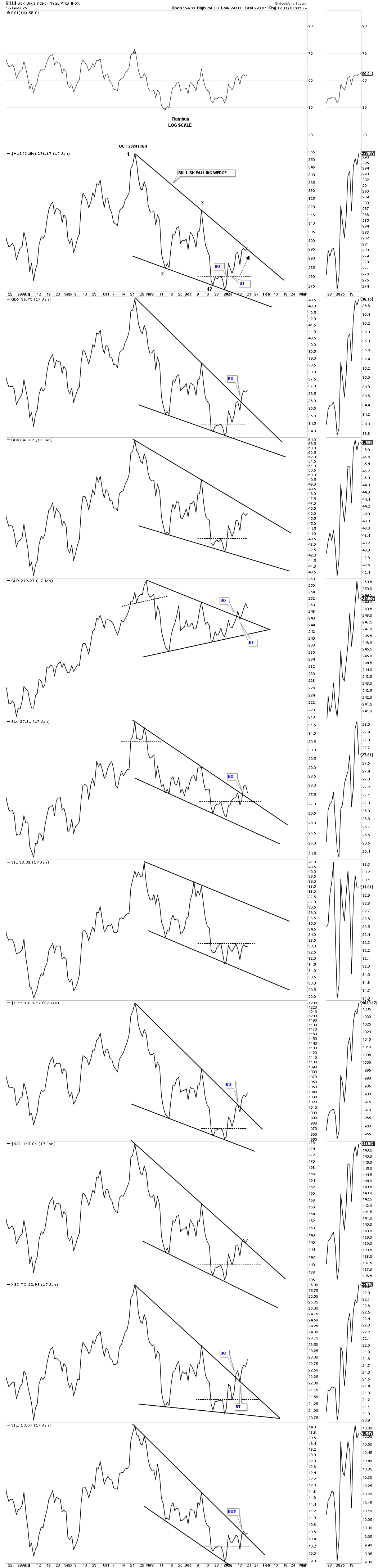
Many times, a line chart can show a breakout before a bar chart. This daily line combo chart shows the October 2024 correction, with most of the top trendlines now giving way.
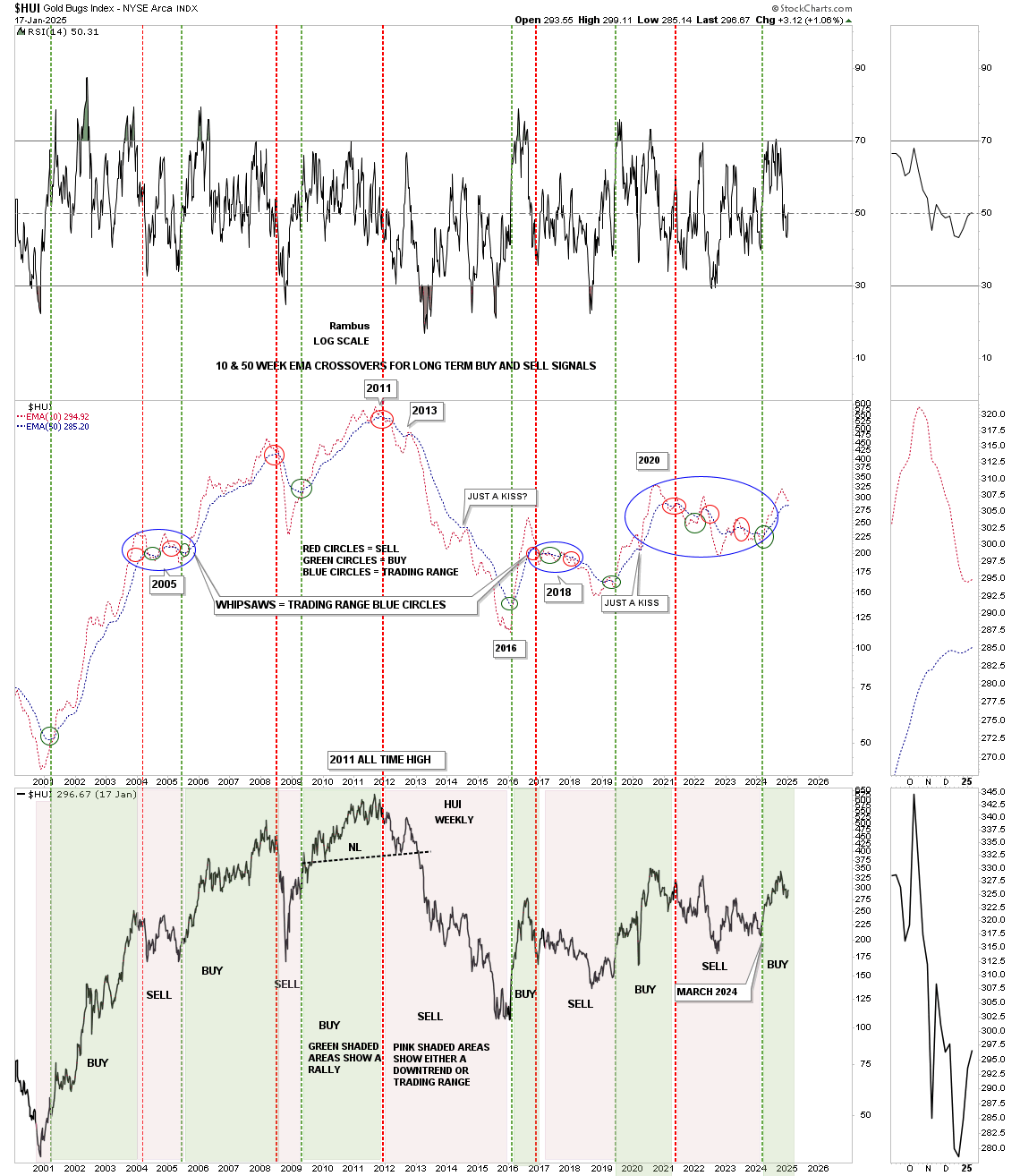
Next is a combo chart with the 10 and 50 week EMAs on top, and the HUI below. When the 10-week EMA crosses above the 50-week EMA, a long-term buy signal can be made, and vice versa for a sell signal. When you see many red and green circles, that tells you a trading range is building out. In early 2024, the last crossover of the 10-week EMA above the 50-week EMA produced a long-term buy signal, which is still in play. During the October correction, you can see how the 10-week EMA has been moving lower toward the 50-week EMA, but is now starting to curl up once again, so hopefully, we’ll just see a kiss.
The pink and green shaded areas on the HUI show the long-term buy and sell signals. On the left side of the chart, during the bull market years, you can see that the green shaded areas were much wider than the pink shaded areas, and somewhat the opposite on the right side of the chart, with the pink shaded areas being wider than the green shaded.
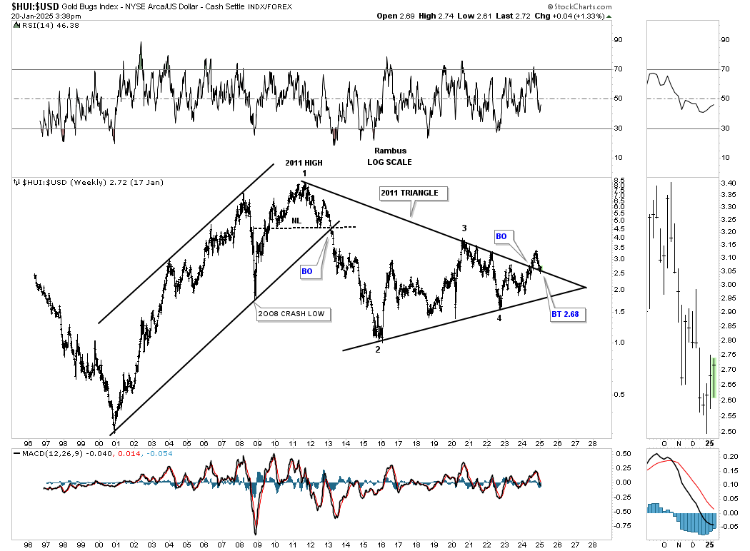
With the US dollar being very strong since October of last year, the HUI:US dollar ratio has held its own, actually breaking out from its 2011 triangle consolidation pattern, with the backtest still holding support.
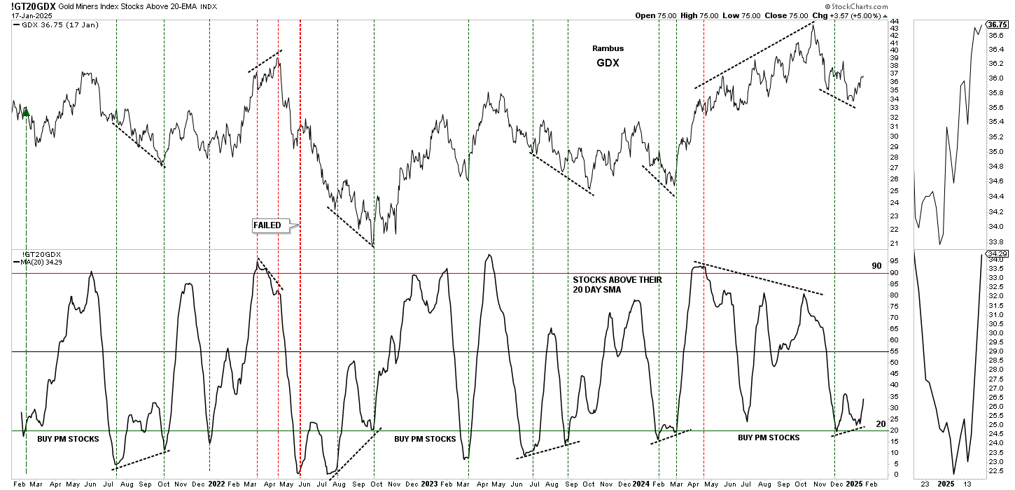
This next combo chart has the GT20GDX, PM stocks above their 20-day SMA on the bottom, with the GDX on top. Normally, when the GT20GDX gets down around the 20 area, it can signal that a potential bottom is forming. The odds increase considerably when you see a divergence taking place between the GT20GDX and the GDX, which can produced a double bottom on the GT20 which is currently the case.
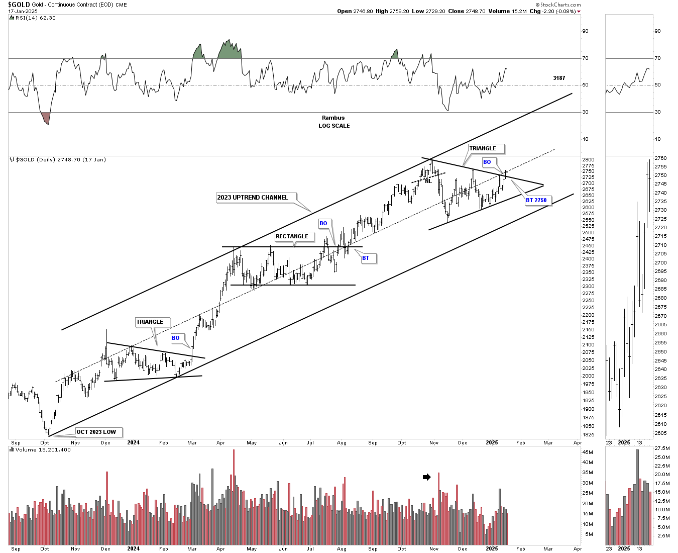
Last week, gold broke out from its third consolidation pattern that has formed within the 2023 uptrend channel. This next impulse move should take gold over $3,000 an ounce.
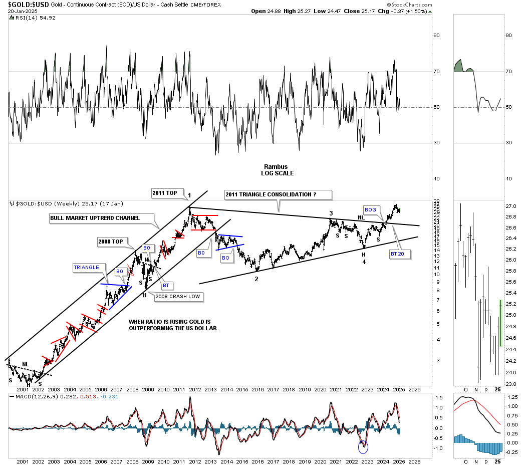
Previously, we looked at the HUI:US dollar ratio, which shows the breakout and backtest underway. This weekly ratio chart, which compares gold to the US dollar, broke out of its 2011 triangle consolidation pattern back in February of last year and hasn’t looked back. Note how the ratio looked during the 2000-2011 bull market years for gold – classic bull market price action.
Silver is still lagging gold, but nothing is broken regarding the breakout and backtesting process. As you can see, silver has formed a falling wedge on top of the bullish expanding falling wedge. Many times, when you see two well-defined chart patterns close together, they can form a larger consolidation pattern, which could be taking place.

Next up is the weekly combo chart, which has the TNX on top and the SPX below. These two tend to move inversely to each other, which isn’t really that tight, except at important reversal points, where the inverse correlation can be very close.
After breaking out from its falling wedge late last year, the TNX may now be in backtest mode to the top trendline. The SPX, on the bottom, broke out below the bottom rail of its October rising wedge and now could also be in backtest mode.
If the TNX remains strong after the backtest and doesn’t create a false breakout/bull trap, which is always possible above the top trendline, that would put pressure on the SPX and the stock markets in general.

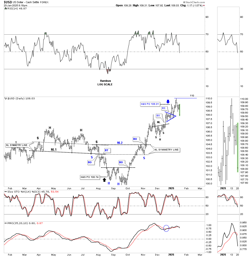
Below is the daily chart for the US dollar that we looked at recently, which shows a H&S top and the H&S bottom with blue annotations. Normally, when a price objective is reached, one of two things can happen: the stock can start to form a consolidation pattern or a reversal pattern.
As you can see, the H&S top on the right side of the chart formed a double bottom reversal pattern after the price objective was reached, which led to the current rally phase. The H&S bottom with the blue annotations reached its price objective in late December, and after reaching 110, has started to decline a bit, so we should expect to see some type of consolidation pattern start to form or a reversal pattern.
This is a new combo chart, which has the US dollar on top and the GDX below. We know that the PM complex has formed those bullish falling wedges on the daily line combo chart above. Here again, you can see that the inverse correlation isn’t perfect, but if the GDX formed a bullish falling wedge, then the odds increase that the US dollar has formed a bearish rising wedge. Today, the US dollar broke below the bottom rail of its bearish rising wedge, which should now create a tailwind for the PM complex, which have been slowly moving higher.
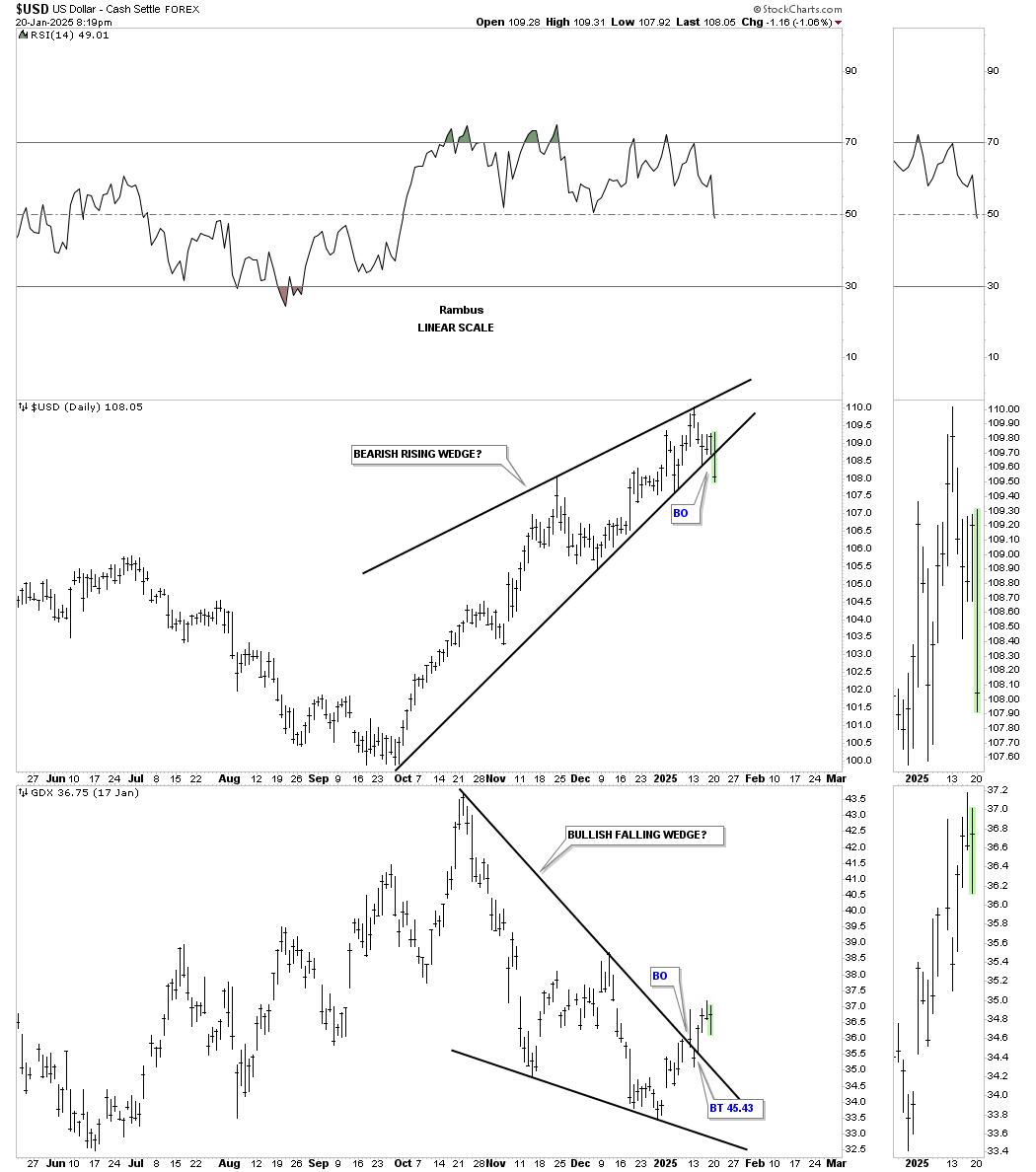
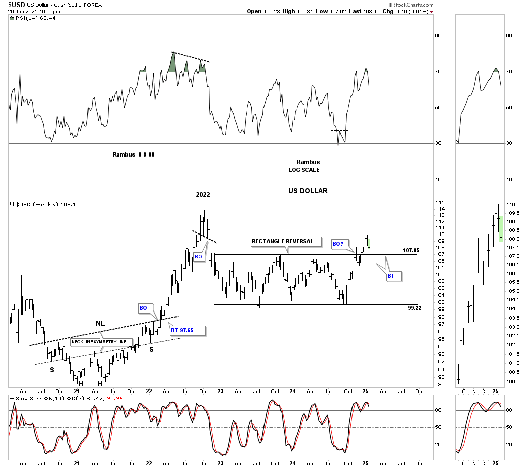
Looking at the big picture for the US dollar, there was a breakout above the top rail of its 2022 rectangle with a modest rise. Now, we are beginning to see the possible backtest to either the top solid or dashed trendlines. Similar to the TNX, if the US dollar is just backtesting the top trendline, the bullish tailwind for the PM complex will be short-lived. On the other hand, a decline back inside the rectangle with a false breakout / bull trap above the top trendline that will be bullish for the PM complex. I’m keeping an open mind to any eventualities.
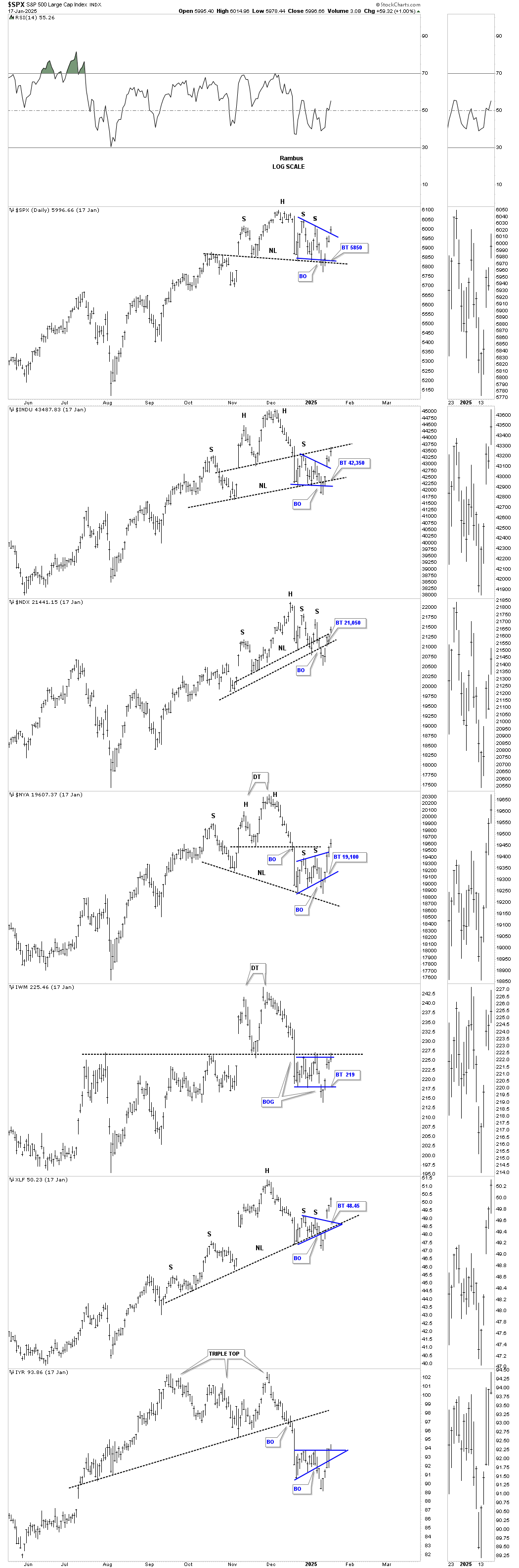
Let’s turn our attention to the US stock markets, which have been either consolidating for another leg higher or in the process of slowly running out of gas. It’s really a mixed picture on the short-term charts, as several patterns we’ve been following are looking a bit sloppy.
This first chart is the 60-minute combo chart, showing the many rising wedges in play, with several false breakouts below the bottom trendline, and the price action now trading back inside the rising wedges, showing a false breakout for now.
There are also several blue falling wedges, with now 6 reversal points in place. Additionally, several H&S tops are forming toward the apex of the rising wedges, with several now trading above their right shoulder high, which can negate the H&S top and lead to a strong move to the upside.
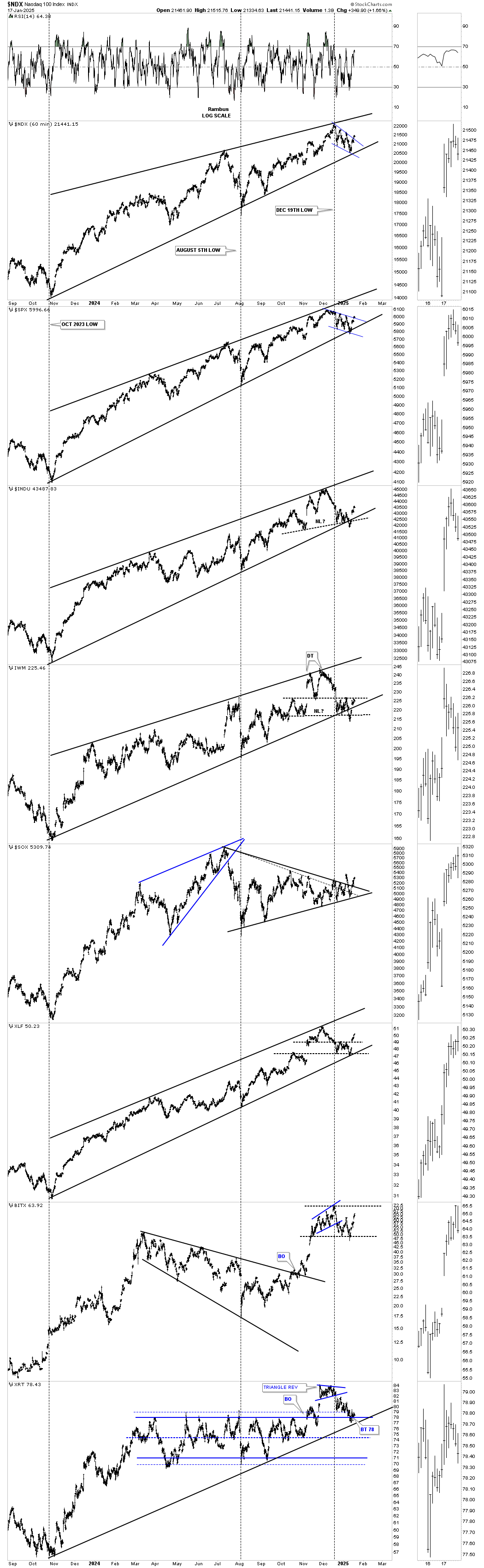
This short-term daily chart focuses on the very short term, showing the price action from the most recent high. Some of the indexes have been trading sideways since October, with many more beginning their respective trading ranges in December.
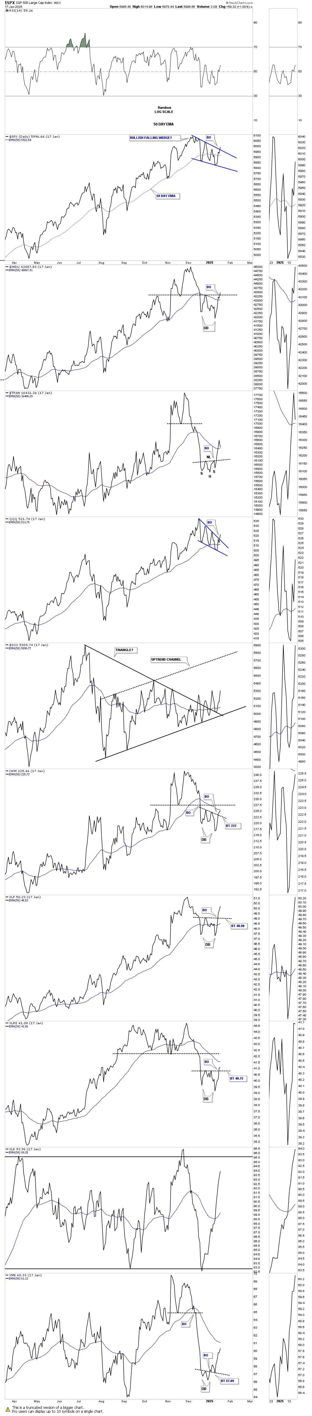
This daily line chart shows many blue falling wedges, with several double bottoms that have broken above their double bottom trendline, and most are now trading back above their 50-day EMA, which is short-term positive. Several indexes have potential strong overhead resistance that they need to overcome to really turn bullish, including the Transportation Average, IWM, and XLRE. The INDU is currently testing its double bottom trendline.
This next chart is a daily bar chart showing the many falling wedges I originally built using a line chart, which is why you see small spikes above the top and bottom trendlines. You can see that most of the blue falling wedges have created 6 reversal points, which makes it particularly challenging for the bulls. Typically, four reversal points are normal, but when you add two more, making it six reversal points, most investors tend to lose interest in the pattern.
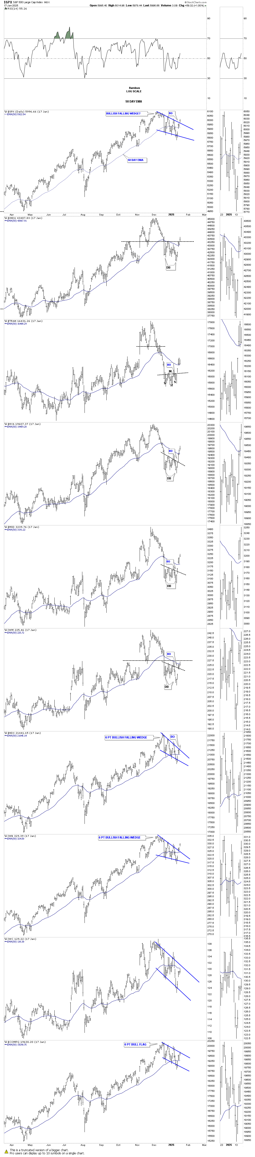
This daily combo chart focuses on the potential H&S tops, which are slowly being negated as the price action trades above the right shoulder high. What once looked like a potential short-term top is now slowly fading away. It’s still possible that we could see a much larger consolidation pattern building out, with the December high and the most recent low being the first two reversal points.
This weekly bar chart below shows an uptrend line taken from the October 2023 low, with most indexes still trading comfortably above it, while the IWM and XLF are trading close to their shorter uptrend line.
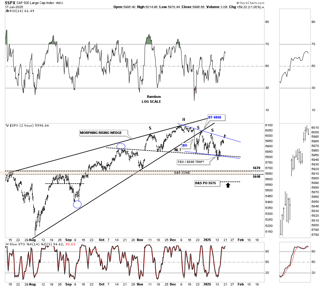
This short-term 2-hour chart for the SPX shows the rising wedge taken from the August 5th Japanese yen carry trade low. What looked like a H&S top forming at the apex was looking pretty good, with that backtest to the underside of the rising wedge showing the initial right shoulder high. Then, we got the 2nd right shoulder, which was still okay, making an unbalanced H&S top with two right shoulders.
Last week, you can see a false breakout below the bottom rail of the blue falling wedge and neckline, which was quickly negated the next day. With last Friday’s price action showing a gap above the top rail of the blue falling wedge, as it stands right now, we have a symmetry failure of the top and bottom trendlines of the blue falling wedge.
If the H&S top, which is really unbalanced right now, and the blue falling wedge, which has completed 6 reversal points, don’t trade any higher and start the 7th reversal point to the downside, the brown shaded S&R zone or the H&S price objective would be the minimum price objectives we could expect. Right now, there is no edge in either direction.
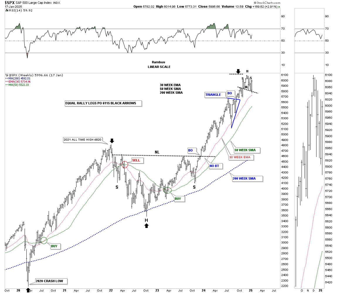
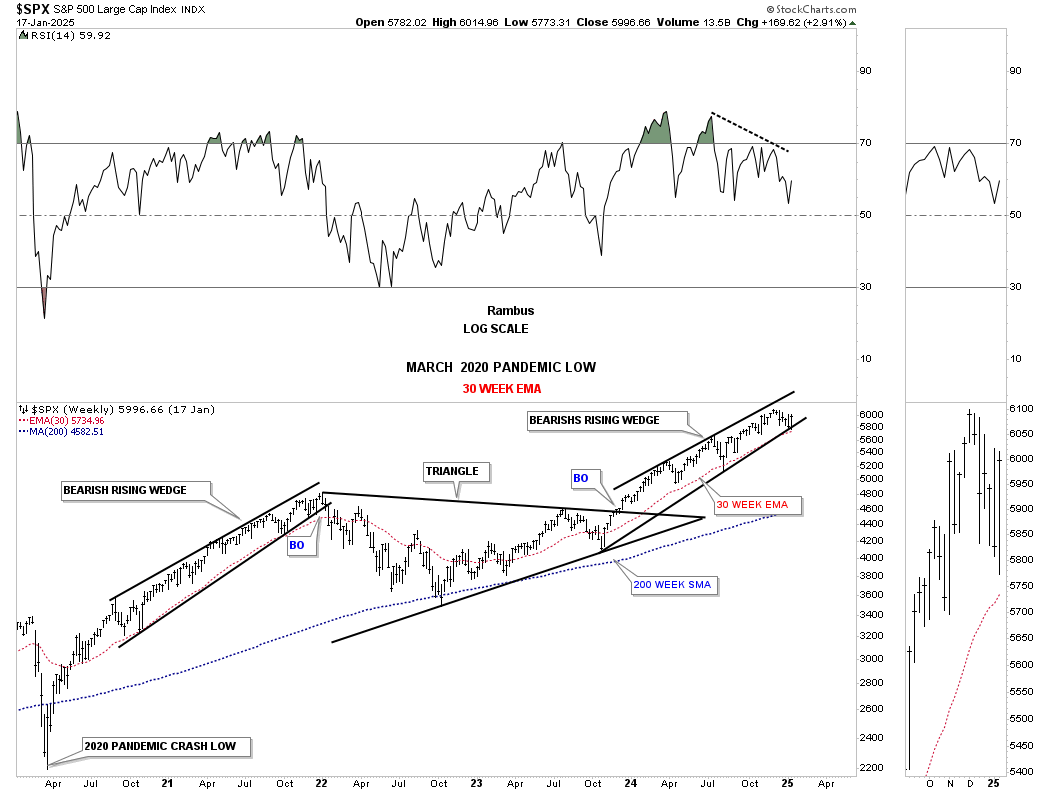
Then we have this weekly chart for the SPX in linear scale, which shows both legs up from the 2020 crash low. So far, from this weekly perspective, which filters out much of the noise from the short-term daily chart, the H&S top remains in place. This is a big deal if the H&S top remains valid and reverses the massive rally out of the 2022 H&S low.
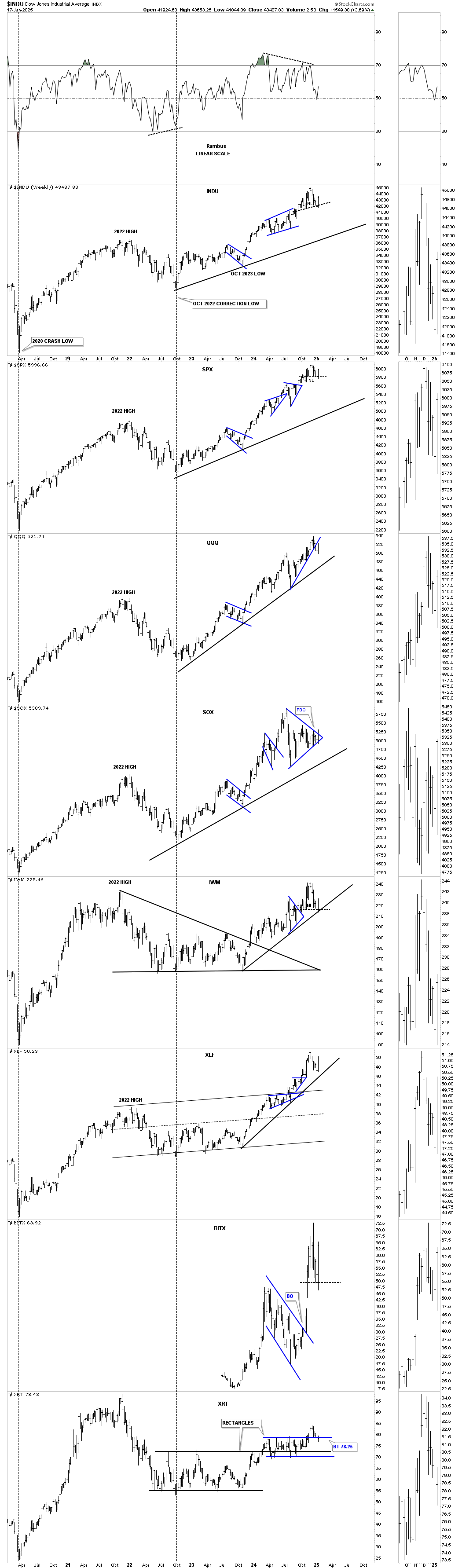
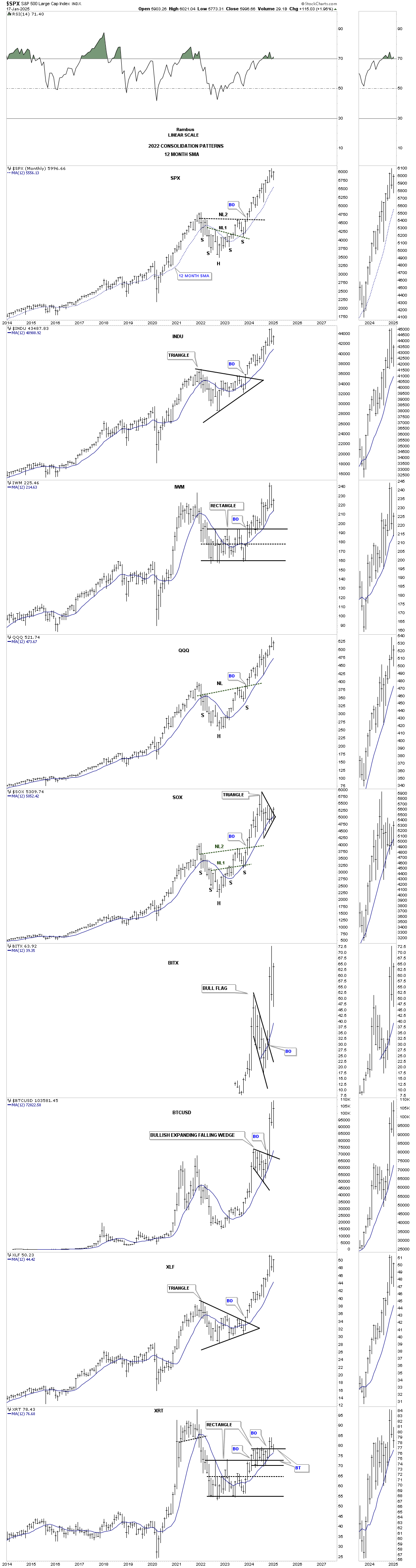
From the long-term monthly combo chart using the 12-month SMA, things don’t look quite so bad, as most of the indexes are trading fairly close to their all-time highs, with the SOX being one of the weakest areas, but it is holding support on its 12-month SMA.
This weekly chart for the SPX shows the bullish rising wedge, on the left side of the chart, which ended the rally out of the 2020 crash low and led to the 2022 correction. Last week, you can see that the price action hit the bottom rail of the current rising wedge and got a decent bounce, with the red 30-week EMA helping with support, which also happened in 2021 before the breakout to the downside.
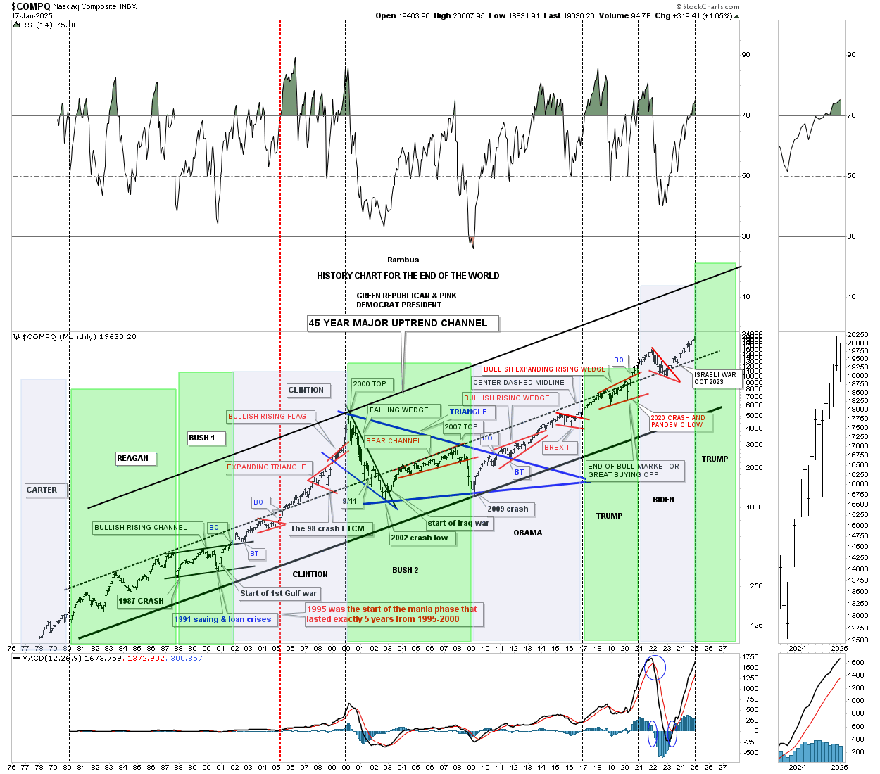
Since we have a new president in office today, below is the old “History Chart for the End of the World,” which shows what the stock market did under a Democrat or Republican president, as shown by the green and pink shaded areas. Many have their own interpretation of what the stock markets do under each party, but my interpretation is that it makes no difference which party is in power, but rather what cycle the economy is in when that party takes office.
When the price action broke above the center dashed midline in 2020 and backtested it from above, I have been looking for the COMPQ to eventually hit the top trendline of the major uptrend channel. So far nothing has changed my mind yet.
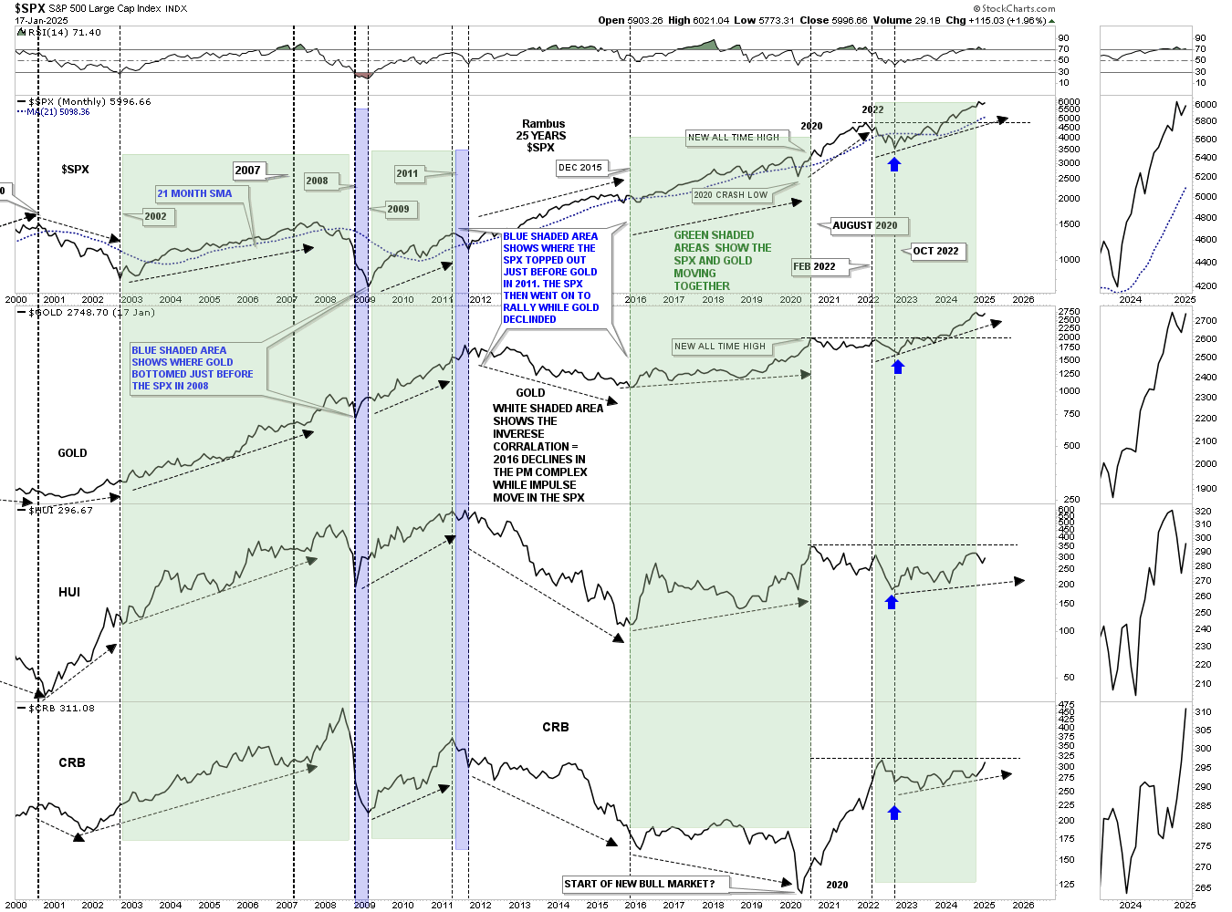
This next combo chart has the SPX on top, followed by Gold, HUI, and the CRB index on the bottom. Most staunch gold complex investors have an unfounded notion that, in order for the precious metals (PM) complex to go up, the stock markets have to crash and burn, which just isn’t true. Yes, there are times when they run inverse to each other, but more often than not, they tend to move up together to a certain degree, as shown by the green shaded areas, with the white areas showing the inverse look.
Looking at the right side of the chart, you can see that all four have been moving higher for the last couple of years, albeit at a different pace, with the SPX and Gold leading the way higher. From my perspective, I wouldn’t mind seeing the stock markets and the PM complex move higher together. Maybe at some point, like in 2000 when the SPX topped out, we’ll see a real negative correlation between the SPX and the PM complex. As you can see, the CRB index declined along with the SPX during the 2000-2003 bear market.
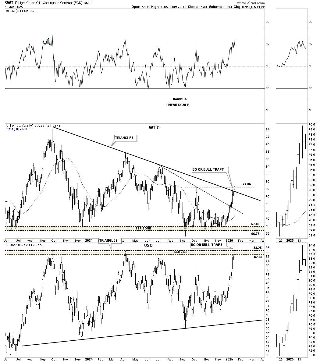
Last week, WTIC broke out above the top rail of its triangle and reached the previous high. Now, the question becomes whether the breakout is a false breakout/bull trap or the real deal. If it’s the real deal, then we may see inflation come back into the picture after declining for the last several years. One to keep a close eye on.
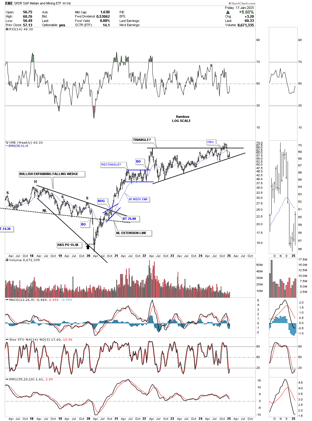
Late last year, the XME, a metals and miners ETF, looked like it was breaking out from its 2022 triangle consolidation pattern, only to fail and put in a false breakout/bull trap. Since declining back into the triangle, the price action has recently found support on the bottom trendline, which is fairly common on a false breakout, keeping the triangle in play. Now, we just need to see the real breakout above the top trendline. Keep in mind that there are several large-cap precious metals stocks in the ETF as well.
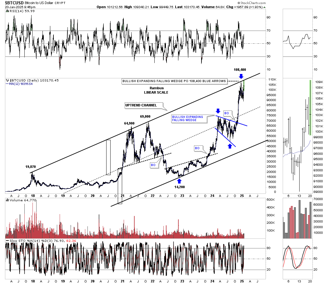
This last chart for tonight is the history chart for BTCUSD. The last time I posted this chart, BTCUSD had just hit the top trendline for the first time, and, as is generally the case, we saw an initial small selloff. I mentioned that in order for me to get bullish on BTCUSD again, I would need to see the top trendline give way, which would clear the way for much higher prices. However, until that happens, I have to remain cautious, regardless of all the hype surrounding BTCUSD.
The bottom line is that the US stock markets are in an indecisive state right now and could break in either direction. I still favor the upside longer-term, but short-term, anything is possible. All the best…Rambus