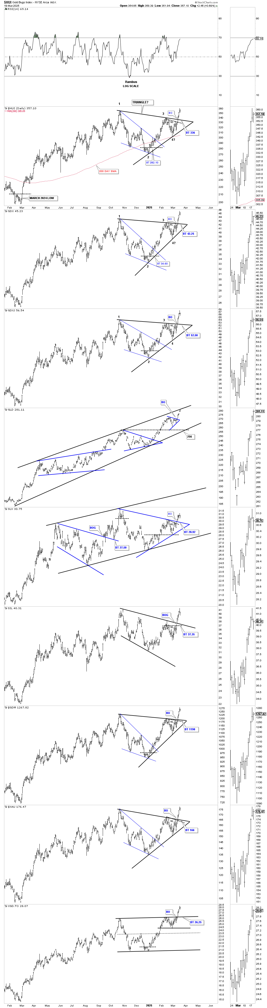
Before we look at some individual precious metals stocks tonight, I’m going to do a quick update on a few charts for the PM stock indexes, using the HUI as a proxy.
Let’s start with this 2-hour chart, which begins at the October 2024 high, and shows the reversal patterns at the reversal points, starting with the H&S top at the October 2024 high, which led to the decline and the formation of the black bullish falling wedge. The black bullish falling wedge bottomed in early January, which led to the rally up to the blue 7-point bearish rising flag reversal pattern. The latest reversal pattern to have formed was the double H&S bottom, which has led to the current rally phase.
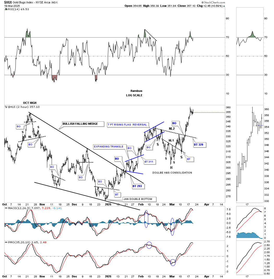
If we connect those four reversal points from the 2-hour chart above, we get the October 2024 triangle consolidation pattern, which saw the breakout last week. The only thing that remains in doubt is whether we are going to see a backtest to the top trendline.
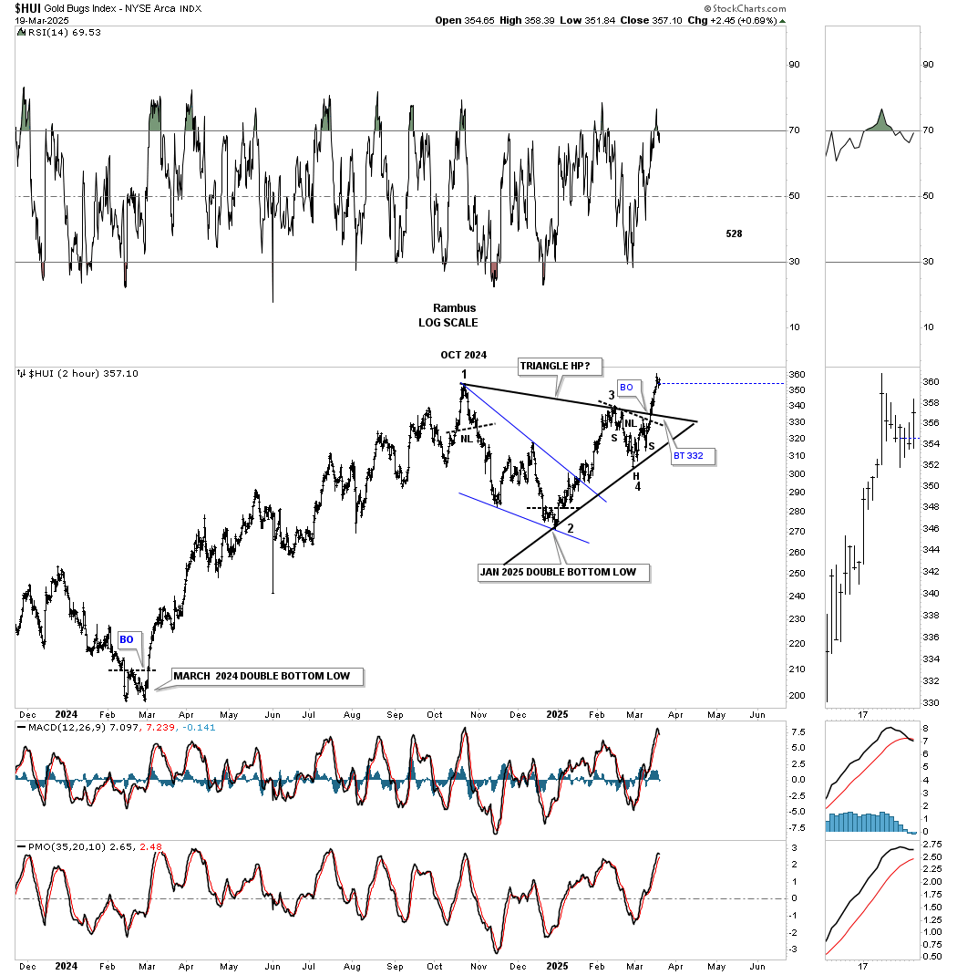
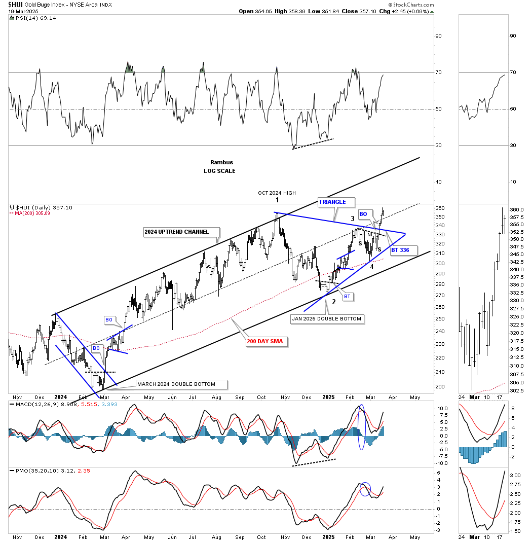
Next is the daily chart, which begins at the March 2024 double bottom reversal pattern. The blue downtrend channel back then formed the width of the much bigger 2024 parallel uptrend channel. Even though the current October 2024 blue triangle was much bigger than the thinner March 2024 downtrend channel, they both shared the same width, which means the HUI had more time to consolidate the March 2024 impulse move into the October 2024 high, creating more energy for the current impulse move that is currently underway.
This daily combo shows most of the October 2024 consolidation patterns, with the HUI forming a black triangle and the SIL forming a bullish expanding falling wedge. Today, GLD reached its top trendline after recently breaking out from its small blue triangle, while SLV broke out from its 2024 blue triangle last week. Again, the question remains: are we going to see a backtest to the top rail of the black triangle consolidation pattern before the next impulse leg up begins in earnest?
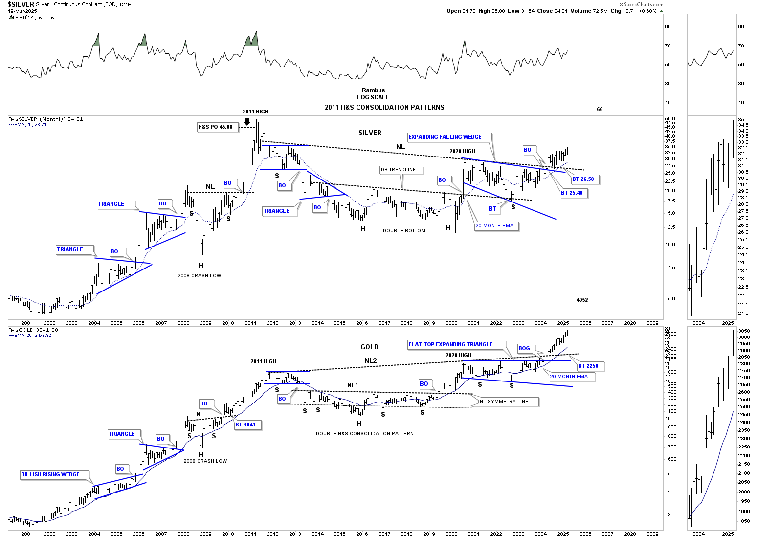
Just a quick update on the monthly combo chart, which has silver on top and gold below, showing their massive 2011 H&S consolidation pattern. Keep in mind that we’ve been following these two massive bases since the right shoulder low, which has been playing out beautifully, with silver on the verge of making another higher high, while gold just continues to make higher highs.
Note the three large consolidation patterns that formed during the first leg up in the 2000 secular bull market into the 2011 high. I would often comment back then that, in the future, when people looked back in history – just as we do with the 1929 crash charts, for instance – they would look back in awe at the classic bull market and how beautiful and symmetrical it was.
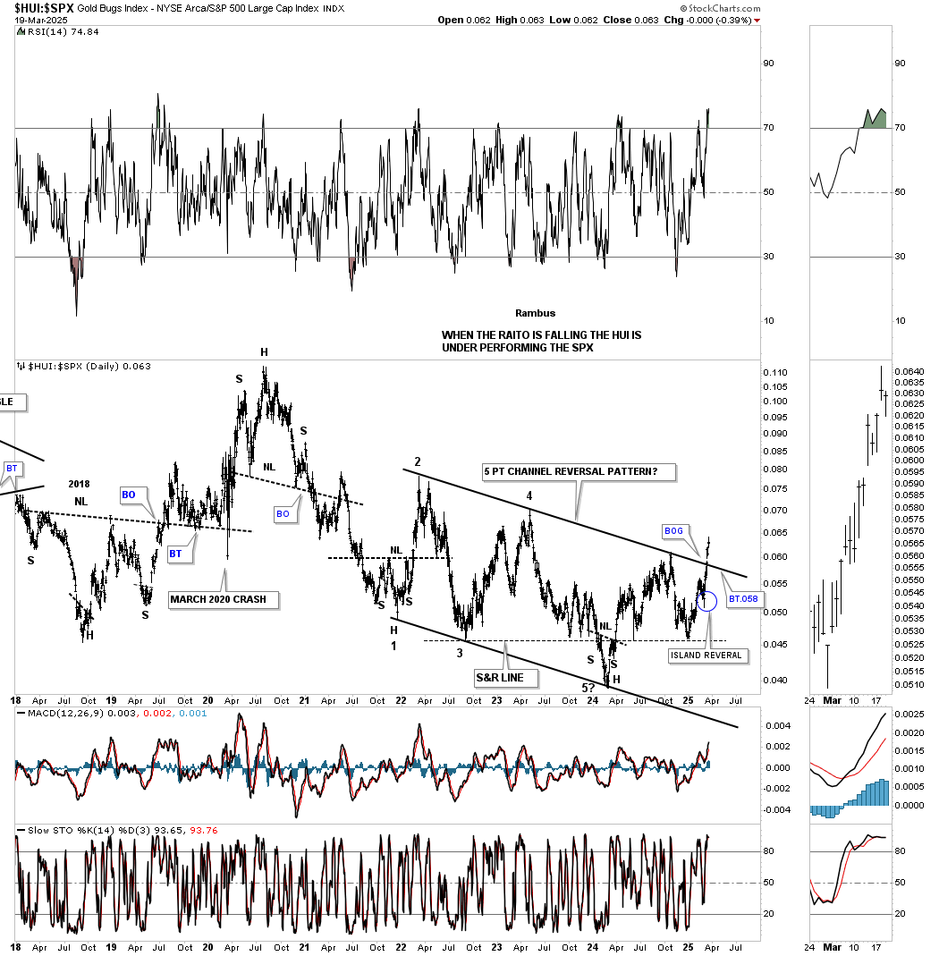
Next is the daily ratio chart, which compares the HUI:SPX. Since the 2020 rally high, the ratio has been trending lower with a lot of chopping action, bottoming in March 2024, sound familiar? Since that low, the HUI has been outperforming the SPX, with a test of the top rail of the black 5-point falling channel reversal pattern. At the time, I added the blue circle around the daily reversal bar, made about three weeks ago, suggesting we could finally see the top trendline broken to the upside. You know you have a hot trendline when you’ve been following it for a long time and then you see a breakout gap above it. Similar to the PM stock indexes we looked at earlier, will we see a backtest?
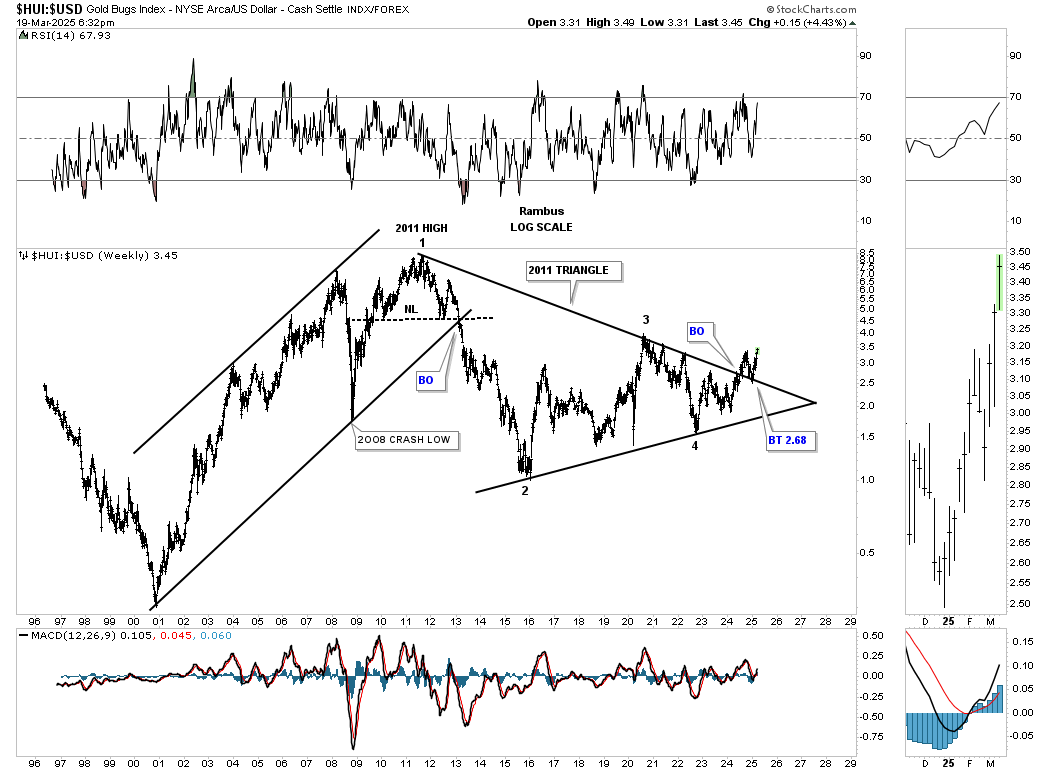
This next ratio chart compares the HUI:US dollar, showing the 2011 triangle consolidation pattern, which has been in breakout and backtesting mode since the breakout last June. As you can see, another important milestone has been reached this week, with a new higher high now being made above the breakout high.
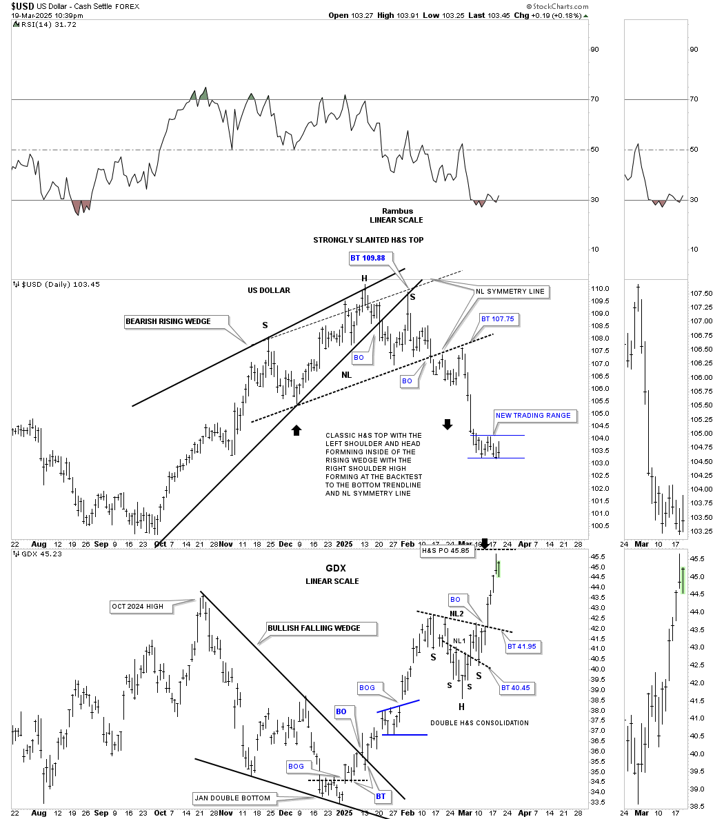
There is an important development in this 2-hour combo chart, which has the TNX on top and the UUP below. After both broke out from the bearish rising wedge earlier this year, the UUP on the bottom formed a classic H&S top, with the left shoulder and head forming inside the rising wedge, and the right shoulder high forming on the backtest from below, where the neckline symmetry line intersects at 109.88. Once the neckline was broken, the UUP had a perfect backtest to the neckline, where the current decline has taken hold.
Now, in regards to reverse symmetry, which happened on the left side of the chart on the way up, we can see reverse symmetry to the downside over the same area. In this case, you can see where I drew in a possible 2nd neckline taken from the left side of the chart. Currently, the right shoulder is pretty shallow but could be completing the 4th reversal point in a possible small blue rectangle. Whenever you see a smaller right shoulder vs. the left shoulder, it can often mean that the H&S pattern is going to complete sooner rather than later. I originally put the neckline symmetry line, taken from the left shoulder high on NL2, as the height of the possible right shoulder, which still remains a possibility.
With these two generally moving in the same direction, the TNX may be giving us a heads-up regarding the right shoulder high on the UUP already in place, as the TNX on top looks to have broken below the bottom rail of its bearish rising wedge today. If that is the case, then the TNX may very well be forming a H&S top, with the blue rising wedge being the right shoulder.
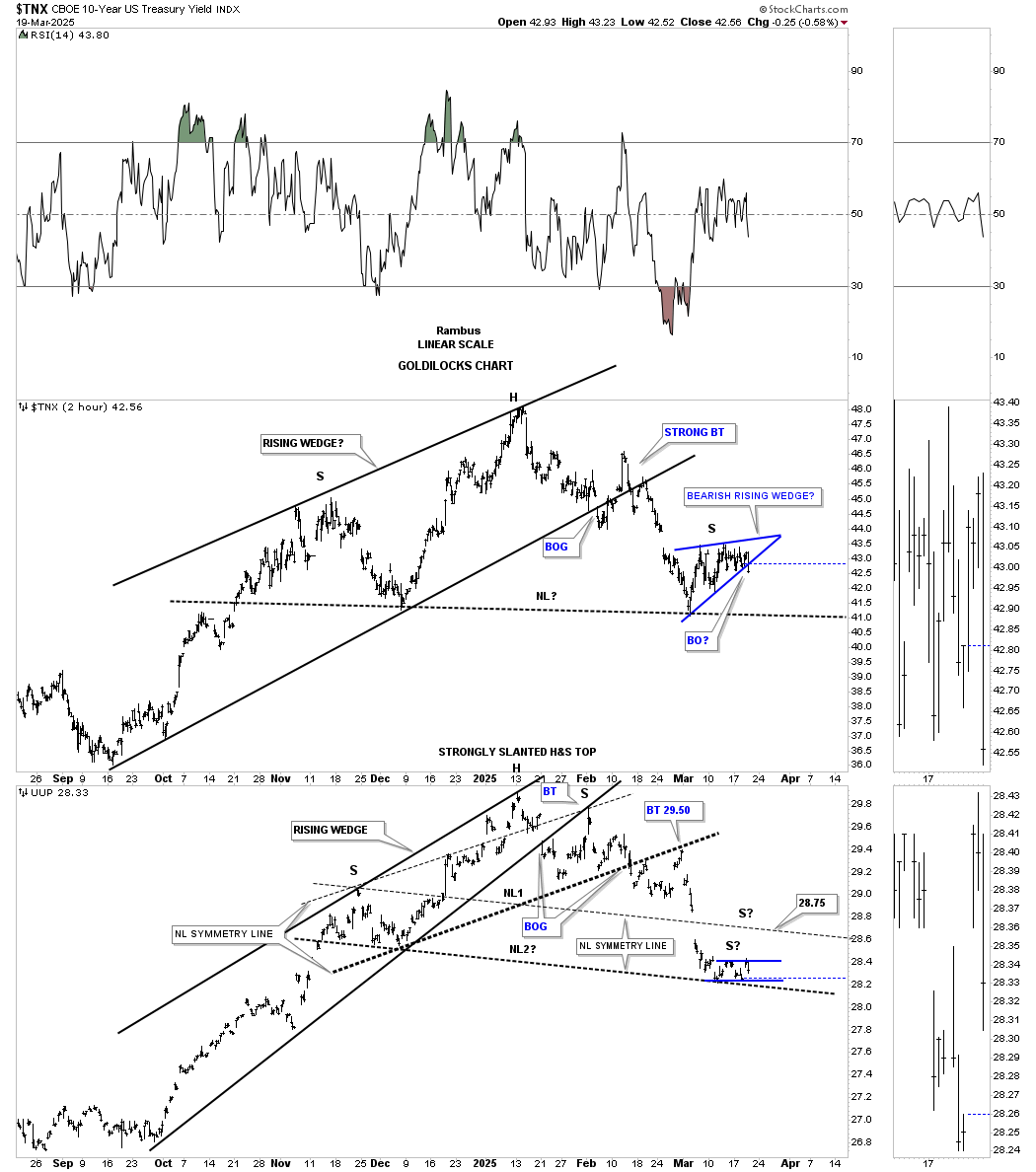
This last combo chart has the US dollar on top with the GDX below. Here again, you can see that possible small blue rectangle forming on the US dollar, which is still incomplete, and I haven’t had a chance yet to draw in the possible neckline taken from the left side of the chart yet.
After the GDX broke out from its H&S consolidation pattern last week, it has reached the minimum price objective around 45.85, making a new higher high vs the October 2024 high, which is positive. Now, we’ll find out if the double H&S consolidation pattern is going to be a halfway pattern to the upside, as would any other consolidation pattern that would have formed in that area, or if that impulse move is now exhausted. The US dollar on the daily chart above will give us our answer.
When looking at some of the PM stocks to follow, keep in mind that the PM complex has been in consolidation mode since the October 2024 high, or nearly 5 months, which created some mild morphing in some of the PM stocks. This can mean a false breakout of a well-defined trading range or adding a 5th and 6th reversal point to an already existing consolidation pattern. In turn, that will still show some low-risk entry points for some of our new members and for those members who are still looking to add a few more positions to their respective portfolios.
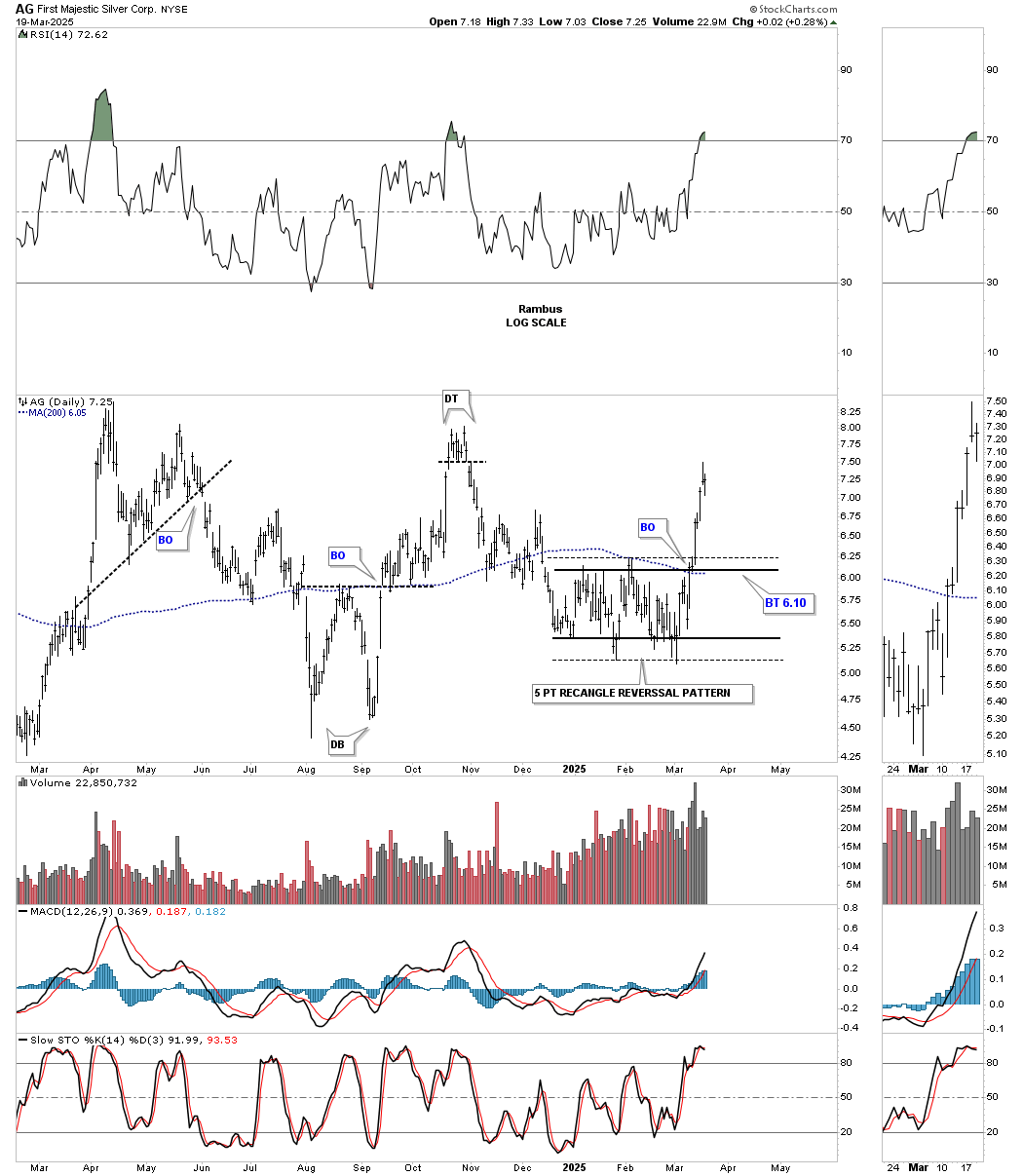
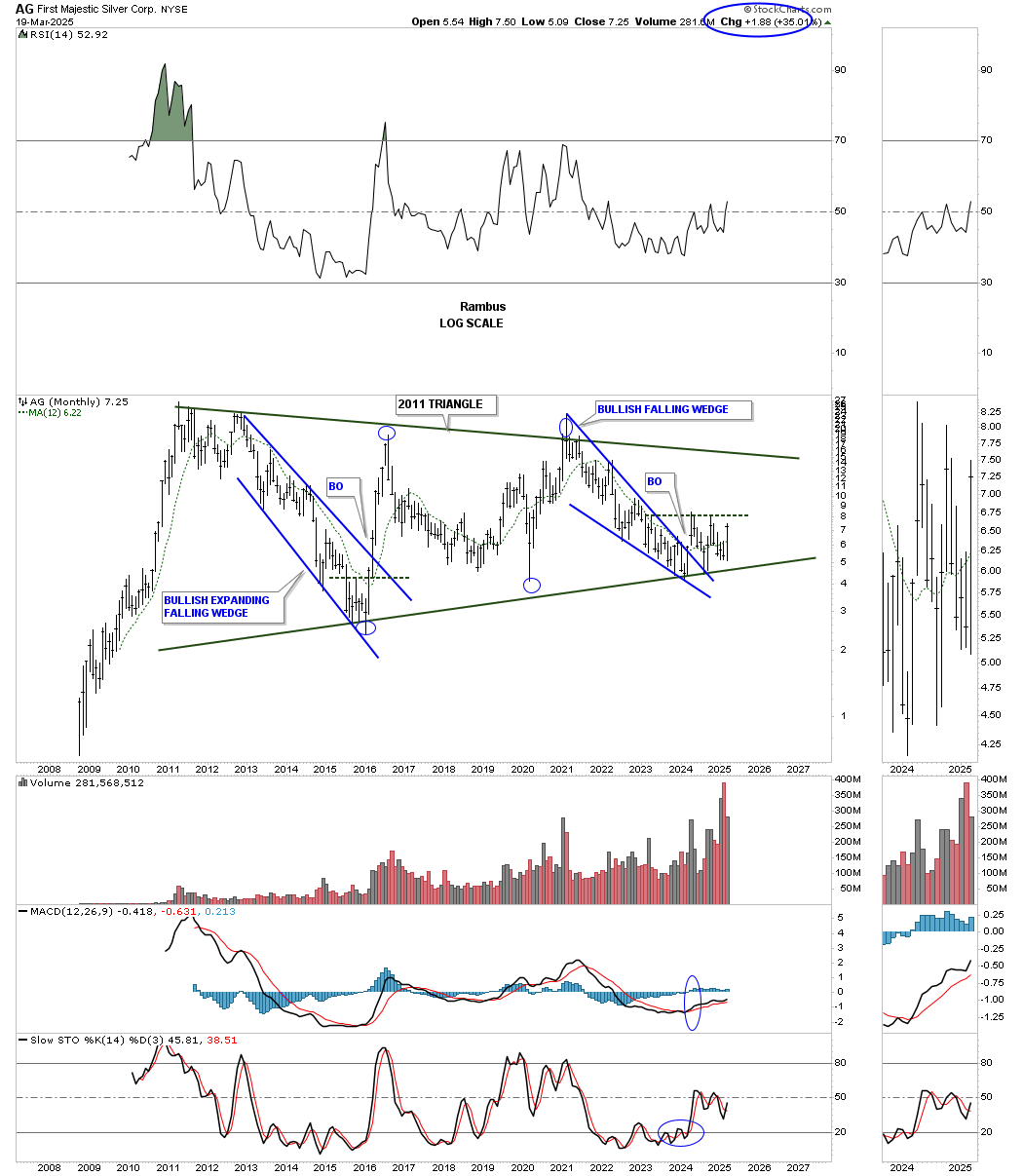
AG DAILY:
Last week, AG, which had been lagging quite a bit, broke out from a 5-point rectangle reversal pattern with a somewhat sloppy lower trendline. Note the volume that came in on the breakout.
This weekly chart shows the much bigger bullish expanding falling wedge, which produced a false breakout last October, leading to a move back inside the expanding falling wedge, thus negating the breakout. As you can see, two weeks ago we saw another breakout of the top trendline, putting the breakout back in play.
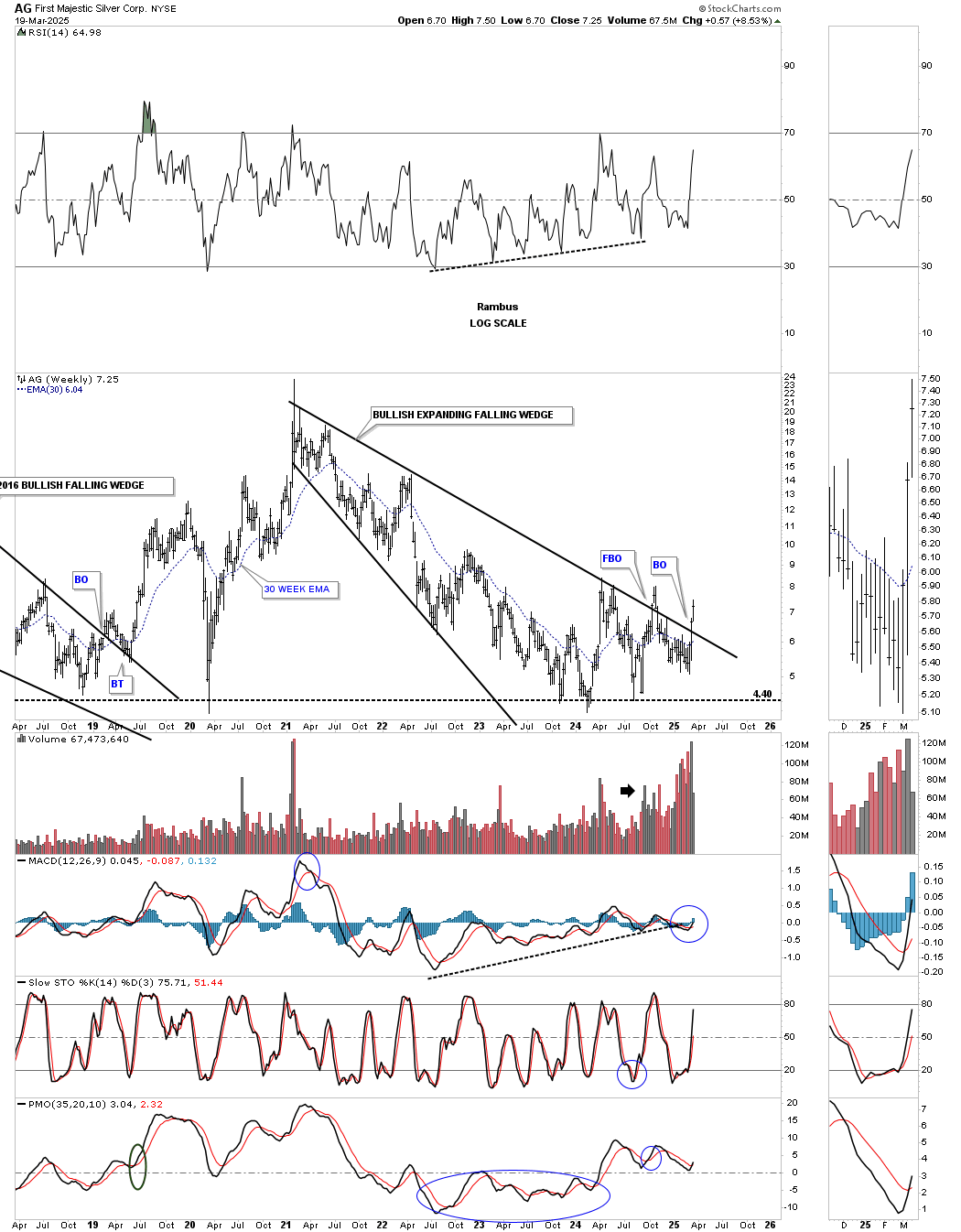
Looking at this monthly history chart, AG has been in consolidation mode for most of its existence, forming another low on the bottom rail of the 2011 triangle. A break above the horizontal black dashed line will confirm that the low is in.
This daily chart for FSM shows a perfect example of a morphing triangle, with a false breakout above the top trendline, which led the price action back down to the bottom trendline before reversing back up and breaking out last week.
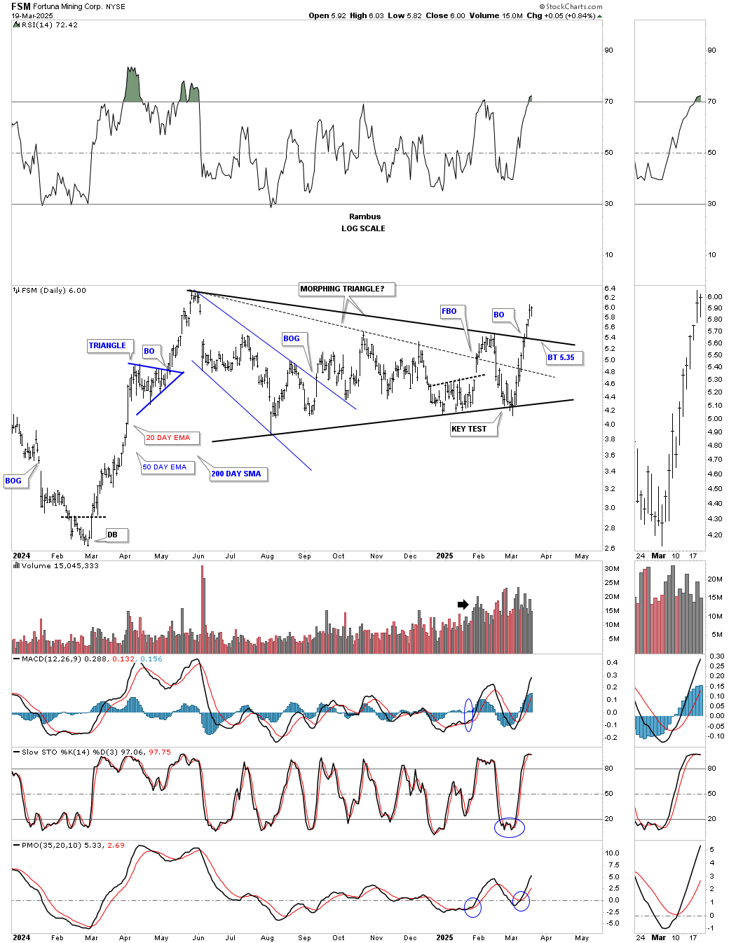
I initially overweighted FSM by a 1/2 position, but when the initial breakout failed, I closed the 1/2 position because discipline dictated that’s what I should do until I got more information. As you can see, the price action reached the bottom rail of the blue triangle, where the thin dashed line shows the false breakout. The reason I didn’t sell the whole position was because of the support on top of the much bigger black triangle reversal pattern. Now we have the 2nd breakout, and, as is the case with the PM stock indexes, the question remains: will we get a backtest?
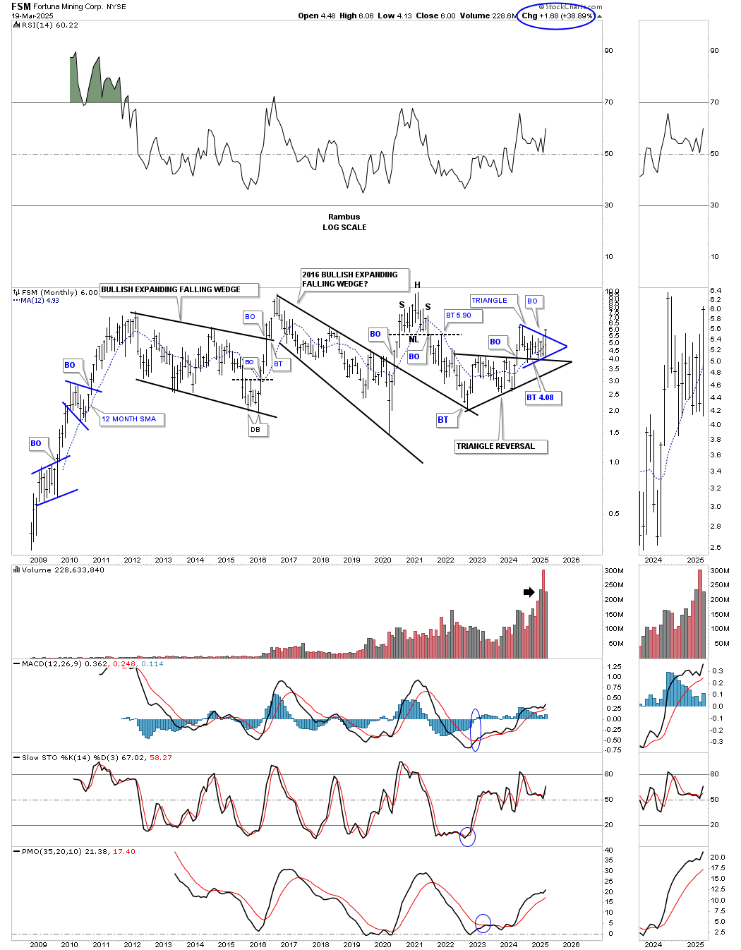
This monthly history chart shows some nice Chartology. Note the massive bull market rally when FSM was born back in 2008, with the first consolidation pattern being the bullish rising flag, followed by the impulse move, then the bullish expanding falling wedge, and finally the impulse move into the 2011 high.
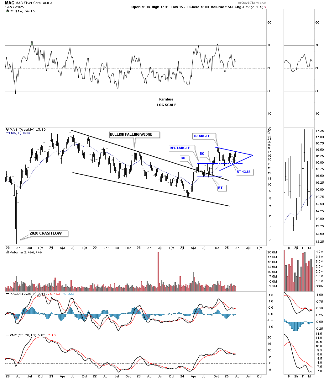
MAG is another example of a PM stock that really didn’t morph into a bigger consolidation pattern, but didn’t follow through on its impulse move on the initial breakout. MAG still has a very bullish setup, with the blue triangle now forming on top of the black 6-point rectangle consolidation pattern. Initially, I was expecting to see a large impulse move out of the black rectangle, but sometimes things don’t work out quite as planned. Nothing was broken, and now we have a bigger consolidation area that can have more staying power.
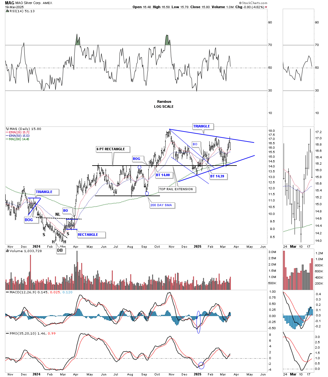
The black rectangle on the daily chart above formed the backtest to the 2021 bullish falling wedge, with the blue triangle forming on top of the rectangle. The blue horizontal dashed line shows how I extended the top rail of the black rectangle to the right side of the chart, looking for initial support, which held beautifully. A touch of the bottom rail of the blue triangle will set up the possible 6th reversal point, which, instead of being a 4-point consolidation pattern, MAG could very well be forming a 6-point triangle consolidation pattern.
This monthly chart shows the entire history for MAG, which has been one massive rising wedge formation, which most will view as bearish. I’m of the opinion that if the PM complex is in a long-term secular bull market, MAG will eventually break out to the upside. Note the classic H&S bottom that formed on the last touch of the bottom uptrend line. The left shoulder and head formed inside the 2021 bullish falling wedge, with the right shoulder low forming on the backtest to the top trendline, which led to the breakout above the neckline, and the blue triangle forming the backtest.

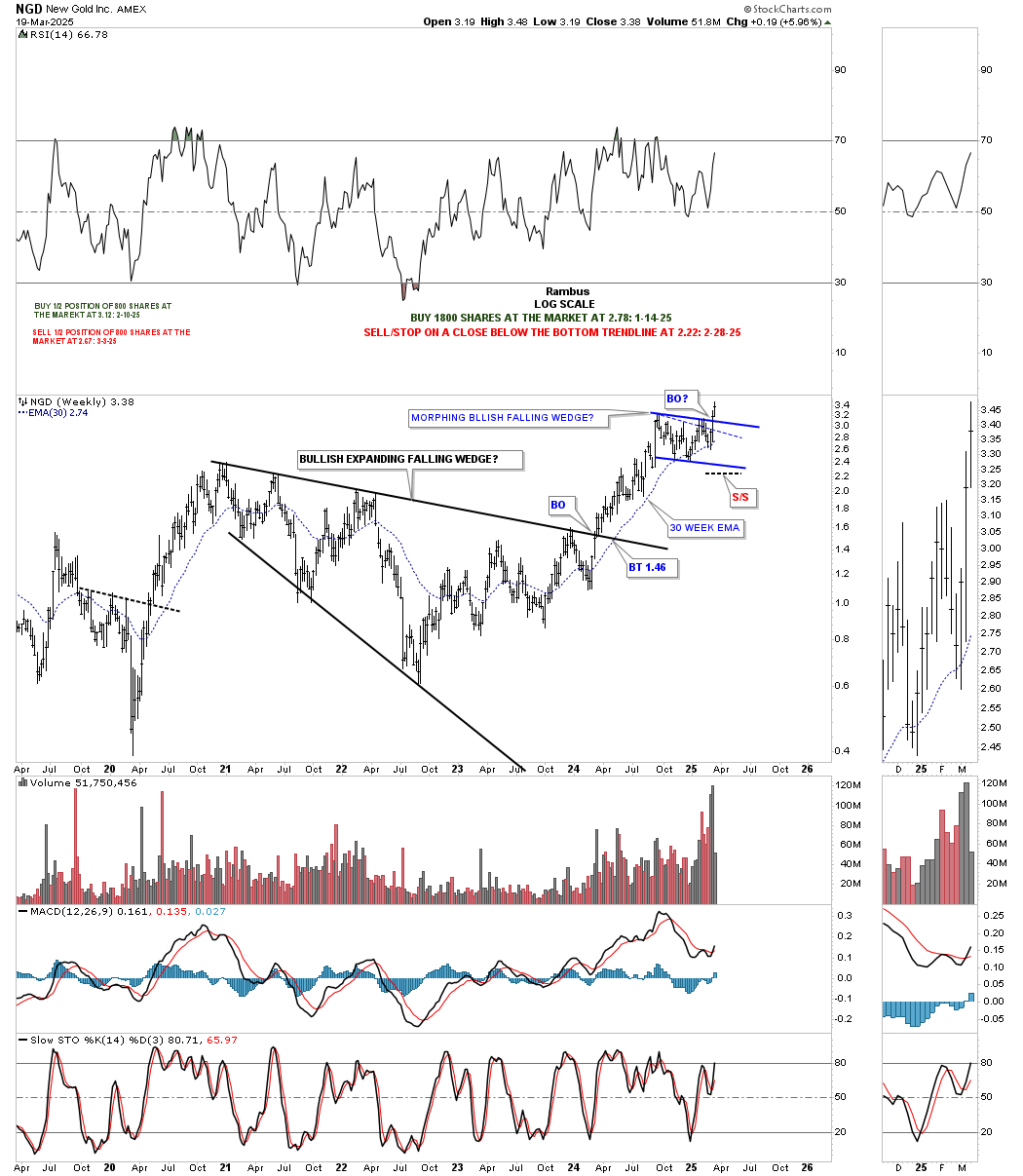
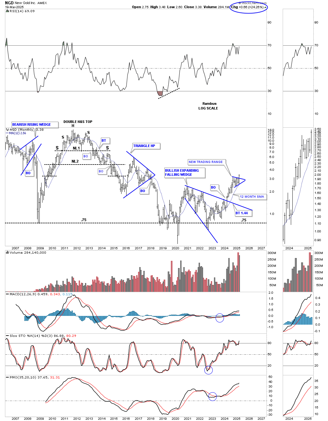
NGD is another one of my favorite PM stocks that I was overweighted in by a half position, and had to sell that half position because of the false breakout, which led to the morphing falling wedge, which has since recovered and broken out.
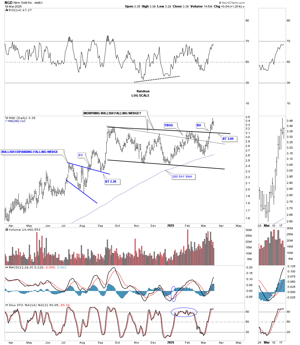
The thin dashed line shows where the original morphing took place, which now looks corrected, with the possible exception of a backtest. Note the nice impulse move out of the 2020 bullish expanding falling wedge, which we know is one of the most bullish chart patterns there is, based on its psychology.
Putting that bullish expanding falling wedge into perspective, you can see how it formed right on top of long-term support, and now, the breakout from the next consolidation pattern.
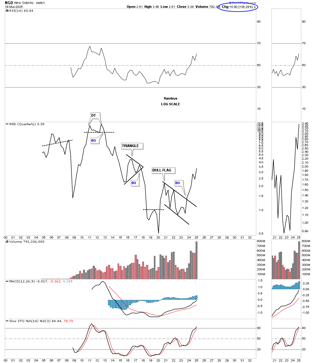
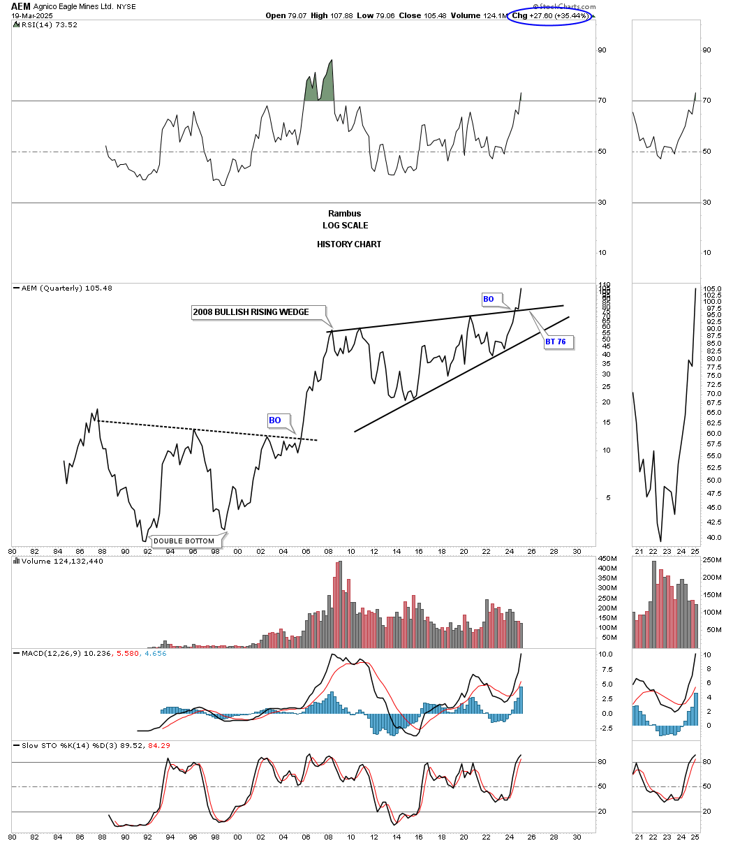
If you really want to get a perspective on a PM stock, you might be interested in looking at a quarterly line history chart, which takes out most of the noise from the shorter-term charts. You won’t see a lot of chart patterns, but when you do, most of the time they will be valid.
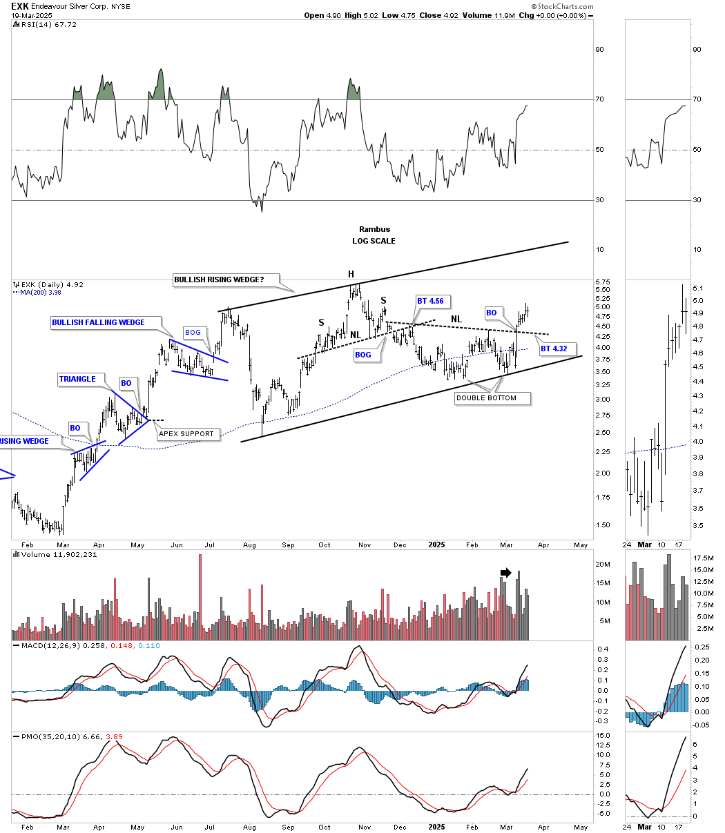
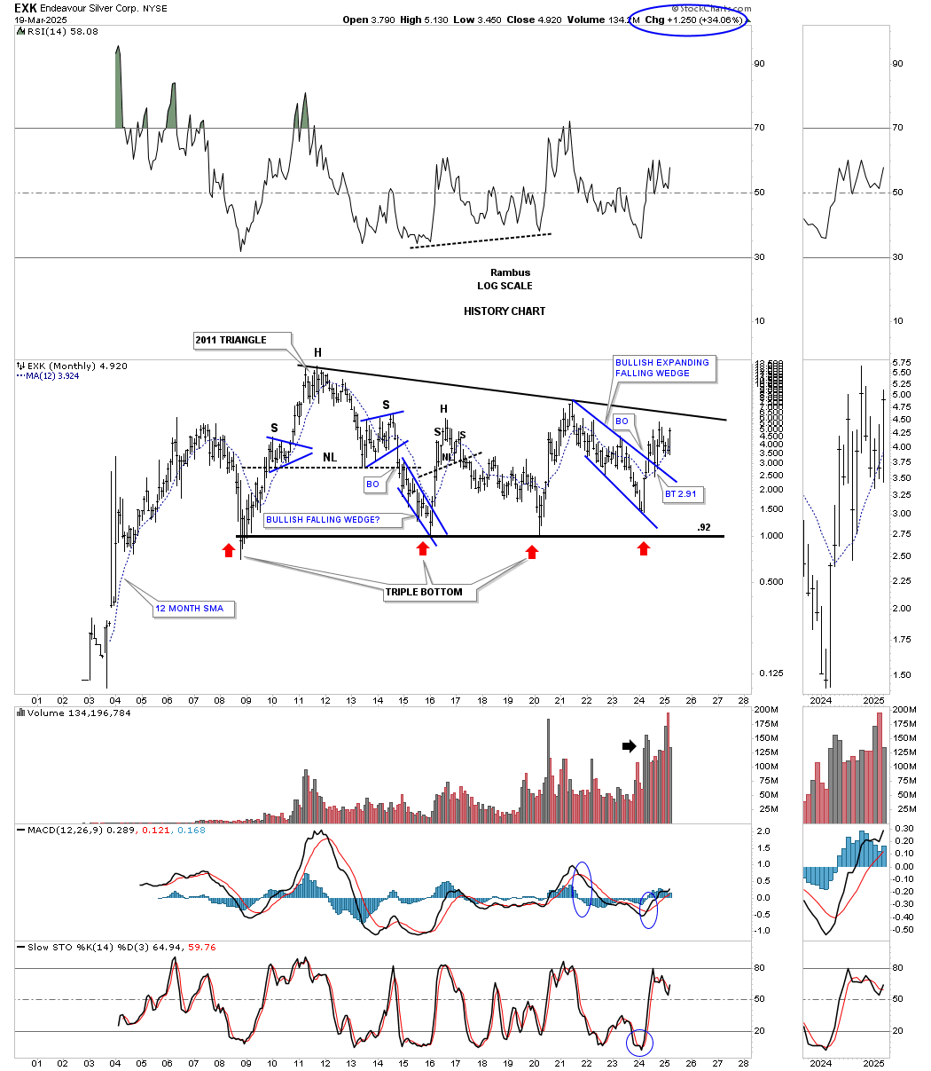
EXK is a PM stock I’ve bought off and on through the years with pretty good results. It’s still building out a possible bullish rising wedge, which is a very bullish pattern if we get the breakout above the top rail. About a week or two ago, the price action broke out from a double bottom/H&S bottom reversal on what could be the last reversal point in the rising wedge.
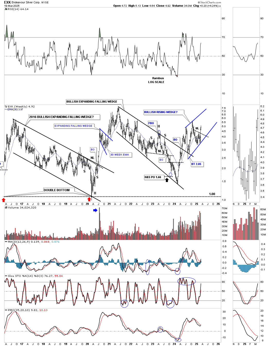
This long-term weekly chart shows the initial breakout from the 2021 bullish expanding falling wedge, with that deep backtest, which held support on the top trendline, leading to the second rally phase, and a possible H&S consolidation pattern forming within the blue rising wedge.
For much of its existence, EXK has been forming a massive triangle consolidation pattern, with the price action getting closer to the top trendline.
FNV shows us another good example of a morphing triangle, which took place in late 2023 and which we were following in real-time. I know most don’t remember this weekly chart, but you can see the breakout below the lower dashed trendline, which I initially labeled as a false breakout. However, I kept saying, “Let’s see what happens,” because it could be a false breakout/bear trap. After forming the blue 5-point triangle reversal pattern, and FNV traded back inside the old triangle, the false breakout was confirmed. Then, the price action formed the blue rectangle on top of the original dashed line and is now reaching the top trendline of what we can now call the chart pattern – a very symmetrical rectangle.
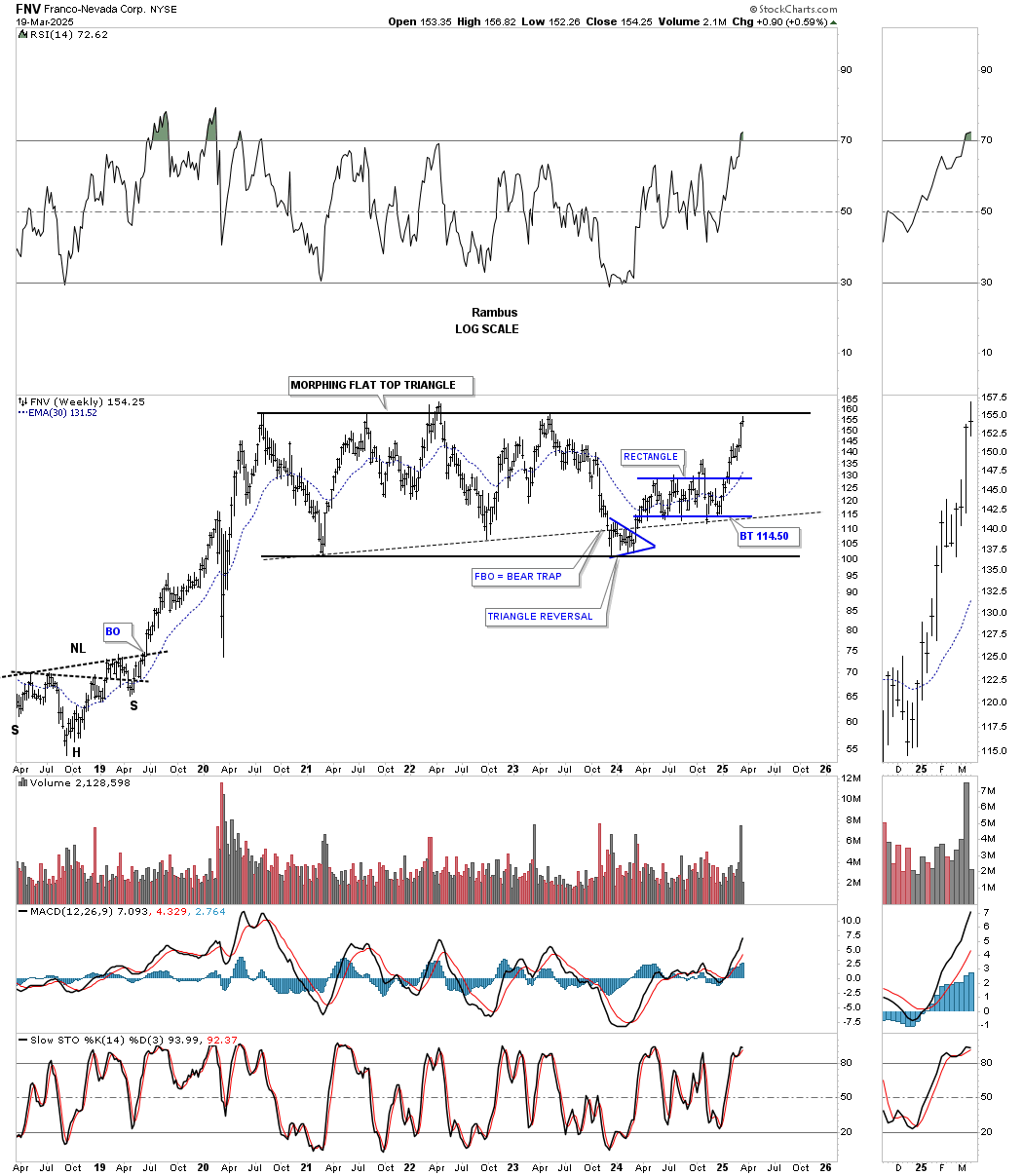
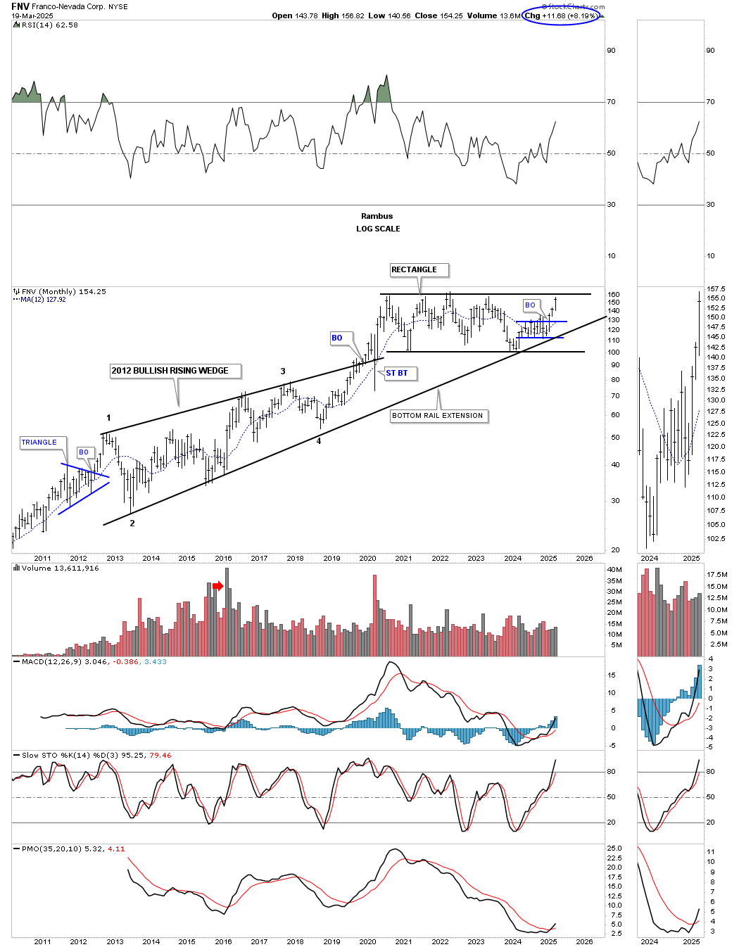
From the monthly perspective, you can now see a perfectly formed rectangle, where the false breakout on the chart above shows that the bottom trendline, which goes all the way back to 2013, held support.
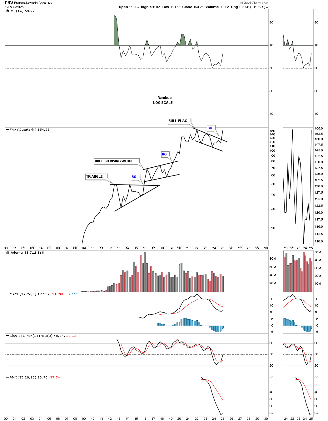
From the quarterly line chart perspective, FNV is now showing a breakout from the multi-year bull flag, in a series of consolidation patterns going back to its inception.
IAG was the third and last PM stock that I was overweighted in, and it, too, shows a morphing triangle. I was hoping to see the original bottom trendline of the blue triangle hold support, which it did, and which has now led to the move back up to the top trendline. When completed, we should see a bullish rising wedge.
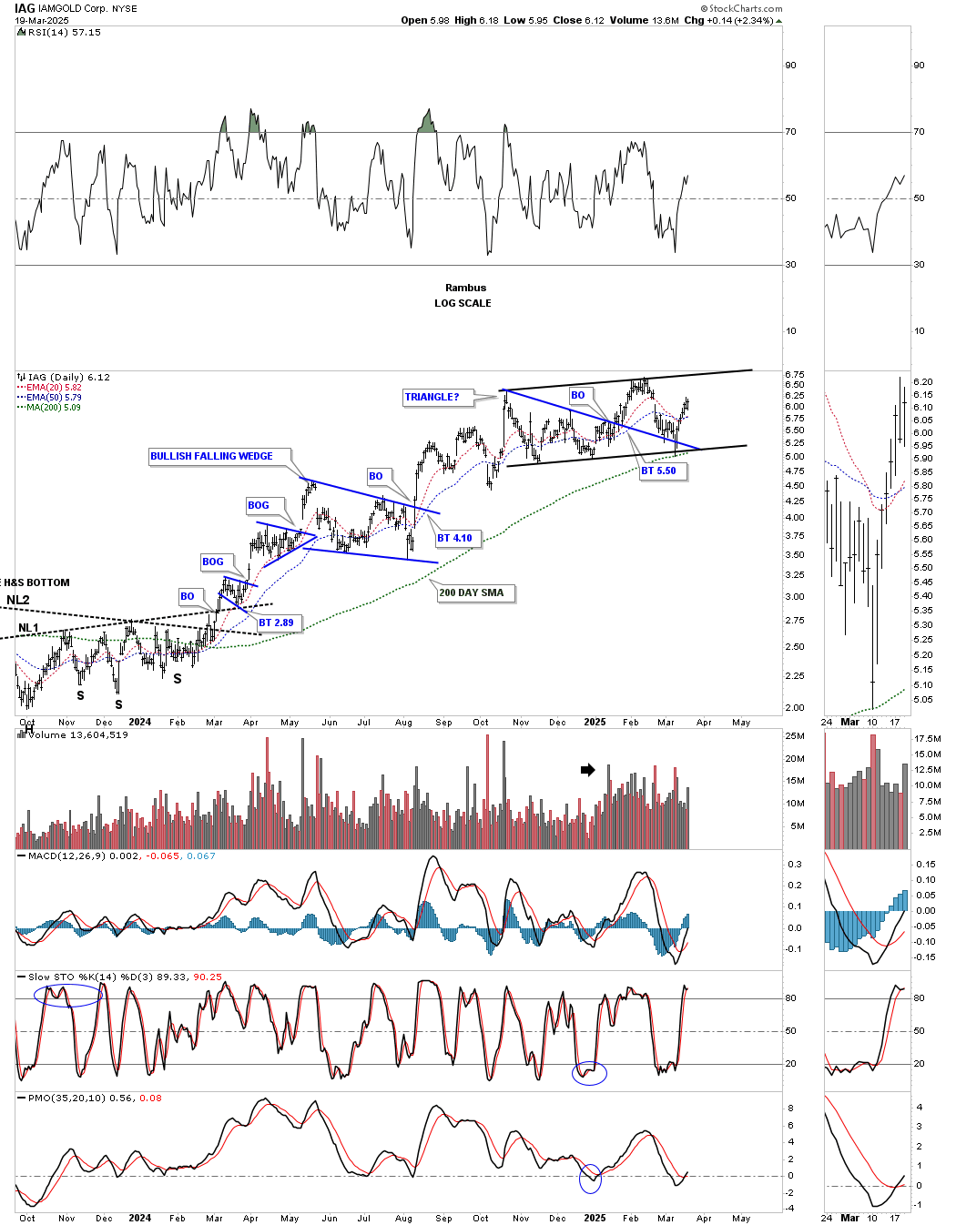
To put that potential bullish rising wedge into perspective, you can see it has been forming above the blue bullish falling wedge, which produced the backtest to the top rail of the 2018 bullish expanding falling wedge, with the beautiful symmetrical inverse H&S bottom forming the last reversal point with two necklines.
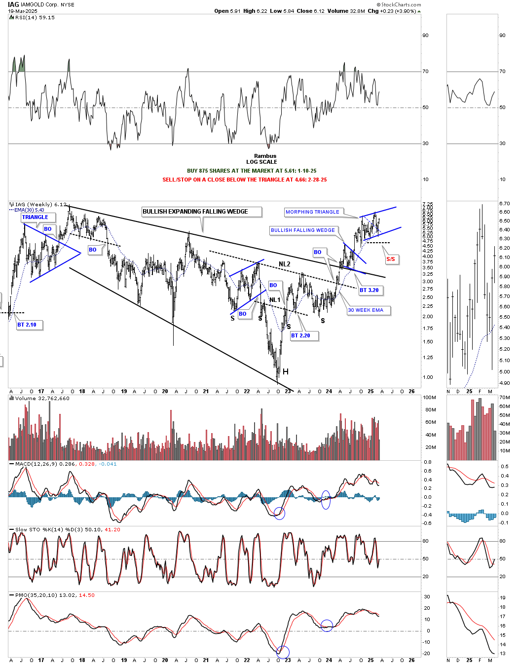
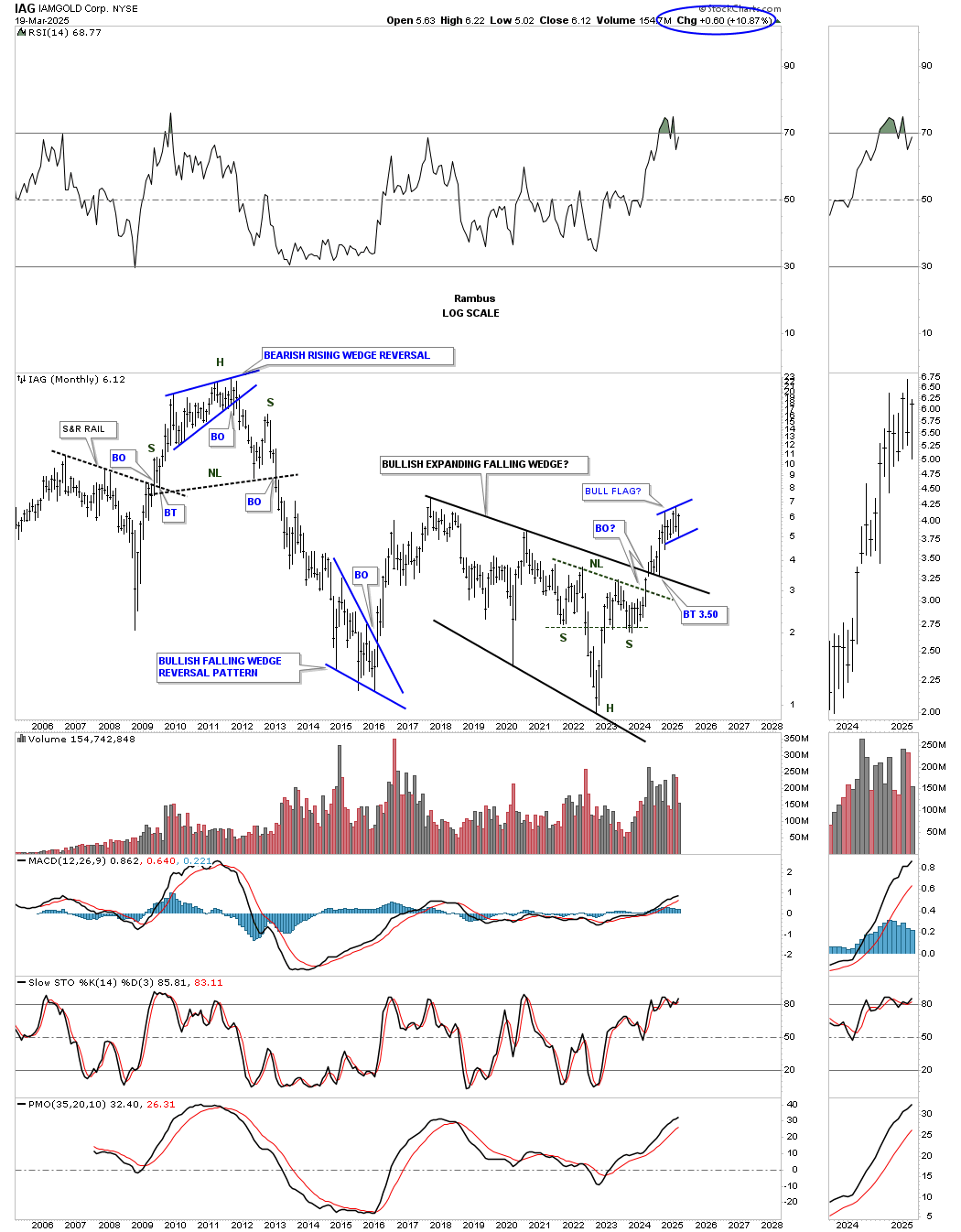
The monthly chart for perspective.
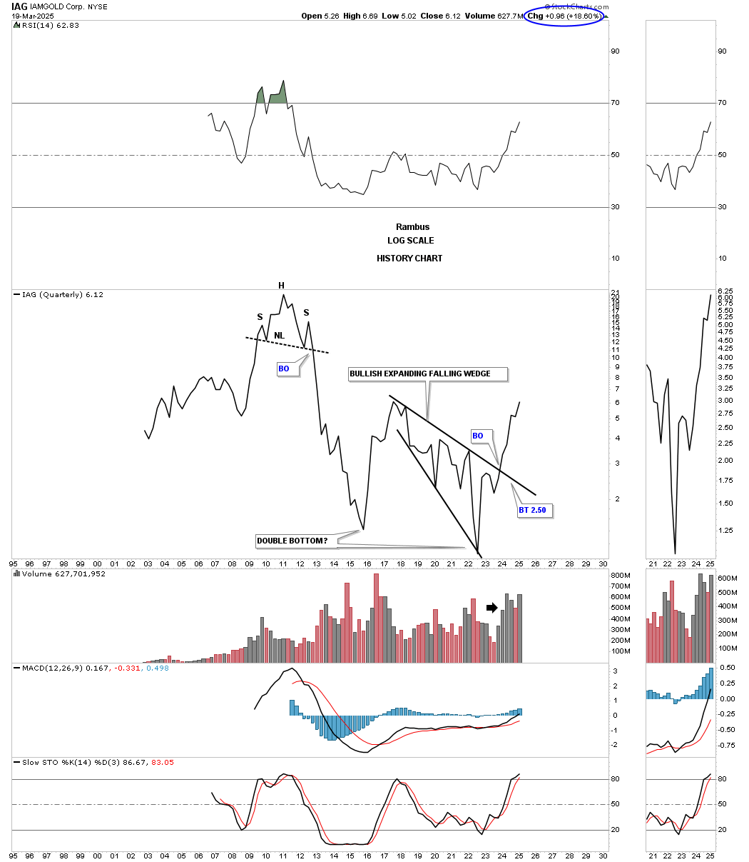
Again, to really get a feel for how a stock looks from the long-term perspective, this quarterly line chart shows how beautifully that bullish expanding falling wedge looks, with hardly a down quarter since the breakout. I wonder how many investors saw that H&S top in 2011 before the big crash?
I would like to show possibly two of the potential big winners in the secular bull market that lies ahead. We recently bought AEM when it broke out from the blue triangle consolidation pattern, after it had broken out from the very symmetrical H&S consolidation pattern. You are looking at a classic bull market since the H&S breakout.
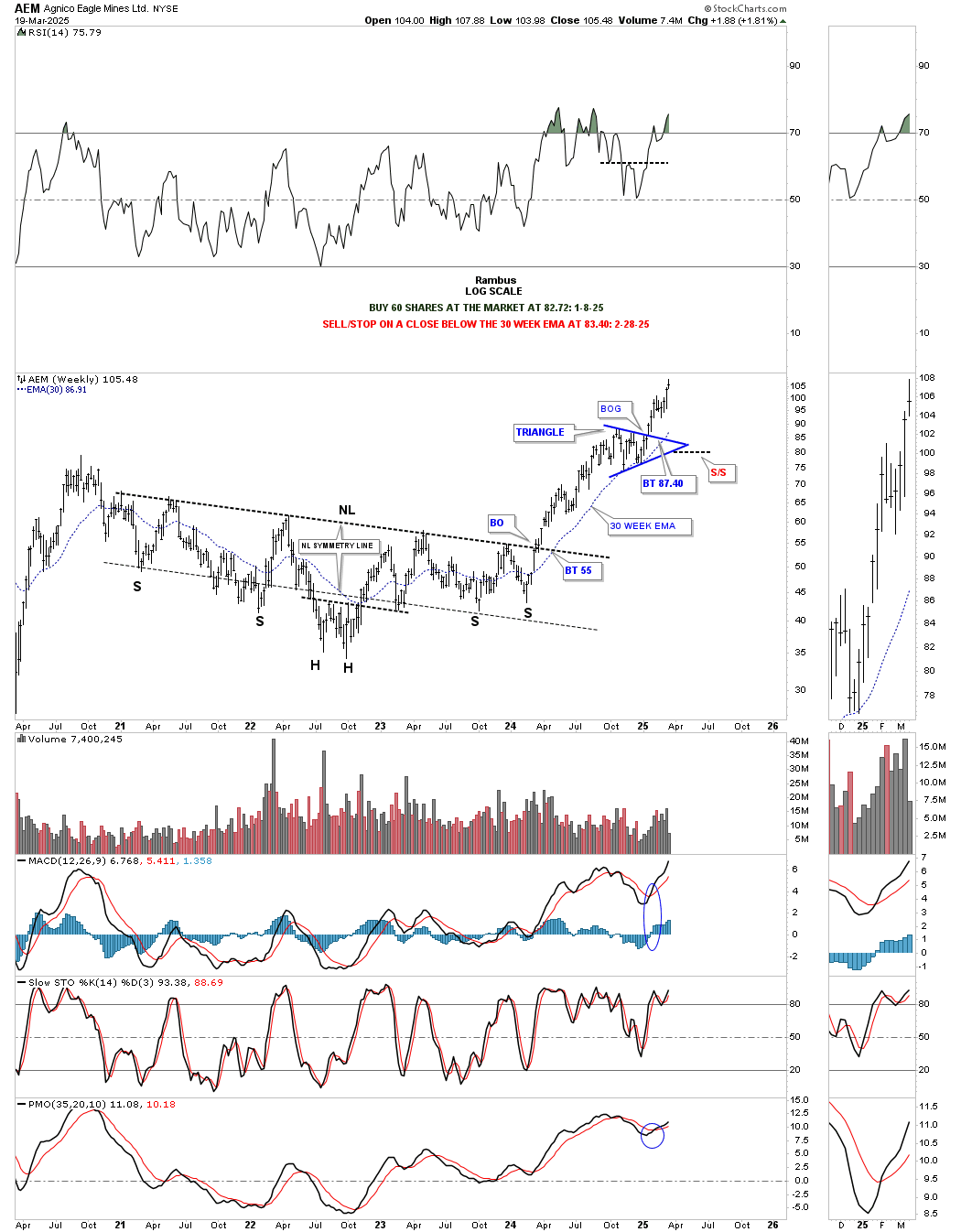
The H&S consolidation pattern formed just below the top rail of the much larger 2008 black rectangle, which has now broken out and is beginning to impulse higher.
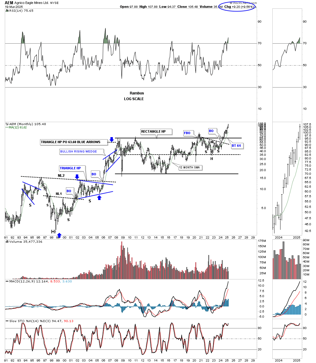
What really makes AEM so bullish from the longer-term perspective is the breakout from the 2008 bullish rising wedge. If you look closely at the breakout, you can see a one see a very small one quarterly backtest. You may recall the monthly chart for gold, which broke out from its own, but slightly smaller, bullish rising wedge.
Since the 2020 crash low, GFI has been building a bullish rising wedge, which we are finally starting to see break out above the top trendline this week. If the PM complex wasn’t in a secular bull market, then I wouldn’t have been so bullish on this chart pattern. However, that isn’t the case, so the bigger the chart pattern, the bigger the move, and it’s finally happening this week with GFI.
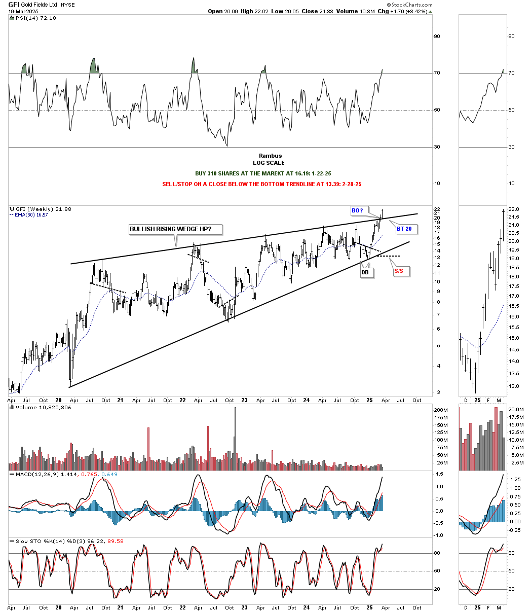
From the monthly perspective, you can see how the bullish falling wedge fits into the historical chart and is now trading at new all-time highs.
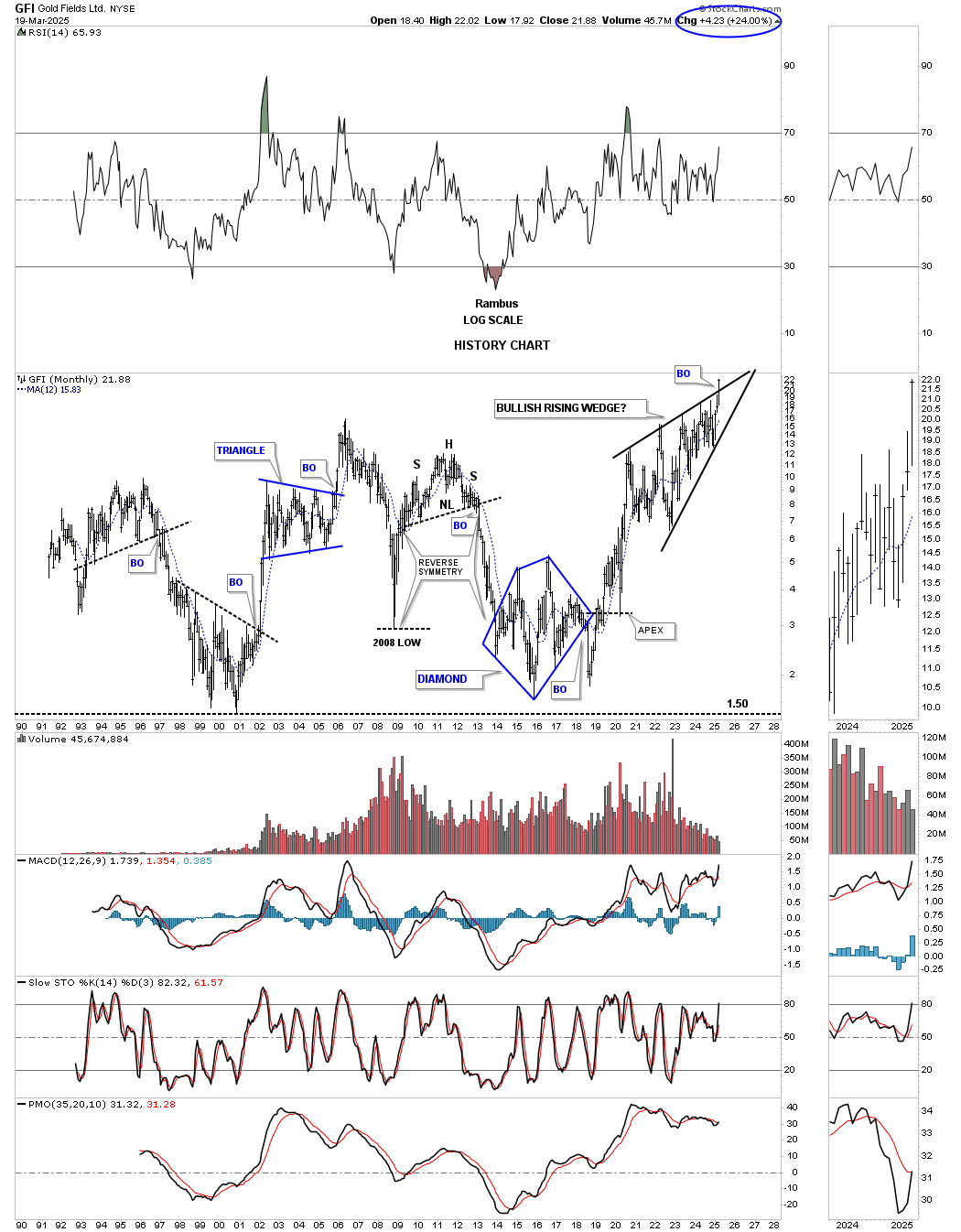
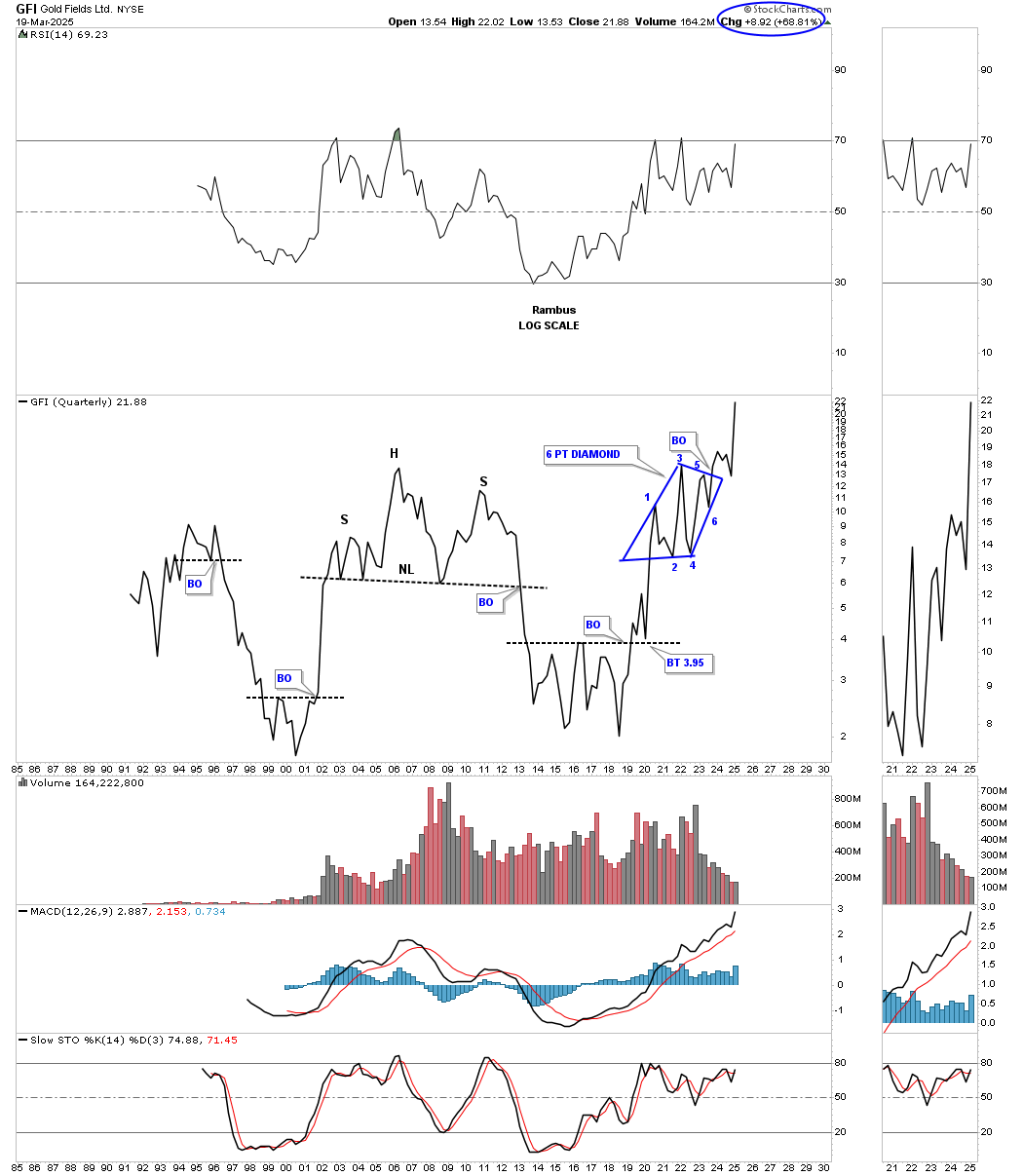
From the quarterly line chart perspective, we don’t see a bullish rising wedge, but rather a 6-point diamond consolidation pattern. Note how the price action is impulsing into new all-time territory without any overhead resistance to slow it down.
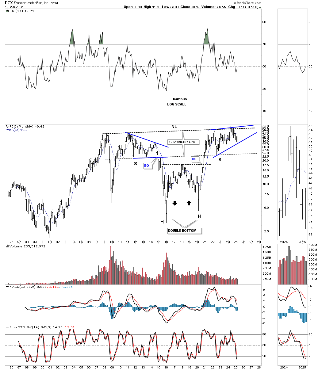
I’m running out of time, but there are a few more charts I’d like to show you. This first one is a monthly chart for FCX, which is in the process of completing the last reversal point in its 2020 bullish rising wedge, which may very well be the right shoulder of a massive double-headed inverse H&S bottom. Note the near-perfect reverse symmetry to the downside, forming the left head, and then back up and back down to form the right head, creating a large double-bottom reversal pattern. Also, note the nearly perfect symmetry of the left and right shoulders, as shown by the neckline symmetry line. The whole inverse H&S bottom is one of beautiful symmetry on both sides of the heads.
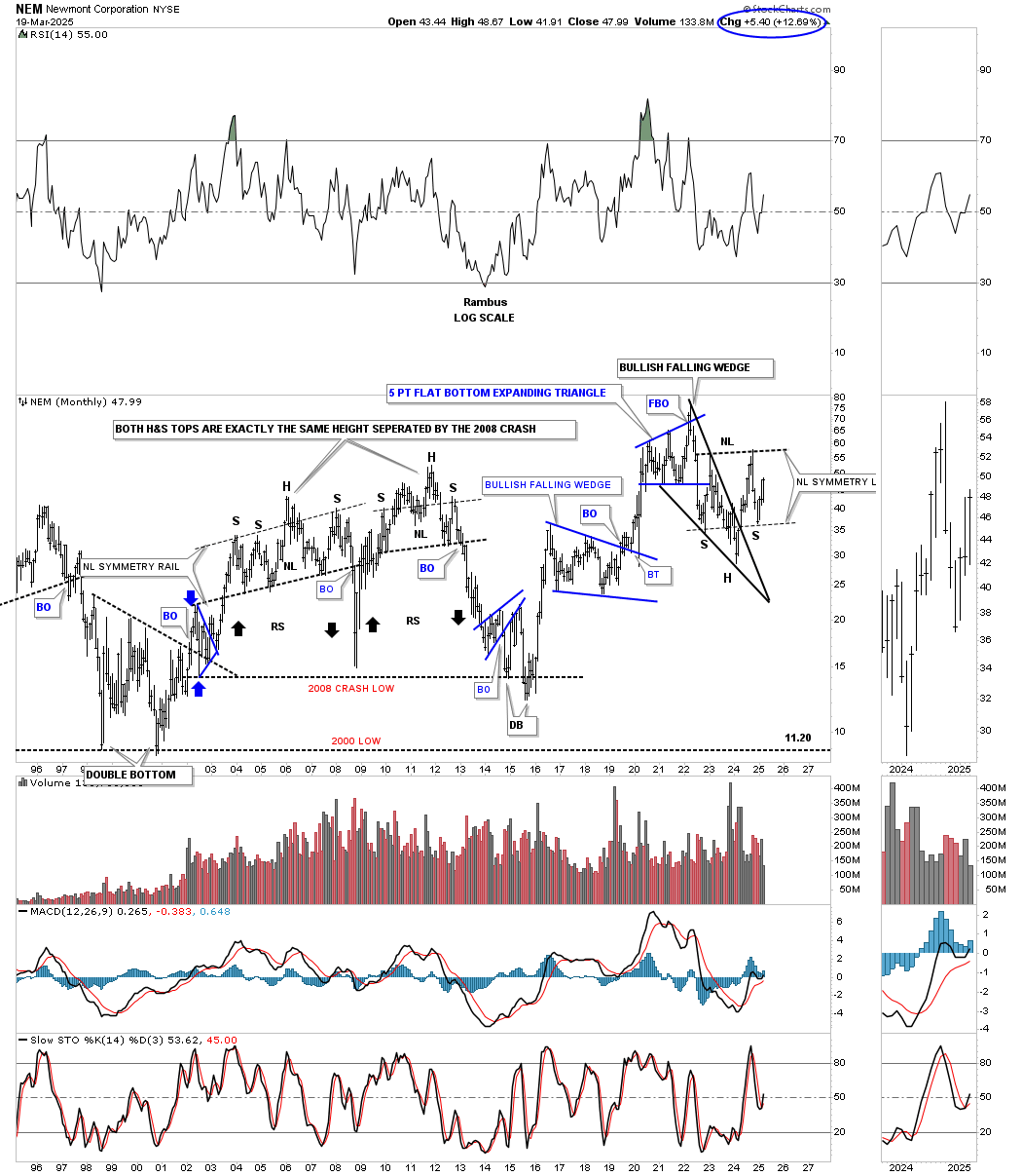
NEM is still lagging badly, but the Chartology is still holding beautifully regarding the small H&S bottom forming the much larger right shoulder of the 2022 inverse H&S bottom. Again, note the nearly perfect symmetry of the 2022 inverse H&S bottom, as shown by the neckline symmetry line, which indicates the low for the right shoulder.
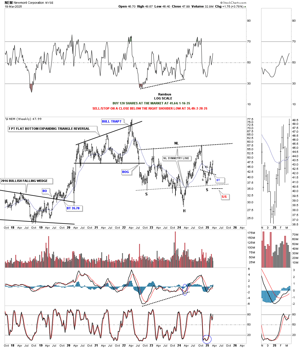
And this monthly chart shows how the inverse H&S bottom fits in with the bullish falling wedge, which is very close to being a classic H&S bottom, where the left shoulder and head form inside the falling wedge, with the right shoulder low forming on the backtest.
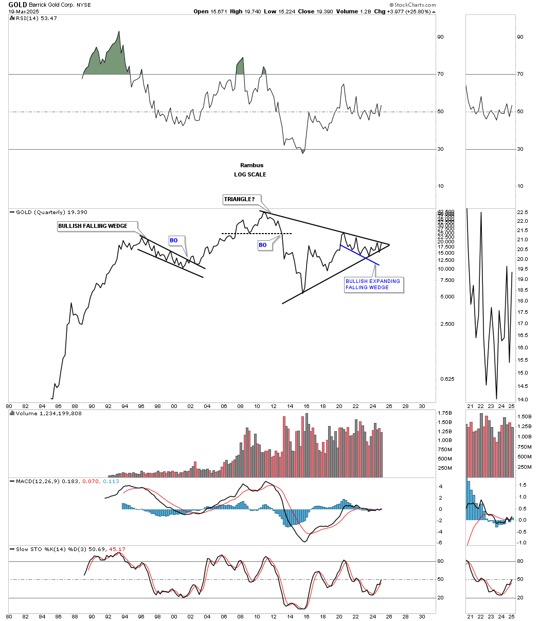
This last stock tonight is going to be GOLD/ABX, which has been lagging badly but is starting to come to life. Last week, ABX broke out from the small blue triangle consolidation pattern after the positive cross of the 20- and 50-day EMAs.
Last year, ABX showed a false breakout above the top rail of its 2020 bullish expanding falling wedge and then formed the blue rising flag. After forming 5 reversal points, the blue rising flag broke to the downside, negating the breakout. Over the last month or so, you can see that ABX has broken out once again and may have completed its backtest.
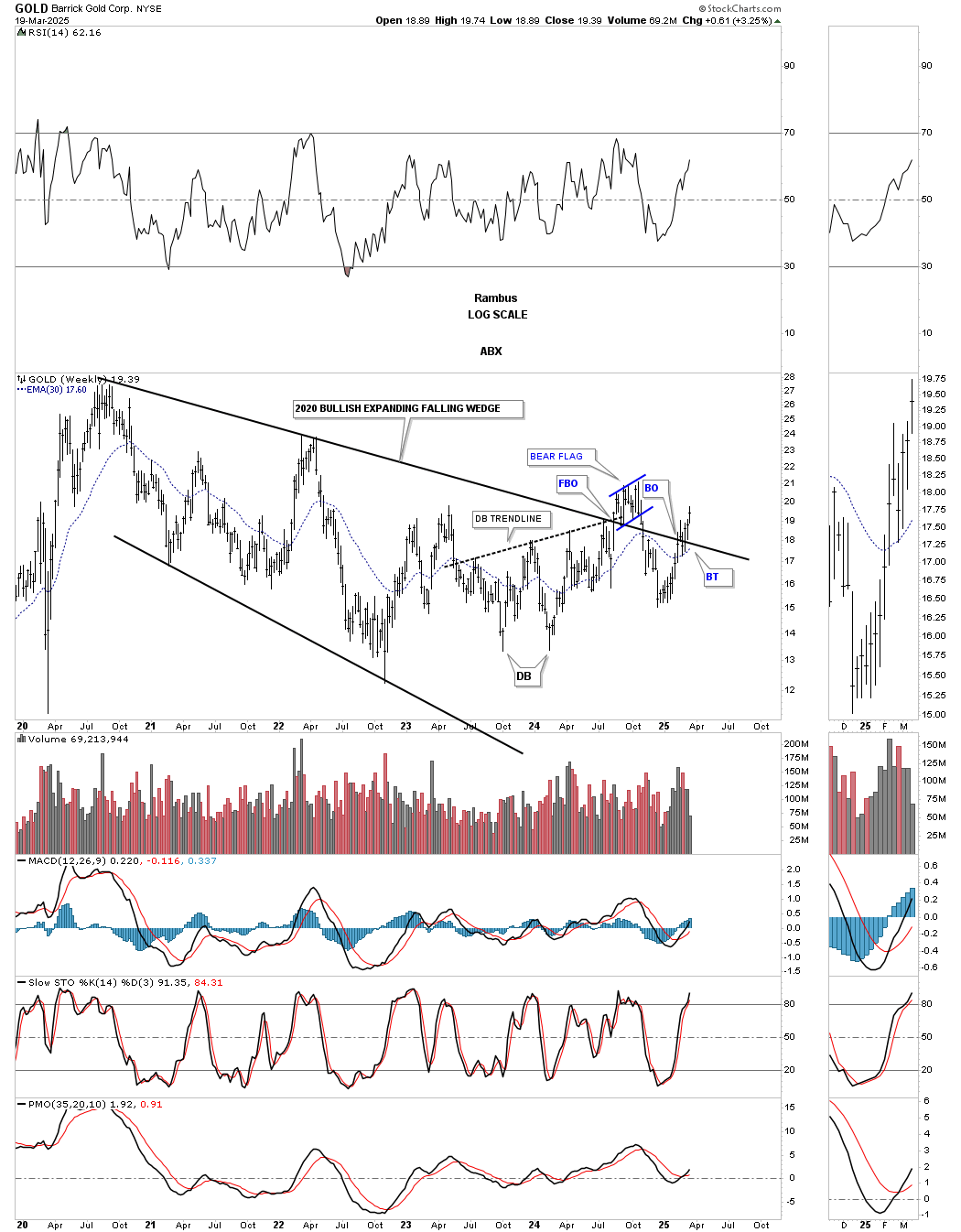
Looking at this long-term monthly chart, you can see the 2020 black bullish expanding falling wedge, which now looks like a sloppy breakout and backtest from this perspective.
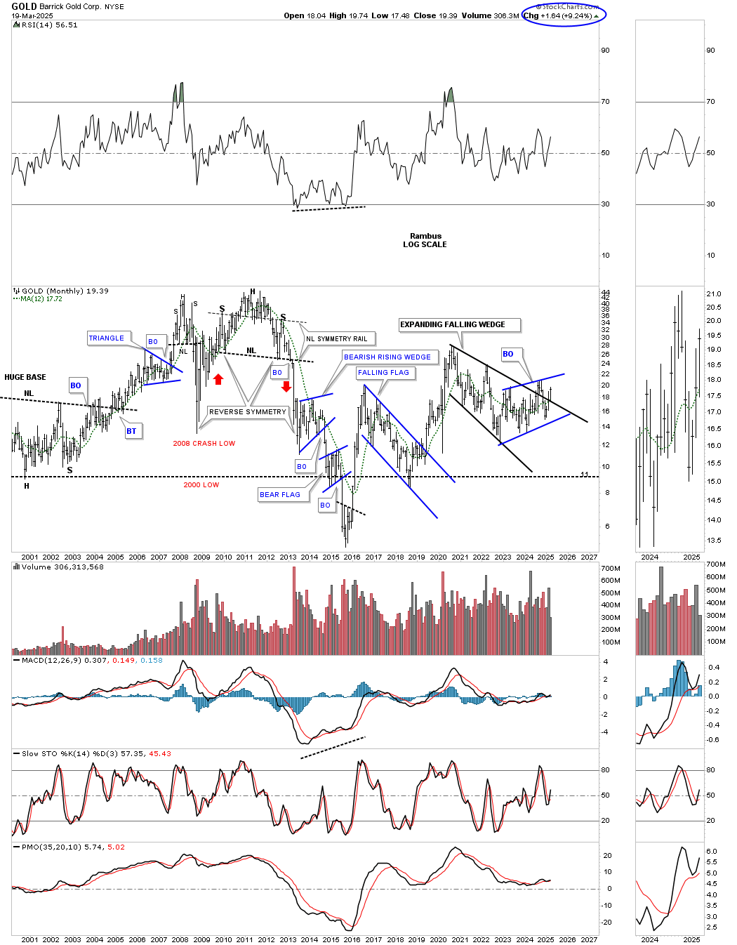
This quarterly line history chart shows a massive symmetrical triangle with the price action squeezing into the apex, along with the blue bullish expanding falling wedge.
I have many more charts I could show you, but I’m now out of time. Even though the rally in the PM complex has been ongoing since the March 2024 low, with the October 2024 triangle consolidation pattern recently breaking out, you can see on the charts above that there are still a lot of fairly low-risk entry points if you are still looking to add a few more positions. Also, as I’ve been showing you regarding all those 2011 triangle consolidation patterns in the PM stock indexes, the PM stocks are also showing very large multi-year consolidation patterns, which are going to lead to long-term moves.
It’s been a very long wait for PM stock investors, but now it’s finally our turn to have some fun. All the best…Rambus