
I’ve been suggesting for some time now that the PM complex is trading at a critical inflection point where they can have a big move in either direction. It may sound like a copout but that is what an inflection point is. Many times at a critical inflection point, in the case of the PM stock indexes, support can hold beautifully or there can be a false breakout of the the S&R line which can be called a bear trap if the price action trades back above that important trendline.
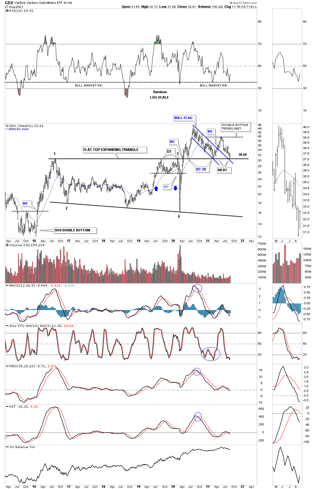
Tonight I’m going to use the GDX as a proxy for the rest of the PM stock indexes which is showing us a great example of the current critical inflection point. The most basic concept in Chartology is how an important trendline can reverse its role to what had been resistance to support once broken to the upside and vise versa. The psychology behind an important trendline, using the top rail of the 2016 flat top expanding triangle on this weekly chart for the GDX below, is that when the top rail of the flat top expanding triangle was broken to the upside everyone that bought below the top rail is above water. As long as there isn’t a big breach of the top rail most will feel comfortable and not sell.
Every trendline you put on a chart is a support and resistance line, above is bullish and below is bearish. This is why we are always looking for a backtest when we see a breakout of a chart pattern. It doesn’t happen all the time but it does happen enough to always be on guard.
Lets focus on the top rail of the 2016 flat top expanding triangle that starts at the 2016 high and runs horizontally to the right side of the chart. Not many caught the double top that formed just below the 2016 trendline which led to the March 2020 crash low. As you can see there were 3 important touches from below. After the 2020 crash low was put in you can see the vertical rally that ensued but this time the top rail gave way. After several more weeks of moving higher the GDX completed its first backtest which could have been the backtest which would lead to the next important move higher but that wasn’t the case.
After a several months rally the GDX topped out at the infamous August 2020 high and began the laborious decline which found support on top of the 2016 flat top expanding triangle which again could have been the backtest which could have led the GDX higher. The next rally failed miserably and was only able to recapture about half of the move down from the August 2020 high.
Six days ago we experienced the 3rd backtest to the top rail of the 2016 flat top expanding triangle which has held support once again. This last touch of the top rail coincided with a backtest to the top rail of the blue March 2020 downtrend channel we’ve been following which seems like forever.
Here is where it gets interesting. If you look at the double top that led to the March 2020 crash low you can see our possible double bottom forming on top of the 2016 trendline from above and on top of the double top. We can see three touches from below and now 3 touches from above. Is the possible double bottom that is forming the backtest to the top of the 2016 trading range going to be the reversal pattern we’ve been looking for? Note how similar our potential double bottom is compared to the 2016 double bottom which are very similar in time and price.
If we boil away all of our emotions on what we think should be happening in the PM complex we are left with the top rail of the 2016 flat top expanding triangle holding support just as it should be doing. As you can see there is a lot of work to do yet like trading above the possible double bottom trendline but the GDX could be at a very low risk entry point using the the top rail of the expanding falling wedge at the 31 area as our line in the sand, above is bullish and below is bearish.
Also note the black dashed horizontal line on the RSI which I labeled a long time ago as support during a bull market. If that line is violated to the downside it generally shows an important longer term low. If the RSI can hold support right here we should see a move up to at least the possible double bottom trendline.
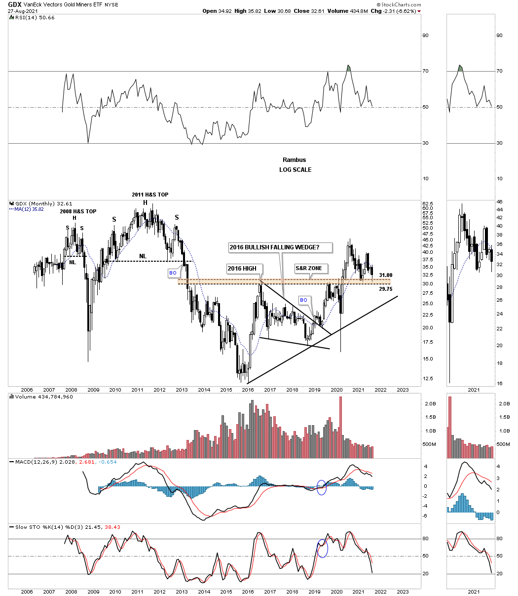
Next is the long term monthly chart for the GDX which shows its entire history along with the brown shaded support and resistance zone. How many remember that 2016 bullish falling wedge which was a long drawn out consolidation pattern that we were are able to side step by trading the US stock markets.
This next chart for the GDX shows all the chart patterns that have formed since the 2016 low. What this chart really shows is how important timing can be. There can be many months to years of sideways price action that leads nowhere. It is only when you have a recognizable chart pattern to trade off of that can often times lead to a decent move but can end up being just part of a bigger pattern. As you can see the important reversal points in the 2016 trading range were all accompanied by some type of reversal pattern. I labeled our current low as a double bottom backtest to the top rail of the 2016 trading range until further notice.
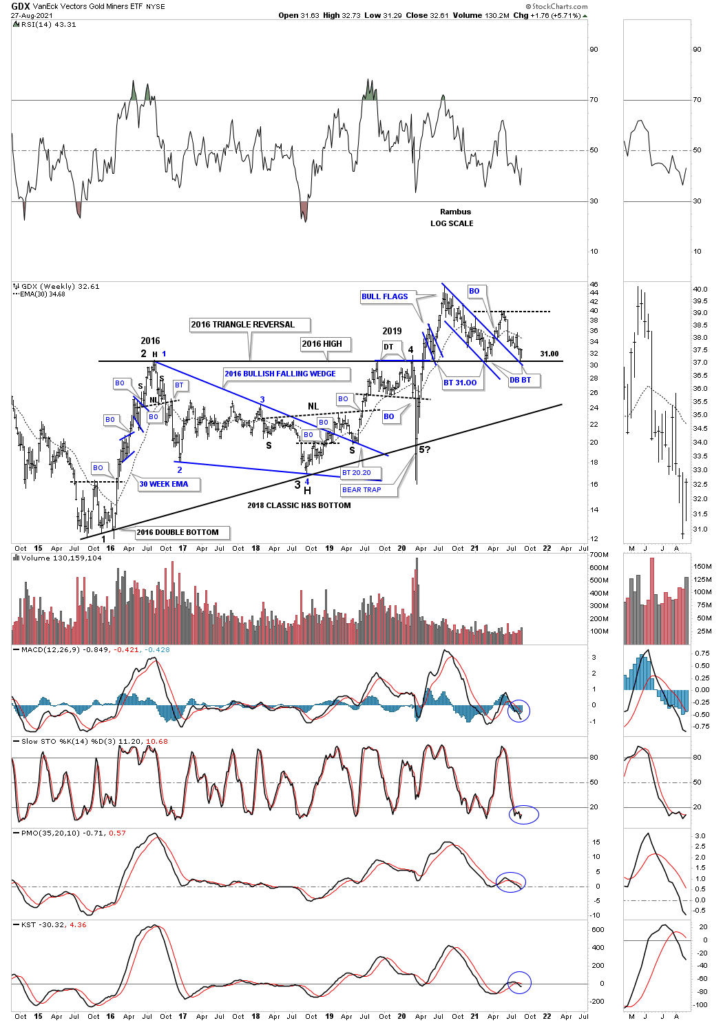
This last chart for the GDX shows you a very clear picture of our current inflection point. If the top rail of the 2016 flat top expanding triangle holds support then the next leg of the bull market will start from the recent backtest that took place a week ago. On the other hand if the H&S top plays out that means the top rail of the flat top expanding triangle is no longer valid and we have something else in place. For the time being we should give the benefit of a doubt to the bullish side of the equation until it is no longer applicable.

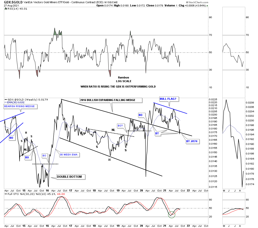
If we are seeing an important low on the GDX then we should also be seeing an important low on the GDX:GOLD ratio as the GDX should outperform Gold in an important impulse move. Even though the trendlines are orientated a bit differently than on the GDX we can still see three touches below the top rail of the 2016 expanding falling wedge and now three touches from above.
This lasts chart for tonight is the combo chart which has the GDX on top with the BPGDM on the bottom. As of last Friday’s close the positive divergence is still in place where there are now more PM stocks on a point and figure buy signal then at the previous low as shown by the red arrows. I would like to see the divergence a little lower on the BPGDM but we have to take what the market gives us.
Sorry for the late report. All the best…Rambus
