Oil, like just about everything else that is related to the markets, bottomed around the March / April 2020 pandemic crash low. The oil complex had been one of the worst performing areas even underperforming the PM complex if that is possible. When oil did bottom it did so in dramatic fashion capitulating hard to the downside in one last climatic thrust.
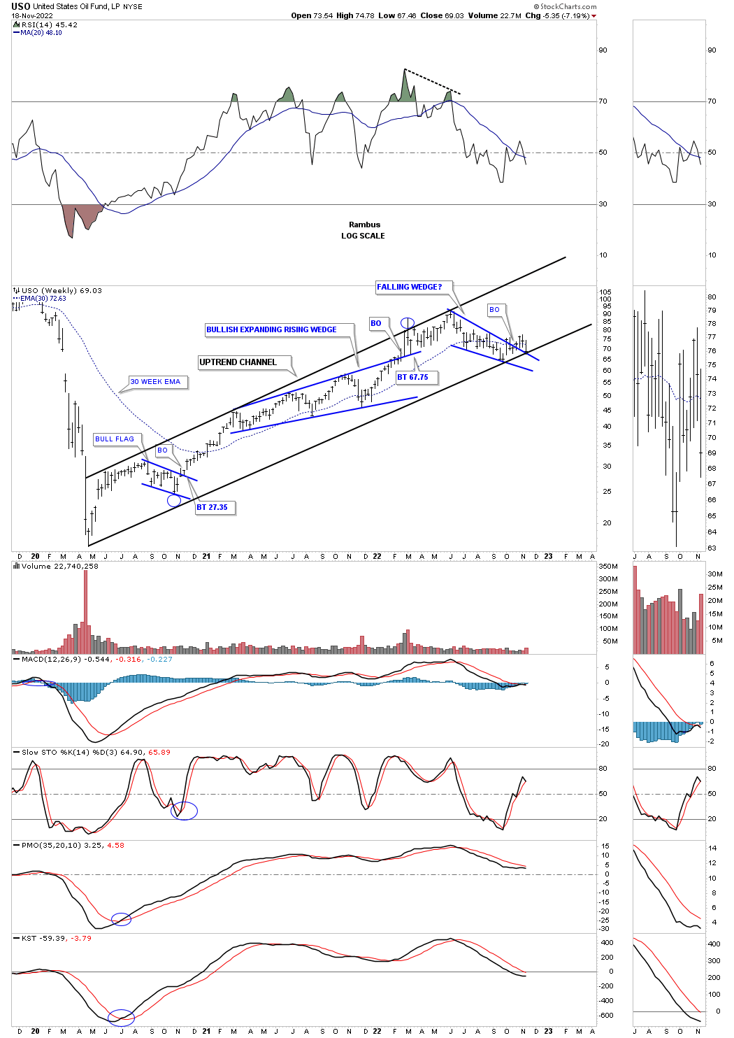
I built a few new combo chart this weekend, related to oil sector, to see if I could paint a more clearer picture of what is taking place. Since the 2020 crash low the USO, US oil fund, has had a very strong rally with the high being made back in the middle of June around 93 or so. The USO has been forming a new trading range since the June high and is currently testing the top rail of the blue falling wedge and the bottom trendline the 2020 uptrend channel. So the moment of truth has arrived.
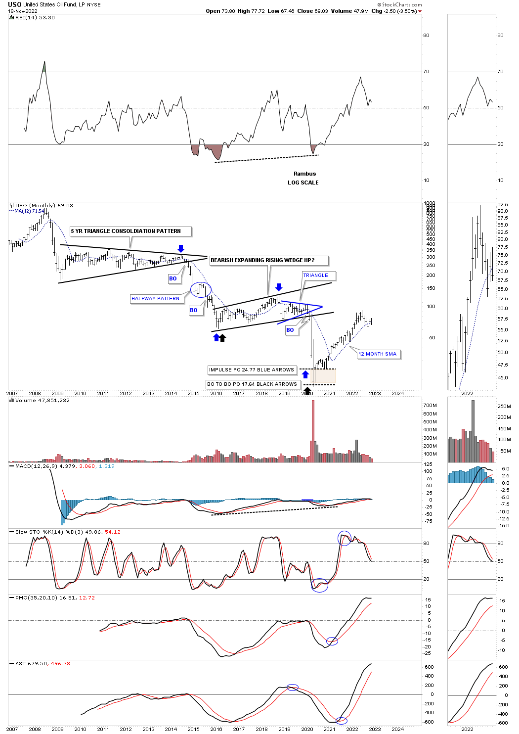
This long term monthly chart for USO shows you what a classic bear market looks like with one consolidation pattern forming below the previous one. The last consolidation pattern that formed was the bearish expanding rising wedge which worked out beautifully as a halfway pattern into the final bear market low as shown by the brown shaded S&R zone. Again, you can see the capitulation move into the final bear market low. Currently the USO is testing its 12 month sma which has done a pretty good job of holding support since the bear market low. It also did a good job of resistance during the impulse move between the two bear market consolidation patterns.
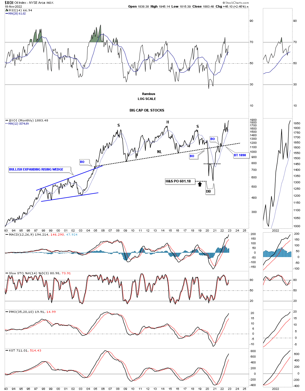
Next I would like to show you a long term monthly chart for the XOI which is made up of big cap Oil stocks. After building out it massive H&S top the breakout move into the 2020 crash low reached it price objective and then put in the double bottom that reversed that vertical move down. Note how the price action interacted with the neckline on the way back up. First, the initial hit and small selloff followed by the breakout and and backtest before moving higher. As you can see the XOI is making a new all time high this month.
Looking at this quarterly history chart you can see the secular bull market that ran from the mid 1980’s to the 2008 high which ended the bull market with a double top. After a secular bull market like that it will take years to consolidate those gains. Note the internal structure of the 2008 expanding triangle which is partly made up of the blue bullish expanding falling wedge which is strongly suggesting the top rail of the expanding triangle is going to give way. You can also see the small double bottoms and a small double top at the reversal points inside of the expanding triangle.
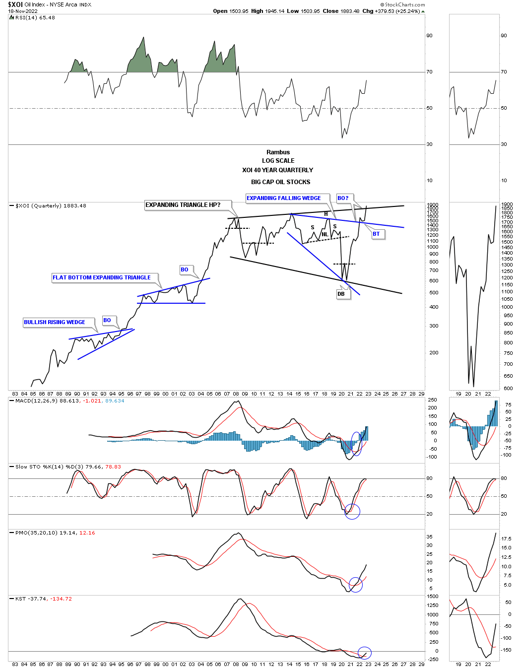
That 2008 expanding triangle on the chart above reminds me a lot of another expanding triangle that formed as a multi year consolidation pattern after another secular bull market ended.
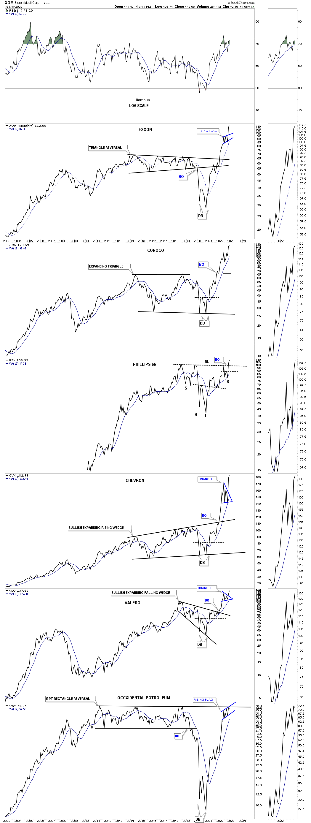
This next chart is a new combo chart I built this weekend which shows the top six big cap oil stocks that help make up the XOI.
One thing I have been noticing lately when it comes to oil and the oil stocks is that the oil stocks seem a bit stronger than oil itself so I built out a new ratio combo chart which compares some of the different areas to the USO. The first chart is just a weekly chart for the USO which shows its rally out of the 2020 crash low.

Below I used the USO to compare some of the different sectors to the USO which shows how the USO has been outperforming most of the individual areas until just recently. Note how the USO has been in a steady uptrend channel while the other areas have been trading down compared to the USO as shown on the ratio combo charts. During the nearly 2 1/2 year uptrend channel for the USO the oil sectors on this combo chart have been forming their own very large trading ranges and are breaking out to the upside which is showing these sectors are now starting to outperform the USO.
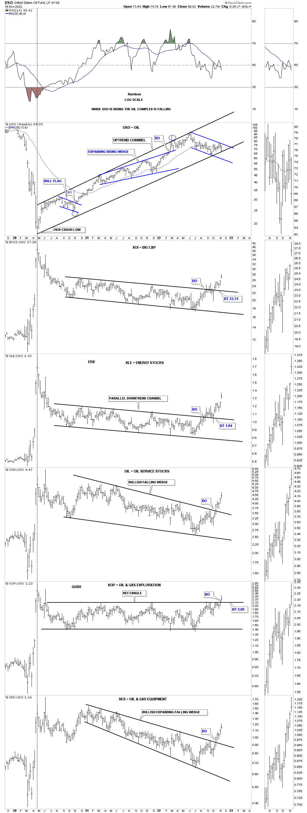
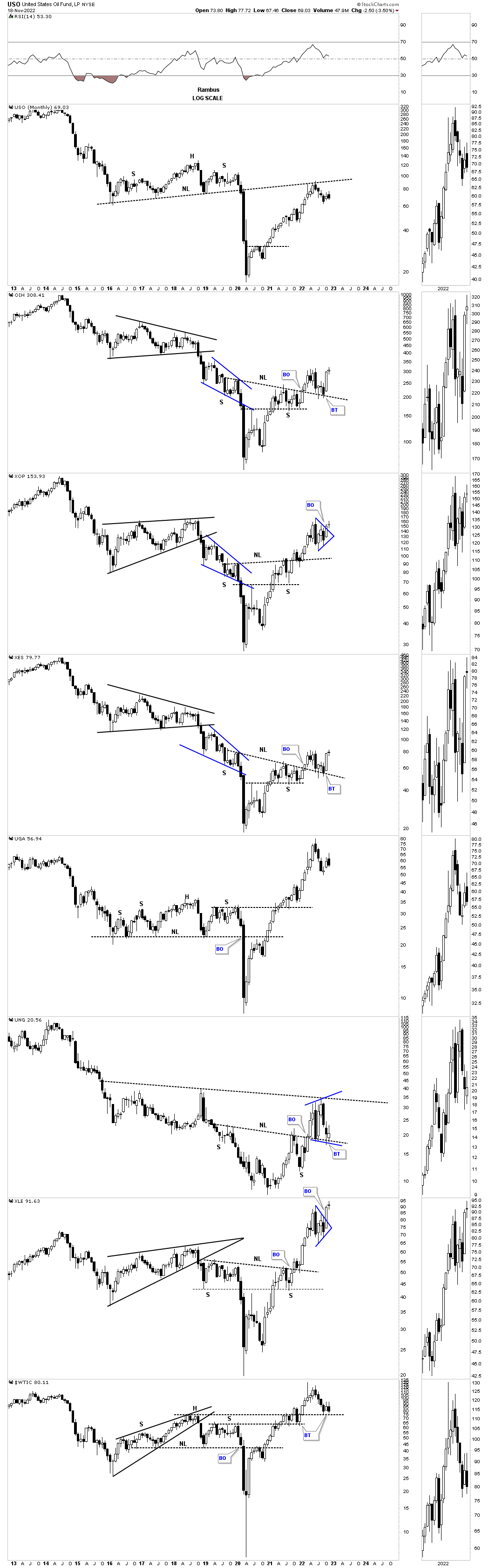
Below is a ten year candlestick chart for the oil complex which shows the large bases with many in backtest to their neckline and a few blue triangle consolidation patterns.
Another area in the energy complex is UGA, US gasoline fund, which could be entering into a new consolidation phase similar to the previous two out of the 2020 crash low.
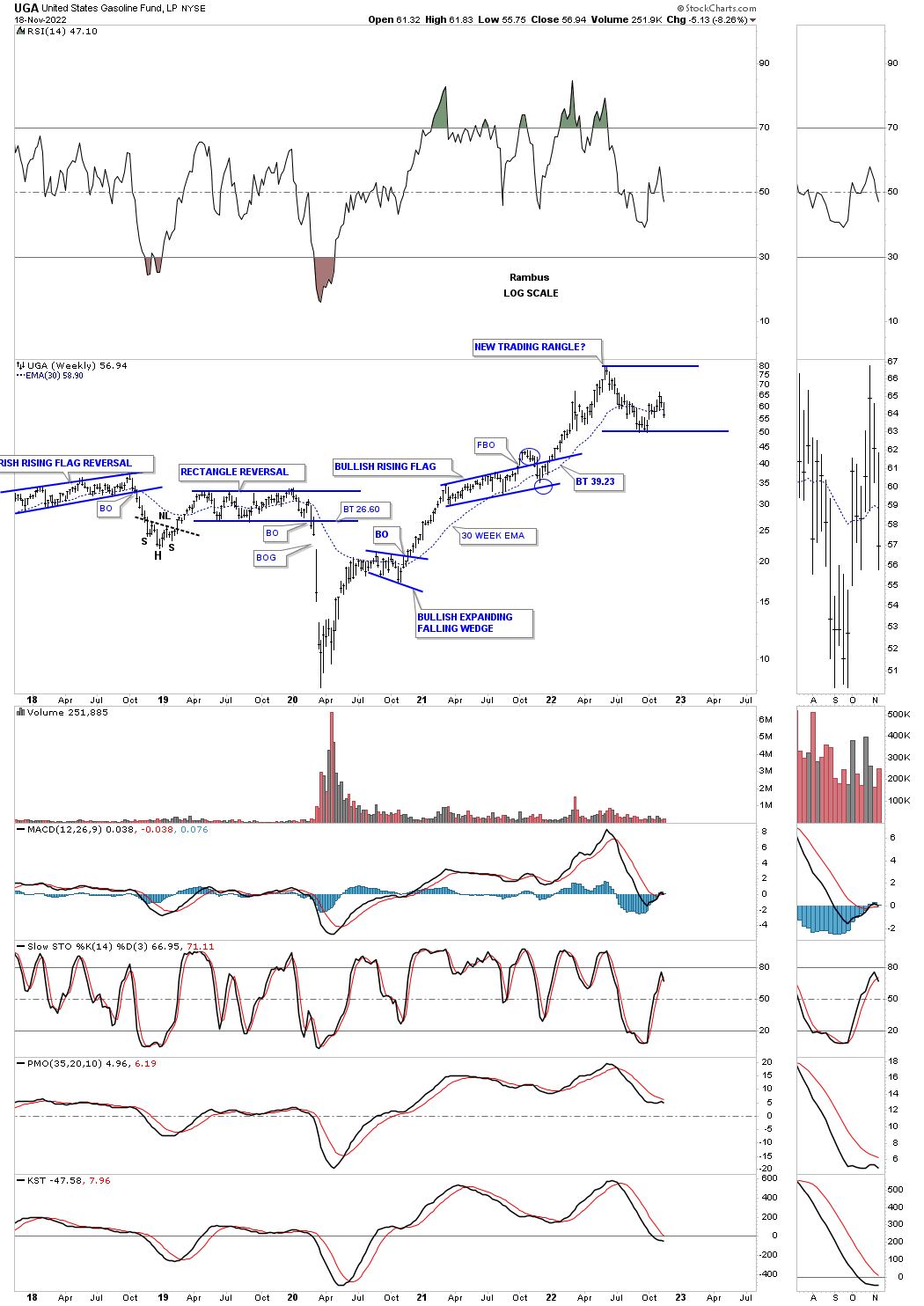
I’ve mentioned many times that an expanding falling wedge can be one of the most bullish patterns there is.
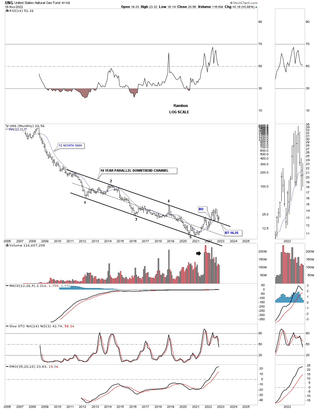
I still have my eyes on the UNG, natural gas, which could be forming the right shoulder of an unbalanced inverse H&S bototm.
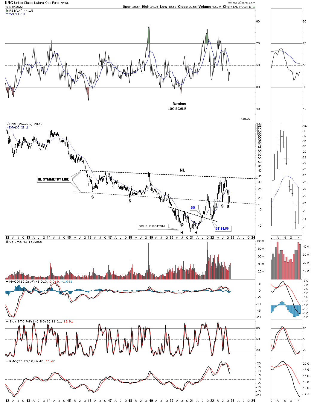
This last chart for tonight is the history chart for UNG which shows a 5 point parallel ten year downtrend channel with a breakout above the top rail and the backtest that is currently playing out.
Oil is usually a good way to judge the health of the economy. If the different oil sectors can breakout to new highs that would be a bullish sign for the US economy and the stock markets in general. As always time will tell. All the best…Rambus