The precious metals complex is an isolated area in the markets that investors either love or hate this often misunderstood sector. Most mainstream investors hardly know it even exits except for a headline that pops up once in awhile. Then there are the goldbugs that are constantly looking for the end of the world and Gold is going to be their salvation.
The truth is somewhere in the middle. There can be long periods of time when the stock markets outperforms gold which can be very frustrating if one only invests in the PM complex. Then there are other times when the precious metals complex can outperform the stock markets for long periods of time. Knowing when to invest in the stock markets or the PM complex is very important to understand if you don’t want to spend half of your trading career on the wrong side of the markets.
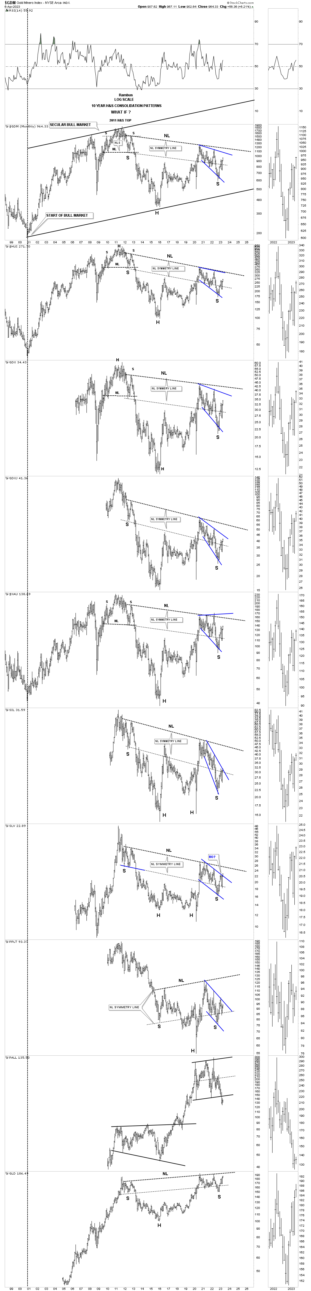
The Chartology I’m gong to show you in this Weekend Report is strongly suggesting that now is the time for the PM complex to shine and start outperforming the stock markets for a prolonged period of time. This is a fairly rare event going back to the 1970’s when Gold moved in a parabolic rally into the 1980 all time high back then. The second time Gold entered into a long term major bull market was in 2000 which lasted until that rally ended at the 2011 high at 1920.
Gold is the only area in the PM complex that has traded above its 2011 high which it did in 2020 while the rest of the PM complex, precious metals stocks and Silver are still trading well below their 2011 all time high let alone their 2020 high. What this means is that the precious metals stocks are very undervalued which can lead to enormous profits if one knows when to get in and get out.
The PM complex has has a secret that few mainstream investors know about and that is the junior exploration and small cap mining stocks that can move five to ten times off their lows which can be very rewarding to say the least if one can get in early enough.
The US dollar will be a key component if the PM complex is ready to embark on the next important leg up in its secular bull market that began at the 2000 lows. If you’ve been following the PM complex for any length of time then you know there is an inverse correlation between Gold and the US dollar that is very strong, but not absolute. There are times when they both can move in the same direction for a period of time, but eventually the inverse correlation always comes back into play.
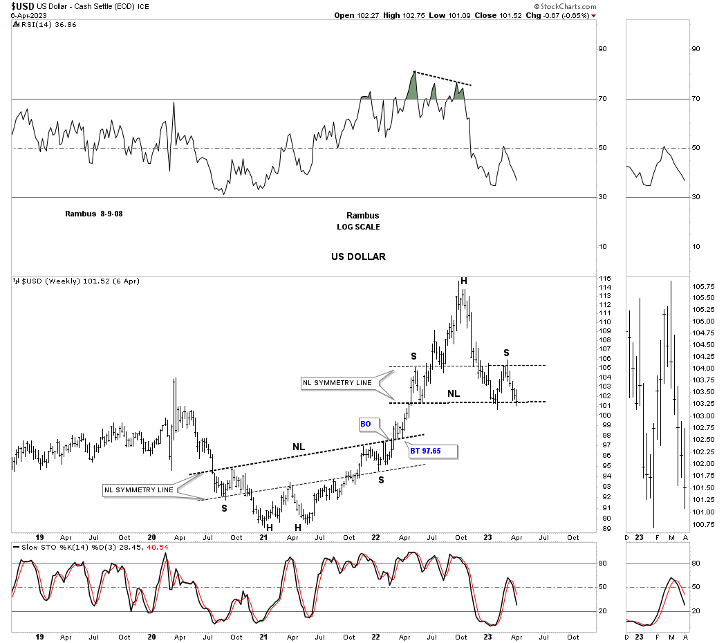
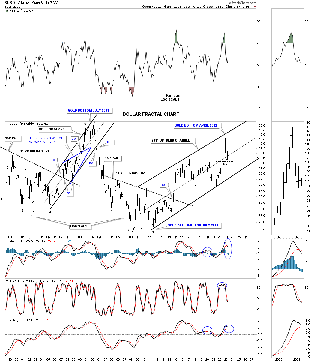
Lets start with just a simple look at the US dollar going back to 2019. The US dollar bottomed in January of 2021 which formed the head of a very symmetrical H&S bottom as shown by the neckline symmetry line. The neckline symmetry line is just the neckline moved down to the left shoulder low which often will show you where to look for a right shoulder low once the head is complete.
There was a classic breakout and backtest to the neckline which launched the US dollar’s impulse move up to the October 2022 high. As you can see that rally was pretty steep going almost parabolic. After topping out the US dollar began to decline in earnest which at that time looked pretty normal after such a strong rally. The problem for the US dollar began when it traded below the left shoulder high which set up the possibility that a H&S top might be under construction.
The US dollar declined even further to reach the previous low made on the way up. At that point the possible H&S top was beginning to take shape, but we needed to see a small countertrend rally to form the right shoulder. Here again you can see how the neckline symmetry line showed us a place to look for the right shoulder high which has given us a very symmetrical H&S top with one caveat. All the pieces are in place except for the breakout which must occur before the H&S top is completed.
This next chart for the US dollar shows the last strong impulse move that occurred on the breakout from the eleven year base and went vertical as shown by all the white candlesticks all in a row. From that high the US dollar traded sideways forming the small rectangle with the false symmetry breakout of the top and bottom trendlines, thin horizontal black lines.
Eventually the US dollar formed a very large rectangle consolidation pattern, solid back lines. The daily chart just above shows the the bottom of the last reversal point in the rectangle as a H&S bottom and the false breakout high above the top of the rectangle as the H&S top on the chart above. The black rectangle should have been a consolidation pattern to the upside, but when the price action failed on the backtest that threw up another big red flag that something was amiss. The price action above the rectangle is what I would now call a bull trap. In order to negate the bull trap the US dollar will have to trade back above the top rail and take out the previous high.
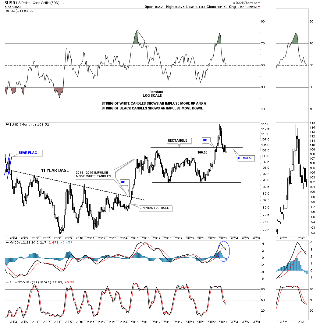
Below is a longer term version of the chart above which shows the two separate eleven year fractal bases labeled big base 1 and big base 2 with each base leading to a strong bull market. Here again you can see how the once promising rectangle is failing.
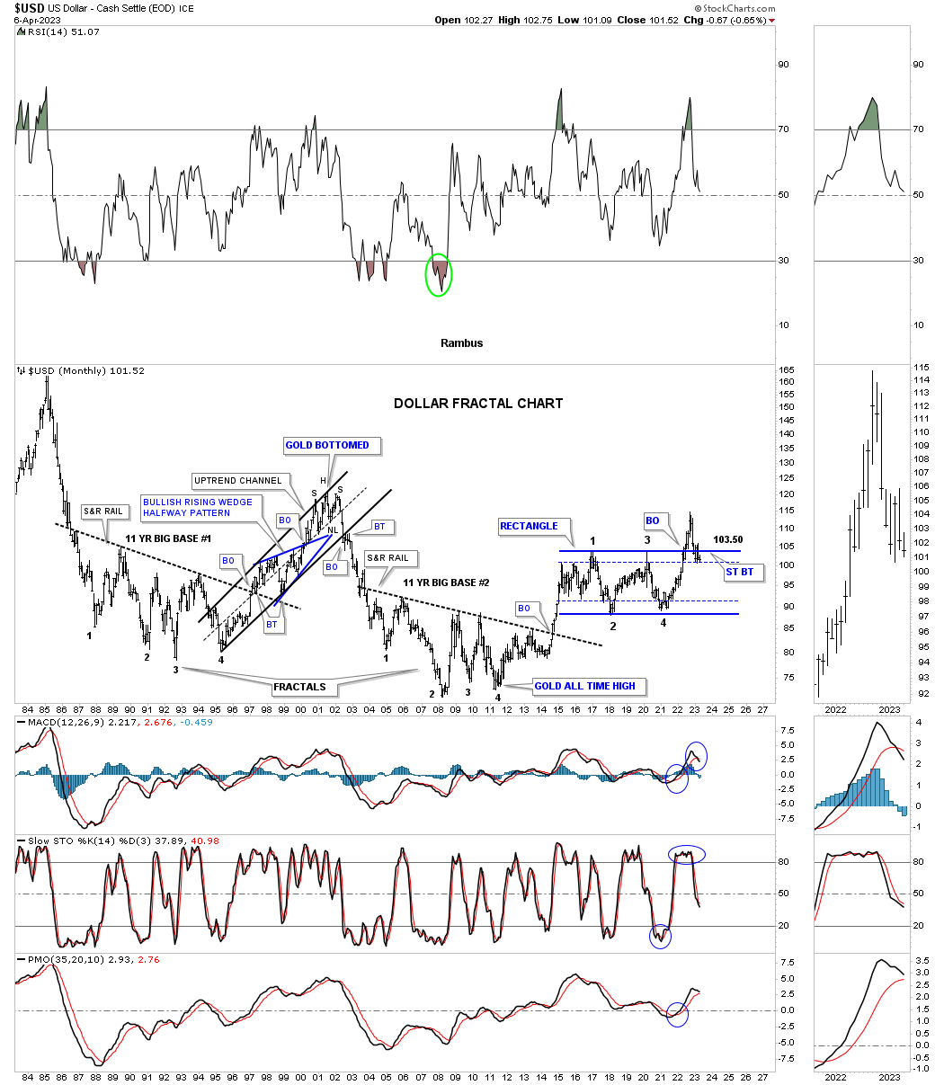
After the breakout from big base 2 the US dollar has formed a pretty decent major uptrend channel that is not perfectly parallel, but is pretty close. You can see how the H&S top, on the daily chart above, is forming on top of the center dashed midline of the major uptrend channel. The US dollar could decline all the way down to the bottom rail and the secular bull market would still be intact. On the other hand if the US dollar breaks below the bottom rail of the secular bull market, that began around the 2011 low, the secular bull market would be over which would dramatically affect the precious metals complex in a positive way.
Note the high in the US dollar back in 2000 which launched the PM complex bull market. The 2011 low marks where the PM complex bear market began. The recent high made in 2022 could be showing us the beginning of the PM complexes new secular bull market leg underway.
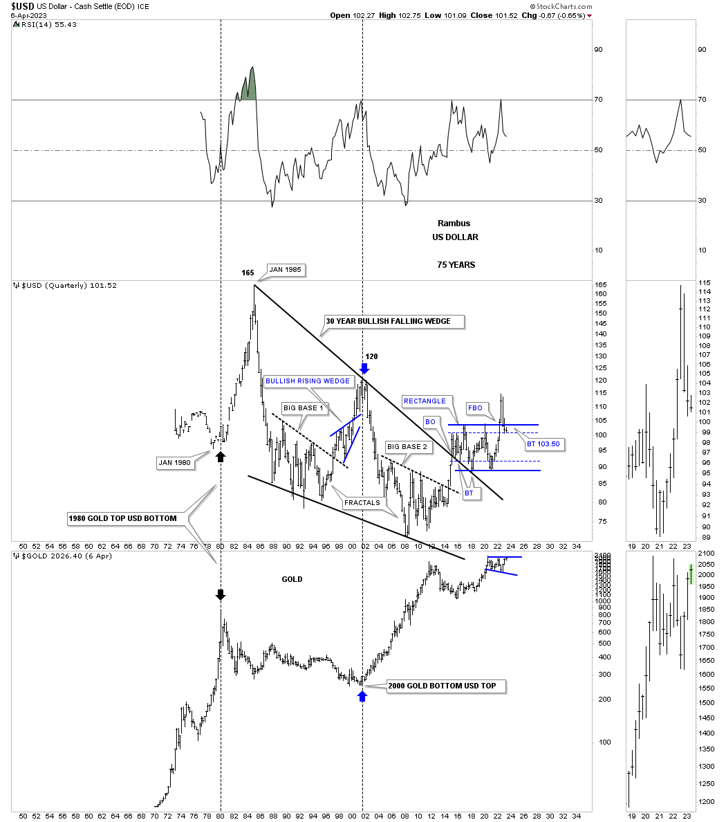
This last chart for the US dollar is a 75 year combo chart with the US dollar on top and Gold on the bottom. Here again you can see the inverse correlation which isn’t perfect, but close enough to pay attention to. You can see how the top in the US dollar could affect Gold which is trading close to its all time highs. A breakdown in the US dollar will most likely lead to a breakout to the upside for Gold.
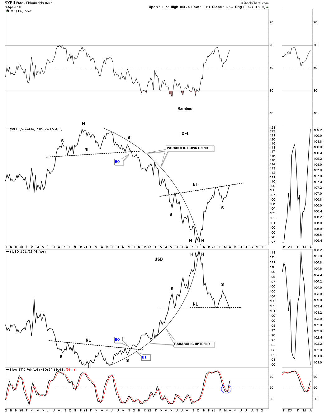
Below is another simple combo daily line chart which has the XEU, Euro on top with the US dollar on the bottom. The XEU makes up the biggest part of the US dollar so it is understandable that they should have an inverse look.
I mentioned earlier that the US dollar’s rally out of its 2021 H&S bottom looked nearly parabolic which you can clearly see on this chart which also shows the XEU going parabolically down. It is easy to see that the critical inflection point for the US dollar is right here and now which is going to have a pronounced affect on the PM complex if the H&S top on the US dollar completes to the downside.
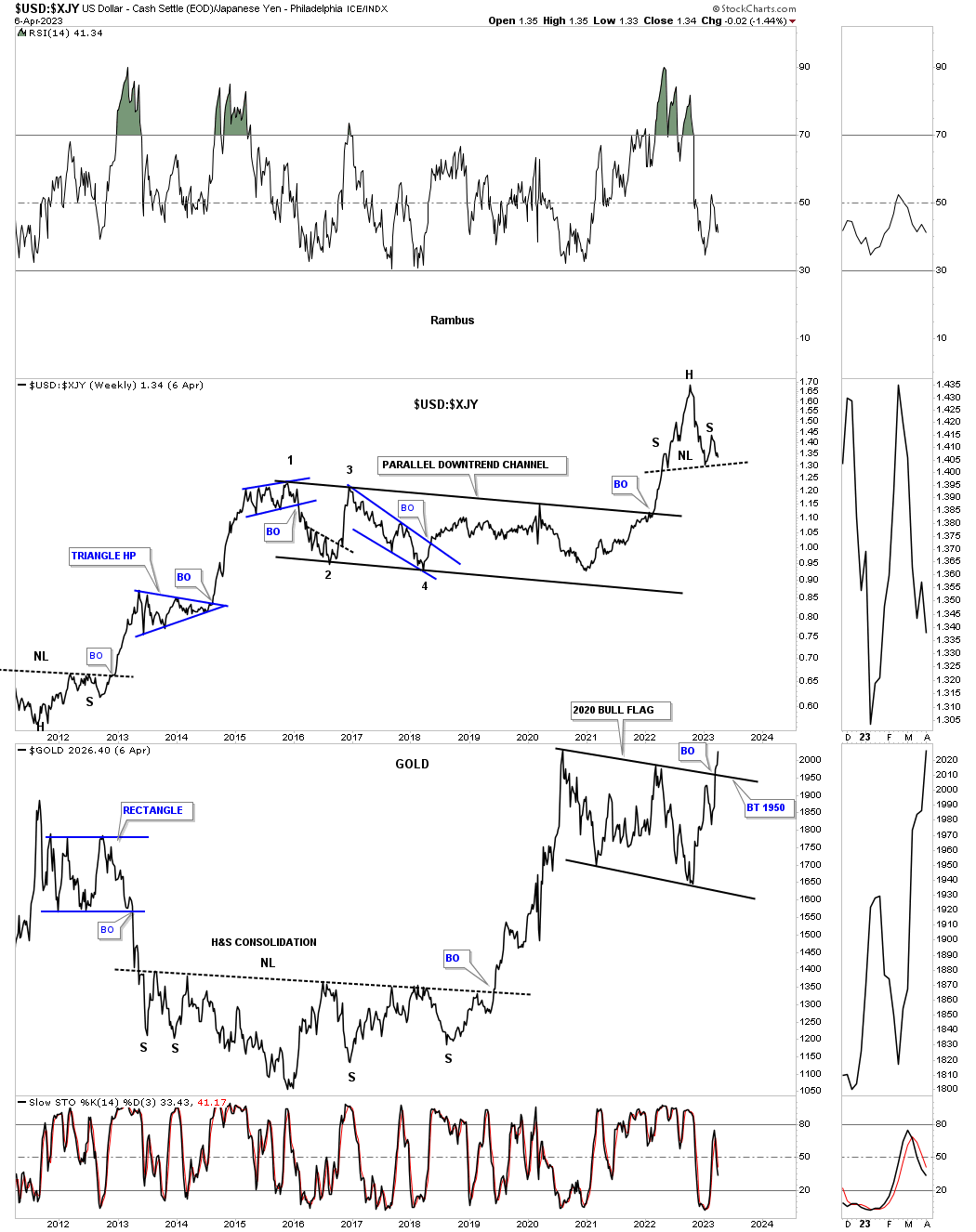
This next chart is a ratio combo chart with the US dollar:XJY ratio on top with Gold on the bottom. Note how strongly the US dollar outperformed the Yen out of the 2021 low and how Gold just traded sideways. As you can see the ratio chart on top is showing a H&S top meaning the US dollar is weaker than the Yen and as we have seen in the past that the PM complex and the Yen can move in the same direction for long periods of time. Note the rally out of the 2011 low in the ratio which was the 2011 high in Gold.
There is a lot of discussions going on right now in regards to Gold’s 2020 trading range. If one only looks at a bar chart they are missing the potential breakout that has already taken place with a possible backtest to the top rail still in play. If the potential H&S top on the ratio chart completes that will create a strong tailwind for the PM complex.
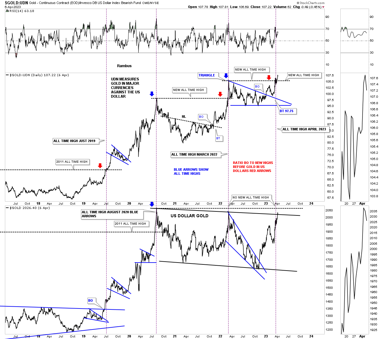
This next ratio combo chart is a long term look at the Gold:UDN ratio on top with Gold on the bottom. The Gold:UDN ratio shows you how Gold is doing in most of the important currencies of the world so when it is rising it says Gold is strong in many of the important currencies of the world and when it is falling Gold is weaker.
Through the years you can see the ratio on top can often lead Gold to new all time highs as shown by the red arrows. Just recently you can see how the ratio has just broken out to a new all time high while Gold in US dollars is approaching its all time highs. Here agin I think the ratio is leading with Gold in US dollars not far behind.
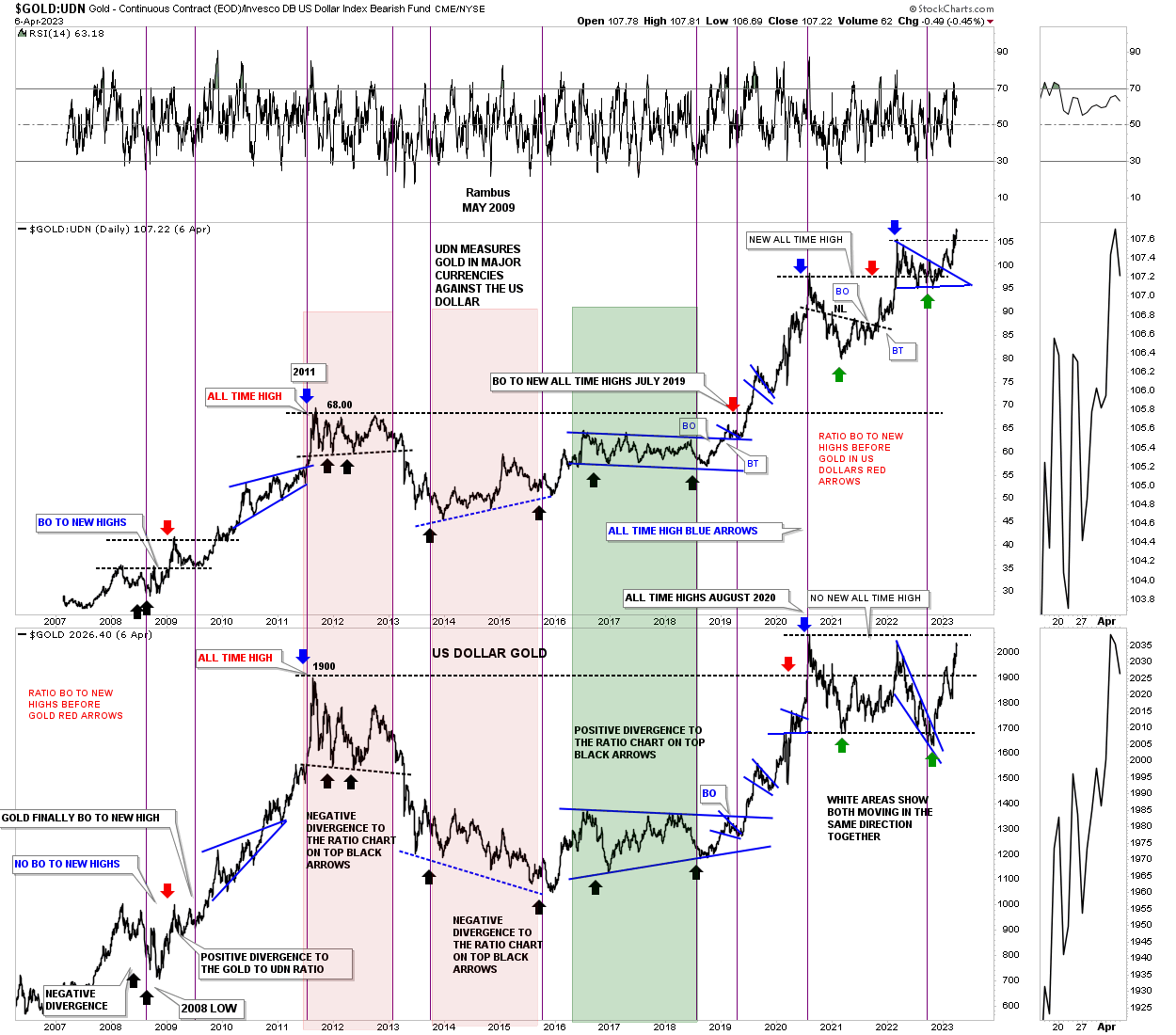
Below is a closeup look at the ratio combo chart above showing the recent breakout in the Gold:UDN ratio with Gold on the bottom attempting to breakout from its 2020 trading range which strongly suggest Gold is not far from breaking out into new all time high territory.
This next chart is a simple ratio chart which compares Gold to the SPX using the 200 week sma for long term buy and sell signals. When the ratio is falling you want to be trading the SPX in no uncertain terms. At major reversal points in long term trends the bottoming process can take quite a long time to complete.
The ratio has experienced a couple of whipsaws down at the multi year lows which is fairly rare. There was the big whipsaw where the ratio gapped above the 200 week sma in early 2020 which at the time looked like Gold was ready to start outperforming the SPX in a big way, but the 200 week sma failed to hold support on the backtest from above. Then over the last year there have been a couple of small whipsaws which you see more in trading ranges than impulse moves. Currently the price action has completed four weeks of trading above the 200 week sma on its most recent long term buy signal.
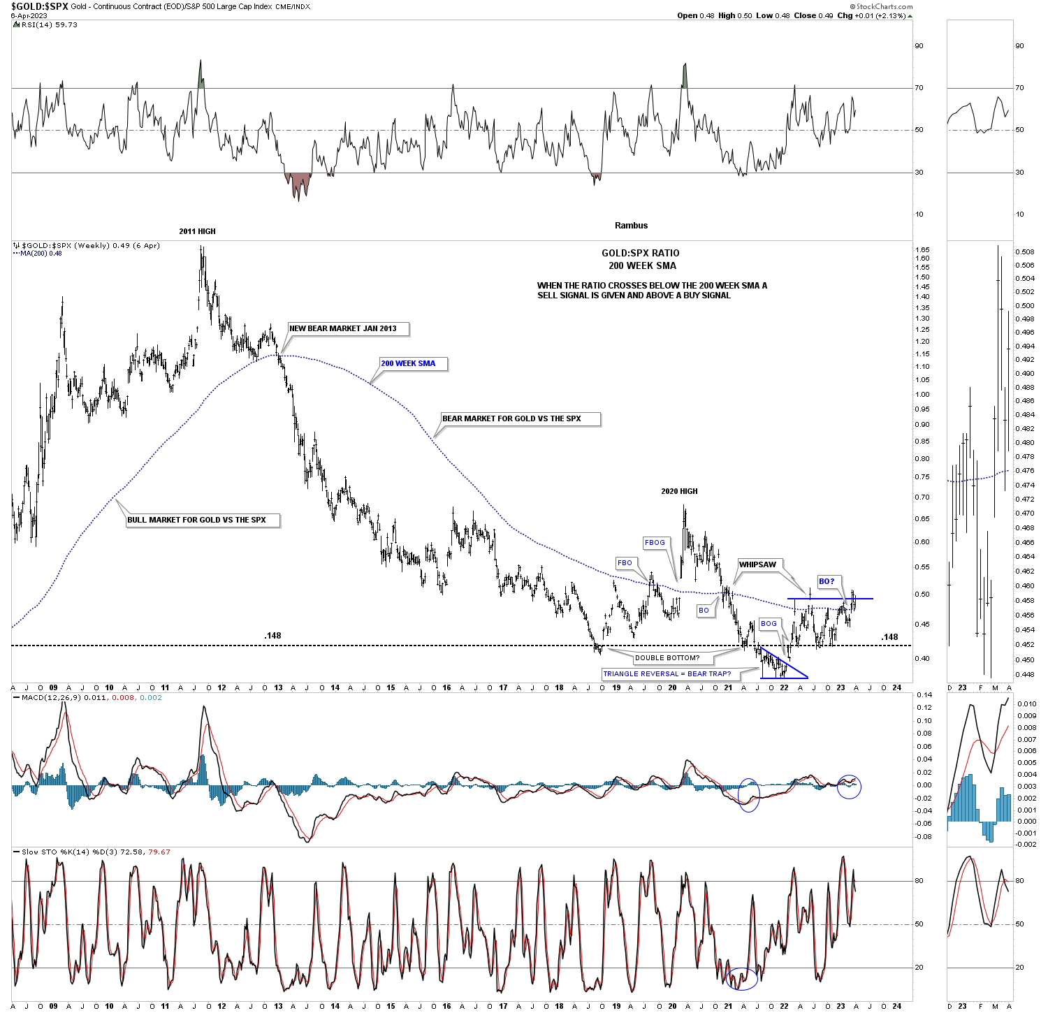
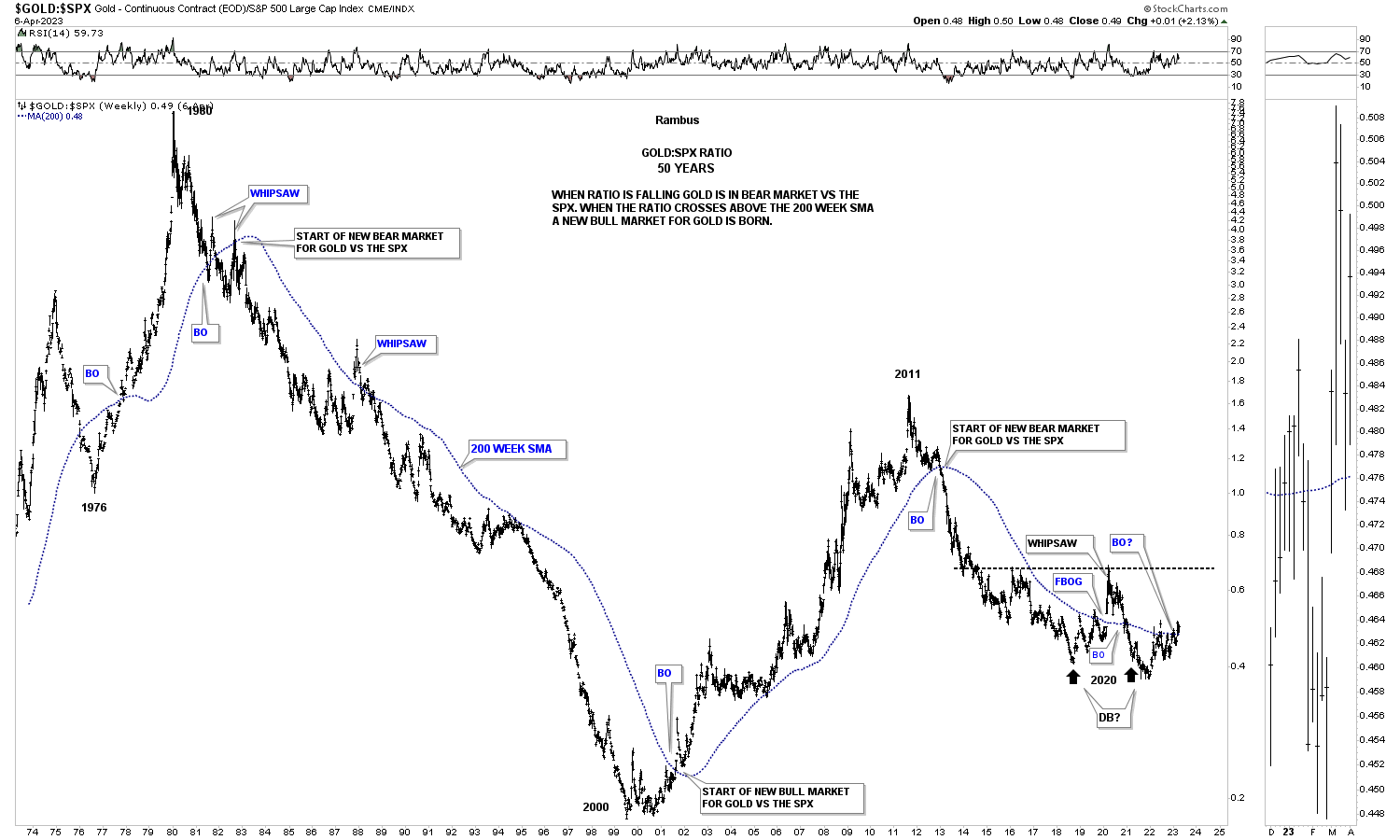
Below is the same ratio chart as the one above, but goes back 50 years. Note how the 200 week sma held the ratio in check for most of the decline except for a couple of small whipsaws early on. At the bottom of the chart you can see how the ratio changed over from Gold underperforming the SPX which ended at the 2000 low to Gold outperforming the SPX and stayed in affect until the 2011 high when the top formed. From that 2011 high the SPX has been outperforming Gold with Gold trying to turn the trend in its favor if it can complete the bottom. Again, you can see the ratio is on a long term buy signal as long as it can trade above the 200 week sma.
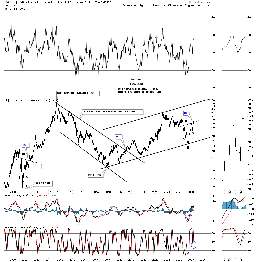
Below is another ratio chart which compares Gold:US dollar. The last time Gold really outperformed the US dollar was shortly after the 2008 crash which produced that H&S consolidation pattern which led to the final parabolic run into the 2011 all time highs. As you can see the ratio has now built out another H&S bottom with a breakout above the neckline last week. Here again if Gold is going to embark on a new impulse move higher it will need to outperform the US dollar which this ratio chart is showing is very possible.
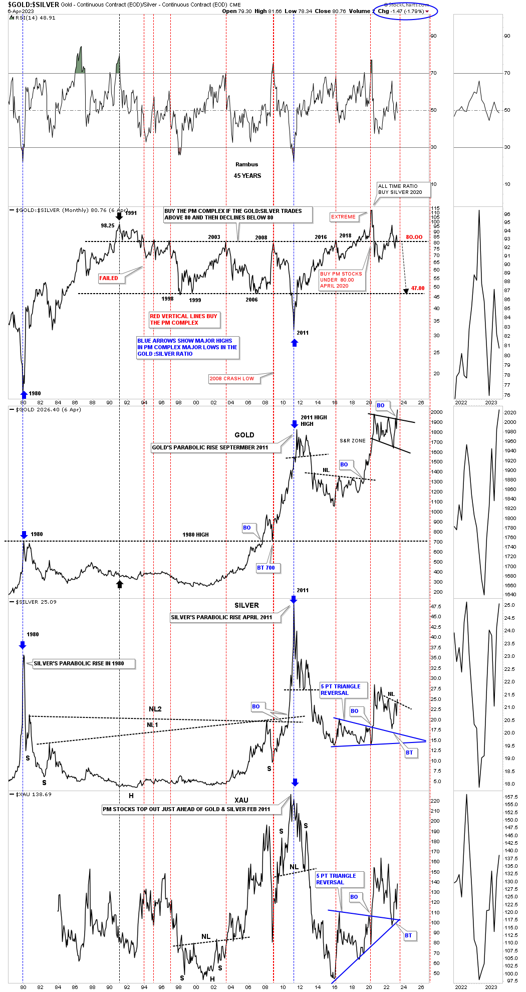
Everyone has their own interpretation on how to use the Gold:Silver ratio. This ratio combo chart has the Gold:Silver ratio on top followed by Gold, Silver with the XAU on the bottom. Just before the 2020 rally started in the PM complex I showed this chart showing how extreme the ratio was as it was trading at the highest point in history. We did get a strong move up in the PM complex, but was short lived.
Normally when the ratio trades above 80 and then closes back below 80 is when you get a buy signal for the PM complex which has worked pretty good in the past, but not always. Currently the ratio is less than a point away from dropping below 80 which will give a buy signal for the PM complex signal.
Since this is a weekly line chart note the bull flag on Gold that has already broken out. Silver is just below and shows a breakout from a H&S consolidation pattern last week while the XAU on the bottom shows a backtest to the top rail of its 5 point triangle reversal pattern. The stage is set, now we just need to see some follow through.
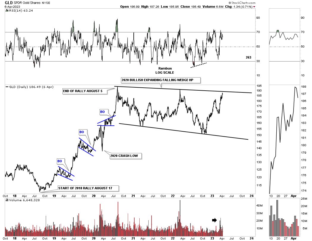
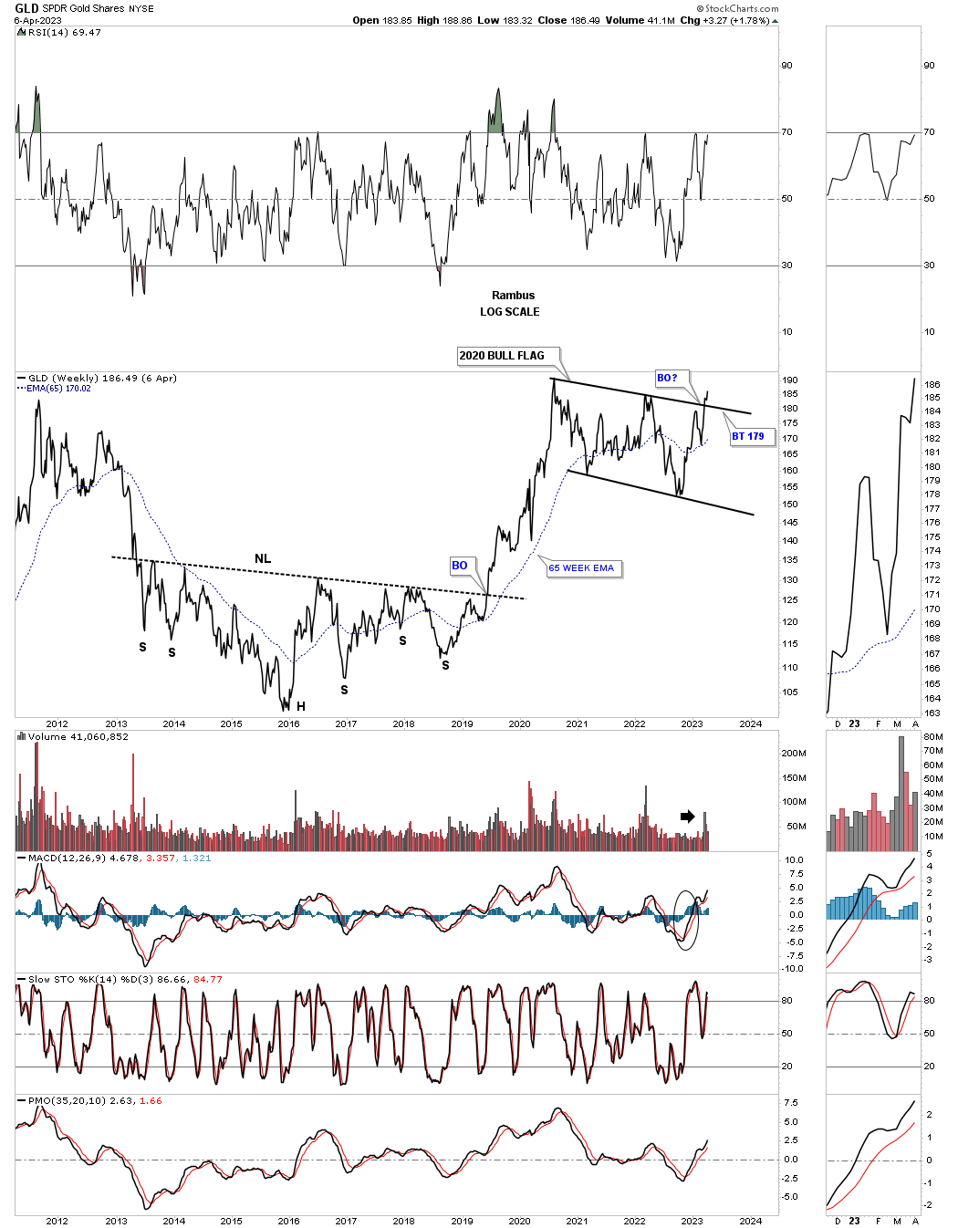
I would like to finish up by showing a daily, weekly, monthly and quarterly line chart for Gold. I have mentioned many times in the past that a line chart can often show a breakout before a bar chart because it takes out a lot of noise a bar chart can make especially long tails or wicks.
The daily line chart for Gold showing the 2020 trading range.
The weekly line chart showing the breakout with a possible backtest to complete the breaking out and backtesting process.
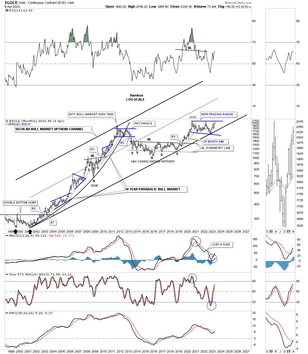
The monthly line chart showing the breakout from the 2020 trading range with NL2 coming into the picture. It is possible we could see a ping pong move between the top rail of the blue 2020 trading range and the neckline before the actual breakout and commencement of the next impulse move up begins in earnest.
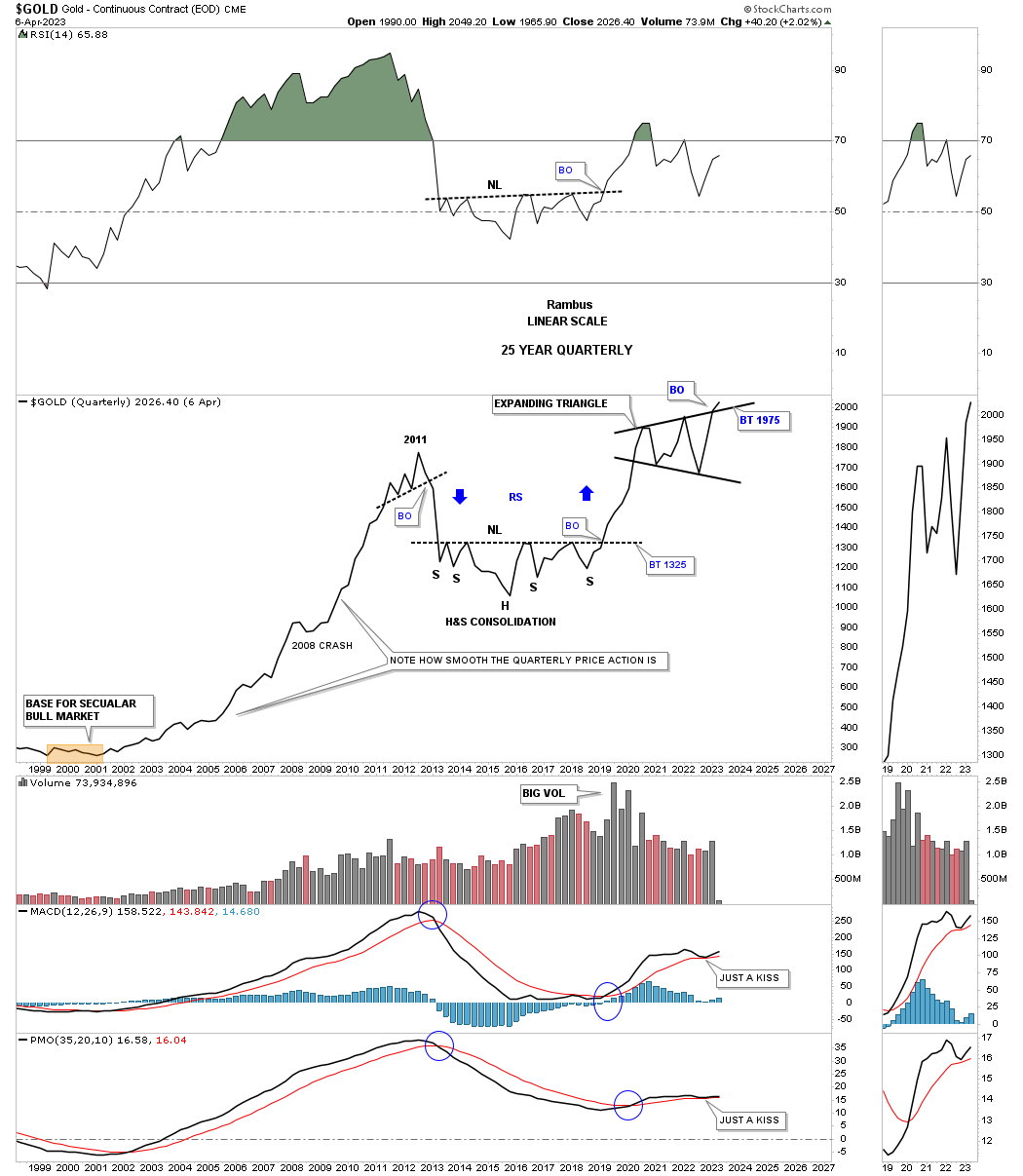
Next is a long term quarterly line chart which stretches all the back to the beginning of Gold’s secular bull market that began at the 2000 low. As you can see if Gold isn’t chopping out an important trading range of which there are just three, it is strongly trending up.
Note how shallow the declines were from the 2000 bottom to the 2011 all time high back then. The biggest correction was the 2008 crash low which looks like nothing at all from this perspective. You can see the 2011 top that ended that bull market and the large H&S consolidation pattern that ended the bear market and launched the new phase of the secular bull market. Again, note the nice clean two year rally above the neckline to the 2020 highs. Last but not least you can see the 2020 expanding triangle with a breakout already in place on a quarterly closing basis.
I could post another 10 or 15 more charts to show why I think the next leg up in the PM complex is about to get underway, but this post is getting long and I need to wrap it up.
Gold’s secular bull market starting at the 2000 low.
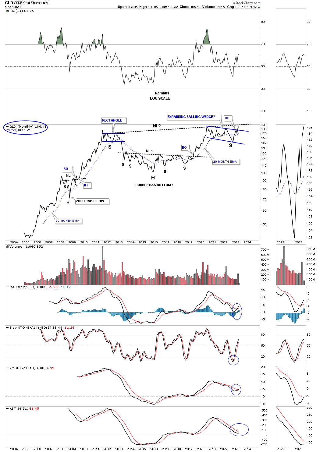
This last chart for tonight is a long term monthly combo chart for the PM complex showing what I was thinking well over a year or so ago when I first built this chart. Once it became apparent that the 2020 high was in place I added a trendline connecting the 2011 high to the 2020 high which gave me a neckline. A year ago the left and right shoulders were more symmetrical, but with the last shakeout move to the downside the right shoulder became much deeper as shown by the neckline symmetry line. Even though that is the case it still doesn’t undermine the massive H&S bottoms that have been forming since 2011.
As you can see there is still a lot of work to do to confirm all these potential H&S bases, but the 2020 blue trading range is going to be our first big clue that those massive necklines are properly placed with GLD showing the way.
Sorry for the long Weekend Report, but I think the PM complex is at a critical inflection point of which we haven’t seen in quite some time. All the best…Rambus