I know the title of this Weekend Report may sound a little bold, but after tracking the 2020 trading range from every imaginable point of view I can say with a strong vote of confidence that the beginning of the next important advance in its secular bull market for Gold, that began at the 2000 low, is underway.
We could still see a backtest to the breakout point, but that would just be part of the breaking out and backtesting process.
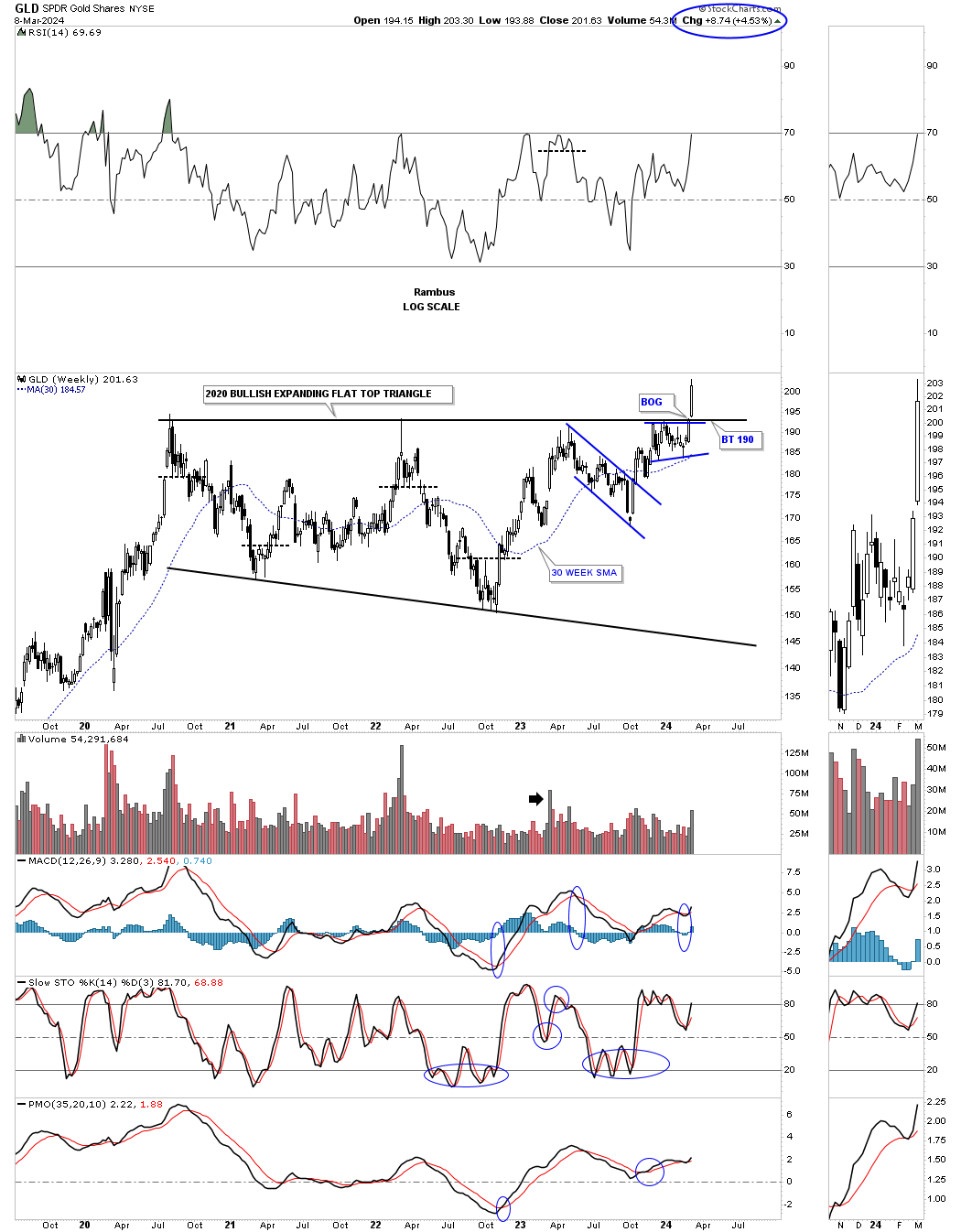
Lets start with the weekly chart for the GLD which shows the 2020 trading range which I’ve labeled as a flat top expanding triangle. This nearly 4 1/2 year consolidation pattern can also be called a cup and handle or a H&S consolidation. At this point it’s just semantics.
Last Monday March 4th you can see the breakout from the 2020 bullish expanding falling wedge. Its a bit hard to see on this long term weekly chart, but if you look at the thumbnail on the right sidebar you can see the breakout gap that occurs on Monday. The top trendline of the 2020 trading range has always been tough to figure out exactly where to draw it, you know one was there, but there were several different ways it could have been drawn. With the breakout gap last Monday there is no doubt on how the top rail can now be applied.
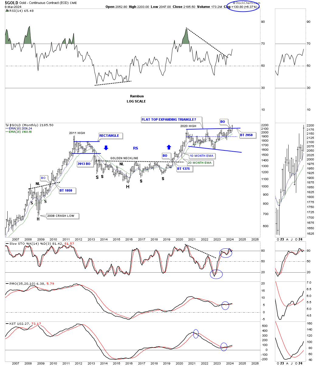
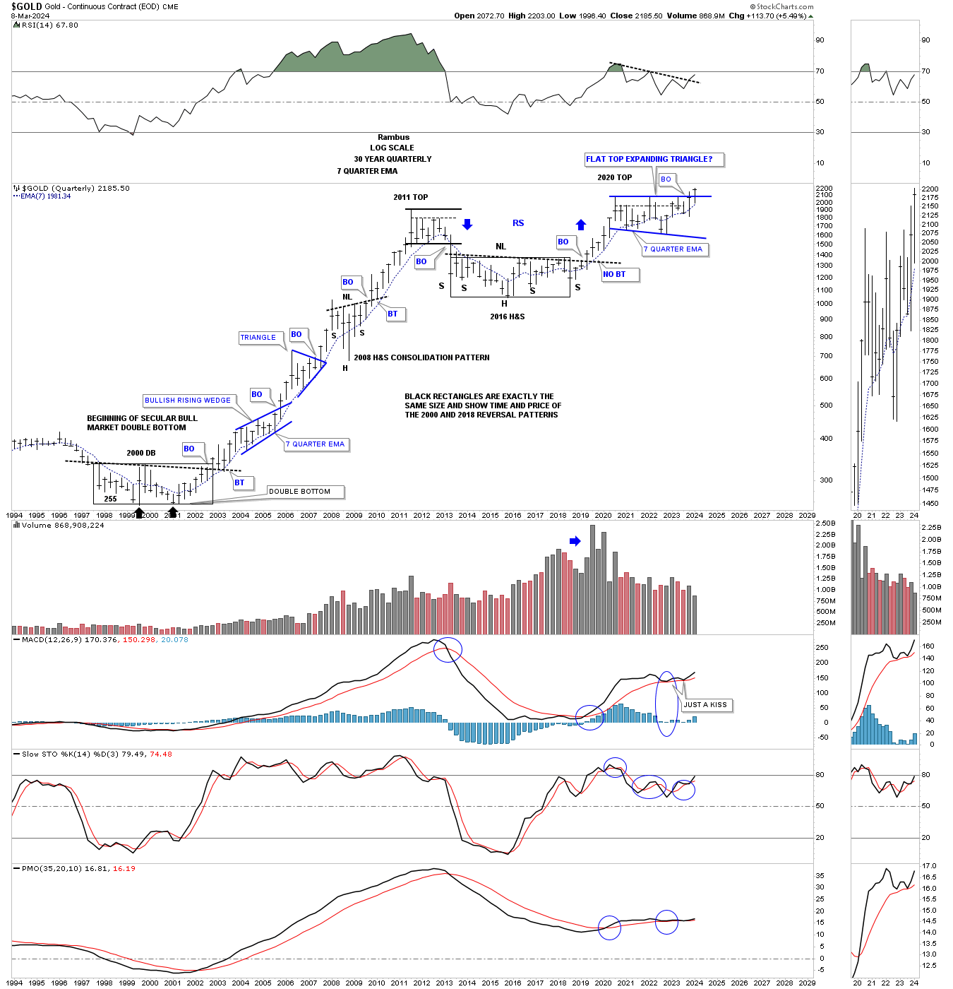
Next is a longer term monthly chart which puts the 2020 trading range into perspective. This chart starts at the 2008 crash low where Gold formed a beautiful H&S consolidation pattern which launched Gold on its way to the 2011 all time high.
Next came the bear market which bottom in 2016 which created the head of the very large 2016 H&S consolidation pattern. The breakout from the 2016 H&S consolidation pattern led to the next important impulse move which topped out just above the 2011 high in 2020.
Keep in mind the job of a consolidation pattern is to sow doubt in your mind about the validity of the bull market and after 4 1/2 years few will have a hard time adjusting to the new paradyme shift that is now taking place from consolidation to impulse. Also the bigger the consolidation pattern the bigger the impulse move.
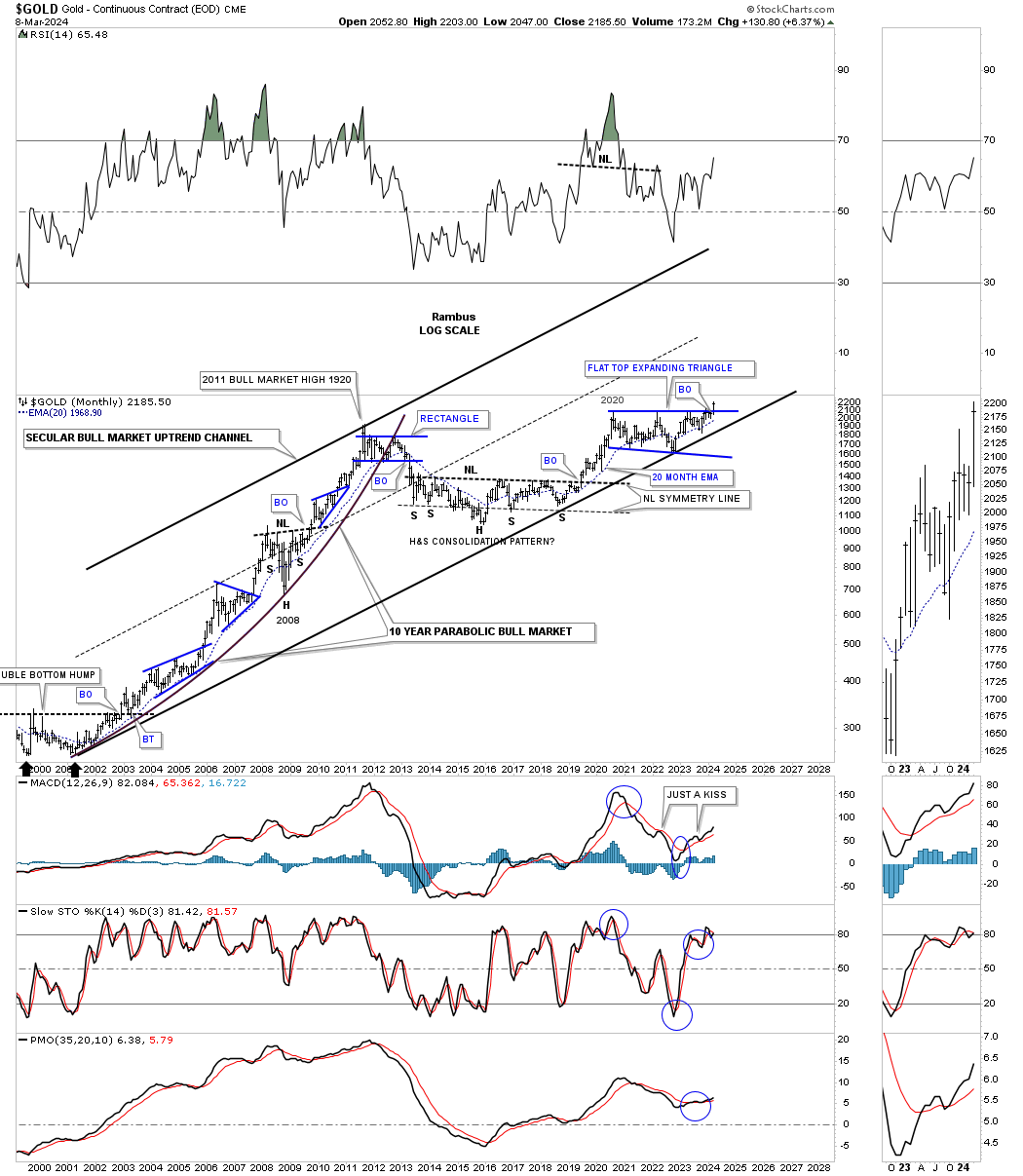
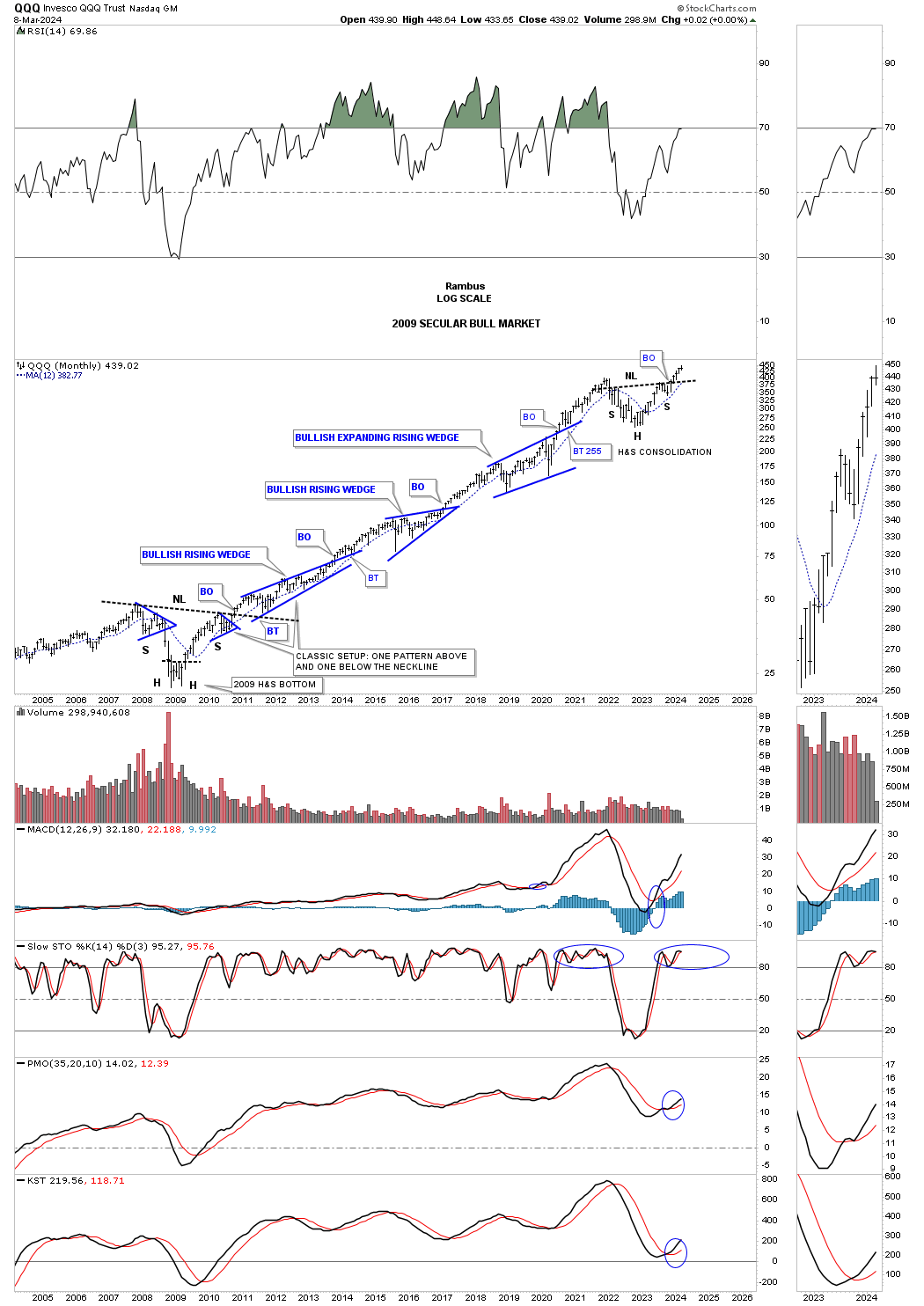
In Friday’s Market Update I mentioned how the QQQ has overtaken the beautiful Chartology of the bull market consolidation patterns that Gold had made during its 2000 to 2011 bull market run with one consolidation pattern forming on top of the previous one as shown on the chart below. Even on this log scale chart you can see the bull market was going parabolic into the 2011 high.
As you can see the bottom trendline of the 2000 secular bull market uptrend channel has been tested on several occasions with the last one being the October 2022 low. Now we can see the monthly bar all by itself above the top rail of the 2020 trading range. Also note how well the 20 month ema has held support during strong advances.
This monthly chart for the QQQ shows its secular bull market that began at the 2009 crash low and the beautiful Chartology with one consolidation pattern forming on top of the previous one and now holds the crown for the best looking secular bull market vs the Gold 2000 to 2011 bull market.
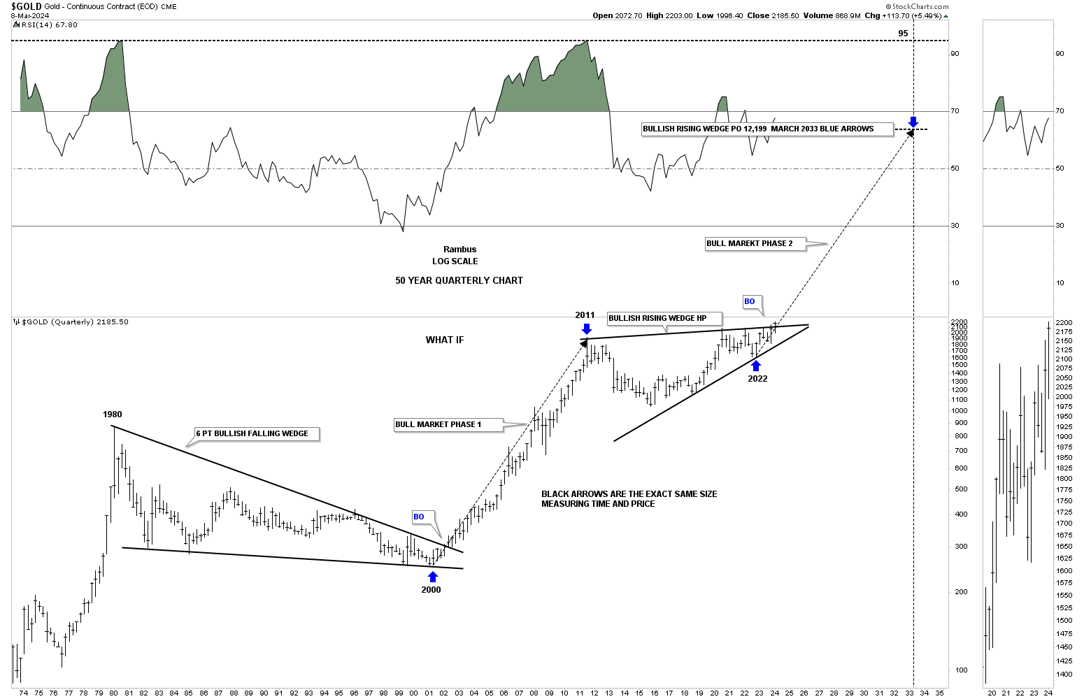
This 50 year quarterly chart compares the 2000 base to the 2016 base with both rectangles being exactly the same size measuring time and price. It the 2000 base was large enough to launch an eleven year bull market it would make sense that the 2016 base should be big enough to launch a similar bull market.
The first consolidation pattern that formed when Gold broke out of the 2000 double bottom base was the blue bullish rising wedge. The first consolidation pattern to have formed since the breakout from the 2016 base is the 2020 blue flat top expanding triangle. Note the impulse moves when a consolidation or reversal pattern is complete.
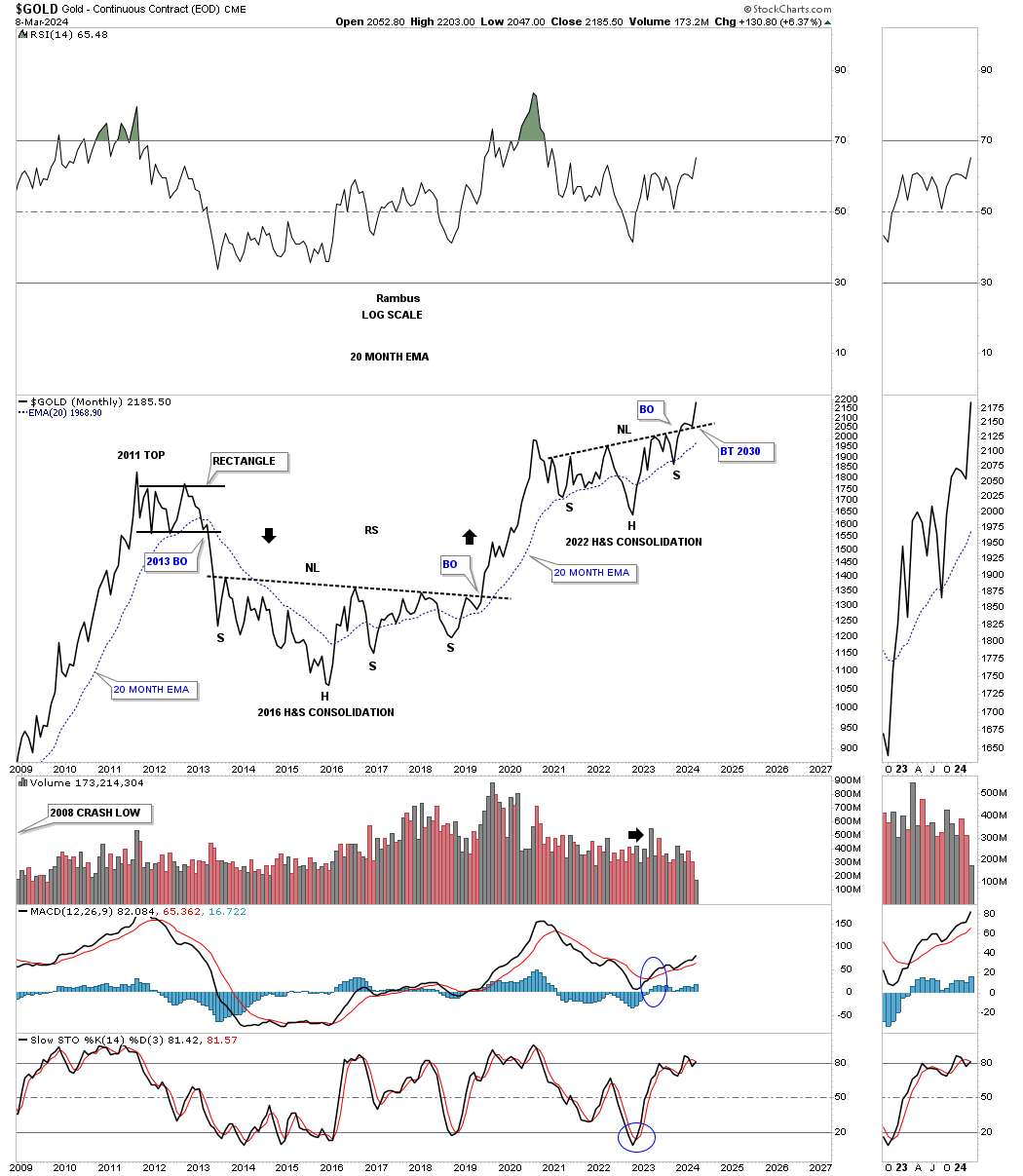
From a monthly line chart perspective you can see the 2016 H&S base and the 2022 H&S consolidation pattern which now shows a breakout and backtest to the neckline with the new impulse move beginning.
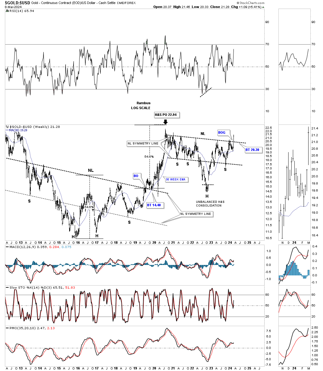
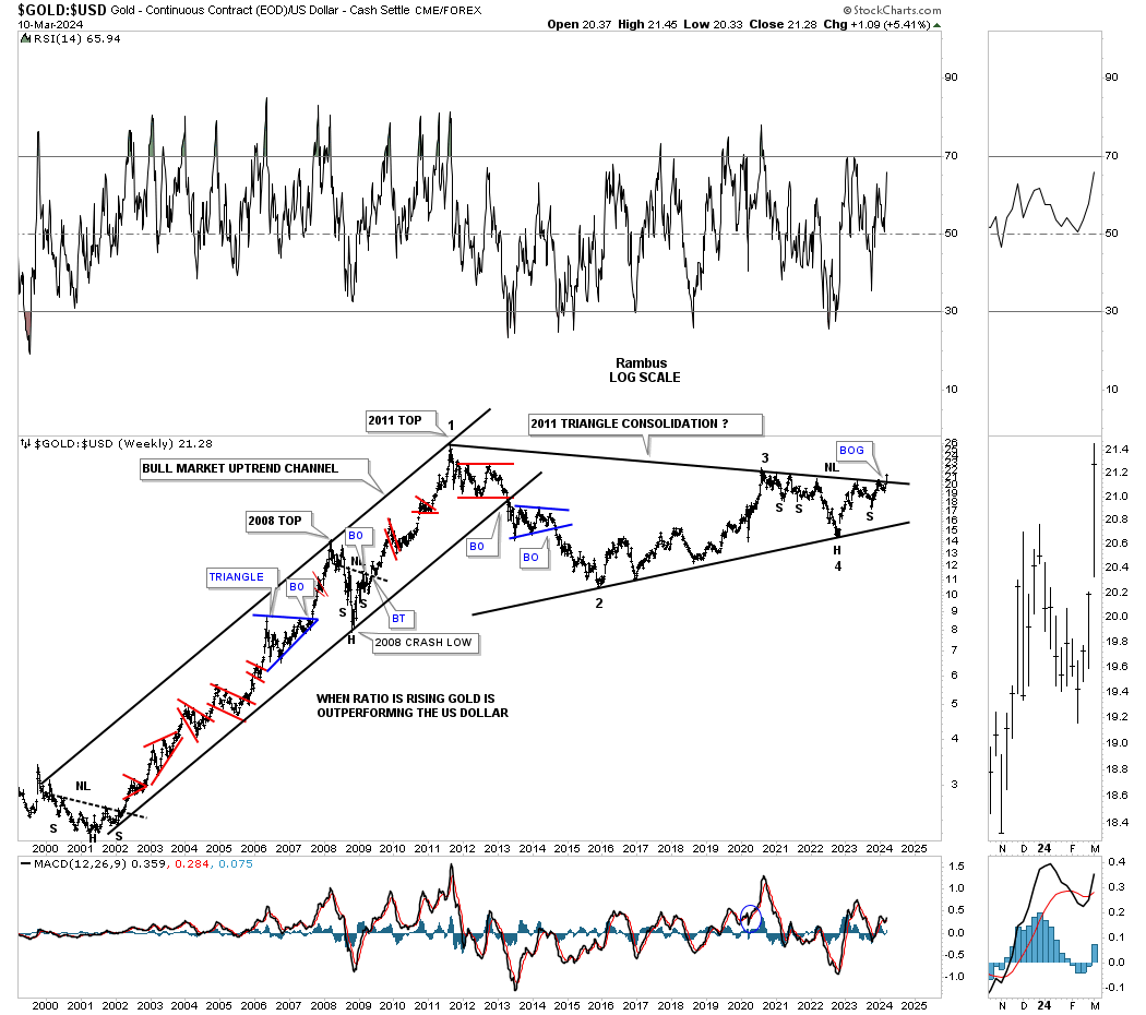
Another big clue that the 2020 correction is over for Gold is this ratio chart which compares Gold:US dollar. Note the very large H&S bottom that formed when Gold was building out its own 2016 H&S base. The neckline symmetry line showed us the low for the right shoulder. You can also see how close the price objective was to the actual high that was made at the 2022 high. Again, last Monday you can see a breakout gap above the neckline of the unbalanced H&S consolidation pattern, see thumbnail on right sidebar of the chart for a better view. We need to see Gold outperforming the US dollar, the stronger the better. Also note how the 2022 neckline symmetry line showed low once again for the right shoulder.
Lets take the Gold:USD ratio a step further and go all the way back to the 2000 low. As you can see Gold outperformed the US dollar for eleven years with only small consolidation patterns along the way.
Once again look at the thumbnail on the right sidebar which shows the breakout gap from last Mondays breakout move above the 2011 triangle consolidation pattern. We’ve literally been following this massive triangle for several years and to finally see it come to fruition it’s pretty rewarding. Big patterns lead to big moves.
Note the H&S consolidation pattern on the chart above. You can see how it fits into the apex of the 2011 triangle which was strongly suggesting the top trendline was going to give way.
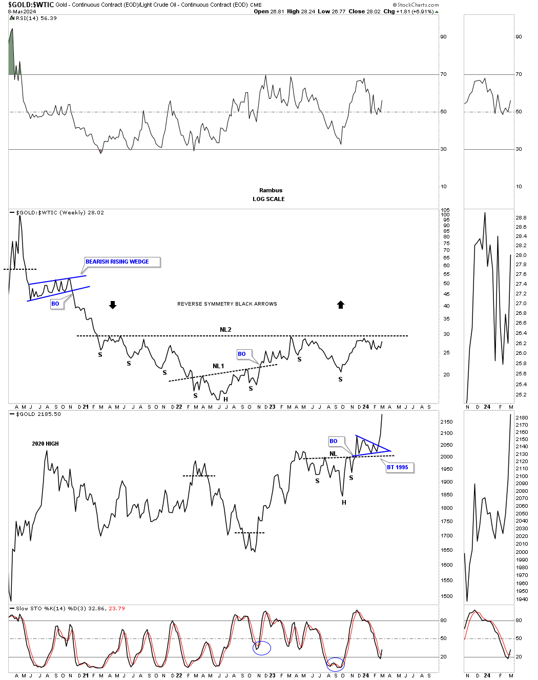
Below is a ratio combo combo chart with the Gold:WTIC on top with Gold on the bottom. There is still a bit of work to do on the ratio chart, but if the neckline is taken out to the upside that should be a good tailwind for the entire PM complex.
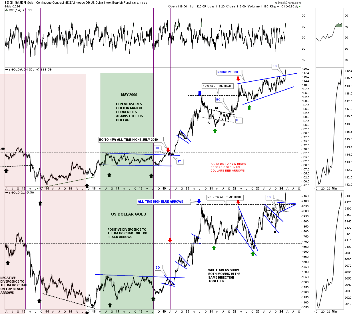
Another major clue took place last week on this ratio combo chart which compares Gold:UDN on top with Gold on the bottom. The Gold:UDN ratio shows how Gold is performing in many of the important currencies of the world ex the US dollar. As you can see the 2022 blue bullish rising wedge broke out into new all time high territory. It doesn’t happen all the time, but Gold in US dollars on the bottom chart also broke out into new all time high territory. Your best rallies in Gold come when both are moving up together.
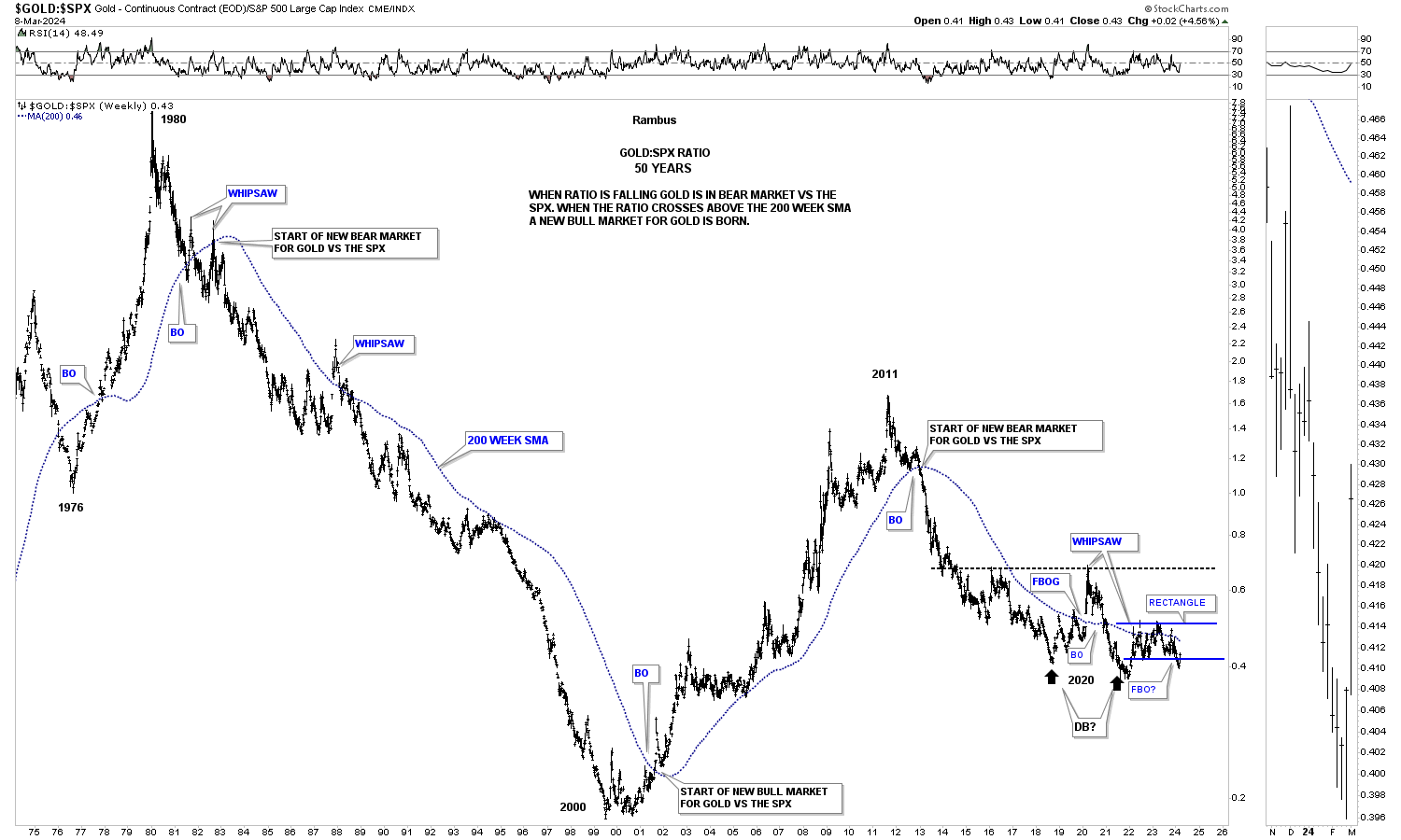
Gold can have its strongest rallies when it’s outperforming the SPX. Since the 2011 high you can see, compared to the SPX, Gold has been declining even though it is at record highs. There could be a possible bright spot at the bottom of the chart where the ratio may have completed a false breakout below the blue rectangle which could now setup as a bear trap. Since the ratio is trading back inside of the blue rectangle the breakout is negated for now.
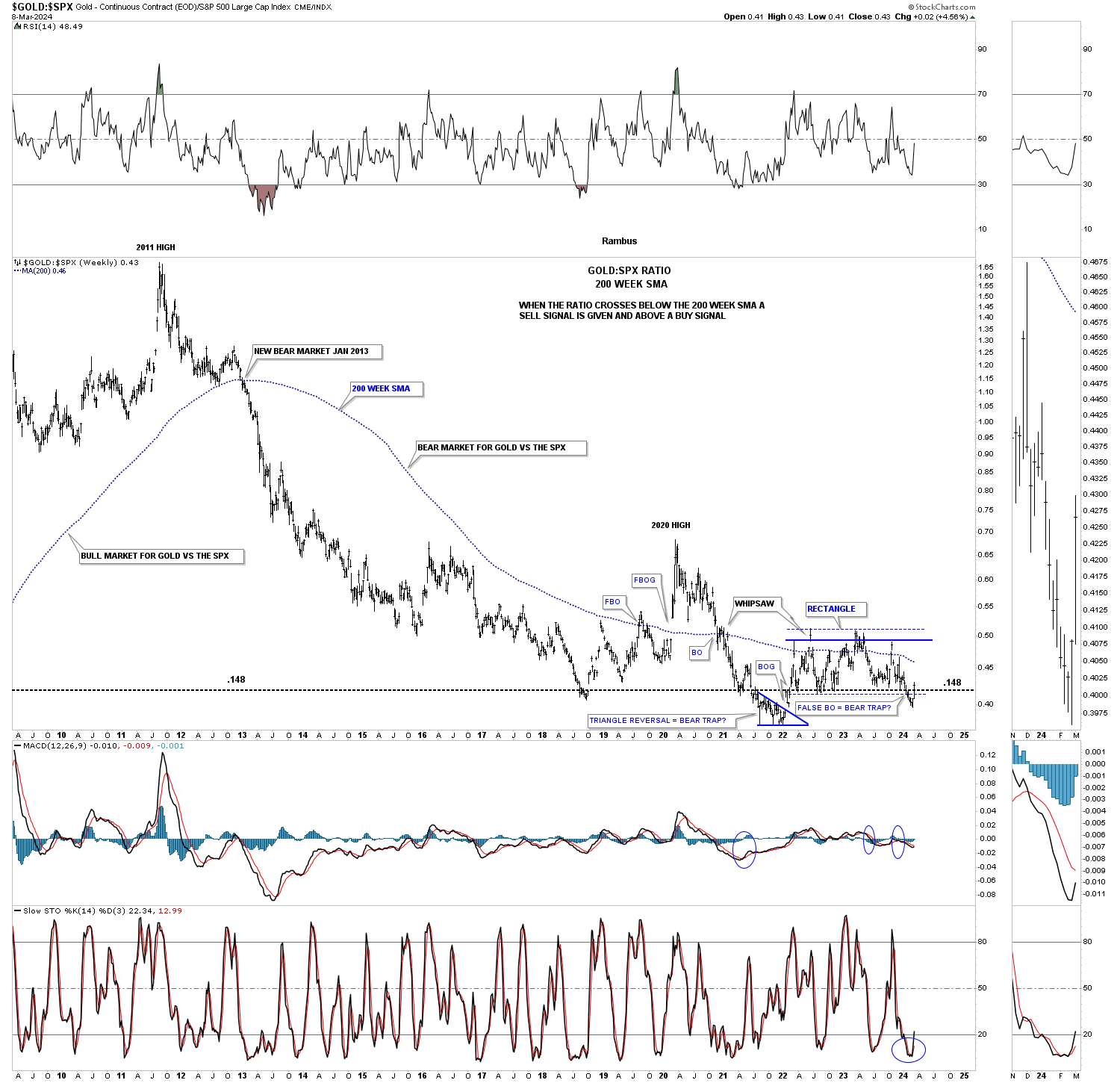
Below is a much longer term 50 year chart for the Gold:SPX ratio using the 200 week sma. The 200 week sma does a very good job of keeping you on the right side of the trend. When the ratio is falling the SPX is outperforming Gold and vise versa in the other direction. There is an occasional whipsaw, but the 200 week sma lets you know who’s stronger Gold or the SPX.
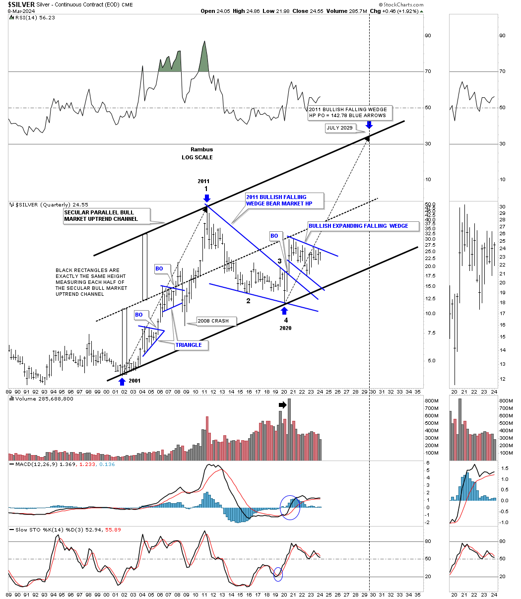
Lets take a quick look at Silver’s secular bull market which began a few years later than Gold’s. Unlike Gold which is trading at all time highs Silver is not even halfway back up to its all time high at 50. Its 2020 trading range shows the blue expanding falling wedge with the top trendline coming into focus once again after several previous touches.
The two long back arrows measure time and price. After topping out in April of 2011 Silver went on to form the 2011 falling wedge which I view will be a halfway pattern to the upside. The fractal nature of the markets suggests that the second leg up, which is now in progress since the last touch of the bottom trendline could be similar in nature to the first leg up into the 2011 all time high. The first big clue the secular bull markets is still alive and well would be to see the 2020 blue expanding falling wedge breakout to the upside.
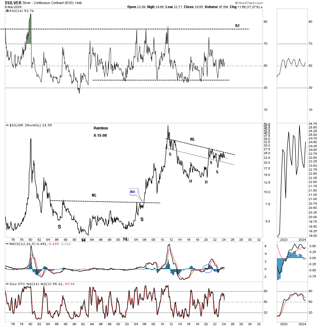
There is another pattern I’ve been following on Silver for several years which is the possible very large H&S consolidation pattern from the monthly line chart perspective. I’ve heard so many times through the years that you can’t trust a long term trading range and they are irrelevant. Note the massive H&S base that formed after the 1980 all time high that took nearly 20 years to complete before the neckline was finally taken out. Gold also formed a very similar 20 year base before its 1980 bear market came to an end in 2000.
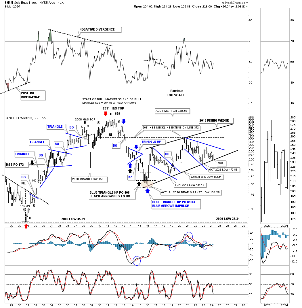
Lets take a quick look at the HUI which shows most of its history going back to the 2000 bear market low and the bull market that followed. Back then was the time to be invested in the PM stocks as one consolidation pattern formed on top of the previous one with a nice impulse move between each consolidation pattern. The HUI’s bull market came to an end when the head of the very symmetrical multi year H&S top formed in 2011.
Note the bottom trendline on the 2016 uptrend channel which has defined the bull market, if you can call it that, up to the present. It is an uptrend channel because the HUI has made higher highs and higher lows. Note that last monthly bar that just touched the bottom rail at the end of February with March showing us a nice rally right where we were hoping to see it.
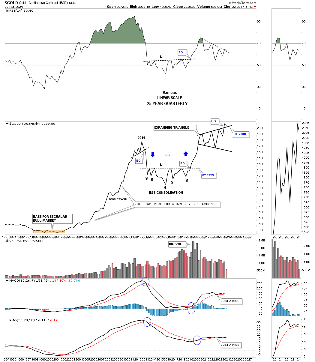
There is a consolidation pattern I’ve been following on Gold which shows up on the quarterly line chart. For several years we’ve watched the price action touch the top tendline from below and fail to breakthrough. Back on February 20th I posted this chart in a Markets Update.
This is what I wrote on February 20th in regards the the 2020 black expanding triangle.
February 20th:
With less that six weeks left of trading for the 1st quarter of 2024 Gold has tested the top rail of the black expanding triangle. A bullish sign would be to see no backtest at the end of March, but a new higher high
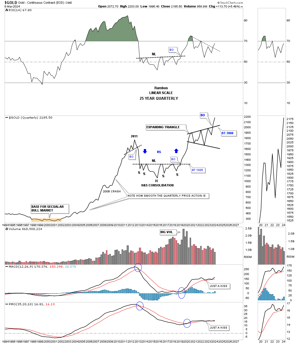
Today March 10th:
When looking at Gold from the quarterly line chart perspective you don’t see many trading ranges and when you do you know they are important. Compare the exact same chart above to this one below. We still have three weeks of trading for March, but you can now see a higher high with the breakout looking more pronounced.
Also note for the quarterly line chart perspective how the bull and bear declines show almost a straight line. During the entire bull market from 2000 to the 2011 high you can see just a couple of modest one quarter declines with the biggest one being the 2008 crash low. Note how the reverse symmetry looked over the same area on the way down from the 2011 high to the first reversal point in the black expanding triangle as shown by the blue arrows.
We’ve looked at some long term charts tonight so lets look at one more I have been following for some time, but was waiting for the right time to post it. Through the years we’ve heard analyst calling for 10,000 gold or 20,000 gold which I thought were crazy price objectives.
If you go back up to where I posted the Gold:USD ratio which shows the 2011 triangle consolidation pattern that is the chart I got the idea for this possible scenario below which I know will sound ludicrous.
If we start at the 1980 all time high to the 20 year bear market low in 2000 you can see a nearly perfect 6 point bullish falling wedge. How do we know it is a 6 point bullish falling wedge, just look at the eleven year bull market that followed the breakout.
Just about every Gold analyst knows about the 2020 trading range with each giving the consolidation pattern their own name. I took it a step further and connected the 2011 high to the 2020 high to get the top trendline and then the two lows for the bottom trendline which shows a bullish rising wedge with the breakout taking place this month. Again, markets are fractal in nature so if the 2000 to 2011 bull market is one massive impulse move and the 2011 bullish rising wedge is the halfway pattern we can measure the price objective that I like to use as shown by the blue arrows.
I’m not saying this is absolutely going to play out, but it is something that I can now watch to see how the second leg of the secular bull market tracks the first leg up into the 2011 high.
From a Chartology perspective I’m strongly suggesting that the next impulse move higher is now underway where there will be consolidation patterns that form along the way but they will be buying opportunities. As they say, we’ll know in the fullness of time. All the best…Rambus