Earlier this morning I told Sir Fullgoldcrown that my wife and I were going on a short road trip to Atlanta GA to see her nephew get married this weekend. I also mentioned that when I usually plan something like this the markets always seem to go against me until I get back. At that time the HUI was only down a couple of points. It’s kind of funny that I hardly got the email written and then the plunge in the PM complex. Murhpy’s Law it seems.
Anyway, there are some interesting charts to look at which I haven’t shown you yet, as I was waiting for more price action before I posted them, but tonight seems like as good of time as any to show you a few of them.
This first chart for Gold is one that I have shown you which is the rising flag formation, which has been in place since the first of February. The rising flag has completed four reversal points so far and is working on its fifth, which will be complete when the bottom rail is hit around the 1235 area. At that point gold will have completed five reversal points which would make the rising flag a reversal pattern to the downside. That’s the bearish side of the equation.
The bullish side of the equation, which I’m still leaning towards, would be for gold to find support at the 1235 area, and then reverse direction to the upside, creating a sixth reversal point, building out a bullish rising flag which I would view as a halfway pattern. So far the red 50 day ema has done a good job of holding support during this consolidation phase. The first signs of trouble would be if gold breaks below the 1235 area which would then bring up the old high at 1190 or so.

The weekly chart for gold shows the three year seven point bullish falling wedge with a breakout, and one backtest to the top rail. If we happen to get a second backtest it would come in around the 1190 area where the 55 week ema comes up to join it.
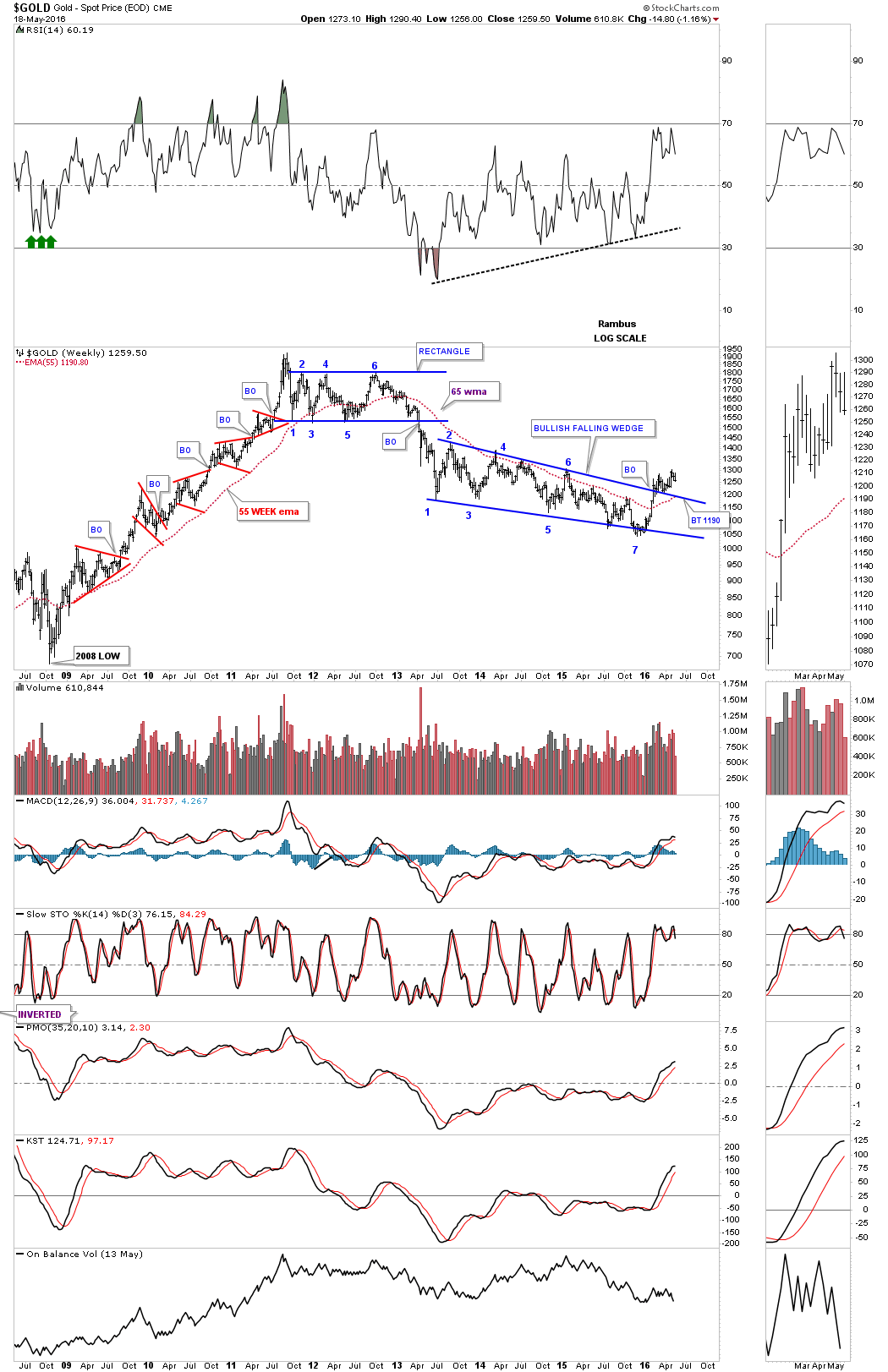
This monthly chart for gold shows the 10 month ema offering support at the 1200 area.
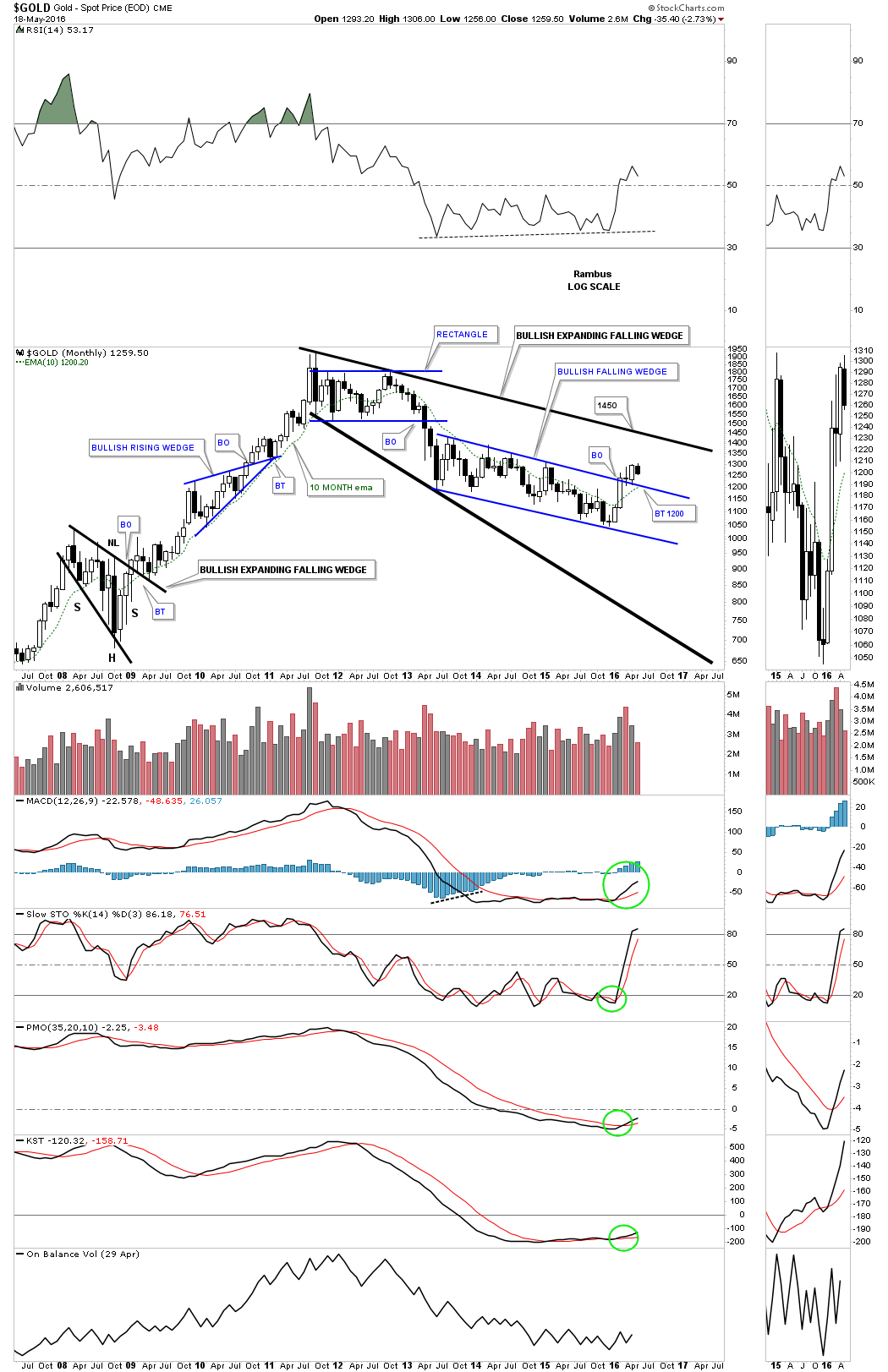
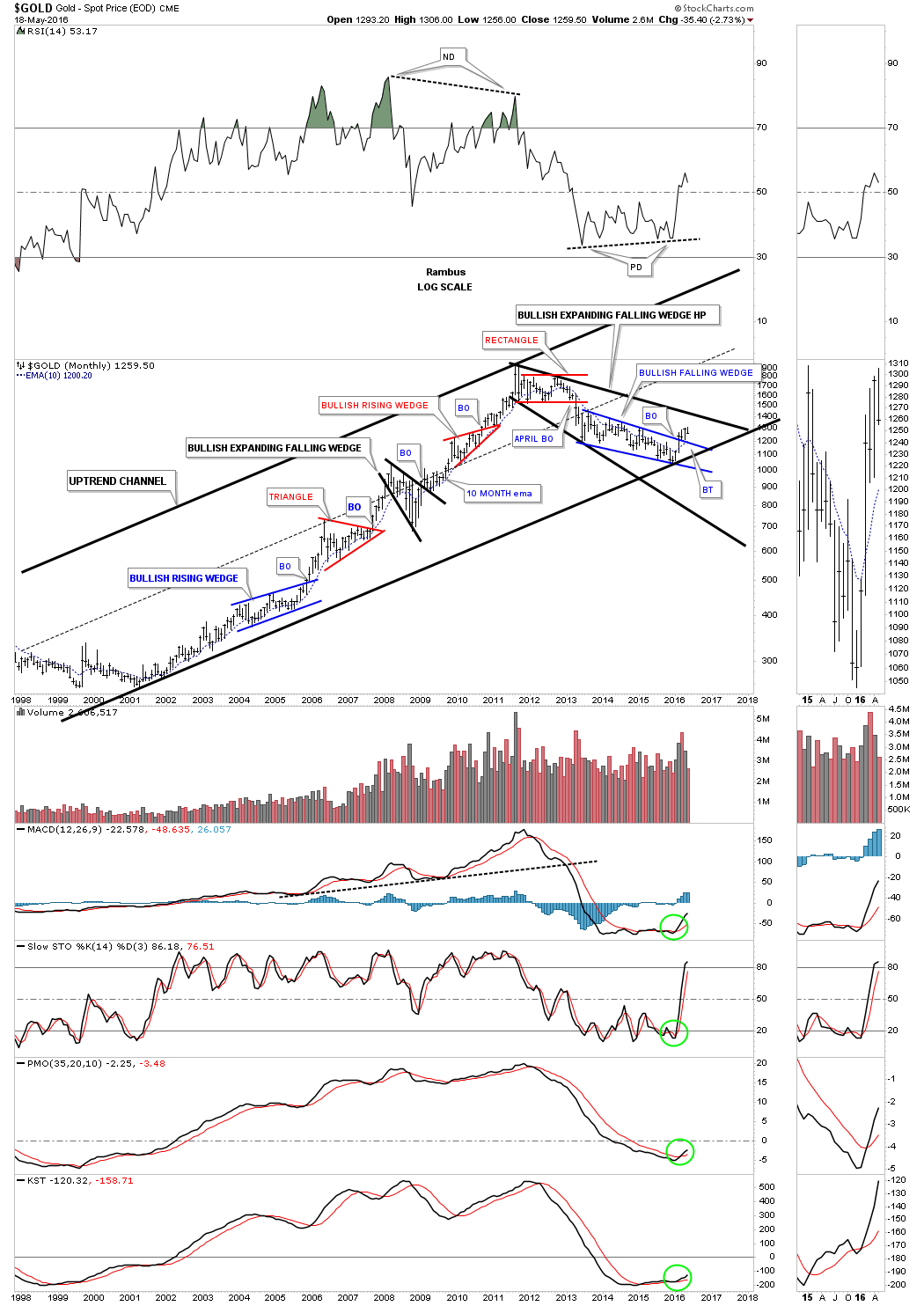
As long as the bottom rail of the bull market uptrend channel, which began to form back in 2001 remains unbroken, I will be a bull, and if it breaks then it’s back to the drawing board.
Lets now take a look at a daily chart for silver which is showing a potential H&S top. Near term support comes in at the top rail of the blue bullish rising flag and the 50 day ema at 16.47 or so. It’s not the prettiest H&S top I’ve ever seen, but if it plays out it will have a price objective down to the 15.87 area.

This next one year daily chart for silver has a brown shaded support and resistance zone which comes into play between 16.00 and 16.20, which should act as support if it’s reached.
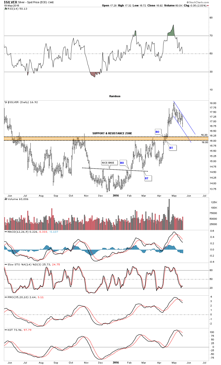
Just over a month ago silver broke two important areas of resistance, the top rail of its bear market downtrend channel, and the neckline of an inverse H&S bottom. A backtest to both trendlines would be at the 16.00 area. Note the big two year H&S consolidation pattern that formed during the 2008 crash low, which led to the parabolic move up to the 50 area.

This last chart for silver is the long term monthly look which shows its bull market uptrend channel that began to form back in late 2001. The bear market downtrend channel stands out like a sore thumb that transverses between the top and bottom rails in a nice parallel downtrend channel. Silver also formed the blue five point bullish falling wedge reversal pattern at the end of its bear market, which is a good place to see such a pattern.

Next lets look at the $XAU which has two different reversal patterns for its bear market low. This first chart is a weekly look, which shows a five point expanding triangle reversal pattern. Some of the long term members may remember the big eight point blue Diamond consolidation pattern that seemed like it would never complete. Then there was the H&S consolidation pattern that formed below the blue Diamond which ended up being the last consolidation pattern in the five year bear market.
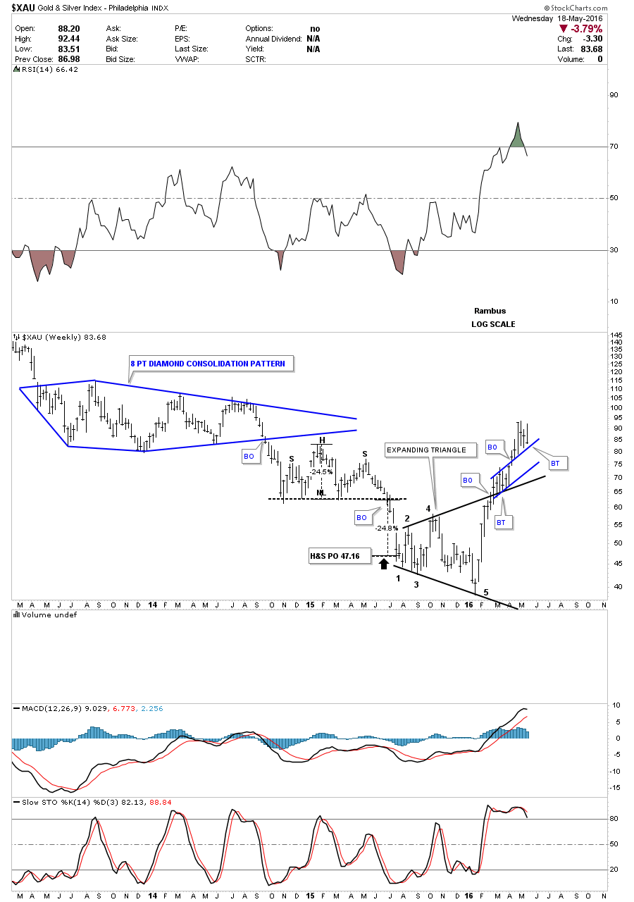
The $XAU also formed another reversal pattern which is a five point bullish falling wedge. Today the price action landed at the top of the big falling wedge, and the top rail of the potential blue bullish rising flag, which comes in around the 82.60 area. From a Chartology perspective this is an important area to keep a close eye on.

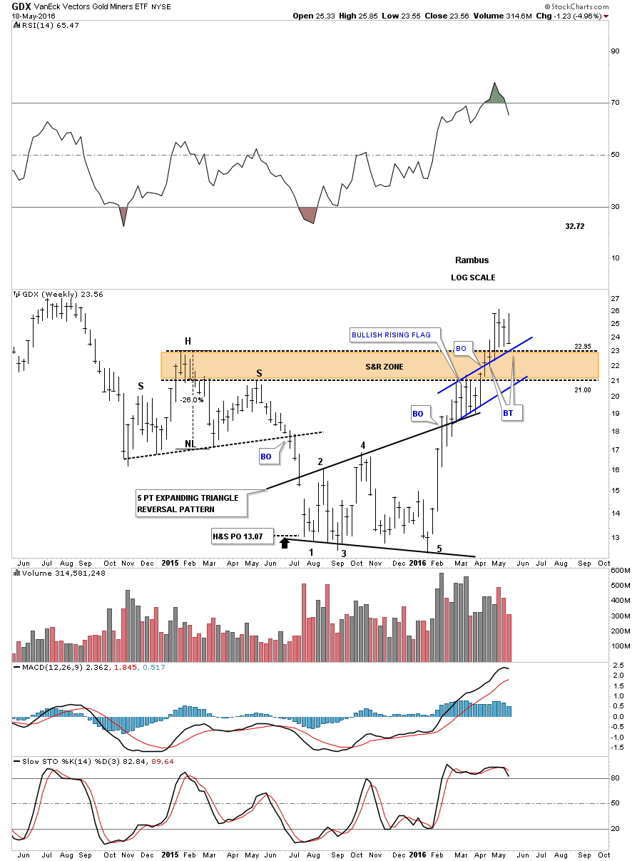
Next is a weekly chart for the GDX which shows a similar setup to the $XAU chart. It took a lot of work for the GDX to breakout above the brown shaded support and resistance zone, which it’s now in the process of backtesting from the top side. There is also the potential blue bullish rising flag which formed as the backtest to the five point black expanding triangle. The 22.95 area is an important area to watch for support.
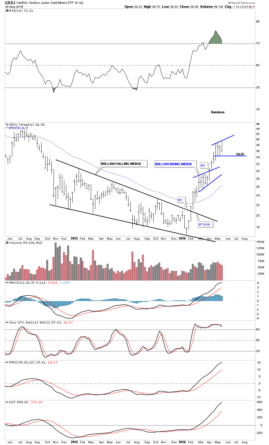
Next up is the weekly chart for the GDXJ which also formed a bullish falling wedge as its bear market reversal pattern. The GDXJ formed a six week blue bullish rising wedge which broke out to the topside. The current and possible consolidation pattern is still only on week number four, so a little more backing and filling would be normal at this point.
Just like gold and silver the long term chart for the HUI shows it to is in a nice secular bull market uptrend channel. The HUI has been finding some resistance at the apex of the blue triangle around the 230 area. It stands to reason that a rally like the HUI has had since the middle of January of this year, a little backing and filling should be expected, nothing goes straight up forever.

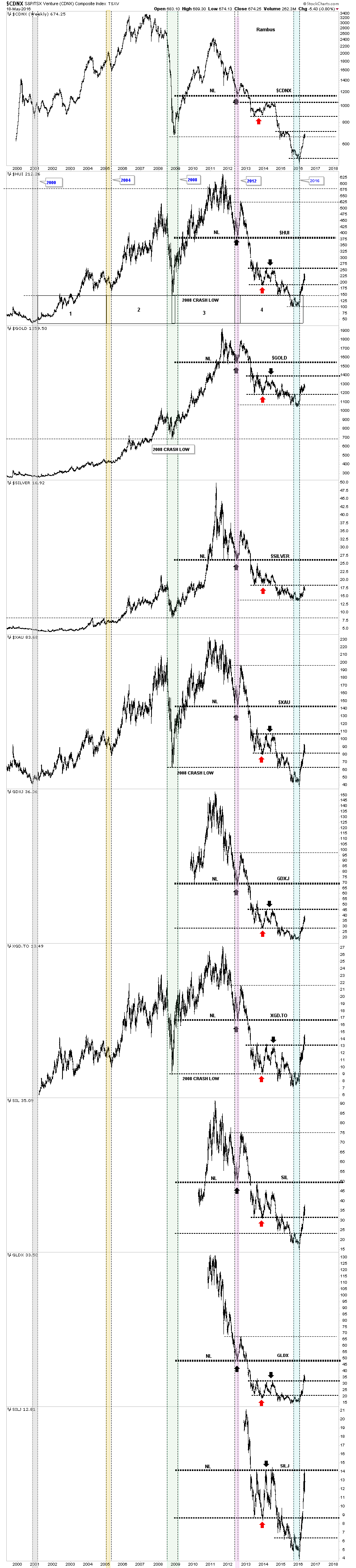
Lets end this Wednesday Report by looking at the Combo 10 chart which is showing some pretty impressive price action by most of the PM complex. Use the red arrow as a reference point, which shows the bottom of the 2014 consolidation area for most of these indexes, with the black arrows showing the top of the consolidation areas. What is so impressive is how most of the PM stock indexes have rallied above their respective red arrows, which would have offered strong resistance during the bear market years. The two strongest of the PM stock indexes still remain the XGD,TO and the GLDX, which have broken above their resistance line as shown by the black arrows. The SILJ has made a strong run up to the top of its 2014 trading range, and is taking a break in the action. Silver still remains the weakest sector within the precious metals complex, as it has still failed to close above it’s 2014 horizontal resistance line, red arrow. Looking at gold and the rest of the PM stock indexes you can see they have rallied strongly into resistance, which is the middle of their 2014 consolidation patterns. That is a lot of overhead supply that has to be eaten through.
Today may have felt like the end of the world for most folks, but from a Chartology perspective, this is normal price action in a new bull market. Two steps forward and one step back should be expected.
As I mentioned in the first paragraph I’m going to be on the road for the next week. I will have my laptop and will post when I get some time. All the best…Rambus