Sometimes a stock will do something that makes you scratch your head in wonderment. There usually isn’t any rhyme or reason why it happens but it works until it doesn’t. Usually though by the time you finally figure out a certain sequence or a fractal type situation it will change just when you want it to work the most.
I was going over some old charts from the bear market years in the PM complex that I haven’t looked at in quite awhile and came across this old weekly chart for the $HUI. I updated it this afternoon to make it current. If this chart doesn’t make you scratch your head in amazement then I don’t know what will. Again it is what it is until it isn’t.
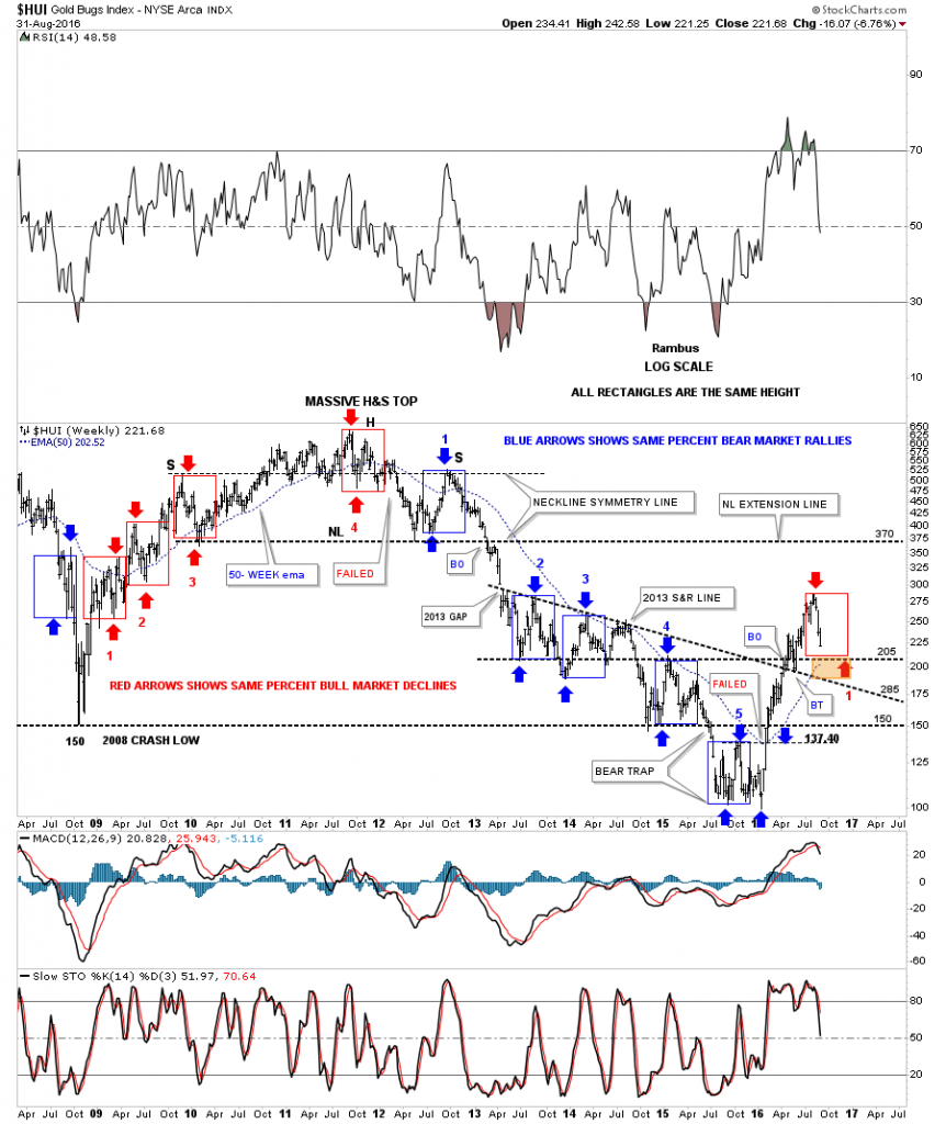
Below is an eight and a half year weekly chart for the $HUI in log scale. You will see ten rectangles that just measures height and not time. The blue arrows shows the bear market rallies and the red arrows shows the bull market declines.
Starting at the 2008 crash low at 150 you can see there were three corrections up to the left shoulder high as shown by the red arrows and rectangles. The HUI continued to rally all the way up to the 2011 top which ended up forming the head of that massive H&S top. The first decline down from what eventually became the head of the H&S top, fell just shy of reaching the bottom of the rectangle before the next rally took hold. That rallied failed to take out the precious high and made a lower high which was the actual beginning of the five year bear market that followed. Once the price action fell below the bottom of red rectangle #4 the HUI made a lower low for the first time since the 2008 bull market began. The new bear market was underway.
During the course of the bear market years there were five bear market rallies that were all exactly the same percentage move up as shown by the blue arrows and rectangles. When the HUI broke above the top of blue rectangle #5, at the bottom of the chart at 137.40, that showed a major change of character. That was the fist time since the 2011 top that the HUI made a higher high and broke the sequence of bear market rallies. That failure then led to one of the strongest bull market rallies in history for the HUI.
Now on to the present which shows the bull market rally and our first correction taking place since the January low of this year. I have to ask the question, what are the odds that the current red rectangle is going to show us the low for this first correction around the 200 area? Keep in mind all these same sized rectangles are showing us the size of the move in price but not time. What this means is that once the low is set that should be the low for this correction but time wise it could still take many weeks to complete the correction.
The brown shaded area shows where a confluence of support comes in at the 2013 S&R line, the top of blue rectangle #4 at 205 and the 50 week ema currently at 202. So price wise it looks like the low for the first correction is just below at the 200 area which would be a good place to pick up a few more shares of your favorite PM stock. All the best…Rambus

