This first precious metals combo chart is one I try to show you at least twice a week so you can follow the price action as it’s unfolding in real time. Except for SLV the other indexes have now traded below their respective neckline for five weeks now. If you look at the sidebar you can see which sectors are doing the best and which ones are weakest. As you can see GLD has been by far the weakest of the four while SLV has been the strongest. To negate these H&S tops we would need to see the price action close back above the necklines. The necklines are your lines in the sand, above is bullish and below is negative.

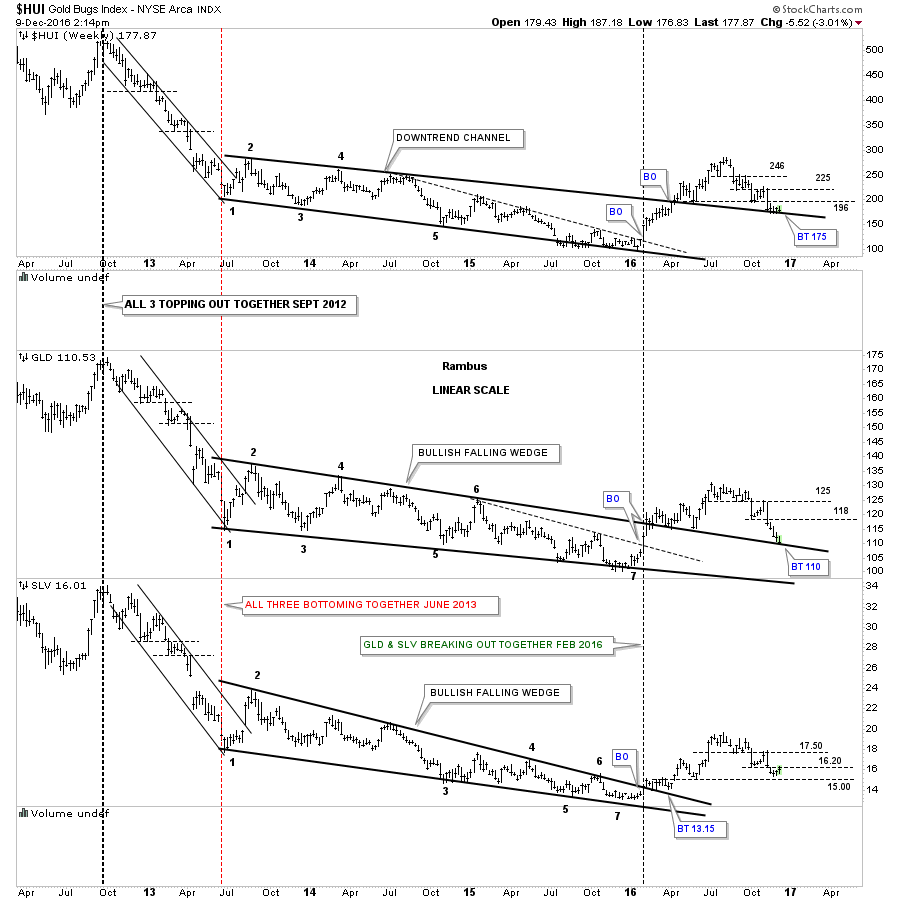
This next combo chart is also one we’ve been following very closely which shows the multi year trading ranges which were broken to the upside earlier this year. Those big top rails should reverse their role from what had been resistance to now support which they’ve done so far.
Now lets look at the thin black dashed horizontal lines which represents support and resistance. During the strong bear market move back in 2013 you can see how they reversed their role to what had been initial support to resistance once the price action broke below those S&R lines. Looking at the right hand side of the chart you can see the same thing taking place since the August highs.
Following the price action is just that, following what the charts are showing us and not trying to second guess what we may think we want to see,, which is a lot harder than it seems. Note how the HUI and GLD are now testing their top rails from above. As long as those top rails hold support then all is good for the PM complex. On the other hand if we see those top rails broken to the downside then the PM complex will be talking to us from a bearish perspective regardless of all the reasons why the PM complex can’t go down.