
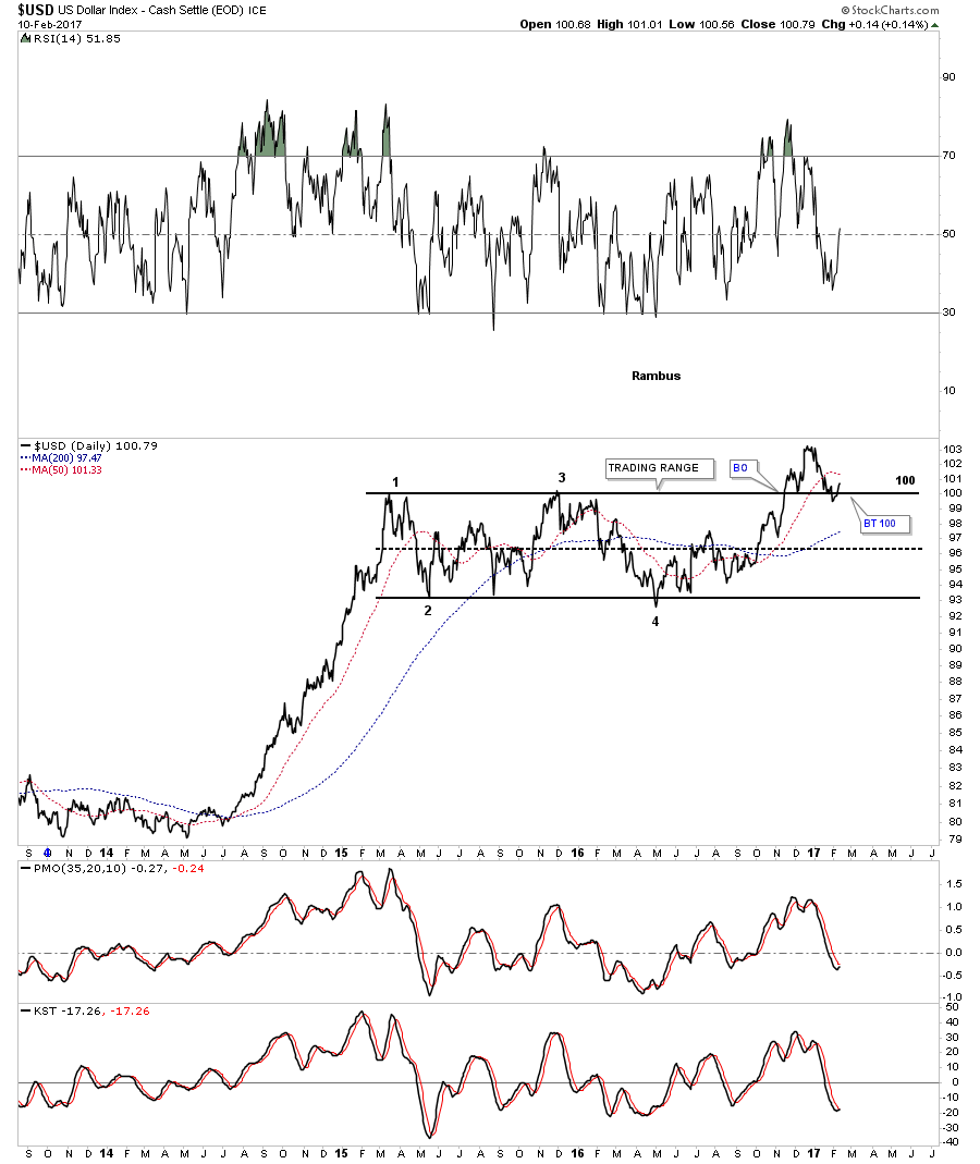
Tonight I would like to update the US dollar as its been testing critical support since breaking out from the nearly 2 year horizontal trading range in early November of last year. The daily line chart shows there was a nice clean backtest about a month later to the top rail which looked like breaking out and backtesting process was complete. After a short rally and making a higher high the US dollar declined once more to the top rail causing a lot of uncertainty for many traders. After a slight breach of the top rail the US dollar is now trading back above that very important trendline. So far at this point there is nothing to conclude the bull market that started in 2011 is over at least accordingly to the daily line chart.
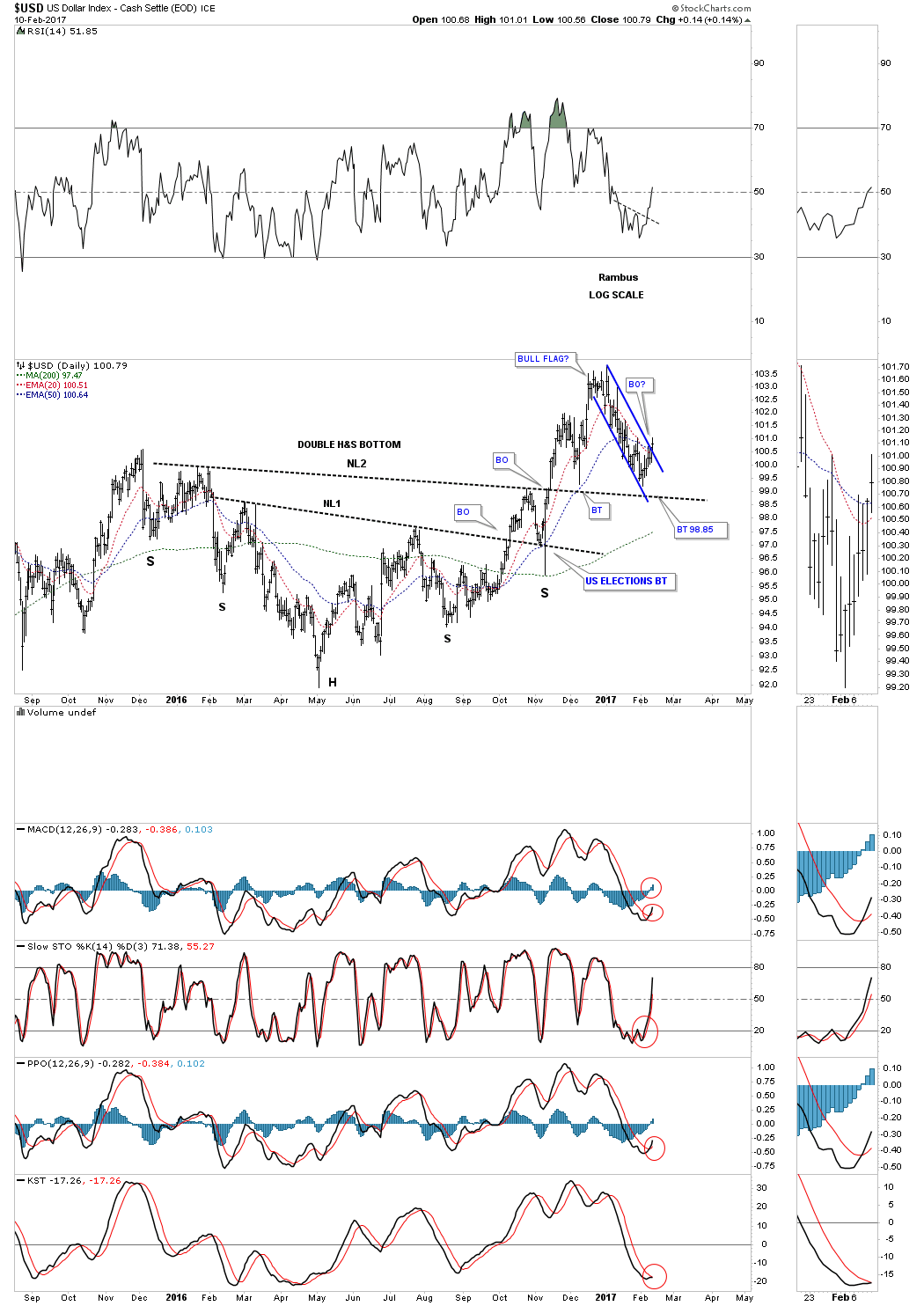
This next daily chart for the US dollar is just as important as the horizontal trading range we looked at on the chart above. I don’t believe anyone else has recognized the double H&S bottom that has formed on the right side of the horizontal trading range. As you can see there were two backtests to the neckline which came in at the same area about 2 months apart which have held support. The six week correction from the recent high has given most of the indicators time to reset as shown by the red circles. The neckline at 98.85 still remains critical support.
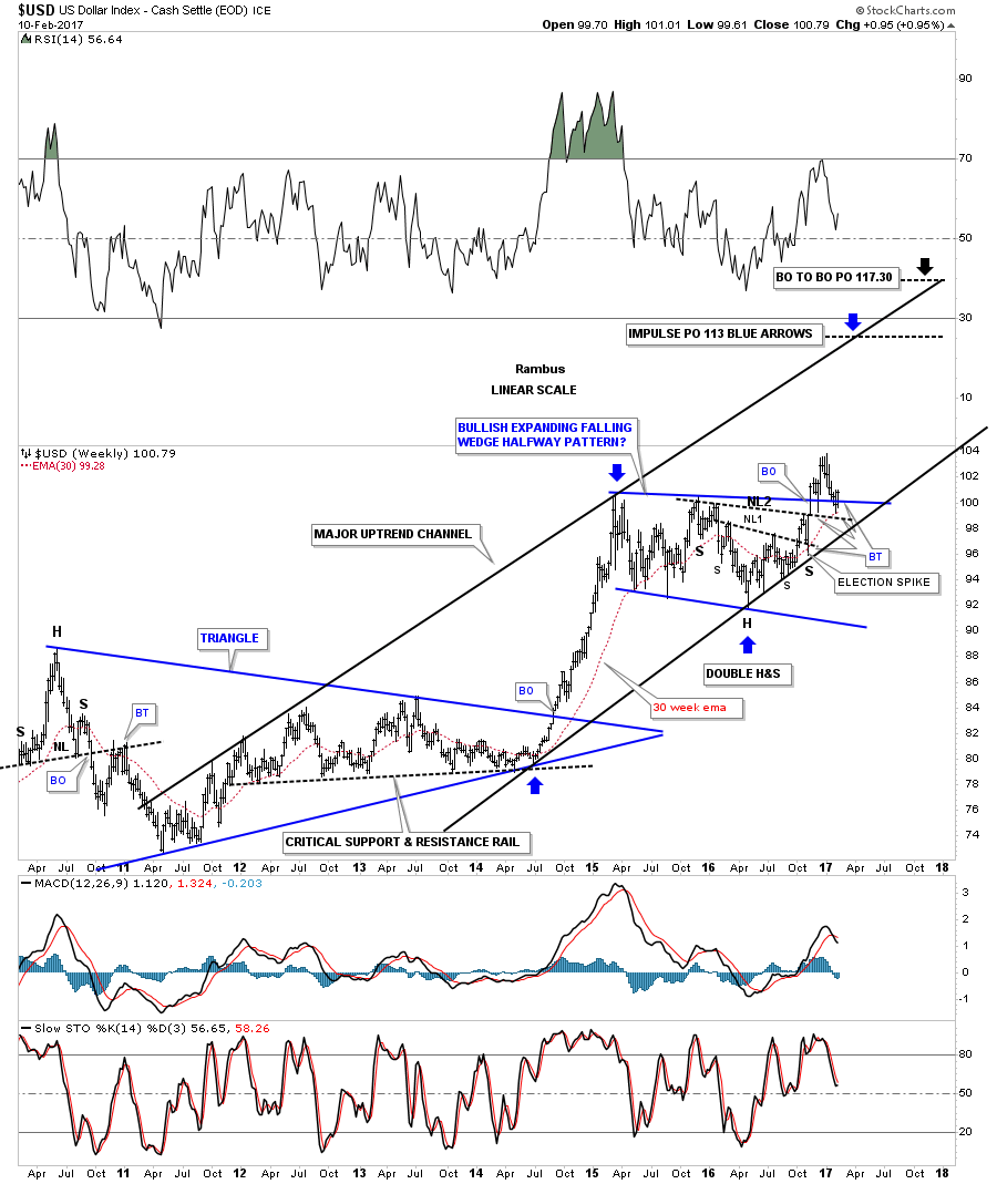
Next lets look at some longer term weekly charts and the bull market that began in 2011. This first weekly chart shows the US dollar in linear scale and the 2 consolidation patterns we looked at on the charts above. The bottom rail of the major uptrend channel has done an excellent job of holding support as shown by the many touches which tells us that rail is very hot and to be respected. The bottom rail of the major uptrend channel also helped in the development of the double H&S bottom as the head and both the bottoms for both right shoulders formed on that trendline. One last note on this weekly chart which shows the 30 week ema held support during the US election spike and then again 2 weeks ago when the price action was backtesting the neckline.
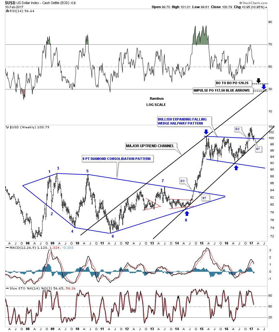
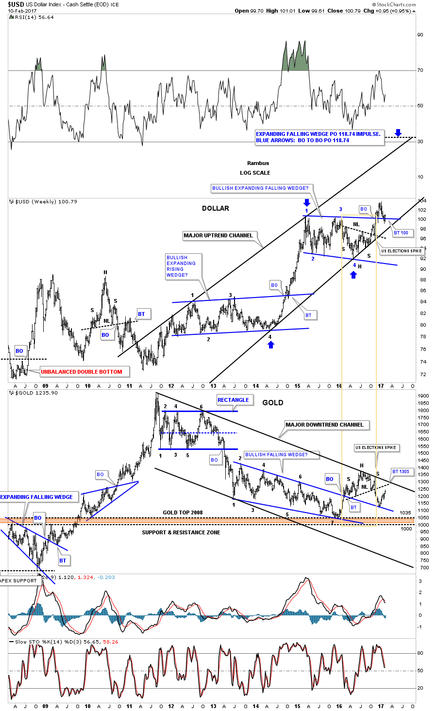
Below is another weekly look at the bull market uptrend channel that is slightly converging in log scale. Big bases lead to big moves and with the 5 1/2 year, 8 point diamond this bull market in the US dollar should have a long ways to run yet. This log scale chart also has a slightly higher price objective than the linear scale chart for this next impulse move up which should be to the 117 to the 120 area as shown by the blue arrows. As I’ve said previously, if the US dollar breaks below the bottom rail of the major uptrend channel I will wave the white flag and surrender to the bears, but until that happens I have to remain a bull regardless of all the reasons the US dollar needs to collapse.
This next weekly chart is a combo chart which has gold on top and the US dollar on the bottom. This chart shows the major positive divergence for the US dollar to gold made back in 2011 as shown by the purple arrows. In 2008 gold was topping out just before the big crash while the US dollar was bottoming. From the 2008 crash low gold went on to make its bull market top in September of 2011. As gold went nearly vertical into its all time high you would have thought that the US dollar was crashing and burning. As you can see the US dollar actually made a higher low vs its 2008 low which is where the positive divergence took place and the beginning of the US dollars bull market.
Since the bull market top in 2011 gold has been declining in a bear market with the top rail holding resistance. That top rail comes in currently around the 1305 area which will be the defining line between the bull and bear market for gold. If gold can trade back above that 2011 bear market downtrend line that will be a very big positive that the bull market is back in earnest. On the other hand if gold fails to take out that very important top rail of the bear downtrend line the bear market lives on.
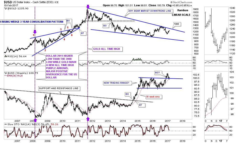
Below is another weekly combo chart which has the US dollar on top and gold on the bottom. This combo chart shows the major 2011 uptrend channel for the US dollar and the major 2011 downtrend channel for gold. Over the last year or so you can see the inverse correlation between the US dollar and gold as shown by the H&S bottom on the US dollar and the H&S top on gold, brown rectangle. The neckline and the top rail of the 2011 bear market downtrend channel intersect at the 1305 area which again is going to be the inflection point between the bull and bear market IMHO.
The weekly chart for the UUP US dollar fund, shows the nearly 2 year correction as a bullish falling flag. A complete backtest to the top rail was almost achieved two weeks ago at 25.50.
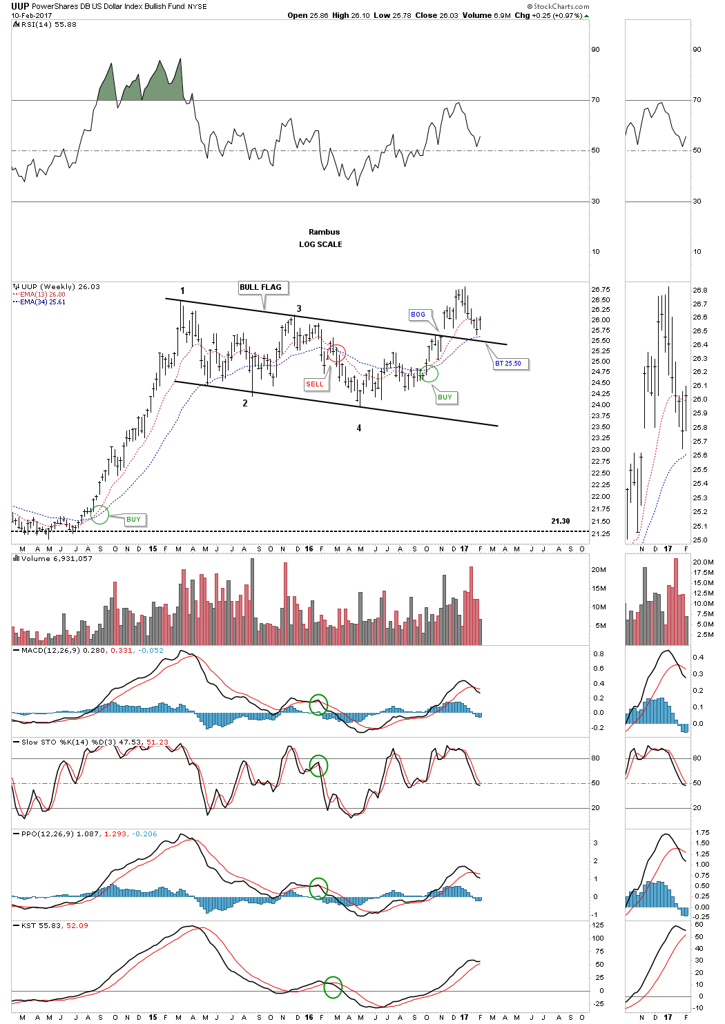
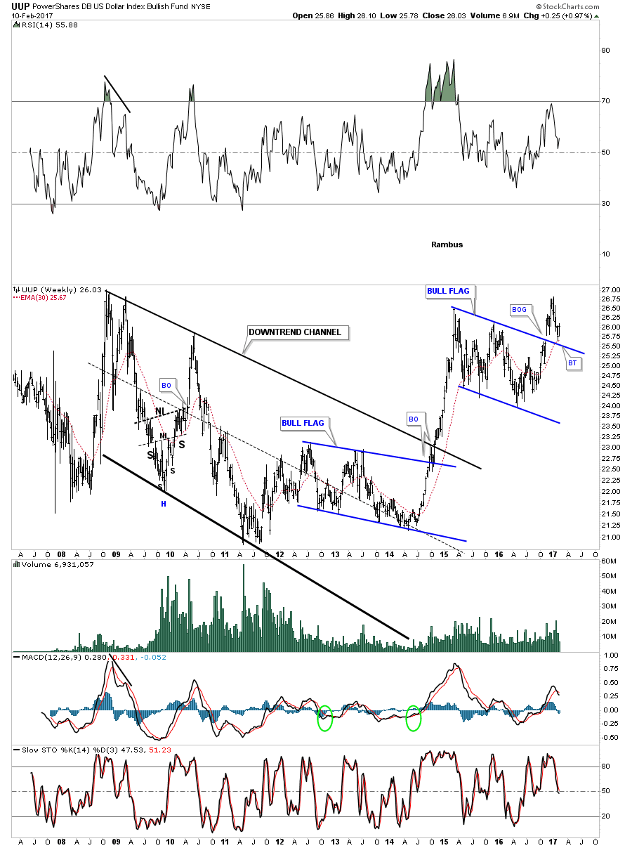
The longer term look at the UUP shows a previous bull flag that formed at the end of the major downtrend channel and gave the UUP the energy it needed to finally breakout and begin its new bull market.
This last chart for tonight is another proxy for the US dollar which is the USDU index which has a more equal weighting of currencies. This index hasn’t been around very long but it to is showing an uptrend channel with the 30 week ema offering support two weeks ago.

The last time the US dollar embarked on its impulse move up starting in the middle of 2014 and ran to March of 2015 currencies and commodities took a big hit. This is why it’s so important to get the major direction of the US dollar right as so much depends on which way it moves especially in the intermediate term. All the best…Rambus