…………………………………………………………..
I haven’t posted much on the US dollar lately as I’ve been waiting for the dust to settle, as the price action completed another reversal point in its nearly 2 1/2 year trading range.
Tonight I would like to update some of the charts we’ve been following to see if we can gain any insight into what the US dollar is currently telling us about which way it wants to go. We’ll also look at some other currencies that may shed some light on the direction for the US dollar.
This first daily chart for the US dollar starts at the 2017 top and down to the bottom of the 2 1/2 year trading range.
I’ve been showing you this technique with some of the stock market indexes that are doubling the size of their 2009 uptrend channel. With the US dollar it’s just the opposite, where I used the black rectangles that are exactly the same height, to look for a place to add the bottom rail of the downtrend channel. As you can see there were no touches on the bottom rail until the very bottom of the downtrend channel was hit.
All it really tells us at this point is that we have a parallel downtrend channel in place. What we need now is to see some type of reversal pattern building out to reverse the downtrend that has been in place for almost a year. We have a potential inverse H&S bottom building out, but we need to see the neckline broken to the upside before we have confirmation that the downtrend may be over. It’s close, but not quite there yet.
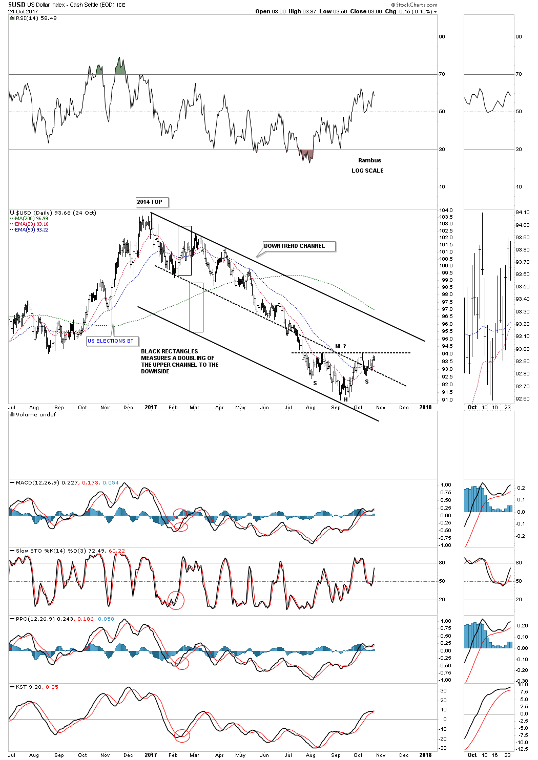
Now I would like to add the downtrend channel from the daily chart above to the big 2 1/2 year trading range so you can see how it fits into the big picture. You can see why for a dollar bull case we need to see a reversal pattern build out right here and now. What this chart is also telling us is that we had a false breakout above the top rail of the 2 1/2 year trading range and one below. I have shown you many charts in the past on how these false breakouts are what I call false symmetry breakouts. What this generally means is that the original 2 1/2 year trading range is still valid and to be respected. It’s important at this point in time to see the price action continue to trade above the bottom rail of the 2 1/2 trading range, above the 93.00 area.
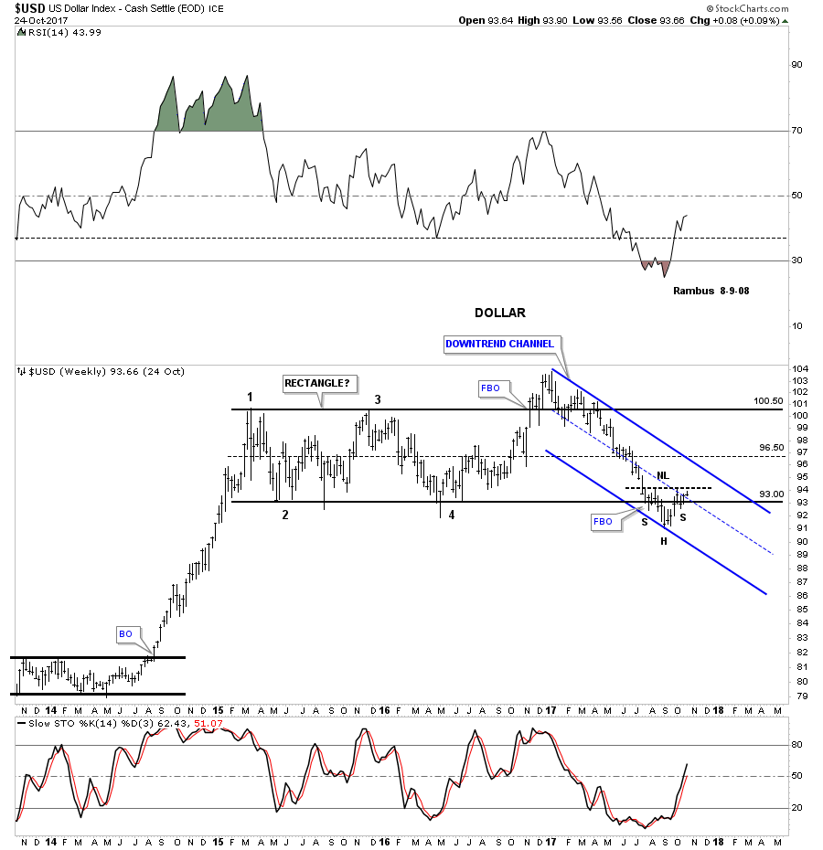
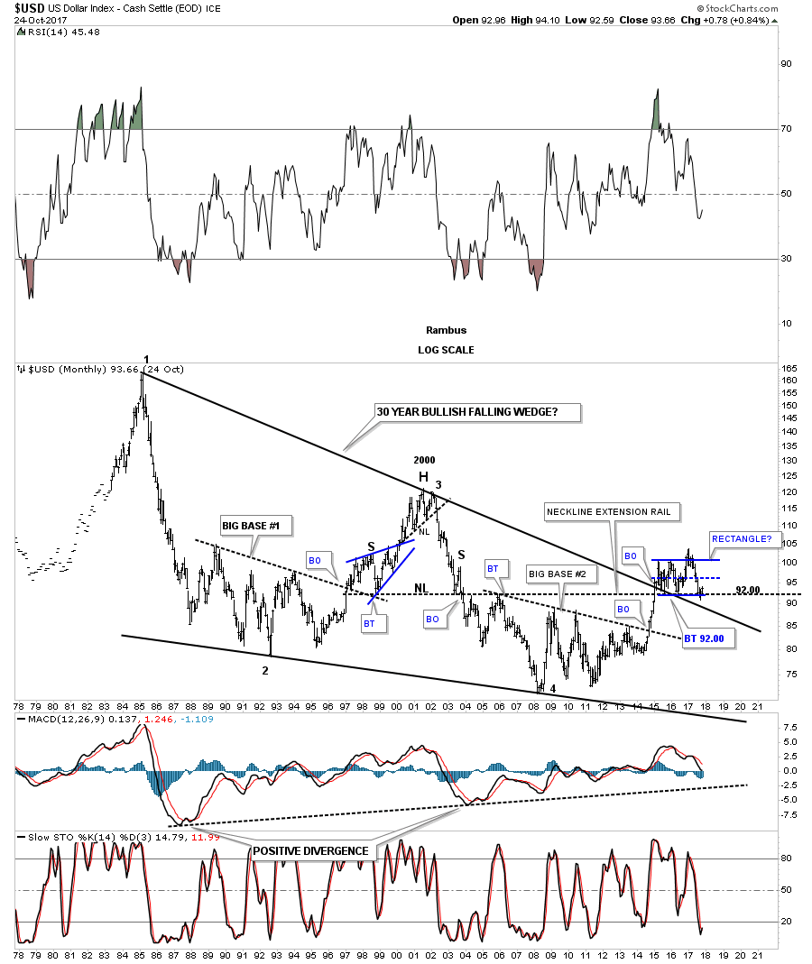
Below is a long term weekly chart which shows the massive 10 year base that launched the previous impulse move up and how our current 2 1/2 year trading range fits into the big picture. Again, you can see how important a reversal pattern is for the life of this 2 1/2 year blue trading range. That big massive 10 year base is strongly suggesting to me that our 2 1/2 year trading range should be a halfway pattern to the upside, vs a top that many are willing to see . Time will tell.

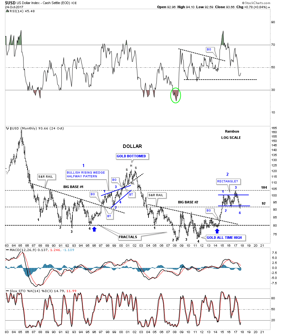
This next long term chart for the US dollar is a long term 35 year monthly look which shows the two massive fractals labeled, big base #1 and big base #2. Long term members should remember this chart as it seemed like it took forever for the big base #2 S&R line to be broken to the upside. It was a case of discovering this big pattern well before the breakout, so a lot of time went by before we got confirmation that big base #2 was indeed valid. Once the breakout occurred the US dollar wasted little time and rallied in an almost vertical move before our current trading range began to buildout.
There is also another piece of fractal information on this chart which is shown by the two thin black dashed horizontal lines at 92 and 104. What those two lines represent is the size of the 1998 – 1999 bullish rising wedge halfway pattern. If big base #1 was big enough to launch that bull market up to the 120 area you would think our big base fractal #2 should also be big enough to launch a similar rally. If that is the case then our 2 1/2 year trading range should be a halfway pattern to the upside.
We’ve been following this next very long term chart for the US dollar that shows its 30 year falling wedge with reversal points #2 and #4 being our two big fractal bases. Reversal point #3 was the H&S top at the 2000 high. It took a lot of energy for the US dollar to breakout above the top rail of that 30 year falling wedge, which was needed to consolidate that move by forming our current 2 1/2 year trading range right on the top rail of that 30 year falling wedge. There is another line of support that comes into play at the 92.00 area, which is the neckline extension rail taken from the bigger H&S top, which formed at the 2000 high. So far it has held support on three separate occasions.
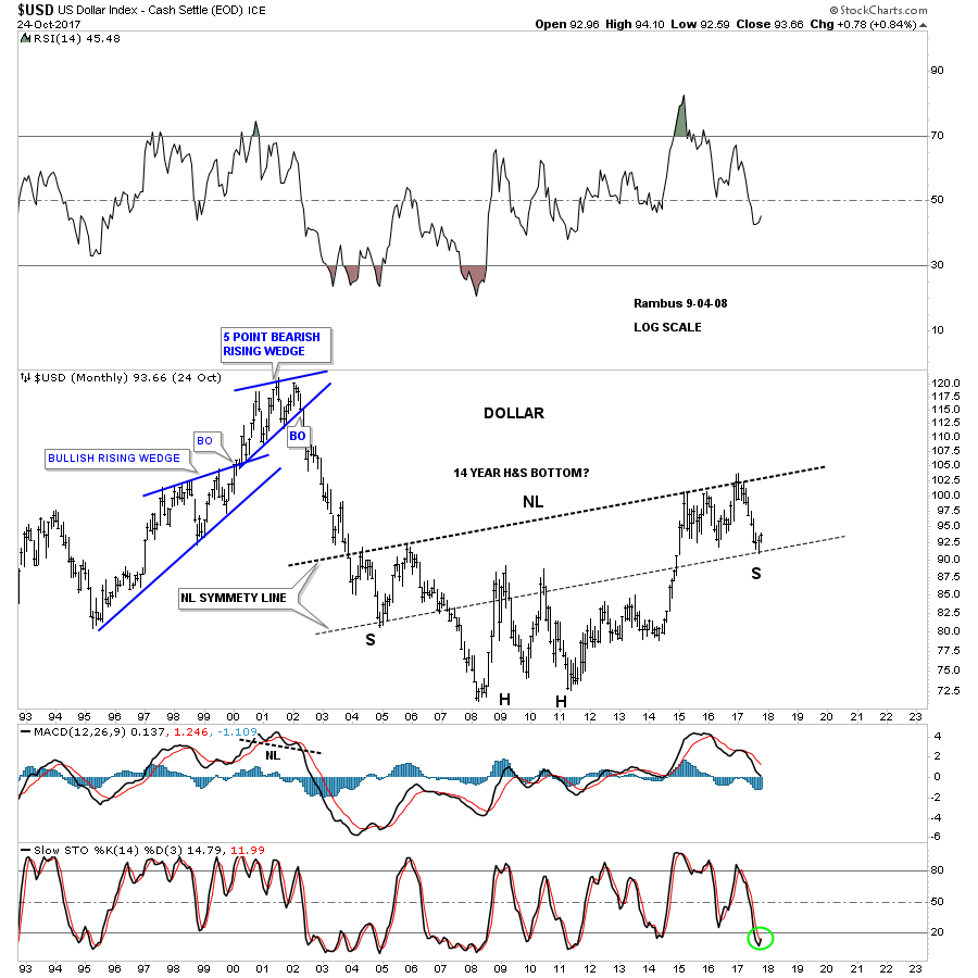
Before we move on there is one more long term chart for the US dollar that I’ve only posted several times in the past. I’ve been keeping a close eye on the neckline symmetry line to see if it would hold support as a possible low for the right shoulder. Keep in mind this possible massive H&S bottom is going to take time before it’s confirmed one way or the other. This is one of those cases that if I’m right, we aren’t going to know for many months if it’s valid or not, but we will be able to follow the price action in real time and monitor it going forward. As they say, stay tuned .
Also for this bullish scenario ,we need to see some type of reversal pattern buildout right here to reverse the price action off the neckline symmetry line. The H&S bottom we looked at on the daily chart is our best option at this time. That potential small H&S bottom is so critical to so many different areas we looked at on these US dollar charts above.
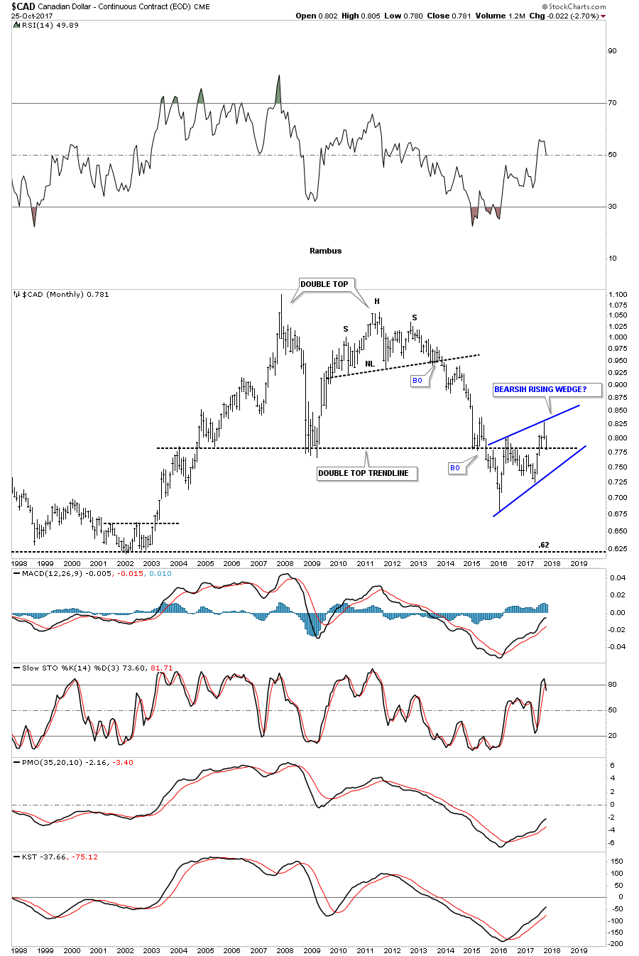
Lets look at some other currencies to see if they can give us any clues on what the US dollar might do. Below is a 20 year monthly chart for the Canadian Dollar that is showing a very large double top with a strong backtest to the double bottom hump which is forming a possible bearish rising wedge.
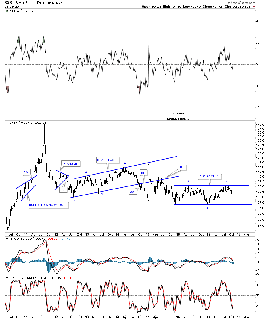
This long term monthly chart for the Swiss Franc is showing us a 6 year falling wedge which may have had a false breakout above the top rail. If the price action trades back into the falling wedge it will negate the breakout for now.
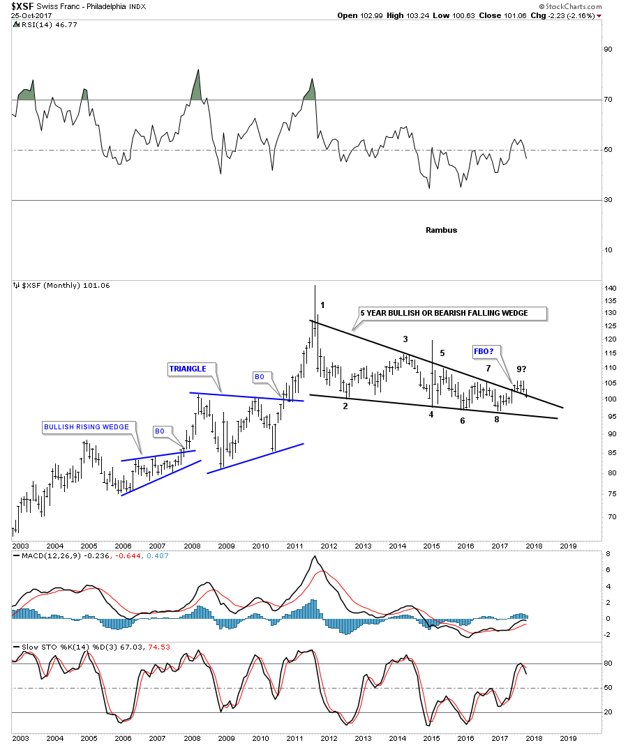
This weekly chart for the $XSF is showing a possible rectangle consolidation pattern building out within the downtrend.
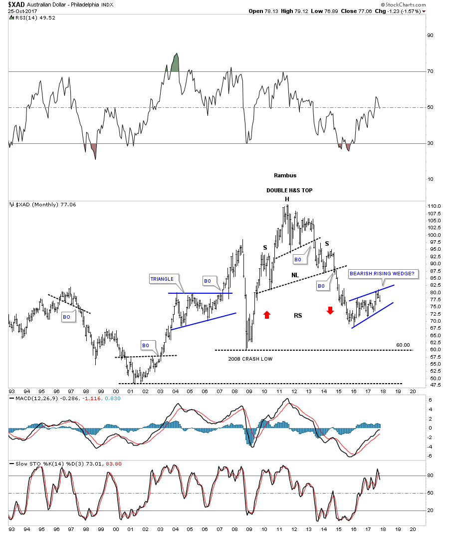
Next up is the Australian Dollar which may be in the process of building out a bearish rising wedge halfway pattern to the downside if the bottom rail is broken.
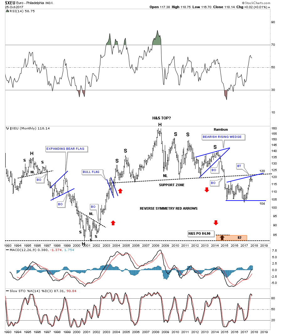
With the US dollar testing critical support then there is a good chance that the $XEU should also be testing resistance somewhere. When the $XEU broke below the neckline I was initially looking for a quick backtest to the underside of the neckline, but little did I know it would take almost three years before we would see a complete backtest at the 120 area. At any rate we now have a complete backtest in place. Now we’ll see if the neckline has reversed its role to what had been support to now resistance.
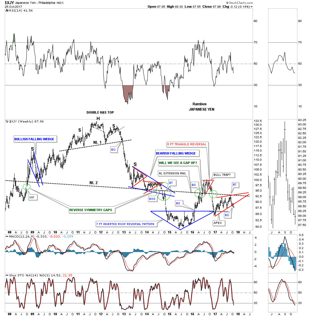
Below is a weekly look at the $XJY which is showing it breaking down from a morphing rising wedge formation as shown by the red circles. If we get a backtest it would come in around the 89.15 area.

Below is another longer term weekly chart for the $XJY that we’ve been following for many years which is getting quite busy now. First, notice how the price action interacts with big Neckline #2. There was an initial gap made on the left hand side of the chart when the $XJY gapped up to start forming the left shoulder of that massive 6 year H&S top #2. There was a breakout gap when the price acton broke below the neckline 6 years later confirming the double H&S top labeled reverse symmetry gap.
After the initial decline the $XJY built out the 7 point inverted roof reversal pattern which led to a countertrend rally back up to the neckline. When we got back up to the neckline I thought the backtest was complete when the price action declined for about 3 weeks or so, but then it decided to rally once again, this time breaking above the neckline which looked like the neckline had failed to hold resistance. After trading above the neckline for several months and backtesting it from above, the XJY built out the red 5 point triangle reversal pattern, which led to the move back below the neckline I then called that trading range above the neckline a bull trap. Note the green circle on the far right hand side of the chart which shows the XYJ gapping below the neckline once again, telling us the neckline was properly placed.
About 6 weeks ago the price action backtested the neckline from below once again, forming the red bearish rising wedge which is the same rising wedge we looked at on at the weekly chart above.
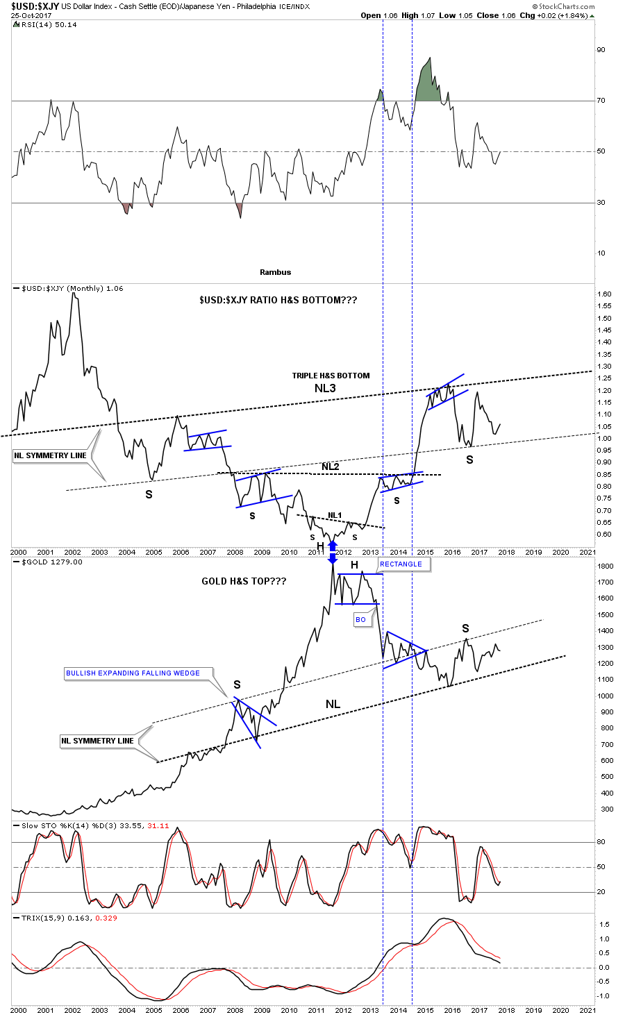
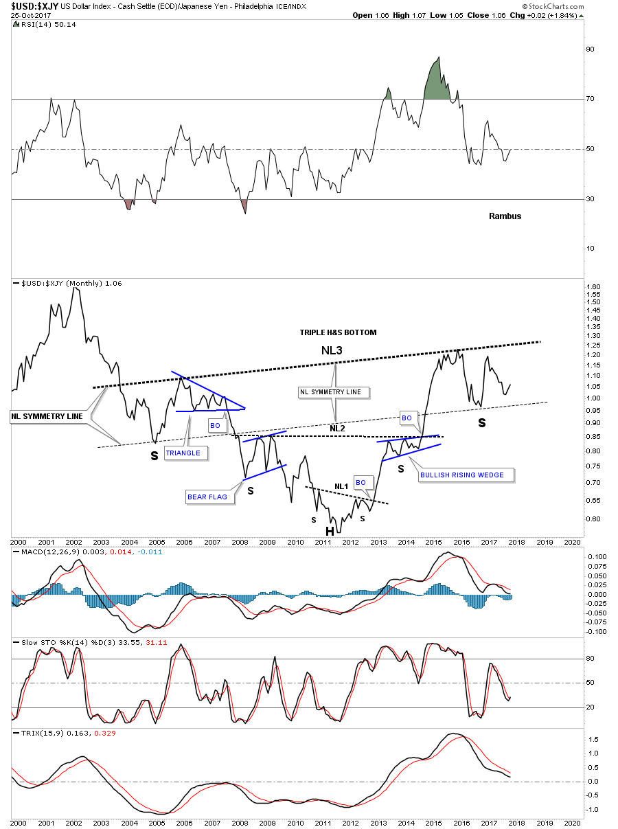
This next chart is a long term chart which compares the $USD to the $XJY. For the last several years the neckline symmetry line has been holding support for the right shoulder low. It’s possible that this ratio may be building out 13 a year triple H&S bottom. We won’t have a definite answer until neckline #3 is broken to the upside, but we can follow the price action for more clues as time marches forward.
Below is a combo chart which has the $USD:$XJY ratio on top and gold on the bottom. The neckline symmetry line on both charts have done a beautiful job of showing us where the low for the right shoulder on the ratio chart is, and the high for the right shoulder on the gold chart is located. Again, we won’t have confirmation that the possible H&S patterns are complete until we see the necklines broken. At any rate this combo chart may have some profound implications if these two H&S patterns play out. Have a great weekend and all the best…Rambus