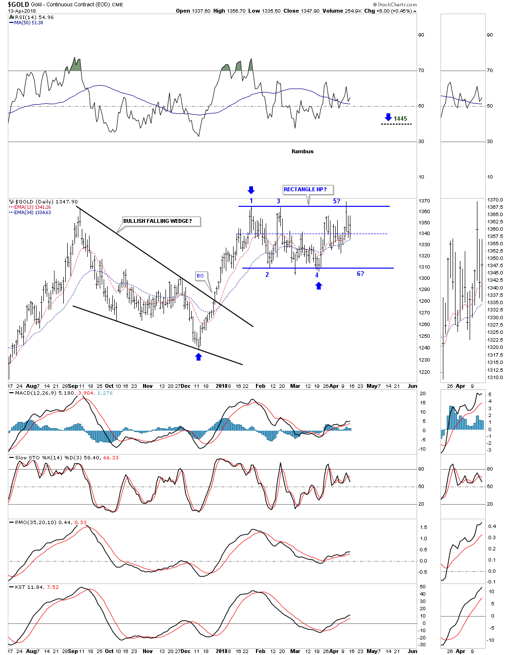
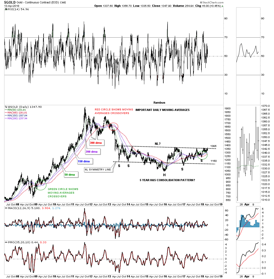
For the last three months gold had been chopping out a rectangle trading range which has completed four reversal points so far. Wednesday of this week it looked like gold may breakout above the top rail but the bears stopped the advance just when it looked like the bulls were finally going to win.
Many times before a rectangle is finished building out there can be one last move back down to the center of the rectangle where support is found. If the bulls are truly in charge they could take this oppurtunity to rally gold up and through the top rail to complete the rectangle as a halfway pattern. If the bulls can muster up enough energy to take out the top rail the rectangle would have a price objective up to the 1445 area as shown by the blue arrows. At this point there is no way to know if we’ll see another reversal all the way back down to the bottom of the rectangle which would complete the 5th reversal point. It’s still a consolidation pattern at this time.
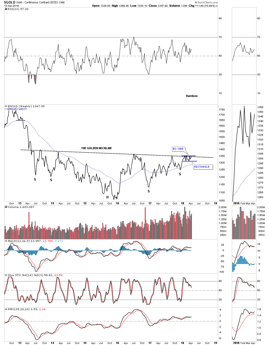
Below is a weekly line chart which shows the possible five year H&S base building out. The three month rectangle we just looked at on the daily chart above is building out just below the neckline. We’ve discussed many times in the past that it can be a bullish situation when we see a small pattern form just below an important trendline, in this case the neckline. These smaller patterns can give the energy a stock needs to finally takeout that important trendline. Gold tested the neckline again this week pushing slightly above the neckline, but the bulls were unable to hold on.
We know that neckline is very hot by the many touches it has had in the last five years. If gold is finally ready to breakout it will be interesting to see how it does it. Since there is such a well defined line in the sand we could see a big breakout gap as all the bears that have been defending that neckline are finally exhausted with none left to put up a fight. The line in the sand comes in at 1365.
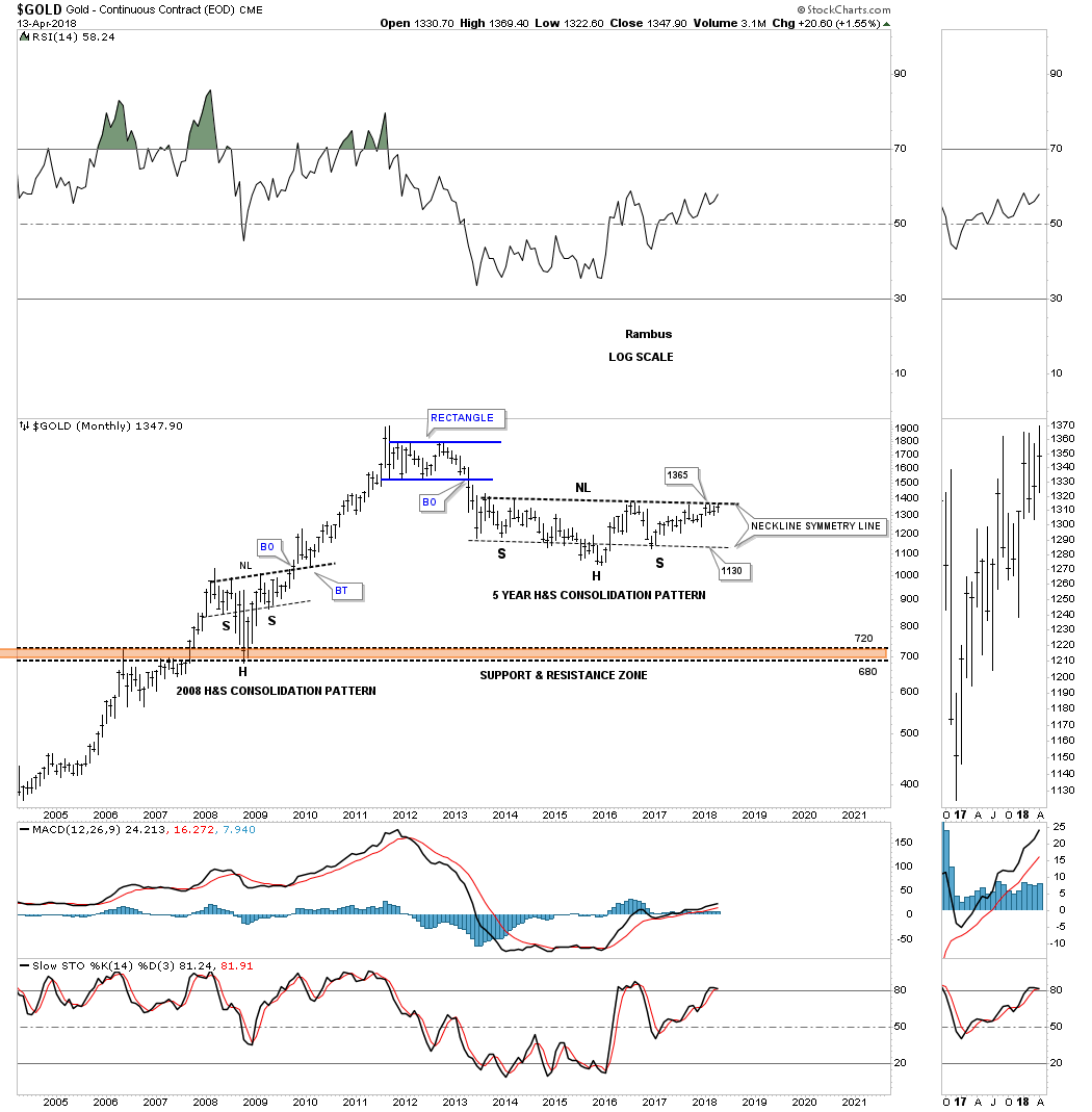
Below is the exact same chart as the line chart above, but this chart is a bar chart which shows how the blue rectangle has formed just below the neckline. If there was ever a time for the gold bulls to show they mean business this is their golden opportunity.

During the 2008 crash gold built out a very symmetrical H&S consolidation pattern which led to the final rally phase into the 2011 high. As you can see it took roughly four months for the breaking out and backtesting to the neckline to finally complete the pattern. It will be interesting to see what this chart looks like in six months.
It’s been a long time since we last looked at this long term daily chart which shows what I consider to be the most important daily moving averages for gold. Whenever the next rally phase gets going in earnest these four moving averages, when they become properly aligned, will show us where to look for short to long term support. The 150 day ma did a good job of showing us intermediate term support while the 300 day ma showed strong long term support. With the formation of the second right shoulder you can see the moving averages are pointing higher which is what we want to see.
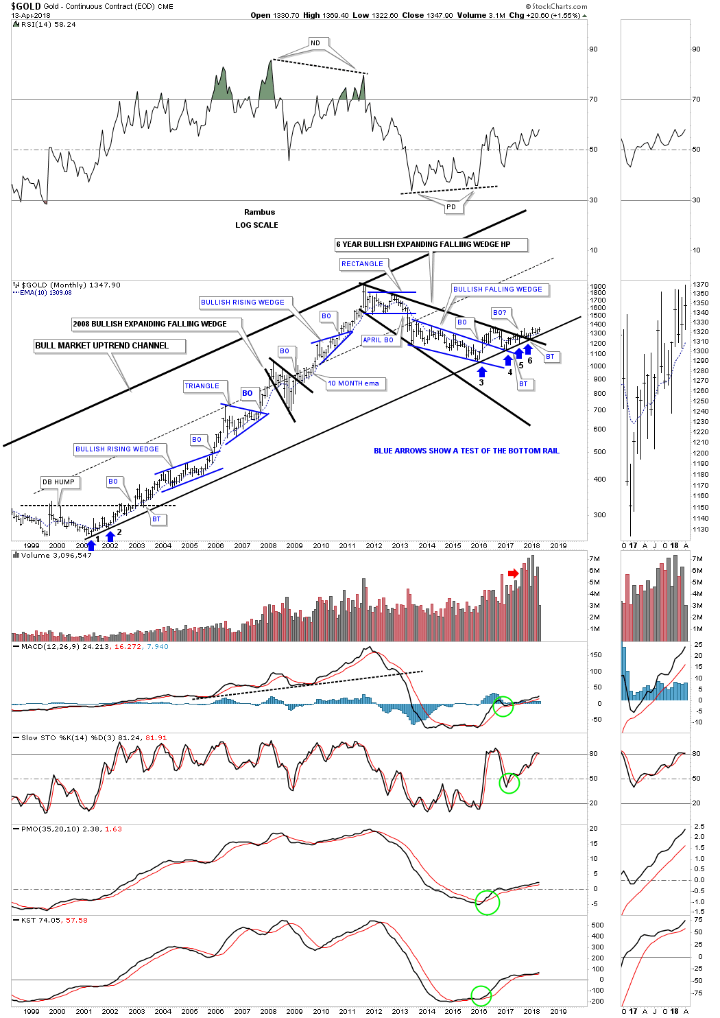
Below is a 20 year monthly chart which shows how the current H&S consolidation pattern fits into the big 20 year bull market uptrend channel.
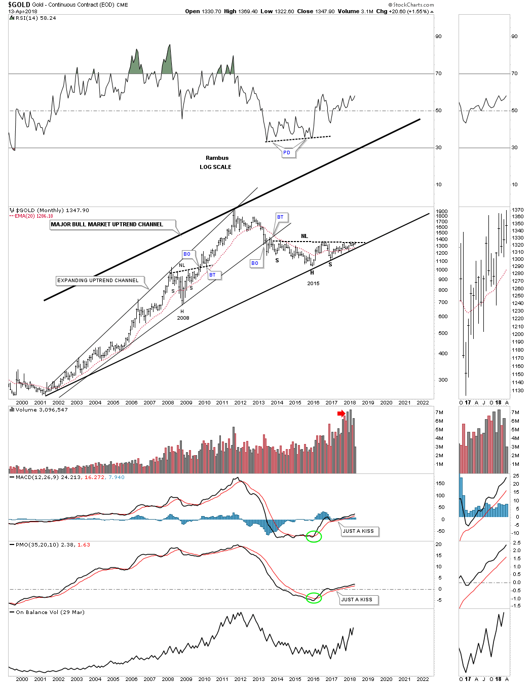
Below is another way to look at gold’s bull market uptrend channel which is my favorite long term chart. This chart shows all the consolidation patterns that formed during the first phase of gold’s bull market. Since 2011 gold has been consolidating that first phase by building out the black expanding falling wedge.
There is some really nice Chartology if you follow the price action starting at the blue arrow marked with a #3 on it. One of the reasons its taken so long for gold to really start moving up is because of all the work it has had to do with the breaking out and backtesting of all the important trendlines. Gold has been painfully climbing along the bottom rail of the major uptrend channel that has been tested six times so far so we know it’s hot.
I don’t show it on this chart, but when the H&S neckline we looked at on the above charts gets broken to the upside, that is when we’ll see the price action start to accelerate away from the bottom rail of the major uptrend channel. I’ve always said that gold produces some of the nicest Chartology of any market sector out there. If gold was manipulated as many seem to think there is no way you would get such beautiful chart patterns.
Now is the time for the gold bulls to step up to the plate and walk the walk. This is the perfect time to launch the next leg of gold’s secular bull market. Everything is in place, now we wait and see if the gold bulls mean business.