
This report looks at the market from the perspective of an Air Force U-2 at 70,000 feet. We will look at markets from around the world and assemble the clues which they offer us as to what is happening beneath the surface. These clues point towards the world entering into a credit contraction. Consensus opinion has formed a market narrative that is most likely wrong. Betting against a consensus narrative opens up a huge opportunity if one is ultimately proven to be right. We will examine the evidence which the charts are providing us and develop a conclusion and trade. This single trade expresses all of the world’s market forces wrapped into one position. I will also discuss the near term prospects of the US markets, uranium and finally offer an explanation of recent gold price action.
First however, I would like to comment on what we have all witnessed over the past 4 weeks here on the Rambus site. New members may not fully realize that the product presented by Dave Tablish is simply unmatched anywhere else in the world. Frankly, over the past 4 weeks I have sat stunned by the level of sophistication which has been presented to us all. Dave’s charts have cut right through the false assumptions the world holds in regards to markets. His chronicling of the breakdown of the gold price has been truly extraordinary. Consider yourself blessed to have stumbled onto this site which only a relative few know about. Please don’t tell Dave this, but I have always felt that there is a million dollar job waiting for him doing proprietary charts for some Greenwich Connecticut hedge fund… they just haven’t found him yet.
There is no way I can match his gift for charting, but what I can offer is a strategic interpretation of what the charts are telling us. That’s what this report is about.
The Post Bubble Contraction (PBC)
I have written a lot about the post bubble contraction and likely put many to sleep reading about it… but it’s time to wake up as its coming right down the snot-locker right now. Viewed from a real time perspective it often seems like a slow motion process. That’s because it is played out over a 15-20 year period. This process however is beginning to accelerate.
The era of modern finance began 350 years ago. That’s when enough stocks began trading in London to make up a stock exchange and modern banking began to include mortgages and a bond market. Credit began to expand via a fractional reserve banking system like we have today. Since then we have had 5 complete credit cycles. The last cycle ended in the 1930’s with the world wide contraction known as the Great Depression. These complete credit cycles last 50-70 years. They begin with balance sheets purged and holding little debt. These delevered balance sheets allow for rapid growth rates in both the private and public sector. As the cycle progresses however, debt builds up until it begins to inhibit growth. Debt reaches a level to where it is no longer sustainable and a contraction begins. The contraction purges debt levels through the process of default and restructuring. Once complete the cycle begins again. The Russian economist identified this phenomenon and named it after himself the Kondratieff Cycle. It’s actually been around forever and was called the year of Jubilee in the Bible.
Our current cycle began in the late 1940’s once private debt levels got paid down during the war. Since then both public and private debt has increased until it has now become unsustainable and its existence has led to anemic growth rates. The system began to contract in 2008, but world central banks addressed the credit excess by adding more credit. Amazingly, to the surprise of gold investors they were able to reinflate the credit bubble for another 10 years and gold got crushed.
The First Cockroach
Dan Oliver has chronicled this process better than anyone, he has recently identified Turkey as the first domino to fall in the upcoming contraction. I highly recommend his recent essay titled “The First Cockroach” at myrmikan.com. He explains the role of central banking in causing the PBC. He claims the contraction has now begun and it will be different than the WFC we saw in 2008. My view is it will appear like a mix of the 1997 Asian crisis, the 2000 dot-com bubble and the 2008 credit crisis all rolled into one. Yes, it will prove to be much worse than the 2008 WFC. Although the central banks of the world successfully reinflated the bubble, it will now be time to pay for it and the bill will be larger than 2008. Why will it be worse? Because the excesses are much larger and there is no longer a fire department to call since central bank tools are now exhausted.
A Contraction of Credit
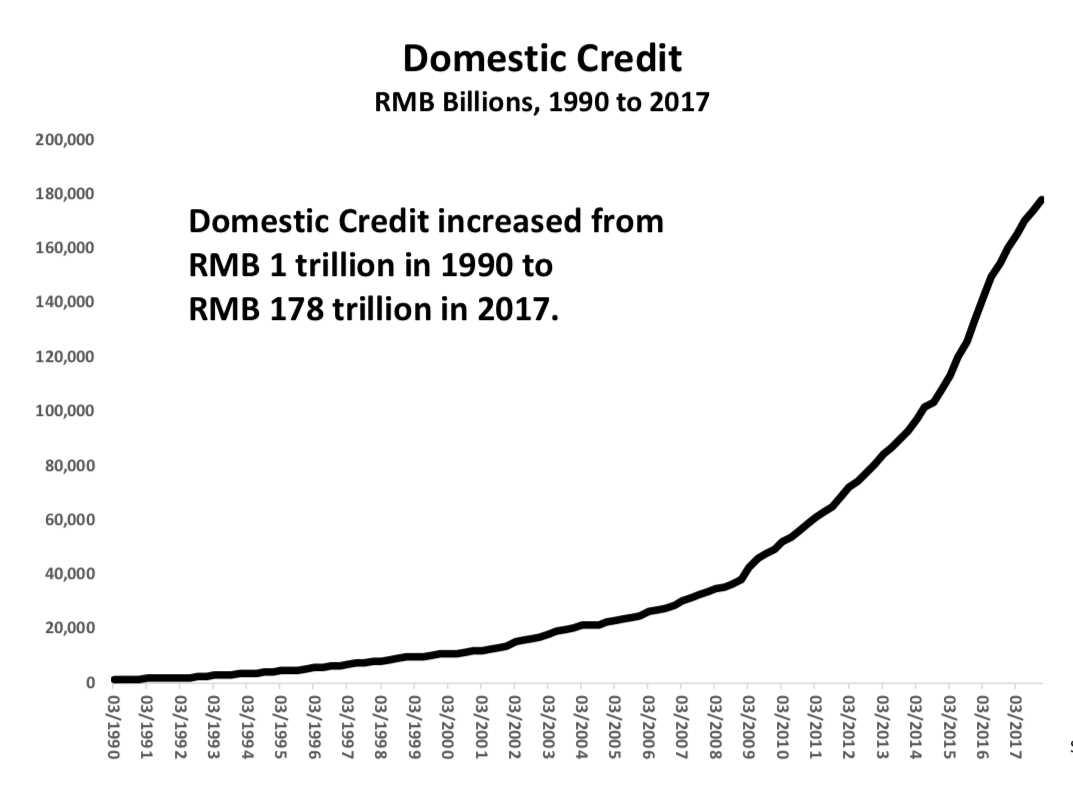
We are now set-up for a classic world wide credit contraction. The bubble expansion of the past 10 years has been driven by the intervention of central banks injecting credit into the world. Recall that credit spending entails pulling future demand into the present. If the free cash flows from that capital investment are not positive then when the future arrives that debt cannot be serviced. That’s where the world sits right now. Once the crisis gets rolling I believe the core of it lies in China. For years they have been building ghost cities enabled by credit conjured from thin air. I will offer only one chart representing the growth which is the increase of domestic credit. Chartologists should quickly see that this is a parabola and we all know how parabolas resolve themselves. This chart should put one on high alert.
Assembling the parts to our trade
So now observing from 70,000 feet let’s see what the world’s markets are trying to tell us. Markets move on liquidity, it is why we should watch currency markets as the currencies tell us where the money is flowing to. The Australian dollar is a commodity based currency which is a good proxy to the state of the commodity markets. When commodities go up money flows into them and into the AUD. The chart below offers a 70,000 foot view of this dynamic. Over a 40 year period we see the secular bear in commodities from 1980-2001, then we see the effects of the China build out from 2001-2011. Since then commodities have been deflating. In 2015 the currency broke a 15 year up-trend line and has been backtesting it until recently. These are slow glacial moves but It now appears to have begun an impulse wave down. It is resuming its downtrend in what may prove to be a half-way pattern. Conclusion: a contraction in commodities lies ahead.

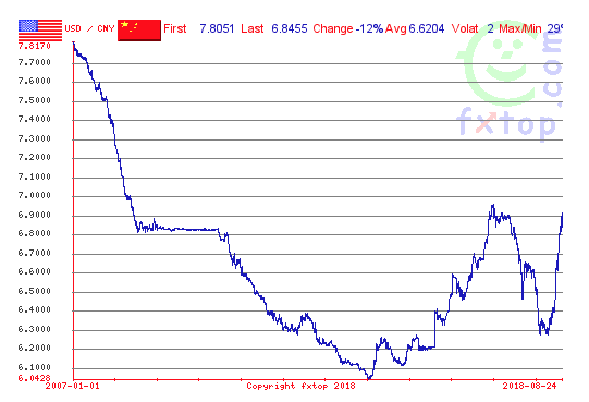
Let’s review one more currency- China. The chart below shows the Yuan since 2007. In this chart a weaker currency is represented by the chart rising. What we have is a very recognizable chart pattern… a Cup & Handle. It is telling us the Chinese Yuan is about to deflate. This means money flow exits China and credit levels decline. This could prove to be catastrophic for China as well as the rest of the world since they have been the engine of growth for the world economy since 2009. Keep in mind China’s financial system is fragile due to its level of financial leverage or credit to base money ratio.
The USD
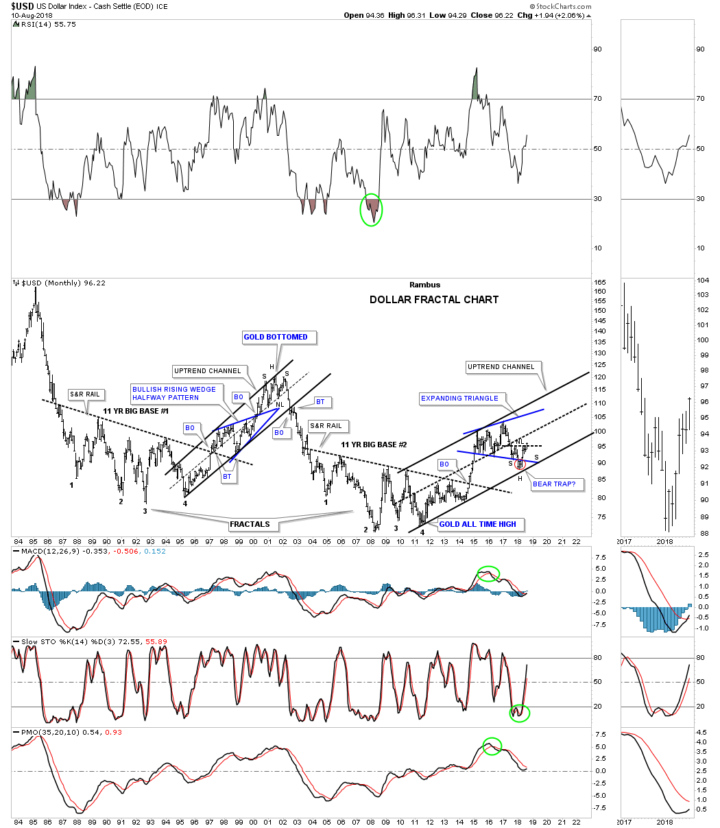
In a PBC money flows from the peripheral economies of the world back to the world’s financial centers. It principally flows towards the senior currency which of course is the USD. This is because it not only seeks safety and liquidity but it must service the debts originated in the financial center. These debts are denominated in US dollars so require the purchase of dollars for repayment. This is how foreign debts act as a synthetic short of the dollar. So when the USD declined for the entire year of 2017 it seemed a conundrum. The catcalls were heard daily that the USD was “toast” whenever the case was made for a stronger USD. It appears now that the 2017 decline was likely just a correction of its upside move during 2011-2016. The USD bull market, reflecting money flows towards it, now seems to have resumed. Rambus has provided the definitive chart suggesting the path ahead is higher:
Commodities- A look ahead
As the USD strengthens commodities are likely to reflect this through a lower price in US dollars. Our long term commodity chart offers us a glimpse into what may unfold and its nothing less than catastrophic. I am not calling for the end of the world here, but certainly the prevailing narrative of rising commodity prices is not prepared for the outcome of commodities being priced back to early 1970’s prices.
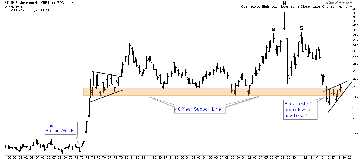
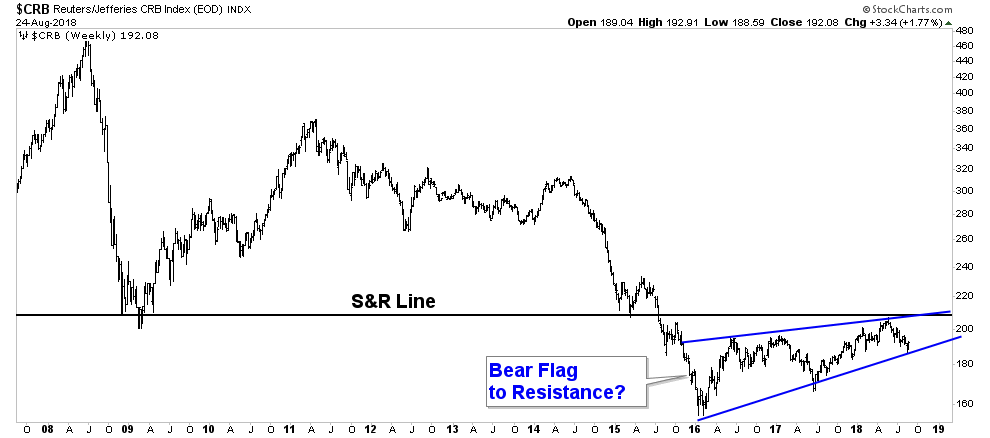
In the chart above we can see there is simply no support below the existing pattern of consolidation represented by the tan bar. A break below the 2016 low could lead to a free fall in price. Below we see a close up of the action of the past 10 years. The rally of the past 3 years is becoming increasingly evident that it may just be a bear flag retracement up to resistance.
Drilling down to the major commodities
Crude Oil is of course the king of commodities so let’s take a look from 70,000 feet. In the below 40 year chart we see three trend zones for oil. From 1974 to 2001 it remained in a consolidation zone between $10-$40. During this period it was consolidating its massive move from $2 to $40 which it underwent during the 1970’s. This move did not occur due to evil oil sheiks jacking up the price it was simply pricing in the immense inflation in the USD which had occurred since the 1950’s.
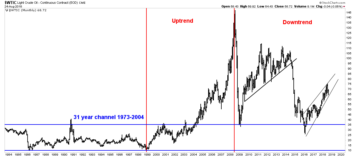
Once the 30 year consolidation was complete oil then underwent a 10 year bull market from 1998-2008 driven by China buildout and hedge fund speculation. After the peak in July 2008 at $147 it then crashed which was a typical (although unexpected) resolution to a mania parabola. It is my view that since then it has been in a secular bear market which entails several cyclical uptrends and downtrends. The move up since 2016 has simply been the second cyclical bull market within the context of a secular bear market. Once the move up exhausts itself we should see the next cyclical bear market which likely will lead to the end of the secular bear market. I am not making any predictions on how far down it will go, but it has the potential to be shocking considering the CRB is made up from 40% liquid fuels and one can see the possibility of that being cut in half.
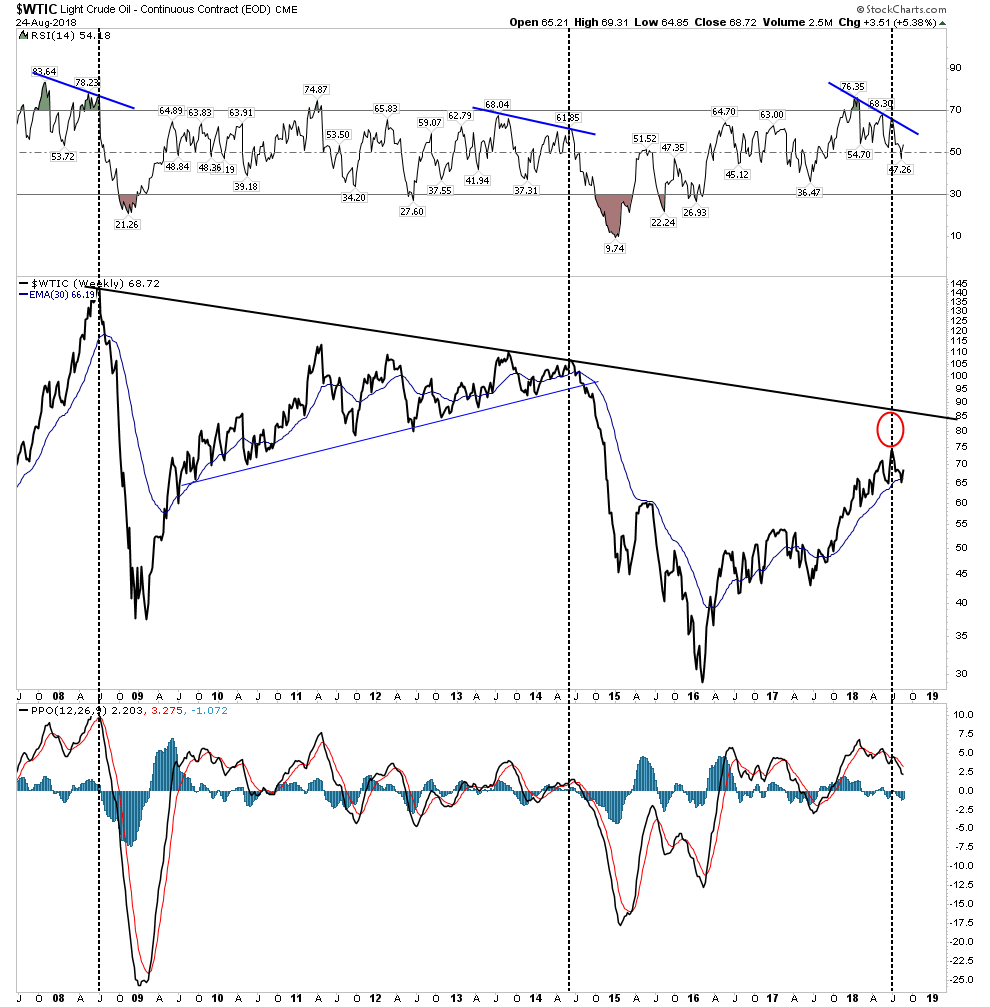
Let’s now zoom in on the past 10 years of oil market action. Could the cyclical bull market since 2016 now be ending? Judging by the waining PPO, the non-confirming RSI and the failure of price to reach its LT trend line it may very well be ending action. We can’t conclude that yet as its too early, but it looks done.
Copper
Dr. Copper has been delivering a serious message for some time now. Things are cooling off and the source of the cooling is China. The below copper chart has a lot of resemblance of the previous LT oil chart. It surged from 2002-2011 due to China build out and its recent 2-year bull market seems now to have ended. Long term Copper fundamentals are wildly bullish, however in the short to intermediate term markets trade off of liquidity NOT fundamentals.
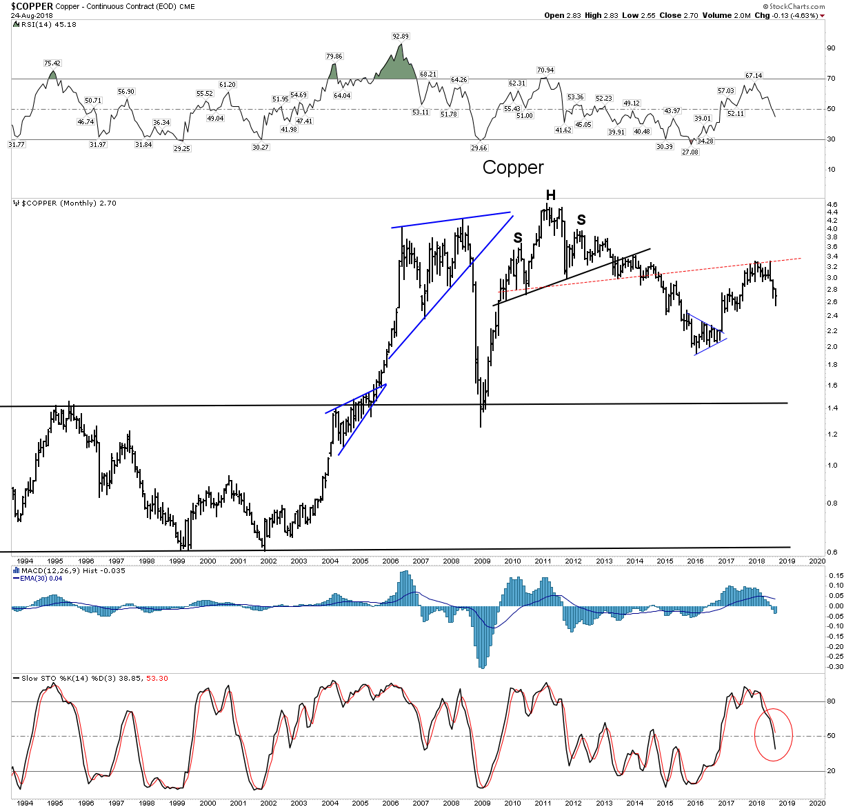
The 2-Year rally ends in a distribution zone:

World Stock Markets
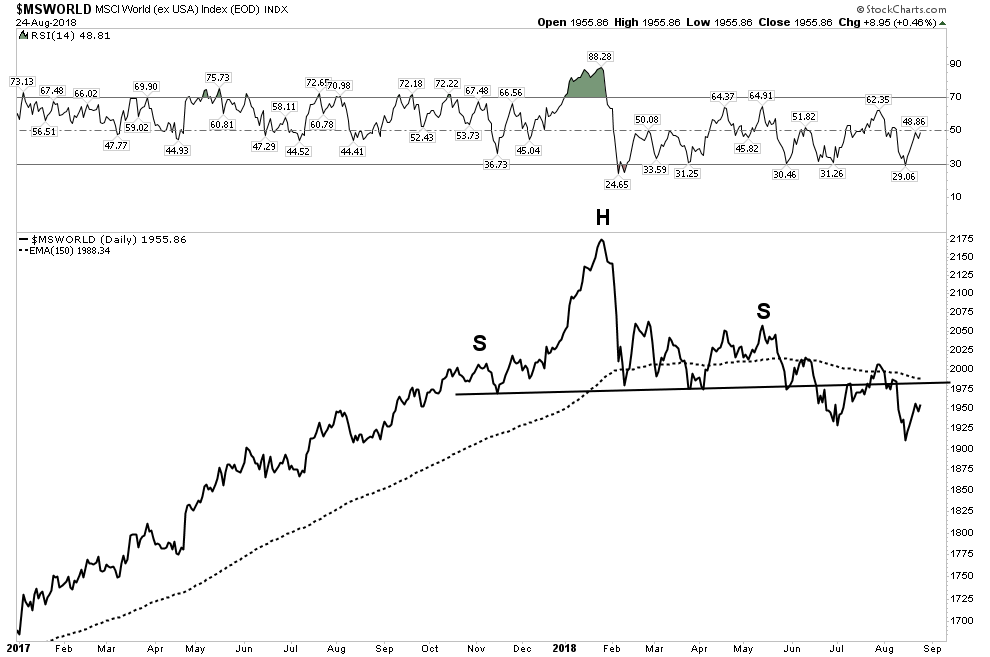
The US Stock market has been surging to new highs (more analysis on this later) yet markets around the world are now fading. Again, this fits the PBC model since money flows away from the emerging markets towards the senior currency and these flows pump up the home market. Let’s look at the entire world Ex-USA distilled into one chart the MSCI World index. Here we see a H&S top, a violation of the NL and currently a backtest towards that NL. It is now below a declining 30 W EMA indicating it may now be entering into a world wide bear market.
China the epicenter of the world’s credit contraction.
Back in February I posted a chart of the Shanghai index pointing out how it had just “jumped the creek” of its 150 & 200 EMA. This was signaling a deflationary event IMO. Here is the chart below dated back to February:
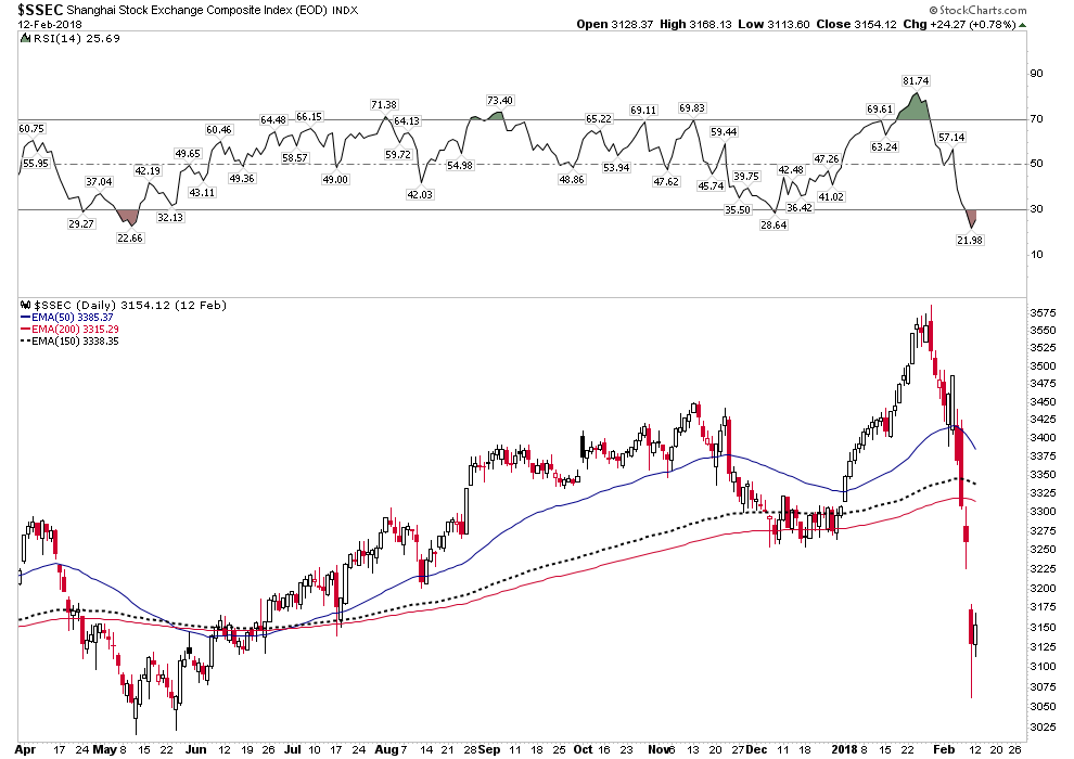
The decline was extremely violent and given the fact that this was the senior index it must be signaling something very serious… a credit deflation. Bringing the chart up to date we see this was in fact a serious lead signal that a decline was in store:
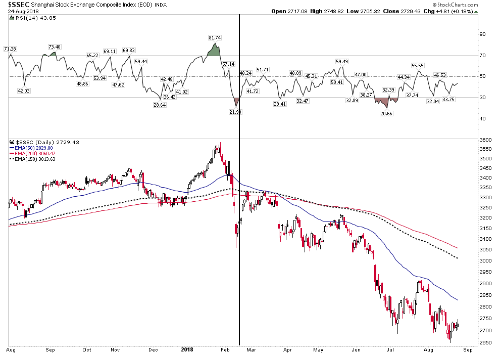
Major capital flight has begun in China and the PBOC has responded by pumping in $1T into its banks to replace the exodus of these funds in order to stem a collapse. Now taking a step back and again viewing the entire time history we see the markets telegraphing an unfolding potential collapse in the market. The rally we see which began in 2016 was likely just another anemic failed bear flag, just like all of these other charts. Yes, we are starting to see a consistent pattern here in all of these markets. That pattern is the footprint of a world wide post bubble contraction beginning to unfold.

Time constants prevent me from presenting the full case for the PBC, but what we see so far is markets all around the world delivering the message that this is beginning to occur. Turkey is NOT an outlier it’s just the first cockroach. Italy is likely next up at bat.
If China has to pull in its horns think about the effect it will have on commodities. Here is what China consumes today as a percent of total global consumption:
Cement -59%, Nickel- 56%, Coal-50%, Copper-50%, Steel-50%, Aluminum- 47%. Pork-47%, Cotton-33%, Rice-31%, Corn-23%, Oil-14%
Wall Street Narrative- The Opportunity
We are likely about to enter the next phase of the PBC. I will call it the toxic USD rally phase. Once the USD breaks above its previous high of 97 we will start hearing the rivets of emerging markets begin to pop. Their debts payable in US dollars will be much more difficult to service. This will lead to faltering markets and currencies. Expect the Euro to run head long into trouble dropping to perhaps below par to the USD. It will possibly be split into two currencies the Northern and the Southern Euro. Big Wall Street money is not positioned for any of this. In fact they currently have record short positions in U.S. bonds and gold. In addition, there exists a record long speculative position in crude oil. The prevailing narrative of big money is on the opposite side of the trade from all of this.
That’s the good news because in this lies tremendous opportunity. The way to make serious money is to bet on something that has never happened before and be right. A PBC is not a new phenomenon, however we haven’t seen one in anyones lifetime, therefore due to recency bias most think it can’t happen. After all, the FED has our back- right?
The Trade- Long the TLT
All of these market moves can be expressed in one single trade… go long the TLT. We are not futures traders, so this is the most simple vehicle to use to align ourselves with the PBC at this time. Later down the road other positions will present themselves, but for now the TLT is the #1 set-up.
Again the narrative is that rates are set to go higher which explains why there is a record short interest in the US 10 year bond which is betting rates are going higher. These trades are based off a lack of understanding of the PBC and how money will flow towards the US Government bond. Yes, I understand that cogent arguments can be made for a weaker bond due to the US governments massive financing needs. This is a reality, but world wide money flows will dwarf this argument once the ball gets rolling. Let’s take a look at what Mr. Market is signaling:
The below chart is a picture of the accepted Wall Street narrative. Interest rates are set to go higher or said differently the TLT is about ready to break down. We see the H&S building out right before our eyes. But as Joe Granville used to say “what is obvious is obviously wrong!”
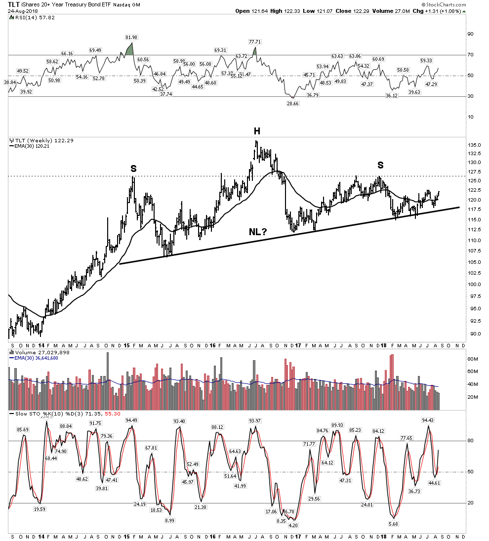
However a closer look shows price above a rising 30 EMA & weekly stochastics headed up. It’s more likely just been in an upward consolidation. Now let’s look at the inverse and review a chart of the shorter duration UST 10y interest rates and the chart simply jumps off the page. Rates are set to drop. They have now done all of their technical work and appear ready to drop.
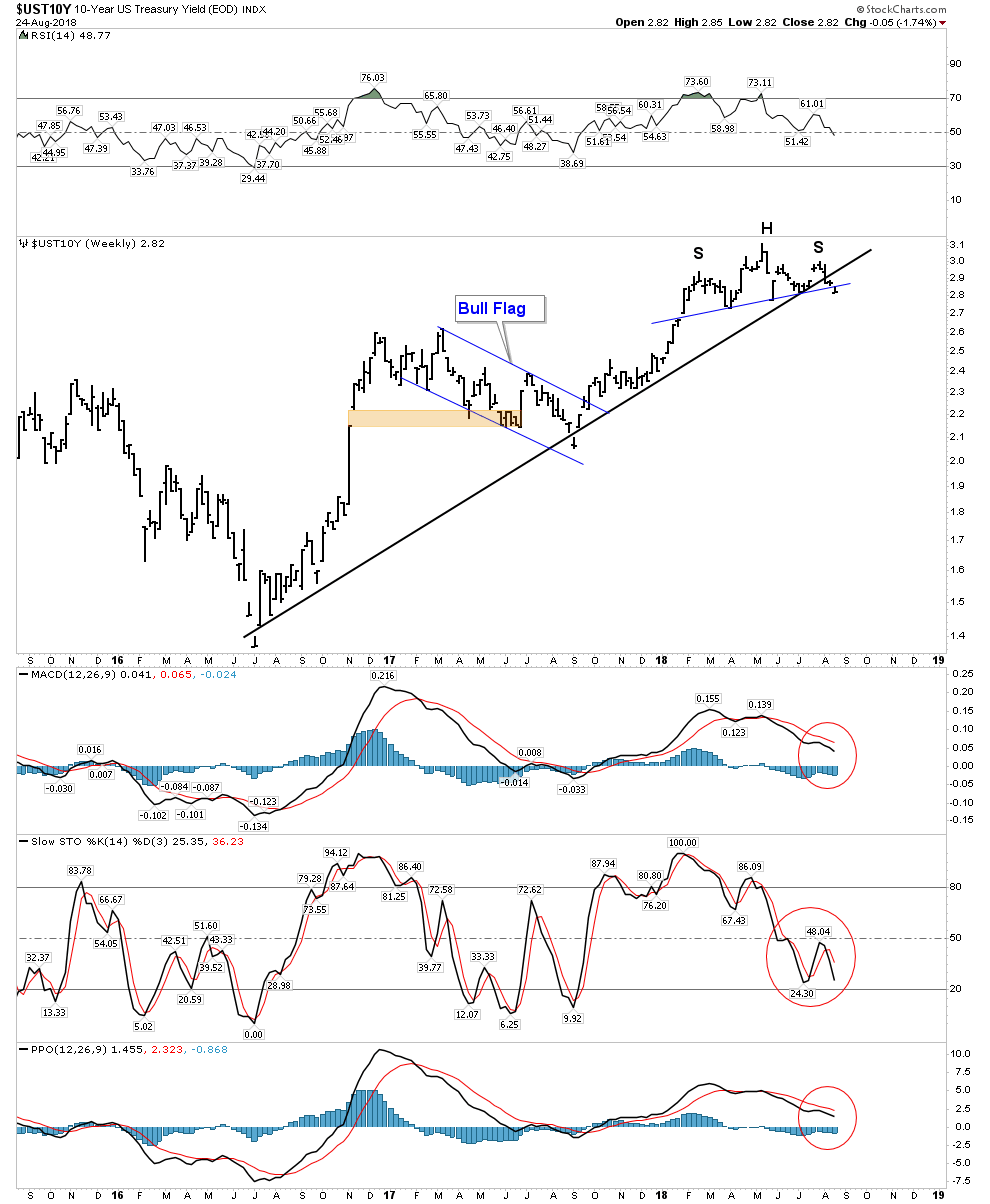
Here we have all the indicators lining up for a drop in rates. The 2-year advance in rates now appears over its time to enter the trade. Money flows into the USD will drive down rates. One could buy the TLT outright or for more participation in the trade you may use a synthetic position buying deep in the money call options. The time horizon may be up to 2 years, however I myself intend to trade over a 4 month interval.
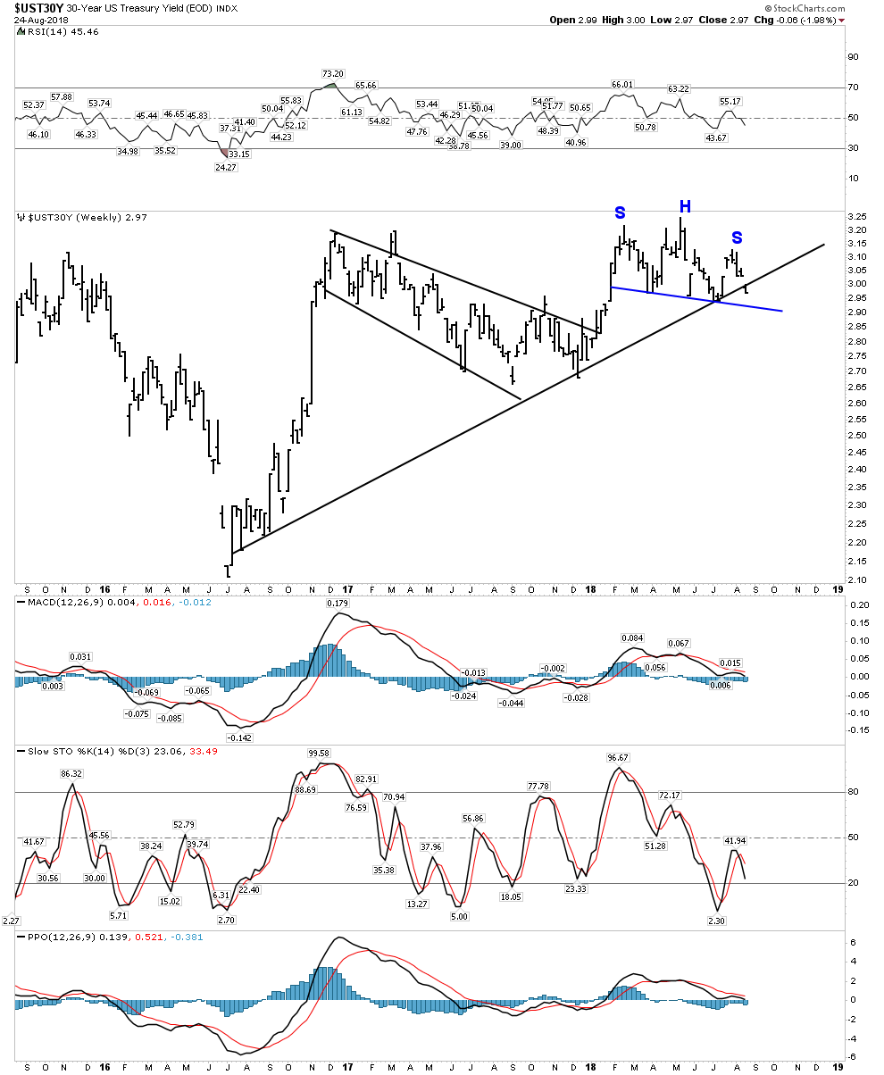
A look at the 30 year yield offers us a similar view, however yields have not yet violated the NL, but just broke the trend line : Stay Tuned
ADDENDUM OCT 7 : I was too early in the TLT trade as Fed Chairman Powell had other ideas on Oct 5 ( see Part 5 for a more comprehensive explanation of the TLT trade prospect.)
The US Stock Market
I have chronicled the US Stock market all year using DOW Theory as a methodology. The last leg up in a 10 year bull market began in November 2016 with the election of Donald Trump. This leg unfolded as a classic Phase III blow off with a throwover top in its last 2 months which included a full blown buyers capitulation where retail investors threw caution to the wind and finally bought with both hands. Incidentally, the weekly RSI registered over 92 which is the highest ever in the DOW’s 120 year history. You want over bought…. well you got fully over bought!
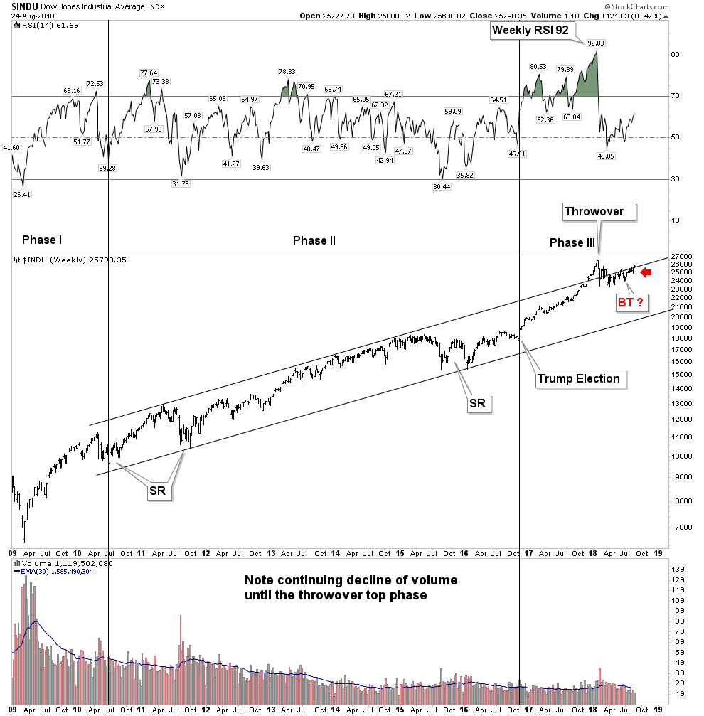
It ended with a 13% smash within one month from its top. This wiped out the most egregious segment of speculation, the volatility or VIX traders. Since this time the market has been crawling back to its old highs with some sectors stronger than others. The DOW in the chart above so far appears to be undergoing an aggressive back test of its upper trend channel. The RUT and QQQ have been the standouts and the DOW has been the laggard. I have used the below DOW Theory chart below to track it according to DOW Theory:
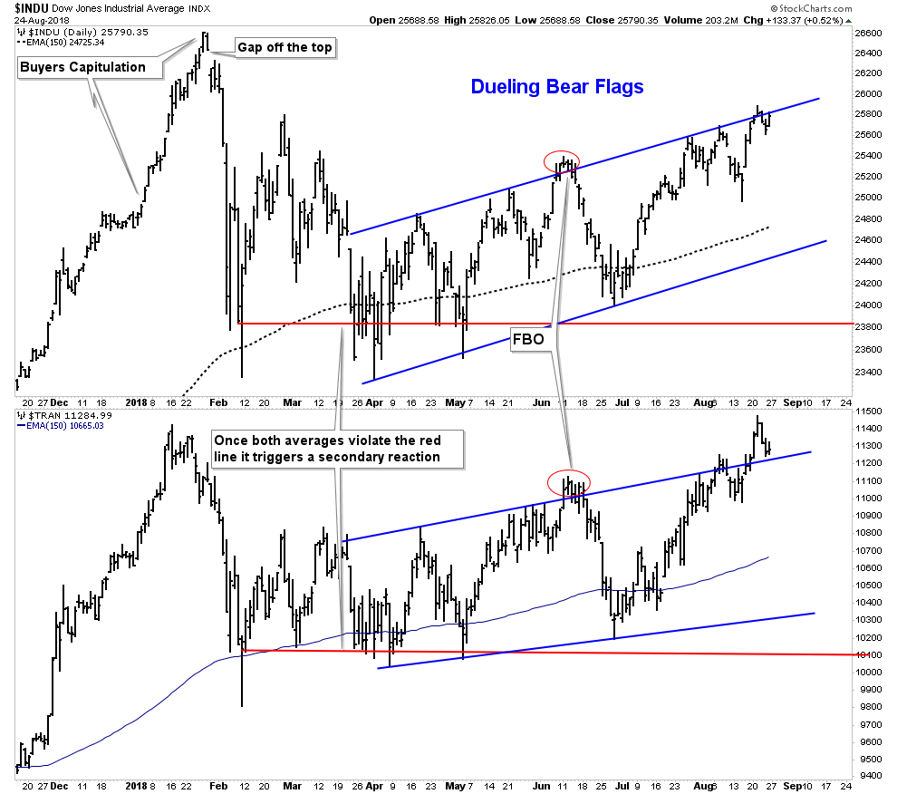
DOW Theory classifies the market as still in a secondary reaction, a sort of no-mans land. Transports have gone on to a new high, but the DOW so far has not confirmed the move. They both need to go to a new high to reconfirm the bull market. We never got a bear market signal which would require a renewed violation of the red line by both averages. I have labeled the rallies in both averages a bear flag, but we will see. If the DOW goes on to a new high then they will be relabeled as bullish consolidation patterns.
But here is what I really think is happening. IMO 2018 will prove to have been the year the top got put in. This is complex topping action and Mr. Market has every intention to deceive and make sure the dumb money gets caught holding the bag. But before the final top is in we are likely to have one more grand finale during the month of September and possibly into October. Managed money needs to be positioned into what has worked this year before the September quarter is over. They must be seen to be in these stocks for their quarterly reports, thus the FANGS are about to be bulled for one more time. Hold on as one last upside romp is about to unfold, we will see where it takes us. I recommend using it to exit to the sidelines and get ready to execute your PBC playbook. (more below)
Uranium- The abandoned little bull
Despite the recent washout in commodities this little sector seems oblivious to it all. Consider its already been through its own 96% bear market decline and now the little baby bull is marching to its own drummer. Uranium is alone, abandoned, hated and in an uptrend. Uranium investors have been so burned for so long that they simply refuse to get on board, they have seen too many false dawns. But let’s just take an objective look here at the U.to which is the proxy for the uranium price:
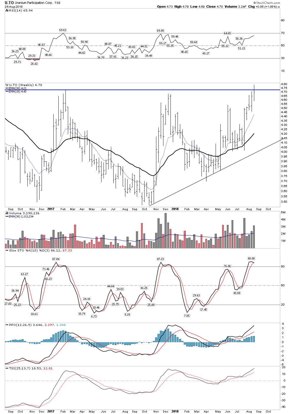
Just this week we punched up through last years high price and we have established a series of higher lows since October 2017. PPO is particularly impressive signaling higher upside momentum. And of course the 30 EMA is now configured upward. There is simply nothing bad about this chart.
Risk vs Reward and Fundamentals Dovetail with Technicals
I have stated before that the risk-reward proposition for uranium is the best of any I have seen in my lifetime. What we now have is the fundamentals dovetailing with the technicals. Cameco shutting in half of its production exceeds the analog of Saudi Arabia cutting half of its oil output. Not only that, but Cameco is now purchasing uranium in the spot market to fulfill its long term contracts for delivery. The market will likely be back in balance in a year.
Rather than watch the ETF URA, I prefer to just look at the stocks and the best proxy for the sector I regard is Cameco. Below is a long term chart showing the level of devastation to this bluest of blue chip uranium stocks.
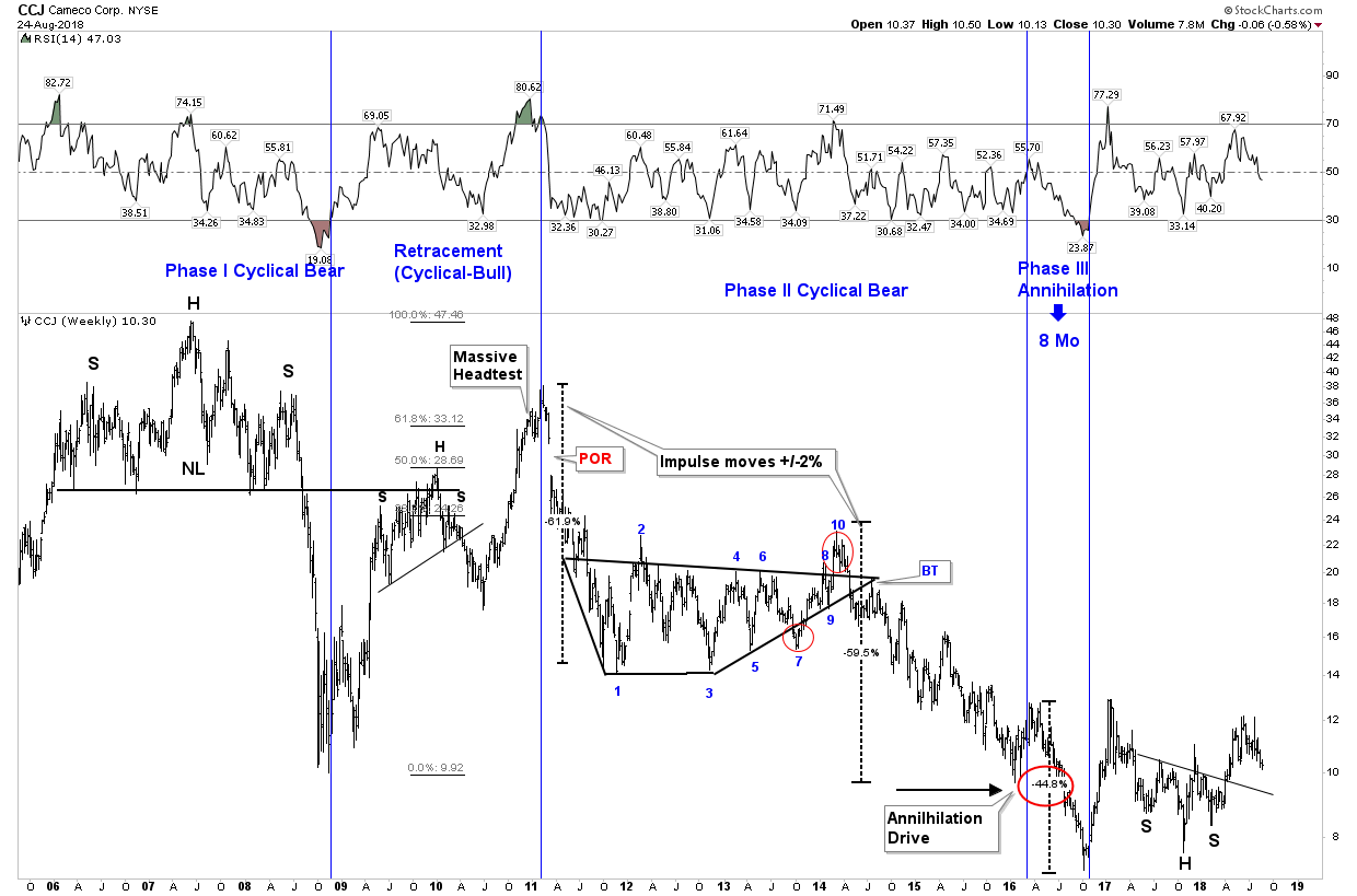
Note we are likely in the BT phase of its breakout above the H&S neckline. It is my opinion that the high performance stocks of this bull market will initially be in the US producers. UUUU and URG are favored domestic issues. Keep in mind that 20% of US electricity comes from nuclear and the US supplies less than 5% of its own fuel while near 100% of Canadian production is already contracted for.
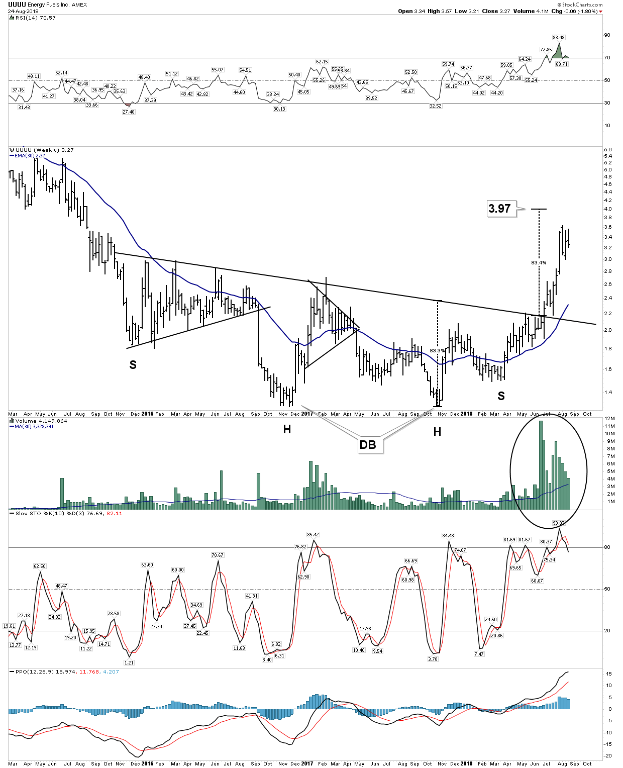
Favorite: Energy Fuels:
URG

UEC is also looking positive, however the company lives or dies on a life line provided by Sprott funding so there are risks.
Post Bubble Contraction Playbook
We have mentioned being long US Bonds for an extended period and playing the US stock market for an upcoming short term rally. Other trades should present themselves such as shorting individual emerging markets and ultimately the US will enter a bear market opening up downside trades in US market averages. Uranium serves as a specialty although volatile trade. Next up the oil market appears to be setting up as well.
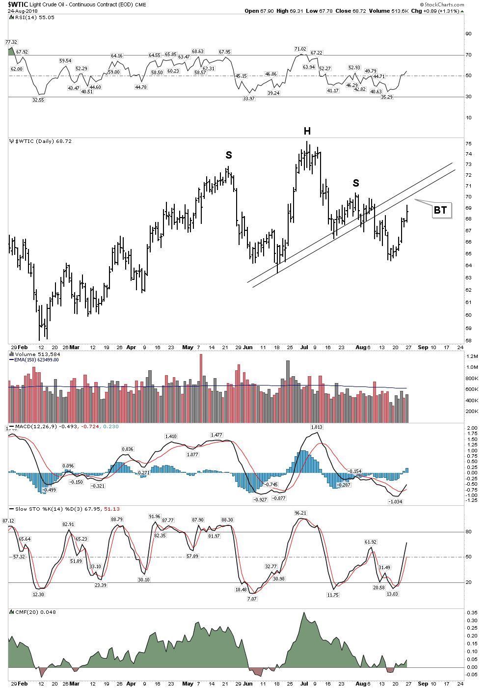
Although still above its slightly rising 150 EMA (not shown) oil appears to be setting up for a short entry. It is now in a back test to its H&S neck line. Note the lack of money flow back into oil during this recent counter trend bounce as depicted by the CMF indicator. I look for a price objective of $58-61 once the down trend resumes. Long term however, oil should be headed lower.
The World of Gold
As mentioned at the top of the page no one in the world has chronicled the collapse of gold and the gold stocks better than Rambus. Simply stated he saw this one coming through his charts and telegraphed it to us all. Some other writers were aware of the possibilities of lower prices, but no one had a handle on it better than Dave.- Good show!
Rambus’ charts clearly present a path forward to much lower prices in gold and the gold stocks, I do not take issue with these projected outcomes, however I assign a lower probability that they will be completed in full. The obvious conclusion based on Rambus’ valid & brilliant charts of the gold sector is that the bear market never ended. The rally of 2016 was likely a corrective Elliott “B” wave within a prolonged bear market. The implications of this of course is that prices are destined to violate the 2015 lows and that the 2016 rally was simply a pressure relief rally within a massive bear market. That’s the message of these excellent charts.
I don’t deny this as a possibility, clearly it’s possible, however below I will make the case that we are still in a bull market that began in 2016. The collapse of the gold stocks we have witnessed over the past month will come to be seen as a final shake out of the 2016 first leg up in a new bull market. I will grant you that it sure doesn’t feel that way as its pretty dark out there and it seems the last bullish impulses have been eradicated and purged… but that’s kinda my point, that’s what a bottom looks like.
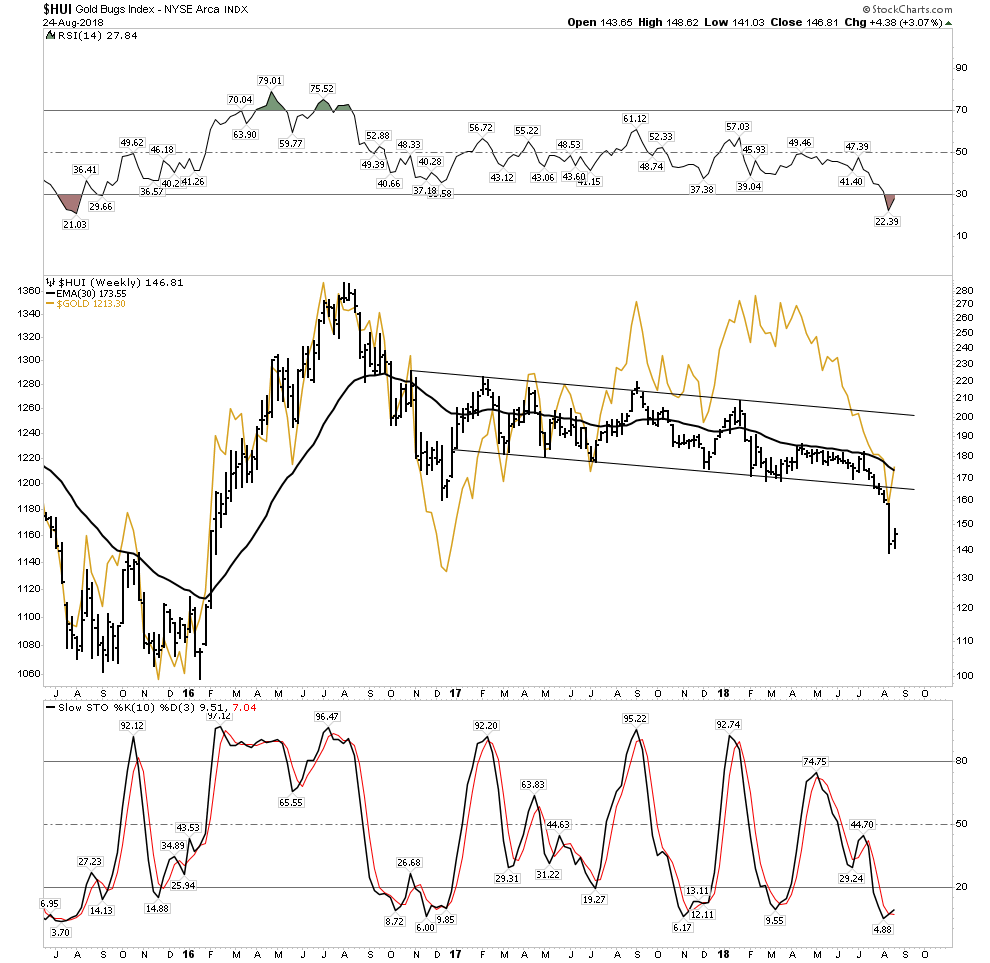
I vividly remember walking through a thinly attended gold show in the Vancouver Convention Center in late January 2016, 5 days after the bottom in the HUI price. No one knew it at the time, but the bottom was then in. Literally no one in that huge center believed gold had bottomed. I asked everyone their opinion and 100% thought gold was headed lower. Sure they all knew it was near a bottom, but the universal consensus was we had one more leg down to go. They were all wrong (including me), as gold and the stocks had already begun what would become a rocket ride for the next 7 months. The precious metals had been abandoned, investors had been wiped and cleaned out, but they were not short gold and they didn’t hate it.
Today’s environment is different as I have never seen such a universal disparaging of the metal in the 40 years I have watched it. This week on Real TV I watched an investment presentation by a respected manager who called gold a “rock” destined to go back down to $200. Short interest in gold by managed money is now at RECORD levels while the commercials (smart money) have closed out their shorts. JPM is now holding a record long position in silver and central banks are buying (exception Turkey). Yes, I see the dreadful charts, but this is starting to fell like a bottoming zone. The short gold trade has now spread to the wannabe hedge fund managers and it is now a very very crowded, illiquid trade.
2015- Major Producers Divesting
2018 Major Producers Acquiring
In 2015 the big producers were thinning out their companies and selling off assets. Barrick was panicking issuing shares to pay off debts to prevent a bankruptcy. It was a bear market and they were acting as such. They were in liquidation mode. Today however that’s not what we see. We see capital being deployed into the space. The majors are actively trying to build out their reserves and projects. They are deploying capital. Let’s look at the record over the past year:
South 32 buys Arizona Mining for $1.2B
Lundeen Mining launches a hostile buyout for Nevsun
Newmont purchases Nova Gold’s Galore Creek project
Coeur buys Klondex then rolls up Northern Empire
Barrick invests $40 million into Midas to own a 20% interest.
This is NOT what goes on in a mature bear market for gold. No, I think what we just saw was a violent vicious shakeout of the last die hard bull investors.
The Shape of a Bottom- The violent shakeout of 2018
This shake out did its job and it’s probably still not over. It cleaned out the last bit of bullishness and will now lay the foundation for the next leg up… the Phase II or mark-up phase of the bull market now lies before us. We shouldn’t expect a V bottom as the damage has been too great, it needs to build out a sustainable bottom. Expect some prolonged basing which could last 4-6 months IMO. Here is a conceptualization of what a bottom formation in the GDX could look like:
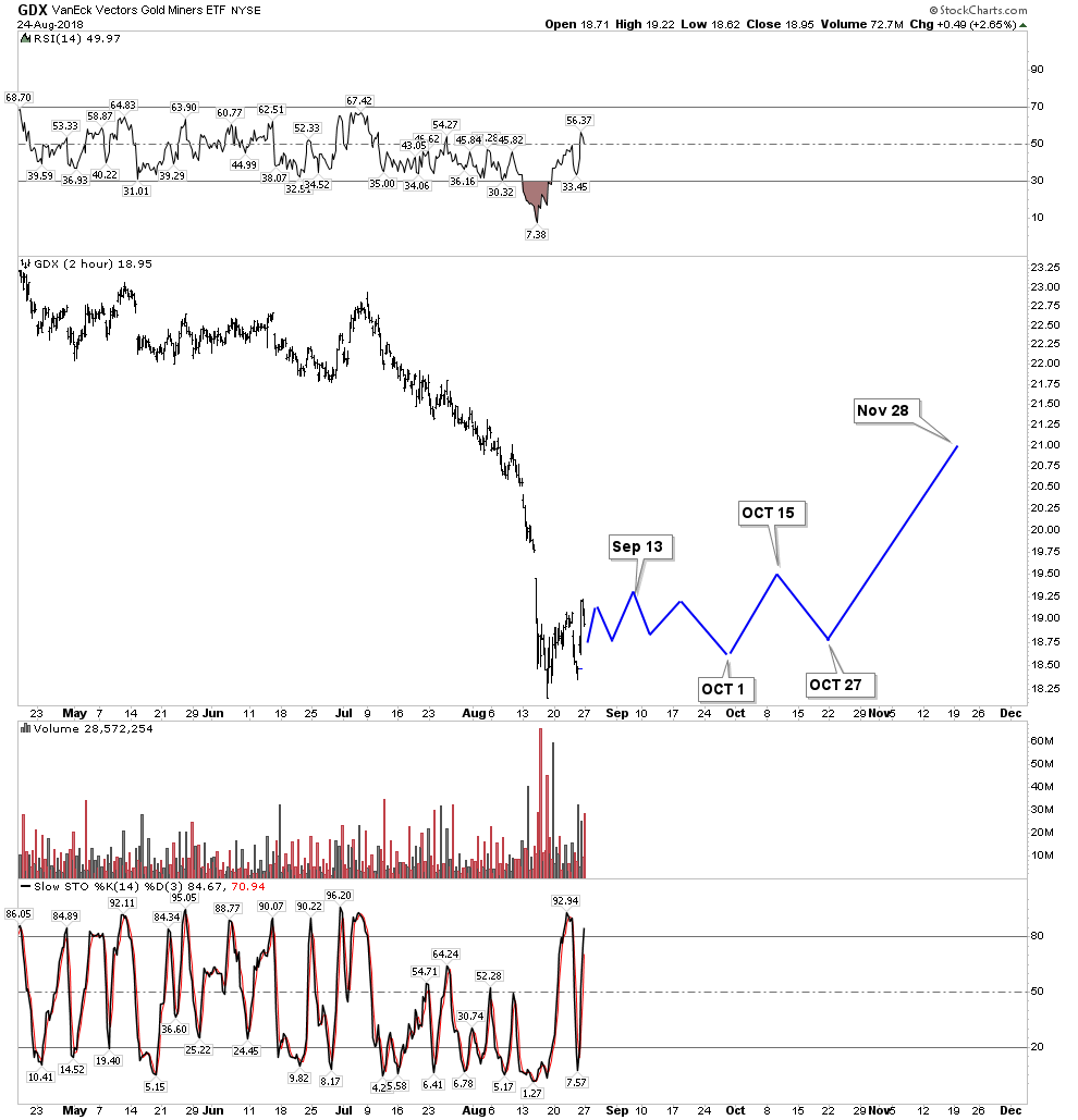
This is a conceptualization based off past panic lows in the gold stocks. No one can know for sure but judging from past panic lows this is the template that has followed. It is possible the GDX could have an undercut low in the following months which goes to lower lows, however it is not my expectation.
The Recession Ahead and Gold Stocks in a PBC
It is my forecast that within one year from now the economy will have entered into a recession. This expansion has lasted 9 years now and is now the second longest in US history. During this current mature expansion the US will run a $1T fiscal deficit. Once a recession begins expect this number to mushroom to at least $2T. This is when gold should begin to move higher. In addition, whenever the FED announces they are halting their rise in rates, possibly as soon as December, the downtrend in the gold price should reverse.
In a post bubble contraction the input costs of mining gold go down (oil, explosives, labor), then once debt begins to become impaired the price of gold goes up. These favorable dynamics drive the gold stocks higher. This moment is rapidly now approaching. It’s not here yet but we can now see its outlines. For now however, gold is performing its traditional role of being the source of liquidity. Turkey has sold most of its gold to pay its bills over the past 3 months and gold underperforms the market while the stock market rises.
Conclusion
Several different trades have been presented for the year ahead. These are based off of the message Mr. Market is delivering through the markets around the world. It’s an ideal set-up because it is a bet opposite the prevailing narrative.
Good Luck.