Before we look at tonights charts I would like to take a minute and explain to our new members how we manage the different portfolios. We have 3 different portfolios, the Kamikaze, Leveraged and the PM Stocks Trade portfolios with each having $100,000. That $100,000 in each portfolio is then broken down into $5000 increments for each trade giving us a total of 20 trades for each portfolio. Currently we have just 4 trades in the Kamikaze Portfolio, 5 in the Leveraged Portfolio and 0 in the PM Stocks Trade portfolio. What that means right now is that we have a very high level of cash. It is completely up to you on how you want to manage your own portfolios. I just wanted to put this out there because sometimes we may have up to 20 trades in the Leveraged Portfolio, 20 trades in the PM Stock Portfolio and 8 to10 in the Kamikaze Portfolio, all at one time. It boils down to what the markets are giving us which sometimes is a lot and other times not much.
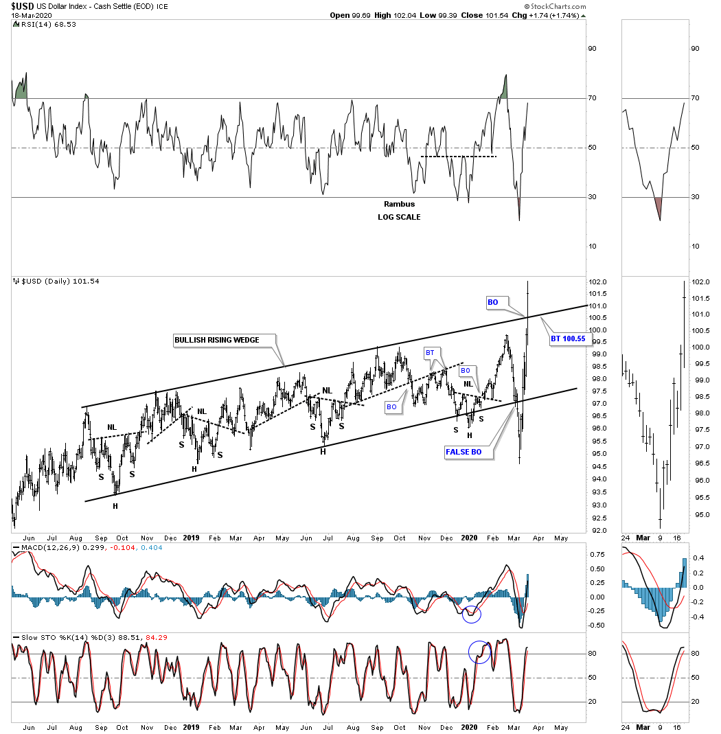
I would like to start by looking at some US dollar charts we’ve been following as its beginning to show some serious strength lately. This nearly 2 year daily chart shows the rising wedge we’ve been following for close to a year that has been trapped between the top and bottom trendlines. Recently there was a false breakout below the bottom rail which caused a whipsaw. Once the price action traded back inside of the rising wedge the false breakout was negated. Today the price action broke out above the top rail. What we need to see now is for the backtest to hold support to complete the breaking out and backtesting process.
This next chart for the US dollar is a 35 year monthly look which shows how the bullish rising wedge on the daily chart above fits into the 2011 uptrend channel.
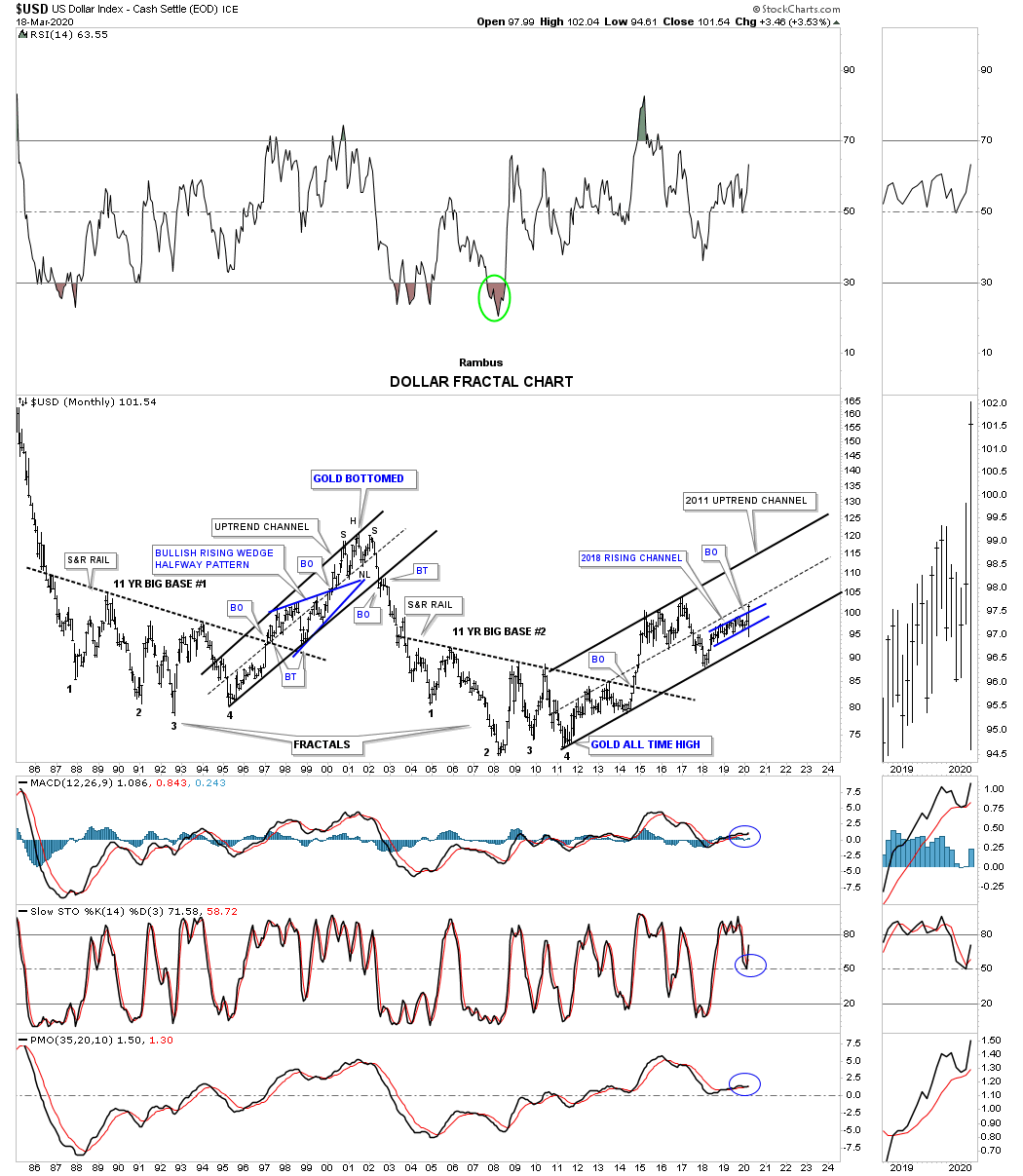
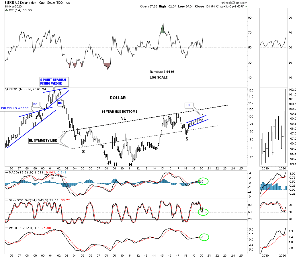
This last chart is a 25 year monthly bar chart for the US dollar I built several years ago which at the time I had no idea if it would play out. Big chart patterns like this can take a long time to come to fruition, but it does give you something to follow until something breaks down. Until something breaks down you just go with it. Note the blue rising wedge that we just looked at on the charts above that is forming as part of the right shoulder of a possible massive 14 year H&S bottom. All in all the symmetry has been pretty good as shown by the neckline symmetry line which shows the bottom for the left and right shoulders. Keep in mind the H&S bottom won’t be complete until the neckline is broken to the upside.
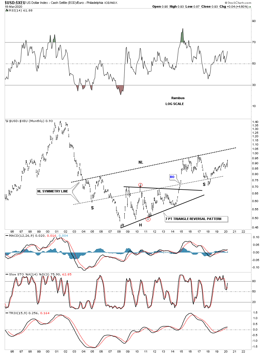
We know that there is a pretty close correlation for the most part between the US dollar and the Euro. If the US dollar is forming a 14 year H&S bottom then the odds are pretty high that the ratio chart, US dollar : XEU, should also be forming a massive H&s bottom which it is.
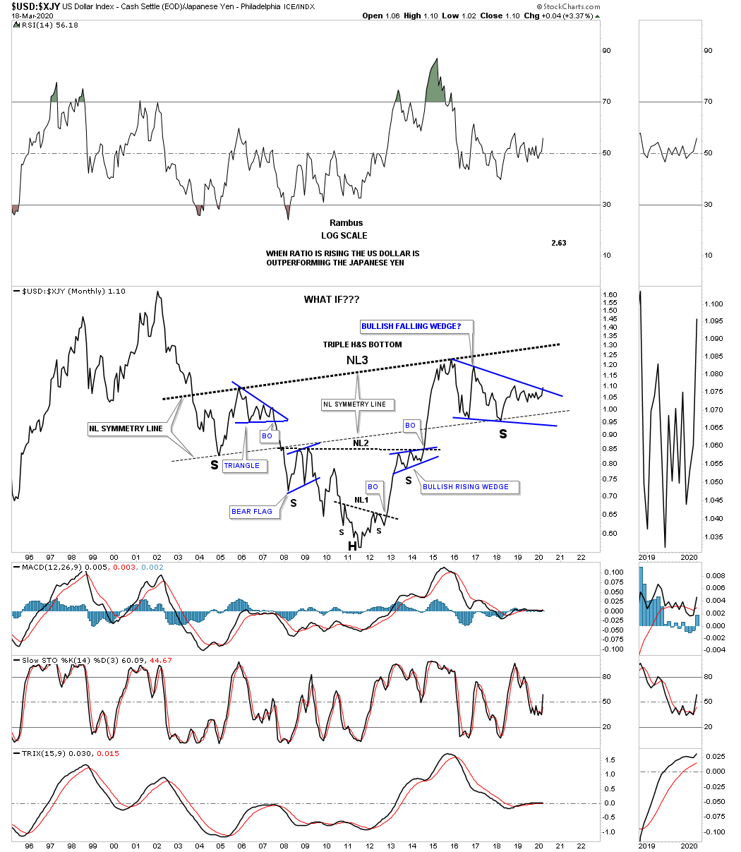
The same can be said for the USD:XJY ratio which is getting close to breaking out from the blue bullish falling wedge right shoulder. Again the neckline symmetry line is showing us the low for the left and right shoulder for neckline #3.
The US dollar to the Swiss Franc is also showing a massive H&S bottom.

I realize these massive H&S bottoms seem impossible for the average investor to believe. How can something 14 years in the making have any relevance to this time period?
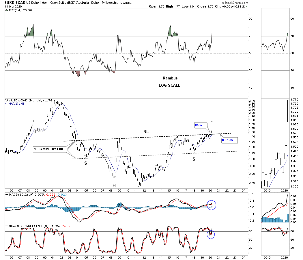
Below is the ratio chart which compares the US dollar to the Australian dollar. While the ratio charts above still show the right shoulder under construction this ratio is breaking out from its massive H&S bottom complete with a breakout gap and neckline symmetry line.
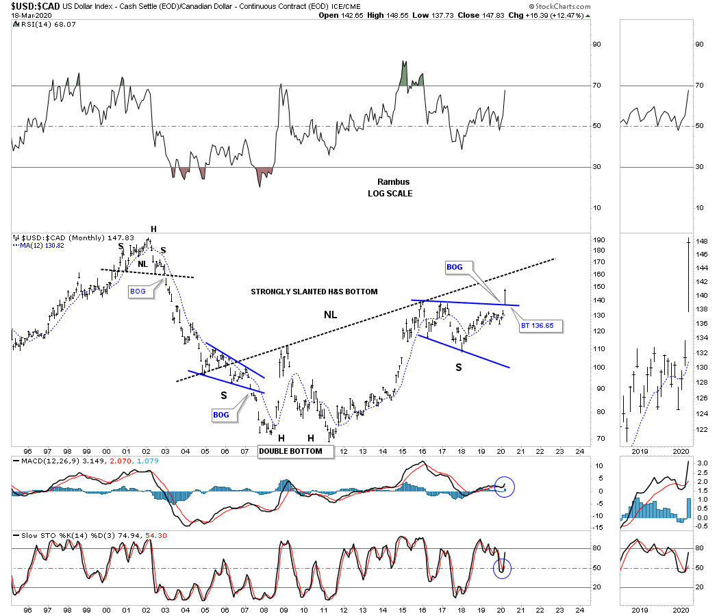
This last currency ratio chart compares the US dollar to the $CAD, Canadian dollar. This ratio is showing a strongly slanted H&S bottom with a breakout above the top rail of the blue bullish expanding falling wedge right shoulder. The breakout this week of the blue expanding falling wedge strongly suggests that the slanted H&S neckline is going to give way to the upside.
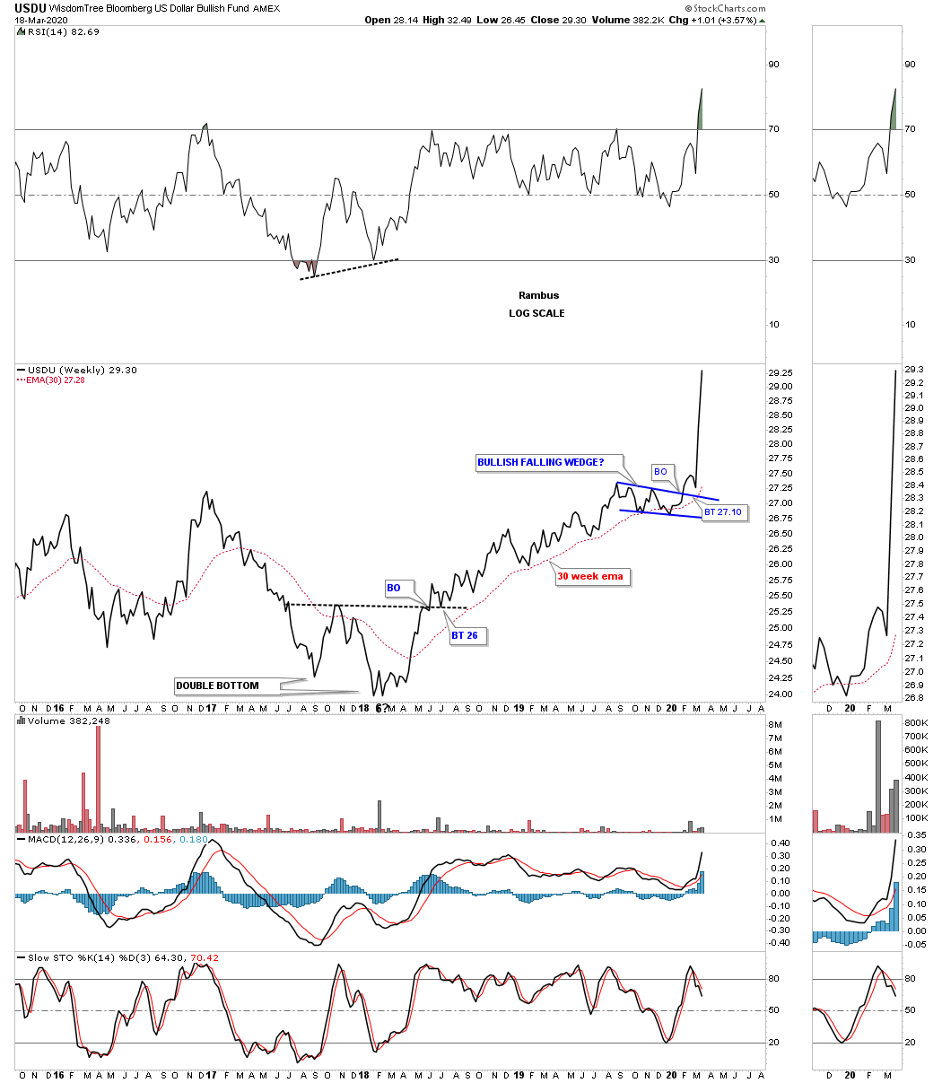
This next chart is a weekly look at the USDU which is a more equally weighted index for the US dollar. After the backtest the impulse move is well underway.
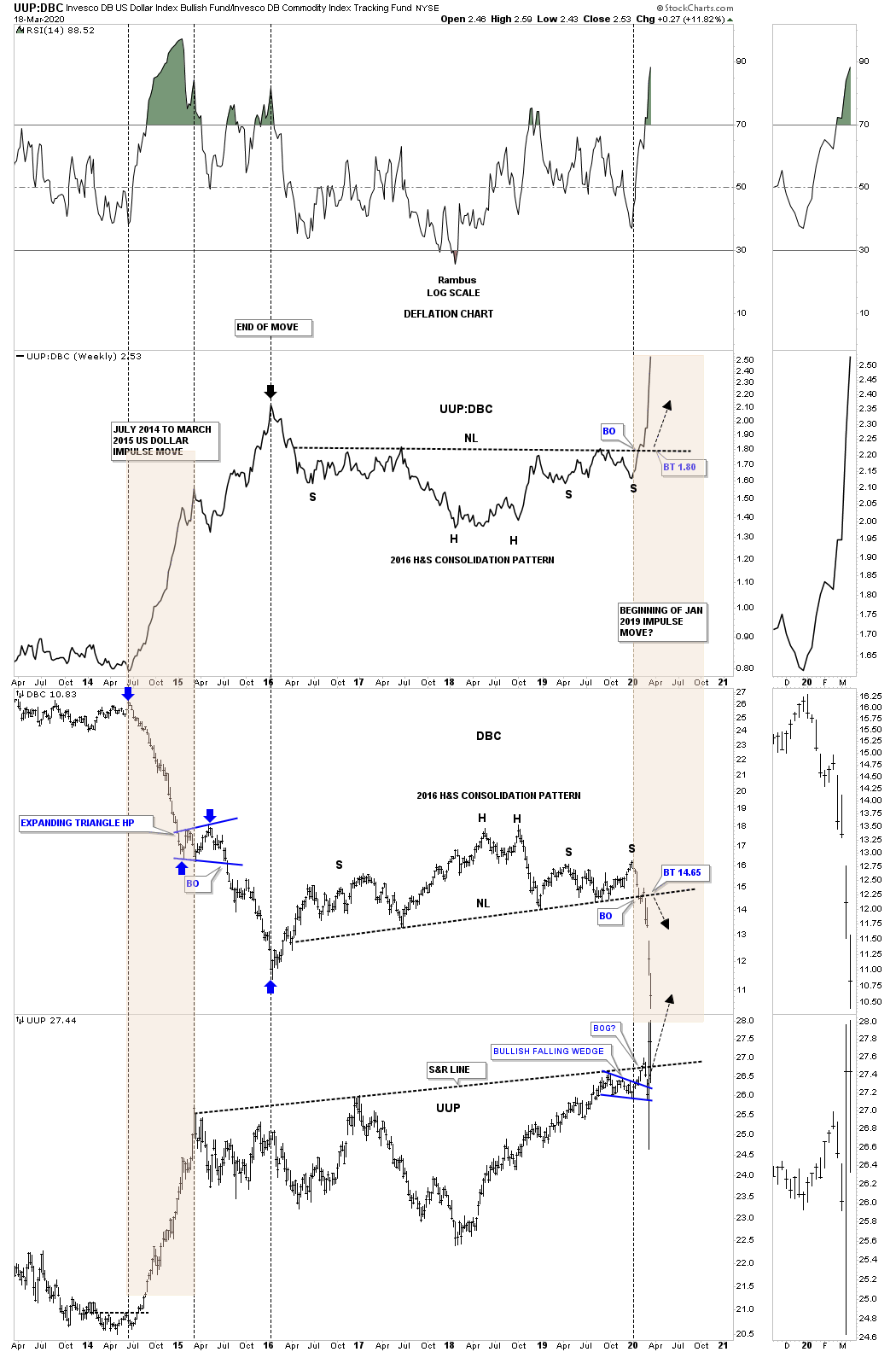
Below is a combo chart which has the ratio UUP:DBC on top with the DBC in the middle and the UUP on the bottom. The last time we looked at this chart the ratio chart on top still hadn’t broken out above the neckline. What this chart shows us is how our current setup, brown shaded area on the right side of the chart, compares to the setup on the left side of the chart which shows the last deflationary event. This ratio combo chart suggest there is still a lot of time left before this these charts run their course.
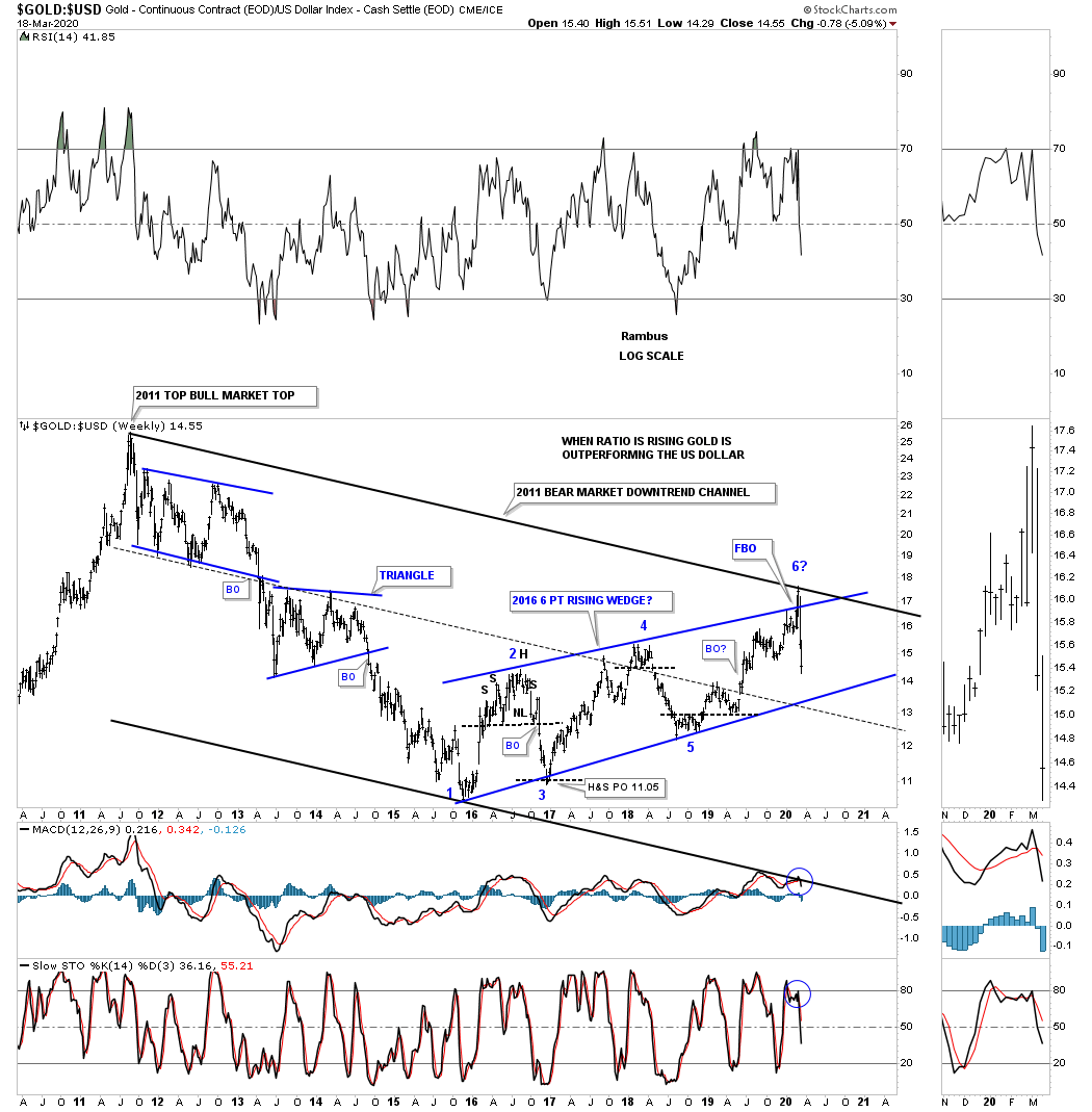
This next chart shows how gold to the US dollar did during the 2000 bull market in the precious metals complex. Just like gold itself this ratio produced some of the best chart patterns of any sector I’ve ever charted. Believe it or not this bear market has been in play for close to 9 years now with no signs of letting up just yet, especially if the 2016 rising wedge ends up being a halfway pattern to the downside.
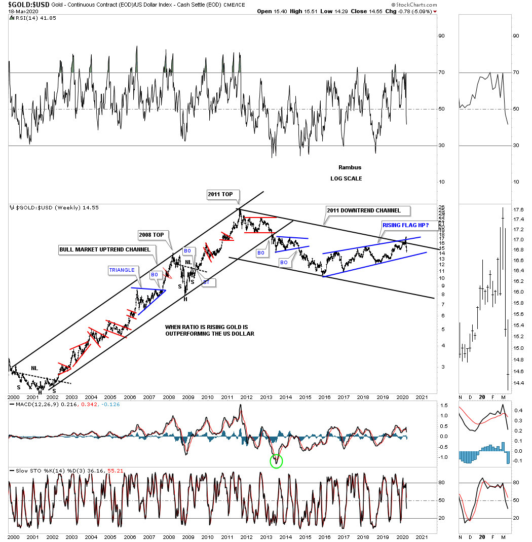
This last chart for tonight compares gold to the US dollar. When the ratio is rising gold is outperforming the US dollar. Since the bottom in 2016 gold has been outperforming the US dollar up until 3 weeks ago. There was a false breakout above the blue trendline that was negated when the ratio traded back inside of the 2016 rising wedge.
For those that like fundamentals to study maybe you can put your skills to the test and figure out why the US dollar has formed a massive 14 year H&S base compared to most of the important currencies of the world. This massive base is going to be in play for years to come. All the best…Rambus