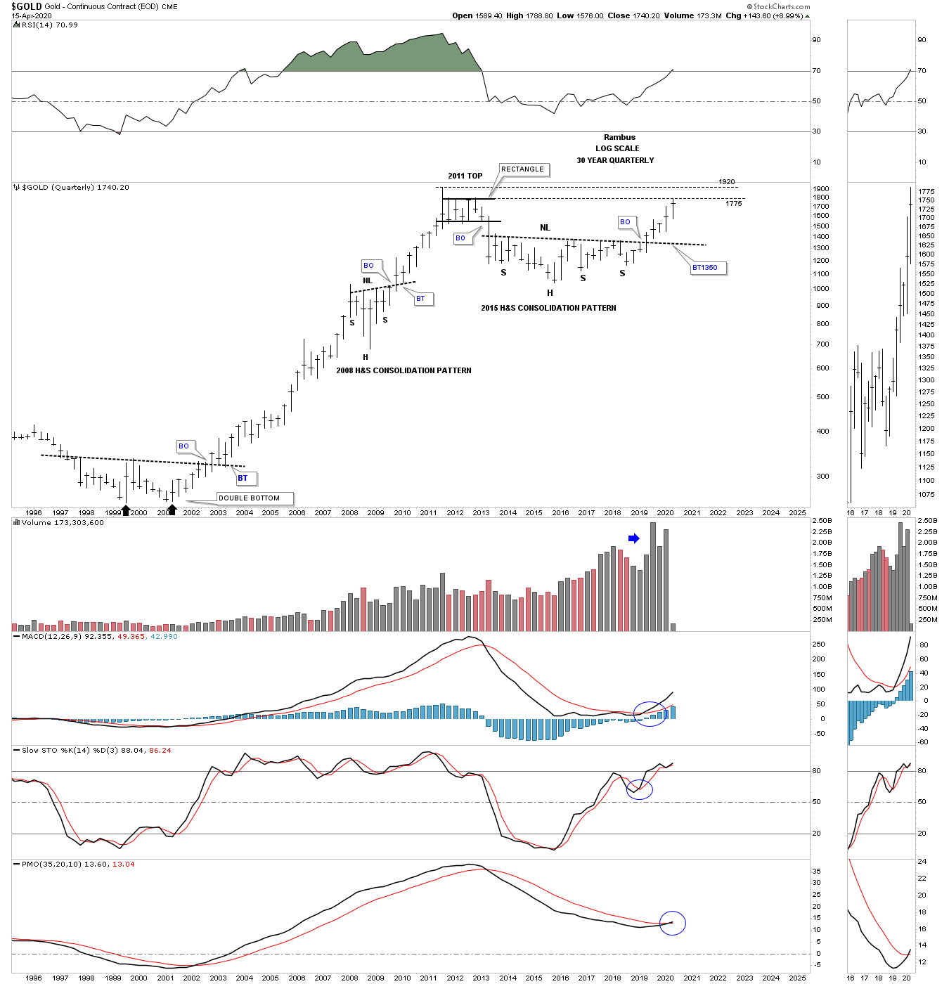
Tonight I would like to show you some very long term charts for the PM complex I used to look at the big picture and big reversal patterns. I like to use the quarterly line chart as it takes out much of the noise a quarterly bar chart can make. A quarterly line chart only uses the quarterly close so the symmetry isn’t there but the big reversal patterns still show up. Also I will switch back to a bar chart just for confirmation that the pattern I’m seeing is really the right one.
We know that gold has been the strongest area in the PM complex for quite sometime. It began to form its massive H&S consolidation pattern at the beginning of 2013 and finally broke out above the neckline in January of 2019. A line chart also shows reverse symmetry especially on the long term charts. This quarterly line chart for gold, on a quarterly closing basis, is not that far from hitting a new all time high.
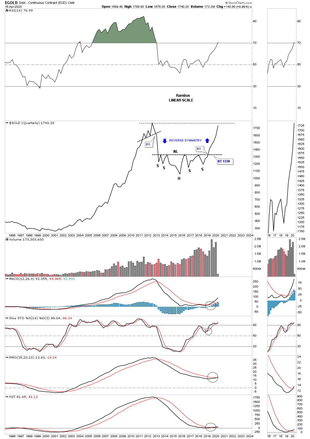
Here is the exact same chart using the quarterly bar. I’ve mentioned many times in the past that big chart patterns lead to big moves. Note the massive base in the late 1990’s and early 2000’s which launched gold’s secular bull market. We should see a similar bull market out of the 2013 H&S consolidation pattern.
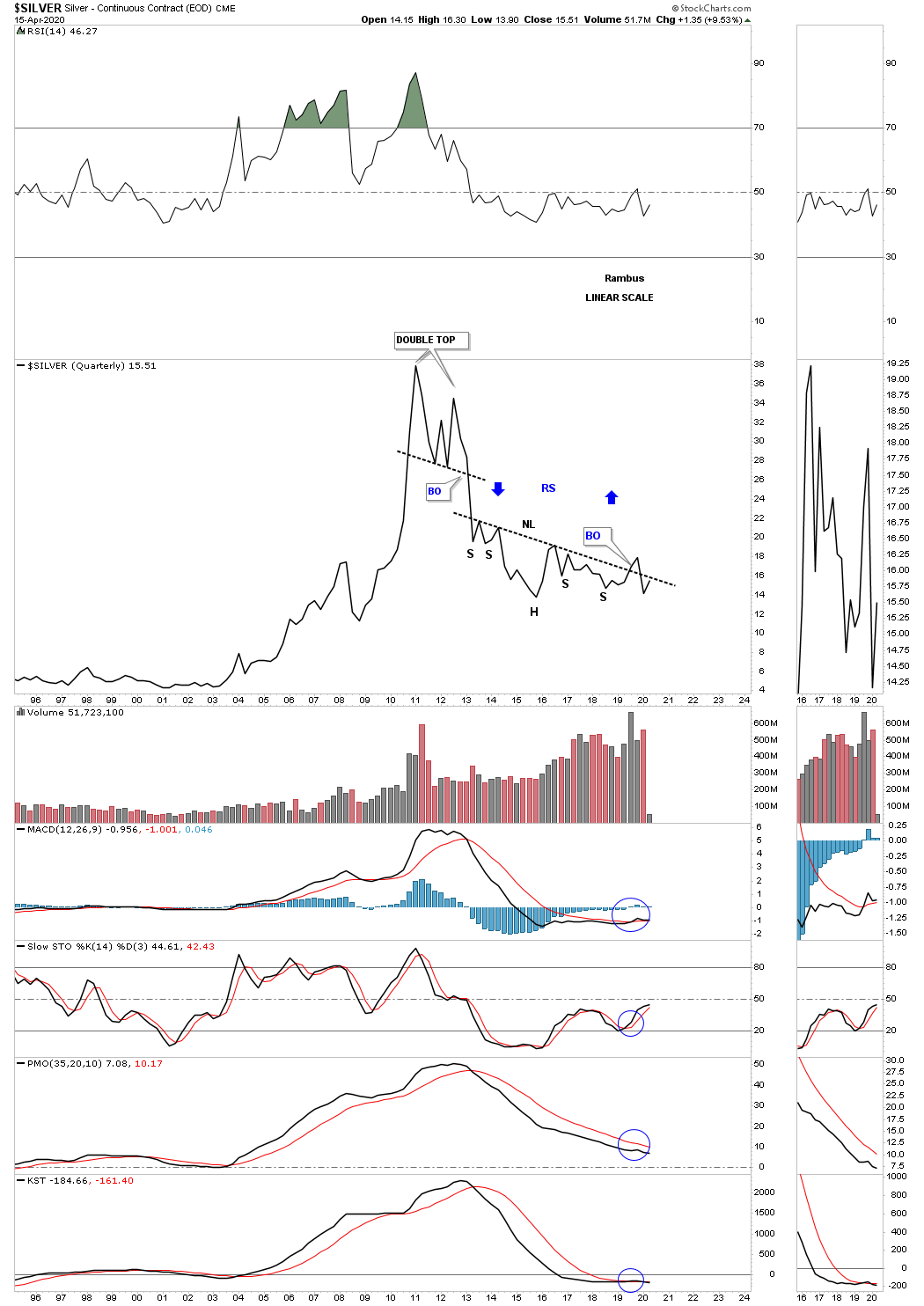
We also know that silver has been the weakest area in the PM complex as this quarterly line chart shows. Last year it looked like silver was going to breakout from its massive H&S bottom but failed to do so. The price action is attempting to hit the neckline once again.
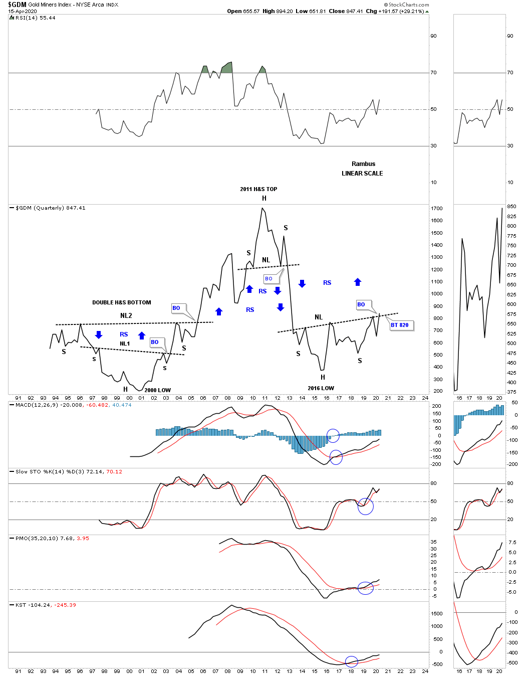
Next is the long term quarterly chart for the GDM, gold miners index, which is beginning to poke its head above the neckline. Note the big double H&S base that formed in the late 1990’s which launched its secular bull market up to the 2011 H&S top.
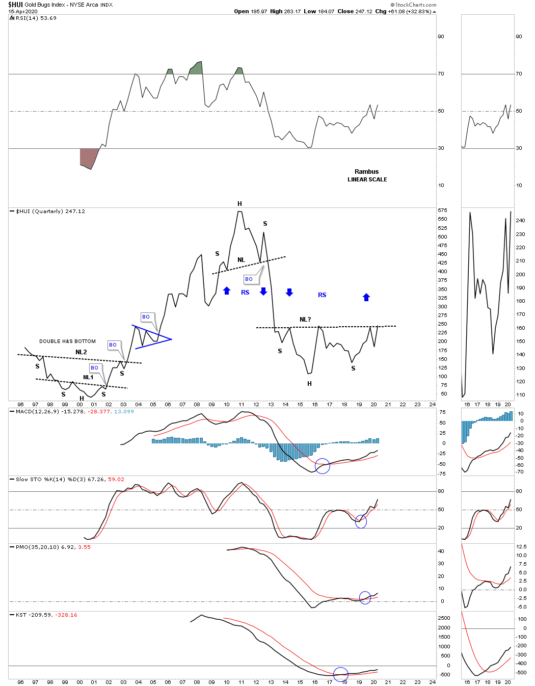
Next is the quarterly line chart for the HUI which shows the current price action testing its 2013 H&S neckline. The HUI also formed a double H&S bottom in the late 1990’s and early 2000’s. What makes this chart so bullish is the possible reverse symmetry to the upside over the same area on the way down as shown by the blue arrows.
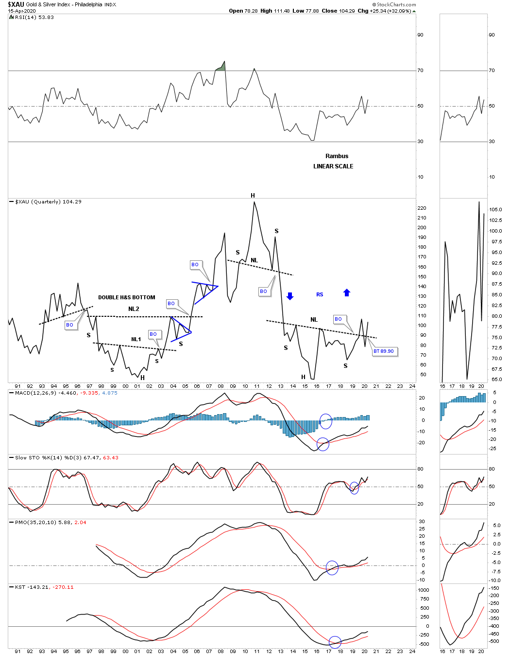
One of the PM stock indexes to keep a close eye on is the XAU, gold and silver index, as it has already broken out from is 2013 H&S bottom. The XAU also formed a double H&S base at the bear market low in 2000.
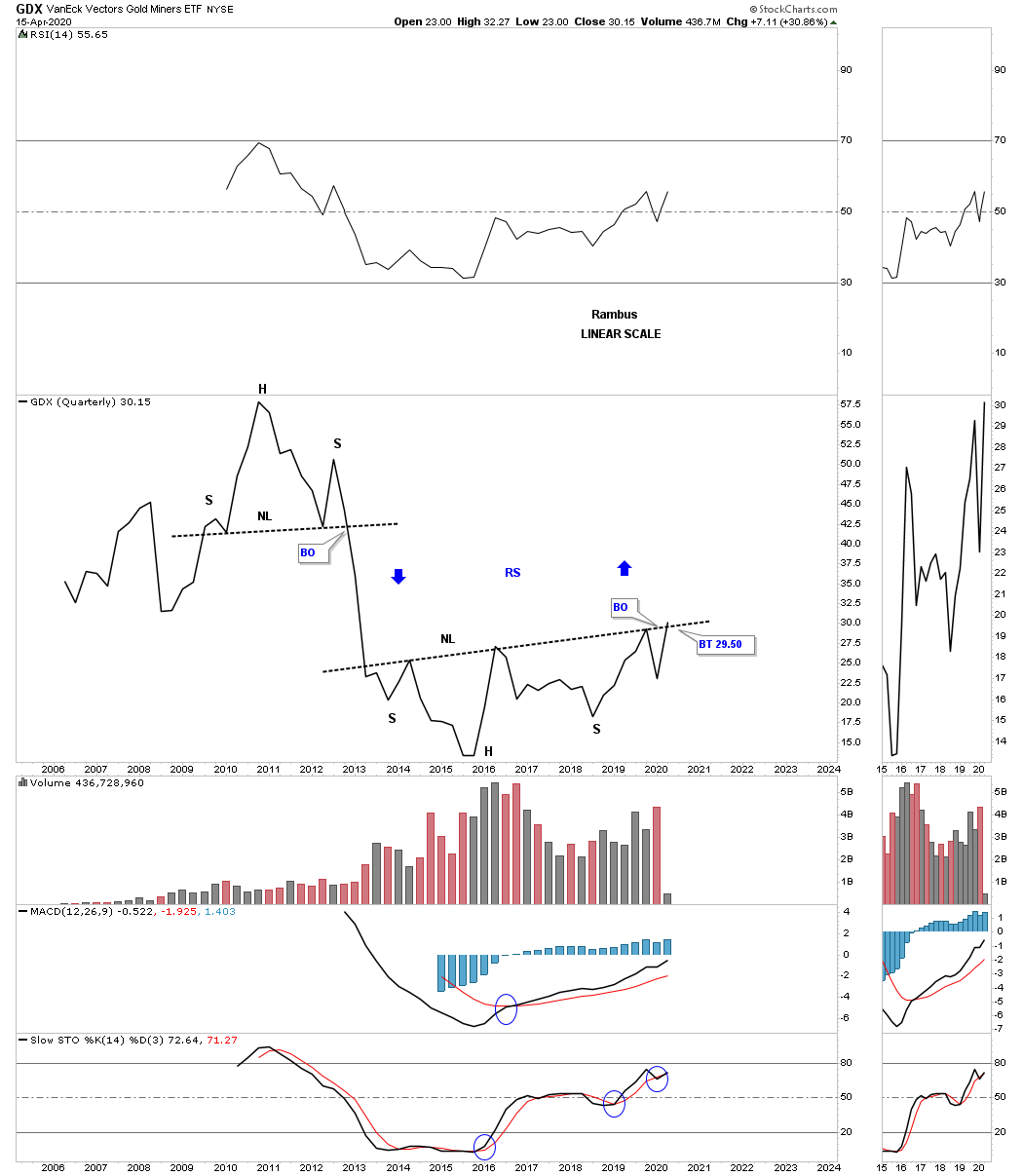
The GDX doesn’t have a lot of history yet but it’s attempting to breakout from its 2013 H&S bottom.
Below is the quarterly chart for the GDXJ, junior gold miners etf, which doesn’t have a lot of history and has been lagging the big cap PM miners for awhile now.

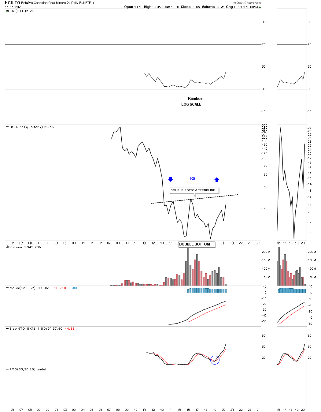
The HGU.TO is a 2 X long the Canadian gold miners etf which is forming a large double bottom reversal pattern.
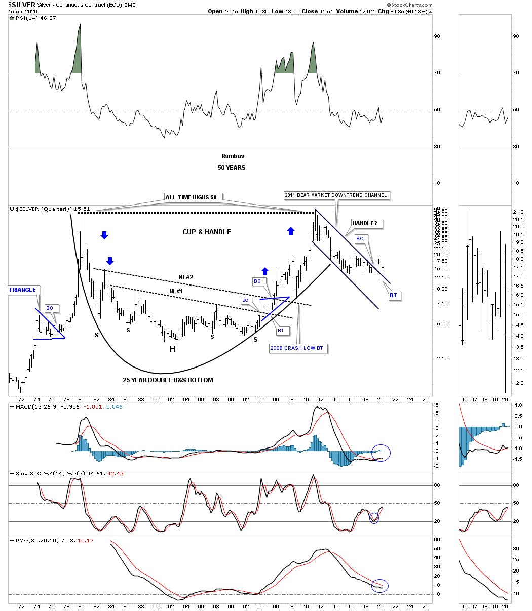
Since we are looking at very long term charts tonight lets look at a 50 year quarterly chart for silver. This chart was the very first chart I ever posted during the early days at the tent. At the time the 2nd neckline was just completing with the blue bullish rising wedge forming the right shoulder for neckline #2. Note how NL #2 held support on the backtest during the 2008 crash which led to the near parabolic rising into the 2011 high. It’s possible that the 2011 bear market downtrend channel could form a handle for a massive cup and handle formation.
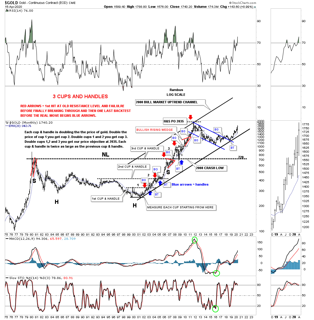
This last chart for tonight is another very long term quarterly chart for gold I haven’t posted in several years. Through the years the patterns are squeezing together which makes it hard to see what this chart is all about. Like silver’s long term 25 year H&S base gold also produced a massive H&S base with the neckline forming at the 720 area which was just below the all time high made back in 1980.
Early on I recognized how the price action was reversing symmetry to the upside which was doubling each move. This chart does an excellent job of showing you how resistance turns into support when broken to the upside. Note the red arrows that show resistance. Once the black dashed horizontal line was broken to the upside the blue arrows show how it reversed it role to support. It kept doing this all the way up to where the massive neckline was broken to the upside. Again note how that massive neckline held support during the 2008 crash, blue arrow. The last point I would like to make is that the 25 year H&S base had a price objective up to the 2035 area which was about 115 points higher than the actual high at 1920 which was pretty remarkable for the size of that 25 year base. Stay safe and all the best…Rambus