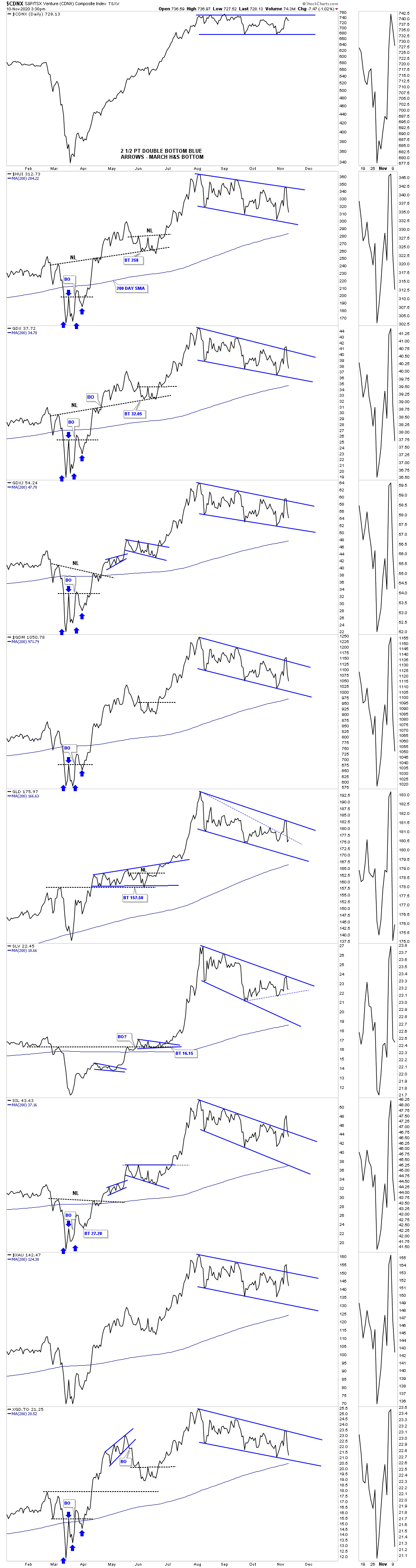
Lets start with the daily bar chart for the pm complex which has the horizontal black dashed S&R line taken from the previous high. Think of them as more of a support zone, brown shaded areas on the left side of the chart, and not an exact point of support. Even though the price action has been lower on two previous occasions during this consolidation phase the psychological pain most are feeling now is much stronger even though today’s low is still higher.
Four reversal points, even number, is what is needed to produce a consolidation pattern. Sometimes there can be 6, 8 or even more before a consolidation pattern is finished building out. The more reversal points the more despair an investor feels which is the job of a consolation pattern. Note how the 200 day sma is starting to come into the picture.
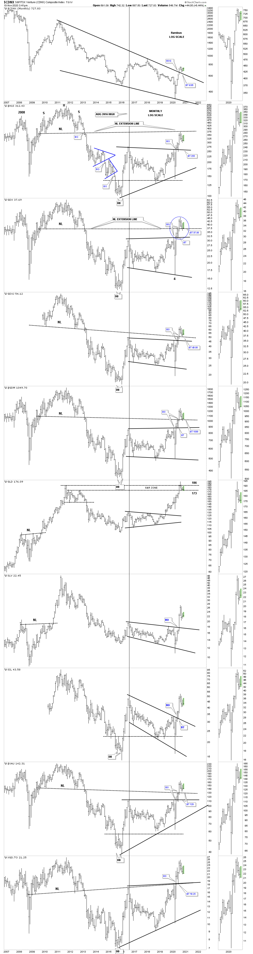
This next combo chart is the weekly look at the PM complex which shows the 2016 trading ranges with the high level consolidation patterns still under construction. I’ve mentioned several times in the past that my line in the sand to keep the bull market alive is that the top rail of the 2016 trading ranges must hold support. It wouldn’t be any fun if they came into play but I can’t tell the market what to do if it comes down to that.

This long term monthly chart for the PM complex puts everything in perspective. As of today nothing is broken with support still holding on the neckline extension lines with the top rail of the 2016 trading ranges just below. The GDX shows the breaking out and backtesting process to the top rail of its 2016 trading range which was perfect and now the breakout and backtest to the top of the 2011 neckline extension line as shown by the blue circle.
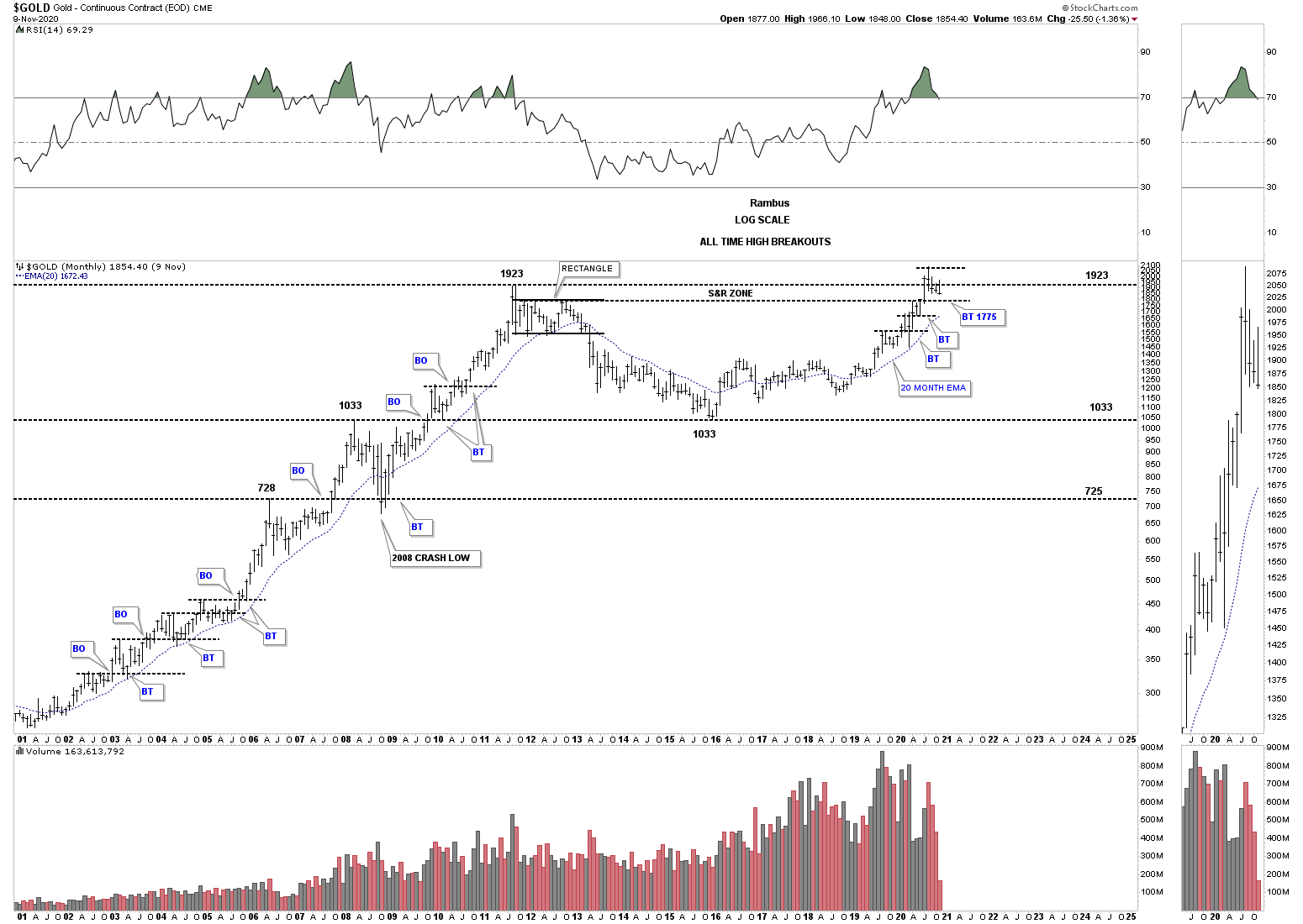
Sometimes very long term charts can show an important area of support which may be hard to see on a short term chart. During the 2000’s bull market the horizontal black dashed lines show a top which was followed by a decline. Once the decline was over and the next rally phase broke out above the top it was always backtested from above before the impulse took off in earnest. Some of the backtests were a little sloppy but for the most part support held. The only failure was during the 2008 crash. Note where the bear market ended in December of 2015 right on top of the S&R line at 1072. On the right hand side of the chart we are seeing a similar setup with one sloppy backtest to the previous high which found support at the 20 month ema. The top of the 2012 rectangle comes into play around the 1775 area which I would consider as major support.
Below is a very long term quarterly line chart for Gold which shows the beautiful reverse symmetry when the multi year H&S consolidation pattern completed as shown by the blue arrows. Here again you can see how a backtest to the quarterly top in 2011 should hold support on a backtest at 1775.

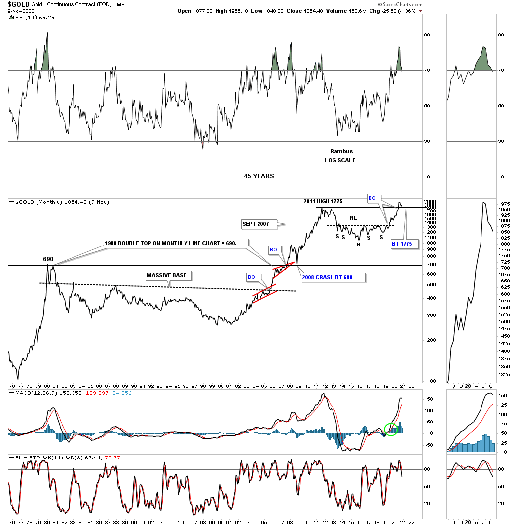
This last chart for Gold is a 45 year monthly line chart which shows the double top that was put in at the end of the last secular bull market in 1980. Note how the horizontal black S&R line held initial held resistance when hit some 27 years later. A big clue that that long term S&R line was finally going to be broken to the upside is when the small red bullish rising wedge formed just below it. After the breakout above that 27 year S&R line came the 2008 crash that found support right where you would have expected it, right on top of the S&R line and the rest they say is history.
Now look at our current price action. We are seeing a similar setup with the breakout above the 2011 high and now the backtest is underway to the 1775 area. What makes our current set up so bullish is that Gold is still in the breaking out and backtesting phase. Once all the work is finished and the backtest is completed is when you begin the impulse move that will last many years.
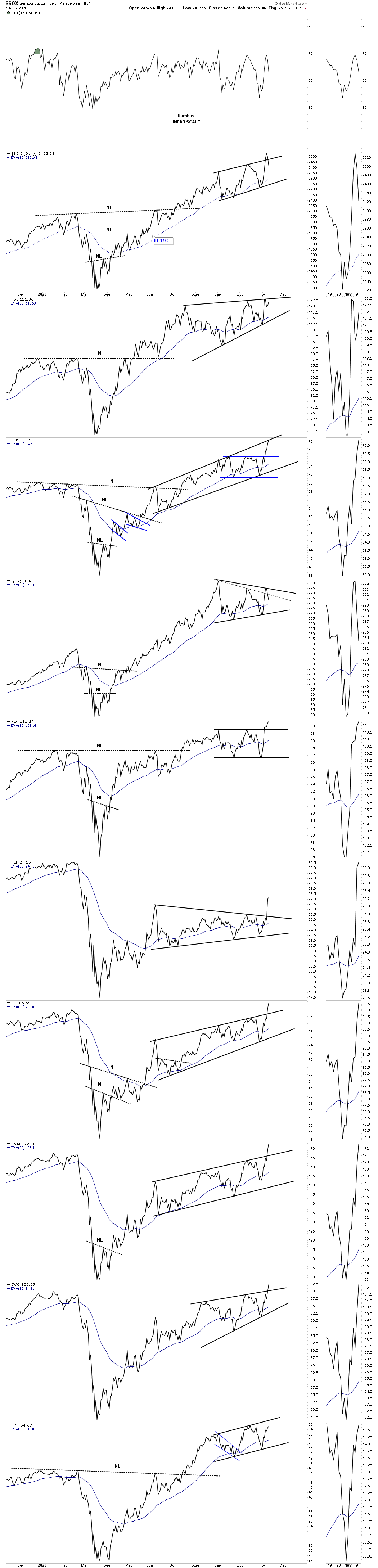
This last chart for today is a daily line combo chart which has some of the important US stock indexes on it. I realize that most are looking for a top in this general area with a major bear market to begin. What I’m seeing right now is just the opposite with capital rotating out of the big tech type stocks into some of the lagging areas such as the INDU, small caps, micro caps, banks, healthcare and industrials to name a few which is healthy. We know that patterns that slope up into the direction of the uptrend can be a very powerful indicator of a strong impulse move. I could be wrong but this combo chart has some very bullish patterns on it that have already broken out. All the best…Rambus