Most of the time during a bull market the short, intermediate and long term charts are pretty much in sync even during a consolidation phase. Consolidation patterns are needed to bring the overbought condition back to what is normal for a bull market. Consolidation patterns are notorious for wild swings both up and down to shakeout as many investors as possible before the next impulse move can begin again.
What you don’t want to see is a topping pattern such as a double top or H&S top as they are reversal patterns. It is normal to see SMALL double tops – bottoms or H&S reversal patterns at the reversal points in a big consolidation pattern, but you don’t want to see a big H&S top as a stand alone pattern especially after a strong impulse move.
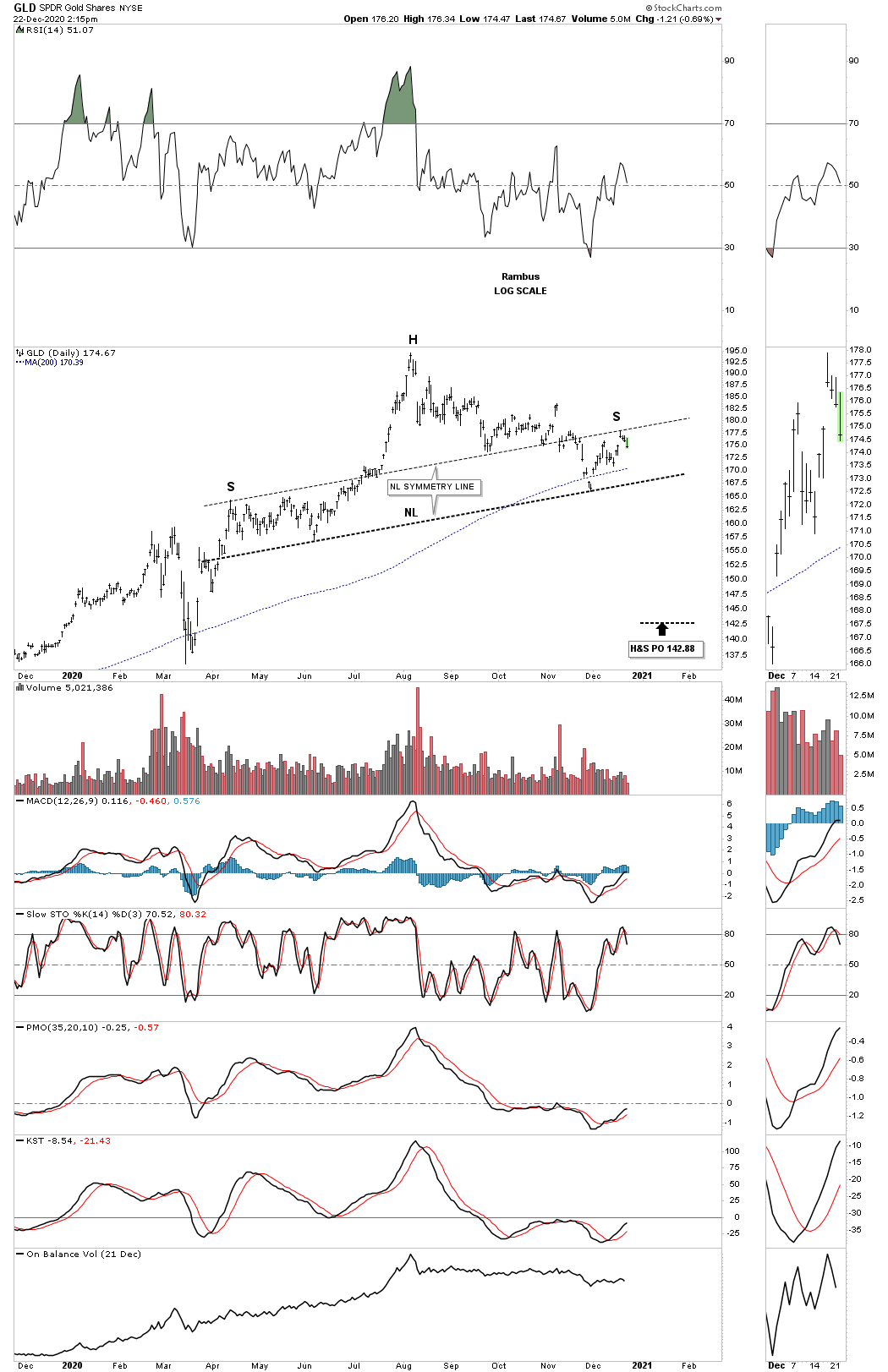
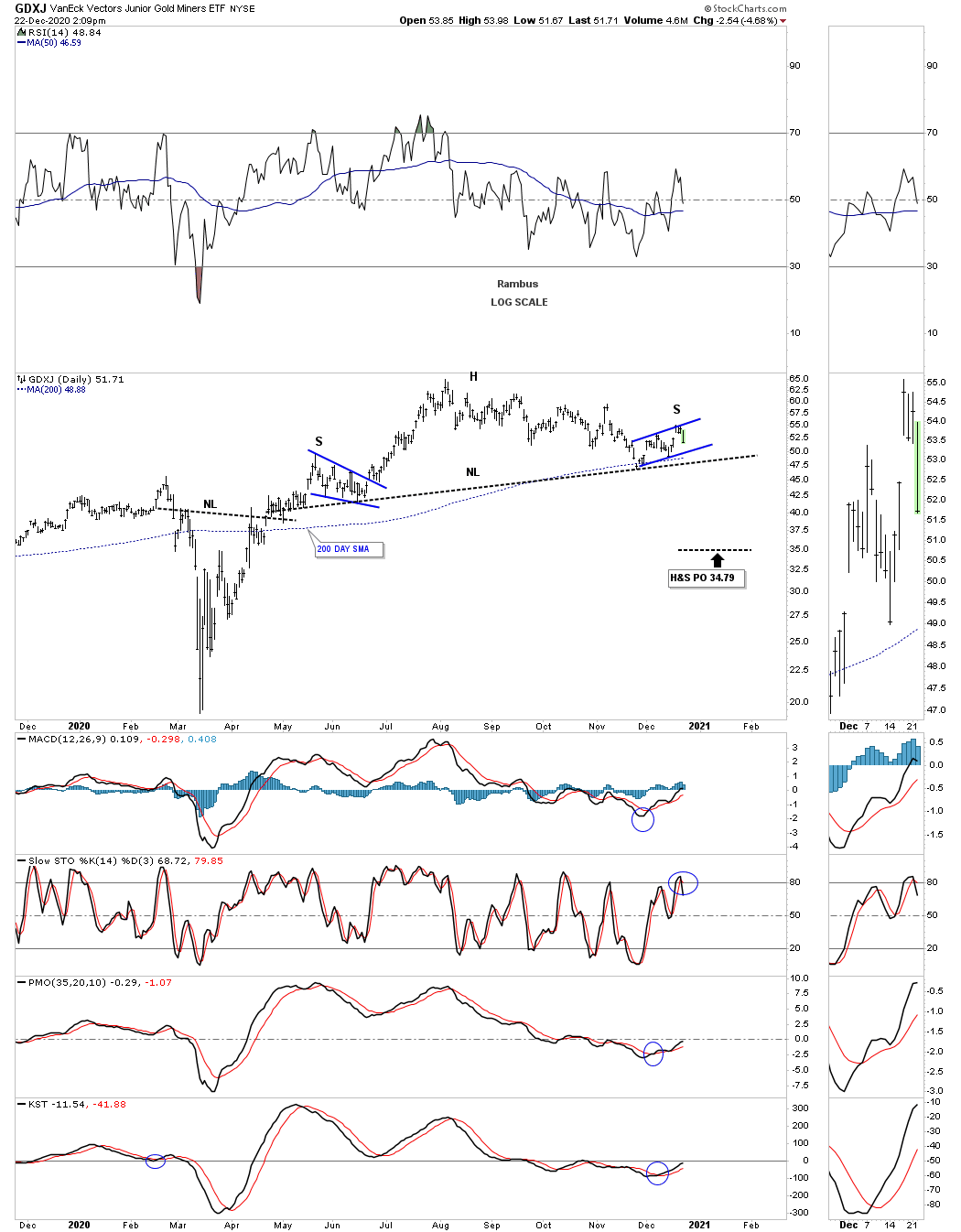
Let’s start with the daily combo chart for the PM complex which shows the potential H&S bottom forming at the last reversal point in the August trading range. To be honest I don’t like today’s price action on this daily PM combo chart even though GLD, SLV, GDXJ, XGD.to and SIL are still holding support on the backtest to their necklines today. The other PM stock indexes have broken down below their respective necklines which is a warning sign the potential H&S bottoms may be failing. So far I view today’s price action as a yellow flag or warning sign to watch this area very closely.
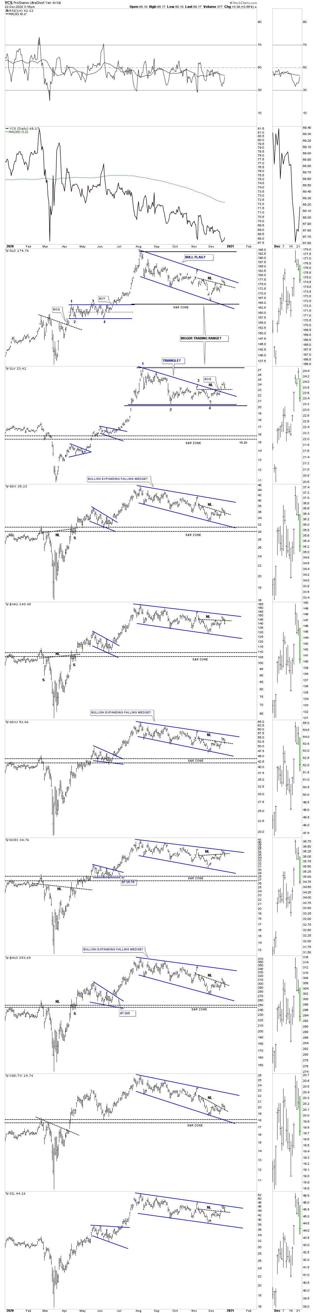
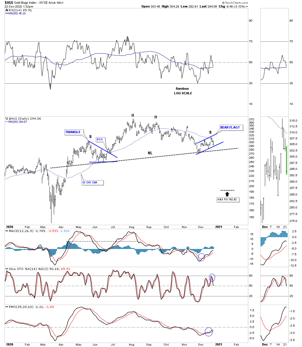
There is another daily combo chart for the PM complex I’ve not shown you before as it needed more work and still does before it shows its possible hand. If you’ve been following me for any length of time you know I don’t have any problems changing my mind if the charts are morphing into something different. Back in 2008 I was booed off the stage when I strongly suggested the HUI was putting in a H&S top at the height of the bull market back then. No one and I mean no one wanted to hear it including myself, but I have no control over the price action and had to take what the markets give me to work with.
Back in 2016 after one of the strongest impulse move in history I had to leave the party earlier when I saw a H&S top forming instead of a consolidation pattern. That call cost us a lot of members that didn’t want to hear it which I can totally understand. Even that massive H&S top at the 2011 high most analysts didn’t see it for what it. There was a list a mile long why that most symmetrical H&S top wouldn’t play out. I believe Sir Fullgoldcrown made a list at the time of many of the analyst and their reasons that H&S top wasn’t valid, and put it on the sidebar somewhere.
Editor’s Note : Precious Metals Too Big To Fail
https://rambus1.com/2013/02/22/precious-metals-stocks-too-big-to-fail/
Right now we could be at a very important inflection point in the PM complex which makes no sense from the short term charts VS the long term charts. I will be the first to admit that I’m beginning to have some doubts, at least for the short to intermediate term, that things could get pretty ugly if the PM stock indexes don’t start showing a sustained move to the upside. Again, it is not what I want but what the market is giving us to work with and it is our interpretation of the price action to make a decision. For now just think of this daily combo chart as a heads up until we begin to see some of the potential H&S necklines give way.
The very first thing you need to see during the formation of a H&S top is for the price action to trade below the left shoulder high. Then after initial support is found you will get the countertrend rally which generally makes a lower high in the move down from the head. In a very symmetrical H&S top you will see both the left shoulder high and the right shoulder high form the same distance above the neckline which creates the neckline symmetry line.
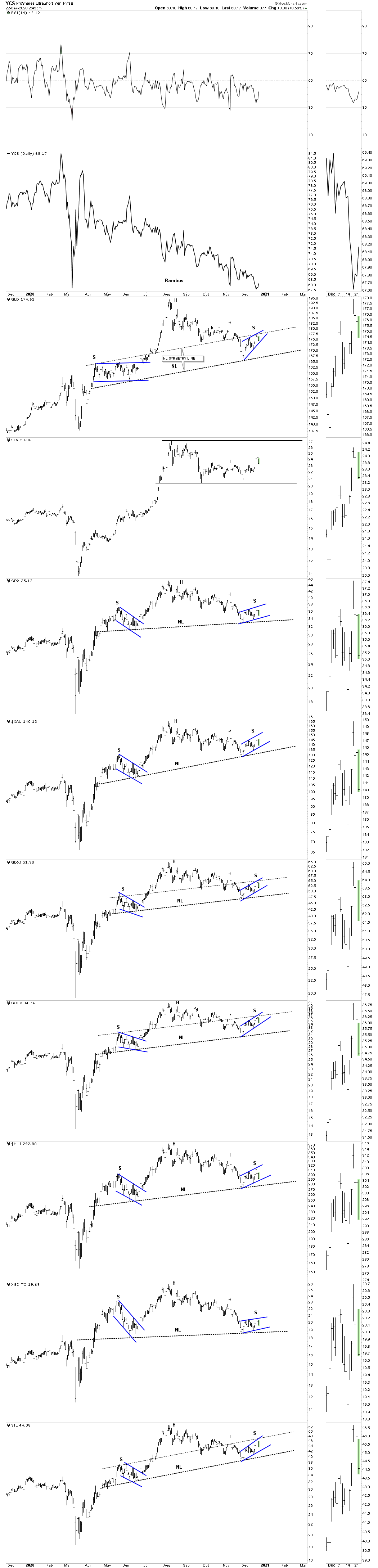
It is not unusual to see a small consolidation pattern form the left and right shoulders. Keep in mind we still have to see the bear flag break its bottom rail and then the neckline has to be broken before we have confirmation. Again, this is just a heads up and something we need to follow until we are out of the woods.
GDXJ daily:
GDX daily:
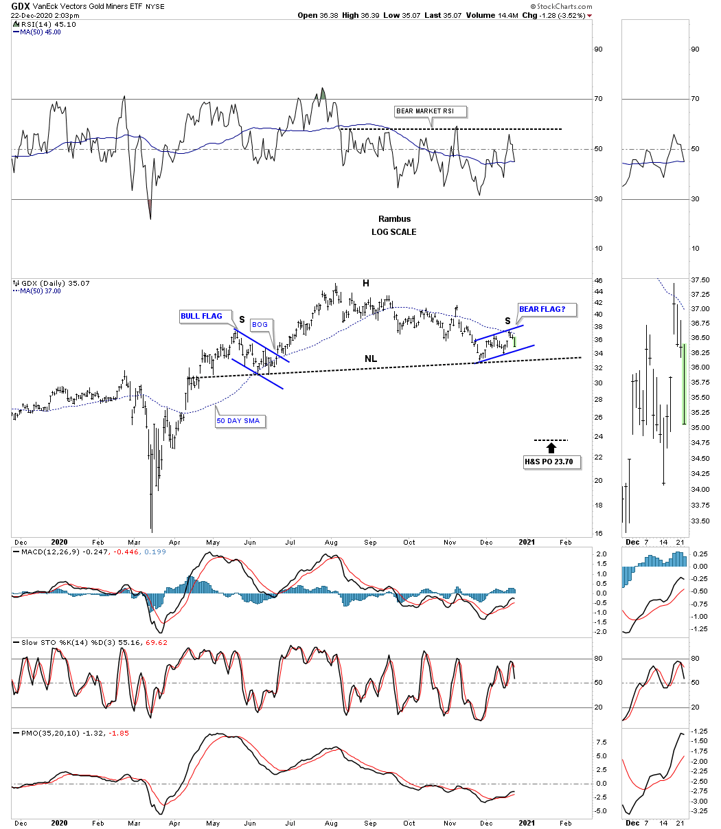
It was actually this old daily chart for the GDX which first got my attention. You can see the H&S top that was made back in 2016 which reversed that massive impulse move off the 2016 double bottom. That 2016 high created that massive brown shaded S&R zone which held resistance until the GDX finally took it out back in the Spring of this year. From a Chartology perspective that brown shaded S&R zone should hold support which it did initially on the breakout and backtest. Rule #1 never discount a H&S top no matter how bullish one may be. This is our conundrum.

As I stated earlier I’m seeing a possible disconnect between these short term charts above and what the longer term charts are showing which at the moment makes no sense. The main thing we have going for us is that we are aware of what is possible while most analysis are only looking at the bullish side of the market. Now we wait to see what the market gives us next to work with. All the best…Rambus